

Category Tabs Accordion
Original · freeCategory tabs that switch between grouped accordion sets.
Copy prompt gives Claude Code, Cursor or v0 a ready-to-paste prompt that recreates this exact component.
npx shadcn@latest add https://webinnoventix.com/r/accordion-category-tabs.json"use client";
import { useId, useRef, useState, type KeyboardEvent } from "react";
type QA = { q: string; a: string };
type Category = { id: string; label: string; blurb: string; items: QA[] };
const CATEGORIES: Category[] = [
{
id: "billing",
label: "Billing",
blurb: "Plans, invoices, refunds and payment methods.",
items: [
{
q: "When am I charged for my subscription?",
a: "Your card is billed on the calendar day you first upgraded, then on that same day each month or year. If the day doesn't exist in a given month (say the 31st), we bill on the last day of that month instead.",
},
{
q: "Can I switch from monthly to annual mid-cycle?",
a: "Yes. We credit the unused portion of your current month against the annual price, so you only pay the difference. The switch takes effect immediately and your renewal date resets to the day you changed.",
},
{
q: "What happens if a payment fails?",
a: "We retry the charge three times over five days and email you before each attempt. Your workspace stays fully active during that window. If all retries fail, we downgrade you to the free tier rather than deleting anything.",
},
{
q: "Do you offer refunds?",
a: "We refund annual plans in full within 14 days of purchase, no questions asked. Monthly plans aren't refundable, but you can cancel anytime and keep access until the period ends.",
},
],
},
{
id: "account",
label: "Account",
blurb: "Sign-in, security and team seats.",
items: [
{
q: "How do I reset my password?",
a: "Choose \"Forgot password\" on the sign-in screen and we'll email a reset link that stays valid for one hour. If you use single sign-on, reset the password with your identity provider instead — we never store it.",
},
{
q: "Can I enable two-factor authentication?",
a: "Go to Settings → Security and turn on 2FA using any authenticator app. We'll show ten one-time recovery codes — save them somewhere safe, because they're the only way back in if you lose your device.",
},
{
q: "How do I add teammates to my workspace?",
a: "Open Members, enter their work email and pick a role. They'll receive an invite that expires after seven days. Seats are added to your plan automatically and prorated for the rest of the billing period.",
},
],
},
{
id: "shipping",
label: "Shipping",
blurb: "Delivery windows, tracking and returns.",
items: [
{
q: "How long does standard delivery take?",
a: "Standard orders arrive in 3–5 business days within the contiguous US. We pack and hand off same-day for anything placed before 2 PM local time on a weekday.",
},
{
q: "Do you ship internationally?",
a: "We ship to 42 countries. Duties and import taxes are calculated at checkout so there are no surprise fees on delivery. Transit usually takes 7–12 business days depending on customs.",
},
{
q: "How do I start a return?",
a: "Head to Orders, select the item and choose \"Return\". We email a prepaid label and refund you the moment the carrier scans the package — you don't have to wait for it to reach our warehouse.",
},
],
},
];
export default function AccordionCategoryTabs() {
const uid = useId();
const [activeTab, setActiveTab] = useState<string>(CATEGORIES[0].id);
const [openItem, setOpenItem] = useState<string | null>(`${CATEGORIES[0].id}-0`);
const tabRefs = useRef<(HTMLButtonElement | null)[]>([]);
const active = CATEGORIES.find((c) => c.id === activeTab) ?? CATEGORIES[0];
function selectTab(id: string) {
setActiveTab(id);
setOpenItem(`${id}-0`);
}
function onTabKeyDown(e: KeyboardEvent<HTMLButtonElement>, index: number) {
const last = CATEGORIES.length - 1;
let next = index;
if (e.key === "ArrowRight" || e.key === "ArrowDown") next = index === last ? 0 : index + 1;
else if (e.key === "ArrowLeft" || e.key === "ArrowUp") next = index === 0 ? last : index - 1;
else if (e.key === "Home") next = 0;
else if (e.key === "End") next = last;
else return;
e.preventDefault();
const target = CATEGORIES[next];
selectTab(target.id);
tabRefs.current[next]?.focus();
}
return (
<section className="relative w-full bg-slate-50 px-4 py-20 sm:px-6 dark:bg-slate-950">
<style>{`
@keyframes actabs-panel-in {
from { opacity: 0; transform: translateY(8px); }
to { opacity: 1; transform: translateY(0); }
}
@keyframes actabs-body-in {
from { opacity: 0; }
to { opacity: 1; }
}
.actabs-panel { animation: actabs-panel-in .35s cubic-bezier(.16,1,.3,1) both; }
.actabs-body-inner { animation: actabs-body-in .4s ease both; }
@media (prefers-reduced-motion: reduce) {
.actabs-panel, .actabs-body-inner { animation: none !important; }
.actabs-grid { transition: none !important; }
}
`}</style>
<div className="mx-auto max-w-2xl">
<div className="mb-8 text-center">
<span className="inline-block rounded-full bg-indigo-100 px-3 py-1 text-xs font-semibold tracking-wide text-indigo-700 uppercase dark:bg-indigo-500/15 dark:text-indigo-300">
Help center
</span>
<h2 className="mt-4 text-3xl font-bold tracking-tight text-slate-900 sm:text-4xl dark:text-white">
Frequently asked questions
</h2>
<p className="mt-3 text-base text-slate-600 dark:text-slate-400">
Browse by category. Everything you need, grouped and answered.
</p>
</div>
{/* Tabs */}
<div
role="tablist"
aria-label="FAQ categories"
aria-orientation="horizontal"
className="mb-6 flex flex-wrap justify-center gap-2"
>
{CATEGORIES.map((cat, i) => {
const selected = cat.id === activeTab;
return (
<button
key={cat.id}
ref={(el) => {
tabRefs.current[i] = el;
}}
role="tab"
id={`${uid}-tab-${cat.id}`}
aria-selected={selected}
aria-controls={`${uid}-panel-${cat.id}`}
tabIndex={selected ? 0 : -1}
onClick={() => selectTab(cat.id)}
onKeyDown={(e) => onTabKeyDown(e, i)}
className={`rounded-full px-4 py-2 text-sm font-semibold outline-none transition-colors focus-visible:ring-2 focus-visible:ring-indigo-500 focus-visible:ring-offset-2 focus-visible:ring-offset-slate-50 dark:focus-visible:ring-offset-slate-950 ${
selected
? "bg-indigo-600 text-white shadow-sm shadow-indigo-600/30"
: "bg-white text-slate-600 ring-1 ring-slate-200 ring-inset hover:bg-slate-100 hover:text-slate-900 dark:bg-slate-900 dark:text-slate-400 dark:ring-slate-800 dark:hover:bg-slate-800 dark:hover:text-white"
}`}
>
{cat.label}
</button>
);
})}
</div>
{/* Panel */}
<div
key={active.id}
role="tabpanel"
id={`${uid}-panel-${active.id}`}
aria-labelledby={`${uid}-tab-${active.id}`}
tabIndex={0}
className="actabs-panel rounded-2xl outline-none focus-visible:ring-2 focus-visible:ring-indigo-500"
>
<p className="mb-4 px-1 text-sm text-slate-500 dark:text-slate-400">{active.blurb}</p>
<div className="space-y-3">
{active.items.map((item, idx) => {
const key = `${active.id}-${idx}`;
const isOpen = openItem === key;
return (
<div
key={key}
className={`overflow-hidden rounded-xl border bg-white transition-colors dark:bg-slate-900 ${
isOpen
? "border-indigo-300 dark:border-indigo-500/40"
: "border-slate-200 dark:border-slate-800"
}`}
>
<h3>
<button
type="button"
id={`${uid}-btn-${key}`}
aria-expanded={isOpen}
aria-controls={`${uid}-region-${key}`}
onClick={() => setOpenItem(isOpen ? null : key)}
className="flex w-full items-center justify-between gap-4 px-5 py-4 text-left outline-none focus-visible:ring-2 focus-visible:ring-inset focus-visible:ring-indigo-500"
>
<span className="text-[0.95rem] font-semibold text-slate-900 dark:text-white">
{item.q}
</span>
<span
aria-hidden="true"
className={`grid size-6 shrink-0 place-items-center rounded-full text-slate-500 transition-transform duration-300 dark:text-slate-400 ${
isOpen ? "rotate-45 text-indigo-600 dark:text-indigo-400" : ""
}`}
>
<svg
viewBox="0 0 24 24"
fill="none"
stroke="currentColor"
strokeWidth="2"
strokeLinecap="round"
className="size-4"
>
<path d="M12 5v14M5 12h14" />
</svg>
</span>
</button>
</h3>
<div
id={`${uid}-region-${key}`}
role="region"
aria-labelledby={`${uid}-btn-${key}`}
className="actabs-grid grid transition-[grid-template-rows] duration-300 ease-out"
style={{ gridTemplateRows: isOpen ? "1fr" : "0fr" }}
>
<div className="overflow-hidden">
<p className="actabs-body-inner px-5 pb-5 text-sm leading-relaxed text-slate-600 dark:text-slate-300">
{item.a}
</p>
</div>
</div>
</div>
);
})}
</div>
</div>
</div>
</section>
);
}Dependencies
Licence
Built by Web Innoventix. Free for personal and commercial use, no attribution required.
Built by Web Innoventix
Need a custom interface, a full website, or SEO that gets you cited by AI? We design, build and rank it end to end.
Get a free quoteSimilar components
Browse all →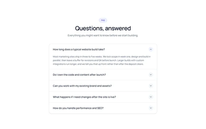
Simple Accordion
OriginalA clean single-column accordion, one panel open at a time, chevron rotates.
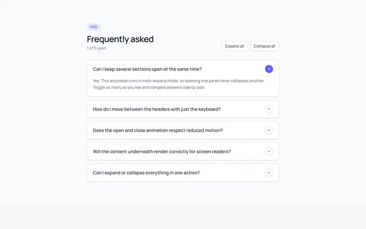
Multi Accordion
OriginalAn accordion where multiple panels can be open at once.
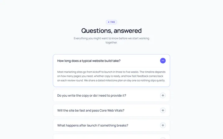
Plus Minus Accordion
OriginalAccordion with a plus/minus icon that toggles per item.
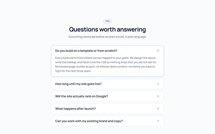
Bordered Accordion
OriginalBordered card-style accordion panels with rounded corners.
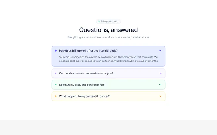
Filled Accordion
OriginalFilled, tinted accordion panels; the active one is highlighted.
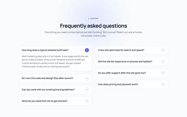
FAQ Two Col Accordion
OriginalA two-column FAQ accordion layout.
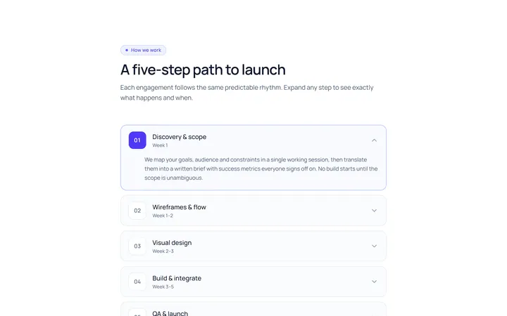
Numbered Accordion
OriginalA numbered-step accordion (01, 02, 03...).
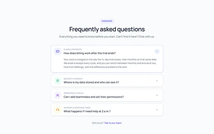
Icon Left Accordion
OriginalAccordion with a leading icon per item and a right chevron.
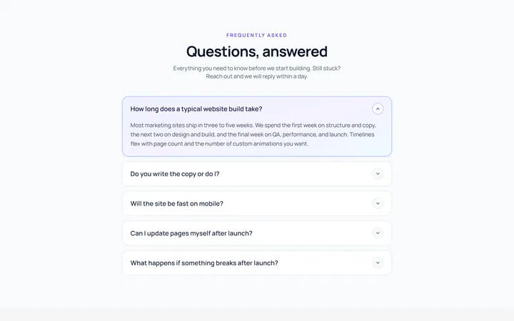
Gradient Active Accordion
OriginalAccordion where the open panel gets a soft gradient background.
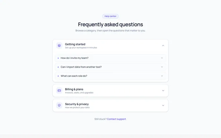
Nested Accordion
OriginalAn accordion with nested sub-accordions.
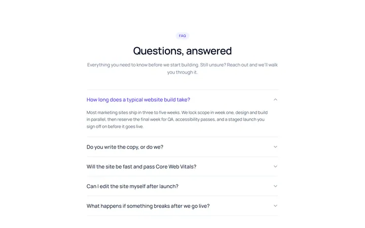
Flush Accordion
OriginalA borderless, flush accordion separated by hairlines.
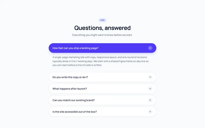
Pill Accordion
OriginalAccordion with rounded pill-shaped headers.