

Image Accordion
Original · freeAn accordion whose open panel reveals an image and text.
Copy prompt gives Claude Code, Cursor or v0 a ready-to-paste prompt that recreates this exact component.
npx shadcn@latest add https://webinnoventix.com/r/accordion-image.json"use client";
import { useId, useState } from "react";
import { AnimatePresence, motion, useReducedMotion } from "motion/react";
type Panel = {
id: string;
eyebrow: string;
title: string;
body: string;
image: string;
alt: string;
meta: string;
};
const PANELS: Panel[] = [
{
id: "kyoto",
eyebrow: "Japan · 5 nights",
title: "Kyoto in low season",
body: "Go the second week of December, after the maple crowds thin out and before the New Year rush. Book a machiya near Gion, walk the Philosopher's Path at dawn, and reserve Arashiyama's bamboo grove for a weekday 7am slot — it's empty and the light is soft.",
image: "/img/gallery/g07.webp",
alt: "Traditional wooden temple framed by autumn maples in Kyoto",
meta: "Best for: temples, tea houses, slow mornings",
},
{
id: "lisbon",
eyebrow: "Portugal · 4 nights",
title: "Lisbon by tram and tile",
body: "Base yourself in Alfama and let the 28 tram do the climbing. Eat pastéis at Manteigaria, not the tourist line, then catch sunset from Miradouro da Senhora do Monte. Day-trip to Sintra by train but leave by 2pm to beat the palace queues.",
image: "/img/gallery/g14.webp",
alt: "Yellow vintage tram climbing a narrow tiled street in Lisbon",
meta: "Best for: viewpoints, seafood, walkable hills",
},
{
id: "patagonia",
eyebrow: "Chile · 7 nights",
title: "Patagonia, the W trek",
body: "Four days through Torres del Paine with refugios booked six months out. Pack for four seasons in one afternoon and start the base-of-the-towers climb before sunrise — the granite turns copper for about ten minutes and then it's gone.",
image: "/img/gallery/g22.webp",
alt: "Jagged granite peaks reflected in a glacial lake in Patagonia",
meta: "Best for: hiking, glaciers, big silence",
},
{
id: "marrakech",
eyebrow: "Morocco · 3 nights",
title: "Marrakech medina",
body: "Stay in a riad with a rooftop so you have somewhere quiet to retreat to. Hire a guide for the first afternoon only — after that the souks make sense. Save the Jardin Majorelle for opening time and haggle for lamps with a smile, never a rush.",
image: "/img/gallery/g31.webp",
alt: "Colourful spice stalls and lanterns in a Marrakech souk",
meta: "Best for: markets, courtyards, rooftop mint tea",
},
];
export default function AccordionImage() {
const prefersReduced = useReducedMotion();
const [open, setOpen] = useState<string>(PANELS[0].id);
const baseId = useId();
const toggle = (id: string) => {
setOpen((cur) => (cur === id ? "" : id));
};
return (
<section className="relative w-full bg-slate-50 px-4 py-20 text-slate-900 sm:px-6 dark:bg-slate-950 dark:text-slate-100">
<style>{`
@keyframes accimg-fade-in {
from { opacity: 0; transform: translateY(8px); }
to { opacity: 1; transform: translateY(0); }
}
@media (prefers-reduced-motion: reduce) {
.accimg-anim { animation: none !important; }
}
`}</style>
<div className="mx-auto max-w-3xl">
<div className="mb-10 text-center">
<span className="inline-block rounded-full border border-indigo-200 bg-indigo-50 px-3 py-1 text-xs font-semibold uppercase tracking-wide text-indigo-700 dark:border-indigo-500/30 dark:bg-indigo-500/10 dark:text-indigo-300">
Field notes
</span>
<h2 className="mt-4 text-3xl font-bold tracking-tight sm:text-4xl">
Four trips worth the flight
</h2>
<p className="mx-auto mt-3 max-w-xl text-base text-slate-600 dark:text-slate-400">
Open a card for the honest version — when to go, where to stay, and
the one thing most people get wrong.
</p>
</div>
<div className="divide-y divide-slate-200 overflow-hidden rounded-2xl border border-slate-200 bg-white shadow-sm dark:divide-slate-800 dark:border-slate-800 dark:bg-slate-900">
{PANELS.map((panel) => {
const isOpen = open === panel.id;
const btnId = `${baseId}-btn-${panel.id}`;
const regionId = `${baseId}-region-${panel.id}`;
return (
<div key={panel.id} className="group">
<h3>
<button
id={btnId}
type="button"
aria-expanded={isOpen}
aria-controls={regionId}
onClick={() => toggle(panel.id)}
className="flex w-full items-center justify-between gap-4 px-5 py-5 text-left transition-colors hover:bg-slate-50 focus-visible:outline-none focus-visible:ring-2 focus-visible:ring-inset focus-visible:ring-indigo-500 sm:px-6 dark:hover:bg-slate-800/60"
>
<span className="flex flex-col">
<span className="text-xs font-medium uppercase tracking-wide text-indigo-600 dark:text-indigo-400">
{panel.eyebrow}
</span>
<span className="mt-1 text-lg font-semibold text-slate-900 dark:text-slate-100">
{panel.title}
</span>
</span>
<span
aria-hidden="true"
className={`flex h-8 w-8 shrink-0 items-center justify-center rounded-full border border-slate-300 text-slate-600 transition-transform duration-300 ${
isOpen ? "rotate-45 border-indigo-400 text-indigo-600 dark:border-indigo-500 dark:text-indigo-300" : ""
} dark:border-slate-700 dark:text-slate-300`}
>
<svg
width="16"
height="16"
viewBox="0 0 16 16"
fill="none"
stroke="currentColor"
strokeWidth="1.75"
strokeLinecap="round"
>
<path d="M8 3v10M3 8h10" />
</svg>
</span>
</button>
</h3>
<AnimatePresence initial={false}>
{isOpen && (
<motion.div
key="content"
id={regionId}
role="region"
aria-labelledby={btnId}
initial={prefersReduced ? false : { height: 0, opacity: 0 }}
animate={{ height: "auto", opacity: 1 }}
exit={prefersReduced ? { opacity: 0 } : { height: 0, opacity: 0 }}
transition={{
duration: prefersReduced ? 0 : 0.32,
ease: [0.22, 1, 0.36, 1],
}}
className="overflow-hidden"
>
<div className="grid gap-5 px-5 pb-6 sm:grid-cols-2 sm:px-6">
<div className="accimg-anim relative aspect-[4/3] overflow-hidden rounded-xl bg-slate-100 [animation:accimg-fade-in_0.45s_both] dark:bg-slate-800">
{/* eslint-disable-next-line @next/next/no-img-element */}
<img
src={panel.image}
alt={panel.alt}
loading="lazy"
draggable={false}
className="h-full w-full object-cover"
/>
</div>
<div className="flex flex-col justify-center">
<p className="text-sm leading-relaxed text-slate-600 dark:text-slate-300">
{panel.body}
</p>
<p className="mt-4 inline-flex w-fit items-center gap-2 rounded-lg bg-emerald-50 px-3 py-1.5 text-xs font-medium text-emerald-700 dark:bg-emerald-500/10 dark:text-emerald-300">
<svg
width="14"
height="14"
viewBox="0 0 16 16"
fill="none"
stroke="currentColor"
strokeWidth="1.75"
strokeLinecap="round"
strokeLinejoin="round"
aria-hidden="true"
>
<path d="M2 8.5l4 4 8-9" />
</svg>
{panel.meta}
</p>
</div>
</div>
</motion.div>
)}
</AnimatePresence>
</div>
);
})}
</div>
</div>
</section>
);
}Dependencies
Licence
Built by Web Innoventix. Free for personal and commercial use, no attribution required.
Built by Web Innoventix
Need a custom interface, a full website, or SEO that gets you cited by AI? We design, build and rank it end to end.
Get a free quoteSimilar components
Browse all →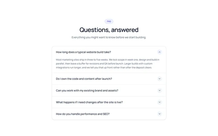
Simple Accordion
OriginalA clean single-column accordion, one panel open at a time, chevron rotates.
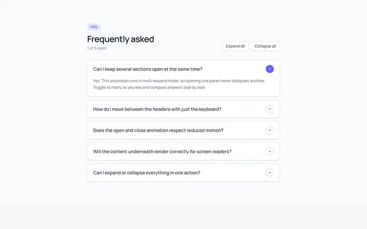
Multi Accordion
OriginalAn accordion where multiple panels can be open at once.
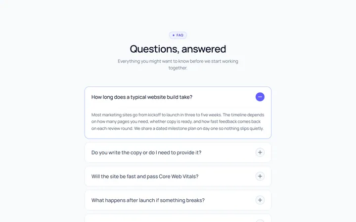
Plus Minus Accordion
OriginalAccordion with a plus/minus icon that toggles per item.
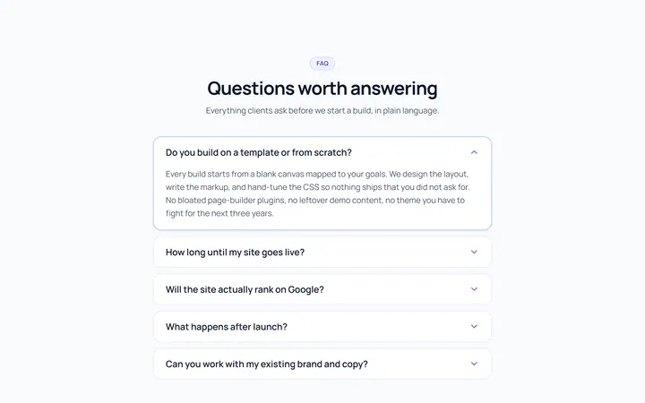
Bordered Accordion
OriginalBordered card-style accordion panels with rounded corners.
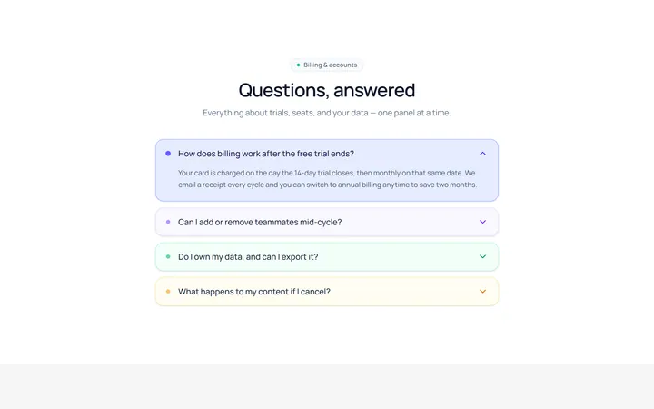
Filled Accordion
OriginalFilled, tinted accordion panels; the active one is highlighted.
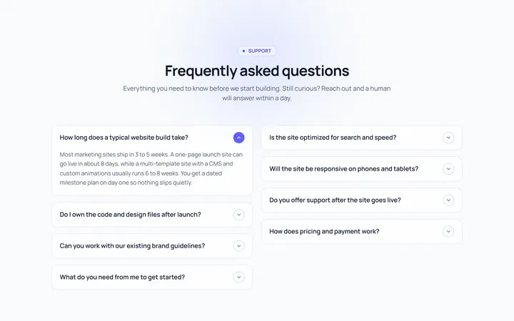
FAQ Two Col Accordion
OriginalA two-column FAQ accordion layout.
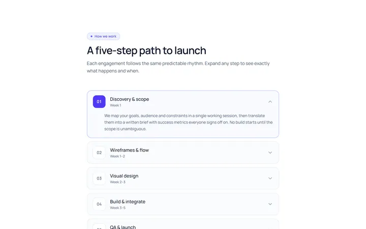
Numbered Accordion
OriginalA numbered-step accordion (01, 02, 03...).
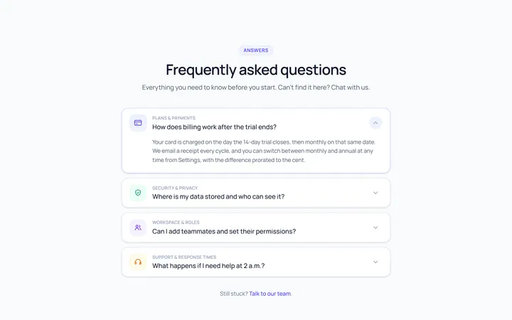
Icon Left Accordion
OriginalAccordion with a leading icon per item and a right chevron.
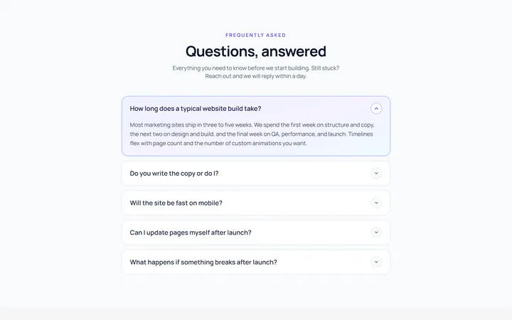
Gradient Active Accordion
OriginalAccordion where the open panel gets a soft gradient background.
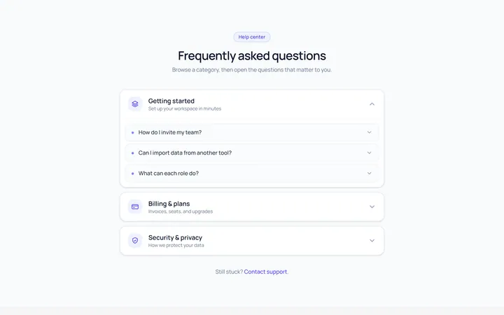
Nested Accordion
OriginalAn accordion with nested sub-accordions.
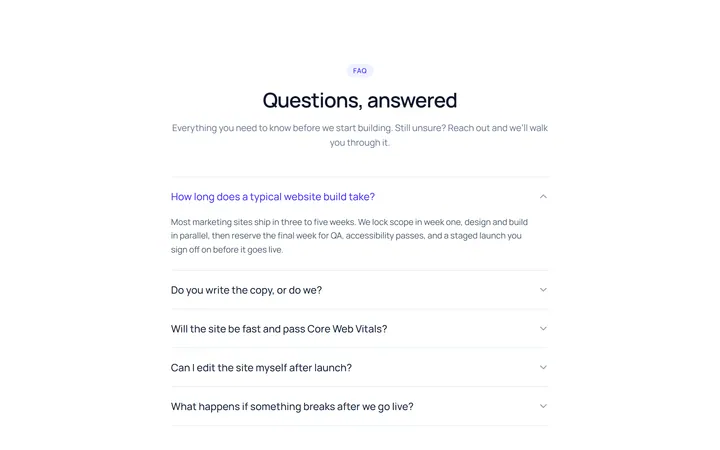
Flush Accordion
OriginalA borderless, flush accordion separated by hairlines.
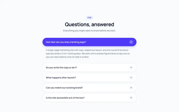
Pill Accordion
OriginalAccordion with rounded pill-shaped headers.