

Split Icon Accordion
Original · freeAccordion whose leading icon swaps and rotates when open.
Copy prompt gives Claude Code, Cursor or v0 a ready-to-paste prompt that recreates this exact component.
npx shadcn@latest add https://webinnoventix.com/r/accordion-split-icon.json"use client";
import { useId, useState } from "react";
const ITEMS: {
id: string;
question: string;
answer: string;
}[] = [
{
id: "billing",
question: "How does monthly billing actually work?",
answer:
"You are charged on the same calendar day you first upgraded, every month, until you cancel. If you switch plans mid-cycle we prorate the difference to the cent and apply it to your next invoice. No lock-in, no cancellation fee.",
},
{
id: "seats",
question: "Can I add or remove teammates after I subscribe?",
answer:
"Yes. Add seats instantly from Settings and Team; new members get access the moment you invite them. Remove a seat and the credit lands on your next bill. You are only ever billed for the seats active on your renewal date.",
},
{
id: "export",
question: "What happens to my data if I cancel?",
answer:
"Your workspace stays read-only for 30 days after cancellation so you can export everything as CSV or JSON. After 30 days it is permanently deleted from primary storage, and purged from encrypted backups within a further 90 days.",
},
{
id: "support",
question: "Do you offer priority support on every plan?",
answer:
"Email support with a one-business-day response is included on all plans. Growth and Scale plans add live chat and a shared Slack channel with a four-hour response target during business hours in your timezone.",
},
];
export default function AccordionSplitIcon() {
const [openId, setOpenId] = useState<string | null>(ITEMS[0].id);
const baseId = useId();
const toggle = (id: string) => {
setOpenId((current) => (current === id ? null : id));
};
return (
<section className="relative w-full bg-white px-4 py-20 sm:px-6 sm:py-28 dark:bg-slate-950">
<style>{`
@keyframes accsplit-fade-in {
from { opacity: 0; transform: translateY(-4px); }
to { opacity: 1; transform: translateY(0); }
}
.accsplit-panel-open {
animation: accsplit-fade-in 260ms cubic-bezier(0.22, 1, 0.36, 1) both;
}
@media (prefers-reduced-motion: reduce) {
.accsplit-icon-swap,
.accsplit-panel-open {
animation: none !important;
transition: none !important;
}
}
`}</style>
<div className="mx-auto max-w-2xl">
<div className="mb-10 text-center">
<span className="inline-flex items-center rounded-full border border-indigo-200 bg-indigo-50 px-3 py-1 text-xs font-semibold uppercase tracking-wider text-indigo-700 dark:border-indigo-500/30 dark:bg-indigo-500/10 dark:text-indigo-300">
Support
</span>
<h2 className="mt-4 text-3xl font-bold tracking-tight text-slate-900 sm:text-4xl dark:text-white">
Billing & account, answered
</h2>
<p className="mt-3 text-base text-slate-600 dark:text-slate-400">
Everything about plans, seats, and your data. Still stuck? Reach the
team from any workspace.
</p>
</div>
<div className="divide-y divide-slate-200 overflow-hidden rounded-2xl border border-slate-200 bg-white shadow-sm dark:divide-slate-800 dark:border-slate-800 dark:bg-slate-900">
{ITEMS.map((item) => {
const isOpen = openId === item.id;
const btnId = `${baseId}-btn-${item.id}`;
const panelId = `${baseId}-panel-${item.id}`;
return (
<div key={item.id} className="group">
<h3 className="m-0">
<button
type="button"
id={btnId}
aria-expanded={isOpen}
aria-controls={panelId}
onClick={() => toggle(item.id)}
className="flex w-full cursor-pointer items-center gap-4 px-5 py-5 text-left transition-colors hover:bg-slate-50 focus-visible:outline-none focus-visible:ring-2 focus-visible:ring-inset focus-visible:ring-indigo-500 dark:hover:bg-slate-800/60"
>
<span
aria-hidden="true"
className={`accsplit-icon-swap relative flex h-9 w-9 shrink-0 items-center justify-center rounded-lg transition-all duration-300 ${
isOpen
? "rotate-90 bg-indigo-600 text-white shadow-sm dark:bg-indigo-500"
: "bg-slate-100 text-slate-500 group-hover:bg-slate-200 dark:bg-slate-800 dark:text-slate-400 dark:group-hover:bg-slate-700"
}`}
>
{/* Closed state: plus / chevron. Open state: minus / dash. Cross-fade + rotate. */}
<svg
viewBox="0 0 20 20"
fill="none"
stroke="currentColor"
strokeWidth={2}
strokeLinecap="round"
strokeLinejoin="round"
className={`absolute h-5 w-5 transition-all duration-300 ${
isOpen ? "scale-50 opacity-0" : "scale-100 opacity-100"
}`}
>
<path d="M10 4.5v11M4.5 10h11" />
</svg>
<svg
viewBox="0 0 20 20"
fill="none"
stroke="currentColor"
strokeWidth={2}
strokeLinecap="round"
strokeLinejoin="round"
className={`absolute h-5 w-5 transition-all duration-300 ${
isOpen ? "scale-100 opacity-100" : "scale-50 opacity-0"
}`}
>
<path d="M4.5 10h11" />
</svg>
</span>
<span className="flex-1 text-base font-semibold text-slate-900 dark:text-white">
{item.question}
</span>
<svg
aria-hidden="true"
viewBox="0 0 20 20"
fill="none"
stroke="currentColor"
strokeWidth={2}
strokeLinecap="round"
strokeLinejoin="round"
className={`h-4 w-4 shrink-0 text-slate-400 transition-transform duration-300 dark:text-slate-500 ${
isOpen ? "rotate-180" : "rotate-0"
}`}
>
<path d="M5 7.5l5 5 5-5" />
</svg>
</button>
</h3>
<div
id={panelId}
role="region"
aria-labelledby={btnId}
hidden={!isOpen}
className={isOpen ? "accsplit-panel-open" : undefined}
>
<p className="px-5 pb-5 pl-[4.25rem] text-sm leading-relaxed text-slate-600 dark:text-slate-400">
{item.answer}
</p>
</div>
</div>
);
})}
</div>
</div>
</section>
);
}Dependencies
Licence
Built by Web Innoventix. Free for personal and commercial use, no attribution required.
Built by Web Innoventix
Need a custom interface, a full website, or SEO that gets you cited by AI? We design, build and rank it end to end.
Get a free quoteSimilar components
Browse all →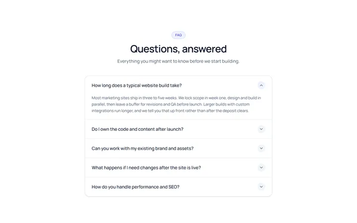
Simple Accordion
OriginalA clean single-column accordion, one panel open at a time, chevron rotates.
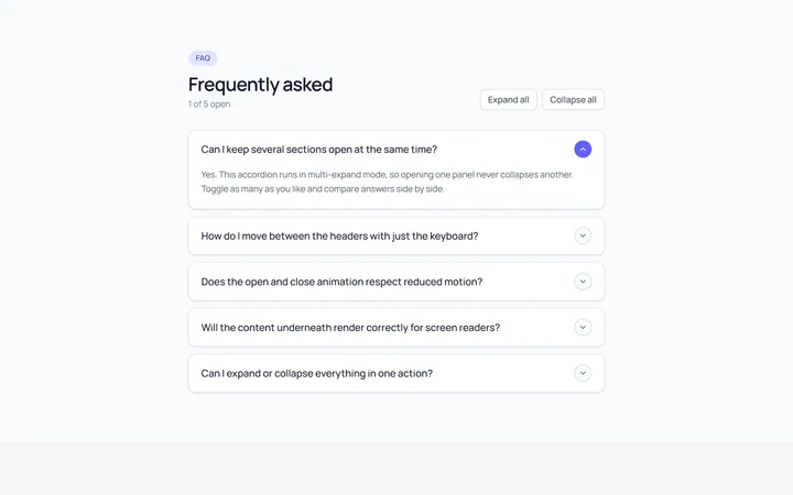
Multi Accordion
OriginalAn accordion where multiple panels can be open at once.
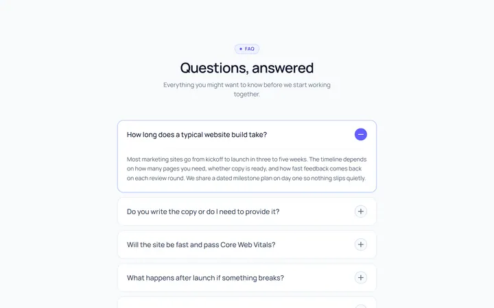
Plus Minus Accordion
OriginalAccordion with a plus/minus icon that toggles per item.
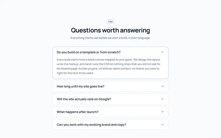
Bordered Accordion
OriginalBordered card-style accordion panels with rounded corners.
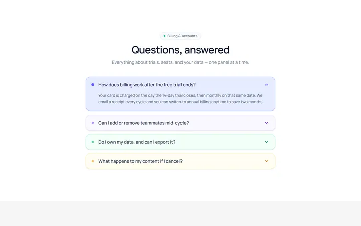
Filled Accordion
OriginalFilled, tinted accordion panels; the active one is highlighted.
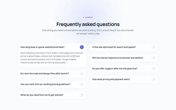
FAQ Two Col Accordion
OriginalA two-column FAQ accordion layout.
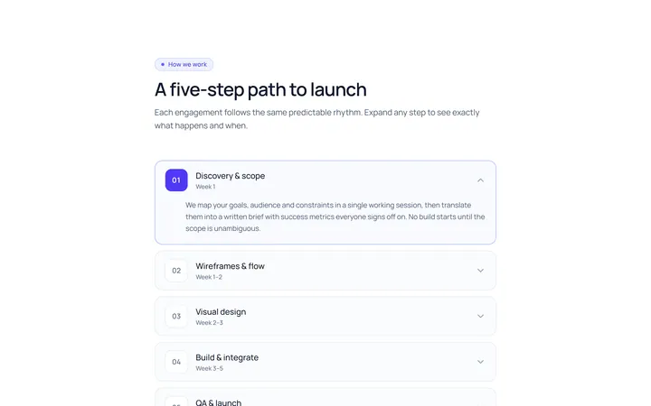
Numbered Accordion
OriginalA numbered-step accordion (01, 02, 03...).
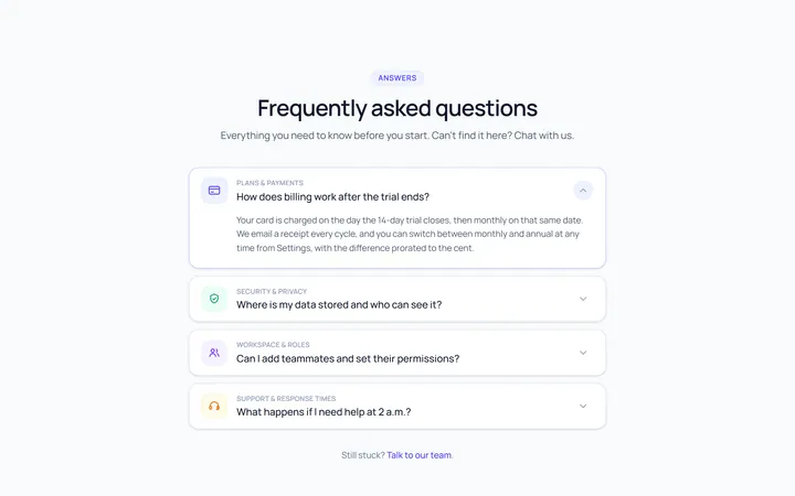
Icon Left Accordion
OriginalAccordion with a leading icon per item and a right chevron.
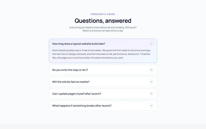
Gradient Active Accordion
OriginalAccordion where the open panel gets a soft gradient background.
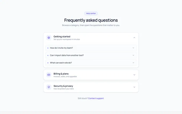
Nested Accordion
OriginalAn accordion with nested sub-accordions.
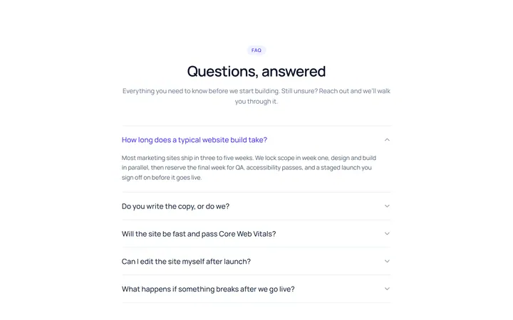
Flush Accordion
OriginalA borderless, flush accordion separated by hairlines.
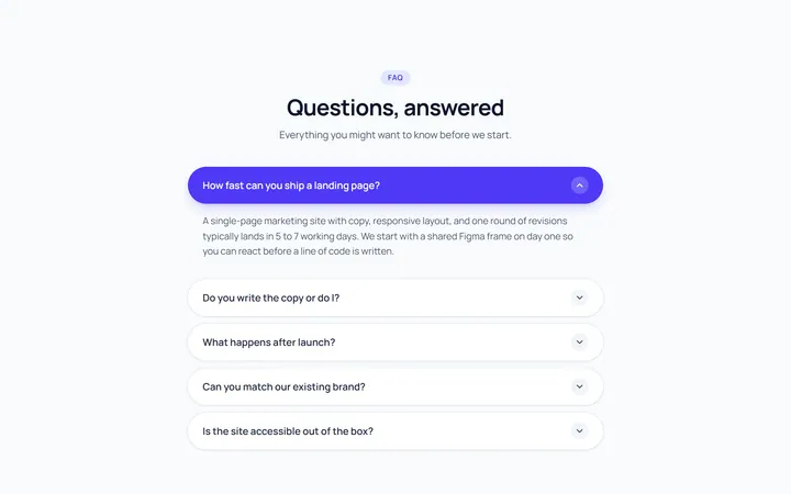
Pill Accordion
OriginalAccordion with rounded pill-shaped headers.