

Timeline Accordion
Original · freeA timeline-style vertical accordion with a connecting line.
Copy prompt gives Claude Code, Cursor or v0 a ready-to-paste prompt that recreates this exact component.
npx shadcn@latest add https://webinnoventix.com/r/accordion-timeline.json"use client";
import { useId, useRef, useState, type KeyboardEvent } from "react";
type TimelineStatus = "done" | "active" | "upcoming";
type TimelineItem = {
year: string;
title: string;
meta: string;
status: TimelineStatus;
body: string;
points: string[];
};
const ITEMS: TimelineItem[] = [
{
year: "2019",
title: "Founded in a two-room studio",
meta: "Company · Seed",
status: "done",
body: "Three engineers left their agency jobs to build software that shipped instead of software that demoed. The first office was a converted apartment with more whiteboards than chairs.",
points: [
"First paying client signed in week six",
"Open-sourced the internal component kit",
"Hit break-even without outside capital",
],
},
{
year: "2021",
title: "Series A and the first 20 hires",
meta: "Growth · $8M raised",
status: "done",
body: "A lead investor came in after seeing retention numbers that looked more like a utility than a startup. The team doubled twice in eighteen months and design finally got its own department.",
points: [
"Opened a second hub across two time zones",
"Shipped the real-time collaboration engine",
"Net revenue retention crossed 130%",
],
},
{
year: "2023",
title: "Platform rewrite and public API",
meta: "Product · v3.0",
status: "active",
body: "The monolith that carried us this far was rebuilt into services without a single day of downtime. Opening the API turned early users into a partner ecosystem almost overnight.",
points: [
"P95 latency cut from 400ms to 90ms",
"Launched a marketplace of 60+ integrations",
"SOC 2 Type II certified",
],
},
{
year: "2025",
title: "Global rollout, one million teams",
meta: "Scale · In progress",
status: "upcoming",
body: "Localization in fourteen languages and regional data residency unlocked enterprise deals that were previously off the table. The roadmap now runs on customer-voted priorities.",
points: [
"On-device model inference for privacy tiers",
"Regional data residency in five geographies",
"Community roadmap with public voting",
],
},
];
const STATUS_STYLES: Record<
TimelineStatus,
{ dot: string; ring: string; label: string; badge: string }
> = {
done: {
dot: "bg-emerald-500 dark:bg-emerald-400",
ring: "ring-emerald-500/30 dark:ring-emerald-400/30",
label: "Shipped",
badge:
"bg-emerald-50 text-emerald-700 ring-emerald-600/20 dark:bg-emerald-500/10 dark:text-emerald-300 dark:ring-emerald-400/20",
},
active: {
dot: "bg-indigo-500 dark:bg-indigo-400",
ring: "ring-indigo-500/30 dark:ring-indigo-400/30",
label: "In flight",
badge:
"bg-indigo-50 text-indigo-700 ring-indigo-600/20 dark:bg-indigo-500/10 dark:text-indigo-300 dark:ring-indigo-400/20",
},
upcoming: {
dot: "bg-slate-400 dark:bg-slate-500",
ring: "ring-slate-400/30 dark:ring-slate-500/30",
label: "Planned",
badge:
"bg-slate-100 text-slate-600 ring-slate-500/20 dark:bg-slate-500/10 dark:text-slate-300 dark:ring-slate-400/20",
},
};
function Chevron({ open }: { open: boolean }) {
return (
<svg
viewBox="0 0 24 24"
fill="none"
stroke="currentColor"
strokeWidth={2}
strokeLinecap="round"
strokeLinejoin="round"
aria-hidden="true"
className={`h-5 w-5 shrink-0 transition-transform duration-300 ease-out ${
open ? "rotate-180" : "rotate-0"
}`}
>
<path d="m6 9 6 6 6-6" />
</svg>
);
}
function CheckDot() {
return (
<svg
viewBox="0 0 24 24"
fill="none"
stroke="currentColor"
strokeWidth={3}
strokeLinecap="round"
strokeLinejoin="round"
aria-hidden="true"
className="h-3 w-3"
>
<path d="M20 6 9 17l-5-5" />
</svg>
);
}
export default function AccordionTimeline() {
const [open, setOpen] = useState<number>(2);
const baseId = useId();
const btnRefs = useRef<(HTMLButtonElement | null)[]>([]);
const toggle = (index: number) => {
setOpen((prev) => (prev === index ? -1 : index));
};
const onKeyDown = (e: KeyboardEvent, index: number) => {
const last = ITEMS.length - 1;
let next = index;
if (e.key === "ArrowDown") next = index === last ? 0 : index + 1;
else if (e.key === "ArrowUp") next = index === 0 ? last : index - 1;
else if (e.key === "Home") next = 0;
else if (e.key === "End") next = last;
else return;
e.preventDefault();
btnRefs.current[next]?.focus();
};
return (
<section className="relative w-full bg-white px-4 py-20 sm:px-6 lg:py-28 dark:bg-slate-950">
<style>{`
@keyframes acctl-reveal {
from { opacity: 0; transform: translateY(-6px); }
to { opacity: 1; transform: translateY(0); }
}
@keyframes acctl-pulse {
0%, 100% { transform: scale(1); opacity: 0.9; }
50% { transform: scale(1.9); opacity: 0; }
}
.acctl-panel[data-open="true"] .acctl-inner {
animation: acctl-reveal 360ms cubic-bezier(0.16, 1, 0.3, 1) both;
}
@media (prefers-reduced-motion: reduce) {
.acctl-panel[data-open="true"] .acctl-inner { animation: none; }
.acctl-ping { animation: none !important; }
}
`}</style>
<div className="mx-auto max-w-2xl">
<div className="mb-12 text-center">
<span className="inline-flex items-center rounded-full bg-indigo-50 px-3 py-1 text-xs font-semibold uppercase tracking-widest text-indigo-700 ring-1 ring-inset ring-indigo-600/20 dark:bg-indigo-500/10 dark:text-indigo-300 dark:ring-indigo-400/20">
Our story
</span>
<h2 className="mt-4 text-3xl font-bold tracking-tight text-slate-900 sm:text-4xl dark:text-white">
Milestones that shaped us
</h2>
<p className="mt-3 text-base text-slate-600 dark:text-slate-400">
Expand any moment on the timeline to see what actually happened
behind the headline.
</p>
</div>
<ol className="relative">
{/* connecting line */}
<span
aria-hidden="true"
className="absolute left-[15px] top-2 bottom-2 w-px bg-gradient-to-b from-slate-200 via-slate-200 to-transparent dark:from-slate-700 dark:via-slate-800"
/>
{ITEMS.map((item, index) => {
const isOpen = open === index;
const s = STATUS_STYLES[item.status];
const panelId = `${baseId}-panel-${index}`;
const btnId = `${baseId}-btn-${index}`;
return (
<li key={item.year} className="relative pl-12">
{/* node on the line */}
<span className="absolute left-0 top-4 flex h-8 w-8 items-center justify-center">
{item.status === "active" && (
<span
aria-hidden="true"
className={`acctl-ping absolute inline-flex h-3.5 w-3.5 rounded-full ${s.dot}`}
style={{
animation: "acctl-pulse 2s ease-out infinite",
}}
/>
)}
<span
className={`relative inline-flex h-3.5 w-3.5 items-center justify-center rounded-full text-white ring-4 ring-white dark:ring-slate-950 ${s.dot}`}
>
<span
className={`absolute inline-flex h-6 w-6 rounded-full ring-1 ${s.ring}`}
aria-hidden="true"
/>
{item.status === "done" && <CheckDot />}
</span>
</span>
<div
className={`mb-4 overflow-hidden rounded-2xl border transition-colors duration-300 ${
isOpen
? "border-indigo-200 bg-indigo-50/40 dark:border-indigo-400/25 dark:bg-indigo-500/[0.06]"
: "border-slate-200 bg-slate-50/60 hover:border-slate-300 dark:border-slate-800 dark:bg-slate-900/50 dark:hover:border-slate-700"
}`}
>
<h3>
<button
ref={(el) => {
btnRefs.current[index] = el;
}}
id={btnId}
type="button"
aria-expanded={isOpen}
aria-controls={panelId}
onClick={() => toggle(index)}
onKeyDown={(e) => onKeyDown(e, index)}
className="flex w-full items-center gap-4 px-5 py-4 text-left outline-none focus-visible:ring-2 focus-visible:ring-inset focus-visible:ring-indigo-500 dark:focus-visible:ring-indigo-400"
>
<span className="flex-1">
<span className="flex flex-wrap items-center gap-x-3 gap-y-1">
<span className="font-mono text-sm font-semibold text-indigo-600 dark:text-indigo-400">
{item.year}
</span>
<span
className={`inline-flex items-center rounded-full px-2 py-0.5 text-[11px] font-semibold ring-1 ring-inset ${s.badge}`}
>
{s.label}
</span>
</span>
<span className="mt-1 block text-base font-semibold text-slate-900 dark:text-white">
{item.title}
</span>
</span>
<span className="text-slate-400 dark:text-slate-500">
<Chevron open={isOpen} />
</span>
</button>
</h3>
<div
id={panelId}
role="region"
aria-labelledby={btnId}
hidden={!isOpen}
data-open={isOpen}
className="acctl-panel"
>
<div className="acctl-inner border-t border-slate-200/70 px-5 py-4 dark:border-slate-800">
<p className="text-[11px] font-medium uppercase tracking-wider text-slate-400 dark:text-slate-500">
{item.meta}
</p>
<p className="mt-2 text-sm leading-relaxed text-slate-600 dark:text-slate-300">
{item.body}
</p>
<ul className="mt-4 space-y-2">
{item.points.map((point) => (
<li
key={point}
className="flex items-start gap-2.5 text-sm text-slate-700 dark:text-slate-300"
>
<span
aria-hidden="true"
className="mt-0.5 inline-flex h-4 w-4 shrink-0 items-center justify-center rounded-full bg-indigo-100 text-indigo-600 dark:bg-indigo-500/15 dark:text-indigo-300"
>
<CheckDot />
</span>
<span>{point}</span>
</li>
))}
</ul>
</div>
</div>
</div>
</li>
);
})}
</ol>
</div>
</section>
);
}Dependencies
Licence
Built by Web Innoventix. Free for personal and commercial use, no attribution required.
Built by Web Innoventix
Need a custom interface, a full website, or SEO that gets you cited by AI? We design, build and rank it end to end.
Get a free quoteSimilar components
Browse all →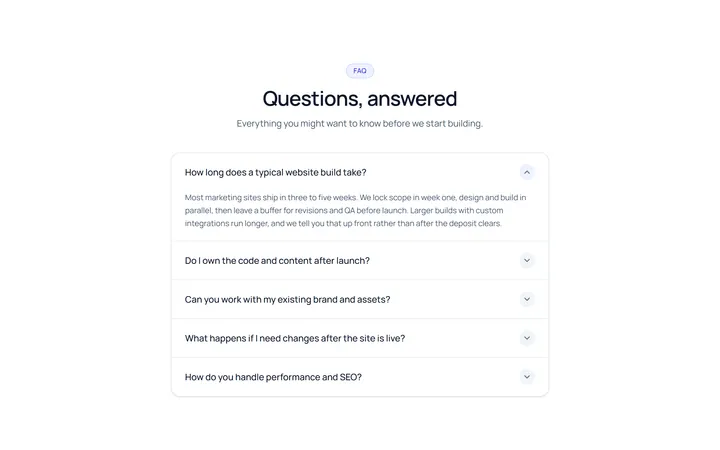
Simple Accordion
OriginalA clean single-column accordion, one panel open at a time, chevron rotates.
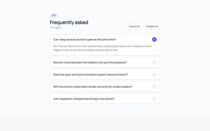
Multi Accordion
OriginalAn accordion where multiple panels can be open at once.
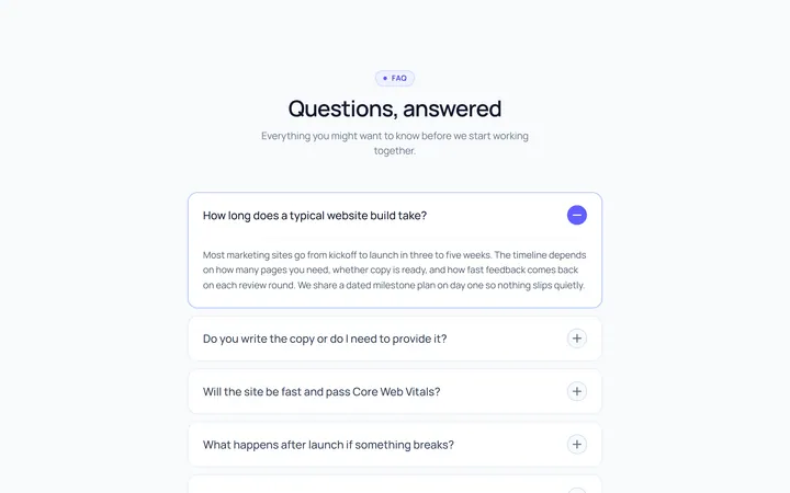
Plus Minus Accordion
OriginalAccordion with a plus/minus icon that toggles per item.
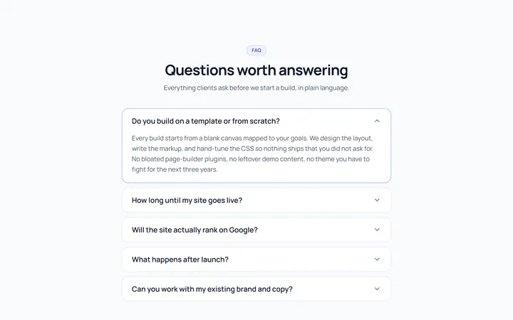
Bordered Accordion
OriginalBordered card-style accordion panels with rounded corners.
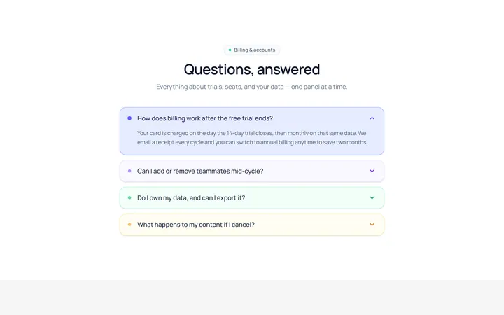
Filled Accordion
OriginalFilled, tinted accordion panels; the active one is highlighted.
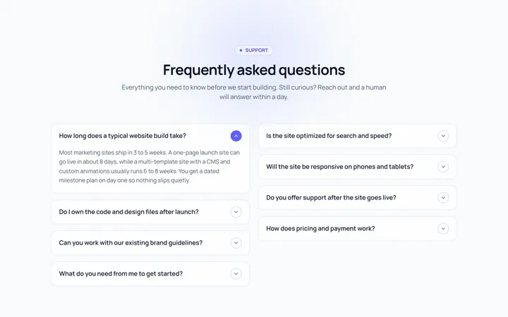
FAQ Two Col Accordion
OriginalA two-column FAQ accordion layout.
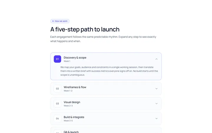
Numbered Accordion
OriginalA numbered-step accordion (01, 02, 03...).
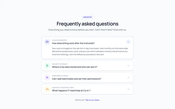
Icon Left Accordion
OriginalAccordion with a leading icon per item and a right chevron.
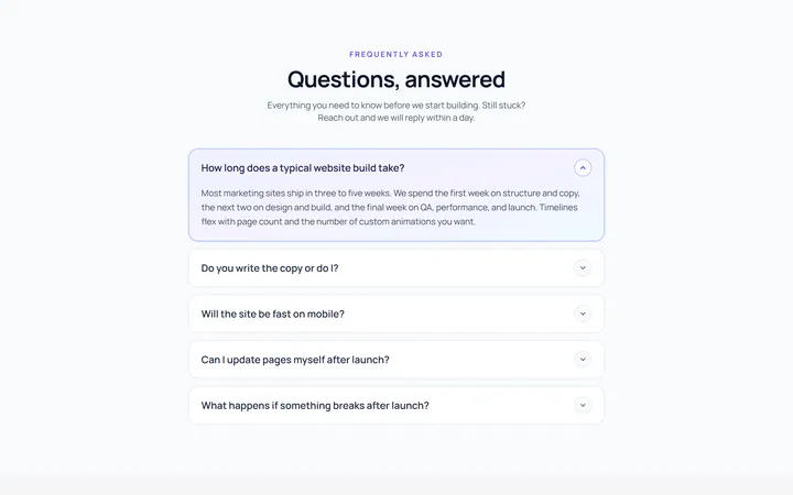
Gradient Active Accordion
OriginalAccordion where the open panel gets a soft gradient background.
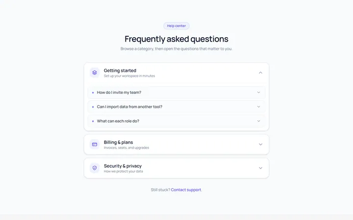
Nested Accordion
OriginalAn accordion with nested sub-accordions.
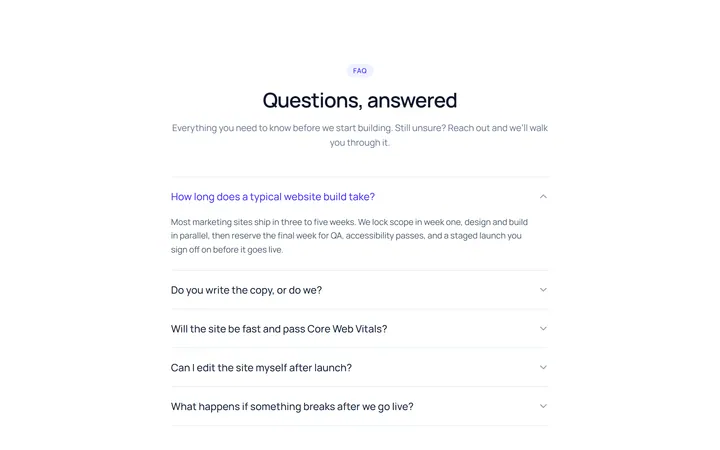
Flush Accordion
OriginalA borderless, flush accordion separated by hairlines.
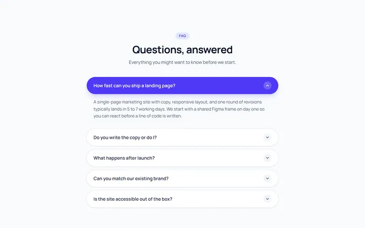
Pill Accordion
OriginalAccordion with rounded pill-shaped headers.