

Alert Modal
Original · freealert dialog with single action
byWeb InnoventixReact + Tailwind
modalalertmodals
Copy prompt gives Claude Code, Cursor or v0 a ready-to-paste prompt that recreates this exact component.
npx shadcn@latest add https://webinnoventix.com/r/modal-alert.jsonmodal-alert.tsx
"use client";
import { useCallback, useEffect, useId, useRef, useState } from "react";
import { AnimatePresence, motion, useReducedMotion } from "motion/react";
type AlertStatus = "idle" | "acknowledged";
export default function ModalAlert() {
const prefersReducedMotion = useReducedMotion();
const [open, setOpen] = useState(false);
const [status, setStatus] = useState<AlertStatus>("idle");
const triggerRef = useRef<HTMLButtonElement | null>(null);
const panelRef = useRef<HTMLDivElement | null>(null);
const actionRef = useRef<HTMLButtonElement | null>(null);
const titleId = useId();
const descId = useId();
const openDialog = useCallback(() => {
setStatus("idle");
setOpen(true);
}, []);
const closeDialog = useCallback(() => {
setOpen(false);
}, []);
const acknowledge = useCallback(() => {
setStatus("acknowledged");
setOpen(false);
}, []);
// Lock body scroll while the dialog is mounted.
useEffect(() => {
if (!open) return;
const previousOverflow = document.body.style.overflow;
document.body.style.overflow = "hidden";
return () => {
document.body.style.overflow = previousOverflow;
};
}, [open]);
// Initial focus lands on the single confirming action (least-destructive).
useEffect(() => {
if (!open) return;
const raf = requestAnimationFrame(() => {
actionRef.current?.focus();
});
return () => cancelAnimationFrame(raf);
}, [open]);
// Return focus to the trigger after the dialog closes.
useEffect(() => {
if (open) return;
triggerRef.current?.focus();
}, [open]);
// Escape to dismiss + a real focus trap over the dialog's controls.
useEffect(() => {
if (!open) return;
const handleKeyDown = (event: KeyboardEvent) => {
if (event.key === "Escape") {
event.preventDefault();
closeDialog();
return;
}
if (event.key !== "Tab") return;
const panel = panelRef.current;
if (!panel) return;
const focusable = panel.querySelectorAll<HTMLElement>(
'button:not([disabled]), a[href], [tabindex]:not([tabindex="-1"])',
);
if (focusable.length === 0) return;
const first = focusable[0];
const last = focusable[focusable.length - 1];
const active = document.activeElement;
if (event.shiftKey) {
if (active === first || !panel.contains(active)) {
event.preventDefault();
last.focus();
}
} else if (active === last || !panel.contains(active)) {
event.preventDefault();
first.focus();
}
};
document.addEventListener("keydown", handleKeyDown);
return () => document.removeEventListener("keydown", handleKeyDown);
}, [open, closeDialog]);
const overlayInitial = prefersReducedMotion ? { opacity: 0 } : { opacity: 0 };
const overlayAnimate = { opacity: 1 };
const overlayExit = { opacity: 0 };
const panelInitial = prefersReducedMotion
? { opacity: 0 }
: { opacity: 0, y: 18, scale: 0.94 };
const panelAnimate = prefersReducedMotion
? { opacity: 1 }
: { opacity: 1, y: 0, scale: 1 };
const panelExit = prefersReducedMotion
? { opacity: 0 }
: { opacity: 0, y: 10, scale: 0.96 };
return (
<section className="relative w-full overflow-hidden bg-slate-50 px-6 py-20 text-slate-900 sm:py-28 dark:bg-slate-950 dark:text-slate-100">
<style>{`
@keyframes mralert-halo {
0% { transform: scale(0.85); opacity: 0.55; }
70% { transform: scale(1.6); opacity: 0; }
100% { transform: scale(1.6); opacity: 0; }
}
@keyframes mralert-sheen {
0% { transform: translateX(-120%); }
100% { transform: translateX(120%); }
}
.mralert-halo {
animation: mralert-halo 2.4s ease-out infinite;
}
.mralert-sheen {
animation: mralert-sheen 5.5s ease-in-out infinite;
}
@media (prefers-reduced-motion: reduce) {
.mralert-halo,
.mralert-sheen {
animation: none !important;
}
}
`}</style>
{/* Ambient background texture */}
<div
aria-hidden="true"
className="pointer-events-none absolute inset-0 [background-image:radial-gradient(circle_at_1px_1px,theme(colors.slate.300)_1px,transparent_0)] [background-size:26px_26px] opacity-40 dark:[background-image:radial-gradient(circle_at_1px_1px,theme(colors.slate.700)_1px,transparent_0)] dark:opacity-30"
/>
<div
aria-hidden="true"
className="pointer-events-none absolute -top-24 right-0 h-72 w-72 rounded-full bg-amber-300/25 blur-3xl dark:bg-amber-500/10"
/>
<div className="relative mx-auto max-w-2xl">
<div className="flex flex-col items-start gap-3">
<span className="inline-flex items-center gap-2 rounded-full border border-amber-300/70 bg-amber-100/60 px-3 py-1 text-xs font-semibold uppercase tracking-[0.14em] text-amber-700 dark:border-amber-500/30 dark:bg-amber-500/10 dark:text-amber-300">
<span className="relative flex h-1.5 w-1.5">
<span className="mralert-halo absolute inline-flex h-full w-full rounded-full bg-amber-500/70" />
<span className="relative inline-flex h-1.5 w-1.5 rounded-full bg-amber-500" />
</span>
Security notice
</span>
<h2 className="text-balance text-3xl font-semibold tracking-tight sm:text-4xl">
API key rotation
</h2>
<p className="max-w-xl text-pretty text-base leading-relaxed text-slate-600 dark:text-slate-400">
An alert dialog interrupts the flow to surface something that needs
acknowledgment before anything else happens. Open the example to see
the focus trap, <kbd className="rounded border border-slate-300 bg-white px-1.5 py-0.5 text-[0.7rem] font-medium text-slate-700 dark:border-slate-700 dark:bg-slate-800 dark:text-slate-200">Esc</kbd>{" "}
to dismiss, and a single confirming action.
</p>
</div>
<div className="mt-8 flex flex-wrap items-center gap-4">
<button
ref={triggerRef}
type="button"
onClick={openDialog}
className="group relative inline-flex items-center gap-2.5 overflow-hidden rounded-xl bg-slate-900 px-5 py-3 text-sm font-semibold text-white shadow-lg shadow-slate-900/20 transition-transform duration-200 hover:-translate-y-0.5 focus:outline-none focus-visible:ring-2 focus-visible:ring-indigo-500 focus-visible:ring-offset-2 focus-visible:ring-offset-slate-50 active:translate-y-0 dark:bg-white dark:text-slate-900 dark:shadow-black/40 dark:focus-visible:ring-offset-slate-950"
>
<span
aria-hidden="true"
className="mralert-sheen pointer-events-none absolute inset-y-0 w-1/3 skew-x-[-20deg] bg-white/15 dark:bg-slate-900/10"
/>
<BellIcon className="h-4 w-4" />
Review security alert
</button>
<p
aria-live="polite"
className="text-sm font-medium text-slate-500 dark:text-slate-400"
>
{status === "acknowledged" ? (
<span className="inline-flex items-center gap-1.5 text-emerald-600 dark:text-emerald-400">
<CheckIcon className="h-4 w-4" />
Acknowledged — rotate your keys before the next deploy.
</span>
) : (
"No action taken yet."
)}
</p>
</div>
</div>
<AnimatePresence>
{open && (
<motion.div
className="fixed inset-0 z-50 flex items-end justify-center p-4 sm:items-center"
initial={overlayInitial}
animate={overlayAnimate}
exit={overlayExit}
transition={{ duration: prefersReducedMotion ? 0.12 : 0.2 }}
>
{/* Backdrop. An alertdialog is not dismissed by an outside click. */}
<div
aria-hidden="true"
onClick={() => {
// Nudge focus back inside instead of closing.
actionRef.current?.focus();
}}
className="absolute inset-0 bg-slate-950/50 backdrop-blur-sm"
/>
<motion.div
ref={panelRef}
role="alertdialog"
aria-modal="true"
aria-labelledby={titleId}
aria-describedby={descId}
initial={panelInitial}
animate={panelAnimate}
exit={panelExit}
transition={{
duration: prefersReducedMotion ? 0.12 : 0.26,
ease: [0.22, 1, 0.36, 1],
}}
className="relative w-full max-w-md overflow-hidden rounded-2xl border border-slate-200 bg-white shadow-2xl shadow-slate-900/25 dark:border-slate-800 dark:bg-slate-900 dark:shadow-black/60"
>
<div
aria-hidden="true"
className="absolute inset-x-0 top-0 h-1 bg-gradient-to-r from-amber-400 via-rose-400 to-amber-400"
/>
<button
type="button"
onClick={closeDialog}
aria-label="Dismiss alert"
className="absolute right-3 top-3 inline-flex h-9 w-9 items-center justify-center rounded-lg text-slate-400 transition-colors hover:bg-slate-100 hover:text-slate-700 focus:outline-none focus-visible:ring-2 focus-visible:ring-indigo-500 focus-visible:ring-offset-2 focus-visible:ring-offset-white dark:hover:bg-slate-800 dark:hover:text-slate-200 dark:focus-visible:ring-offset-slate-900"
>
<CloseIcon className="h-5 w-5" />
</button>
<div className="p-6 sm:p-7">
<div className="flex items-start gap-4">
<span className="relative flex h-12 w-12 shrink-0 items-center justify-center rounded-full bg-amber-100 text-amber-600 ring-8 ring-amber-50 dark:bg-amber-500/15 dark:text-amber-300 dark:ring-amber-500/5">
<span className="mralert-halo absolute inset-0 rounded-full bg-amber-400/40" />
<ShieldIcon className="relative h-6 w-6" />
</span>
<div className="min-w-0 pt-0.5">
<h3
id={titleId}
className="text-lg font-semibold tracking-tight text-slate-900 dark:text-white"
>
Your API key was rotated
</h3>
<p
id={descId}
className="mt-2 text-sm leading-relaxed text-slate-600 dark:text-slate-300"
>
The key ending in{" "}
<span className="font-mono font-medium text-slate-900 dark:text-slate-100">
••4a7f
</span>{" "}
was revoked after a sign-in from an unrecognized location
(Frankfurt, DE at 03:14 UTC). We generated a replacement and
emailed it to your account owner. Update your environment
variables before your next deploy.
</p>
</div>
</div>
<div className="mt-6 flex justify-end">
<button
ref={actionRef}
type="button"
onClick={acknowledge}
className="inline-flex w-full items-center justify-center gap-2 rounded-xl bg-slate-900 px-5 py-2.5 text-sm font-semibold text-white shadow-sm transition-colors hover:bg-slate-700 focus:outline-none focus-visible:ring-2 focus-visible:ring-indigo-500 focus-visible:ring-offset-2 focus-visible:ring-offset-white sm:w-auto dark:bg-white dark:text-slate-900 dark:hover:bg-slate-200 dark:focus-visible:ring-offset-slate-900"
>
<CheckIcon className="h-4 w-4" />
Got it, I'll update my keys
</button>
</div>
</div>
</motion.div>
</motion.div>
)}
</AnimatePresence>
</section>
);
}
function ShieldIcon({ className }: { className?: string }) {
return (
<svg
className={className}
viewBox="0 0 24 24"
fill="none"
stroke="currentColor"
strokeWidth={1.8}
strokeLinecap="round"
strokeLinejoin="round"
aria-hidden="true"
>
<path d="M12 3 4.5 6v5.5c0 4.5 3.2 7.6 7.5 9 4.3-1.4 7.5-4.5 7.5-9V6L12 3Z" />
<path d="M12 8v4" />
<path d="M12 15.5h.01" />
</svg>
);
}
function BellIcon({ className }: { className?: string }) {
return (
<svg
className={className}
viewBox="0 0 24 24"
fill="none"
stroke="currentColor"
strokeWidth={1.8}
strokeLinecap="round"
strokeLinejoin="round"
aria-hidden="true"
>
<path d="M6 8a6 6 0 0 1 12 0c0 4.2 1 6 2 7H4c1-1 2-2.8 2-7Z" />
<path d="M10 21a2 2 0 0 0 4 0" />
</svg>
);
}
function CheckIcon({ className }: { className?: string }) {
return (
<svg
className={className}
viewBox="0 0 24 24"
fill="none"
stroke="currentColor"
strokeWidth={2.2}
strokeLinecap="round"
strokeLinejoin="round"
aria-hidden="true"
>
<path d="m5 12.5 4.5 4.5L19 7" />
</svg>
);
}
function CloseIcon({ className }: { className?: string }) {
return (
<svg
className={className}
viewBox="0 0 24 24"
fill="none"
stroke="currentColor"
strokeWidth={1.9}
strokeLinecap="round"
strokeLinejoin="round"
aria-hidden="true"
>
<path d="M6 6 18 18M18 6 6 18" />
</svg>
);
}Dependencies
motion
Licence
Built by Web Innoventix. Free for personal and commercial use, no attribution required.
Built by Web Innoventix
Need a custom interface, a full website, or SEO that gets you cited by AI? We design, build and rank it end to end.
Get a free quoteSimilar components
Browse all →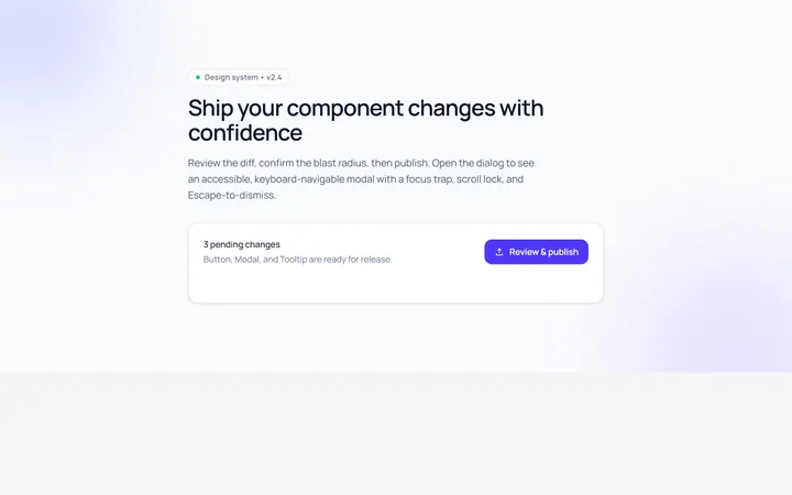
Basic Modal
Originalbasic centred modal with overlay
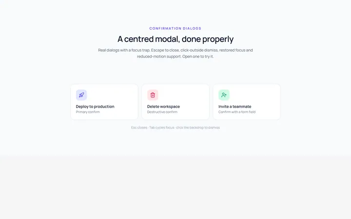
Center Modal
Originalcentred modal with icon and actions
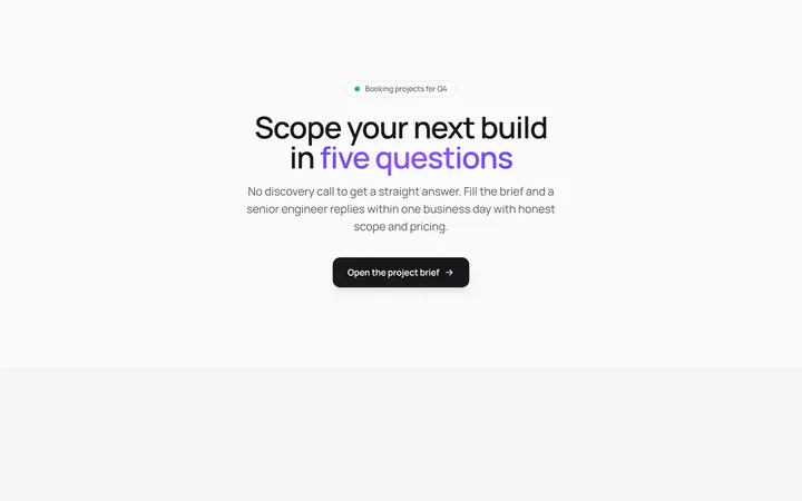
Form Modal
Originalmodal containing a form
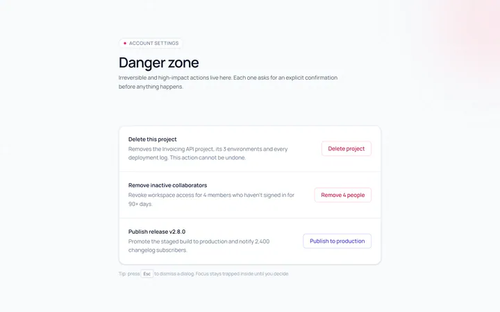
Confirm Modal
Originalconfirm/destructive dialog
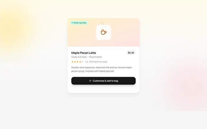
Drawer Bottom Modal
Originalbottom sheet drawer
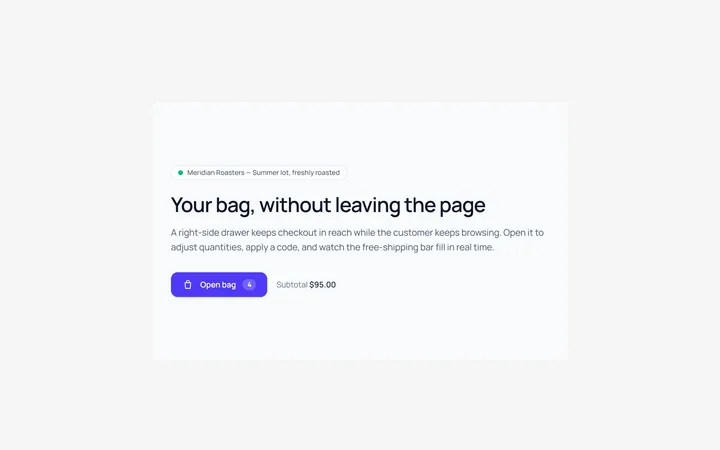
Side Drawer Modal
Originalright side drawer modal
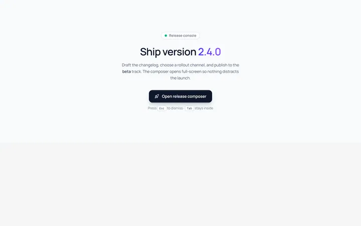
Fullscreen Modal
Originalfullscreen modal
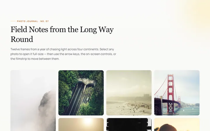
Image Lightbox Modal
Originalimage lightbox modal with nav
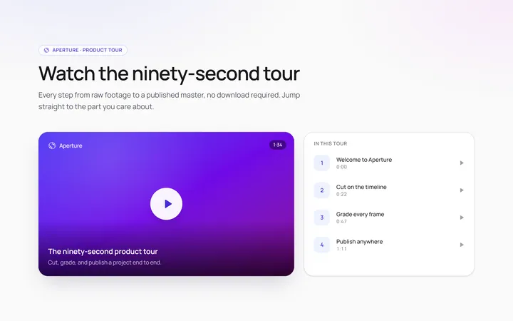
Video Modal
Originalvideo player modal
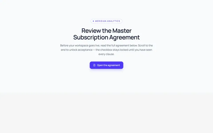
Scroll Modal
Originalmodal with long scrollable body
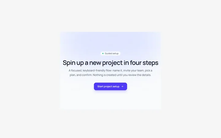
Steps Modal
Originalmulti-step modal flow
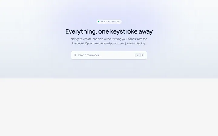
Command Palette Modal
Originalcommand palette modal with search