

Video Modal
Original · freevideo player modal
byWeb InnoventixReact + Tailwind
modalvideomodals
Copy prompt gives Claude Code, Cursor or v0 a ready-to-paste prompt that recreates this exact component.
npx shadcn@latest add https://webinnoventix.com/r/modal-video.jsonmodal-video.tsx
"use client"
import {
useEffect,
useRef,
useState,
type CSSProperties,
type KeyboardEvent as ReactKeyboardEvent,
} from "react"
import { AnimatePresence, motion, useReducedMotion } from "motion/react"
/* ------------------------------------------------------------------ */
/* Data */
/* ------------------------------------------------------------------ */
const DURATION = 94 // seconds — 1:34
const CHAPTERS = [
{
start: 0,
title: "Welcome to Aperture",
caption: "Aperture is a browser-based editor built for motion designers.",
},
{
start: 22,
title: "Cut on the timeline",
caption: "Trim, ripple, and slip clips with frame-accurate keyboard shortcuts.",
},
{
start: 47,
title: "Grade every frame",
caption: "Match looks across shots with node-based color and live scopes.",
},
{
start: 71,
title: "Publish anywhere",
caption: "Render once, then push to web, social, and a 4K master in one pass.",
},
] as const
const SPEEDS = [0.5, 1, 1.25, 1.5, 2] as const
const CSS = `
.mvp-range{-webkit-appearance:none;appearance:none;width:100%;height:6px;border-radius:9999px;cursor:pointer;outline:none;}
.mvp-range::-webkit-slider-thumb{-webkit-appearance:none;appearance:none;width:15px;height:15px;border-radius:9999px;background:#fff;border:2px solid #818cf8;box-shadow:0 1px 4px rgba(0,0,0,.45);}
.mvp-range::-moz-range-thumb{width:15px;height:15px;border-radius:9999px;background:#fff;border:2px solid #818cf8;box-shadow:0 1px 4px rgba(0,0,0,.45);}
.mvp-range::-moz-range-track{background:transparent;}
.mvp-range:focus-visible{outline:2px solid #a5b4fc;outline-offset:3px;}
@keyframes mvpFloat{0%,100%{transform:translateY(0)}50%{transform:translateY(-10px)}}
@keyframes mvpScan{0%{left:6%}100%{left:94%}}
@keyframes mvpSpin{to{transform:rotate(360deg)}}
@keyframes mvpEq{0%,100%{transform:scaleY(.3)}50%{transform:scaleY(1)}}
@keyframes mvpFill{0%{transform:scaleX(.08)}100%{transform:scaleX(.94)}}
@keyframes mvpPulse{0%,100%{opacity:.45}50%{opacity:1}}
@media (prefers-reduced-motion: reduce){.mvp-anim{animation:none !important}}
`
const fmt = (s: number): string => {
const clamped = Math.max(0, s)
const m = Math.floor(clamped / 60)
const sec = Math.floor(clamped % 60)
return `${m}:${sec.toString().padStart(2, "0")}`
}
/* ------------------------------------------------------------------ */
/* Icons (inline) */
/* ------------------------------------------------------------------ */
type IconProps = { className?: string }
function PlayIcon({ className }: IconProps) {
return (
<svg viewBox="0 0 24 24" fill="currentColor" className={className} aria-hidden="true">
<path d="M8 5.14v13.72a1 1 0 0 0 1.54.84l10.79-6.86a1 1 0 0 0 0-1.68L9.54 4.3A1 1 0 0 0 8 5.14Z" />
</svg>
)
}
function PauseIcon({ className }: IconProps) {
return (
<svg viewBox="0 0 24 24" fill="currentColor" className={className} aria-hidden="true">
<rect x="6" y="5" width="4" height="14" rx="1.2" />
<rect x="14" y="5" width="4" height="14" rx="1.2" />
</svg>
)
}
function ReplayIcon({ className }: IconProps) {
return (
<svg viewBox="0 0 24 24" fill="none" stroke="currentColor" strokeWidth="2" strokeLinecap="round" strokeLinejoin="round" className={className} aria-hidden="true">
<path d="M3 12a9 9 0 1 0 3-6.7" />
<path d="M3 4v4h4" />
</svg>
)
}
function VolumeIcon({ className }: IconProps) {
return (
<svg viewBox="0 0 24 24" fill="none" stroke="currentColor" strokeWidth="2" strokeLinecap="round" strokeLinejoin="round" className={className} aria-hidden="true">
<path d="M11 5 6 9H3v6h3l5 4V5Z" />
<path d="M15.5 8.5a5 5 0 0 1 0 7" />
<path d="M18.5 6a9 9 0 0 1 0 12" />
</svg>
)
}
function MutedIcon({ className }: IconProps) {
return (
<svg viewBox="0 0 24 24" fill="none" stroke="currentColor" strokeWidth="2" strokeLinecap="round" strokeLinejoin="round" className={className} aria-hidden="true">
<path d="M11 5 6 9H3v6h3l5 4V5Z" />
<path d="m16 9 5 6" />
<path d="m21 9-5 6" />
</svg>
)
}
function CcIcon({ className }: IconProps) {
return (
<svg viewBox="0 0 24 24" fill="none" stroke="currentColor" strokeWidth="2" strokeLinecap="round" strokeLinejoin="round" className={className} aria-hidden="true">
<rect x="2.5" y="5" width="19" height="14" rx="3" />
<path d="M10 10a2.5 2.5 0 0 0-2.5-.5A2 2 0 0 0 6 11.5v1A2 2 0 0 0 7.5 14.5 2.5 2.5 0 0 0 10 14" />
<path d="M18 10a2.5 2.5 0 0 0-2.5-.5A2 2 0 0 0 14 11.5v1a2 2 0 0 0 1.5 2 2.5 2.5 0 0 0 2.5-.5" />
</svg>
)
}
function GearIcon({ className }: IconProps) {
return (
<svg viewBox="0 0 24 24" fill="none" stroke="currentColor" strokeWidth="2" strokeLinecap="round" strokeLinejoin="round" className={className} aria-hidden="true">
<circle cx="12" cy="12" r="3" />
<path d="M19.4 15a1.65 1.65 0 0 0 .33 1.82l.06.06a2 2 0 1 1-2.83 2.83l-.06-.06a1.65 1.65 0 0 0-1.82-.33 1.65 1.65 0 0 0-1 1.51V21a2 2 0 0 1-4 0v-.09A1.65 1.65 0 0 0 9 19.4a1.65 1.65 0 0 0-1.82.33l-.06.06a2 2 0 1 1-2.83-2.83l.06-.06a1.65 1.65 0 0 0 .33-1.82 1.65 1.65 0 0 0-1.51-1H3a2 2 0 0 1 0-4h.09A1.65 1.65 0 0 0 4.6 9a1.65 1.65 0 0 0-.33-1.82l-.06-.06a2 2 0 1 1 2.83-2.83l.06.06a1.65 1.65 0 0 0 1.82.33H9a1.65 1.65 0 0 0 1-1.51V3a2 2 0 0 1 4 0v.09a1.65 1.65 0 0 0 1 1.51 1.65 1.65 0 0 0 1.82-.33l.06-.06a2 2 0 1 1 2.83 2.83l-.06.06a1.65 1.65 0 0 0-.33 1.82V9c.2.62.76 1.05 1.42 1.09H21a2 2 0 0 1 0 4h-.09a1.65 1.65 0 0 0-1.51 1Z" />
</svg>
)
}
function ExpandIcon({ className }: IconProps) {
return (
<svg viewBox="0 0 24 24" fill="none" stroke="currentColor" strokeWidth="2" strokeLinecap="round" strokeLinejoin="round" className={className} aria-hidden="true">
<path d="M8 3H5a2 2 0 0 0-2 2v3" />
<path d="M16 3h3a2 2 0 0 1 2 2v3" />
<path d="M8 21H5a2 2 0 0 1-2-2v-3" />
<path d="M16 21h3a2 2 0 0 0 2-2v-3" />
</svg>
)
}
function ShrinkIcon({ className }: IconProps) {
return (
<svg viewBox="0 0 24 24" fill="none" stroke="currentColor" strokeWidth="2" strokeLinecap="round" strokeLinejoin="round" className={className} aria-hidden="true">
<path d="M4 8h3a1 1 0 0 0 1-1V4" />
<path d="M20 8h-3a1 1 0 0 1-1-1V4" />
<path d="M4 16h3a1 1 0 0 1 1 1v3" />
<path d="M20 16h-3a1 1 0 0 0-1 1v3" />
</svg>
)
}
function CloseIcon({ className }: IconProps) {
return (
<svg viewBox="0 0 24 24" fill="none" stroke="currentColor" strokeWidth="2" strokeLinecap="round" strokeLinejoin="round" className={className} aria-hidden="true">
<path d="m6 6 12 12" />
<path d="m18 6-12 12" />
</svg>
)
}
function ListIcon({ className }: IconProps) {
return (
<svg viewBox="0 0 24 24" fill="none" stroke="currentColor" strokeWidth="2" strokeLinecap="round" strokeLinejoin="round" className={className} aria-hidden="true">
<path d="M8 6h13" />
<path d="M8 12h13" />
<path d="M8 18h13" />
<path d="M3 6h.01" />
<path d="M3 12h.01" />
<path d="M3 18h.01" />
</svg>
)
}
function CheckIcon({ className }: IconProps) {
return (
<svg viewBox="0 0 24 24" fill="none" stroke="currentColor" strokeWidth="2.4" strokeLinecap="round" strokeLinejoin="round" className={className} aria-hidden="true">
<path d="m20 6-11 11-5-5" />
</svg>
)
}
function ApertureMark({ className }: IconProps) {
return (
<svg viewBox="0 0 48 48" fill="none" stroke="currentColor" strokeWidth="2.4" strokeLinejoin="round" className={className} aria-hidden="true">
<circle cx="24" cy="24" r="19" />
<path d="M24 5 33.5 21.5" />
<path d="M40.5 15 21.5 15" />
<path d="M43 33 33.5 16.5" />
<path d="M24 43 14.5 26.5" />
<path d="M7.5 33 26.5 33" />
<path d="M5 15 14.5 31.5" />
</svg>
)
}
/* ------------------------------------------------------------------ */
/* Simulated "video" surface — a rendered scene per chapter */
/* ------------------------------------------------------------------ */
function Stage({ chapter, reduce }: { chapter: number; reduce: boolean }) {
const anim = (value: string): CSSProperties | undefined =>
reduce ? undefined : { animation: value }
if (chapter === 1) {
const tracks = [
[
{ w: "24%", c: "bg-indigo-400" },
{ w: "34%", c: "bg-indigo-500" },
{ w: "20%", c: "bg-indigo-300" },
],
[
{ w: "40%", c: "bg-emerald-400" },
{ w: "26%", c: "bg-emerald-500" },
],
[
{ w: "18%", c: "bg-amber-400" },
{ w: "30%", c: "bg-amber-300" },
{ w: "28%", c: "bg-amber-500" },
],
]
return (
<div className="absolute inset-0 bg-gradient-to-br from-slate-900 via-zinc-900 to-slate-800" aria-hidden="true">
<div className="relative mx-auto flex h-full max-w-xl flex-col justify-center gap-3.5 px-8">
{tracks.map((row, ri) => (
<div key={ri} className="flex gap-2">
{row.map((clip, ci) => (
<div
key={ci}
className={`h-8 rounded-md ${clip.c} shadow-inner ring-1 ring-white/10`}
style={{ width: clip.w }}
/>
))}
</div>
))}
<span
className="mvp-anim absolute inset-y-8 w-0.5 rounded-full bg-rose-400 shadow-[0_0_12px_2px_rgba(251,113,133,0.6)]"
style={anim("mvpScan 3.2s linear infinite")}
/>
</div>
</div>
)
}
if (chapter === 2) {
return (
<div className="absolute inset-0 bg-gradient-to-br from-emerald-800 via-teal-800 to-sky-900" aria-hidden="true">
<div className="flex h-full items-center justify-center gap-8 px-8">
<span
className="mvp-anim h-24 w-24 rounded-full ring-4 ring-white/20"
style={{
background:
"conic-gradient(from 0deg,#f87171,#fbbf24,#34d399,#22d3ee,#818cf8,#e879f9,#f87171)",
...anim("mvpSpin 9s linear infinite"),
}}
/>
<div className="flex h-24 items-end gap-1.5">
{[0, 1, 2, 3, 4, 5, 6].map((b) => (
<span
key={b}
className="mvp-anim w-2.5 origin-bottom rounded-full bg-gradient-to-t from-sky-300 to-emerald-200"
style={{ height: "100%", ...anim(`mvpEq ${1 + b * 0.14}s ease-in-out ${b * 0.08}s infinite`) }}
/>
))}
</div>
</div>
</div>
)
}
if (chapter === 3) {
return (
<div className="absolute inset-0 bg-gradient-to-br from-amber-600 via-orange-700 to-rose-800" aria-hidden="true">
<div className="flex h-full flex-col items-center justify-center gap-5 px-8">
<div className="w-full max-w-sm">
<div className="mb-2 flex items-center justify-between text-xs font-medium text-white/90">
<span>Rendering master</span>
<span>2160p · H.264</span>
</div>
<div className="h-2.5 w-full overflow-hidden rounded-full bg-black/30">
<span
className="mvp-anim block h-full w-full origin-left rounded-full bg-gradient-to-r from-amber-200 to-rose-200"
style={anim("mvpFill 4s ease-in-out infinite alternate")}
/>
</div>
</div>
<div className="flex flex-wrap justify-center gap-2">
{["Web embed", "Social 9:16", "4K master"].map((d, i) => (
<span
key={d}
className="mvp-anim rounded-full bg-white/15 px-3.5 py-1.5 text-xs font-medium text-white ring-1 ring-white/25 backdrop-blur"
style={anim(`mvpPulse ${2.4 + i * 0.4}s ease-in-out ${i * 0.3}s infinite`)}
>
{d}
</span>
))}
</div>
</div>
</div>
)
}
return (
<div className="absolute inset-0 bg-gradient-to-br from-indigo-600 via-violet-700 to-fuchsia-800" aria-hidden="true">
<div
className="absolute inset-0 opacity-40"
style={{ backgroundImage: "radial-gradient(circle at 30% 20%,rgba(255,255,255,0.35),transparent 45%)" }}
/>
<div className="relative flex h-full flex-col items-center justify-center gap-3 text-center">
<span className="mvp-anim" style={anim("mvpFloat 5s ease-in-out infinite")}>
<ApertureMark className="h-16 w-16 text-white" />
</span>
<span className="text-3xl font-semibold tracking-tight text-white">Aperture</span>
<span className="text-sm text-white/75">Motion design, straight in the browser</span>
</div>
</div>
)
}
/* ------------------------------------------------------------------ */
/* Component */
/* ------------------------------------------------------------------ */
export default function ModalVideo() {
const reduce = useReducedMotion() ?? false
const [open, setOpen] = useState(false)
const [playing, setPlaying] = useState(false)
const [currentTime, setCurrentTime] = useState(0)
const [volume, setVolume] = useState(0.7)
const [muted, setMuted] = useState(false)
const [rate, setRate] = useState<number>(1)
const [captionsOn, setCaptionsOn] = useState(true)
const [isFullscreen, setIsFullscreen] = useState(false)
const [speedOpen, setSpeedOpen] = useState(false)
const [chaptersOpen, setChaptersOpen] = useState(false)
const timeRef = useRef(0)
const dialogRef = useRef<HTMLDivElement | null>(null)
const playerRef = useRef<HTMLDivElement | null>(null)
const playBtnRef = useRef<HTMLButtonElement | null>(null)
const triggerRef = useRef<HTMLElement | null>(null)
const speedRef = useRef<HTMLDivElement | null>(null)
const chaptersMenuRef = useRef<HTMLDivElement | null>(null)
const ended = currentTime >= DURATION
const effectiveVolume = muted ? 0 : volume
const activeChapter = CHAPTERS.reduce(
(acc, c, i) => (currentTime >= c.start ? i : acc),
0,
)
const seek = (t: number) => {
const clamped = Math.max(0, Math.min(DURATION, t))
timeRef.current = clamped
setCurrentTime(clamped)
}
const togglePlay = () => {
if (timeRef.current >= DURATION) seek(0)
setPlaying((p) => !p)
}
const onVolume = (v: number) => {
setVolume(v)
setMuted(v === 0)
}
const toggleMute = () => {
if (muted) {
setMuted(false)
if (volume === 0) setVolume(0.5)
} else {
setMuted(true)
}
}
const toggleFullscreen = () => {
const el = playerRef.current
if (!el) return
if (document.fullscreenElement) {
void document.exitFullscreen()
} else {
void el.requestFullscreen?.()
}
}
const launch = (start: number, el: HTMLElement | null) => {
triggerRef.current = el
seek(start)
setOpen(true)
setPlaying(true)
}
const close = () => {
setOpen(false)
setPlaying(false)
setSpeedOpen(false)
setChaptersOpen(false)
}
/* playback loop */
useEffect(() => {
if (!playing) return
let raf = 0
let last = performance.now()
const tick = (now: number) => {
const dt = (now - last) / 1000
last = now
const next = timeRef.current + dt * rate
if (next >= DURATION) {
timeRef.current = DURATION
setCurrentTime(DURATION)
setPlaying(false)
return
}
timeRef.current = next
setCurrentTime(next)
raf = requestAnimationFrame(tick)
}
raf = requestAnimationFrame(tick)
return () => cancelAnimationFrame(raf)
}, [playing, rate])
/* body scroll lock */
useEffect(() => {
if (!open) return
const prev = document.body.style.overflow
document.body.style.overflow = "hidden"
return () => {
document.body.style.overflow = prev
}
}, [open])
/* focus management */
useEffect(() => {
if (open) {
const id = requestAnimationFrame(() => playBtnRef.current?.focus())
return () => cancelAnimationFrame(id)
}
triggerRef.current?.focus()
}, [open])
/* fullscreen sync */
useEffect(() => {
const onFs = () => setIsFullscreen(Boolean(document.fullscreenElement))
document.addEventListener("fullscreenchange", onFs)
return () => document.removeEventListener("fullscreenchange", onFs)
}, [])
/* outside click for popovers */
useEffect(() => {
if (!speedOpen && !chaptersOpen) return
const onDown = (e: globalThis.MouseEvent) => {
const t = e.target as Node
if (speedRef.current && !speedRef.current.contains(t)) setSpeedOpen(false)
if (chaptersMenuRef.current && !chaptersMenuRef.current.contains(t)) setChaptersOpen(false)
}
document.addEventListener("mousedown", onDown)
return () => document.removeEventListener("mousedown", onDown)
}, [speedOpen, chaptersOpen])
const onDialogKeyDown = (e: ReactKeyboardEvent<HTMLDivElement>) => {
if (e.key === "Escape") {
if (speedOpen || chaptersOpen) {
setSpeedOpen(false)
setChaptersOpen(false)
return
}
close()
return
}
if (e.key === "Tab") {
const root = dialogRef.current
if (!root) return
const nodes = root.querySelectorAll<HTMLElement>(
'button:not([disabled]), input:not([disabled]), [href], [tabindex]:not([tabindex="-1"])',
)
const list = Array.from(nodes).filter((n) => n.getClientRects().length > 0)
if (list.length === 0) return
const first = list[0]
const lastEl = list[list.length - 1]
const activeEl = document.activeElement
if (e.shiftKey && activeEl === first) {
e.preventDefault()
lastEl.focus()
} else if (!e.shiftKey && activeEl === lastEl) {
e.preventDefault()
first.focus()
}
return
}
const target = e.target as HTMLElement
if (target.tagName === "INPUT") return
switch (e.key) {
case " ":
case "k":
e.preventDefault()
togglePlay()
break
case "ArrowRight":
e.preventDefault()
seek(timeRef.current + 5)
break
case "ArrowLeft":
e.preventDefault()
seek(timeRef.current - 5)
break
case "m":
toggleMute()
break
case "c":
setCaptionsOn((v) => !v)
break
case "f":
toggleFullscreen()
break
default:
break
}
}
const seekPct = (currentTime / DURATION) * 100
const volPct = effectiveVolume * 100
const seekBg = `linear-gradient(to right,#818cf8 ${seekPct}%,rgba(255,255,255,0.22) ${seekPct}%)`
const volBg = `linear-gradient(to right,#818cf8 ${volPct}%,rgba(255,255,255,0.22) ${volPct}%)`
const ctrlBtn =
"inline-flex h-9 w-9 items-center justify-center rounded-lg text-white/90 transition-colors hover:bg-white/10 hover:text-white focus-visible:outline-none focus-visible:ring-2 focus-visible:ring-indigo-400 focus-visible:ring-offset-2 focus-visible:ring-offset-zinc-900"
return (
<section className="relative w-full overflow-hidden bg-zinc-50 text-zinc-900 dark:bg-zinc-950 dark:text-zinc-50">
<style>{CSS}</style>
{/* ambient background */}
<div
aria-hidden="true"
className="pointer-events-none absolute inset-0 opacity-70 dark:opacity-100"
style={{
backgroundImage:
"radial-gradient(60rem 30rem at 15% -10%,rgba(99,102,241,0.16),transparent 60%),radial-gradient(50rem 28rem at 100% 0%,rgba(217,70,239,0.12),transparent 55%)",
}}
/>
<div className="relative mx-auto max-w-6xl px-6 py-20 sm:px-8 lg:py-28">
<header className="max-w-2xl">
<span className="inline-flex items-center gap-2 rounded-full border border-indigo-200 bg-white/70 px-3 py-1 text-xs font-semibold uppercase tracking-wider text-indigo-700 dark:border-indigo-400/30 dark:bg-indigo-400/10 dark:text-indigo-300">
<ApertureMark className="h-3.5 w-3.5" />
Aperture · Product tour
</span>
<h2 className="mt-5 text-4xl font-semibold tracking-tight sm:text-5xl">
Watch the ninety-second tour
</h2>
<p className="mt-4 text-lg leading-relaxed text-zinc-600 dark:text-zinc-400">
Every step from raw footage to a published master, no download required.
Jump straight to the part you care about.
</p>
</header>
<div className="mt-12 grid gap-6 lg:grid-cols-[1.5fr_1fr]">
{/* launcher poster */}
<button
type="button"
onClick={(e) => launch(0, e.currentTarget)}
className="group relative block aspect-video w-full overflow-hidden rounded-3xl bg-zinc-900 text-left shadow-2xl shadow-indigo-950/20 ring-1 ring-zinc-900/10 transition focus-visible:outline-none focus-visible:ring-2 focus-visible:ring-indigo-500 focus-visible:ring-offset-2 focus-visible:ring-offset-zinc-50 dark:ring-white/10 dark:focus-visible:ring-offset-zinc-950"
aria-label="Play the Aperture product tour, 1 minute 34 seconds"
>
<span className="absolute inset-0 bg-gradient-to-br from-indigo-600 via-violet-700 to-fuchsia-800" />
<span
aria-hidden="true"
className="absolute inset-0 opacity-40"
style={{ backgroundImage: "radial-gradient(circle at 28% 18%,rgba(255,255,255,0.35),transparent 45%)" }}
/>
<span className="absolute left-6 top-6 inline-flex items-center gap-2 text-white/85">
<ApertureMark className="h-5 w-5" />
<span className="text-sm font-semibold tracking-tight">Aperture</span>
</span>
<span className="absolute right-5 top-5 rounded-full bg-black/40 px-2.5 py-1 text-xs font-medium text-white/90 backdrop-blur">
1:34
</span>
<span className="absolute left-1/2 top-1/2 flex h-20 w-20 -translate-x-1/2 -translate-y-1/2 items-center justify-center rounded-full bg-white/95 text-indigo-700 shadow-xl transition-transform duration-300 group-hover:scale-105">
<PlayIcon className="ml-1 h-8 w-8" />
</span>
<span className="absolute inset-x-0 bottom-0 bg-gradient-to-t from-black/70 to-transparent p-6 pt-16">
<span className="block text-lg font-semibold text-white">
The ninety-second product tour
</span>
<span className="mt-1 block text-sm text-white/70">
Cut, grade, and publish a project end to end.
</span>
</span>
</button>
{/* chapter list */}
<div className="rounded-3xl border border-zinc-200 bg-white p-2 shadow-sm dark:border-white/10 dark:bg-zinc-900/60">
<p className="px-4 pb-2 pt-3 text-xs font-semibold uppercase tracking-wider text-zinc-500 dark:text-zinc-400">
In this tour
</p>
<ul className="space-y-1">
{CHAPTERS.map((c, i) => (
<li key={c.start}>
<button
type="button"
onClick={(e) => launch(c.start, e.currentTarget)}
className="group flex w-full items-center gap-4 rounded-2xl px-4 py-3 text-left transition-colors hover:bg-zinc-100 focus-visible:outline-none focus-visible:ring-2 focus-visible:ring-indigo-500 dark:hover:bg-white/5"
>
<span className="inline-flex h-10 w-10 shrink-0 items-center justify-center rounded-xl bg-indigo-50 text-sm font-semibold tabular-nums text-indigo-700 dark:bg-indigo-400/10 dark:text-indigo-300">
{i + 1}
</span>
<span className="min-w-0 flex-1">
<span className="block truncate text-sm font-medium text-zinc-900 dark:text-zinc-100">
{c.title}
</span>
<span className="block text-xs tabular-nums text-zinc-500 dark:text-zinc-400">
{fmt(c.start)}
</span>
</span>
<PlayIcon className="h-4 w-4 shrink-0 text-zinc-400 transition-colors group-hover:text-indigo-500" />
</button>
</li>
))}
</ul>
</div>
</div>
</div>
{/* modal */}
<AnimatePresence>
{open && (
<div className="fixed inset-0 z-50">
<motion.div
className="absolute inset-0 bg-black/75 backdrop-blur-sm"
initial={{ opacity: 0 }}
animate={{ opacity: 1 }}
exit={{ opacity: 0 }}
transition={{ duration: reduce ? 0 : 0.2 }}
onClick={close}
/>
<div
className="relative flex min-h-full items-center justify-center p-4 sm:p-6"
onMouseDown={(e) => {
if (e.target === e.currentTarget) close()
}}
>
<motion.div
ref={dialogRef}
role="dialog"
aria-modal="true"
aria-labelledby="mvp-title"
tabIndex={-1}
onKeyDown={onDialogKeyDown}
initial={reduce ? { opacity: 0 } : { opacity: 0, scale: 0.96, y: 10 }}
animate={reduce ? { opacity: 1 } : { opacity: 1, scale: 1, y: 0 }}
exit={reduce ? { opacity: 0 } : { opacity: 0, scale: 0.97, y: 10 }}
transition={{ duration: reduce ? 0 : 0.26, ease: [0.22, 1, 0.36, 1] }}
className="relative w-full max-w-3xl overflow-hidden rounded-2xl bg-white shadow-2xl ring-1 ring-black/10 dark:bg-zinc-900 dark:ring-white/10"
>
{/* header */}
<div className="flex items-center justify-between gap-3 border-b border-zinc-200 px-5 py-3 dark:border-white/10">
<div className="min-w-0">
<h3 id="mvp-title" className="truncate text-sm font-semibold text-zinc-900 dark:text-zinc-100">
Aperture — the ninety-second product tour
</h3>
<p className="truncate text-xs text-zinc-500 dark:text-zinc-400">
Chapter {activeChapter + 1} of {CHAPTERS.length} · {CHAPTERS[activeChapter].title}
</p>
</div>
<button
type="button"
onClick={close}
aria-label="Close video"
className="inline-flex h-9 w-9 shrink-0 items-center justify-center rounded-lg text-zinc-500 transition-colors hover:bg-zinc-100 hover:text-zinc-900 focus-visible:outline-none focus-visible:ring-2 focus-visible:ring-indigo-500 dark:text-zinc-400 dark:hover:bg-white/10 dark:hover:text-white"
>
<CloseIcon className="h-5 w-5" />
</button>
</div>
{/* player */}
<div ref={playerRef} className="bg-black">
{/* stage */}
<div className="relative aspect-video w-full overflow-hidden">
<AnimatePresence mode="popLayout">
<motion.div
key={activeChapter}
className="absolute inset-0"
initial={{ opacity: 0 }}
animate={{ opacity: 1 }}
exit={{ opacity: 0 }}
transition={{ duration: reduce ? 0 : 0.4 }}
>
<Stage chapter={activeChapter} reduce={reduce} />
</motion.div>
</AnimatePresence>
{/* captions */}
{captionsOn && (
<div className="pointer-events-none absolute inset-x-0 bottom-3 flex justify-center px-4">
<p className="max-w-lg rounded-md bg-black/70 px-3 py-1.5 text-center text-sm font-medium leading-snug text-white">
{CHAPTERS[activeChapter].caption}
</p>
</div>
)}
{/* center play / replay overlay */}
{!playing && (
<button
type="button"
onClick={togglePlay}
aria-label={ended ? "Replay" : "Play"}
className="group absolute inset-0 flex items-center justify-center focus-visible:outline-none"
>
<span className="flex h-16 w-16 items-center justify-center rounded-full bg-white/95 text-indigo-700 shadow-xl transition-transform duration-200 group-hover:scale-105 group-focus-visible:ring-4 group-focus-visible:ring-indigo-400">
{ended ? <ReplayIcon className="h-7 w-7" /> : <PlayIcon className="ml-1 h-7 w-7" />}
</span>
</button>
)}
{/* live region for screen readers */}
<p className="sr-only" aria-live="polite">
Chapter {activeChapter + 1}: {CHAPTERS[activeChapter].title}
</p>
</div>
{/* control bar */}
<div className="bg-zinc-900 px-3 pb-3 pt-2 sm:px-4">
{/* seek */}
<input
type="range"
min={0}
max={DURATION}
step={0.1}
value={currentTime}
onChange={(e) => seek(Number(e.target.value))}
className="mvp-range"
style={{ background: seekBg }}
aria-label="Seek"
aria-valuetext={`${fmt(currentTime)} of ${fmt(DURATION)}`}
/>
<div className="mt-2 flex items-center gap-1.5">
<button
ref={playBtnRef}
type="button"
onClick={togglePlay}
aria-label={ended ? "Replay" : playing ? "Pause" : "Play"}
className={ctrlBtn}
>
{ended ? (
<ReplayIcon className="h-5 w-5" />
) : playing ? (
<PauseIcon className="h-5 w-5" />
) : (
<PlayIcon className="h-5 w-5" />
)}
</button>
{/* volume */}
<div className="group flex items-center">
<button
type="button"
onClick={toggleMute}
aria-label={effectiveVolume === 0 ? "Unmute" : "Mute"}
aria-pressed={effectiveVolume === 0}
className={ctrlBtn}
>
{effectiveVolume === 0 ? (
<MutedIcon className="h-5 w-5" />
) : (
<VolumeIcon className="h-5 w-5" />
)}
</button>
<div className="w-0 overflow-hidden opacity-0 transition-all duration-200 group-hover:w-20 group-hover:opacity-100 group-focus-within:w-20 group-focus-within:opacity-100">
<input
type="range"
min={0}
max={1}
step={0.05}
value={effectiveVolume}
onChange={(e) => onVolume(Number(e.target.value))}
className="mvp-range ml-1 w-[4.5rem]"
style={{ background: volBg }}
aria-label="Volume"
aria-valuetext={`${Math.round(effectiveVolume * 100)} percent`}
/>
</div>
</div>
<span className="ml-1 select-none text-xs font-medium tabular-nums text-white/80">
{fmt(currentTime)} <span className="text-white/40">/</span> {fmt(DURATION)}
</span>
<div className="flex-1" />
{/* captions */}
<button
type="button"
onClick={() => setCaptionsOn((v) => !v)}
aria-label="Toggle captions"
aria-pressed={captionsOn}
className={`${ctrlBtn} ${captionsOn ? "bg-indigo-500/20 text-indigo-300 hover:bg-indigo-500/30 hover:text-indigo-200" : ""}`}
>
<CcIcon className="h-5 w-5" />
</button>
{/* chapters */}
<div className="relative" ref={chaptersMenuRef}>
<button
type="button"
onClick={() => {
setChaptersOpen((v) => !v)
setSpeedOpen(false)
}}
aria-label="Chapters"
aria-haspopup="menu"
aria-expanded={chaptersOpen}
className={ctrlBtn}
>
<ListIcon className="h-5 w-5" />
</button>
{chaptersOpen && (
<div
role="menu"
aria-label="Chapters"
className="absolute bottom-full right-0 mb-2 w-56 overflow-hidden rounded-xl border border-white/10 bg-zinc-800 p-1 shadow-2xl"
>
{CHAPTERS.map((c, i) => (
<button
key={c.start}
type="button"
role="menuitemradio"
aria-checked={i === activeChapter}
onClick={() => {
seek(c.start)
setChaptersOpen(false)
}}
className={`flex w-full items-center gap-3 rounded-lg px-3 py-2 text-left text-sm transition-colors focus-visible:outline-none focus-visible:bg-white/10 ${
i === activeChapter
? "bg-white/10 text-white"
: "text-white/80 hover:bg-white/5 hover:text-white"
}`}
>
<span className="text-xs tabular-nums text-white/50">{fmt(c.start)}</span>
<span className="flex-1 truncate">{c.title}</span>
{i === activeChapter && <CheckIcon className="h-4 w-4 text-indigo-300" />}
</button>
))}
</div>
)}
</div>
{/* speed */}
<div className="relative" ref={speedRef}>
<button
type="button"
onClick={() => {
setSpeedOpen((v) => !v)
setChaptersOpen(false)
}}
aria-label={`Playback speed, currently ${rate} times`}
aria-haspopup="menu"
aria-expanded={speedOpen}
className={`inline-flex h-9 items-center gap-1 rounded-lg px-2 text-white/90 transition-colors hover:bg-white/10 hover:text-white focus-visible:outline-none focus-visible:ring-2 focus-visible:ring-indigo-400 focus-visible:ring-offset-2 focus-visible:ring-offset-zinc-900`}
>
<GearIcon className="h-5 w-5" />
<span className="text-xs font-semibold tabular-nums">{rate}×</span>
</button>
{speedOpen && (
<div
role="menu"
aria-label="Playback speed"
className="absolute bottom-full right-0 mb-2 w-32 overflow-hidden rounded-xl border border-white/10 bg-zinc-800 p-1 shadow-2xl"
>
{SPEEDS.map((s) => (
<button
key={s}
type="button"
role="menuitemradio"
aria-checked={rate === s}
onClick={() => {
setRate(s)
setSpeedOpen(false)
}}
className={`flex w-full items-center justify-between rounded-lg px-3 py-2 text-left text-sm transition-colors focus-visible:outline-none focus-visible:bg-white/10 ${
rate === s ? "bg-white/10 text-white" : "text-white/80 hover:bg-white/5 hover:text-white"
}`}
>
<span className="tabular-nums">{s === 1 ? "Normal" : `${s}×`}</span>
{rate === s && <CheckIcon className="h-4 w-4 text-indigo-300" />}
</button>
))}
</div>
)}
</div>
{/* fullscreen */}
<button
type="button"
onClick={toggleFullscreen}
aria-label={isFullscreen ? "Exit full screen" : "Full screen"}
className={ctrlBtn}
>
{isFullscreen ? <ShrinkIcon className="h-5 w-5" /> : <ExpandIcon className="h-5 w-5" />}
</button>
</div>
</div>
</div>
{/* footer hint */}
<div className="hidden items-center gap-2 border-t border-zinc-200 px-5 py-2.5 text-xs text-zinc-500 sm:flex dark:border-white/10 dark:text-zinc-400">
<span className="rounded border border-zinc-300 bg-zinc-100 px-1.5 py-0.5 font-mono text-[10px] dark:border-white/15 dark:bg-white/5">Space</span>
play
<span className="ml-2 rounded border border-zinc-300 bg-zinc-100 px-1.5 py-0.5 font-mono text-[10px] dark:border-white/15 dark:bg-white/5">← →</span>
seek
<span className="ml-2 rounded border border-zinc-300 bg-zinc-100 px-1.5 py-0.5 font-mono text-[10px] dark:border-white/15 dark:bg-white/5">M</span>
mute
<span className="ml-2 rounded border border-zinc-300 bg-zinc-100 px-1.5 py-0.5 font-mono text-[10px] dark:border-white/15 dark:bg-white/5">Esc</span>
close
</div>
</motion.div>
</div>
</div>
)}
</AnimatePresence>
</section>
)
}Dependencies
motion
Licence
Built by Web Innoventix. Free for personal and commercial use, no attribution required.
Built by Web Innoventix
Need a custom interface, a full website, or SEO that gets you cited by AI? We design, build and rank it end to end.
Get a free quoteSimilar components
Browse all →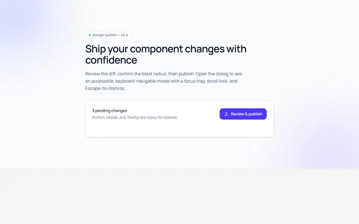
Basic Modal
Originalbasic centred modal with overlay
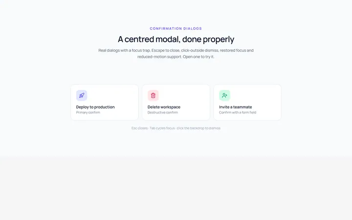
Center Modal
Originalcentred modal with icon and actions
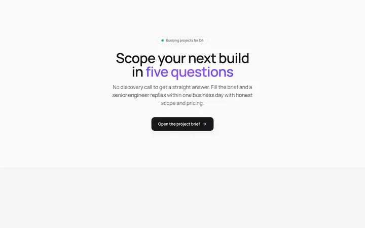
Form Modal
Originalmodal containing a form
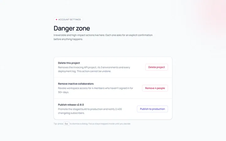
Confirm Modal
Originalconfirm/destructive dialog
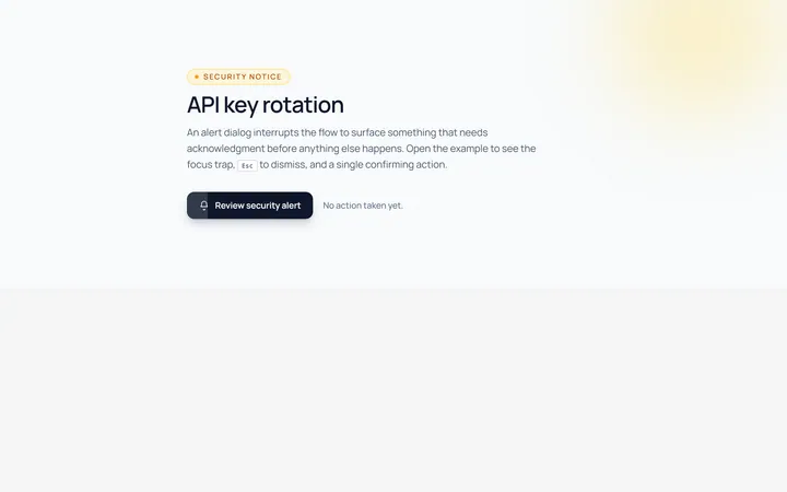
Alert Modal
Originalalert dialog with single action
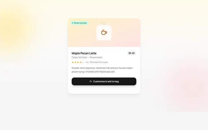
Drawer Bottom Modal
Originalbottom sheet drawer
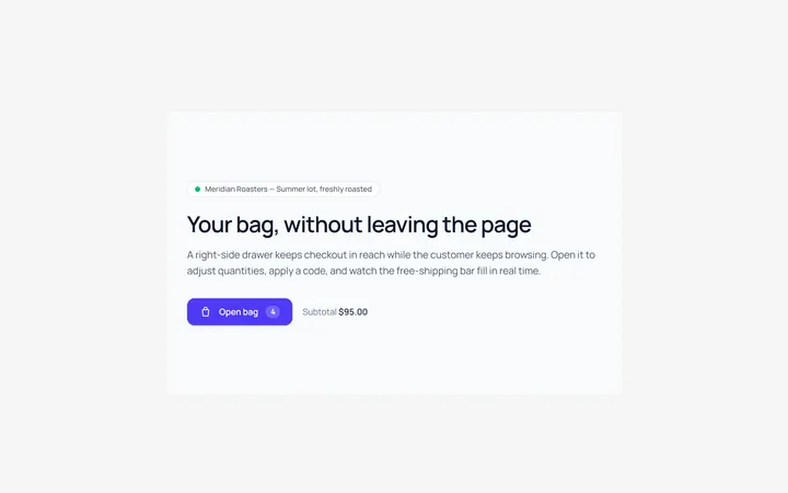
Side Drawer Modal
Originalright side drawer modal
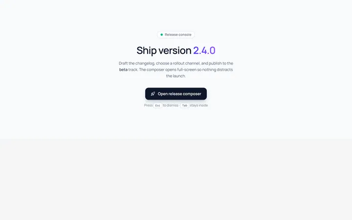
Fullscreen Modal
Originalfullscreen modal
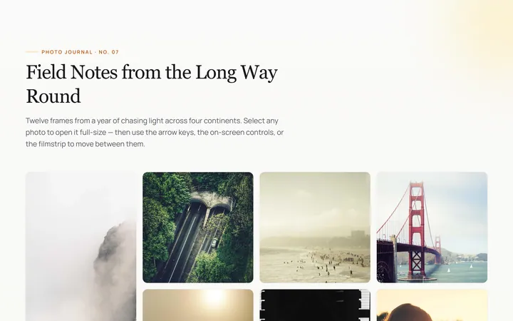
Image Lightbox Modal
Originalimage lightbox modal with nav
Scroll Modal
Originalmodal with long scrollable body
Steps Modal
Originalmulti-step modal flow
Command Palette Modal
Originalcommand palette modal with search