

Center Modal
Original · freecentred modal with icon and actions
byWeb InnoventixReact + Tailwind
modalcentermodals
Copy prompt gives Claude Code, Cursor or v0 a ready-to-paste prompt that recreates this exact component.
npx shadcn@latest add https://webinnoventix.com/r/modal-center.jsonmodal-center.tsx
"use client";

import { useCallback, useEffect, useId, useRef, useState } from "react";
import type { ReactNode } from "react";
import { AnimatePresence, motion, useReducedMotion } from "motion/react";

type IconProps = { className?: string };

type ModalKind = "deploy" | "delete" | "invite";

type FocusTarget = "primary" | "secondary" | "email";

type Variant = {
  triggerLabel: string;
  triggerHint: string;
  eyebrow: string;
  title: string;
  body: string;
  primary: string;
  busy: string;
  secondary: string;
  Icon: (props: IconProps) => ReactNode;
  badge: string;
  halo: string;
  accentText: string;
  primaryBtn: string;
  focusRing: string;
  hasEmail: boolean;
  focusTarget: FocusTarget;
  result: (email: string) => string;
};

function RocketIcon({ className }: IconProps) {
  return (
    <svg
      viewBox="0 0 24 24"
      fill="none"
      stroke="currentColor"
      strokeWidth={1.8}
      strokeLinecap="round"
      strokeLinejoin="round"
      className={className}
      aria-hidden="true"
    >
      <path d="M4.5 16.5c-1.5 1.26-2 5-2 5s3.74-.5 5-2c.71-.84.7-2.13-.09-2.91a2.18 2.18 0 0 0-2.91-.09z" />
      <path d="M12 15l-3-3a22 22 0 0 1 2-3.95A12.88 12.88 0 0 1 22 2c0 2.72-.78 7.5-6 11a22.35 22.35 0 0 1-4 2z" />
      <path d="M9 12H4s.55-3.03 2-4c1.62-1.08 5 0 5 0" />
      <path d="M12 15v5s3.03-.55 4-2c1.08-1.62 0-5 0-5" />
    </svg>
  );
}

function TrashIcon({ className }: IconProps) {
  return (
    <svg
      viewBox="0 0 24 24"
      fill="none"
      stroke="currentColor"
      strokeWidth={1.8}
      strokeLinecap="round"
      strokeLinejoin="round"
      className={className}
      aria-hidden="true"
    >
      <path d="M3 6h18" />
      <path d="M19 6v14a2 2 0 0 1-2 2H7a2 2 0 0 1-2-2V6" />
      <path d="M8 6V4a2 2 0 0 1 2-2h4a2 2 0 0 1 2 2v2" />
      <path d="M10 11v6" />
      <path d="M14 11v6" />
    </svg>
  );
}

function UserPlusIcon({ className }: IconProps) {
  return (
    <svg
      viewBox="0 0 24 24"
      fill="none"
      stroke="currentColor"
      strokeWidth={1.8}
      strokeLinecap="round"
      strokeLinejoin="round"
      className={className}
      aria-hidden="true"
    >
      <path d="M16 21v-2a4 4 0 0 0-4-4H6a4 4 0 0 0-4 4v2" />
      <circle cx="9" cy="7" r="4" />
      <path d="M19 8v6" />
      <path d="M22 11h-6" />
    </svg>
  );
}

function CloseIcon({ className }: IconProps) {
  return (
    <svg
      viewBox="0 0 24 24"
      fill="none"
      stroke="currentColor"
      strokeWidth={2}
      strokeLinecap="round"
      strokeLinejoin="round"
      className={className}
      aria-hidden="true"
    >
      <path d="M18 6 6 18" />
      <path d="m6 6 12 12" />
    </svg>
  );
}

function CheckIcon({ className }: IconProps) {
  return (
    <svg
      viewBox="0 0 24 24"
      fill="none"
      stroke="currentColor"
      strokeWidth={2}
      strokeLinecap="round"
      strokeLinejoin="round"
      className={className}
      aria-hidden="true"
    >
      <path d="M20 6 9 17l-5-5" />
    </svg>
  );
}

function SpinnerIcon({ className }: IconProps) {
  return (
    <svg viewBox="0 0 24 24" fill="none" className={className} aria-hidden="true">
      <circle cx="12" cy="12" r="10" stroke="currentColor" strokeWidth={4} className="opacity-25" />
      <path
        d="M4 12a8 8 0 0 1 8-8"
        stroke="currentColor"
        strokeWidth={4}
        strokeLinecap="round"
        className="opacity-90"
      />
    </svg>
  );
}

const VARIANTS: Record<ModalKind, Variant> = {
  deploy: {
    triggerLabel: "Deploy to production",
    triggerHint: "Primary confirm",
    eyebrow: "Deployment",
    title: "Ship build 2.14.0 to production?",
    body: "This replaces the live release across all 5 regions. A one-click rollback stays available for 24 hours in the Deploys panel.",
    primary: "Deploy now",
    busy: "Deploying…",
    secondary: "Not yet",
    Icon: RocketIcon,
    badge: "bg-indigo-100 text-indigo-600 dark:bg-indigo-500/15 dark:text-indigo-300",
    halo: "bg-indigo-400/40 dark:bg-indigo-400/25",
    accentText: "text-indigo-600 dark:text-indigo-400",
    primaryBtn: "bg-indigo-600 text-white hover:bg-indigo-500 active:bg-indigo-600",
    focusRing: "focus-visible:ring-indigo-500",
    hasEmail: false,
    focusTarget: "primary",
    result: () => "Build 2.14.0 is live in all 5 regions.",
  },
  delete: {
    triggerLabel: "Delete workspace",
    triggerHint: "Destructive confirm",
    eyebrow: "Danger zone",
    title: "Delete the “Northwind” workspace?",
    body: "42 projects, 1,208 documents and every API key inside will be permanently removed. This action cannot be undone.",
    primary: "Delete workspace",
    busy: "Deleting…",
    secondary: "Keep it",
    Icon: TrashIcon,
    badge: "bg-rose-100 text-rose-600 dark:bg-rose-500/15 dark:text-rose-300",
    halo: "bg-rose-400/40 dark:bg-rose-400/25",
    accentText: "text-rose-600 dark:text-rose-400",
    primaryBtn: "bg-rose-600 text-white hover:bg-rose-500 active:bg-rose-600",
    focusRing: "focus-visible:ring-rose-500",
    hasEmail: false,
    focusTarget: "secondary",
    result: () => "The “Northwind” workspace was deleted.",
  },
  invite: {
    triggerLabel: "Invite a teammate",
    triggerHint: "Confirm with a form field",
    eyebrow: "Team access",
    title: "Invite a teammate to Atlas",
    body: "They’ll get Editor access to the Atlas project and can be removed anytime from Settings → Members.",
    primary: "Send invite",
    busy: "Sending…",
    secondary: "Cancel",
    Icon: UserPlusIcon,
    badge: "bg-emerald-100 text-emerald-600 dark:bg-emerald-500/15 dark:text-emerald-300",
    halo: "bg-emerald-400/40 dark:bg-emerald-400/25",
    accentText: "text-emerald-600 dark:text-emerald-400",
    primaryBtn: "bg-emerald-600 text-white hover:bg-emerald-500 active:bg-emerald-600",
    focusRing: "focus-visible:ring-emerald-500",
    hasEmail: true,
    focusTarget: "email",
    result: (email) => `Invite sent to ${email}.`,
  },
};

const KINDS: ModalKind[] = ["deploy", "delete", "invite"];

const EMAIL_RE = /^[^\s@]+@[^\s@]+\.[^\s@]+$/;

const FOCUSABLE_SELECTOR =
  'a[href], button:not([disabled]), textarea:not([disabled]), input:not([disabled]), select:not([disabled]), [tabindex]:not([tabindex="-1"])';

function getFocusable(root: HTMLElement | null): HTMLElement[] {
  if (!root) return [];
  return Array.from(root.querySelectorAll<HTMLElement>(FOCUSABLE_SELECTOR)).filter(
    (el) => el.offsetParent !== null || el === document.activeElement,
  );
}

export default function ModalCenter() {
  const reduce = useReducedMotion();

  const [activeKind, setActiveKind] = useState<ModalKind | null>(null);
  const [busyKind, setBusyKind] = useState<ModalKind | null>(null);
  const [email, setEmail] = useState<string>("");
  const [result, setResult] = useState<string | null>(null);

  const panelRef = useRef<HTMLDivElement | null>(null);
  const lastFocusedRef = useRef<HTMLElement | null>(null);
  const timeoutRef = useRef<number | null>(null);

  const titleId = useId();
  const descId = useId();
  const emailId = useId();

  const emailValid = EMAIL_RE.test(email.trim());
  const current = activeKind ? VARIANTS[activeKind] : null;
  const primaryDisabled =
    busyKind !== null || (current?.hasEmail === true && !emailValid);

  const requestClose = useCallback(() => {
    setActiveKind(null);
    setEmail("");
  }, []);

  const openKind = useCallback((kind: ModalKind) => {
    setActiveKind(kind);
    setEmail("");
  }, []);

  const handleConfirm = useCallback(
    (kind: ModalKind) => {
      setBusyKind(kind);
      timeoutRef.current = window.setTimeout(() => {
        timeoutRef.current = null;
        setBusyKind(null);
        setResult(VARIANTS[kind].result(email.trim()));
        setActiveKind(null);
        setEmail("");
      }, 1100);
    },
    [email],
  );

  useEffect(() => {
    return () => {
      if (timeoutRef.current) window.clearTimeout(timeoutRef.current);
    };
  }, []);

  useEffect(() => {
    if (!activeKind) return;
    lastFocusedRef.current =
      document.activeElement instanceof HTMLElement ? document.activeElement : null;

    const raf = window.requestAnimationFrame(() => {
      const panel = panelRef.current;
      const preferred = panel?.querySelector<HTMLElement>("[data-autofocus]");
      (preferred ?? getFocusable(panel)[0])?.focus();
    });

    const previousOverflow = document.body.style.overflow;
    document.body.style.overflow = "hidden";

    return () => {
      window.cancelAnimationFrame(raf);
      document.body.style.overflow = previousOverflow;
      lastFocusedRef.current?.focus?.();
    };
  }, [activeKind]);

  useEffect(() => {
    if (!activeKind) return;

    function onKeyDown(event: KeyboardEvent) {
      if (event.key === "Escape") {
        if (busyKind) return;
        event.preventDefault();
        requestClose();
        return;
      }
      if (event.key !== "Tab") return;

      const focusable = getFocusable(panelRef.current);
      if (focusable.length === 0) {
        event.preventDefault();
        return;
      }
      const first = focusable[0];
      const last = focusable[focusable.length - 1];
      const active = document.activeElement;
      const inside = panelRef.current?.contains(active) ?? false;

      if (event.shiftKey && (active === first || !inside)) {
        event.preventDefault();
        last.focus();
      } else if (!event.shiftKey && active === last) {
        event.preventDefault();
        first.focus();
      }
    }

    document.addEventListener("keydown", onKeyDown);
    return () => document.removeEventListener("keydown", onKeyDown);
  }, [activeKind, busyKind, requestClose]);

  const panelInitial = reduce
    ? { opacity: 0 }
    : { opacity: 0, scale: 0.95, y: 12 };
  const panelAnimate = reduce
    ? { opacity: 1 }
    : { opacity: 1, scale: 1, y: 0 };
  const panelExit = reduce
    ? { opacity: 0 }
    : { opacity: 0, scale: 0.97, y: 8 };

  const Icon = current?.Icon;

  return (
    <section className="relative w-full bg-slate-50 px-4 py-16 text-slate-900 dark:bg-slate-950 dark:text-slate-100 sm:py-24">
      <div className="mx-auto max-w-3xl">
        <header className="text-center">
          <p className="text-xs font-semibold uppercase tracking-[0.2em] text-indigo-600 dark:text-indigo-400">
            Confirmation dialogs
          </p>
          <h2 className="mt-3 text-2xl font-semibold tracking-tight text-slate-900 dark:text-slate-50 sm:text-3xl">
            A centred modal, done properly
          </h2>
          <p className="mx-auto mt-3 max-w-xl text-sm leading-relaxed text-slate-600 dark:text-slate-400">
            Real dialogs with a focus trap, Escape to close, click-outside dismiss,
            restored focus and reduced-motion support. Open one to try it.
          </p>
        </header>

        <div className="mx-auto mt-6 min-h-[3rem] max-w-md" aria-live="polite">
          <AnimatePresence>
            {result ? (
              <motion.div
                key="mc-result"
                initial={reduce ? { opacity: 0 } : { opacity: 0, y: -6 }}
                animate={{ opacity: 1, y: 0 }}
                exit={reduce ? { opacity: 0 } : { opacity: 0, y: -6 }}
                transition={{ duration: reduce ? 0 : 0.2 }}
                className="flex items-center gap-2.5 rounded-xl border border-emerald-200 bg-emerald-50 px-3.5 py-2.5 text-sm text-emerald-800 dark:border-emerald-500/25 dark:bg-emerald-500/10 dark:text-emerald-200"
              >
                <CheckIcon className="h-4 w-4 shrink-0" />
                <span className="flex-1">{result}</span>
                <button
                  type="button"
                  onClick={() => setResult(null)}
                  aria-label="Dismiss notification"
                  className="inline-flex h-6 w-6 items-center justify-center rounded-md text-emerald-700/70 transition hover:bg-emerald-100 hover:text-emerald-800 focus-visible:outline-none focus-visible:ring-2 focus-visible:ring-emerald-500 focus-visible:ring-offset-2 focus-visible:ring-offset-emerald-50 dark:text-emerald-300/70 dark:hover:bg-emerald-500/20 dark:hover:text-emerald-100 dark:focus-visible:ring-offset-slate-950"
                >
                  <CloseIcon className="h-3.5 w-3.5" />
                </button>
              </motion.div>
            ) : null}
          </AnimatePresence>
        </div>

        <div className="mt-4 grid gap-3 sm:grid-cols-3">
          {KINDS.map((kind) => {
            const variant = VARIANTS[kind];
            const TriggerIcon = variant.Icon;
            return (
              <button
                key={kind}
                type="button"
                onClick={() => openKind(kind)}
                className={`group flex flex-col items-start gap-3 rounded-2xl border border-slate-200 bg-white p-5 text-left transition hover:border-slate-300 hover:shadow-lg hover:shadow-slate-900/5 focus-visible:outline-none focus-visible:ring-2 focus-visible:ring-offset-2 focus-visible:ring-offset-slate-50 dark:border-slate-800 dark:bg-slate-900 dark:hover:border-slate-700 dark:focus-visible:ring-offset-slate-950 ${variant.focusRing}`}
              >
                <span
                  className={`inline-flex h-10 w-10 items-center justify-center rounded-xl ${variant.badge}`}
                >
                  <TriggerIcon className="h-5 w-5" />
                </span>
                <span className="block">
                  <span className="block text-sm font-semibold text-slate-900 dark:text-slate-100">
                    {variant.triggerLabel}
                  </span>
                  <span className="mt-0.5 block text-xs text-slate-500 dark:text-slate-400">
                    {variant.triggerHint}
                  </span>
                </span>
              </button>
            );
          })}
        </div>

        <p className="mt-5 text-center text-xs text-slate-400 dark:text-slate-500">
          Esc closes · Tab cycles focus · click the backdrop to dismiss
        </p>
      </div>

      <AnimatePresence>
        {activeKind && current && Icon ? (
          <motion.div
            key="mc-overlay"
            initial={{ opacity: 0 }}
            animate={{ opacity: 1 }}
            exit={{ opacity: 0 }}
            transition={{ duration: reduce ? 0 : 0.18 }}
            className="fixed inset-0 z-50 flex items-center justify-center p-4 sm:p-6"
          >
            <div
              className="absolute inset-0 bg-slate-950/60 backdrop-blur-sm"
              onClick={() => {
                if (!busyKind) requestClose();
              }}
              aria-hidden="true"
            />

            <motion.div
              ref={panelRef}
              role="dialog"
              aria-modal="true"
              aria-labelledby={titleId}
              aria-describedby={descId}
              initial={panelInitial}
              animate={panelAnimate}
              exit={panelExit}
              transition={{ duration: reduce ? 0 : 0.22, ease: [0.16, 1, 0.3, 1] }}
              className="relative z-10 w-full max-w-md rounded-2xl border border-slate-200 bg-white p-6 text-center shadow-2xl shadow-slate-900/20 dark:border-slate-800 dark:bg-slate-900 sm:p-8"
            >
              <button
                type="button"
                onClick={requestClose}
                disabled={busyKind !== null}
                aria-label="Close dialog"
                className="absolute right-3.5 top-3.5 inline-flex h-8 w-8 items-center justify-center rounded-lg text-slate-400 transition hover:bg-slate-100 hover:text-slate-600 disabled:pointer-events-none disabled:opacity-40 focus-visible:outline-none focus-visible:ring-2 focus-visible:ring-slate-400 focus-visible:ring-offset-2 focus-visible:ring-offset-white dark:hover:bg-slate-800 dark:hover:text-slate-200 dark:focus-visible:ring-offset-slate-900"
              >
                <CloseIcon className="h-4 w-4" />
              </button>

              <div className="relative mx-auto mb-5 flex h-14 w-14 items-center justify-center">
                <span
                  className={`mc-halo absolute inset-0 rounded-2xl ${current.halo}`}
                  aria-hidden="true"
                />
                <span
                  className={`relative flex h-14 w-14 items-center justify-center rounded-2xl ${current.badge}`}
                >
                  <Icon className="h-6 w-6" />
                </span>
              </div>

              <p
                className={`text-xs font-semibold uppercase tracking-[0.16em] ${current.accentText}`}
              >
                {current.eyebrow}
              </p>
              <h3
                id={titleId}
                className="mt-1.5 text-lg font-semibold text-slate-900 dark:text-slate-50"
              >
                {current.title}
              </h3>
              <p
                id={descId}
                className="mx-auto mt-2 max-w-sm text-sm leading-relaxed text-slate-600 dark:text-slate-400"
              >
                {current.body}
              </p>

              {current.hasEmail ? (
                <div className="mt-5 text-left">
                  <label
                    htmlFor={emailId}
                    className="block text-xs font-medium text-slate-600 dark:text-slate-400"
                  >
                    Teammate’s email
                  </label>
                  <input
                    id={emailId}
                    type="email"
                    inputMode="email"
                    autoComplete="off"
                    data-autofocus=""
                    value={email}
                    onChange={(event) => setEmail(event.target.value)}
                    aria-invalid={email.length > 0 && !emailValid}
                    aria-describedby={
                      email.length > 0 && !emailValid ? `${emailId}-error` : undefined
                    }
                    placeholder="teammate@company.com"
                    className="mt-1.5 w-full rounded-xl border border-slate-300 bg-white px-3.5 py-2.5 text-sm text-slate-900 placeholder:text-slate-400 focus-visible:outline-none focus-visible:ring-2 focus-visible:ring-emerald-500 focus-visible:ring-offset-2 focus-visible:ring-offset-white dark:border-slate-700 dark:bg-slate-800 dark:text-slate-100 dark:placeholder:text-slate-500 dark:focus-visible:ring-offset-slate-900"
                  />
                  {email.length > 0 && !emailValid ? (
                    <p
                      id={`${emailId}-error`}
                      className="mt-1.5 text-xs text-rose-600 dark:text-rose-400"
                    >
                      Enter a valid email address.
                    </p>
                  ) : null}
                </div>
              ) : null}

              <div className="mt-6 flex flex-col-reverse gap-2.5 sm:flex-row sm:justify-center">
                <button
                  type="button"
                  onClick={requestClose}
                  disabled={busyKind !== null}
                  {...(current.focusTarget === "secondary" ? { "data-autofocus": "" } : {})}
                  className="inline-flex items-center justify-center rounded-xl border border-slate-300 bg-white px-4 py-2.5 text-sm font-medium text-slate-700 transition hover:bg-slate-100 disabled:pointer-events-none disabled:opacity-50 focus-visible:outline-none focus-visible:ring-2 focus-visible:ring-slate-400 focus-visible:ring-offset-2 focus-visible:ring-offset-white dark:border-slate-700 dark:bg-slate-800 dark:text-slate-200 dark:hover:bg-slate-700 dark:focus-visible:ring-offset-slate-900 sm:min-w-[7rem]"
                >
                  {current.secondary}
                </button>
                <button
                  type="button"
                  onClick={() => {
                    if (activeKind) handleConfirm(activeKind);
                  }}
                  disabled={primaryDisabled}
                  {...(current.focusTarget === "primary" ? { "data-autofocus": "" } : {})}
                  className={`inline-flex items-center justify-center gap-2 rounded-xl px-4 py-2.5 text-sm font-semibold shadow-sm transition disabled:cursor-not-allowed disabled:opacity-60 focus-visible:outline-none focus-visible:ring-2 focus-visible:ring-offset-2 focus-visible:ring-offset-white dark:focus-visible:ring-offset-slate-900 sm:min-w-[7rem] ${current.primaryBtn} ${current.focusRing}`}
                >
                  {busyKind ? (
                    <>
                      <SpinnerIcon className="h-4 w-4 animate-spin" />
                      {current.busy}
                    </>
                  ) : (
                    current.primary
                  )}
                </button>
              </div>
            </motion.div>
          </motion.div>
        ) : null}
      </AnimatePresence>

      <style>{`
        @keyframes mc-halo {
          0% { transform: scale(0.85); opacity: 0.55; }
          70% { transform: scale(1.6); opacity: 0; }
          100% { transform: scale(1.6); opacity: 0; }
        }
        .mc-halo {
          animation: mc-halo 2.4s cubic-bezier(0.4, 0, 0.2, 1) infinite;
        }
        @media (prefers-reduced-motion: reduce) {
          .mc-halo { animation: none; }
        }
      `}</style>
    </section>
  );
}
Dependencies
motion
Licence
Built by Web Innoventix. Free for personal and commercial use, no attribution required.
Built by Web Innoventix
Need a custom interface, a full website, or SEO that gets you cited by AI? We design, build and rank it end to end.
Get a free quoteSimilar components
Browse all →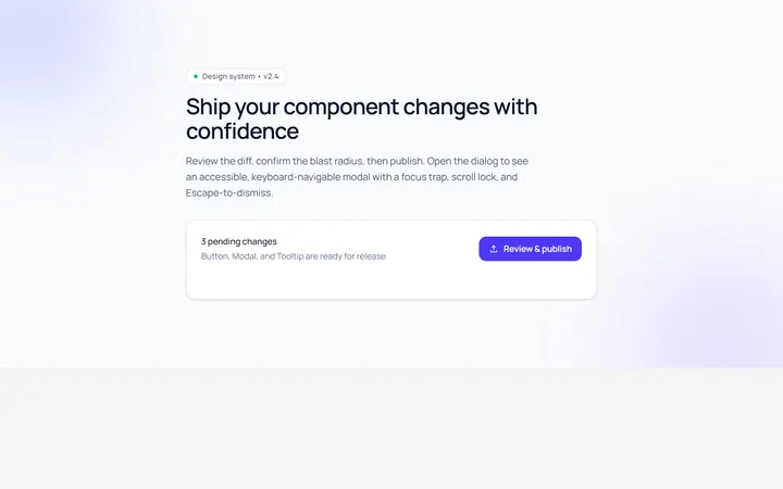
Basic Modal
Originalbasic centred modal with overlay
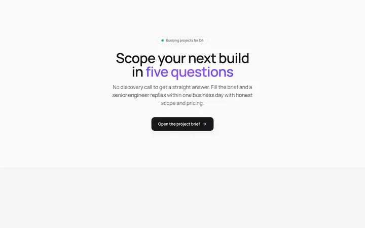
Form Modal
Originalmodal containing a form
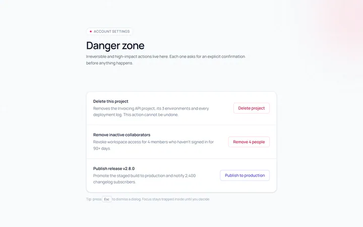
Confirm Modal
Originalconfirm/destructive dialog
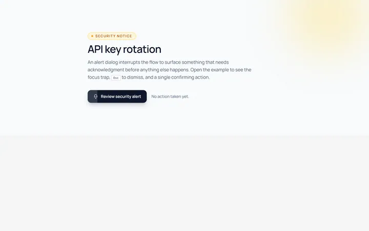
Alert Modal
Originalalert dialog with single action
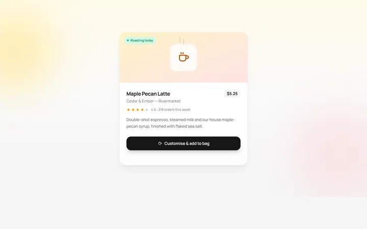
Drawer Bottom Modal
Originalbottom sheet drawer
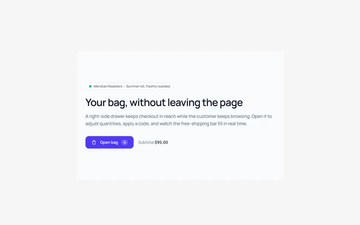
Side Drawer Modal
Originalright side drawer modal
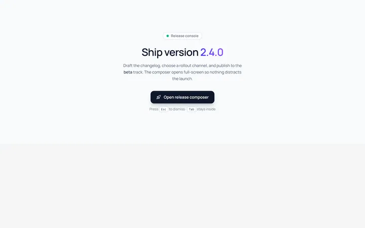
Fullscreen Modal
Originalfullscreen modal
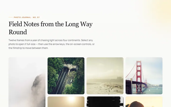
Image Lightbox Modal
Originalimage lightbox modal with nav
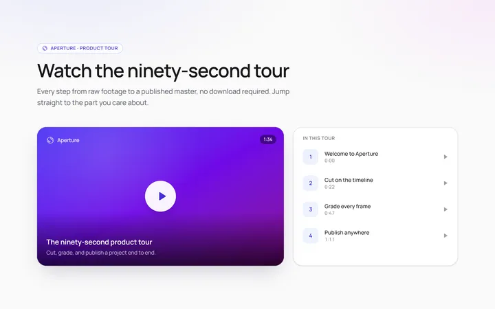
Video Modal
Originalvideo player modal
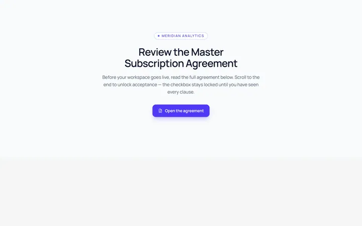
Scroll Modal
Originalmodal with long scrollable body
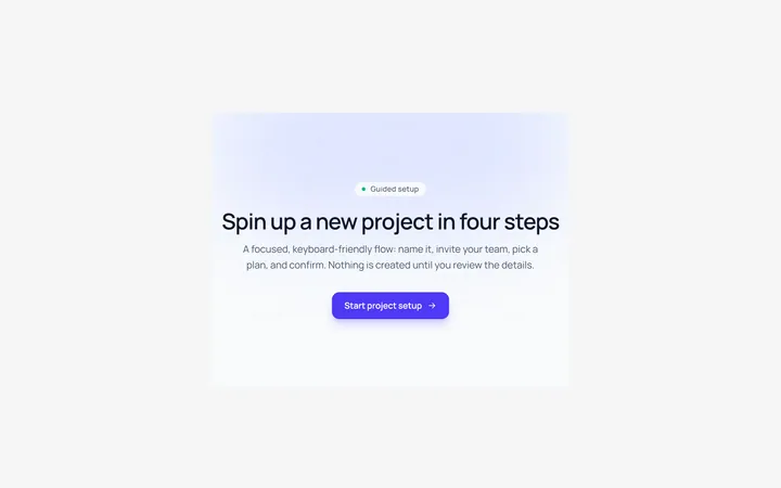
Steps Modal
Originalmulti-step modal flow
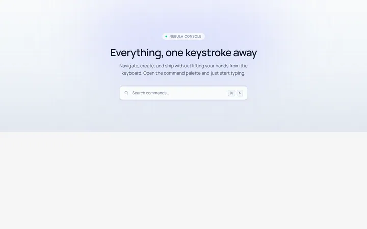
Command Palette Modal
Originalcommand palette modal with search