

Steps Modal
Original · freemulti-step modal flow
byWeb InnoventixReact + Tailwind
modalstepsmodals
Copy prompt gives Claude Code, Cursor or v0 a ready-to-paste prompt that recreates this exact component.
npx shadcn@latest add https://webinnoventix.com/r/modal-steps.jsonmodal-steps.tsx
"use client";
import {
useCallback,
useEffect,
useId,
useRef,
useState,
type ChangeEvent,
type FormEvent,
type KeyboardEvent,
type ReactNode,
} from "react";
import { AnimatePresence, motion, useReducedMotion } from "motion/react";
/* ---------- data ---------- */
type StepMeta = { key: string; title: string; hint: string };
const STEPS: StepMeta[] = [
{ key: "project", title: "Project", hint: "Name it and pick a type" },
{ key: "team", title: "Team", hint: "Invite people to collaborate" },
{ key: "plan", title: "Plan", hint: "Choose what fits your stage" },
{ key: "review", title: "Review", hint: "Confirm and create" },
];
type ProjectType = { id: string; label: string; blurb: string; icon: ReactNode };
const iconWeb = (
<svg viewBox="0 0 24 24" fill="none" stroke="currentColor" strokeWidth={1.6} aria-hidden="true" className="h-5 w-5">
<rect x="3" y="4" width="18" height="15" rx="2" />
<path d="M3 9h18" strokeLinecap="round" />
<circle cx="6.5" cy="6.5" r=".6" fill="currentColor" stroke="none" />
</svg>
);
const iconApi = (
<svg viewBox="0 0 24 24" fill="none" stroke="currentColor" strokeWidth={1.6} aria-hidden="true" className="h-5 w-5">
<path d="M8 7 4 12l4 5M16 7l4 5-4 5" strokeLinecap="round" strokeLinejoin="round" />
<path d="M13 6l-2 12" strokeLinecap="round" />
</svg>
);
const iconStatic = (
<svg viewBox="0 0 24 24" fill="none" stroke="currentColor" strokeWidth={1.6} aria-hidden="true" className="h-5 w-5">
<path d="M12 3 3 8l9 5 9-5-9-5Z" strokeLinejoin="round" />
<path d="m3 13 9 5 9-5" strokeLinejoin="round" />
</svg>
);
const iconMarketing = (
<svg viewBox="0 0 24 24" fill="none" stroke="currentColor" strokeWidth={1.6} aria-hidden="true" className="h-5 w-5">
<path d="M3 11v3a1 1 0 0 0 1 1h2l4 3V7L6 10H4a1 1 0 0 0-1 1Z" strokeLinejoin="round" />
<path d="M15 9a3 3 0 0 1 0 6M18 6a6 6 0 0 1 0 12" strokeLinecap="round" />
</svg>
);
const PROJECT_TYPES: ProjectType[] = [
{ id: "web", label: "Web app", blurb: "Full-stack, server-rendered UI", icon: iconWeb },
{ id: "api", label: "API service", blurb: "Headless backend & endpoints", icon: iconApi },
{ id: "static", label: "Static site", blurb: "Pre-built, edge-cached pages", icon: iconStatic },
{ id: "marketing", label: "Marketing", blurb: "Landing pages & campaigns", icon: iconMarketing },
];
type Plan = { id: string; name: string; price: string; per: string; points: string[]; featured?: boolean };
const PLANS: Plan[] = [
{ id: "starter", name: "Starter", price: "$0", per: "/mo", points: ["1 seat", "Community support", "Shared build minutes"] },
{ id: "team", name: "Team", price: "$29", per: "/mo", points: ["Up to 10 seats", "Preview environments", "Email support"], featured: true },
{ id: "scale", name: "Scale", price: "$99", per: "/mo", points: ["Unlimited seats", "SSO & audit log", "Priority SLA"] },
];
type FormState = {
projectName: string;
projectType: string;
invites: string[];
plan: string;
agree: boolean;
};
const INITIAL: FormState = {
projectName: "",
projectType: "web",
invites: [""],
plan: "team",
agree: false,
};
const EMAIL_RE = /^[^\s@]+@[^\s@]+\.[^\s@]+$/;
const FOCUSABLE =
'a[href],button:not([disabled]),textarea:not([disabled]),input:not([disabled]),select:not([disabled]),[tabindex]:not([tabindex="-1"])';
/* ---------- inline icons ---------- */
const XIcon = () => (
<svg viewBox="0 0 24 24" fill="none" stroke="currentColor" strokeWidth={1.8} strokeLinecap="round" aria-hidden="true" className="h-4 w-4">
<path d="M6 6l12 12M18 6 6 18" />
</svg>
);
const CheckIcon = ({ className = "h-3.5 w-3.5" }: { className?: string }) => (
<svg viewBox="0 0 24 24" fill="none" stroke="currentColor" strokeWidth={2.4} strokeLinecap="round" strokeLinejoin="round" aria-hidden="true" className={className}>
<path d="m5 12 4.5 4.5L19 7" />
</svg>
);
const PlusIcon = () => (
<svg viewBox="0 0 24 24" fill="none" stroke="currentColor" strokeWidth={1.8} strokeLinecap="round" aria-hidden="true" className="h-4 w-4">
<path d="M12 5v14M5 12h14" />
</svg>
);
const TrashIcon = () => (
<svg viewBox="0 0 24 24" fill="none" stroke="currentColor" strokeWidth={1.7} strokeLinecap="round" strokeLinejoin="round" aria-hidden="true" className="h-4 w-4">
<path d="M4 7h16M9 7V5h6v2m-8 0 1 12h8l1-12" />
</svg>
);
const ChevronLeft = () => (
<svg viewBox="0 0 24 24" fill="none" stroke="currentColor" strokeWidth={1.8} strokeLinecap="round" strokeLinejoin="round" aria-hidden="true" className="h-4 w-4">
<path d="m14 6-6 6 6 6" />
</svg>
);
const ArrowRight = () => (
<svg viewBox="0 0 24 24" fill="none" stroke="currentColor" strokeWidth={1.8} strokeLinecap="round" strokeLinejoin="round" aria-hidden="true" className="h-4 w-4">
<path d="M5 12h14M13 6l6 6-6 6" />
</svg>
);
/* ---------- component ---------- */
export default function ModalSteps() {
const reduce = useReducedMotion();
const [open, setOpen] = useState(false);
const [step, setStep] = useState(0);
const [maxStep, setMaxStep] = useState(0);
const [dir, setDir] = useState(1);
const [submitted, setSubmitted] = useState(false);
const [form, setForm] = useState<FormState>(INITIAL);
const [errors, setErrors] = useState<Record<string, string>>({});
const triggerRef = useRef<HTMLButtonElement | null>(null);
const dialogRef = useRef<HTMLDivElement | null>(null);
const headingRef = useRef<HTMLHeadingElement | null>(null);
const uid = useId();
const titleId = `${uid}-title`;
const descId = `${uid}-desc`;
const isLast = step === STEPS.length - 1;
const openModal = useCallback(() => {
setForm(INITIAL);
setStep(0);
setMaxStep(0);
setDir(1);
setErrors({});
setSubmitted(false);
setOpen(true);
}, []);
const closeModal = useCallback(() => {
setOpen(false);
triggerRef.current?.focus();
}, []);
/* lock scroll while open */
useEffect(() => {
if (!open) return;
const prev = document.body.style.overflow;
document.body.style.overflow = "hidden";
return () => {
document.body.style.overflow = prev;
};
}, [open]);
/* move focus to step heading on open / step change */
useEffect(() => {
if (!open) return;
const id = window.setTimeout(() => headingRef.current?.focus(), 20);
return () => window.clearTimeout(id);
}, [open, step, submitted]);
const validate = useCallback(
(s: number): Record<string, string> => {
const e: Record<string, string> = {};
if (s === 0) {
const name = form.projectName.trim();
if (!name) e.projectName = "Give your project a name.";
else if (name.length < 2) e.projectName = "Use at least 2 characters.";
if (!form.projectType) e.projectType = "Pick a project type.";
}
if (s === 1) {
form.invites.forEach((v, i) => {
const t = v.trim();
if (t && !EMAIL_RE.test(t)) e[`invite:${i}`] = "Enter a valid email address.";
});
}
if (s === 2 && !form.plan) e.plan = "Choose a plan.";
if (s === 3 && !form.agree) e.agree = "Please accept the terms to continue.";
return e;
},
[form],
);
const goNext = useCallback(() => {
const e = validate(step);
if (Object.keys(e).length) {
setErrors(e);
return;
}
setErrors({});
if (isLast) {
setSubmitted(true);
return;
}
setDir(1);
const n = step + 1;
setStep(n);
setMaxStep((m) => Math.max(m, n));
}, [isLast, step, validate]);
const goBack = useCallback(() => {
setErrors({});
setDir(-1);
setStep((s) => Math.max(0, s - 1));
}, []);
const jumpTo = useCallback(
(i: number) => {
if (i > maxStep || i === step) return;
setErrors({});
setDir(i > step ? 1 : -1);
setStep(i);
},
[maxStep, step],
);
const onDialogKeyDown = useCallback(
(e: KeyboardEvent<HTMLDivElement>) => {
if (e.key === "Escape") {
e.preventDefault();
closeModal();
return;
}
if (e.key !== "Tab" || !dialogRef.current) return;
const nodes = Array.from(dialogRef.current.querySelectorAll<HTMLElement>(FOCUSABLE)).filter(
(n) => n.offsetParent !== null || n === document.activeElement,
);
if (nodes.length === 0) return;
const first = nodes[0];
const last = nodes[nodes.length - 1];
const active = document.activeElement;
if (e.shiftKey && active === first) {
e.preventDefault();
last.focus();
} else if (!e.shiftKey && active === last) {
e.preventDefault();
first.focus();
}
},
[closeModal],
);
const onSubmit = useCallback(
(e: FormEvent<HTMLFormElement>) => {
e.preventDefault();
goNext();
},
[goNext],
);
/* field updaters */
const setName = (e: ChangeEvent<HTMLInputElement>) =>
setForm((f) => ({ ...f, projectName: e.target.value }));
const setType = (id: string) => setForm((f) => ({ ...f, projectType: id }));
const setPlan = (id: string) => setForm((f) => ({ ...f, plan: id }));
const setAgree = (e: ChangeEvent<HTMLInputElement>) =>
setForm((f) => ({ ...f, agree: e.target.checked }));
const updateInvite = (i: number, v: string) =>
setForm((f) => ({ ...f, invites: f.invites.map((x, idx) => (idx === i ? v : x)) }));
const addInvite = () => setForm((f) => ({ ...f, invites: [...f.invites, ""] }));
const removeInvite = (i: number) =>
setForm((f) => ({ ...f, invites: f.invites.filter((_, idx) => idx !== i) }));
const progress = (step / (STEPS.length - 1)) * 100;
const typeLabel = PROJECT_TYPES.find((t) => t.id === form.projectType)?.label ?? "—";
const planLabel = PLANS.find((p) => p.id === form.plan)?.name ?? "—";
const filledInvites = form.invites.map((v) => v.trim()).filter(Boolean);
const spring = reduce ? { duration: 0 } : { type: "spring" as const, stiffness: 320, damping: 30 };
const fade = reduce ? { duration: 0 } : { duration: 0.2, ease: [0.22, 0.61, 0.36, 1] as const };
return (
<section className="relative w-full overflow-hidden bg-slate-50 px-4 py-20 text-slate-900 sm:py-28 dark:bg-slate-950 dark:text-slate-100">
<style>{`
@keyframes msf-check-draw { from { stroke-dashoffset: 32; } to { stroke-dashoffset: 0; } }
@keyframes msf-ring-pulse { 0% { transform: scale(.85); opacity: .55; } 70% { transform: scale(1.25); opacity: 0; } 100% { opacity: 0; } }
@keyframes msf-sheen { from { transform: translateX(-120%); } to { transform: translateX(320%); } }
@media (prefers-reduced-motion: reduce) {
.msf-check-path { animation: none !important; stroke-dashoffset: 0 !important; }
.msf-ring { animation: none !important; }
.msf-sheen { animation: none !important; }
}
`}</style>
{/* atmosphere */}
<div
aria-hidden="true"
className="pointer-events-none absolute -top-24 left-1/2 h-72 w-[36rem] -translate-x-1/2 rounded-full bg-indigo-300/30 blur-3xl dark:bg-indigo-600/20"
/>
<div
aria-hidden="true"
className="pointer-events-none absolute inset-0 opacity-[0.4] [background-image:radial-gradient(circle_at_1px_1px,theme(colors.slate.300)_1px,transparent_0)] [background-size:22px_22px] dark:opacity-[0.15] dark:[background-image:radial-gradient(circle_at_1px_1px,theme(colors.slate.700)_1px,transparent_0)]"
/>
<div className="relative mx-auto flex max-w-2xl flex-col items-center text-center">
<span className="inline-flex items-center gap-2 rounded-full border border-slate-200 bg-white/70 px-3 py-1 text-xs font-medium tracking-wide text-slate-600 backdrop-blur dark:border-slate-800 dark:bg-slate-900/70 dark:text-slate-300">
<span className="h-1.5 w-1.5 rounded-full bg-emerald-500" />
Guided setup
</span>
<h2 className="mt-5 text-balance text-3xl font-semibold tracking-tight sm:text-4xl">
Spin up a new project in four steps
</h2>
<p className="mt-3 max-w-lg text-pretty text-sm leading-relaxed text-slate-600 sm:text-base dark:text-slate-400">
A focused, keyboard-friendly flow: name it, invite your team, pick a plan, and confirm. Nothing
is created until you review the details.
</p>
<button
ref={triggerRef}
type="button"
onClick={openModal}
className="mt-8 inline-flex items-center gap-2 rounded-xl bg-indigo-600 px-5 py-3 text-sm font-semibold text-white shadow-lg shadow-indigo-600/25 transition hover:bg-indigo-500 focus:outline-none focus-visible:ring-2 focus-visible:ring-indigo-500 focus-visible:ring-offset-2 focus-visible:ring-offset-slate-50 active:scale-[.98] dark:focus-visible:ring-offset-slate-950"
>
Start project setup
<ArrowRight />
</button>
</div>
<AnimatePresence>
{open && (
<motion.div
className="fixed inset-0 z-50 flex items-end justify-center p-0 sm:items-center sm:p-6"
initial="hidden"
animate="visible"
exit="hidden"
>
{/* backdrop */}
<motion.div
className="absolute inset-0 bg-slate-950/60 backdrop-blur-sm"
variants={{ hidden: { opacity: 0 }, visible: { opacity: 1 } }}
transition={fade}
onClick={closeModal}
aria-hidden="true"
/>
{/* dialog */}
<motion.div
ref={dialogRef}
role="dialog"
aria-modal="true"
aria-labelledby={titleId}
aria-describedby={descId}
onKeyDown={onDialogKeyDown}
className="relative flex w-full max-w-lg flex-col overflow-hidden rounded-t-2xl border border-slate-200 bg-white shadow-2xl sm:rounded-2xl dark:border-slate-800 dark:bg-slate-900"
variants={{
hidden: { opacity: 0, y: reduce ? 0 : 24, scale: reduce ? 1 : 0.98 },
visible: { opacity: 1, y: 0, scale: 1 },
}}
transition={spring}
>
{/* header */}
<div className="relative border-b border-slate-200 px-5 pb-4 pt-5 sm:px-6 dark:border-slate-800">
<div className="flex items-start justify-between gap-4">
<div className="min-w-0">
<p className="text-[0.7rem] font-semibold uppercase tracking-widest text-indigo-600 dark:text-indigo-400">
{submitted ? "Complete" : `Step ${step + 1} of ${STEPS.length}`}
</p>
<h2
id={titleId}
ref={headingRef}
tabIndex={-1}
className="mt-1 text-lg font-semibold tracking-tight outline-none"
>
{submitted ? "Project created" : STEPS[step].title}
</h2>
<p id={descId} className="mt-0.5 text-sm text-slate-500 dark:text-slate-400">
{submitted ? "Your workspace is ready to go." : STEPS[step].hint}
</p>
</div>
<button
type="button"
onClick={closeModal}
aria-label="Close dialog"
className="shrink-0 rounded-lg border border-slate-200 p-2 text-slate-500 transition hover:bg-slate-100 hover:text-slate-900 focus:outline-none focus-visible:ring-2 focus-visible:ring-indigo-500 dark:border-slate-700 dark:text-slate-400 dark:hover:bg-slate-800 dark:hover:text-slate-100"
>
<XIcon />
</button>
</div>
{/* stepper */}
{!submitted && (
<div className="mt-5">
<div
className="relative mb-4 h-1.5 overflow-hidden rounded-full bg-slate-200 dark:bg-slate-800"
role="progressbar"
aria-valuemin={1}
aria-valuemax={STEPS.length}
aria-valuenow={step + 1}
aria-label="Setup progress"
>
<motion.div
className="relative h-full rounded-full bg-gradient-to-r from-indigo-500 to-violet-500"
initial={false}
animate={{ width: `${progress}%` }}
transition={spring}
>
<span className="msf-sheen absolute inset-y-0 left-0 w-1/3 bg-white/40 blur-[2px] [animation:msf-sheen_2.4s_ease-in-out_infinite]" />
</motion.div>
</div>
<ol className="flex items-center justify-between">
{STEPS.map((s, i) => {
const done = i < step;
const current = i === step;
const reachable = i <= maxStep;
return (
<li key={s.key} className="flex min-w-0 flex-1 flex-col items-center">
<button
type="button"
onClick={() => jumpTo(i)}
disabled={!reachable || current}
aria-current={current ? "step" : undefined}
aria-label={`${s.title}${done ? " (completed)" : current ? " (current)" : ""}`}
className={`flex h-8 w-8 items-center justify-center rounded-full border text-xs font-semibold transition focus:outline-none focus-visible:ring-2 focus-visible:ring-indigo-500 focus-visible:ring-offset-2 focus-visible:ring-offset-white dark:focus-visible:ring-offset-slate-900 ${
current
? "border-indigo-600 bg-indigo-600 text-white shadow-md shadow-indigo-600/30"
: done
? "border-indigo-500 bg-indigo-500/10 text-indigo-600 hover:bg-indigo-500/20 dark:text-indigo-300"
: "border-slate-300 bg-transparent text-slate-400 dark:border-slate-700 dark:text-slate-500"
} ${reachable && !current ? "cursor-pointer" : "cursor-default"}`}
>
{done ? <CheckIcon /> : i + 1}
</button>
<span
className={`mt-1.5 hidden truncate text-[0.68rem] font-medium sm:block ${
current ? "text-slate-900 dark:text-slate-100" : "text-slate-400 dark:text-slate-500"
}`}
>
{s.title}
</span>
</li>
);
})}
</ol>
</div>
)}
</div>
{/* body */}
<div className="max-h-[min(60vh,32rem)] overflow-y-auto px-5 py-5 sm:px-6">
{submitted ? (
<SuccessPanel
name={form.projectName.trim() || "Untitled project"}
type={typeLabel}
plan={planLabel}
seats={filledInvites.length}
reduce={!!reduce}
/>
) : (
<form id={`${uid}-form`} onSubmit={onSubmit} noValidate>
<AnimatePresence mode="wait" custom={dir}>
<motion.div
key={step}
custom={dir}
variants={{
enter: (d: number) => ({ opacity: 0, x: reduce ? 0 : d * 28 }),
center: { opacity: 1, x: 0 },
exit: (d: number) => ({ opacity: 0, x: reduce ? 0 : d * -28 }),
}}
initial="enter"
animate="center"
exit="exit"
transition={fade}
>
{step === 0 && (
<StepProject
uid={uid}
name={form.projectName}
onName={setName}
type={form.projectType}
onType={setType}
errors={errors}
/>
)}
{step === 1 && (
<StepTeam
uid={uid}
invites={form.invites}
onUpdate={updateInvite}
onAdd={addInvite}
onRemove={removeInvite}
errors={errors}
/>
)}
{step === 2 && <StepPlan uid={uid} plan={form.plan} onPlan={setPlan} error={errors.plan} />}
{step === 3 && (
<StepReview
uid={uid}
name={form.projectName.trim() || "Untitled project"}
type={typeLabel}
plan={planLabel}
invites={filledInvites}
agree={form.agree}
onAgree={setAgree}
error={errors.agree}
onEdit={jumpTo}
/>
)}
</motion.div>
</AnimatePresence>
</form>
)}
</div>
{/* footer */}
{!submitted && (
<div className="flex items-center justify-between gap-3 border-t border-slate-200 px-5 py-4 sm:px-6 dark:border-slate-800">
<button
type="button"
onClick={goBack}
disabled={step === 0}
className="inline-flex items-center gap-1.5 rounded-lg px-3 py-2 text-sm font-medium text-slate-600 transition hover:bg-slate-100 disabled:pointer-events-none disabled:opacity-0 focus:outline-none focus-visible:ring-2 focus-visible:ring-indigo-500 dark:text-slate-300 dark:hover:bg-slate-800"
>
<ChevronLeft />
Back
</button>
<button
type="submit"
form={`${uid}-form`}
className="inline-flex items-center gap-2 rounded-lg bg-indigo-600 px-5 py-2.5 text-sm font-semibold text-white shadow-md shadow-indigo-600/25 transition hover:bg-indigo-500 focus:outline-none focus-visible:ring-2 focus-visible:ring-indigo-500 focus-visible:ring-offset-2 focus-visible:ring-offset-white active:scale-[.98] dark:focus-visible:ring-offset-slate-900"
>
{isLast ? "Create project" : "Continue"}
{!isLast && <ArrowRight />}
</button>
</div>
)}
</motion.div>
</motion.div>
)}
</AnimatePresence>
</section>
);
}
/* ---------- step 1: project ---------- */
function StepProject({
uid,
name,
onName,
type,
onType,
errors,
}: {
uid: string;
name: string;
onName: (e: ChangeEvent<HTMLInputElement>) => void;
type: string;
onType: (id: string) => void;
errors: Record<string, string>;
}) {
const nameId = `${uid}-name`;
const nameErr = errors.projectName;
return (
<div className="space-y-6">
<div>
<label htmlFor={nameId} className="mb-1.5 block text-sm font-medium text-slate-700 dark:text-slate-200">
Project name
</label>
<input
id={nameId}
type="text"
value={name}
onChange={onName}
autoComplete="off"
placeholder="e.g. Aurora Checkout"
aria-invalid={nameErr ? true : undefined}
aria-describedby={nameErr ? `${nameId}-err` : undefined}
className={`w-full rounded-lg border bg-white px-3.5 py-2.5 text-sm text-slate-900 placeholder:text-slate-400 transition focus:outline-none focus-visible:ring-2 focus-visible:ring-indigo-500 dark:bg-slate-950/40 dark:text-slate-100 dark:placeholder:text-slate-500 ${
nameErr ? "border-rose-400 dark:border-rose-500" : "border-slate-300 dark:border-slate-700"
}`}
/>
{nameErr && (
<p id={`${nameId}-err`} className="mt-1.5 text-xs font-medium text-rose-600 dark:text-rose-400">
{nameErr}
</p>
)}
</div>
<fieldset>
<legend className="mb-2 text-sm font-medium text-slate-700 dark:text-slate-200">Project type</legend>
<div className="grid grid-cols-1 gap-2.5 sm:grid-cols-2" role="radiogroup" aria-label="Project type">
{PROJECT_TYPES.map((t) => {
const selected = type === t.id;
return (
<button
key={t.id}
type="button"
role="radio"
aria-checked={selected}
onClick={() => onType(t.id)}
className={`group flex items-start gap-3 rounded-xl border p-3 text-left transition focus:outline-none focus-visible:ring-2 focus-visible:ring-indigo-500 focus-visible:ring-offset-2 focus-visible:ring-offset-white dark:focus-visible:ring-offset-slate-900 ${
selected
? "border-indigo-500 bg-indigo-50 ring-1 ring-indigo-500/40 dark:border-indigo-500 dark:bg-indigo-500/10"
: "border-slate-200 bg-white hover:border-slate-300 hover:bg-slate-50 dark:border-slate-800 dark:bg-slate-950/30 dark:hover:border-slate-700"
}`}
>
<span
className={`mt-0.5 shrink-0 rounded-lg p-1.5 transition ${
selected
? "bg-indigo-600 text-white"
: "bg-slate-100 text-slate-500 group-hover:text-slate-700 dark:bg-slate-800 dark:text-slate-400"
}`}
>
{t.icon}
</span>
<span className="min-w-0">
<span className="block text-sm font-semibold text-slate-900 dark:text-slate-100">{t.label}</span>
<span className="mt-0.5 block text-xs text-slate-500 dark:text-slate-400">{t.blurb}</span>
</span>
<span
aria-hidden="true"
className={`ml-auto mt-0.5 flex h-4 w-4 shrink-0 items-center justify-center rounded-full border transition ${
selected ? "border-indigo-600 bg-indigo-600 text-white" : "border-slate-300 dark:border-slate-600"
}`}
>
{selected && <CheckIcon className="h-2.5 w-2.5" />}
</span>
</button>
);
})}
</div>
{errors.projectType && (
<p className="mt-1.5 text-xs font-medium text-rose-600 dark:text-rose-400">{errors.projectType}</p>
)}
</fieldset>
</div>
);
}
/* ---------- step 2: team ---------- */
function StepTeam({
uid,
invites,
onUpdate,
onAdd,
onRemove,
errors,
}: {
uid: string;
invites: string[];
onUpdate: (i: number, v: string) => void;
onAdd: () => void;
onRemove: (i: number) => void;
errors: Record<string, string>;
}) {
return (
<div className="space-y-4">
<p className="text-sm text-slate-600 dark:text-slate-400">
Invite teammates by email. You can skip this and add people later.
</p>
<ul className="space-y-2.5">
{invites.map((v, i) => {
const fieldId = `${uid}-invite-${i}`;
const err = errors[`invite:${i}`];
return (
<li key={i}>
<label htmlFor={fieldId} className="sr-only">
Teammate email {i + 1}
</label>
<div className="flex items-center gap-2">
<input
id={fieldId}
type="email"
inputMode="email"
value={v}
onChange={(e) => onUpdate(i, e.target.value)}
placeholder="teammate@company.com"
autoComplete="off"
aria-invalid={err ? true : undefined}
aria-describedby={err ? `${fieldId}-err` : undefined}
className={`w-full rounded-lg border bg-white px-3.5 py-2.5 text-sm text-slate-900 placeholder:text-slate-400 transition focus:outline-none focus-visible:ring-2 focus-visible:ring-indigo-500 dark:bg-slate-950/40 dark:text-slate-100 dark:placeholder:text-slate-500 ${
err ? "border-rose-400 dark:border-rose-500" : "border-slate-300 dark:border-slate-700"
}`}
/>
{invites.length > 1 && (
<button
type="button"
onClick={() => onRemove(i)}
aria-label={`Remove teammate ${i + 1}`}
className="shrink-0 rounded-lg border border-slate-200 p-2.5 text-slate-500 transition hover:border-rose-300 hover:bg-rose-50 hover:text-rose-600 focus:outline-none focus-visible:ring-2 focus-visible:ring-rose-500 dark:border-slate-700 dark:text-slate-400 dark:hover:border-rose-500/50 dark:hover:bg-rose-500/10 dark:hover:text-rose-400"
>
<TrashIcon />
</button>
)}
</div>
{err && (
<p id={`${fieldId}-err`} className="mt-1 text-xs font-medium text-rose-600 dark:text-rose-400">
{err}
</p>
)}
</li>
);
})}
</ul>
<button
type="button"
onClick={onAdd}
className="inline-flex items-center gap-1.5 rounded-lg border border-dashed border-slate-300 px-3 py-2 text-sm font-medium text-slate-600 transition hover:border-indigo-400 hover:text-indigo-600 focus:outline-none focus-visible:ring-2 focus-visible:ring-indigo-500 dark:border-slate-700 dark:text-slate-300 dark:hover:border-indigo-500 dark:hover:text-indigo-400"
>
<PlusIcon />
Add another
</button>
</div>
);
}
/* ---------- step 3: plan ---------- */
function StepPlan({ uid, plan, onPlan, error }: { uid: string; plan: string; onPlan: (id: string) => void; error?: string }) {
return (
<fieldset>
<legend className="sr-only">Choose a plan</legend>
<div className="space-y-2.5" role="radiogroup" aria-label="Plan">
{PLANS.map((p) => {
const selected = plan === p.id;
const id = `${uid}-plan-${p.id}`;
return (
<button
key={p.id}
id={id}
type="button"
role="radio"
aria-checked={selected}
onClick={() => onPlan(p.id)}
className={`flex w-full items-center gap-4 rounded-xl border p-4 text-left transition focus:outline-none focus-visible:ring-2 focus-visible:ring-indigo-500 focus-visible:ring-offset-2 focus-visible:ring-offset-white dark:focus-visible:ring-offset-slate-900 ${
selected
? "border-indigo-500 bg-indigo-50 ring-1 ring-indigo-500/40 dark:border-indigo-500 dark:bg-indigo-500/10"
: "border-slate-200 bg-white hover:border-slate-300 hover:bg-slate-50 dark:border-slate-800 dark:bg-slate-950/30 dark:hover:border-slate-700"
}`}
>
<span
aria-hidden="true"
className={`flex h-5 w-5 shrink-0 items-center justify-center rounded-full border transition ${
selected ? "border-indigo-600 bg-indigo-600 text-white" : "border-slate-300 dark:border-slate-600"
}`}
>
{selected && <CheckIcon className="h-3 w-3" />}
</span>
<span className="min-w-0 flex-1">
<span className="flex items-center gap-2">
<span className="text-sm font-semibold text-slate-900 dark:text-slate-100">{p.name}</span>
{p.featured && (
<span className="rounded-full bg-violet-100 px-2 py-0.5 text-[0.62rem] font-semibold uppercase tracking-wide text-violet-700 dark:bg-violet-500/15 dark:text-violet-300">
Popular
</span>
)}
</span>
<span className="mt-1 block text-xs text-slate-500 dark:text-slate-400">{p.points.join(" · ")}</span>
</span>
<span className="shrink-0 text-right">
<span className="text-base font-bold text-slate-900 dark:text-slate-100">{p.price}</span>
<span className="text-xs text-slate-500 dark:text-slate-400">{p.per}</span>
</span>
</button>
);
})}
</div>
{error && <p className="mt-2 text-xs font-medium text-rose-600 dark:text-rose-400">{error}</p>}
</fieldset>
);
}
/* ---------- step 4: review ---------- */
function ReviewRow({ label, value, onEdit }: { label: string; value: string; onEdit: () => void }) {
return (
<div className="flex items-center justify-between gap-3 py-2.5">
<div className="min-w-0">
<dt className="text-xs uppercase tracking-wide text-slate-400 dark:text-slate-500">{label}</dt>
<dd className="mt-0.5 truncate text-sm font-medium text-slate-900 dark:text-slate-100">{value}</dd>
</div>
<button
type="button"
onClick={onEdit}
className="shrink-0 rounded-md px-2 py-1 text-xs font-semibold text-indigo-600 transition hover:bg-indigo-50 focus:outline-none focus-visible:ring-2 focus-visible:ring-indigo-500 dark:text-indigo-400 dark:hover:bg-indigo-500/10"
>
Edit
</button>
</div>
);
}
function StepReview({
uid,
name,
type,
plan,
invites,
agree,
onAgree,
error,
onEdit,
}: {
uid: string;
name: string;
type: string;
plan: string;
invites: string[];
agree: boolean;
onAgree: (e: ChangeEvent<HTMLInputElement>) => void;
error?: string;
onEdit: (i: number) => void;
}) {
const agreeId = `${uid}-agree`;
return (
<div className="space-y-5">
<dl className="divide-y divide-slate-200 rounded-xl border border-slate-200 px-4 dark:divide-slate-800 dark:border-slate-800">
<ReviewRow label="Project" value={name} onEdit={() => onEdit(0)} />
<ReviewRow label="Type" value={type} onEdit={() => onEdit(0)} />
<ReviewRow
label="Team"
value={invites.length ? `${invites.length} invited` : "No invites yet"}
onEdit={() => onEdit(1)}
/>
<ReviewRow label="Plan" value={plan} onEdit={() => onEdit(2)} />
</dl>
{invites.length > 0 && (
<div className="flex flex-wrap gap-1.5">
{invites.map((e, i) => (
<span
key={i}
className="max-w-full truncate rounded-full bg-slate-100 px-2.5 py-1 text-xs text-slate-600 dark:bg-slate-800 dark:text-slate-300"
>
{e}
</span>
))}
</div>
)}
<div>
<label
htmlFor={agreeId}
className={`flex cursor-pointer items-start gap-3 rounded-xl border p-3.5 transition ${
error ? "border-rose-400 dark:border-rose-500" : "border-slate-200 dark:border-slate-800"
}`}
>
<input
id={agreeId}
type="checkbox"
checked={agree}
onChange={onAgree}
aria-invalid={error ? true : undefined}
aria-describedby={error ? `${agreeId}-err` : undefined}
className="mt-0.5 h-4 w-4 shrink-0 rounded border-slate-300 text-indigo-600 accent-indigo-600 focus:outline-none focus-visible:ring-2 focus-visible:ring-indigo-500 dark:border-slate-600"
/>
<span className="text-sm text-slate-600 dark:text-slate-300">
I understand this creates a billable workspace and I agree to the fair-use and data-processing terms.
</span>
</label>
{error && (
<p id={`${agreeId}-err`} className="mt-1.5 text-xs font-medium text-rose-600 dark:text-rose-400">
{error}
</p>
)}
</div>
</div>
);
}
/* ---------- success ---------- */
function SuccessPanel({
name,
type,
plan,
seats,
reduce,
}: {
name: string;
type: string;
plan: string;
seats: number;
reduce: boolean;
}) {
return (
<div className="flex flex-col items-center py-4 text-center">
<div className="relative flex h-16 w-16 items-center justify-center">
{!reduce && (
<span className="msf-ring absolute inset-0 rounded-full bg-emerald-400/40 [animation:msf-ring-pulse_1.6s_ease-out_infinite]" />
)}
<span className="relative flex h-16 w-16 items-center justify-center rounded-full bg-emerald-500 text-white shadow-lg shadow-emerald-500/30">
<svg viewBox="0 0 24 24" fill="none" stroke="currentColor" strokeWidth={2.6} strokeLinecap="round" strokeLinejoin="round" aria-hidden="true" className="h-8 w-8">
<path
className="msf-check-path [animation:msf-check-draw_.55s_.15s_ease-out_both]"
style={{ strokeDasharray: 32 }}
d="m5 12 4.5 4.5L19 7"
/>
</svg>
</span>
</div>
<h3 className="mt-4 text-lg font-semibold tracking-tight text-slate-900 dark:text-slate-100">
{name} is live
</h3>
<p className="mt-1 max-w-xs text-sm text-slate-500 dark:text-slate-400">
We provisioned a {type.toLowerCase()} on the {plan} plan
{seats > 0 ? ` and sent ${seats} invite${seats > 1 ? "s" : ""}.` : "."}
</p>
<div className="mt-5 grid w-full max-w-xs grid-cols-3 gap-2 text-center">
{[
{ k: "Type", v: type },
{ k: "Plan", v: plan },
{ k: "Seats", v: String(seats + 1) },
].map((s) => (
<div key={s.k} className="rounded-lg border border-slate-200 bg-slate-50 px-2 py-2.5 dark:border-slate-800 dark:bg-slate-950/40">
<div className="truncate text-sm font-semibold text-slate-900 dark:text-slate-100">{s.v}</div>
<div className="mt-0.5 text-[0.65rem] uppercase tracking-wide text-slate-400 dark:text-slate-500">{s.k}</div>
</div>
))}
</div>
</div>
);
}Dependencies
motion
Licence
Built by Web Innoventix. Free for personal and commercial use, no attribution required.
Built by Web Innoventix
Need a custom interface, a full website, or SEO that gets you cited by AI? We design, build and rank it end to end.
Get a free quoteSimilar components
Browse all →
Basic Modal
Originalbasic centred modal with overlay
Center Modal
Originalcentred modal with icon and actions
Form Modal
Originalmodal containing a form
Confirm Modal
Originalconfirm/destructive dialog
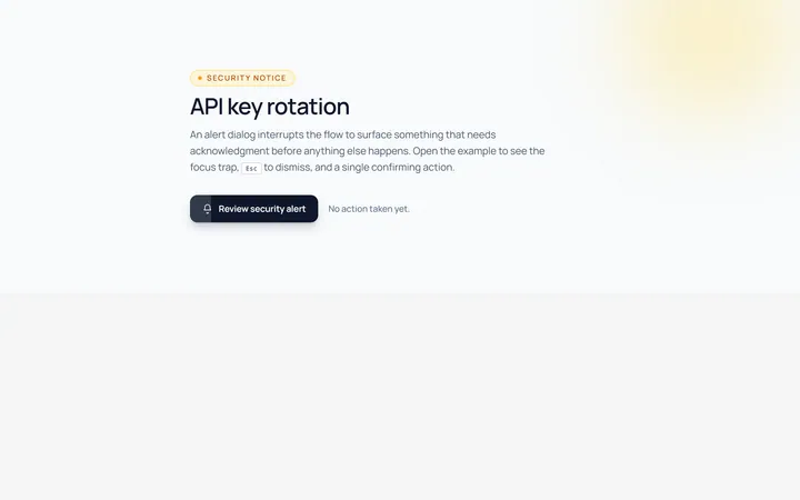
Alert Modal
Originalalert dialog with single action
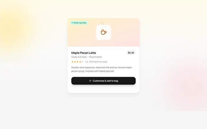
Drawer Bottom Modal
Originalbottom sheet drawer
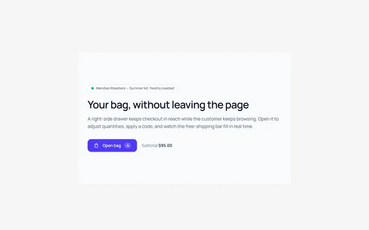
Side Drawer Modal
Originalright side drawer modal
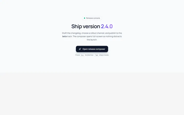
Fullscreen Modal
Originalfullscreen modal
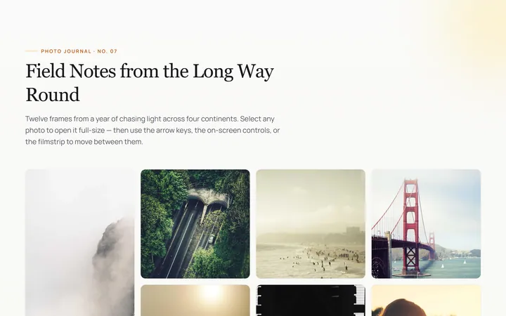
Image Lightbox Modal
Originalimage lightbox modal with nav
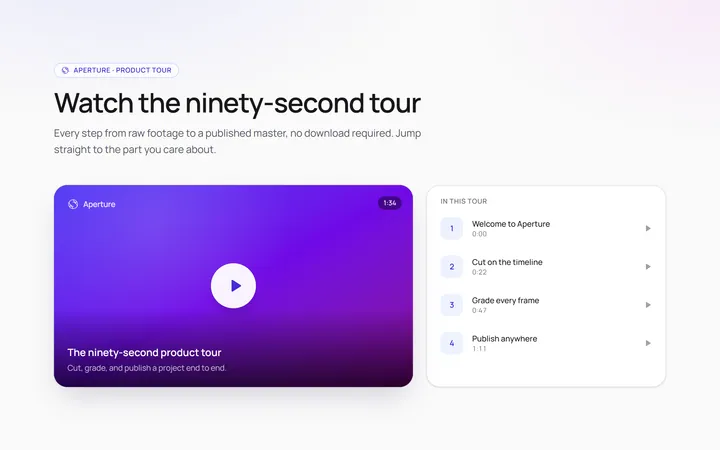
Video Modal
Originalvideo player modal
Scroll Modal
Originalmodal with long scrollable body
Command Palette Modal
Originalcommand palette modal with search