

Drawer Bottom Modal
Original · freebottom sheet drawer
byWeb InnoventixReact + Tailwind
modaldrawerbottommodals
Copy prompt gives Claude Code, Cursor or v0 a ready-to-paste prompt that recreates this exact component.
npx shadcn@latest add https://webinnoventix.com/r/modal-drawer-bottom.jsonmodal-drawer-bottom.tsx
"use client";
import {
useCallback,
useEffect,
useId,
useRef,
useState,
type KeyboardEvent as ReactKeyboardEvent,
type PointerEvent as ReactPointerEvent,
} from "react";
import {
AnimatePresence,
motion,
useDragControls,
useReducedMotion,
type PanInfo,
type Variants,
} from "motion/react";
/* ------------------------------------------------------------------ */
/* Menu data — a real, specific order sheet for a neighbourhood café. */
/* ------------------------------------------------------------------ */
const BASE_PRICE = 5.25;
const SIZE_OPTIONS = [
{ value: "small", label: "8 oz", sub: "Cortado", delta: -0.6 },
{ value: "medium", label: "12 oz", sub: "Standard", delta: 0 },
{ value: "large", label: "16 oz", sub: "Traveller", delta: 0.85 },
] as const;
const MILK_OPTIONS = [
{ value: "whole", label: "Whole", delta: 0 },
{ value: "oat", label: "Oat", delta: 0.75 },
{ value: "almond", label: "Almond", delta: 0.75 },
{ value: "none", label: "No milk", delta: 0 },
] as const;
type SizeValue = (typeof SIZE_OPTIONS)[number]["value"];
type MilkValue = (typeof MILK_OPTIONS)[number]["value"];
const money = (n: number): string => `$${n.toFixed(2)}`;
const FOCUSABLE =
'a[href],button:not([disabled]):not([tabindex="-1"]),input:not([disabled]),[tabindex="0"]';
/* ------------------------------------------------------------------ */
/* Small inline icons */
/* ------------------------------------------------------------------ */
function CupIcon({ className }: { className?: string }) {
return (
<svg
viewBox="0 0 24 24"
fill="none"
stroke="currentColor"
strokeWidth={1.6}
strokeLinecap="round"
strokeLinejoin="round"
className={className}
aria-hidden="true"
>
<path d="M5 8h11v6a4 4 0 0 1-4 4H9a4 4 0 0 1-4-4V8Z" />
<path d="M16 9h2.2a2.3 2.3 0 0 1 0 4.6H16" />
<path d="M8 3.5c-.5.7-.5 1.3 0 2M11.5 3.5c-.5.7-.5 1.3 0 2" />
</svg>
);
}
function CloseIcon({ className }: { className?: string }) {
return (
<svg
viewBox="0 0 24 24"
fill="none"
stroke="currentColor"
strokeWidth={1.8}
strokeLinecap="round"
className={className}
aria-hidden="true"
>
<path d="m6 6 12 12M18 6 6 18" />
</svg>
);
}
function Star({ filled }: { filled: boolean }) {
return (
<svg viewBox="0 0 24 24" className="h-3.5 w-3.5" aria-hidden="true">
<path
d="m12 3.5 2.6 5.3 5.8.85-4.2 4.1 1 5.8L12 17.9 6.8 20.6l1-5.8-4.2-4.1 5.8-.85L12 3.5Z"
className={
filled
? "fill-amber-500 dark:fill-amber-400"
: "fill-neutral-300 dark:fill-neutral-700"
}
/>
</svg>
);
}
/* ------------------------------------------------------------------ */
/* Segmented radio — accessible radiogroup with roving tabindex. */
/* ------------------------------------------------------------------ */
function Segmented<T extends string>({
label,
hint,
options,
value,
onChange,
}: {
label: string;
hint?: string;
options: readonly { value: T; label: string; sub?: string; delta: number }[];
value: T;
onChange: (v: T) => void;
}) {
const groupRef = useRef<HTMLDivElement>(null);
const onKey = (e: ReactKeyboardEvent<HTMLButtonElement>, index: number) => {
const dir =
e.key === "ArrowRight" || e.key === "ArrowDown"
? 1
: e.key === "ArrowLeft" || e.key === "ArrowUp"
? -1
: 0;
if (dir === 0) return;
e.preventDefault();
const next = (index + dir + options.length) % options.length;
onChange(options[next].value);
const radios =
groupRef.current?.querySelectorAll<HTMLButtonElement>('[role="radio"]');
radios?.[next]?.focus();
};
return (
<div>
<div className="mb-2 flex items-baseline justify-between">
<span className="text-sm font-semibold text-neutral-800 dark:text-neutral-100">
{label}
</span>
{hint ? (
<span className="text-xs text-neutral-500 dark:text-neutral-400">
{hint}
</span>
) : null}
</div>
<div
ref={groupRef}
role="radiogroup"
aria-label={label}
className="grid grid-cols-3 gap-2"
>
{options.map((opt, i) => {
const active = opt.value === value;
return (
<button
key={opt.value}
type="button"
role="radio"
aria-checked={active}
tabIndex={active ? 0 : -1}
onClick={() => onChange(opt.value)}
onKeyDown={(e) => onKey(e, i)}
className={[
"group relative flex flex-col items-center gap-0.5 rounded-2xl border px-2 py-3 text-center transition-colors",
"focus-visible:outline-none focus-visible:ring-2 focus-visible:ring-amber-500 focus-visible:ring-offset-2 focus-visible:ring-offset-white dark:focus-visible:ring-amber-400 dark:focus-visible:ring-offset-neutral-900",
active
? "border-amber-500 bg-amber-50 dark:border-amber-400/70 dark:bg-amber-400/10"
: "border-neutral-200 bg-white hover:border-neutral-300 dark:border-neutral-700 dark:bg-neutral-800/60 dark:hover:border-neutral-600",
].join(" ")}
>
<span
className={[
"text-sm font-semibold",
active
? "text-amber-700 dark:text-amber-300"
: "text-neutral-800 dark:text-neutral-100",
].join(" ")}
>
{opt.label}
</span>
{opt.sub ? (
<span className="text-[11px] text-neutral-500 dark:text-neutral-400">
{opt.sub}
</span>
) : null}
{opt.delta !== 0 ? (
<span className="text-[11px] font-medium text-neutral-400 dark:text-neutral-500">
{opt.delta > 0 ? `+${money(opt.delta)}` : money(opt.delta)}
</span>
) : null}
</button>
);
})}
</div>
</div>
);
}
/* ------------------------------------------------------------------ */
/* Stepper — accessible numeric control with live announcement. */
/* ------------------------------------------------------------------ */
function Stepper({
label,
value,
min,
max,
onChange,
suffix,
}: {
label: string;
value: number;
min: number;
max: number;
onChange: (v: number) => void;
suffix?: string;
}) {
const dec = () => onChange(Math.max(min, value - 1));
const inc = () => onChange(Math.min(max, value + 1));
const btn =
"flex h-9 w-9 items-center justify-center rounded-full border text-lg leading-none transition-colors focus-visible:outline-none focus-visible:ring-2 focus-visible:ring-amber-500 focus-visible:ring-offset-2 focus-visible:ring-offset-white disabled:cursor-not-allowed disabled:opacity-40 dark:focus-visible:ring-amber-400 dark:focus-visible:ring-offset-neutral-900 border-neutral-200 bg-white text-neutral-700 hover:border-neutral-300 hover:bg-neutral-50 dark:border-neutral-700 dark:bg-neutral-800 dark:text-neutral-200 dark:hover:border-neutral-600";
return (
<div className="flex items-center justify-between">
<span className="text-sm font-semibold text-neutral-800 dark:text-neutral-100">
{label}
</span>
<div className="flex items-center gap-3">
<button
type="button"
onClick={dec}
disabled={value <= min}
aria-label={`Decrease ${label.toLowerCase()}`}
className={btn}
>
<span aria-hidden="true">−</span>
</button>
<span
aria-live="polite"
className="min-w-[3.25rem] text-center text-sm font-semibold tabular-nums text-neutral-800 dark:text-neutral-100"
>
{value}
{suffix ? (
<span className="ml-0.5 text-neutral-400 dark:text-neutral-500">
{suffix}
</span>
) : null}
</span>
<button
type="button"
onClick={inc}
disabled={value >= max}
aria-label={`Increase ${label.toLowerCase()}`}
className={btn}
>
<span aria-hidden="true">+</span>
</button>
</div>
</div>
);
}
/* ------------------------------------------------------------------ */
/* Main component */
/* ------------------------------------------------------------------ */
export default function ModalDrawerBottom() {
const reduce = useReducedMotion();
const [open, setOpen] = useState(false);
const [size, setSize] = useState<SizeValue>("medium");
const [milk, setMilk] = useState<MilkValue>("oat");
const [shots, setShots] = useState(1);
const [iced, setIced] = useState(false);
const [qty, setQty] = useState(1);
const [added, setAdded] = useState(false);
const sheetRef = useRef<HTMLDivElement>(null);
const closeBtnRef = useRef<HTMLButtonElement>(null);
const triggerRef = useRef<HTMLButtonElement>(null);
const dragControls = useDragControls();
const titleId = useId();
const descId = useId();
const close = useCallback(() => setOpen(false), []);
const sizeDelta = SIZE_OPTIONS.find((o) => o.value === size)?.delta ?? 0;
const milkDelta = MILK_OPTIONS.find((o) => o.value === milk)?.delta ?? 0;
const unit = BASE_PRICE + sizeDelta + milkDelta + shots * 0.85;
const total = unit * qty;
/* body scroll lock + focus management */
useEffect(() => {
if (!open) return;
const prevActive = triggerRef.current;
const prevOverflow = document.body.style.overflow;
document.body.style.overflow = "hidden";
const t = window.setTimeout(() => closeBtnRef.current?.focus(), 60);
return () => {
window.clearTimeout(t);
document.body.style.overflow = prevOverflow;
prevActive?.focus();
};
}, [open]);
/* focus trap + escape, scoped to the dialog */
const onDialogKeyDown = (e: ReactKeyboardEvent<HTMLDivElement>) => {
if (e.key === "Escape") {
e.stopPropagation();
close();
return;
}
if (e.key !== "Tab") return;
const nodes = sheetRef.current?.querySelectorAll<HTMLElement>(FOCUSABLE);
if (!nodes || nodes.length === 0) return;
const list = Array.from(nodes);
const first = list[0];
const last = list[list.length - 1];
const active = document.activeElement;
if (e.shiftKey && active === first) {
e.preventDefault();
last.focus();
} else if (!e.shiftKey && active === last) {
e.preventDefault();
first.focus();
}
};
const onDragEnd = (
_e: MouseEvent | TouchEvent | PointerEvent,
info: PanInfo,
) => {
if (info.offset.y > 120 || info.velocity.y > 700) close();
};
const startDrag = (e: ReactPointerEvent<HTMLDivElement>) => {
if (reduce) return;
dragControls.start(e);
};
const handleAdd = () => {
setAdded(true);
close();
window.setTimeout(() => setAdded(false), 2600);
};
const listVariants: Variants = {
hidden: {},
show: {
transition: {
staggerChildren: reduce ? 0 : 0.05,
delayChildren: reduce ? 0 : 0.06,
},
},
};
const itemVariants: Variants = {
hidden: reduce ? { opacity: 0 } : { opacity: 0, y: 14 },
show: {
opacity: 1,
y: 0,
transition: { duration: reduce ? 0.2 : 0.4, ease: [0.22, 1, 0.36, 1] },
},
};
const sheetTransition = reduce
? { duration: 0.15 }
: { type: "spring" as const, stiffness: 360, damping: 38, mass: 0.9 };
return (
<section className="relative w-full overflow-hidden bg-gradient-to-b from-amber-50 via-neutral-50 to-neutral-100 px-5 py-20 sm:py-28 dark:from-neutral-950 dark:via-neutral-900 dark:to-neutral-950">
<style>{`
@keyframes mdb-steam {
0% { opacity: 0; transform: translateY(2px) scaleX(1); }
35% { opacity: 0.6; }
100% { opacity: 0; transform: translateY(-16px) scaleX(1.5); }
}
@keyframes mdb-float {
0%, 100% { transform: translate3d(0,0,0); }
50% { transform: translate3d(0,-22px,0); }
}
@media (prefers-reduced-motion: reduce) {
.mdb-steam-el, .mdb-orb { animation: none !important; }
}
`}</style>
{/* atmosphere */}
<div aria-hidden="true" className="pointer-events-none absolute inset-0">
<div
className="mdb-orb absolute -left-24 top-10 h-72 w-72 rounded-full bg-amber-300/30 blur-3xl dark:bg-amber-500/10"
style={{ animation: "mdb-float 13s ease-in-out infinite" }}
/>
<div
className="mdb-orb absolute -right-16 bottom-0 h-80 w-80 rounded-full bg-rose-300/20 blur-3xl dark:bg-rose-500/10"
style={{ animation: "mdb-float 17s ease-in-out infinite 1.5s" }}
/>
</div>
{/* ---- context card / trigger ---- */}
<div className="relative mx-auto max-w-md">
<div className="overflow-hidden rounded-3xl border border-neutral-200/80 bg-white/80 shadow-xl shadow-neutral-900/5 backdrop-blur-sm dark:border-neutral-800 dark:bg-neutral-900/70 dark:shadow-black/30">
<div className="relative flex h-44 items-center justify-center bg-gradient-to-br from-amber-100 to-rose-100 dark:from-neutral-800 dark:to-neutral-900">
<div className="relative">
<div className="flex h-24 w-24 items-center justify-center rounded-3xl bg-white/80 text-amber-700 shadow-inner dark:bg-neutral-950/60 dark:text-amber-300">
<CupIcon className="h-12 w-12" />
</div>
<div
aria-hidden="true"
className="pointer-events-none absolute inset-x-0 -top-4 flex justify-center gap-2"
>
{[0, 1, 2].map((i) => (
<span
key={i}
className="mdb-steam-el h-5 w-1 rounded-full bg-neutral-400/40 dark:bg-white/20"
style={{
animation: "mdb-steam 3s ease-in-out infinite",
animationDelay: `${i * 0.7}s`,
}}
/>
))}
</div>
</div>
<span className="absolute left-4 top-4 inline-flex items-center gap-1.5 rounded-full bg-emerald-100 px-2.5 py-1 text-[11px] font-semibold text-emerald-700 dark:bg-emerald-500/15 dark:text-emerald-300">
<span className="h-1.5 w-1.5 rounded-full bg-emerald-500" />
Roasting today
</span>
</div>
<div className="p-6">
<div className="flex items-start justify-between gap-3">
<div>
<h2 className="text-lg font-bold tracking-tight text-neutral-900 dark:text-white">
Maple Pecan Latte
</h2>
<p className="mt-0.5 text-sm text-neutral-500 dark:text-neutral-400">
Cedar & Ember — Rivermarket
</p>
</div>
<span className="shrink-0 rounded-xl bg-neutral-100 px-2.5 py-1 text-sm font-bold text-neutral-900 dark:bg-neutral-800 dark:text-white">
{money(BASE_PRICE)}
</span>
</div>
<div className="mt-3 flex items-center gap-2">
<span className="flex gap-0.5" aria-hidden="true">
{[0, 1, 2, 3, 4].map((i) => (
<Star key={i} filled={i < 4} />
))}
</span>
<span className="text-xs text-neutral-500 dark:text-neutral-400">
4.6 · 218 orders this week
</span>
</div>
<p className="mt-4 text-sm leading-relaxed text-neutral-600 dark:text-neutral-300">
Double-shot espresso, steamed milk and our house maple-pecan syrup,
finished with flaked sea salt.
</p>
<button
ref={triggerRef}
type="button"
onClick={() => setOpen(true)}
aria-haspopup="dialog"
aria-expanded={open}
className="mt-6 flex w-full items-center justify-center gap-2 rounded-2xl bg-neutral-900 px-5 py-3.5 text-sm font-semibold text-white shadow-lg shadow-neutral-900/20 transition-transform hover:-translate-y-0.5 active:translate-y-0 focus-visible:outline-none focus-visible:ring-2 focus-visible:ring-amber-500 focus-visible:ring-offset-2 focus-visible:ring-offset-white dark:bg-white dark:text-neutral-900 dark:focus-visible:ring-amber-400 dark:focus-visible:ring-offset-neutral-900"
>
<CupIcon className="h-4 w-4" />
Customise & add to bag
</button>
<p
aria-live="polite"
className={[
"mt-3 text-center text-xs font-medium transition-opacity",
added
? "text-emerald-600 opacity-100 dark:text-emerald-400"
: "text-transparent opacity-0",
].join(" ")}
>
Added to your bag — thanks!
</p>
</div>
</div>
</div>
{/* ---- bottom sheet ---- */}
<AnimatePresence>
{open ? (
<motion.div
key="mdb-backdrop"
className="fixed inset-0 z-40 bg-neutral-950/50 backdrop-blur-sm"
initial={{ opacity: 0 }}
animate={{ opacity: 1 }}
exit={{ opacity: 0 }}
transition={{ duration: reduce ? 0.15 : 0.25 }}
onClick={close}
/>
) : null}
{open ? (
<motion.div
key="mdb-wrap"
className="pointer-events-none fixed inset-x-0 bottom-0 z-50 flex justify-center px-0 sm:px-4 sm:pb-4"
>
<motion.div
ref={sheetRef}
role="dialog"
aria-modal="true"
aria-labelledby={titleId}
aria-describedby={descId}
onKeyDown={onDialogKeyDown}
className="pointer-events-auto flex max-h-[88vh] w-full max-w-md flex-col overflow-hidden rounded-t-3xl border border-neutral-200 bg-white shadow-2xl shadow-black/30 sm:rounded-3xl dark:border-neutral-800 dark:bg-neutral-900"
drag={reduce ? false : "y"}
dragControls={dragControls}
dragListener={false}
dragConstraints={{ top: 0, bottom: 0 }}
dragElastic={{ top: 0, bottom: 0.55 }}
onDragEnd={onDragEnd}
initial={{ y: "100%" }}
animate={{ y: 0 }}
exit={{ y: "100%" }}
transition={sheetTransition}
>
{/* grab zone */}
<div
role="presentation"
onPointerDown={startDrag}
style={{ touchAction: "none" }}
className="flex cursor-grab flex-col items-center pt-3 active:cursor-grabbing"
>
<span className="h-1.5 w-11 rounded-full bg-neutral-300 dark:bg-neutral-700" />
</div>
{/* header */}
<div className="flex items-start justify-between gap-3 px-6 pb-4 pt-3">
<div>
<h2
id={titleId}
className="text-lg font-bold tracking-tight text-neutral-900 dark:text-white"
>
Build your latte
</h2>
<p
id={descId}
className="mt-0.5 text-sm text-neutral-500 dark:text-neutral-400"
>
Maple Pecan Latte · pickup in ~7 min
</p>
</div>
<button
ref={closeBtnRef}
type="button"
onClick={close}
aria-label="Close order sheet"
className="flex h-9 w-9 shrink-0 items-center justify-center rounded-full border border-neutral-200 text-neutral-500 transition-colors hover:bg-neutral-100 hover:text-neutral-800 focus-visible:outline-none focus-visible:ring-2 focus-visible:ring-amber-500 focus-visible:ring-offset-2 focus-visible:ring-offset-white dark:border-neutral-700 dark:text-neutral-400 dark:hover:bg-neutral-800 dark:hover:text-neutral-100 dark:focus-visible:ring-amber-400 dark:focus-visible:ring-offset-neutral-900"
>
<CloseIcon className="h-4 w-4" />
</button>
</div>
{/* scrollable body */}
<motion.div
variants={listVariants}
initial="hidden"
animate="show"
className="flex-1 space-y-6 overflow-y-auto px-6 pb-2"
>
<motion.div variants={itemVariants}>
<Segmented
label="Size"
hint="Ceramic or paper"
options={SIZE_OPTIONS}
value={size}
onChange={setSize}
/>
</motion.div>
<motion.div variants={itemVariants}>
<Segmented
label="Milk"
hint="Barista-grade"
options={MILK_OPTIONS.slice(0, 3)}
value={milk === "none" ? "whole" : milk}
onChange={setMilk}
/>
<button
type="button"
role="checkbox"
aria-checked={milk === "none"}
onClick={() =>
setMilk((m) => (m === "none" ? "whole" : "none"))
}
className="mt-2 inline-flex items-center gap-2 rounded-full px-1 py-1 text-xs font-medium text-neutral-500 focus-visible:outline-none focus-visible:ring-2 focus-visible:ring-amber-500 focus-visible:ring-offset-2 focus-visible:ring-offset-white dark:text-neutral-400 dark:focus-visible:ring-amber-400 dark:focus-visible:ring-offset-neutral-900"
>
<span
className={[
"flex h-4 w-4 items-center justify-center rounded border transition-colors",
milk === "none"
? "border-amber-500 bg-amber-500 text-white dark:border-amber-400 dark:bg-amber-400 dark:text-neutral-900"
: "border-neutral-300 dark:border-neutral-600",
].join(" ")}
>
{milk === "none" ? (
<svg
viewBox="0 0 16 16"
className="h-3 w-3"
aria-hidden="true"
>
<path
d="m3.5 8.5 3 3 6-6.5"
fill="none"
stroke="currentColor"
strokeWidth={2}
strokeLinecap="round"
strokeLinejoin="round"
/>
</svg>
) : null}
</span>
Make it black — no milk
</button>
</motion.div>
<motion.div
variants={itemVariants}
className="rounded-2xl border border-neutral-200 bg-neutral-50/60 px-4 py-3 dark:border-neutral-800 dark:bg-neutral-800/40"
>
<Stepper
label="Espresso shots"
value={shots}
min={1}
max={4}
suffix="×"
onChange={setShots}
/>
<p className="mt-1 text-xs text-neutral-400 dark:text-neutral-500">
{money(0.85)} per extra shot
</p>
</motion.div>
<motion.div
variants={itemVariants}
className="flex items-center justify-between"
>
<div>
<span className="text-sm font-semibold text-neutral-800 dark:text-neutral-100">
Serve iced
</span>
<p className="text-xs text-neutral-400 dark:text-neutral-500">
Over slow-melt cubes
</p>
</div>
<button
type="button"
role="switch"
aria-checked={iced}
aria-label="Serve iced"
onClick={() => setIced((v) => !v)}
className={[
"relative inline-flex h-7 w-12 items-center rounded-full transition-colors focus-visible:outline-none focus-visible:ring-2 focus-visible:ring-amber-500 focus-visible:ring-offset-2 focus-visible:ring-offset-white dark:focus-visible:ring-amber-400 dark:focus-visible:ring-offset-neutral-900",
iced
? "bg-sky-500 dark:bg-sky-500"
: "bg-neutral-300 dark:bg-neutral-700",
].join(" ")}
>
<span
className={[
"inline-block h-5 w-5 transform rounded-full bg-white shadow transition-transform",
iced ? "translate-x-6" : "translate-x-1",
].join(" ")}
/>
</button>
</motion.div>
</motion.div>
{/* footer */}
<div className="border-t border-neutral-200 bg-white/95 px-6 pb-6 pt-4 backdrop-blur dark:border-neutral-800 dark:bg-neutral-900/95">
<div className="mb-3 flex items-center justify-between">
<Stepper
label="Quantity"
value={qty}
min={1}
max={9}
onChange={setQty}
/>
</div>
<button
type="button"
onClick={handleAdd}
className="flex w-full items-center justify-between gap-2 rounded-2xl bg-amber-500 px-5 py-4 text-sm font-bold text-neutral-950 shadow-lg shadow-amber-500/25 transition-transform hover:-translate-y-0.5 active:translate-y-0 focus-visible:outline-none focus-visible:ring-2 focus-visible:ring-amber-600 focus-visible:ring-offset-2 focus-visible:ring-offset-white dark:focus-visible:ring-amber-300 dark:focus-visible:ring-offset-neutral-900"
>
<span>Add {qty > 1 ? `${qty} ` : ""}to bag</span>
<span aria-live="polite" className="tabular-nums">
{money(total)}
</span>
</button>
</div>
</motion.div>
</motion.div>
) : null}
</AnimatePresence>
</section>
);
}Dependencies
motion
Licence
Built by Web Innoventix. Free for personal and commercial use, no attribution required.
Built by Web Innoventix
Need a custom interface, a full website, or SEO that gets you cited by AI? We design, build and rank it end to end.
Get a free quoteSimilar components
Browse all →
Basic Modal
Originalbasic centred modal with overlay
Center Modal
Originalcentred modal with icon and actions
Form Modal
Originalmodal containing a form
Confirm Modal
Originalconfirm/destructive dialog
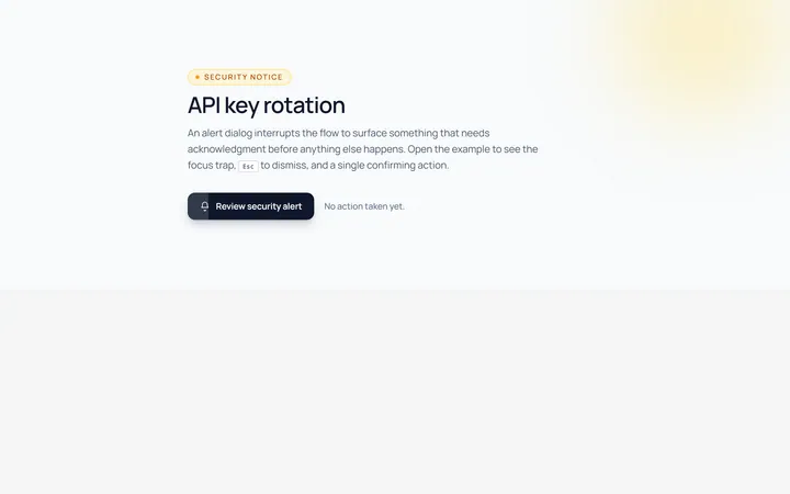
Alert Modal
Originalalert dialog with single action
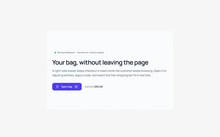
Side Drawer Modal
Originalright side drawer modal
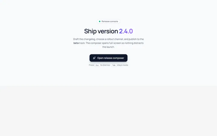
Fullscreen Modal
Originalfullscreen modal
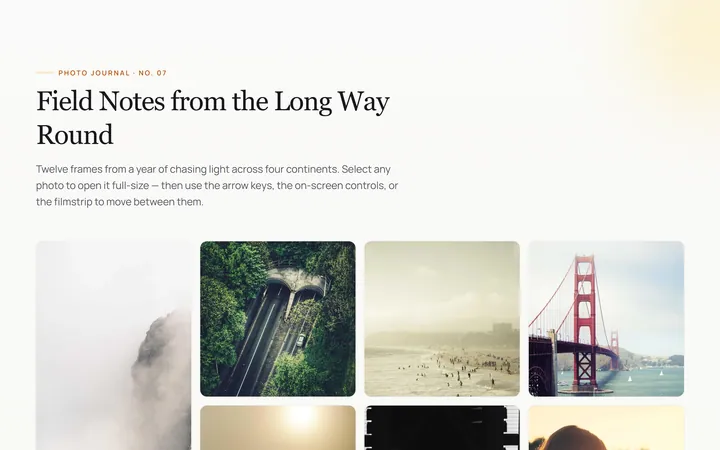
Image Lightbox Modal
Originalimage lightbox modal with nav
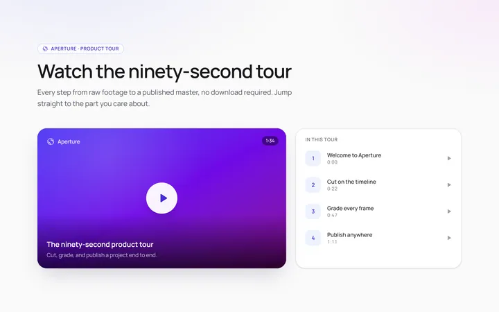
Video Modal
Originalvideo player modal
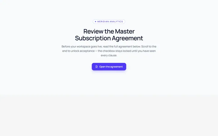
Scroll Modal
Originalmodal with long scrollable body
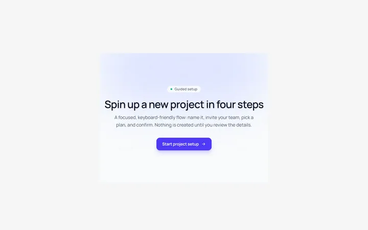
Steps Modal
Originalmulti-step modal flow
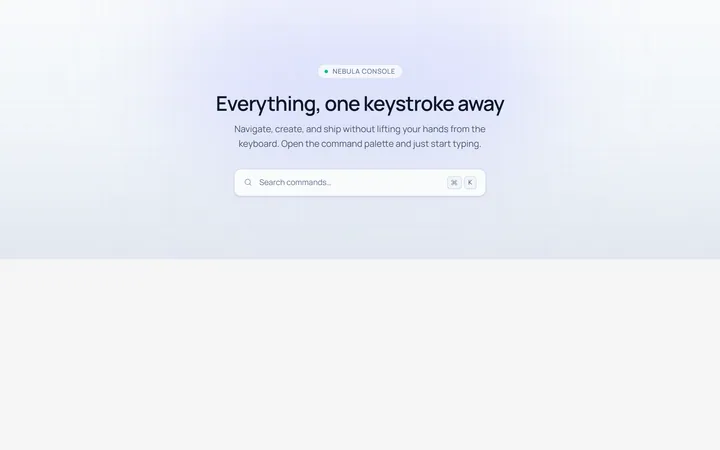
Command Palette Modal
Originalcommand palette modal with search