

Fullscreen Modal
Original · freefullscreen modal
byWeb InnoventixReact + Tailwind
modalfullscreenmodals
Copy prompt gives Claude Code, Cursor or v0 a ready-to-paste prompt that recreates this exact component.
npx shadcn@latest add https://webinnoventix.com/r/modal-fullscreen.jsonmodal-fullscreen.tsx
"use client";
import {
useCallback,
useEffect,
useId,
useRef,
useState,
type ChangeEvent,
type KeyboardEvent as ReactKeyboardEvent,
} from "react";
import {
AnimatePresence,
motion,
useReducedMotion,
type Variants,
} from "motion/react";
const CHANNELS = [
{ id: "stable", label: "Stable", hint: "Everyone on the default track" },
{ id: "beta", label: "Beta", hint: "Opt-in early adopters" },
{ id: "canary", label: "Canary", hint: "Internal & power users" },
] as const;
type ChannelId = (typeof CHANNELS)[number]["id"];
const HIGHLIGHT_LIMIT = 280;
const SUBSCRIBERS = 12480;
const FOCUSABLE_SELECTOR =
'a[href],button:not([disabled]),textarea:not([disabled]),input:not([disabled]),select:not([disabled]),[tabindex]:not([tabindex="-1"])';
export default function ModalFullscreen() {
const reduce = useReducedMotion();
const [open, setOpen] = useState(false);
const [status, setStatus] = useState<"editing" | "published">("editing");
const [version, setVersion] = useState("2.4.0");
const [title, setTitle] = useState("Realtime collaboration, everywhere");
const [highlights, setHighlights] = useState(
"Cursors, comments, and presence now sync in under 40ms. Offline edits reconcile automatically when you reconnect.",
);
const [channel, setChannel] = useState<ChannelId>("beta");
const [notify, setNotify] = useState(true);
const dialogRef = useRef<HTMLDivElement | null>(null);
const initialFocusRef = useRef<HTMLInputElement | null>(null);
const triggerRef = useRef<HTMLButtonElement | null>(null);
const previouslyFocused = useRef<HTMLElement | null>(null);
const channelRefs = useRef<(HTMLButtonElement | null)[]>([]);
const headingId = useId();
const descId = useId();
const versionId = useId();
const titleId = useId();
const highlightsId = useId();
const counterId = useId();
const channelLabelId = useId();
const notifyLabelId = useId();
const notifyDescId = useId();
const overLimit = highlights.length > HIGHLIGHT_LIMIT;
const remaining = HIGHLIGHT_LIMIT - highlights.length;
const canPublish =
version.trim().length > 0 && title.trim().length > 0 && !overLimit;
const openModal = useCallback(() => {
setStatus("editing");
setOpen(true);
}, []);
const closeModal = useCallback(() => {
setOpen(false);
}, []);
// Focus trap, scroll lock, Escape + Tab handling, focus restore.
useEffect(() => {
if (!open) return;
const dialog = dialogRef.current;
previouslyFocused.current =
(document.activeElement as HTMLElement | null) ?? triggerRef.current;
const prevOverflow = document.body.style.overflow;
document.body.style.overflow = "hidden";
const focusStart = window.setTimeout(() => {
if (initialFocusRef.current) initialFocusRef.current.focus();
else dialog?.focus();
}, 0);
const onKeyDown = (event: KeyboardEvent) => {
if (event.key === "Escape") {
event.preventDefault();
setOpen(false);
return;
}
if (event.key !== "Tab" || !dialog) return;
const nodes = Array.from(
dialog.querySelectorAll<HTMLElement>(FOCUSABLE_SELECTOR),
).filter((el) => el.getClientRects().length > 0);
if (nodes.length === 0) {
event.preventDefault();
return;
}
const first = nodes[0];
const last = nodes[nodes.length - 1];
const active = document.activeElement as HTMLElement | null;
if (event.shiftKey) {
if (active === first || !dialog.contains(active)) {
event.preventDefault();
last.focus();
}
} else if (active === last || !dialog.contains(active)) {
event.preventDefault();
first.focus();
}
};
document.addEventListener("keydown", onKeyDown, true);
return () => {
window.clearTimeout(focusStart);
document.removeEventListener("keydown", onKeyDown, true);
document.body.style.overflow = prevOverflow;
const restore = previouslyFocused.current;
if (restore && typeof restore.focus === "function") restore.focus();
};
}, [open]);
const onChannelKeyDown = (
event: ReactKeyboardEvent<HTMLButtonElement>,
index: number,
) => {
let next = index;
if (event.key === "ArrowRight" || event.key === "ArrowDown") {
next = (index + 1) % CHANNELS.length;
} else if (event.key === "ArrowLeft" || event.key === "ArrowUp") {
next = (index - 1 + CHANNELS.length) % CHANNELS.length;
} else if (event.key === "Home") {
next = 0;
} else if (event.key === "End") {
next = CHANNELS.length - 1;
} else {
return;
}
event.preventDefault();
setChannel(CHANNELS[next].id);
channelRefs.current[next]?.focus();
};
const dur = reduce ? 0 : 0.42;
const backdropVariants: Variants = {
hidden: { opacity: 0 },
visible: { opacity: 1, transition: { duration: dur * 0.6 } },
exit: { opacity: 0, transition: { duration: dur * 0.5 } },
};
const panelVariants: Variants = {
hidden: { opacity: 0, scale: reduce ? 1 : 0.985, y: reduce ? 0 : 14 },
visible: {
opacity: 1,
scale: 1,
y: 0,
transition: { duration: dur, ease: "easeOut" },
},
exit: {
opacity: 0,
scale: reduce ? 1 : 0.99,
y: reduce ? 0 : 8,
transition: { duration: dur * 0.6, ease: "easeIn" },
},
};
const currentChannel = CHANNELS.find((c) => c.id === channel) ?? CHANNELS[0];
return (
<section className="relative w-full overflow-hidden bg-slate-50 px-5 py-20 text-slate-900 sm:px-8 md:py-28 dark:bg-slate-950 dark:text-slate-100">
<style>{`
@keyframes fsm_aurora {
0% { transform: translate3d(-8%, 0, 0) scale(1.05); opacity: .7; }
50% { transform: translate3d(8%, -6%, 0) scale(1.15); opacity: 1; }
100% { transform: translate3d(-8%, 0, 0) scale(1.05); opacity: .7; }
}
@keyframes fsm_sheen {
0% { background-position: 0% 50%; }
100% { background-position: 200% 50%; }
}
.fsm-aurora { animation: fsm_aurora 14s ease-in-out infinite; }
.fsm-sheen {
background-size: 200% 100%;
animation: fsm_sheen 6s linear infinite;
}
@media (prefers-reduced-motion: reduce) {
.fsm-aurora, .fsm-sheen { animation: none !important; }
}
`}</style>
{/* Ambient backdrop texture */}
<div
aria-hidden="true"
className="pointer-events-none absolute inset-0 -z-10 opacity-70"
>
<div className="fsm-aurora absolute -top-24 left-1/2 h-72 w-[42rem] -translate-x-1/2 rounded-full bg-gradient-to-tr from-indigo-300/40 via-violet-300/30 to-sky-200/40 blur-3xl dark:from-indigo-600/25 dark:via-violet-600/20 dark:to-sky-700/20" />
<div
className="absolute inset-0 opacity-[0.35] dark:opacity-[0.25]"
style={{
backgroundImage:
"linear-gradient(to right, rgba(100,116,139,.12) 1px, transparent 1px), linear-gradient(to bottom, rgba(100,116,139,.12) 1px, transparent 1px)",
backgroundSize: "44px 44px",
maskImage:
"radial-gradient(ellipse 70% 60% at 50% 40%, black, transparent)",
WebkitMaskImage:
"radial-gradient(ellipse 70% 60% at 50% 40%, black, transparent)",
}}
/>
</div>
{/* ---- Trigger / context canvas ---- */}
<div className="mx-auto max-w-2xl text-center">
<span className="inline-flex items-center gap-2 rounded-full border border-slate-300/70 bg-white/70 px-3 py-1 text-xs font-medium tracking-wide text-slate-600 backdrop-blur dark:border-slate-700/70 dark:bg-slate-900/60 dark:text-slate-300">
<span className="relative flex h-2 w-2">
<span className="absolute inline-flex h-full w-full animate-ping rounded-full bg-emerald-400 opacity-60" />
<span className="relative inline-flex h-2 w-2 rounded-full bg-emerald-500" />
</span>
Release console
</span>
<h2 className="mt-6 text-balance text-3xl font-semibold tracking-tight sm:text-4xl">
Ship version{" "}
<span className="bg-gradient-to-r from-indigo-600 to-violet-500 bg-clip-text text-transparent dark:from-indigo-400 dark:to-violet-300">
{version || "—"}
</span>
</h2>
<p className="mx-auto mt-4 max-w-md text-pretty text-sm leading-relaxed text-slate-600 dark:text-slate-400">
Draft the changelog, choose a rollout channel, and publish to the{" "}
<span className="font-medium text-slate-800 dark:text-slate-200">
{currentChannel.label.toLowerCase()}
</span>{" "}
track. The composer opens full-screen so nothing distracts the launch.
</p>
<button
ref={triggerRef}
type="button"
onClick={openModal}
aria-haspopup="dialog"
aria-expanded={open}
className="group mt-8 inline-flex items-center gap-2.5 rounded-xl bg-slate-900 px-5 py-3 text-sm font-semibold text-white shadow-lg shadow-slate-900/20 transition hover:-translate-y-0.5 hover:bg-slate-800 focus-visible:outline-none focus-visible:ring-2 focus-visible:ring-indigo-500 focus-visible:ring-offset-2 focus-visible:ring-offset-slate-50 dark:bg-white dark:text-slate-900 dark:shadow-black/40 dark:hover:bg-slate-100 dark:focus-visible:ring-offset-slate-950"
>
<RocketIcon className="h-4 w-4 transition-transform duration-300 group-hover:-translate-y-0.5 group-hover:translate-x-0.5" />
Open release composer
</button>
<p className="mt-3 text-xs text-slate-500 dark:text-slate-500">
Press{" "}
<kbd className="rounded border border-slate-300 bg-white px-1.5 py-0.5 font-mono text-[11px] text-slate-600 dark:border-slate-700 dark:bg-slate-900 dark:text-slate-400">
Esc
</kbd>{" "}
to dismiss ·{" "}
<kbd className="rounded border border-slate-300 bg-white px-1.5 py-0.5 font-mono text-[11px] text-slate-600 dark:border-slate-700 dark:bg-slate-900 dark:text-slate-400">
Tab
</kbd>{" "}
stays inside
</p>
</div>
{/* ---- Fullscreen modal ---- */}
<AnimatePresence>
{open && (
<motion.div
key="fsm-backdrop"
variants={backdropVariants}
initial="hidden"
animate="visible"
exit="exit"
className="fixed inset-0 z-50 bg-slate-950/40 backdrop-blur-sm"
>
<motion.div
key="fsm-panel"
ref={dialogRef}
role="dialog"
aria-modal="true"
aria-labelledby={headingId}
aria-describedby={descId}
tabIndex={-1}
variants={panelVariants}
initial="hidden"
animate="visible"
exit="exit"
className="fixed inset-0 flex flex-col bg-white outline-none dark:bg-slate-950"
>
{/* Header */}
<header className="relative shrink-0 border-b border-slate-200 bg-white/80 backdrop-blur dark:border-slate-800 dark:bg-slate-950/80">
<div
aria-hidden="true"
className="fsm-sheen absolute inset-x-0 top-0 h-px bg-gradient-to-r from-transparent via-indigo-500 to-transparent"
/>
<div className="mx-auto flex w-full max-w-3xl items-center justify-between gap-4 px-5 py-4 sm:px-8">
<div className="flex min-w-0 items-center gap-3">
<span className="flex h-9 w-9 shrink-0 items-center justify-center rounded-lg bg-gradient-to-br from-indigo-500 to-violet-600 text-white shadow-sm">
<RocketIcon className="h-5 w-5" />
</span>
<div className="min-w-0">
<h2
id={headingId}
className="truncate text-base font-semibold tracking-tight text-slate-900 dark:text-slate-50"
>
New release
</h2>
<p
id={descId}
className="truncate text-xs text-slate-500 dark:text-slate-400"
>
Draft · autosaved just now
</p>
</div>
</div>
<button
type="button"
onClick={closeModal}
aria-label="Close release composer"
className="inline-flex h-9 w-9 shrink-0 items-center justify-center rounded-lg text-slate-500 transition hover:bg-slate-100 hover:text-slate-900 focus-visible:outline-none focus-visible:ring-2 focus-visible:ring-indigo-500 dark:text-slate-400 dark:hover:bg-slate-800 dark:hover:text-slate-50"
>
<CloseIcon className="h-5 w-5" />
</button>
</div>
</header>
{/* Body */}
<div className="relative flex-1 overflow-y-auto">
{status === "published" ? (
<div className="mx-auto flex min-h-full w-full max-w-3xl flex-col items-center justify-center px-5 py-16 text-center sm:px-8">
<span className="flex h-16 w-16 items-center justify-center rounded-2xl bg-emerald-100 text-emerald-600 dark:bg-emerald-500/15 dark:text-emerald-400">
<CheckIcon className="h-8 w-8" />
</span>
<h3 className="mt-6 text-2xl font-semibold tracking-tight text-slate-900 dark:text-slate-50">
{version} is live on {currentChannel.label}
</h3>
<p className="mt-3 max-w-sm text-sm leading-relaxed text-slate-600 dark:text-slate-400">
{notify
? `Release notes are rolling out and ${SUBSCRIBERS.toLocaleString()} subscribers are being emailed now.`
: "Release notes are rolling out. No subscriber email was sent."}
</p>
<button
type="button"
onClick={closeModal}
className="mt-8 inline-flex items-center gap-2 rounded-xl bg-slate-900 px-5 py-2.5 text-sm font-semibold text-white transition hover:bg-slate-800 focus-visible:outline-none focus-visible:ring-2 focus-visible:ring-indigo-500 focus-visible:ring-offset-2 focus-visible:ring-offset-white dark:bg-white dark:text-slate-900 dark:hover:bg-slate-100 dark:focus-visible:ring-offset-slate-950"
>
Back to console
</button>
</div>
) : (
<form
onSubmit={(e) => e.preventDefault()}
className="mx-auto w-full max-w-3xl space-y-10 px-5 py-8 sm:px-8 sm:py-10"
>
{/* Version + title */}
<div className="grid gap-5 sm:grid-cols-[9rem_1fr]">
<div>
<label
htmlFor={versionId}
className="mb-1.5 block text-sm font-medium text-slate-700 dark:text-slate-300"
>
Version
</label>
<div className="relative">
<span className="pointer-events-none absolute left-3 top-1/2 -translate-y-1/2 font-mono text-sm text-slate-400 dark:text-slate-500">
v
</span>
<input
ref={initialFocusRef}
id={versionId}
value={version}
onChange={(e: ChangeEvent<HTMLInputElement>) =>
setVersion(e.target.value)
}
inputMode="decimal"
placeholder="2.4.0"
className="w-full rounded-lg border border-slate-300 bg-white py-2.5 pl-7 pr-3 font-mono text-sm text-slate-900 shadow-sm transition placeholder:text-slate-400 focus:border-indigo-500 focus-visible:outline-none focus-visible:ring-2 focus-visible:ring-indigo-500/40 dark:border-slate-700 dark:bg-slate-900 dark:text-slate-100 dark:placeholder:text-slate-600 dark:focus:border-indigo-400"
/>
</div>
</div>
<div>
<label
htmlFor={titleId}
className="mb-1.5 block text-sm font-medium text-slate-700 dark:text-slate-300"
>
Release title
</label>
<input
id={titleId}
value={title}
onChange={(e: ChangeEvent<HTMLInputElement>) =>
setTitle(e.target.value)
}
placeholder="A short, human summary"
className="w-full rounded-lg border border-slate-300 bg-white px-3 py-2.5 text-sm text-slate-900 shadow-sm transition placeholder:text-slate-400 focus:border-indigo-500 focus-visible:outline-none focus-visible:ring-2 focus-visible:ring-indigo-500/40 dark:border-slate-700 dark:bg-slate-900 dark:text-slate-100 dark:placeholder:text-slate-600 dark:focus:border-indigo-400"
/>
</div>
</div>
{/* Highlights */}
<div>
<div className="mb-1.5 flex items-baseline justify-between gap-3">
<label
htmlFor={highlightsId}
className="text-sm font-medium text-slate-700 dark:text-slate-300"
>
Highlights
</label>
<span
id={counterId}
aria-live="polite"
className={`font-mono text-xs tabular-nums ${
overLimit
? "text-rose-600 dark:text-rose-400"
: "text-slate-400 dark:text-slate-500"
}`}
>
{remaining}
</span>
</div>
<textarea
id={highlightsId}
value={highlights}
onChange={(e: ChangeEvent<HTMLTextAreaElement>) =>
setHighlights(e.target.value)
}
rows={4}
aria-describedby={counterId}
aria-invalid={overLimit}
placeholder="What changed, and why it matters."
className={`w-full resize-y rounded-lg border bg-white px-3 py-2.5 text-sm leading-relaxed text-slate-900 shadow-sm transition placeholder:text-slate-400 focus-visible:outline-none focus-visible:ring-2 dark:bg-slate-900 dark:text-slate-100 dark:placeholder:text-slate-600 ${
overLimit
? "border-rose-400 focus:border-rose-500 focus-visible:ring-rose-500/40 dark:border-rose-500/60"
: "border-slate-300 focus:border-indigo-500 focus-visible:ring-indigo-500/40 dark:border-slate-700 dark:focus:border-indigo-400"
}`}
/>
{overLimit && (
<p className="mt-1.5 text-xs text-rose-600 dark:text-rose-400">
Trim {Math.abs(remaining)} character
{Math.abs(remaining) === 1 ? "" : "s"} to stay under
the {HIGHLIGHT_LIMIT}-character summary limit.
</p>
)}
</div>
{/* Channel — roving-tabindex radiogroup */}
<div>
<span
id={channelLabelId}
className="mb-2 block text-sm font-medium text-slate-700 dark:text-slate-300"
>
Rollout channel
</span>
<div
role="radiogroup"
aria-labelledby={channelLabelId}
className="grid gap-3 sm:grid-cols-3"
>
{CHANNELS.map((c, i) => {
const selected = c.id === channel;
return (
<button
key={c.id}
ref={(el) => {
channelRefs.current[i] = el;
}}
type="button"
role="radio"
aria-checked={selected}
tabIndex={selected ? 0 : -1}
onClick={() => setChannel(c.id)}
onKeyDown={(e) => onChannelKeyDown(e, i)}
className={`relative rounded-xl border p-4 text-left transition focus-visible:outline-none focus-visible:ring-2 focus-visible:ring-indigo-500 focus-visible:ring-offset-2 focus-visible:ring-offset-white dark:focus-visible:ring-offset-slate-950 ${
selected
? "border-indigo-500 bg-indigo-50/70 shadow-sm dark:border-indigo-400 dark:bg-indigo-500/10"
: "border-slate-200 bg-white hover:border-slate-300 hover:bg-slate-50 dark:border-slate-800 dark:bg-slate-900 dark:hover:border-slate-700"
}`}
>
<span className="flex items-center justify-between">
<span
className={`text-sm font-semibold ${
selected
? "text-indigo-700 dark:text-indigo-300"
: "text-slate-800 dark:text-slate-200"
}`}
>
{c.label}
</span>
<span
aria-hidden="true"
className={`flex h-4 w-4 items-center justify-center rounded-full border ${
selected
? "border-indigo-500 bg-indigo-500 dark:border-indigo-400 dark:bg-indigo-400"
: "border-slate-300 dark:border-slate-600"
}`}
>
{selected && (
<span className="h-1.5 w-1.5 rounded-full bg-white" />
)}
</span>
</span>
<span className="mt-1 block text-xs text-slate-500 dark:text-slate-400">
{c.hint}
</span>
</button>
);
})}
</div>
</div>
{/* Notify — ARIA switch */}
<div className="flex items-center justify-between gap-4 rounded-xl border border-slate-200 bg-slate-50/70 p-4 dark:border-slate-800 dark:bg-slate-900/60">
<div className="min-w-0">
<p
id={notifyLabelId}
className="text-sm font-medium text-slate-800 dark:text-slate-200"
>
Email subscribers
</p>
<p
id={notifyDescId}
className="mt-0.5 text-xs text-slate-500 dark:text-slate-400"
>
Send these notes to {SUBSCRIBERS.toLocaleString()}{" "}
people watching this project.
</p>
</div>
<button
type="button"
role="switch"
aria-checked={notify}
aria-labelledby={notifyLabelId}
aria-describedby={notifyDescId}
onClick={() => setNotify((v) => !v)}
className={`relative inline-flex h-6 w-11 shrink-0 items-center rounded-full transition-colors focus-visible:outline-none focus-visible:ring-2 focus-visible:ring-indigo-500 focus-visible:ring-offset-2 focus-visible:ring-offset-slate-50 dark:focus-visible:ring-offset-slate-950 ${
notify
? "bg-emerald-500 dark:bg-emerald-500"
: "bg-slate-300 dark:bg-slate-700"
}`}
>
<span
className={`inline-block h-5 w-5 transform rounded-full bg-white shadow transition-transform ${
notify ? "translate-x-5" : "translate-x-0.5"
}`}
/>
</button>
</div>
</form>
)}
</div>
{/* Footer */}
{status === "editing" && (
<footer className="shrink-0 border-t border-slate-200 bg-white/85 backdrop-blur dark:border-slate-800 dark:bg-slate-950/85">
<div className="mx-auto flex w-full max-w-3xl flex-col-reverse items-stretch gap-3 px-5 py-4 sm:flex-row sm:items-center sm:justify-between sm:px-8">
<p className="text-xs text-slate-500 dark:text-slate-400">
Publishing to{" "}
<span className="font-medium text-slate-700 dark:text-slate-300">
{currentChannel.label}
</span>
{notify ? " · notifying subscribers" : " · no email"}
</p>
<div className="flex items-center gap-3">
<button
type="button"
onClick={closeModal}
className="flex-1 rounded-lg border border-slate-300 bg-white px-4 py-2.5 text-sm font-medium text-slate-700 transition hover:bg-slate-50 focus-visible:outline-none focus-visible:ring-2 focus-visible:ring-slate-400 sm:flex-none dark:border-slate-700 dark:bg-slate-900 dark:text-slate-200 dark:hover:bg-slate-800"
>
Discard
</button>
<button
type="button"
onClick={() => canPublish && setStatus("published")}
disabled={!canPublish}
className="flex-1 inline-flex items-center justify-center gap-2 rounded-lg bg-indigo-600 px-4 py-2.5 text-sm font-semibold text-white shadow-sm transition hover:bg-indigo-500 focus-visible:outline-none focus-visible:ring-2 focus-visible:ring-indigo-500 focus-visible:ring-offset-2 focus-visible:ring-offset-white disabled:cursor-not-allowed disabled:opacity-50 disabled:hover:bg-indigo-600 sm:flex-none dark:focus-visible:ring-offset-slate-950"
>
<RocketIcon className="h-4 w-4" />
Publish release
</button>
</div>
</div>
</footer>
)}
</motion.div>
</motion.div>
)}
</AnimatePresence>
</section>
);
}
/* ---------------- Inline icons ---------------- */
function RocketIcon({ className }: { className?: string }) {
return (
<svg
className={className}
viewBox="0 0 24 24"
fill="none"
stroke="currentColor"
strokeWidth={1.75}
strokeLinecap="round"
strokeLinejoin="round"
aria-hidden="true"
>
<path d="M4.5 16.5c-1.5 1.26-2 5-2 5s3.74-.5 5-2c.71-.84.7-2.13-.09-2.91a2.18 2.18 0 0 0-2.91-.09Z" />
<path d="M12 15l-3-3a22 22 0 0 1 2-3.95A12.88 12.88 0 0 1 22 2c0 2.72-.78 7.5-6 11a22.35 22.35 0 0 1-4 2Z" />
<path d="M9 12H4s.55-3.03 2-4c1.62-1.08 5 0 5 0" />
<path d="M12 15v5s3.03-.55 4-2c1.08-1.62 0-5 0-5" />
</svg>
);
}
function CloseIcon({ className }: { className?: string }) {
return (
<svg
className={className}
viewBox="0 0 24 24"
fill="none"
stroke="currentColor"
strokeWidth={1.75}
strokeLinecap="round"
strokeLinejoin="round"
aria-hidden="true"
>
<path d="M18 6 6 18" />
<path d="m6 6 12 12" />
</svg>
);
}
function CheckIcon({ className }: { className?: string }) {
return (
<svg
className={className}
viewBox="0 0 24 24"
fill="none"
stroke="currentColor"
strokeWidth={2}
strokeLinecap="round"
strokeLinejoin="round"
aria-hidden="true"
>
<path d="M20 6 9 17l-5-5" />
</svg>
);
}Dependencies
motion
Licence
Built by Web Innoventix. Free for personal and commercial use, no attribution required.
Built by Web Innoventix
Need a custom interface, a full website, or SEO that gets you cited by AI? We design, build and rank it end to end.
Get a free quoteSimilar components
Browse all →
Basic Modal
Originalbasic centred modal with overlay
Center Modal
Originalcentred modal with icon and actions
Form Modal
Originalmodal containing a form
Confirm Modal
Originalconfirm/destructive dialog
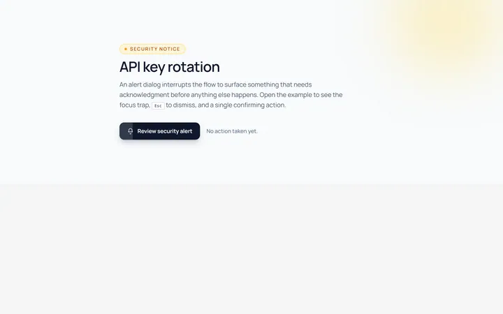
Alert Modal
Originalalert dialog with single action
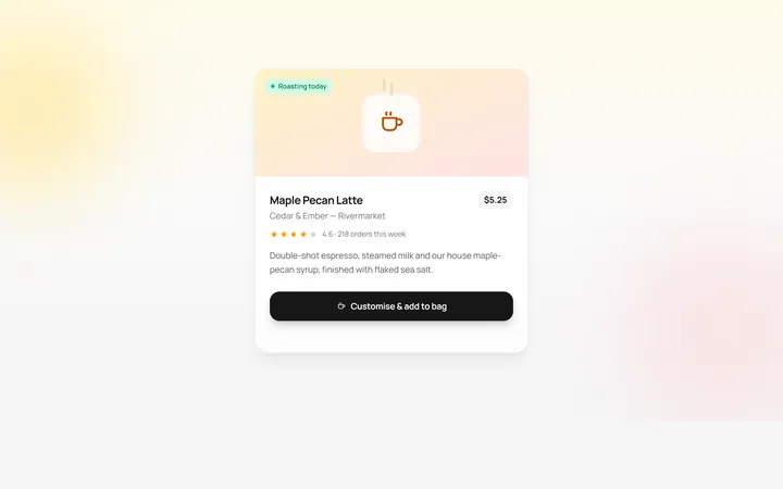
Drawer Bottom Modal
Originalbottom sheet drawer
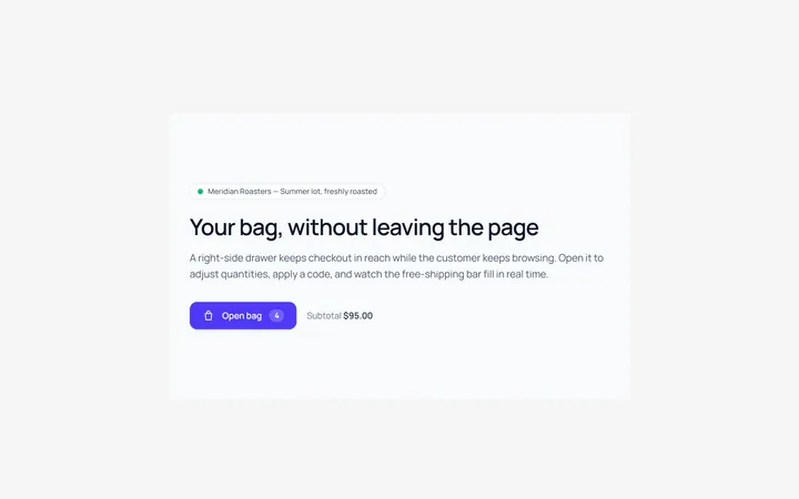
Side Drawer Modal
Originalright side drawer modal
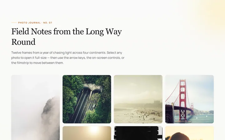
Image Lightbox Modal
Originalimage lightbox modal with nav
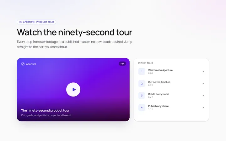
Video Modal
Originalvideo player modal
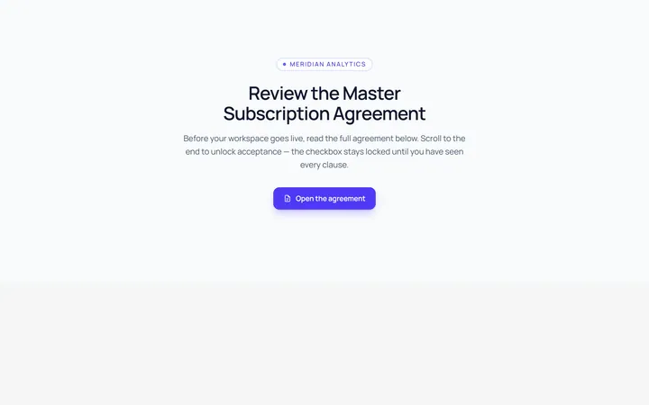
Scroll Modal
Originalmodal with long scrollable body
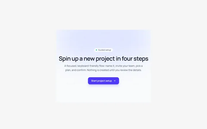
Steps Modal
Originalmulti-step modal flow
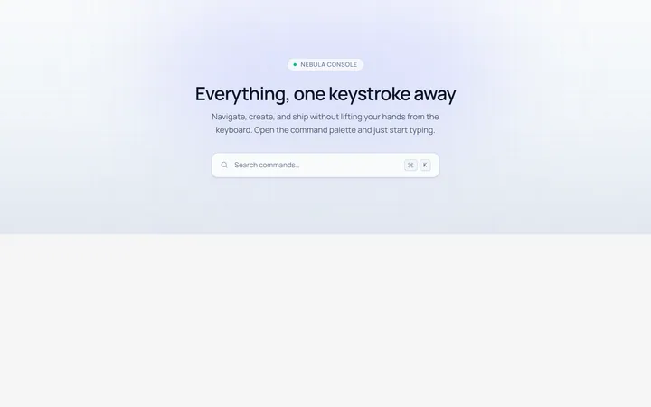
Command Palette Modal
Originalcommand palette modal with search