

Confirm Modal
Original · freeconfirm/destructive dialog
byWeb InnoventixReact + Tailwind
modalconfirmmodals
Copy prompt gives Claude Code, Cursor or v0 a ready-to-paste prompt that recreates this exact component.
npx shadcn@latest add https://webinnoventix.com/r/modal-confirm.jsonmodal-confirm.tsx
"use client";

import { useCallback, useEffect, useId, useRef, useState } from "react";
import type {
  KeyboardEvent as ReactKeyboardEvent,
  MouseEvent as ReactMouseEvent,
} from "react";
import { AnimatePresence, motion, useReducedMotion } from "motion/react";

type DialogTone = "danger" | "default";

interface DangerAction {
  id: string;
  tone: DialogTone;
  rowTitle: string;
  rowDescription: string;
  rowButton: string;
  dialogTitle: string;
  dialogDescription: string;
  confirmLabel: string;
  cancelLabel: string;
  confirmPhrase?: string;
  successMessage: string;
}

const ACTIONS: DangerAction[] = [
  {
    id: "delete-project",
    tone: "danger",
    rowTitle: "Delete this project",
    rowDescription:
      "Removes the Invoicing API project, its 3 environments and every deployment log. This action cannot be undone.",
    rowButton: "Delete project",
    dialogTitle: "Delete “Invoicing API”?",
    dialogDescription:
      "This permanently deletes the project, all 3 environments, 128 deployments and revokes 14 active API keys. There is no recovery once this completes.",
    confirmLabel: "Delete project",
    cancelLabel: "Keep project",
    confirmPhrase: "invoicing-api",
    successMessage:
      "Project “Invoicing API” and all of its data were permanently deleted.",
  },
  {
    id: "remove-collaborators",
    tone: "danger",
    rowTitle: "Remove inactive collaborators",
    rowDescription:
      "Revoke workspace access for 4 members who haven’t signed in for 90+ days.",
    rowButton: "Remove 4 people",
    dialogTitle: "Remove 4 collaborators?",
    dialogDescription:
      "They will immediately lose access to every repository and shared secret. You can re-invite them at any time.",
    confirmLabel: "Remove members",
    cancelLabel: "Cancel",
    successMessage: "Removed 4 collaborators from the workspace.",
  },
  {
    id: "publish-release",
    tone: "default",
    rowTitle: "Publish release v2.8.0",
    rowDescription:
      "Promote the staged build to production and notify 2,400 changelog subscribers.",
    rowButton: "Publish to production",
    dialogTitle: "Publish v2.8.0 to production?",
    dialogDescription:
      "The staged build goes live for all users immediately and a changelog email is sent to 2,400 subscribers.",
    confirmLabel: "Publish now",
    cancelLabel: "Not yet",
    successMessage: "Release v2.8.0 is now live in production.",
  },
];

const FOCUSABLE =
  'a[href],button:not([disabled]),textarea,input:not([disabled]),select,[tabindex]:not([tabindex="-1"])';

function WarningIcon() {
  return (
    <svg viewBox="0 0 24 24" aria-hidden="true" className="h-5 w-5">
      <path
        fill="none"
        stroke="currentColor"
        strokeWidth="1.8"
        strokeLinecap="round"
        strokeLinejoin="round"
        d="M12 3.2 21 19H3L12 3.2Z M12 10v4 M12 17h.01"
      />
    </svg>
  );
}

function RocketIcon() {
  return (
    <svg viewBox="0 0 24 24" aria-hidden="true" className="h-5 w-5">
      <path
        fill="none"
        stroke="currentColor"
        strokeWidth="1.8"
        strokeLinecap="round"
        strokeLinejoin="round"
        d="M5 15c-1.2.6-2 2-2 4 2 0 3.4-.8 4-2m1-6.5C8.5 7 12 4 18 4c1 0 2 .1 2 .1s.1 1 .1 2c0 6-3 9.5-6.5 10m-6.1-4.6 4.6 4.6M14 10.5a1.5 1.5 0 1 0 3 0 1.5 1.5 0 0 0-3 0Z"
      />
    </svg>
  );
}

function CheckIcon() {
  return (
    <svg viewBox="0 0 24 24" aria-hidden="true" className="h-4 w-4">
      <path
        fill="none"
        stroke="currentColor"
        strokeWidth="2.2"
        strokeLinecap="round"
        strokeLinejoin="round"
        d="m5 12.5 4.5 4.5L19 6.5"
      />
    </svg>
  );
}

function CloseIcon() {
  return (
    <svg viewBox="0 0 24 24" aria-hidden="true" className="h-4 w-4">
      <path
        fill="none"
        stroke="currentColor"
        strokeWidth="1.9"
        strokeLinecap="round"
        d="M6 6l12 12M18 6 6 18"
      />
    </svg>
  );
}

function Spinner() {
  return (
    <svg viewBox="0 0 24 24" aria-hidden="true" className="cnfrm-spin h-4 w-4">
      <circle
        cx="12"
        cy="12"
        r="9"
        fill="none"
        stroke="currentColor"
        strokeWidth="2.4"
        strokeOpacity="0.3"
      />
      <path
        d="M21 12a9 9 0 0 0-9-9"
        fill="none"
        stroke="currentColor"
        strokeWidth="2.4"
        strokeLinecap="round"
      />
    </svg>
  );
}

interface ConfirmDialogProps {
  action: DangerAction;
  typed: string;
  pending: boolean;
  onTypedChange: (value: string) => void;
  onCancel: () => void;
  onConfirm: () => void;
}

function ConfirmDialog({
  action,
  typed,
  pending,
  onTypedChange,
  onCancel,
  onConfirm,
}: ConfirmDialogProps) {
  const reduce = useReducedMotion();
  const rawId = useId();
  const titleId = `${rawId}-title`;
  const descId = `${rawId}-desc`;
  const inputId = `${rawId}-input`;
  const hintId = `${rawId}-hint`;

  const panelRef = useRef<HTMLDivElement>(null);
  const cancelRef = useRef<HTMLButtonElement>(null);
  const inputRef = useRef<HTMLInputElement>(null);

  const isDanger = action.tone === "danger";
  const needsPhrase = Boolean(action.confirmPhrase);
  const phraseOk = !needsPhrase || typed.trim() === action.confirmPhrase;
  const confirmDisabled = pending || !phraseOk;

  useEffect(() => {
    const target = needsPhrase ? inputRef.current : cancelRef.current;
    const raf = requestAnimationFrame(() => target?.focus());
    const previousOverflow = document.body.style.overflow;
    document.body.style.overflow = "hidden";
    return () => {
      cancelAnimationFrame(raf);
      document.body.style.overflow = previousOverflow;
    };
  }, [needsPhrase]);

  const handleKeyDown = useCallback(
    (event: ReactKeyboardEvent<HTMLDivElement>) => {
      if (event.key === "Escape") {
        if (pending) return;
        event.stopPropagation();
        onCancel();
        return;
      }
      if (event.key !== "Tab") return;
      const panel = panelRef.current;
      if (!panel) return;
      const nodes = Array.from(
        panel.querySelectorAll<HTMLElement>(FOCUSABLE),
      ).filter((node) => node.offsetParent !== null);
      if (nodes.length === 0) return;
      const first = nodes[0];
      const last = nodes[nodes.length - 1];
      const activeEl = document.activeElement;
      if (event.shiftKey && activeEl === first) {
        event.preventDefault();
        last.focus();
      } else if (!event.shiftKey && activeEl === last) {
        event.preventDefault();
        first.focus();
      }
    },
    [onCancel, pending],
  );

  const handleBackdrop = useCallback(
    (event: ReactMouseEvent<HTMLDivElement>) => {
      if (event.target === event.currentTarget && !pending) onCancel();
    },
    [onCancel, pending],
  );

  const confirmClasses = isDanger
    ? "bg-rose-600 text-white hover:bg-rose-500 focus-visible:ring-rose-500 shadow-rose-900/30"
    : "bg-indigo-600 text-white hover:bg-indigo-500 focus-visible:ring-indigo-500 shadow-indigo-900/30";

  return (
    <motion.div
      className="fixed inset-0 z-50 grid place-items-center overflow-y-auto bg-slate-950/55 p-4 backdrop-blur-sm sm:p-6"
      initial={{ opacity: 0 }}
      animate={{ opacity: 1 }}
      exit={{ opacity: 0 }}
      transition={{ duration: reduce ? 0 : 0.18 }}
      onMouseDown={handleBackdrop}
      onKeyDown={handleKeyDown}
    >
      <motion.div
        ref={panelRef}
        role="dialog"
        aria-modal="true"
        aria-labelledby={titleId}
        aria-describedby={descId}
        className="relative w-full max-w-md overflow-hidden rounded-2xl border border-slate-200 bg-white shadow-2xl shadow-slate-950/25 dark:border-white/10 dark:bg-neutral-900"
        initial={
          reduce ? { opacity: 0 } : { opacity: 0, y: 14, scale: 0.96 }
        }
        animate={{ opacity: 1, y: 0, scale: 1 }}
        exit={reduce ? { opacity: 0 } : { opacity: 0, y: 8, scale: 0.98 }}
        transition={{
          duration: reduce ? 0 : 0.24,
          ease: [0.16, 1, 0.3, 1],
        }}
      >
        <span
          aria-hidden="true"
          className={`absolute inset-x-0 top-0 h-1 ${
            isDanger
              ? "bg-gradient-to-r from-rose-500 via-rose-400 to-amber-400"
              : "bg-gradient-to-r from-indigo-500 via-violet-400 to-sky-400"
          }`}
        />

        <button
          type="button"
          onClick={onCancel}
          disabled={pending}
          aria-label="Close dialog"
          className="absolute right-3.5 top-3.5 grid h-8 w-8 place-items-center rounded-lg text-slate-400 transition-colors hover:bg-slate-100 hover:text-slate-700 focus-visible:outline-none focus-visible:ring-2 focus-visible:ring-slate-400 focus-visible:ring-offset-2 focus-visible:ring-offset-white disabled:opacity-40 dark:text-neutral-500 dark:hover:bg-white/5 dark:hover:text-neutral-200 dark:focus-visible:ring-offset-neutral-900"
        >
          <CloseIcon />
        </button>

        <div className="p-6 sm:p-7">
          <div className="relative inline-grid place-items-center">
            {isDanger ? (
              <span
                aria-hidden="true"
                className="cnfrm-ring absolute inset-0 rounded-2xl bg-rose-400/40"
              />
            ) : null}
            <span
              className={`relative grid h-12 w-12 place-items-center rounded-2xl border ${
                isDanger
                  ? "border-rose-200 bg-rose-50 text-rose-600 dark:border-rose-500/25 dark:bg-rose-500/10 dark:text-rose-300"
                  : "border-indigo-200 bg-indigo-50 text-indigo-600 dark:border-indigo-500/25 dark:bg-indigo-500/10 dark:text-indigo-300"
              }`}
            >
              {isDanger ? <WarningIcon /> : <RocketIcon />}
            </span>
          </div>

          <h2
            id={titleId}
            className="mt-4 text-lg font-semibold tracking-tight text-slate-900 dark:text-white"
          >
            {action.dialogTitle}
          </h2>
          <p
            id={descId}
            className="mt-2 text-sm leading-relaxed text-slate-600 dark:text-neutral-400"
          >
            {action.dialogDescription}
          </p>

          {needsPhrase ? (
            <div className="mt-5">
              <label
                htmlFor={inputId}
                className="block text-sm font-medium text-slate-700 dark:text-neutral-300"
              >
                Type{" "}
                <code className="rounded bg-slate-100 px-1.5 py-0.5 font-mono text-[0.8125rem] text-rose-600 dark:bg-white/10 dark:text-rose-300">
                  {action.confirmPhrase}
                </code>{" "}
                to confirm
              </label>
              <input
                ref={inputRef}
                id={inputId}
                type="text"
                autoComplete="off"
                spellCheck={false}
                value={typed}
                aria-describedby={hintId}
                aria-invalid={typed.length > 0 && !phraseOk}
                onChange={(event) => onTypedChange(event.target.value)}
                className="mt-2 w-full rounded-lg border border-slate-300 bg-white px-3 py-2 font-mono text-sm text-slate-900 shadow-sm transition-colors placeholder:text-slate-400 focus-visible:border-rose-400 focus-visible:outline-none focus-visible:ring-2 focus-visible:ring-rose-400/70 dark:border-white/15 dark:bg-neutral-950 dark:text-neutral-100 dark:placeholder:text-neutral-600"
                placeholder={action.confirmPhrase}
              />
              <p
                id={hintId}
                className="mt-1.5 h-4 text-xs text-slate-500 dark:text-neutral-500"
              >
                {typed.length > 0 && !phraseOk
                  ? "The text doesn’t match yet."
                  : " "}
              </p>
            </div>
          ) : null}

          <div className="mt-6 flex flex-col-reverse gap-2.5 sm:flex-row sm:justify-end">
            <button
              ref={cancelRef}
              type="button"
              onClick={onCancel}
              disabled={pending}
              className="inline-flex items-center justify-center rounded-lg border border-slate-300 bg-white px-4 py-2 text-sm font-medium text-slate-700 transition-colors hover:bg-slate-50 focus-visible:outline-none focus-visible:ring-2 focus-visible:ring-slate-400 focus-visible:ring-offset-2 focus-visible:ring-offset-white disabled:opacity-50 dark:border-white/15 dark:bg-transparent dark:text-neutral-200 dark:hover:bg-white/5 dark:focus-visible:ring-offset-neutral-900"
            >
              {action.cancelLabel}
            </button>
            <button
              type="button"
              onClick={onConfirm}
              disabled={confirmDisabled}
              aria-disabled={confirmDisabled}
              className={`inline-flex items-center justify-center gap-2 rounded-lg px-4 py-2 text-sm font-semibold shadow-lg transition-all focus-visible:outline-none focus-visible:ring-2 focus-visible:ring-offset-2 focus-visible:ring-offset-white disabled:cursor-not-allowed disabled:opacity-50 disabled:shadow-none dark:focus-visible:ring-offset-neutral-900 ${confirmClasses}`}
            >
              {pending ? <Spinner /> : null}
              {pending ? "Working…" : action.confirmLabel}
            </button>
          </div>
        </div>
      </motion.div>
    </motion.div>
  );
}

interface StatusState {
  message: string;
}

export default function ModalConfirm() {
  const reduce = useReducedMotion();
  const [active, setActive] = useState<DangerAction | null>(null);
  const [typed, setTyped] = useState("");
  const [pending, setPending] = useState(false);
  const [status, setStatus] = useState<StatusState | null>(null);

  const lastFocused = useRef<HTMLElement | null>(null);
  const timeoutRef = useRef<number | null>(null);

  useEffect(
    () => () => {
      if (timeoutRef.current !== null) window.clearTimeout(timeoutRef.current);
    },
    [],
  );

  const openDialog = useCallback(
    (actionItem: DangerAction, event: ReactMouseEvent<HTMLButtonElement>) => {
      lastFocused.current = event.currentTarget;
      setTyped("");
      setPending(false);
      setStatus(null);
      setActive(actionItem);
    },
    [],
  );

  const restoreFocus = useCallback(() => {
    requestAnimationFrame(() => lastFocused.current?.focus());
  }, []);

  const handleCancel = useCallback(() => {
    if (pending) return;
    setActive(null);
    restoreFocus();
  }, [pending, restoreFocus]);

  const handleConfirm = useCallback(() => {
    if (!active) return;
    const message = active.successMessage;
    setPending(true);
    timeoutRef.current = window.setTimeout(() => {
      setPending(false);
      setActive(null);
      setStatus({ message });
      restoreFocus();
    }, 900);
  }, [active, restoreFocus]);

  return (
    <section className="relative w-full overflow-hidden bg-slate-50 px-4 py-20 text-slate-900 sm:px-6 sm:py-24 dark:bg-neutral-950 dark:text-white">
      <div
        aria-hidden="true"
        className="pointer-events-none absolute inset-0 [background-image:radial-gradient(circle_at_1px_1px,rgba(148,163,184,0.18)_1px,transparent_0)] [background-size:22px_22px] dark:[background-image:radial-gradient(circle_at_1px_1px,rgba(255,255,255,0.06)_1px,transparent_0)]"
      />
      <div
        aria-hidden="true"
        className="pointer-events-none absolute -top-24 right-[-10%] h-72 w-72 rounded-full bg-rose-300/20 blur-3xl dark:bg-rose-600/10"
      />

      <div className="relative mx-auto max-w-2xl">
        <header className="mb-8">
          <span className="inline-flex items-center gap-2 rounded-full border border-slate-200 bg-white/70 px-3 py-1 text-xs font-medium uppercase tracking-wider text-slate-500 backdrop-blur dark:border-white/10 dark:bg-white/5 dark:text-neutral-400">
            <span className="h-1.5 w-1.5 rounded-full bg-rose-500" />
            Account settings
          </span>
          <h1 className="mt-4 text-3xl font-semibold tracking-tight sm:text-4xl">
            Danger zone
          </h1>
          <p className="mt-2 max-w-xl text-sm leading-relaxed text-slate-600 dark:text-neutral-400">
            Irreversible and high-impact actions live here. Each one asks for an
            explicit confirmation before anything happens.
          </p>
        </header>

        <div aria-live="polite" className="min-h-[3.5rem]">
          <AnimatePresence>
            {status ? (
              <motion.div
                key={status.message}
                role="status"
                initial={reduce ? { opacity: 0 } : { opacity: 0, y: -8 }}
                animate={{ opacity: 1, y: 0 }}
                exit={reduce ? { opacity: 0 } : { opacity: 0, y: -8 }}
                transition={{ duration: reduce ? 0 : 0.2 }}
                className="mb-6 flex items-start gap-3 rounded-xl border border-emerald-200 bg-emerald-50 px-4 py-3 dark:border-emerald-500/25 dark:bg-emerald-500/10"
              >
                <span className="mt-0.5 grid h-5 w-5 shrink-0 place-items-center rounded-full bg-emerald-500 text-white">
                  <CheckIcon />
                </span>
                <p className="flex-1 text-sm text-emerald-800 dark:text-emerald-200">
                  {status.message}
                </p>
                <button
                  type="button"
                  onClick={() => setStatus(null)}
                  aria-label="Dismiss notification"
                  className="grid h-6 w-6 place-items-center rounded-md text-emerald-600 transition-colors hover:bg-emerald-500/15 focus-visible:outline-none focus-visible:ring-2 focus-visible:ring-emerald-500 dark:text-emerald-300"
                >
                  <CloseIcon />
                </button>
              </motion.div>
            ) : null}
          </AnimatePresence>
        </div>

        <div className="divide-y divide-slate-200 overflow-hidden rounded-2xl border border-slate-200 bg-white shadow-sm dark:divide-white/10 dark:border-white/10 dark:bg-neutral-900">
          {ACTIONS.map((item) => {
            const danger = item.tone === "danger";
            return (
              <div
                key={item.id}
                className="flex flex-col gap-4 p-5 sm:flex-row sm:items-center sm:justify-between sm:gap-6 sm:p-6"
              >
                <div className="min-w-0">
                  <h3 className="text-sm font-semibold text-slate-900 dark:text-white">
                    {item.rowTitle}
                  </h3>
                  <p className="mt-1 text-sm leading-relaxed text-slate-500 dark:text-neutral-400">
                    {item.rowDescription}
                  </p>
                </div>
                <button
                  type="button"
                  onClick={(event) => openDialog(item, event)}
                  className={`shrink-0 self-start rounded-lg border px-4 py-2 text-sm font-medium transition-colors focus-visible:outline-none focus-visible:ring-2 focus-visible:ring-offset-2 focus-visible:ring-offset-white sm:self-auto dark:focus-visible:ring-offset-neutral-900 ${
                    danger
                      ? "border-rose-200 text-rose-700 hover:bg-rose-50 focus-visible:ring-rose-500 dark:border-rose-500/30 dark:text-rose-300 dark:hover:bg-rose-500/10"
                      : "border-indigo-200 text-indigo-700 hover:bg-indigo-50 focus-visible:ring-indigo-500 dark:border-indigo-500/30 dark:text-indigo-300 dark:hover:bg-indigo-500/10"
                  }`}
                >
                  {item.rowButton}
                </button>
              </div>
            );
          })}
        </div>

        <p className="mt-4 text-xs text-slate-400 dark:text-neutral-600">
          Tip: press{" "}
          <kbd className="rounded border border-slate-300 bg-white px-1.5 py-0.5 font-sans text-[0.6875rem] text-slate-600 dark:border-white/15 dark:bg-neutral-800 dark:text-neutral-300">
            Esc
          </kbd>{" "}
          to dismiss a dialog. Focus stays trapped inside until you decide.
        </p>
      </div>

      <AnimatePresence>
        {active ? (
          <ConfirmDialog
            key={active.id}
            action={active}
            typed={typed}
            pending={pending}
            onTypedChange={setTyped}
            onCancel={handleCancel}
            onConfirm={handleConfirm}
          />
        ) : null}
      </AnimatePresence>

      <style>{`
        @keyframes cnfrm-spin {
          to { transform: rotate(360deg); }
        }
        @keyframes cnfrm-ring {
          0%, 100% { opacity: 0.5; transform: scale(1); }
          50% { opacity: 0.1; transform: scale(1.4); }
        }
        .cnfrm-spin { animation: cnfrm-spin 0.7s linear infinite; }
        .cnfrm-ring { animation: cnfrm-ring 2.4s ease-in-out infinite; }
        @media (prefers-reduced-motion: reduce) {
          .cnfrm-spin, .cnfrm-ring { animation: none !important; }
        }
      `}</style>
    </section>
  );
}
Dependencies
motion
Licence
Built by Web Innoventix. Free for personal and commercial use, no attribution required.
Built by Web Innoventix
Need a custom interface, a full website, or SEO that gets you cited by AI? We design, build and rank it end to end.
Get a free quoteSimilar components
Browse all →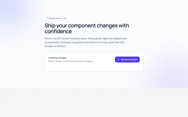
Basic Modal
Originalbasic centred modal with overlay
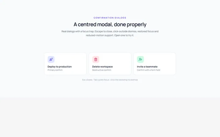
Center Modal
Originalcentred modal with icon and actions
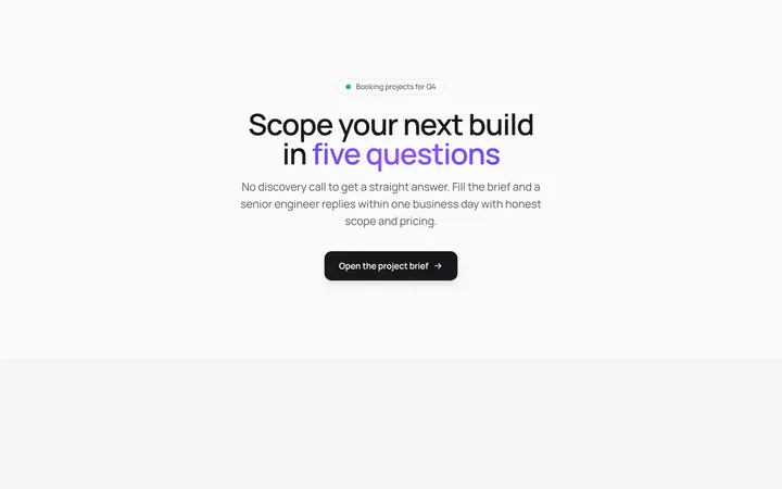
Form Modal
Originalmodal containing a form
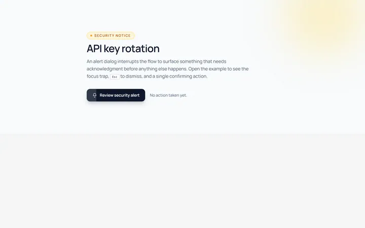
Alert Modal
Originalalert dialog with single action
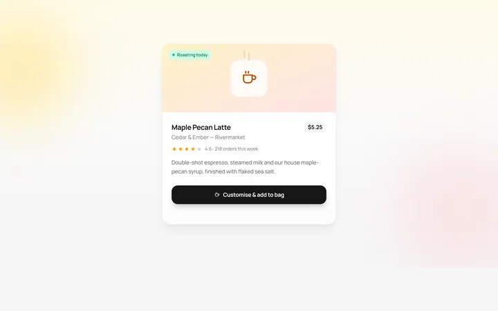
Drawer Bottom Modal
Originalbottom sheet drawer
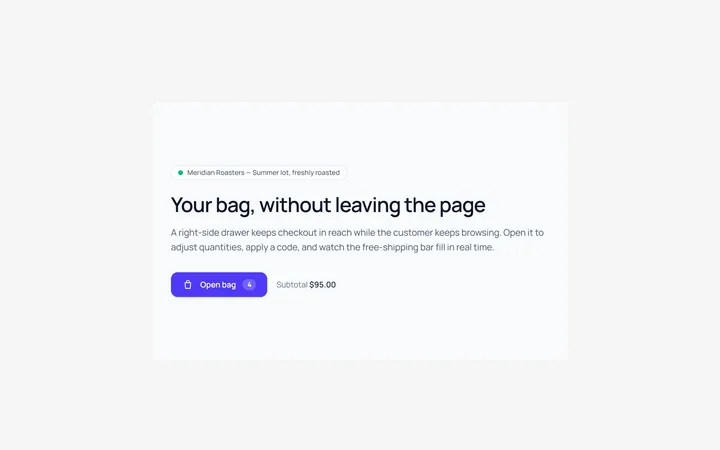
Side Drawer Modal
Originalright side drawer modal
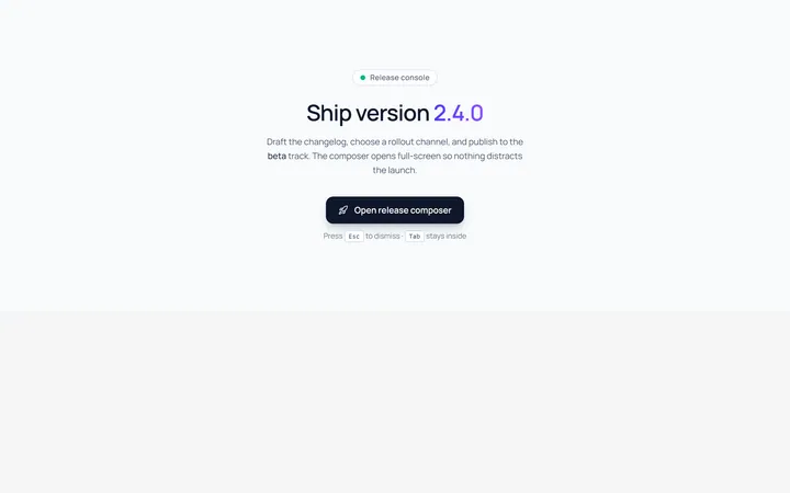
Fullscreen Modal
Originalfullscreen modal
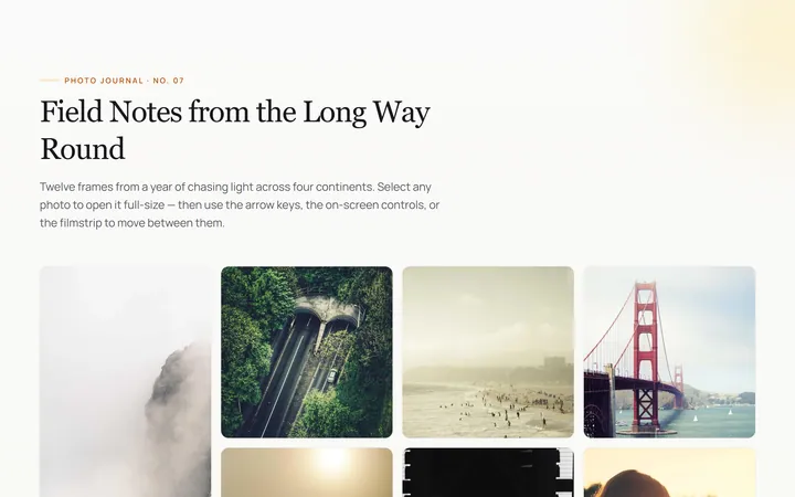
Image Lightbox Modal
Originalimage lightbox modal with nav
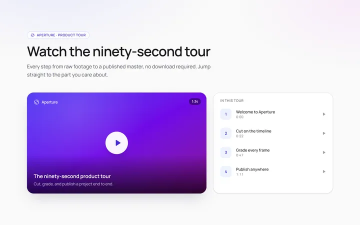
Video Modal
Originalvideo player modal
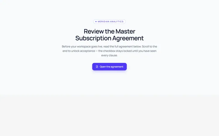
Scroll Modal
Originalmodal with long scrollable body
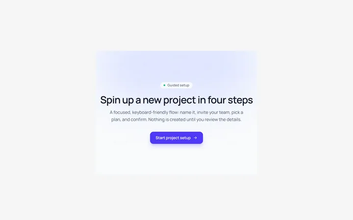
Steps Modal
Originalmulti-step modal flow
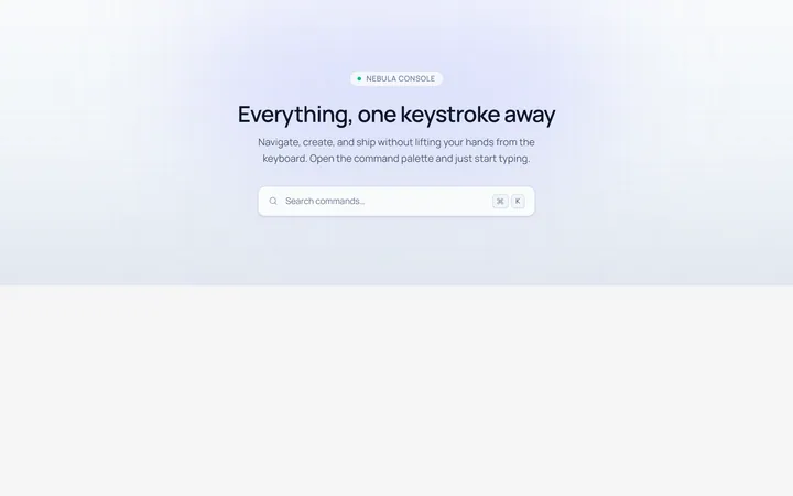
Command Palette Modal
Originalcommand palette modal with search