

Basic Divider
Original · freebasic horizontal dividers
Copy prompt gives Claude Code, Cursor or v0 a ready-to-paste prompt that recreates this exact component.
npx shadcn@latest add https://webinnoventix.com/r/div-basic.json"use client";
import {
useId,
useRef,
useState,
type ChangeEvent,
type KeyboardEvent,
type ReactNode,
} from "react";
import { motion, useReducedMotion } from "motion/react";
/* ------------------------------------------------------------------ */
/* Types & option tables */
/* ------------------------------------------------------------------ */
type StyleId =
| "solid"
| "dashed"
| "dotted"
| "gradient"
| "labeled"
| "ornament";
type WeightId = "hairline" | "regular" | "bold";
type AccentId = "slate" | "indigo" | "emerald" | "rose" | "amber";
interface Option<T extends string> {
value: T;
label: string;
leading?: ReactNode;
}
const STYLE_OPTIONS: Option<StyleId>[] = [
{ value: "solid", label: "Solid" },
{ value: "dashed", label: "Dashed" },
{ value: "dotted", label: "Dotted" },
{ value: "gradient", label: "Gradient" },
{ value: "labeled", label: "Labeled" },
{ value: "ornament", label: "Ornament" },
];
const WEIGHT_OPTIONS: Option<WeightId>[] = [
{ value: "hairline", label: "Hairline" },
{ value: "regular", label: "Regular" },
{ value: "bold", label: "Bold" },
];
const WEIGHT_PX: Record<WeightId, number> = {
hairline: 1,
regular: 2,
bold: 4,
};
const ACCENT_CLASS: Record<AccentId, string> = {
slate: "text-slate-300 dark:text-slate-600",
indigo: "text-indigo-400 dark:text-indigo-500",
emerald: "text-emerald-400 dark:text-emerald-500",
rose: "text-rose-400 dark:text-rose-500",
amber: "text-amber-400 dark:text-amber-500",
};
const ACCENT_LABEL: Record<AccentId, string> = {
slate: "Slate",
indigo: "Indigo",
emerald: "Emerald",
rose: "Rose",
amber: "Amber",
};
const ACCENT_SWATCH: Record<AccentId, string> = {
slate: "bg-slate-400 dark:bg-slate-500",
indigo: "bg-indigo-400 dark:bg-indigo-500",
emerald: "bg-emerald-400 dark:bg-emerald-500",
rose: "bg-rose-400 dark:bg-rose-500",
amber: "bg-amber-400 dark:bg-amber-500",
};
const ACCENT_OPTIONS: Option<AccentId>[] = (
Object.keys(ACCENT_LABEL) as AccentId[]
).map((id) => ({
value: id,
label: ACCENT_LABEL[id],
leading: (
<span
aria-hidden="true"
className={cn(
"h-3 w-3 shrink-0 rounded-full ring-1 ring-black/5 dark:ring-white/10",
ACCENT_SWATCH[id]
)}
/>
),
}));
/* ------------------------------------------------------------------ */
/* Utilities */
/* ------------------------------------------------------------------ */
function cn(...parts: (string | false | null | undefined)[]): string {
return parts.filter(Boolean).join(" ");
}
/* ------------------------------------------------------------------ */
/* Accessible segmented radiogroup */
/* ------------------------------------------------------------------ */
interface SegmentedProps<T extends string> {
label: string;
options: Option<T>[];
value: T;
onChange: (next: T) => void;
columnsClass?: string;
hideLabelOnMobile?: boolean;
reduce: boolean;
}
function Segmented<T extends string>({
label,
options,
value,
onChange,
columnsClass,
hideLabelOnMobile,
reduce,
}: SegmentedProps<T>) {
const groupId = useId();
const labelId = `${groupId}-label`;
const pillId = `${groupId}-pill`;
const refs = useRef<(HTMLButtonElement | null)[]>([]);
function move(index: number, delta: number) {
const count = options.length;
const next = (index + delta + count) % count;
onChange(options[next].value);
refs.current[next]?.focus();
}
function onKeyDown(event: KeyboardEvent<HTMLButtonElement>, index: number) {
switch (event.key) {
case "ArrowRight":
case "ArrowDown":
event.preventDefault();
move(index, 1);
break;
case "ArrowLeft":
case "ArrowUp":
event.preventDefault();
move(index, -1);
break;
case "Home":
event.preventDefault();
onChange(options[0].value);
refs.current[0]?.focus();
break;
case "End":
event.preventDefault();
onChange(options[options.length - 1].value);
refs.current[options.length - 1]?.focus();
break;
default:
break;
}
}
return (
<div>
<span
id={labelId}
className="mb-2 block text-[0.7rem] font-semibold uppercase tracking-[0.14em] text-slate-500 dark:text-slate-400"
>
{label}
</span>
<div
role="radiogroup"
aria-labelledby={labelId}
className={cn(
"grid gap-1 rounded-2xl border border-slate-200 bg-slate-100/80 p-1 dark:border-slate-800 dark:bg-slate-800/60",
columnsClass ?? "grid-flow-col auto-cols-fr"
)}
>
{options.map((option, index) => {
const selected = option.value === value;
return (
<button
key={option.value}
ref={(node) => {
refs.current[index] = node;
}}
type="button"
role="radio"
aria-checked={selected}
aria-label={option.label}
tabIndex={selected ? 0 : -1}
onClick={() => onChange(option.value)}
onKeyDown={(event) => onKeyDown(event, index)}
className={cn(
"relative flex items-center justify-center gap-2 rounded-xl px-3 py-2 text-sm font-medium transition-colors",
"focus-visible:outline-none focus-visible:ring-2 focus-visible:ring-indigo-500 focus-visible:ring-offset-2 focus-visible:ring-offset-slate-100 dark:focus-visible:ring-offset-slate-800",
selected
? "text-slate-900 dark:text-white"
: "text-slate-500 hover:text-slate-800 dark:text-slate-400 dark:hover:text-slate-100"
)}
>
{selected && (
<motion.span
layoutId={pillId}
aria-hidden="true"
className="absolute inset-0 z-0 rounded-xl bg-white shadow-sm ring-1 ring-slate-900/5 dark:bg-slate-950 dark:ring-white/10"
transition={
reduce
? { duration: 0 }
: { type: "spring", stiffness: 480, damping: 38 }
}
/>
)}
<span className="relative z-10 flex items-center gap-2">
{option.leading}
<span
className={cn(hideLabelOnMobile && "hidden sm:inline")}
>
{option.label}
</span>
</span>
</button>
);
})}
</div>
</div>
);
}
/* ------------------------------------------------------------------ */
/* Divider renderer */
/* ------------------------------------------------------------------ */
interface DividerProps {
styleId: StyleId;
weightPx: number;
accentClass: string;
labelText: string;
shimmer: boolean;
}
function DividerLine({
styleId,
weightPx,
accentClass,
labelText,
shimmer,
}: DividerProps) {
const trimmed = labelText.trim();
if (styleId === "solid") {
return (
<div
role="separator"
className={cn("w-full rounded-full bg-current", accentClass)}
style={{ height: weightPx }}
/>
);
}
if (styleId === "dashed" || styleId === "dotted") {
return (
<div
role="separator"
className={cn("w-full border-current", accentClass)}
style={{
borderTopWidth: weightPx,
borderTopStyle: styleId === "dashed" ? "dashed" : "dotted",
}}
/>
);
}
if (styleId === "gradient") {
return (
<div
role="separator"
className={cn(
"relative w-full overflow-hidden rounded-full",
accentClass
)}
style={{
height: Math.max(weightPx, 2),
backgroundImage:
"linear-gradient(90deg, transparent, currentColor 15%, currentColor 85%, transparent)",
}}
>
{shimmer && (
<span
aria-hidden="true"
className="divbasic-sheen absolute inset-y-0 left-0 w-1/4 bg-gradient-to-r from-transparent via-white/80 to-transparent dark:via-white/50"
/>
)}
</div>
);
}
// labeled + ornament share the line/center/line structure
const line = (
<span
aria-hidden="true"
className={cn("h-px flex-1 rounded-full bg-current", accentClass)}
style={{ height: weightPx }}
/>
);
const center =
styleId === "ornament" ? (
<span className={cn("shrink-0", accentClass)} aria-hidden="true">
<svg
width="20"
height="20"
viewBox="0 0 24 24"
fill="none"
stroke="currentColor"
strokeWidth={1.4}
strokeLinejoin="round"
>
<path d="M12 2.5 21.5 12 12 21.5 2.5 12Z" />
<circle cx="12" cy="12" r="2.4" fill="currentColor" stroke="none" />
</svg>
</span>
) : (
<span className="shrink-0 text-[0.7rem] font-semibold uppercase tracking-[0.18em] text-slate-500 dark:text-slate-400">
{trimmed.length > 0 ? trimmed : "Section"}
</span>
);
return (
<div
role="separator"
aria-label={
styleId === "labeled" && trimmed.length > 0 ? trimmed : undefined
}
className="flex w-full items-center gap-4"
>
{line}
{center}
{line}
</div>
);
}
/* ------------------------------------------------------------------ */
/* Main component */
/* ------------------------------------------------------------------ */
export default function DivBasic() {
const reduce = useReducedMotion() ?? false;
const [styleId, setStyleId] = useState<StyleId>("gradient");
const [weightId, setWeightId] = useState<WeightId>("regular");
const [accentId, setAccentId] = useState<AccentId>("indigo");
const [labelText, setLabelText] = useState<string>("Chapter two");
const inputId = useId();
const weightPx = WEIGHT_PX[weightId];
const accentClass = ACCENT_CLASS[accentId];
const shimmer = styleId === "gradient" && !reduce;
const showLabelInput = styleId === "labeled" || styleId === "ornament";
const summary = `${STYLE_OPTIONS.find((o) => o.value === styleId)?.label} · ${
WEIGHT_OPTIONS.find((o) => o.value === weightId)?.label
} · ${ACCENT_LABEL[accentId]}`;
return (
<section className="relative w-full overflow-hidden bg-gradient-to-b from-slate-50 to-white px-4 py-20 text-slate-900 dark:from-slate-950 dark:to-slate-900 dark:text-slate-100 sm:px-6 sm:py-24">
<style>{`
@keyframes divbasic-sheen {
0% { transform: translateX(-120%); }
100% { transform: translateX(440%); }
}
.divbasic-sheen {
animation: divbasic-sheen 2.8s ease-in-out infinite;
}
@media (prefers-reduced-motion: reduce) {
.divbasic-sheen { animation: none; opacity: 0; }
}
`}</style>
<div className="mx-auto max-w-3xl">
{/* Header */}
<header className="mb-10">
<span className="inline-flex items-center gap-2 rounded-full border border-slate-200 bg-white px-3 py-1 text-[0.7rem] font-semibold uppercase tracking-[0.16em] text-slate-500 shadow-sm dark:border-slate-800 dark:bg-slate-900 dark:text-slate-400">
<span className="h-1.5 w-1.5 rounded-full bg-emerald-500" />
Dividers · Basic
</span>
<h2 className="mt-4 text-3xl font-semibold tracking-tight text-slate-900 dark:text-white sm:text-4xl">
A small kit of horizontal rules
</h2>
<p className="mt-3 max-w-xl text-base leading-relaxed text-slate-600 dark:text-slate-300">
Six honest ways to separate two blocks of content. Change the style,
weight, and tone, then watch the rule redraw itself in real time.
</p>
</header>
{/* Controls */}
<div className="grid gap-5 rounded-3xl border border-slate-200 bg-white/70 p-5 shadow-sm backdrop-blur dark:border-slate-800 dark:bg-slate-900/60 sm:p-6">
<Segmented
label="Style"
options={STYLE_OPTIONS}
value={styleId}
onChange={setStyleId}
columnsClass="grid-cols-3 sm:grid-cols-6"
reduce={reduce}
/>
<div className="grid gap-5 sm:grid-cols-2">
<Segmented
label="Weight"
options={WEIGHT_OPTIONS}
value={weightId}
onChange={setWeightId}
columnsClass="grid-cols-3"
reduce={reduce}
/>
<Segmented
label="Tone"
options={ACCENT_OPTIONS}
value={accentId}
onChange={setAccentId}
columnsClass="grid-cols-5"
hideLabelOnMobile
reduce={reduce}
/>
</div>
<div
className={cn(
"transition-opacity",
showLabelInput ? "opacity-100" : "pointer-events-none opacity-40"
)}
>
<label
htmlFor={inputId}
className="mb-2 block text-[0.7rem] font-semibold uppercase tracking-[0.14em] text-slate-500 dark:text-slate-400"
>
Label text
</label>
<input
id={inputId}
type="text"
value={labelText}
disabled={!showLabelInput}
maxLength={28}
onChange={(event: ChangeEvent<HTMLInputElement>) =>
setLabelText(event.target.value)
}
placeholder="e.g. Chapter two"
className="w-full rounded-xl border border-slate-200 bg-white px-4 py-2.5 text-sm text-slate-900 shadow-sm transition-colors placeholder:text-slate-400 focus-visible:border-indigo-500 focus-visible:outline-none focus-visible:ring-2 focus-visible:ring-indigo-500/40 disabled:cursor-not-allowed dark:border-slate-700 dark:bg-slate-950 dark:text-slate-100 dark:placeholder:text-slate-500"
/>
<p className="mt-1.5 text-xs text-slate-400 dark:text-slate-500">
Used by the{" "}
<span className="font-medium text-slate-600 dark:text-slate-300">
Labeled
</span>{" "}
style. The{" "}
<span className="font-medium text-slate-600 dark:text-slate-300">
Ornament
</span>{" "}
style draws a diamond instead.
</p>
</div>
</div>
{/* Live preview */}
<div className="mt-8 overflow-hidden rounded-3xl border border-slate-200 bg-white shadow-sm dark:border-slate-800 dark:bg-slate-900">
<div className="flex items-center justify-between border-b border-slate-100 px-6 py-3 dark:border-slate-800">
<span className="text-xs font-medium text-slate-500 dark:text-slate-400">
Live preview
</span>
<span
aria-live="polite"
className="rounded-full bg-slate-100 px-2.5 py-1 font-mono text-[0.7rem] text-slate-600 dark:bg-slate-800 dark:text-slate-300"
>
{summary}
</span>
</div>
<div className="px-6 py-8 sm:px-10 sm:py-10">
<p className="text-[0.7rem] font-semibold uppercase tracking-[0.18em] text-indigo-500 dark:text-indigo-400">
Overview
</p>
<h3 className="mt-2 text-xl font-semibold text-slate-900 dark:text-white">
Separate ideas without stealing attention
</h3>
<p className="mt-3 text-sm leading-relaxed text-slate-600 dark:text-slate-300">
A good divider is quiet. It marks the seam between two thoughts,
gives the eye a place to rest, and then gets out of the way. The
rule below is the exact element you would ship.
</p>
<motion.div
key={`${styleId}-${weightId}-${accentId}`}
initial={reduce ? false : { opacity: 0, scaleX: 0.94 }}
animate={{ opacity: 1, scaleX: 1 }}
transition={reduce ? { duration: 0 } : { duration: 0.4, ease: "easeOut" }}
className="my-8 origin-center"
>
<DividerLine
styleId={styleId}
weightPx={weightPx}
accentClass={accentClass}
labelText={labelText}
shimmer={shimmer}
/>
</motion.div>
<p className="text-sm leading-relaxed text-slate-600 dark:text-slate-300">
Below the seam, the reader picks up a fresh section already primed
for the shift. No heavy borders, no boxes, no shouting, just a
clean horizontal line doing one job precisely.
</p>
</div>
</div>
<p className="mt-6 text-center text-xs text-slate-400 dark:text-slate-500">
Use arrow keys inside any control to switch options. Every rule renders
identically in light and dark.
</p>
</div>
</section>
);
}Dependencies
Licence
Built by Web Innoventix. Free for personal and commercial use, no attribution required.
Built by Web Innoventix
Need a custom interface, a full website, or SEO that gets you cited by AI? We design, build and rank it end to end.
Get a free quoteSimilar components
Browse all →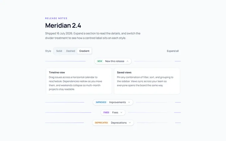
Label Divider
Originaldivider with centred label
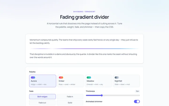
Gradient Divider
Originalgradient/fading divider
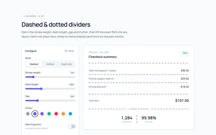
Dashed Divider
Originaldashed and dotted dividers
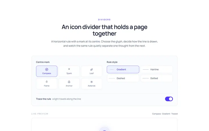
Icon Divider
Originaldivider with a centre icon
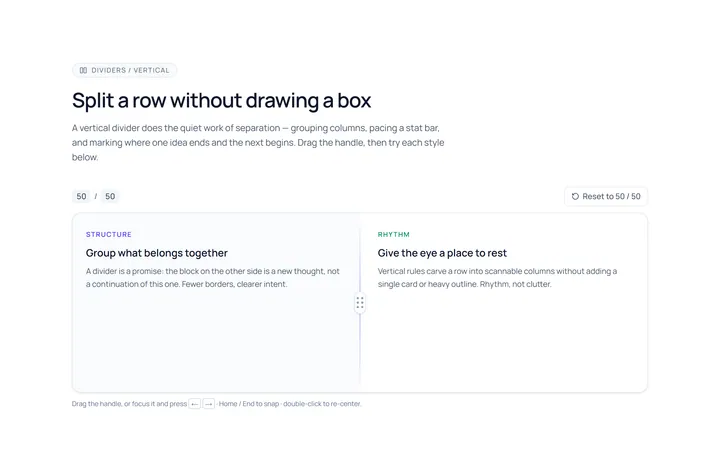
Vertical Divider
Originalvertical dividers
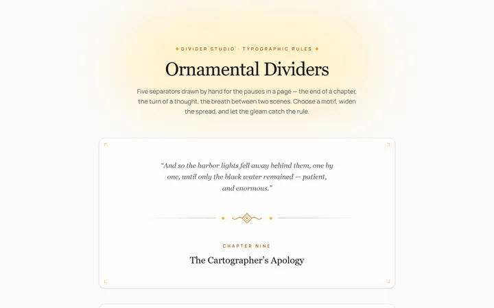
Fancy Divider
Originaldecorative ornament divider
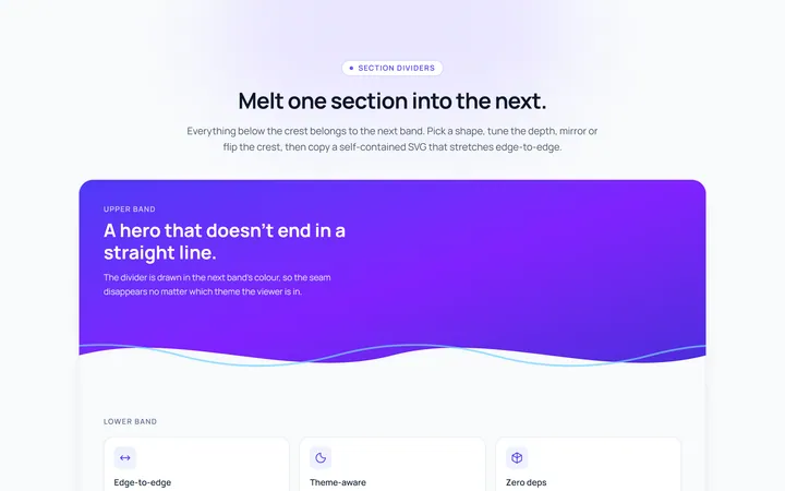
Section Divider
Originalsection wave/angle divider

Spotlight Hero
OriginalA centred hero with a soft radial spotlight, badge and dual call-to-action.

Split Hero
OriginalA two-column hero pairing a headline and CTAs with a product mock and social proof.

Gradient Spotlight Hero
OriginalA minimal centred hero with a soft gradient-mesh backdrop, announcement pill and dual call-to-action buttons.

App Preview Hero
OriginalA centred hero that pairs headline copy with a realistic product dashboard mock built entirely from markup, complete with browser chrome and a floating notification card.

Waitlist Capture Hero
OriginalA dark, focused hero with an inline email capture form and avatar social proof, ready for pre-launch waitlists.