

Icon Divider
Original · freedivider with a centre icon
Copy prompt gives Claude Code, Cursor or v0 a ready-to-paste prompt that recreates this exact component.
npx shadcn@latest add https://webinnoventix.com/r/div-icon.json"use client";
import { useId, useState } from "react";
import { AnimatePresence, motion, useReducedMotion } from "motion/react";
/* ---------------------------------------------------------------- icons --- */
type IconProps = { className?: string };
function CompassIcon({ className }: IconProps) {
return (
<svg viewBox="0 0 24 24" fill="none" stroke="currentColor" strokeWidth={1.6} strokeLinecap="round" strokeLinejoin="round" className={className} aria-hidden="true">
<circle cx="12" cy="12" r="9" />
<path d="m15.6 8.4-2 5.2-5.2 2 2-5.2z" />
</svg>
);
}
function SparkIcon({ className }: IconProps) {
return (
<svg viewBox="0 0 24 24" fill="none" stroke="currentColor" strokeWidth={1.6} strokeLinecap="round" strokeLinejoin="round" className={className} aria-hidden="true">
<path d="M12 3c.4 4.3 1.7 5.6 6 6-4.3.4-5.6 1.7-6 6-.4-4.3-1.7-5.6-6-6 4.3-.4 5.6-1.7 6-6Z" />
</svg>
);
}
function LeafIcon({ className }: IconProps) {
return (
<svg viewBox="0 0 24 24" fill="none" stroke="currentColor" strokeWidth={1.6} strokeLinecap="round" strokeLinejoin="round" className={className} aria-hidden="true">
<path d="M5 19c0-8 5-13 14-13 0 9-5 14-13 14-.9-3.7.4-7.4 3.6-10" />
<path d="M8 16c2.4-2.7 5.1-4.4 8-5" />
</svg>
);
}
function FlameIcon({ className }: IconProps) {
return (
<svg viewBox="0 0 24 24" fill="none" stroke="currentColor" strokeWidth={1.6} strokeLinecap="round" strokeLinejoin="round" className={className} aria-hidden="true">
<path d="M12 3c3.5 3 5 5.7 5 8.5a5 5 0 0 1-10 0c0-1 .4-2 1.2-3 .3 1 .9 1.6 1.8 1.8C9.6 8 10.4 5.7 12 3Z" />
</svg>
);
}
function AnchorIcon({ className }: IconProps) {
return (
<svg viewBox="0 0 24 24" fill="none" stroke="currentColor" strokeWidth={1.6} strokeLinecap="round" strokeLinejoin="round" className={className} aria-hidden="true">
<circle cx="12" cy="5" r="2" />
<path d="M12 7v13M6 11H4a8 8 0 0 0 16 0h-2M8 11h8" />
</svg>
);
}
function AsteriskIcon({ className }: IconProps) {
return (
<svg viewBox="0 0 24 24" fill="none" stroke="currentColor" strokeWidth={1.6} strokeLinecap="round" strokeLinejoin="round" className={className} aria-hidden="true">
<path d="M12 4v16M4.5 7.5l15 9M19.5 7.5l-15 9" />
</svg>
);
}
const ICONS = [
{ id: "compass", label: "Compass", Icon: CompassIcon },
{ id: "spark", label: "Spark", Icon: SparkIcon },
{ id: "leaf", label: "Leaf", Icon: LeafIcon },
{ id: "flame", label: "Flame", Icon: FlameIcon },
{ id: "anchor", label: "Anchor", Icon: AnchorIcon },
{ id: "asterisk", label: "Asterisk", Icon: AsteriskIcon },
] as const;
type IconId = (typeof ICONS)[number]["id"];
/* ------------------------------------------------------------ line styles --- */
const LINE_STYLES = [
{ id: "gradient", label: "Gradient" },
{ id: "solid", label: "Hairline" },
{ id: "dashed", label: "Dashed" },
{ id: "dotted", label: "Dotted" },
] as const;
type LineId = (typeof LINE_STYLES)[number]["id"];
function lineSide(style: LineId, side: "left" | "right"): string {
switch (style) {
case "solid":
return "h-px bg-slate-200 dark:bg-slate-700";
case "dashed":
return "h-0 border-t border-dashed border-slate-300 dark:border-slate-600";
case "dotted":
return "h-0 border-t-2 border-dotted border-slate-300 dark:border-slate-600";
case "gradient":
default:
return side === "left"
? "h-px bg-gradient-to-r from-transparent to-slate-300 dark:to-slate-600"
: "h-px bg-gradient-to-l from-transparent to-slate-300 dark:to-slate-600";
}
}
function sampleLine(style: LineId): string {
switch (style) {
case "solid":
return "h-px w-9 bg-slate-400 dark:bg-slate-500";
case "dashed":
return "h-0 w-9 border-t border-dashed border-slate-400 dark:border-slate-500";
case "dotted":
return "h-0 w-9 border-t-2 border-dotted border-slate-400 dark:border-slate-500";
case "gradient":
default:
return "h-px w-9 bg-gradient-to-r from-transparent via-slate-400 to-transparent dark:via-slate-500";
}
}
/* --------------------------------------------------------------- divider --- */
type DividerProps = {
icon: (typeof ICONS)[number];
lineStyle: LineId;
animated: boolean;
reduce: boolean;
size?: "md" | "lg";
label: string;
};
function IconDivider({ icon, lineStyle, animated, reduce, size = "md", label }: DividerProps) {
const Active = icon.Icon;
const showShimmer = animated && !reduce;
const badge =
size === "lg" ? "h-16 w-16" : "h-12 w-12";
const glyph = size === "lg" ? "h-7 w-7" : "h-5 w-5";
return (
<div role="separator" aria-orientation="horizontal" aria-label={label} className="relative w-full">
{showShimmer && (
<span aria-hidden="true" className="pointer-events-none absolute inset-x-6 top-1/2 h-px -translate-y-1/2 overflow-hidden">
<span className="divicon-anim block h-full w-1/4 bg-gradient-to-r from-transparent via-indigo-400/70 to-transparent [animation:divicon-shimmer_3.2s_linear_infinite]" />
</span>
)}
<div className="relative z-10 flex items-center gap-4 sm:gap-6">
<span aria-hidden="true" className={"flex-1 " + lineSide(lineStyle, "left")} />
<span
className={
"relative flex shrink-0 items-center justify-center rounded-full border border-slate-200 bg-white text-indigo-600 shadow-sm shadow-slate-900/5 dark:border-slate-700 dark:bg-slate-900 dark:text-indigo-300 " +
badge
}
>
{showShimmer && (
<span aria-hidden="true" className="divicon-anim absolute inset-0 rounded-full bg-indigo-400/25 blur-md dark:bg-indigo-500/30 [animation:divicon-pulse_3.4s_ease-in-out_infinite]" />
)}
<span className="relative">
<AnimatePresence mode="wait" initial={false}>
<motion.span
key={icon.id}
className="block"
initial={reduce ? false : { opacity: 0, scale: 0.5, rotate: -35 }}
animate={reduce ? {} : { opacity: 1, scale: 1, rotate: 0 }}
exit={reduce ? {} : { opacity: 0, scale: 0.5, rotate: 35 }}
transition={reduce ? { duration: 0 } : { type: "spring" as const, stiffness: 340, damping: 22 }}
>
<Active className={glyph} />
</motion.span>
</AnimatePresence>
</span>
</span>
<span aria-hidden="true" className={"flex-1 " + lineSide(lineStyle, "right")} />
</div>
</div>
);
}
/* ----------------------------------------------------------------- shell --- */
export default function DivIcon() {
const reduce = useReducedMotion() ?? false;
const iconGroup = useId();
const lineGroup = useId();
const [iconId, setIconId] = useState<IconId>("compass");
const [lineStyle, setLineStyle] = useState<LineId>("gradient");
const [animated, setAnimated] = useState(true);
const active = ICONS.find((i) => i.id === iconId) ?? ICONS[0];
const activeLine = LINE_STYLES.find((l) => l.id === lineStyle) ?? LINE_STYLES[0];
return (
<section className="relative w-full overflow-hidden bg-white px-4 py-20 text-slate-900 dark:bg-slate-950 dark:text-slate-100 sm:px-6 sm:py-28 lg:px-8">
<style>{`
@keyframes divicon-shimmer {
0% { transform: translateX(-140%); }
100% { transform: translateX(360%); }
}
@keyframes divicon-pulse {
0%, 100% { opacity: .35; transform: scale(1); }
50% { opacity: .7; transform: scale(1.14); }
}
@media (prefers-reduced-motion: reduce) {
.divicon-anim { animation: none !important; }
}
`}</style>
<div className="mx-auto max-w-4xl">
<header className="mx-auto max-w-2xl text-center">
<p className="text-xs font-semibold uppercase tracking-[0.25em] text-indigo-600 dark:text-indigo-400">
Dividers
</p>
<h2 className="mt-4 text-3xl font-semibold tracking-tight sm:text-4xl">
An icon divider that holds a page together
</h2>
<p className="mt-4 text-base leading-relaxed text-slate-600 dark:text-slate-400">
A horizontal rule with a mark at its centre. Choose the glyph, decide how the line is
drawn, and watch the same rule quietly separate one thought from the next.
</p>
</header>
{/* controls */}
<div className="mt-12 rounded-2xl border border-slate-200 bg-slate-50/60 p-5 dark:border-slate-800 dark:bg-slate-900/40 sm:p-7">
<div className="grid gap-7 sm:grid-cols-2">
{/* icon picker */}
<fieldset>
<legend className="mb-3 text-sm font-semibold text-slate-700 dark:text-slate-300">
Centre mark
</legend>
<div className="grid grid-cols-3 gap-2 sm:grid-cols-3">
{ICONS.map((opt) => {
const OptIcon = opt.Icon;
return (
<label key={opt.id} className="cursor-pointer">
<input
type="radio"
name={iconGroup}
value={opt.id}
checked={iconId === opt.id}
onChange={() => setIconId(opt.id)}
className="peer sr-only"
/>
<span className="flex flex-col items-center gap-1.5 rounded-xl border border-slate-200 bg-white px-3 py-3 text-slate-500 transition-colors peer-hover:border-slate-300 peer-checked:border-indigo-500 peer-checked:bg-indigo-50 peer-checked:text-indigo-700 peer-focus-visible:outline-none peer-focus-visible:ring-2 peer-focus-visible:ring-indigo-500 peer-focus-visible:ring-offset-2 peer-focus-visible:ring-offset-white dark:border-slate-700 dark:bg-slate-900 dark:text-slate-400 dark:peer-hover:border-slate-600 dark:peer-checked:border-indigo-400 dark:peer-checked:bg-indigo-500/10 dark:peer-checked:text-indigo-300 dark:peer-focus-visible:ring-offset-slate-900">
<OptIcon className="h-5 w-5" />
<span className="text-xs font-medium">{opt.label}</span>
</span>
</label>
);
})}
</div>
</fieldset>
{/* line style */}
<fieldset>
<legend className="mb-3 text-sm font-semibold text-slate-700 dark:text-slate-300">
Rule style
</legend>
<div className="grid grid-cols-2 gap-2">
{LINE_STYLES.map((opt) => (
<label key={opt.id} className="cursor-pointer">
<input
type="radio"
name={lineGroup}
value={opt.id}
checked={lineStyle === opt.id}
onChange={() => setLineStyle(opt.id)}
className="peer sr-only"
/>
<span className="flex items-center gap-3 rounded-xl border border-slate-200 bg-white px-3 py-3 text-slate-600 transition-colors peer-hover:border-slate-300 peer-checked:border-indigo-500 peer-checked:bg-indigo-50 peer-checked:text-indigo-700 peer-focus-visible:outline-none peer-focus-visible:ring-2 peer-focus-visible:ring-indigo-500 peer-focus-visible:ring-offset-2 peer-focus-visible:ring-offset-white dark:border-slate-700 dark:bg-slate-900 dark:text-slate-300 dark:peer-hover:border-slate-600 dark:peer-checked:border-indigo-400 dark:peer-checked:bg-indigo-500/10 dark:peer-checked:text-indigo-300 dark:peer-focus-visible:ring-offset-slate-900">
<span aria-hidden="true" className={sampleLine(opt.id)} />
<span className="text-sm font-medium">{opt.label}</span>
</span>
</label>
))}
</div>
</fieldset>
</div>
{/* animate switch */}
<div className="mt-6 flex items-center justify-between gap-4 border-t border-slate-200 pt-5 dark:border-slate-800">
<span className="text-sm">
<span className="font-semibold text-slate-700 dark:text-slate-300">Trace the rule</span>
<span className="ml-2 text-slate-500 dark:text-slate-400">a light travels along the line</span>
</span>
<button
type="button"
role="switch"
aria-checked={animated}
aria-label="Trace the rule"
onClick={() => setAnimated((v) => !v)}
className={
"relative inline-flex h-7 w-12 shrink-0 items-center rounded-full transition-colors focus-visible:outline-none focus-visible:ring-2 focus-visible:ring-indigo-500 focus-visible:ring-offset-2 focus-visible:ring-offset-slate-50 dark:focus-visible:ring-offset-slate-900 " +
(animated ? "bg-indigo-600 dark:bg-indigo-500" : "bg-slate-300 dark:bg-slate-700")
}
>
<span
className={
"inline-block h-5 w-5 transform rounded-full bg-white shadow-sm transition-transform " +
(animated ? "translate-x-6" : "translate-x-1")
}
/>
</button>
</div>
</div>
{/* live preview */}
<div className="mt-10">
<div className="mb-4 flex items-center justify-between text-xs uppercase tracking-[0.2em] text-slate-400 dark:text-slate-500">
<span>Live preview</span>
<span aria-live="polite" className="font-medium normal-case tracking-normal text-slate-500 dark:text-slate-400">
{active.label} · {activeLine.label} · {animated ? "Traced" : "Static"}
</span>
</div>
<div className="rounded-2xl border border-slate-200 bg-white px-6 py-14 dark:border-slate-800 dark:bg-slate-900/40 sm:px-12">
<IconDivider icon={active} lineStyle={lineStyle} animated={animated} reduce={reduce} size="lg" label="Preview divider" />
</div>
</div>
{/* in context */}
<article className="mt-14 rounded-2xl border border-slate-200 bg-white p-7 dark:border-slate-800 dark:bg-slate-900/40 sm:p-10">
<p className="text-xs font-semibold uppercase tracking-[0.25em] text-slate-400 dark:text-slate-500">
In context
</p>
<h3 className="mt-3 text-2xl font-semibold tracking-tight">Notes from the bindery</h3>
<p className="mt-5 text-[15px] leading-7 text-slate-600 dark:text-slate-300">
We reset the Vandercook this morning after a week of dry runs. The rollers finally hold an
even film of ink — a muted violet mixed from rubine and reflex blue — and the first pull
came off the press cleaner than anything we managed all spring.
</p>
<div className="my-8">
<IconDivider icon={active} lineStyle={lineStyle} animated={animated} reduce={reduce} label="Section break" />
</div>
<p className="text-[15px] leading-7 text-slate-600 dark:text-slate-300">
Registration is still the hard part. On a two-colour job the sheet travels through the press
twice, and a shift of even half a millimetre turns crisp type into a ghost. We tape a
T-shaped guide to the tympan and hold every tenth sheet up to the window light.
</p>
<div className="my-8">
<IconDivider icon={active} lineStyle={lineStyle} animated={animated} reduce={reduce} label="Section break" />
</div>
<p className="text-[15px] leading-7 text-slate-600 dark:text-slate-300">
By four o'clock the drying rack held two hundred sheets of Somerset Book, each stamped with
the same small mark at the foot of the page. Tomorrow we fold; the week after, we sew —
sixteen signatures to a text block, linen thread, and no glue until the very end.
</p>
</article>
</div>
</section>
);
}Dependencies
Licence
Built by Web Innoventix. Free for personal and commercial use, no attribution required.
Built by Web Innoventix
Need a custom interface, a full website, or SEO that gets you cited by AI? We design, build and rank it end to end.
Get a free quoteSimilar components
Browse all →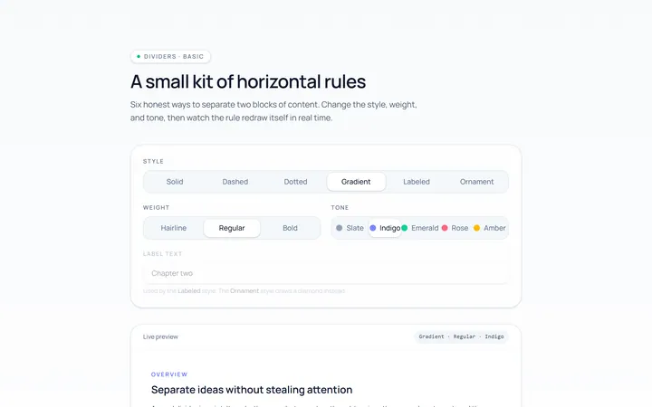
Basic Divider
Originalbasic horizontal dividers
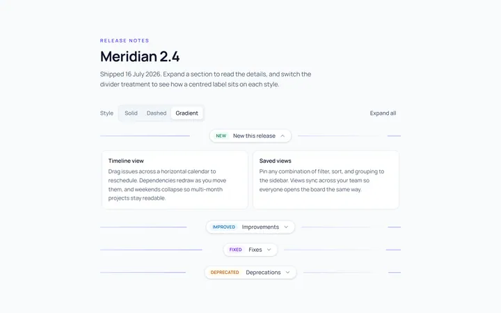
Label Divider
Originaldivider with centred label
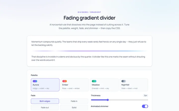
Gradient Divider
Originalgradient/fading divider
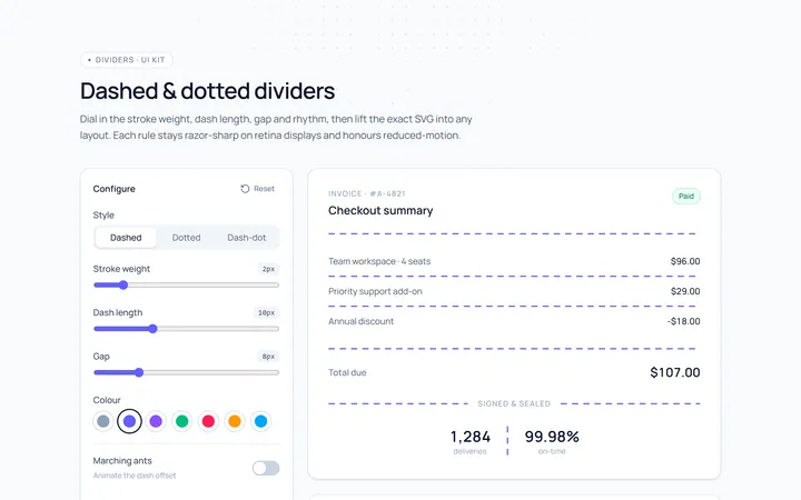
Dashed Divider
Originaldashed and dotted dividers
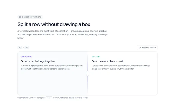
Vertical Divider
Originalvertical dividers
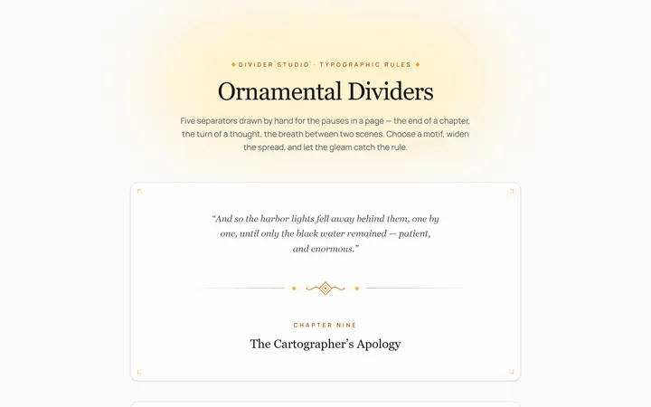
Fancy Divider
Originaldecorative ornament divider
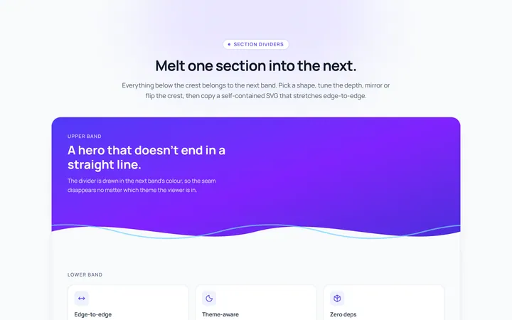
Section Divider
Originalsection wave/angle divider

Spotlight Hero
OriginalA centred hero with a soft radial spotlight, badge and dual call-to-action.

Split Hero
OriginalA two-column hero pairing a headline and CTAs with a product mock and social proof.

Gradient Spotlight Hero
OriginalA minimal centred hero with a soft gradient-mesh backdrop, announcement pill and dual call-to-action buttons.

App Preview Hero
OriginalA centred hero that pairs headline copy with a realistic product dashboard mock built entirely from markup, complete with browser chrome and a floating notification card.

Waitlist Capture Hero
OriginalA dark, focused hero with an inline email capture form and avatar social proof, ready for pre-launch waitlists.