

Dashed Divider
Original · freedashed and dotted dividers
Copy prompt gives Claude Code, Cursor or v0 a ready-to-paste prompt that recreates this exact component.
npx shadcn@latest add https://webinnoventix.com/r/div-dashed.json"use client";
import {
useId,
useRef,
useState,
type CSSProperties,
type KeyboardEvent,
} from "react";
import { motion, useReducedMotion } from "motion/react";
type LineStyle = "dashed" | "dotted" | "dashdot";
type ColorKey = "slate" | "indigo" | "violet" | "emerald" | "rose" | "amber" | "sky";
type ColorDef = {
key: ColorKey;
label: string;
stroke: string;
dot: string;
hex: string;
};
const COLORS: ColorDef[] = [
{ key: "slate", label: "Slate", stroke: "text-slate-400 dark:text-slate-500", dot: "bg-slate-400 dark:bg-slate-500", hex: "#94a3b8" },
{ key: "indigo", label: "Indigo", stroke: "text-indigo-500 dark:text-indigo-400", dot: "bg-indigo-500 dark:bg-indigo-400", hex: "#6366f1" },
{ key: "violet", label: "Violet", stroke: "text-violet-500 dark:text-violet-400", dot: "bg-violet-500 dark:bg-violet-400", hex: "#8b5cf6" },
{ key: "emerald", label: "Emerald", stroke: "text-emerald-500 dark:text-emerald-400", dot: "bg-emerald-500 dark:bg-emerald-400", hex: "#10b981" },
{ key: "rose", label: "Rose", stroke: "text-rose-500 dark:text-rose-400", dot: "bg-rose-500 dark:bg-rose-400", hex: "#f43f5e" },
{ key: "amber", label: "Amber", stroke: "text-amber-500 dark:text-amber-400", dot: "bg-amber-500 dark:bg-amber-400", hex: "#f59e0b" },
{ key: "sky", label: "Sky", stroke: "text-sky-500 dark:text-sky-400", dot: "bg-sky-500 dark:bg-sky-400", hex: "#0ea5e9" },
];
const STYLE_OPTIONS: { value: LineStyle; label: string }[] = [
{ value: "dashed", label: "Dashed" },
{ value: "dotted", label: "Dotted" },
{ value: "dashdot", label: "Dash-dot" },
];
type Pattern = { array: string; cap: "butt" | "round"; period: number };
function buildPattern(style: LineStyle, weight: number, dash: number, gap: number): Pattern {
if (style === "dotted") {
const step = gap + weight;
return { array: `0.01 ${step}`, cap: "round", period: step + 0.01 };
}
if (style === "dashdot") {
return { array: `${dash} ${gap} 0.01 ${gap}`, cap: "round", period: dash + gap + 0.01 + gap };
}
return { array: `${dash} ${gap}`, cap: "butt", period: dash + gap };
}
function getColor(key: ColorKey): ColorDef {
return COLORS.find((c) => c.key === key) ?? COLORS[0];
}
/* ---------- Divider primitive ---------- */
function DashDivider({
style,
weight,
dash,
gap,
colorClass,
animate,
orientation = "h",
length = 56,
}: {
style: LineStyle;
weight: number;
dash: number;
gap: number;
colorClass: string;
animate: boolean;
orientation?: "h" | "v";
length?: number;
}) {
const p = buildPattern(style, weight, dash, gap);
const lineStyle = { "--ddash-period": `${p.period}px` } as CSSProperties;
if (orientation === "v") {
const w = Math.max(weight + 2, 6);
return (
<svg width={w} height={length} className={colorClass} aria-hidden="true" style={{ display: "block" }}>
<line
x1={w / 2}
y1={0}
x2={w / 2}
y2={length}
stroke="currentColor"
strokeWidth={weight}
strokeDasharray={p.array}
strokeLinecap={p.cap}
className={animate ? "ddash-anim" : undefined}
style={lineStyle}
/>
</svg>
);
}
const h = Math.max(weight + 2, 8);
return (
<svg width="100%" height={h} className={colorClass} aria-hidden="true" style={{ display: "block" }}>
<line
x1={0}
y1={h / 2}
x2="100%"
y2={h / 2}
stroke="currentColor"
strokeWidth={weight}
strokeDasharray={p.array}
strokeLinecap={p.cap}
className={animate ? "ddash-anim" : undefined}
style={lineStyle}
/>
</svg>
);
}
/* ---------- Segmented radio group ---------- */
function Segmented({
label,
value,
options,
onChange,
}: {
label: string;
value: string;
options: { value: string; label: string }[];
onChange: (v: string) => void;
}) {
const refs = useRef<(HTMLButtonElement | null)[]>([]);
function move(to: number) {
const n = (to + options.length) % options.length;
onChange(options[n].value);
refs.current[n]?.focus();
}
function onKeyDown(e: KeyboardEvent<HTMLButtonElement>, i: number) {
if (e.key === "ArrowRight" || e.key === "ArrowDown") {
e.preventDefault();
move(i + 1);
} else if (e.key === "ArrowLeft" || e.key === "ArrowUp") {
e.preventDefault();
move(i - 1);
} else if (e.key === "Home") {
e.preventDefault();
move(0);
} else if (e.key === "End") {
e.preventDefault();
move(options.length - 1);
}
}
return (
<div
role="radiogroup"
aria-label={label}
className="inline-flex w-full rounded-xl bg-slate-100 p-1 dark:bg-slate-800/60"
>
{options.map((o, i) => {
const selected = o.value === value;
return (
<button
key={o.value}
ref={(el) => {
refs.current[i] = el;
}}
type="button"
role="radio"
aria-checked={selected}
tabIndex={selected ? 0 : -1}
onClick={() => onChange(o.value)}
onKeyDown={(e) => onKeyDown(e, i)}
className={`flex-1 rounded-lg px-3 py-1.5 text-sm font-medium transition focus-visible:outline-none focus-visible:ring-2 focus-visible:ring-indigo-500 focus-visible:ring-offset-2 focus-visible:ring-offset-white dark:focus-visible:ring-offset-slate-900 ${
selected
? "bg-white text-slate-900 shadow-sm dark:bg-slate-950 dark:text-white"
: "text-slate-500 hover:text-slate-800 dark:text-slate-400 dark:hover:text-slate-200"
}`}
>
{o.label}
</button>
);
})}
</div>
);
}
/* ---------- Slider row ---------- */
function SliderRow({
id,
label,
value,
min,
max,
disabled,
onChange,
}: {
id: string;
label: string;
value: number;
min: number;
max: number;
disabled?: boolean;
onChange: (v: number) => void;
}) {
return (
<div className={disabled ? "opacity-40" : undefined}>
<div className="mb-1.5 flex items-center justify-between">
<label htmlFor={id} className="text-sm font-medium text-slate-700 dark:text-slate-300">
{label}
</label>
<span className="rounded-md bg-slate-100 px-2 py-0.5 font-mono text-xs tabular-nums text-slate-600 dark:bg-slate-800 dark:text-slate-300">
{value}px
</span>
</div>
<input
id={id}
type="range"
min={min}
max={max}
step={1}
value={value}
disabled={disabled}
aria-disabled={disabled}
onChange={(e) => onChange(Number(e.target.value))}
className="w-full cursor-pointer rounded-full accent-indigo-500 focus-visible:outline-none focus-visible:ring-2 focus-visible:ring-indigo-500 focus-visible:ring-offset-2 focus-visible:ring-offset-white disabled:cursor-not-allowed dark:accent-indigo-400 dark:focus-visible:ring-offset-slate-900"
/>
</div>
);
}
/* ---------- Icons ---------- */
function CopyIcon() {
return (
<svg width="16" height="16" viewBox="0 0 24 24" fill="none" stroke="currentColor" strokeWidth="2" strokeLinecap="round" strokeLinejoin="round" aria-hidden="true">
<rect x="9" y="9" width="13" height="13" rx="2" />
<path d="M5 15H4a2 2 0 0 1-2-2V4a2 2 0 0 1 2-2h9a2 2 0 0 1 2 2v1" />
</svg>
);
}
function CheckIcon() {
return (
<svg width="16" height="16" viewBox="0 0 24 24" fill="none" stroke="currentColor" strokeWidth="2.4" strokeLinecap="round" strokeLinejoin="round" aria-hidden="true">
<path d="M20 6 9 17l-5-5" />
</svg>
);
}
function ResetIcon() {
return (
<svg width="16" height="16" viewBox="0 0 24 24" fill="none" stroke="currentColor" strokeWidth="2" strokeLinecap="round" strokeLinejoin="round" aria-hidden="true">
<path d="M3 12a9 9 0 1 0 3-6.7L3 8" />
<path d="M3 3v5h5" />
</svg>
);
}
/* ---------- Preview line item ---------- */
const ITEMS: { label: string; amount: string }[] = [
{ label: "Team workspace · 4 seats", amount: "$96.00" },
{ label: "Priority support add-on", amount: "$29.00" },
{ label: "Annual discount", amount: "-$18.00" },
];
/* ---------- Main component ---------- */
export default function DivDashed() {
const reducedRaw = useReducedMotion();
const reduced = reducedRaw ?? false;
const [style, setStyle] = useState<LineStyle>("dashed");
const [weight, setWeight] = useState(2);
const [dash, setDash] = useState(10);
const [gap, setGap] = useState(8);
const [color, setColor] = useState<ColorKey>("indigo");
const [animate, setAnimate] = useState(false);
const [copied, setCopied] = useState(false);
const uid = useId();
const copyTimer = useRef<ReturnType<typeof setTimeout> | null>(null);
const swatchRefs = useRef<(HTMLButtonElement | null)[]>([]);
const activeColor = getColor(color);
const effectiveAnimate = animate && !reduced;
const pattern = buildPattern(style, weight, dash, gap);
const dashDisabled = style === "dotted";
const snippet = `<svg width="100%" height="${Math.max(weight + 2, 8)}" role="presentation" aria-hidden="true">
<line x1="0" y1="${Math.max(weight + 2, 8) / 2}" x2="100%" y2="${Math.max(weight + 2, 8) / 2}"
stroke="${activeColor.hex}" stroke-width="${weight}"
stroke-dasharray="${pattern.array}" stroke-linecap="${pattern.cap}" />
</svg>`;
function copy() {
if (typeof navigator === "undefined" || !navigator.clipboard) return;
navigator.clipboard.writeText(snippet).then(() => {
setCopied(true);
if (copyTimer.current) clearTimeout(copyTimer.current);
copyTimer.current = setTimeout(() => setCopied(false), 1800);
});
}
function reset() {
setStyle("dashed");
setWeight(2);
setDash(10);
setGap(8);
setColor("indigo");
setAnimate(false);
}
function moveColor(to: number) {
const n = (to + COLORS.length) % COLORS.length;
setColor(COLORS[n].key);
swatchRefs.current[n]?.focus();
}
function onColorKey(e: KeyboardEvent<HTMLButtonElement>, i: number) {
if (e.key === "ArrowRight" || e.key === "ArrowDown") {
e.preventDefault();
moveColor(i + 1);
} else if (e.key === "ArrowLeft" || e.key === "ArrowUp") {
e.preventDefault();
moveColor(i - 1);
} else if (e.key === "Home") {
e.preventDefault();
moveColor(0);
} else if (e.key === "End") {
e.preventDefault();
moveColor(COLORS.length - 1);
}
}
const headingId = `${uid}-heading`;
return (
<section
aria-labelledby={headingId}
className="relative w-full overflow-hidden bg-slate-50 px-4 py-20 text-slate-900 sm:px-6 dark:bg-slate-950 dark:text-slate-100"
>
<style>{`
@keyframes ddash-march {
from { stroke-dashoffset: 0; }
to { stroke-dashoffset: var(--ddash-period); }
}
.ddash-anim { animation: ddash-march 1.1s linear infinite; }
.ddash-grid {
background-image: radial-gradient(circle at center, rgba(100,116,139,0.22) 1px, transparent 1.6px);
background-size: 22px 22px;
-webkit-mask-image: radial-gradient(ellipse 80% 60% at 50% 0%, #000 8%, transparent 74%);
mask-image: radial-gradient(ellipse 80% 60% at 50% 0%, #000 8%, transparent 74%);
opacity: 0.6;
}
@media (prefers-color-scheme: dark) {
.ddash-grid {
background-image: radial-gradient(circle at center, rgba(148,163,184,0.16) 1px, transparent 1.6px);
opacity: 0.5;
}
}
@media (prefers-reduced-motion: reduce) {
.ddash-anim { animation: none !important; }
}
`}</style>
<div aria-hidden="true" className="ddash-grid pointer-events-none absolute inset-0" />
<div className="relative mx-auto max-w-5xl">
{/* Header */}
<div className="mb-10 max-w-2xl">
<span className="inline-flex items-center gap-2 rounded-full border border-slate-200 bg-white/70 px-3 py-1 text-xs font-medium uppercase tracking-widest text-slate-500 dark:border-slate-800 dark:bg-slate-900/60 dark:text-slate-400">
<span className="h-1 w-1 rounded-full bg-indigo-500" />
Dividers · UI kit
</span>
<h2 id={headingId} className="mt-4 text-3xl font-semibold tracking-tight sm:text-4xl">
Dashed & dotted dividers
</h2>
<p className="mt-3 text-base leading-relaxed text-slate-600 dark:text-slate-400">
Dial in the stroke weight, dash length, gap and rhythm, then lift the exact SVG into any
layout. Each rule stays razor-sharp on retina displays and honours reduced-motion.
</p>
</div>
<div className="grid gap-6 lg:grid-cols-[minmax(0,340px)_1fr]">
{/* Controls */}
<div className="rounded-2xl border border-slate-200 bg-white p-5 shadow-sm dark:border-slate-800 dark:bg-slate-900/70">
<div className="flex items-center justify-between">
<h3 className="text-sm font-semibold text-slate-900 dark:text-white">Configure</h3>
<button
type="button"
onClick={reset}
className="inline-flex items-center gap-1.5 rounded-lg px-2 py-1 text-xs font-medium text-slate-500 transition hover:bg-slate-100 hover:text-slate-800 focus-visible:outline-none focus-visible:ring-2 focus-visible:ring-indigo-500 focus-visible:ring-offset-2 focus-visible:ring-offset-white dark:text-slate-400 dark:hover:bg-slate-800 dark:hover:text-slate-100 dark:focus-visible:ring-offset-slate-900"
>
<ResetIcon />
Reset
</button>
</div>
<div className="mt-5 space-y-5">
<div>
<span className="mb-1.5 block text-sm font-medium text-slate-700 dark:text-slate-300">Style</span>
<Segmented
label="Divider style"
value={style}
options={STYLE_OPTIONS}
onChange={(v) => setStyle(v as LineStyle)}
/>
</div>
<SliderRow id={`${uid}-w`} label="Stroke weight" value={weight} min={1} max={8} onChange={setWeight} />
<SliderRow
id={`${uid}-d`}
label="Dash length"
value={dash}
min={2}
max={28}
disabled={dashDisabled}
onChange={setDash}
/>
<SliderRow id={`${uid}-g`} label="Gap" value={gap} min={2} max={28} onChange={setGap} />
<div>
<span className="mb-2 block text-sm font-medium text-slate-700 dark:text-slate-300">Colour</span>
<div role="radiogroup" aria-label="Divider colour" className="flex flex-wrap gap-2.5">
{COLORS.map((c, i) => {
const selected = c.key === color;
return (
<button
key={c.key}
ref={(el) => {
swatchRefs.current[i] = el;
}}
type="button"
role="radio"
aria-checked={selected}
aria-label={c.label}
title={c.label}
tabIndex={selected ? 0 : -1}
onClick={() => setColor(c.key)}
onKeyDown={(e) => onColorKey(e, i)}
className={`flex h-8 w-8 items-center justify-center rounded-full transition focus-visible:outline-none focus-visible:ring-2 focus-visible:ring-indigo-500 focus-visible:ring-offset-2 focus-visible:ring-offset-white dark:focus-visible:ring-offset-slate-900 ${
selected
? "ring-2 ring-slate-900 ring-offset-2 ring-offset-white dark:ring-white dark:ring-offset-slate-900"
: "ring-1 ring-slate-300 hover:ring-slate-400 dark:ring-slate-700 dark:hover:ring-slate-500"
}`}
>
<span className={`h-5 w-5 rounded-full ${c.dot}`} />
</button>
);
})}
</div>
</div>
<div className="flex items-center justify-between border-t border-slate-200 pt-4 dark:border-slate-800">
<div>
<span className="block text-sm font-medium text-slate-700 dark:text-slate-300">Marching ants</span>
<span className="text-xs text-slate-400 dark:text-slate-500">
{reduced ? "Off — reduced-motion is on" : "Animate the dash offset"}
</span>
</div>
<button
type="button"
role="switch"
aria-checked={effectiveAnimate}
aria-label="Marching ants animation"
disabled={reduced}
onClick={() => setAnimate((v) => !v)}
className={`relative inline-flex h-6 w-11 shrink-0 items-center rounded-full transition focus-visible:outline-none focus-visible:ring-2 focus-visible:ring-indigo-500 focus-visible:ring-offset-2 focus-visible:ring-offset-white disabled:cursor-not-allowed disabled:opacity-40 dark:focus-visible:ring-offset-slate-900 ${
effectiveAnimate ? "bg-indigo-500 dark:bg-indigo-400" : "bg-slate-300 dark:bg-slate-700"
}`}
>
<span
className={`inline-block h-5 w-5 transform rounded-full bg-white shadow transition ${
effectiveAnimate ? "translate-x-5" : "translate-x-0.5"
}`}
/>
</button>
</div>
</div>
</div>
{/* Preview */}
<motion.div
initial={reduced ? false : { opacity: 0, y: 14 }}
animate={{ opacity: 1, y: 0 }}
transition={{ duration: 0.5, ease: [0.22, 1, 0.36, 1] }}
className="flex flex-col gap-6"
>
{/* Live card */}
<div className="rounded-2xl border border-slate-200 bg-white p-6 shadow-sm sm:p-8 dark:border-slate-800 dark:bg-slate-900/70">
<div className="flex items-start justify-between">
<div>
<p className="text-xs font-medium uppercase tracking-widest text-slate-400 dark:text-slate-500">
Invoice · #A-4821
</p>
<h3 className="mt-1 text-lg font-semibold text-slate-900 dark:text-white">Checkout summary</h3>
</div>
<span className="rounded-full bg-emerald-50 px-2.5 py-1 text-xs font-medium text-emerald-700 ring-1 ring-emerald-200 dark:bg-emerald-500/10 dark:text-emerald-300 dark:ring-emerald-500/30">
Paid
</span>
</div>
<div className="my-5">
<DashDivider style={style} weight={weight} dash={dash} gap={gap} colorClass={activeColor.stroke} animate={effectiveAnimate} />
</div>
<div>
{ITEMS.map((it, i) => (
<div key={it.label}>
<div className="flex items-center justify-between py-2.5 text-sm">
<span className="text-slate-600 dark:text-slate-300">{it.label}</span>
<span className="font-medium tabular-nums text-slate-900 dark:text-white">{it.amount}</span>
</div>
{i < ITEMS.length - 1 && (
<DashDivider style={style} weight={weight} dash={dash} gap={gap} colorClass={activeColor.stroke} animate={effectiveAnimate} />
)}
</div>
))}
</div>
<div className="my-5">
<DashDivider style={style} weight={weight} dash={dash} gap={gap} colorClass={activeColor.stroke} animate={effectiveAnimate} />
</div>
<div className="flex items-center justify-between">
<span className="text-sm font-medium text-slate-500 dark:text-slate-400">Total due</span>
<span className="text-xl font-semibold tabular-nums text-slate-900 dark:text-white">$107.00</span>
</div>
{/* Labelled divider */}
<div className="mt-7 flex items-center gap-4">
<div className="flex-1">
<DashDivider style={style} weight={weight} dash={dash} gap={gap} colorClass={activeColor.stroke} animate={effectiveAnimate} />
</div>
<span className="whitespace-nowrap text-xs font-medium uppercase tracking-widest text-slate-400 dark:text-slate-500">
Signed & sealed
</span>
<div className="flex-1">
<DashDivider style={style} weight={weight} dash={dash} gap={gap} colorClass={activeColor.stroke} animate={effectiveAnimate} />
</div>
</div>
{/* Vertical divider between stats */}
<div className="mt-7 flex items-stretch justify-center gap-6">
<div className="text-center">
<p className="text-2xl font-semibold tabular-nums text-slate-900 dark:text-white">1,284</p>
<p className="text-xs text-slate-400 dark:text-slate-500">deliveries</p>
</div>
<DashDivider
style={style}
weight={weight}
dash={dash}
gap={gap}
colorClass={activeColor.stroke}
animate={effectiveAnimate}
orientation="v"
length={52}
/>
<div className="text-center">
<p className="text-2xl font-semibold tabular-nums text-slate-900 dark:text-white">99.98%</p>
<p className="text-xs text-slate-400 dark:text-slate-500">on-time</p>
</div>
</div>
</div>
{/* Snippet */}
<div className="rounded-2xl border border-slate-200 bg-white p-5 shadow-sm dark:border-slate-800 dark:bg-slate-900/70">
<div className="mb-3 flex items-center justify-between">
<div className="flex items-center gap-2">
<span className="text-sm font-semibold text-slate-900 dark:text-white">SVG output</span>
<code className="rounded bg-slate-100 px-1.5 py-0.5 font-mono text-[11px] text-slate-500 dark:bg-slate-800 dark:text-slate-400">
dasharray {pattern.array}
</code>
</div>
<button
type="button"
onClick={copy}
aria-label="Copy SVG snippet"
className={`inline-flex items-center gap-1.5 rounded-lg px-2.5 py-1.5 text-xs font-medium transition focus-visible:outline-none focus-visible:ring-2 focus-visible:ring-indigo-500 focus-visible:ring-offset-2 focus-visible:ring-offset-white dark:focus-visible:ring-offset-slate-900 ${
copied
? "bg-emerald-50 text-emerald-700 dark:bg-emerald-500/10 dark:text-emerald-300"
: "bg-slate-100 text-slate-600 hover:bg-slate-200 hover:text-slate-900 dark:bg-slate-800 dark:text-slate-300 dark:hover:bg-slate-700 dark:hover:text-white"
}`}
>
{copied ? <CheckIcon /> : <CopyIcon />}
{copied ? "Copied" : "Copy"}
</button>
</div>
<pre className="overflow-x-auto rounded-xl bg-slate-950 p-4 font-mono text-[12px] leading-relaxed text-slate-300 dark:bg-black/40">
<code>{snippet}</code>
</pre>
</div>
</motion.div>
</div>
</div>
</section>
);
}Dependencies
Licence
Built by Web Innoventix. Free for personal and commercial use, no attribution required.
Built by Web Innoventix
Need a custom interface, a full website, or SEO that gets you cited by AI? We design, build and rank it end to end.
Get a free quoteSimilar components
Browse all →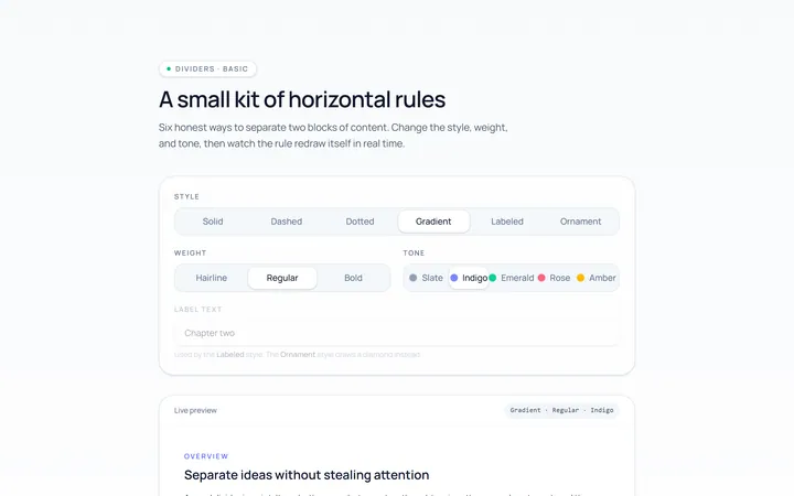
Basic Divider
Originalbasic horizontal dividers
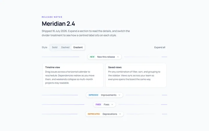
Label Divider
Originaldivider with centred label
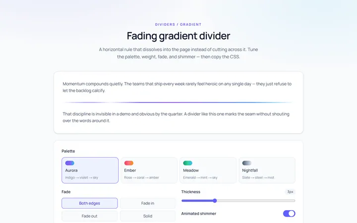
Gradient Divider
Originalgradient/fading divider
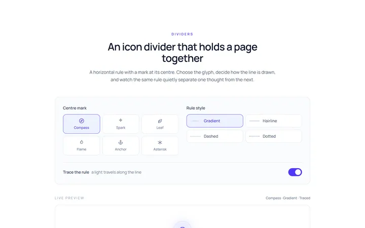
Icon Divider
Originaldivider with a centre icon
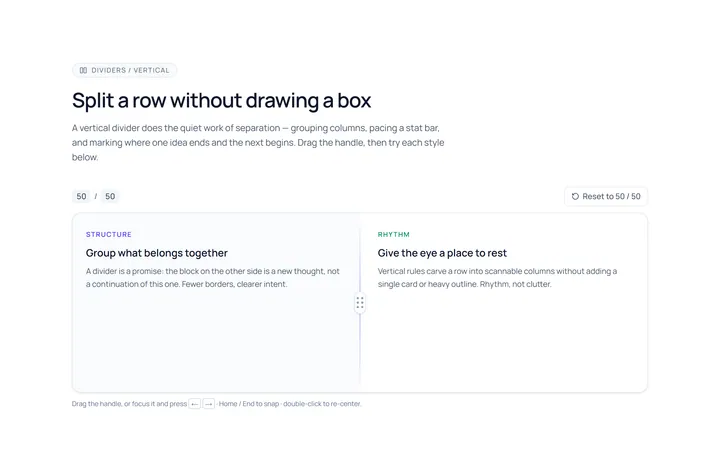
Vertical Divider
Originalvertical dividers
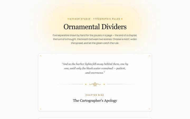
Fancy Divider
Originaldecorative ornament divider
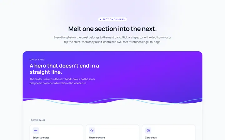
Section Divider
Originalsection wave/angle divider

Spotlight Hero
OriginalA centred hero with a soft radial spotlight, badge and dual call-to-action.

Split Hero
OriginalA two-column hero pairing a headline and CTAs with a product mock and social proof.

Gradient Spotlight Hero
OriginalA minimal centred hero with a soft gradient-mesh backdrop, announcement pill and dual call-to-action buttons.

App Preview Hero
OriginalA centred hero that pairs headline copy with a realistic product dashboard mock built entirely from markup, complete with browser chrome and a floating notification card.

Waitlist Capture Hero
OriginalA dark, focused hero with an inline email capture form and avatar social proof, ready for pre-launch waitlists.