

Vertical Divider
Original · freevertical dividers
Copy prompt gives Claude Code, Cursor or v0 a ready-to-paste prompt that recreates this exact component.
npx shadcn@latest add https://webinnoventix.com/r/div-vertical.json"use client";
import {
Fragment,
useCallback,
useId,
useRef,
useState,
type KeyboardEvent as ReactKeyboardEvent,
type PointerEvent as ReactPointerEvent,
} from "react";
import { motion, useReducedMotion } from "motion/react";
const VARIANTS = [
{ id: "hairline", label: "Hairline", hint: "1px, quiet" },
{ id: "gradient", label: "Gradient", hint: "fades at both ends" },
{ id: "dashed", label: "Dashed", hint: "a moving rhythm" },
{ id: "beaded", label: "Beaded", hint: "a column of dots" },
{ id: "glow", label: "Glow", hint: "accent, pulsing" },
] as const;
type DividerVariant = (typeof VARIANTS)[number]["id"];
const MIN = 22;
const MAX = 78;
const STEP = 2;
const METRICS = [
{ value: "1.4s", label: "Median load" },
{ value: "98", label: "Lighthouse" },
{ value: "24", label: "Components" },
{ value: "0", label: "Layout shifts" },
];
function VerticalLine({
variant,
reduced,
}: {
variant: DividerVariant;
reduced: boolean;
}) {
switch (variant) {
case "hairline":
return <span className="h-full w-px bg-slate-300 dark:bg-slate-700" />;
case "gradient":
return (
<span className="h-full w-px bg-gradient-to-b from-transparent via-indigo-400 to-transparent dark:via-indigo-500" />
);
case "dashed":
return (
<span
className={`h-full w-0.5 text-slate-300 dark:text-slate-600 ${
reduced ? "" : "dvv-dash-flow"
}`}
style={{
backgroundImage:
"repeating-linear-gradient(to bottom, currentColor 0 6px, transparent 6px 12px)",
}}
/>
);
case "beaded":
return (
<span
className="h-full w-1 text-slate-400 dark:text-slate-500"
style={{
backgroundImage:
"radial-gradient(currentColor 45%, transparent 50%)",
backgroundSize: "4px 10px",
backgroundRepeat: "repeat-y",
backgroundPosition: "center",
}}
/>
);
case "glow":
return (
<span
className={`h-full w-px bg-violet-400 ${
reduced ? "" : "dvv-glow-line"
}`}
style={{ boxShadow: "0 0 8px 1px rgba(139, 92, 246, 0.7)" }}
/>
);
}
}
export default function VerticalDividerLab() {
const prefersReduced = useReducedMotion() ?? false;
const [pos, setPos] = useState(50);
const [dragging, setDragging] = useState(false);
const [variant, setVariant] = useState<DividerVariant>("gradient");
const containerRef = useRef<HTMLDivElement | null>(null);
const radioRefs = useRef<Array<HTMLButtonElement | null>>([]);
const groupLabelId = useId();
const separatorLabelId = useId();
const rounded = Math.round(pos);
const updateFromClientX = useCallback((clientX: number) => {
const el = containerRef.current;
if (!el) return;
const rect = el.getBoundingClientRect();
const pct = ((clientX - rect.left) / rect.width) * 100;
setPos(Math.min(MAX, Math.max(MIN, pct)));
}, []);
const onPointerDown = (e: ReactPointerEvent<HTMLDivElement>) => {
e.preventDefault();
e.currentTarget.setPointerCapture(e.pointerId);
setDragging(true);
};
const onPointerMove = (e: ReactPointerEvent<HTMLDivElement>) => {
if (!dragging) return;
updateFromClientX(e.clientX);
};
const onPointerUp = (e: ReactPointerEvent<HTMLDivElement>) => {
if (e.currentTarget.hasPointerCapture(e.pointerId)) {
e.currentTarget.releasePointerCapture(e.pointerId);
}
setDragging(false);
};
const onSeparatorKeyDown = (e: ReactKeyboardEvent<HTMLDivElement>) => {
let next = pos;
switch (e.key) {
case "ArrowLeft":
next = pos - STEP;
break;
case "ArrowRight":
next = pos + STEP;
break;
case "PageDown":
next = pos - STEP * 4;
break;
case "PageUp":
next = pos + STEP * 4;
break;
case "Home":
next = MIN;
break;
case "End":
next = MAX;
break;
default:
return;
}
e.preventDefault();
setPos(Math.min(MAX, Math.max(MIN, next)));
};
const onRadioKeyDown = (
e: ReactKeyboardEvent<HTMLButtonElement>,
index: number,
) => {
const count = VARIANTS.length;
let next = index;
switch (e.key) {
case "ArrowRight":
case "ArrowDown":
next = (index + 1) % count;
break;
case "ArrowLeft":
case "ArrowUp":
next = (index - 1 + count) % count;
break;
case "Home":
next = 0;
break;
case "End":
next = count - 1;
break;
default:
return;
}
e.preventDefault();
setVariant(VARIANTS[next].id);
radioRefs.current[next]?.focus();
};
const rise = (delay: number) =>
prefersReduced
? {}
: {
initial: { opacity: 0, y: 18 },
whileInView: { opacity: 1, y: 0 },
viewport: { once: true, margin: "-80px" },
transition: { duration: 0.55, delay, ease: "easeOut" as const },
};
return (
<section className="relative w-full bg-white px-5 py-20 text-slate-900 sm:py-28 dark:bg-slate-950 dark:text-slate-100">
<style>{`
@keyframes dvv-dash-flow { to { background-position: 0 12px; } }
@keyframes dvv-glow-pulse { 0%, 100% { opacity: 0.5; } 50% { opacity: 1; } }
.dvv-dash-flow { animation: dvv-dash-flow 1.1s linear infinite; }
.dvv-glow-line { animation: dvv-glow-pulse 2.4s ease-in-out infinite; }
@media (prefers-reduced-motion: reduce) {
.dvv-dash-flow, .dvv-glow-line { animation: none !important; }
}
`}</style>
<div className="mx-auto max-w-5xl">
<motion.div {...rise(0)} className="max-w-2xl">
<span className="inline-flex items-center gap-2 rounded-full border border-slate-200 bg-slate-50 px-3 py-1 text-xs font-medium uppercase tracking-widest text-slate-500 dark:border-slate-800 dark:bg-slate-900 dark:text-slate-400">
<svg
viewBox="0 0 24 24"
fill="none"
stroke="currentColor"
strokeWidth={2}
className="h-3.5 w-3.5"
aria-hidden="true"
>
<rect x="3" y="4" width="7" height="16" rx="1.5" />
<rect x="14" y="4" width="7" height="16" rx="1.5" />
</svg>
Dividers / Vertical
</span>
<h2 className="mt-5 text-3xl font-semibold tracking-tight sm:text-4xl">
Split a row without drawing a box
</h2>
<p className="mt-4 text-base leading-relaxed text-slate-600 dark:text-slate-400">
A vertical divider does the quiet work of separation — grouping
columns, pacing a stat bar, and marking where one idea ends and the
next begins. Drag the handle, then try each style below.
</p>
</motion.div>
<motion.div {...rise(0.08)} className="mt-10">
<div className="mb-3 flex items-center justify-between gap-3">
<span className="inline-flex items-center gap-1.5 text-sm font-medium tabular-nums text-slate-500 dark:text-slate-400">
<span className="rounded-md bg-slate-100 px-2 py-0.5 text-slate-700 dark:bg-slate-800 dark:text-slate-200">
{rounded}
</span>
<span aria-hidden="true">/</span>
<span className="rounded-md bg-slate-100 px-2 py-0.5 text-slate-700 dark:bg-slate-800 dark:text-slate-200">
{100 - rounded}
</span>
</span>
<button
type="button"
onClick={() => setPos(50)}
className="inline-flex items-center gap-1.5 rounded-lg border border-slate-200 px-3 py-1.5 text-sm font-medium text-slate-600 transition-colors hover:bg-slate-50 focus-visible:outline-none focus-visible:ring-2 focus-visible:ring-indigo-500 focus-visible:ring-offset-2 focus-visible:ring-offset-white dark:border-slate-800 dark:text-slate-300 dark:hover:bg-slate-900 dark:focus-visible:ring-offset-slate-950"
>
<svg
viewBox="0 0 24 24"
fill="none"
stroke="currentColor"
strokeWidth={2}
strokeLinecap="round"
strokeLinejoin="round"
className="h-3.5 w-3.5"
aria-hidden="true"
>
<path d="M3 12a9 9 0 1 0 3-6.7L3 8" />
<path d="M3 3v5h5" />
</svg>
Reset to 50 / 50
</button>
</div>
<div
ref={containerRef}
className={`relative grid h-72 overflow-hidden rounded-2xl border border-slate-200 bg-white shadow-sm sm:h-80 dark:border-slate-800 dark:bg-slate-900 ${
dragging ? "select-none" : ""
}`}
style={{ gridTemplateColumns: `${pos}% ${100 - pos}%` }}
>
<div className="min-w-0 overflow-hidden bg-slate-50/70 p-5 pr-8 sm:p-6 sm:pr-8 dark:bg-slate-900/60">
<span className="text-xs font-semibold uppercase tracking-widest text-indigo-600 dark:text-indigo-400">
Structure
</span>
<h3 className="mt-2 text-lg font-semibold">
Group what belongs together
</h3>
<p className="mt-2 text-sm leading-relaxed text-slate-600 dark:text-slate-400">
A divider is a promise: the block on the other side is a new
thought, not a continuation of this one. Fewer borders, clearer
intent.
</p>
</div>
<div className="min-w-0 overflow-hidden bg-white p-5 pl-8 sm:p-6 sm:pl-8 dark:bg-slate-900">
<span className="text-xs font-semibold uppercase tracking-widest text-emerald-600 dark:text-emerald-400">
Rhythm
</span>
<h3 className="mt-2 text-lg font-semibold">
Give the eye a place to rest
</h3>
<p className="mt-2 text-sm leading-relaxed text-slate-600 dark:text-slate-400">
Vertical rules carve a row into scannable columns without adding
a single card or heavy outline. Rhythm, not clutter.
</p>
</div>
<div
role="separator"
aria-orientation="vertical"
aria-labelledby={separatorLabelId}
aria-valuenow={rounded}
aria-valuemin={MIN}
aria-valuemax={MAX}
aria-valuetext={`${rounded}% left, ${100 - rounded}% right`}
tabIndex={0}
onPointerDown={onPointerDown}
onPointerMove={onPointerMove}
onPointerUp={onPointerUp}
onPointerCancel={onPointerUp}
onKeyDown={onSeparatorKeyDown}
onDoubleClick={() => setPos(50)}
data-dragging={dragging ? "true" : "false"}
className="group absolute inset-y-0 z-10 flex w-6 -translate-x-1/2 cursor-col-resize touch-none items-center justify-center focus-visible:outline-none"
style={{ left: `${pos}%` }}
>
<span id={separatorLabelId} className="sr-only">
Resize panels. Use the left and right arrow keys to adjust.
</span>
<span className="pointer-events-none absolute inset-y-0 left-1/2 flex -translate-x-1/2 items-stretch">
<VerticalLine variant={variant} reduced={prefersReduced} />
</span>
<span className="pointer-events-none relative z-10 flex h-10 w-5 items-center justify-center rounded-full border border-slate-200 bg-white shadow-sm transition-transform group-hover:scale-105 group-focus-visible:ring-2 group-focus-visible:ring-indigo-500 group-focus-visible:ring-offset-2 group-focus-visible:ring-offset-white group-data-[dragging=true]:scale-110 group-data-[dragging=true]:border-indigo-400 dark:border-slate-700 dark:bg-slate-800 dark:group-focus-visible:ring-offset-slate-900 dark:group-data-[dragging=true]:border-indigo-500">
<span className="grid grid-cols-2 gap-1">
{Array.from({ length: 6 }).map((_, i) => (
<span
key={i}
className="h-1 w-1 rounded-full bg-slate-400 dark:bg-slate-500"
/>
))}
</span>
</span>
</div>
</div>
<p className="mt-3 text-xs text-slate-500 dark:text-slate-500">
Drag the handle, or focus it and press{" "}
<kbd className="rounded border border-slate-300 px-1 font-sans dark:border-slate-700">
←
</kbd>{" "}
<kbd className="rounded border border-slate-300 px-1 font-sans dark:border-slate-700">
→
</kbd>{" "}
· Home / End to snap · double-click to re-center.
</p>
</motion.div>
<motion.div {...rise(0.16)} className="mt-12">
<h3
id={groupLabelId}
className="text-sm font-semibold uppercase tracking-widest text-slate-500 dark:text-slate-400"
>
Divider style
</h3>
<div
role="radiogroup"
aria-labelledby={groupLabelId}
className="mt-4 flex flex-wrap gap-3"
>
{VARIANTS.map((v, i) => {
const selected = v.id === variant;
return (
<button
key={v.id}
ref={(node) => {
radioRefs.current[i] = node;
}}
type="button"
role="radio"
aria-checked={selected}
tabIndex={selected ? 0 : -1}
onClick={() => setVariant(v.id)}
onKeyDown={(e) => onRadioKeyDown(e, i)}
className={`flex items-center gap-3 rounded-xl border px-4 py-3 text-left transition-colors focus-visible:outline-none focus-visible:ring-2 focus-visible:ring-indigo-500 focus-visible:ring-offset-2 focus-visible:ring-offset-white dark:focus-visible:ring-offset-slate-950 ${
selected
? "border-indigo-500 bg-indigo-50 dark:border-indigo-500 dark:bg-indigo-500/10"
: "border-slate-200 bg-white hover:border-slate-300 hover:bg-slate-50 dark:border-slate-800 dark:bg-slate-900 dark:hover:border-slate-700"
}`}
>
<span className="flex h-8 w-3 items-stretch justify-center">
<VerticalLine variant={v.id} reduced={prefersReduced} />
</span>
<span className="min-w-0">
<span
className={`block text-sm font-semibold ${
selected
? "text-indigo-700 dark:text-indigo-300"
: "text-slate-800 dark:text-slate-200"
}`}
>
{v.label}
</span>
<span className="block text-xs text-slate-500 dark:text-slate-400">
{v.hint}
</span>
</span>
</button>
);
})}
</div>
</motion.div>
<motion.div {...rise(0.24)} className="mt-12">
<div className="rounded-2xl border border-slate-200 bg-white p-6 shadow-sm dark:border-slate-800 dark:bg-slate-900">
<div className="flex items-stretch justify-between gap-1 sm:gap-2">
{METRICS.map((m, i) => (
<Fragment key={m.label}>
{i > 0 && (
<div className="flex w-3 items-stretch justify-center py-1">
<VerticalLine
variant={variant}
reduced={prefersReduced}
/>
</div>
)}
<div className="flex flex-1 flex-col items-center justify-center px-1 text-center">
<span className="text-2xl font-semibold tabular-nums tracking-tight sm:text-3xl">
{m.value}
</span>
<span className="mt-1 text-[11px] font-medium uppercase tracking-wide text-slate-500 sm:text-xs dark:text-slate-400">
{m.label}
</span>
</div>
</Fragment>
))}
</div>
</div>
<p className="mt-3 text-xs text-slate-500 dark:text-slate-500">
The same divider style keeps a metric bar readable — one rule
between numbers, no boxes.
</p>
</motion.div>
</div>
</section>
);
}Dependencies
Licence
Built by Web Innoventix. Free for personal and commercial use, no attribution required.
Built by Web Innoventix
Need a custom interface, a full website, or SEO that gets you cited by AI? We design, build and rank it end to end.
Get a free quoteSimilar components
Browse all →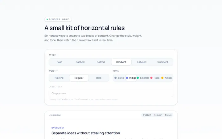
Basic Divider
Originalbasic horizontal dividers
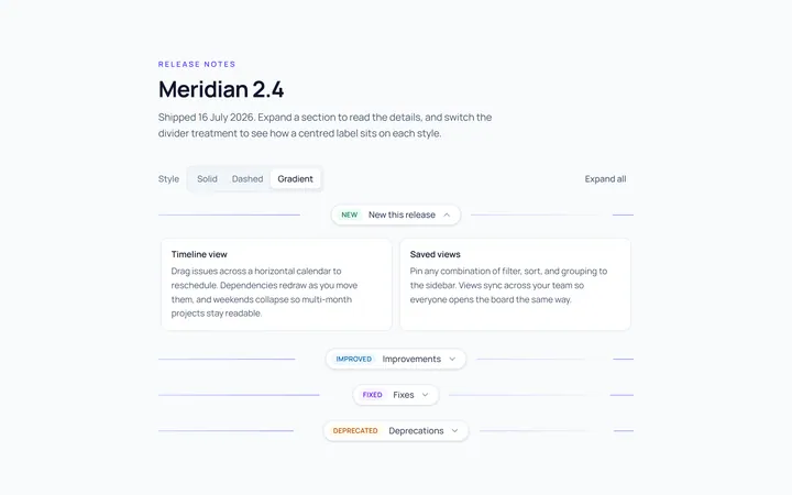
Label Divider
Originaldivider with centred label
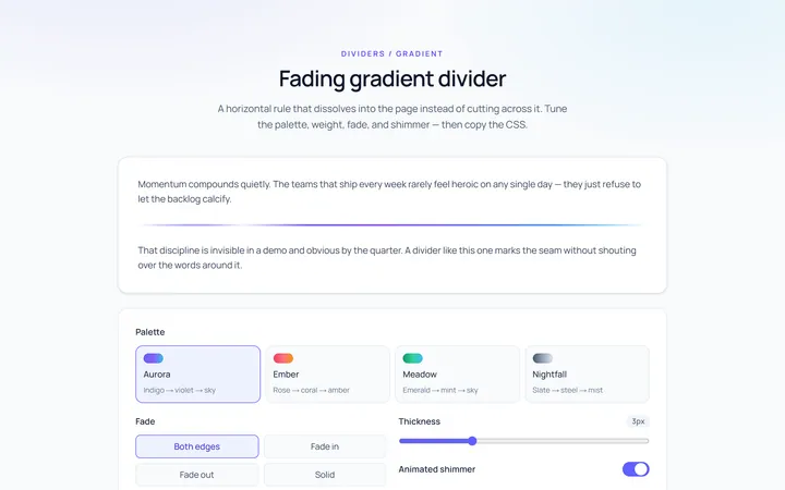
Gradient Divider
Originalgradient/fading divider
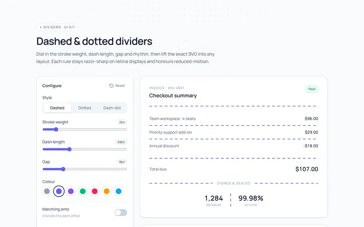
Dashed Divider
Originaldashed and dotted dividers
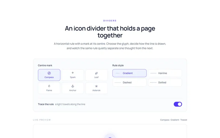
Icon Divider
Originaldivider with a centre icon
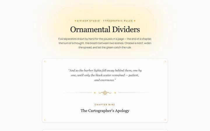
Fancy Divider
Originaldecorative ornament divider
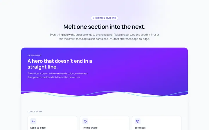
Section Divider
Originalsection wave/angle divider

Spotlight Hero
OriginalA centred hero with a soft radial spotlight, badge and dual call-to-action.

Split Hero
OriginalA two-column hero pairing a headline and CTAs with a product mock and social proof.

Gradient Spotlight Hero
OriginalA minimal centred hero with a soft gradient-mesh backdrop, announcement pill and dual call-to-action buttons.

App Preview Hero
OriginalA centred hero that pairs headline copy with a realistic product dashboard mock built entirely from markup, complete with browser chrome and a floating notification card.

Waitlist Capture Hero
OriginalA dark, focused hero with an inline email capture form and avatar social proof, ready for pre-launch waitlists.