

Fancy Divider
Original · freedecorative ornament divider
Copy prompt gives Claude Code, Cursor or v0 a ready-to-paste prompt that recreates this exact component.
npx shadcn@latest add https://webinnoventix.com/r/div-fancy.json"use client";
import { useId, useRef, useState, type KeyboardEvent } from "react";
import { motion, useReducedMotion } from "motion/react";
type MotifId = "filigree" | "fan" | "compass" | "laurel" | "quatrefoil";
const MOTIFS: ReadonlyArray<{ id: MotifId; name: string; blurb: string }> = [
{
id: "filigree",
name: "Filigree",
blurb: "Curling flourishes drawn around a cut lozenge — the printer's classic breather.",
},
{
id: "fan",
name: "Deco Fan",
blurb: "Eight rays fanning from a struck center, in the stepped art-deco manner.",
},
{
id: "compass",
name: "Compass",
blurb: "An eight-point star inside its ring — a small heading for the lost.",
},
{
id: "laurel",
name: "Laurel",
blurb: "Twin sprigs mirrored leaf for leaf, meeting at a single berry.",
},
{
id: "quatrefoil",
name: "Quatrefoil",
blurb: "A four-lobed medallion borrowed from the cloister windows.",
},
];
function Emblem({
id,
className,
label,
}: {
id: MotifId;
className?: string;
label?: string;
}) {
const shared = {
viewBox: "0 0 100 56",
fill: "none",
stroke: "currentColor",
strokeWidth: 1.5,
strokeLinecap: "round" as const,
strokeLinejoin: "round" as const,
className,
role: label ? "img" : undefined,
"aria-label": label,
"aria-hidden": label ? undefined : true,
};
if (id === "filigree") {
return (
<svg {...shared}>
<path d="M50 14 L64 28 L50 42 L36 28 Z" />
<path d="M50 20 L58 28 L50 36 L42 28 Z" opacity={0.55} />
<circle cx={50} cy={28} r={2} fill="currentColor" stroke="none" />
<path d="M36 28 C 26 18, 18 38, 9 28" />
<path d="M64 28 C 74 18, 82 38, 91 28" />
<circle cx={9} cy={28} r={1.6} fill="currentColor" stroke="none" />
<circle cx={91} cy={28} r={1.6} fill="currentColor" stroke="none" />
</svg>
);
}
if (id === "fan") {
return (
<svg {...shared}>
<path d="M50 10 L70 28 L50 46 L30 28 Z" />
<path
d="M50 28 L50 10 M50 28 L60 17 M50 28 L70 28 M50 28 L60 39 M50 28 L50 46 M50 28 L40 39 M50 28 L30 28 M50 28 L40 17"
opacity={0.7}
/>
<circle cx={50} cy={28} r={2.5} fill="currentColor" stroke="none" />
<path d="M30 28 L16 28 M70 28 L84 28" opacity={0.5} />
<circle cx={16} cy={28} r={1.5} fill="currentColor" stroke="none" />
<circle cx={84} cy={28} r={1.5} fill="currentColor" stroke="none" />
</svg>
);
}
if (id === "compass") {
return (
<svg {...shared}>
<circle cx={50} cy={28} r={21} opacity={0.3} />
<polygon points="50,10 52.7,21.5 62.7,15.3 56.5,25.3 68,28 56.5,30.7 62.7,40.7 52.7,34.5 50,46 47.3,34.5 37.3,40.7 43.5,30.7 32,28 43.5,25.3 37.3,15.3 47.3,21.5" />
<circle cx={50} cy={28} r={2.5} fill="currentColor" stroke="none" />
</svg>
);
}
if (id === "laurel") {
return (
<svg {...shared}>
<circle cx={50} cy={28} r={2} fill="currentColor" stroke="none" />
<path d="M47 28 C 40 27, 32 24, 24 27" />
<path d="M53 28 C 60 27, 68 24, 76 27" />
<ellipse cx={41} cy={25} rx={3.4} ry={1.5} transform="rotate(-32 41 25)" />
<ellipse cx={34} cy={23.5} rx={3.4} ry={1.5} transform="rotate(-32 34 23.5)" />
<ellipse cx={27} cy={23.5} rx={3} ry={1.4} transform="rotate(-32 27 23.5)" />
<ellipse cx={59} cy={25} rx={3.4} ry={1.5} transform="rotate(32 59 25)" />
<ellipse cx={66} cy={23.5} rx={3.4} ry={1.5} transform="rotate(32 66 23.5)" />
<ellipse cx={73} cy={23.5} rx={3} ry={1.4} transform="rotate(32 73 23.5)" />
</svg>
);
}
return (
<svg {...shared}>
<circle cx={50} cy={17} r={8} />
<circle cx={62} cy={28} r={8} />
<circle cx={50} cy={39} r={8} />
<circle cx={38} cy={28} r={8} />
<path d="M50 24 L54 28 L50 32 L46 28 Z" fill="currentColor" stroke="none" />
</svg>
);
}
function Corner({ className }: { className: string }) {
return (
<svg
aria-hidden
viewBox="0 0 24 24"
fill="none"
stroke="currentColor"
strokeWidth={1.25}
strokeLinecap="round"
strokeLinejoin="round"
className={className}
>
<path d="M2 11 L2 2 L11 2" />
<path d="M2 2 C 8 4, 10 6, 12 12" opacity={0.5} />
</svg>
);
}
function Rule({ side, gleam }: { side: "left" | "right"; gleam: boolean }) {
const base =
side === "left"
? "from-transparent via-zinc-300 to-zinc-400 dark:via-zinc-700 dark:to-zinc-600"
: "from-zinc-400 via-zinc-300 to-transparent dark:from-zinc-600 dark:via-zinc-700";
return (
<span className="relative h-px flex-1 overflow-hidden rounded-full">
<span className={`absolute inset-0 bg-gradient-to-r ${base}`} />
{gleam ? (
<span
aria-hidden
className="dvfy-gleam absolute inset-y-0 -left-1/3 w-1/3 bg-gradient-to-r from-transparent via-amber-400 to-transparent dark:via-amber-300"
style={{ animationDelay: side === "left" ? "0s" : "1.4s" }}
/>
) : null}
</span>
);
}
export default function DivFancy() {
const shouldReduce = useReducedMotion();
const canAnimate = !shouldReduce;
const [selected, setSelected] = useState<MotifId>("filigree");
const [spread, setSpread] = useState<number>(58);
const [animate, setAnimate] = useState<boolean>(true);
const radioRefs = useRef<Array<HTMLButtonElement | null>>([]);
const spreadId = useId();
const switchLabelId = useId();
const gleamOn = animate && canAnimate;
const maxW = 22 + (spread / 100) * 24;
const current = MOTIFS.find((m) => m.id === selected) ?? MOTIFS[0];
const onKeyDown = (e: KeyboardEvent<HTMLDivElement>) => {
const idx = MOTIFS.findIndex((m) => m.id === selected);
const len = MOTIFS.length;
let next = idx;
if (e.key === "ArrowRight" || e.key === "ArrowDown") next = (idx + 1) % len;
else if (e.key === "ArrowLeft" || e.key === "ArrowUp") next = (idx - 1 + len) % len;
else if (e.key === "Home") next = 0;
else if (e.key === "End") next = len - 1;
else return;
e.preventDefault();
setSelected(MOTIFS[next].id);
radioRefs.current[next]?.focus();
};
const rise = (delay: number) =>
shouldReduce
? { initial: { opacity: 0 }, animate: { opacity: 1 }, transition: { duration: 0.4, delay } }
: {
initial: { opacity: 0, y: 18 },
animate: { opacity: 1, y: 0 },
transition: { duration: 0.6, delay, ease: "easeOut" as const },
};
const focusRing =
"focus-visible:outline-none focus-visible:ring-2 focus-visible:ring-amber-500 focus-visible:ring-offset-2 focus-visible:ring-offset-white dark:focus-visible:ring-offset-zinc-950";
return (
<section className="relative w-full overflow-hidden bg-zinc-50 px-6 py-20 text-zinc-900 sm:py-28 dark:bg-zinc-950 dark:text-zinc-100">
<style>{`
@keyframes dvfy-gleam {
from { transform: translateX(-160%); }
to { transform: translateX(460%); }
}
@keyframes dvfy-emblem {
0%, 100% { transform: scale(1); }
50% { transform: scale(1.05); }
}
.dvfy-gleam { animation: dvfy-gleam 2.8s cubic-bezier(0.4, 0, 0.2, 1) infinite; }
.dvfy-emblem { animation: dvfy-emblem 3.6s ease-in-out infinite; transform-origin: center; }
@media (prefers-reduced-motion: reduce) {
.dvfy-gleam, .dvfy-emblem { animation: none !important; }
}
`}</style>
<div aria-hidden className="pointer-events-none absolute inset-0">
<div className="absolute left-1/2 top-4 h-72 w-[42rem] max-w-full -translate-x-1/2 rounded-full bg-amber-200/40 blur-3xl dark:bg-amber-500/10" />
<div className="absolute bottom-0 left-1/2 h-64 w-[36rem] max-w-full -translate-x-1/2 rounded-full bg-rose-200/20 blur-3xl dark:bg-rose-500/5" />
</div>
<div className="relative mx-auto max-w-3xl">
<motion.header {...rise(0)} className="text-center">
<span className="inline-flex items-center gap-2 text-[0.7rem] font-semibold uppercase tracking-[0.35em] text-amber-700 dark:text-amber-500">
<span className="h-1.5 w-1.5 rotate-45 bg-amber-500 dark:bg-amber-400" aria-hidden />
Divider Studio · Typographic Rules
<span className="h-1.5 w-1.5 rotate-45 bg-amber-500 dark:bg-amber-400" aria-hidden />
</span>
<h2 className="mt-5 font-serif text-4xl font-medium tracking-tight text-zinc-900 sm:text-5xl dark:text-zinc-50">
Ornamental Dividers
</h2>
<p className="mx-auto mt-5 max-w-xl text-pretty text-base leading-relaxed text-zinc-600 dark:text-zinc-300">
Five separators drawn by hand for the pauses in a page — the end of a chapter,
the turn of a thought, the breath between two scenes. Choose a motif, widen the
spread, and let the gleam catch the rule.
</p>
</motion.header>
<motion.figure
{...rise(0.1)}
className="relative mt-14 rounded-2xl border border-zinc-200 bg-white/70 px-6 py-14 shadow-sm backdrop-blur-sm sm:px-12 dark:border-zinc-800 dark:bg-zinc-900/60"
>
<Corner className="absolute left-3 top-3 h-5 w-5 text-amber-500/70 dark:text-amber-400/60" />
<Corner className="absolute right-3 top-3 h-5 w-5 rotate-90 text-amber-500/70 dark:text-amber-400/60" />
<Corner className="absolute bottom-3 right-3 h-5 w-5 rotate-180 text-amber-500/70 dark:text-amber-400/60" />
<Corner className="absolute bottom-3 left-3 h-5 w-5 -rotate-90 text-amber-500/70 dark:text-amber-400/60" />
<p className="mx-auto max-w-md text-pretty text-center font-serif text-lg italic leading-relaxed text-zinc-600 dark:text-zinc-300">
“And so the harbor lights fell away behind them, one by one, until only the
black water remained — patient, and enormous.”
</p>
<div
className="mx-auto my-10 flex w-full items-center gap-3 sm:gap-4"
style={{ maxWidth: `${maxW}rem` }}
>
<Rule side="left" gleam={gleamOn} />
<span
className="h-1.5 w-1.5 shrink-0 rotate-45 bg-amber-500/80 dark:bg-amber-400/80"
aria-hidden
/>
<Emblem
id={selected}
label={`${current.name} ornament divider`}
className={`h-12 w-auto shrink-0 text-amber-600 dark:text-amber-400 ${
gleamOn ? "dvfy-emblem" : ""
}`}
/>
<span
className="h-1.5 w-1.5 shrink-0 rotate-45 bg-amber-500/80 dark:bg-amber-400/80"
aria-hidden
/>
<Rule side="right" gleam={gleamOn} />
</div>
<figcaption className="text-center">
<span className="block text-[0.7rem] font-semibold uppercase tracking-[0.35em] text-amber-700 dark:text-amber-500">
Chapter Nine
</span>
<span className="mt-3 block font-serif text-2xl font-medium text-zinc-900 dark:text-zinc-100">
The Cartographer’s Apology
</span>
</figcaption>
</motion.figure>
<motion.div
{...rise(0.2)}
className="mt-10 rounded-2xl border border-zinc-200 bg-white/60 p-6 shadow-sm backdrop-blur-sm sm:p-8 dark:border-zinc-800 dark:bg-zinc-900/50"
>
<div className="flex items-baseline justify-between">
<h3 className="text-sm font-semibold text-zinc-900 dark:text-zinc-100">Motif</h3>
<span className="text-xs text-zinc-500 dark:text-zinc-400">
Arrow keys to browse
</span>
</div>
<div
role="radiogroup"
aria-label="Divider motif"
onKeyDown={onKeyDown}
className="mt-3 grid grid-cols-2 gap-2 sm:grid-cols-5"
>
{MOTIFS.map((m, i) => {
const active = m.id === selected;
return (
<button
key={m.id}
type="button"
role="radio"
aria-checked={active}
tabIndex={active ? 0 : -1}
ref={(el) => {
radioRefs.current[i] = el;
}}
onClick={() => setSelected(m.id)}
className={`group flex flex-col items-center rounded-xl border px-2 py-3 transition-colors ${focusRing} ${
active
? "border-amber-400 bg-amber-50 text-amber-700 dark:border-amber-500/60 dark:bg-amber-500/10 dark:text-amber-300"
: "border-zinc-200 bg-transparent text-zinc-500 hover:border-zinc-300 hover:text-zinc-700 dark:border-zinc-800 dark:text-zinc-400 dark:hover:border-zinc-700 dark:hover:text-zinc-200"
}`}
>
<Emblem
id={m.id}
className={`h-7 w-auto ${
active
? "text-amber-600 dark:text-amber-400"
: "text-zinc-400 group-hover:text-zinc-600 dark:text-zinc-500 dark:group-hover:text-zinc-300"
}`}
/>
<span className="mt-2 block text-xs font-medium">{m.name}</span>
</button>
);
})}
</div>
<p
aria-live="polite"
className="mt-4 min-h-[2.5rem] text-sm leading-relaxed text-zinc-600 dark:text-zinc-300"
>
{current.blurb}
</p>
<hr className="my-6 border-zinc-200 dark:border-zinc-800" />
<div className="grid gap-8 sm:grid-cols-2 sm:items-center">
<div>
<div className="flex items-center justify-between">
<label
htmlFor={spreadId}
className="text-sm font-medium text-zinc-900 dark:text-zinc-100"
>
Spread
</label>
<span className="text-xs tabular-nums text-zinc-500 dark:text-zinc-400">
{maxW.toFixed(1)} rem
</span>
</div>
<input
id={spreadId}
type="range"
min={0}
max={100}
step={1}
value={spread}
onChange={(e) => setSpread(Number(e.target.value))}
aria-valuetext={`${maxW.toFixed(1)} rem wide`}
className={`mt-3 w-full cursor-pointer accent-amber-500 ${focusRing} rounded-full`}
/>
</div>
<div className="flex items-center justify-between gap-4">
<span
id={switchLabelId}
className="text-sm font-medium text-zinc-900 dark:text-zinc-100"
>
Gleam
<span className="mt-0.5 block text-xs font-normal text-zinc-500 dark:text-zinc-400">
{canAnimate
? "Animated highlight sweeps the rule"
: "Disabled — system prefers reduced motion"}
</span>
</span>
<button
type="button"
role="switch"
aria-checked={gleamOn}
aria-labelledby={switchLabelId}
disabled={!canAnimate}
onClick={() => setAnimate((a) => !a)}
className={`relative h-6 w-11 shrink-0 rounded-full transition-colors disabled:cursor-not-allowed disabled:opacity-40 ${focusRing} ${
gleamOn ? "bg-amber-500" : "bg-zinc-300 dark:bg-zinc-700"
}`}
>
<span
aria-hidden
className={`absolute left-0.5 top-0.5 h-5 w-5 rounded-full bg-white shadow transition-transform dark:bg-zinc-100 ${
gleamOn ? "translate-x-5" : "translate-x-0"
}`}
/>
</button>
</div>
</div>
</motion.div>
</div>
</section>
);
}Dependencies
Licence
Built by Web Innoventix. Free for personal and commercial use, no attribution required.
Built by Web Innoventix
Need a custom interface, a full website, or SEO that gets you cited by AI? We design, build and rank it end to end.
Get a free quoteSimilar components
Browse all →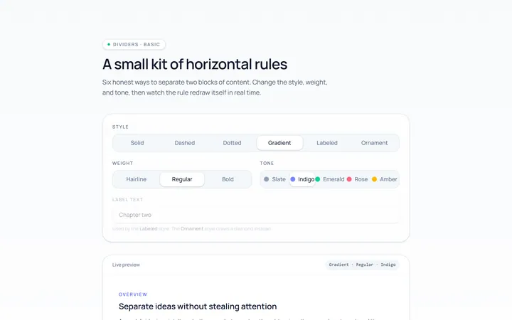
Basic Divider
Originalbasic horizontal dividers
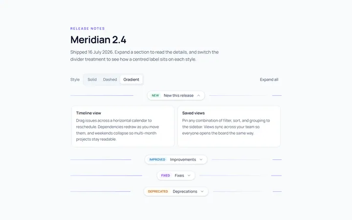
Label Divider
Originaldivider with centred label
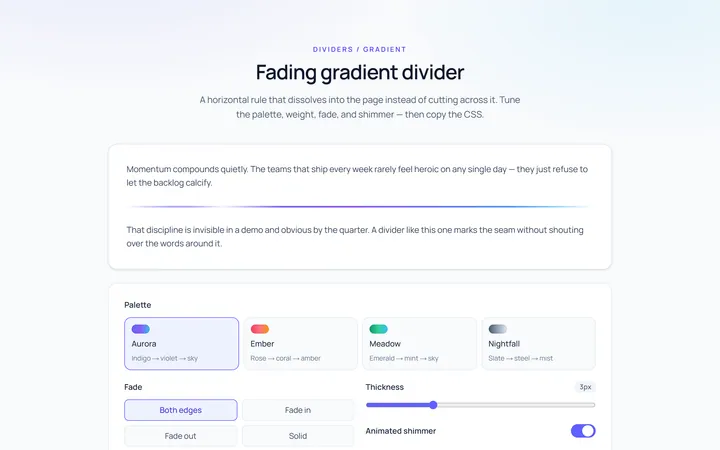
Gradient Divider
Originalgradient/fading divider
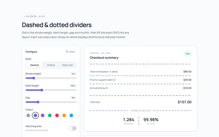
Dashed Divider
Originaldashed and dotted dividers
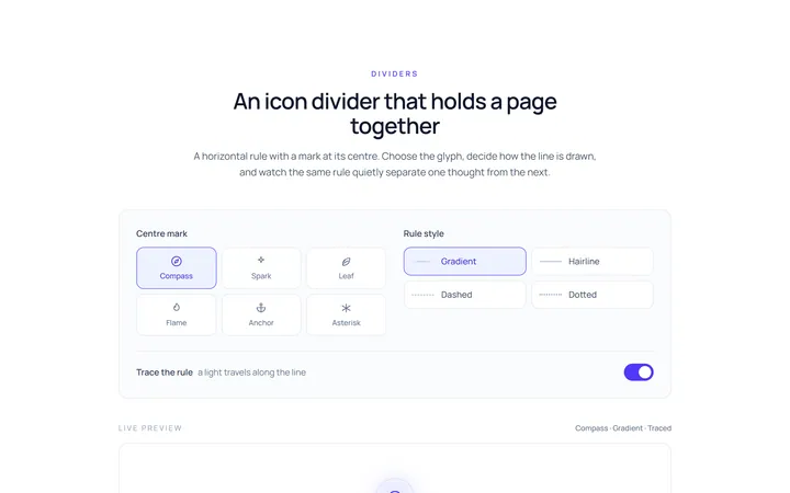
Icon Divider
Originaldivider with a centre icon
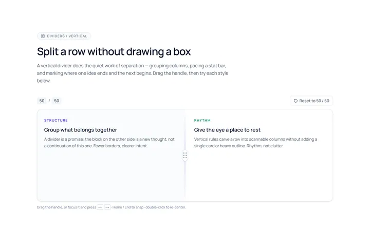
Vertical Divider
Originalvertical dividers
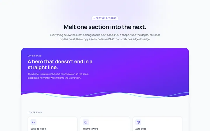
Section Divider
Originalsection wave/angle divider

Spotlight Hero
OriginalA centred hero with a soft radial spotlight, badge and dual call-to-action.

Split Hero
OriginalA two-column hero pairing a headline and CTAs with a product mock and social proof.

Gradient Spotlight Hero
OriginalA minimal centred hero with a soft gradient-mesh backdrop, announcement pill and dual call-to-action buttons.

App Preview Hero
OriginalA centred hero that pairs headline copy with a realistic product dashboard mock built entirely from markup, complete with browser chrome and a floating notification card.

Waitlist Capture Hero
OriginalA dark, focused hero with an inline email capture form and avatar social proof, ready for pre-launch waitlists.