

Label Divider
Original · freedivider with centred label
Copy prompt gives Claude Code, Cursor or v0 a ready-to-paste prompt that recreates this exact component.
npx shadcn@latest add https://webinnoventix.com/r/div-label.json"use client";
import { useId, useState } from "react";
import { AnimatePresence, motion, useReducedMotion } from "motion/react";
type StyleId = "solid" | "dashed" | "gradient";
type Section = {
id: string;
label: string;
tag: string;
tone: string;
items: { title: string; body: string }[];
};
const STYLES: { id: StyleId; label: string }[] = [
{ id: "solid", label: "Solid" },
{ id: "dashed", label: "Dashed" },
{ id: "gradient", label: "Gradient" },
];
const SECTIONS: Section[] = [
{
id: "new",
label: "New this release",
tag: "New",
tone: "bg-emerald-50 text-emerald-700 dark:bg-emerald-500/10 dark:text-emerald-300",
items: [
{
title: "Timeline view",
body: "Drag issues across a horizontal calendar to reschedule. Dependencies redraw as you move them, and weekends collapse so multi-month projects stay readable.",
},
{
title: "Saved views",
body: "Pin any combination of filter, sort, and grouping to the sidebar. Views sync across your team so everyone opens the board the same way.",
},
],
},
{
id: "improved",
label: "Improvements",
tag: "Improved",
tone: "bg-sky-50 text-sky-700 dark:bg-sky-500/10 dark:text-sky-300",
items: [
{
title: "Faster board loads",
body: "Boards with more than 500 cards now render in under 400ms by streaming columns as you scroll instead of hydrating all of them at once.",
},
{
title: "Keyboard command bar",
body: "Press Cmd K anywhere to jump to a project, assign yourself, or change a status without ever reaching for the mouse.",
},
],
},
{
id: "fixed",
label: "Fixes",
tag: "Fixed",
tone: "bg-violet-50 text-violet-700 dark:bg-violet-500/10 dark:text-violet-300",
items: [
{
title: "Comment mentions",
body: "Typing @ inside a fenced code block no longer opens the mention menu, so pasted snippets keep their exact formatting.",
},
{
title: "Timezone drift",
body: "Due dates set near midnight kept shifting a day for users east of UTC. Dates are now stored and displayed in your local zone.",
},
],
},
{
id: "deprecated",
label: "Deprecations",
tag: "Deprecated",
tone: "bg-amber-50 text-amber-700 dark:bg-amber-500/10 dark:text-amber-300",
items: [
{
title: "Legacy API v1",
body: "The v1 REST endpoints retire on 30 September 2026. Migrate to v2, which returns cursor-based pagination and strongly typed webhook payloads.",
},
],
},
];
export default function DivLabel() {
const uid = useId();
const reduced = useReducedMotion();
const [style, setStyle] = useState<StyleId>("gradient");
const [open, setOpen] = useState<string[]>([SECTIONS[0].id]);
const allOpen = SECTIONS.every((s) => open.includes(s.id));
const toggle = (id: string) =>
setOpen((cur) =>
cur.includes(id) ? cur.filter((x) => x !== id) : [...cur, id],
);
const renderLine = (side: "l" | "r") => {
if (style === "dashed") {
return (
<span
aria-hidden
className="h-0 flex-1 border-t border-dashed border-slate-300 dark:border-slate-600"
/>
);
}
if (style === "gradient") {
const grad =
side === "l"
? "bg-gradient-to-r from-transparent via-indigo-400/50 to-indigo-500/80 dark:via-indigo-400/30 dark:to-indigo-400/70"
: "bg-gradient-to-r from-indigo-500/80 via-indigo-400/50 to-transparent dark:from-indigo-400/70 dark:via-indigo-400/30";
return (
<span
aria-hidden
className={`h-px flex-1 rounded-full ${grad} ${reduced ? "" : "divlbl-shimmer"}`}
style={reduced ? undefined : { backgroundSize: "200% 100%" }}
/>
);
}
return (
<span
aria-hidden
className="h-px flex-1 rounded-full bg-slate-200 dark:bg-slate-700"
/>
);
};
return (
<section className="relative w-full overflow-hidden bg-slate-50 px-6 py-20 text-slate-900 dark:bg-slate-950 dark:text-slate-100 sm:px-8 sm:py-24">
<div className="mx-auto max-w-3xl">
<header>
<p className="text-xs font-semibold uppercase tracking-[0.22em] text-indigo-600 dark:text-indigo-400">
Release notes
</p>
<h2 className="mt-3 text-3xl font-bold tracking-tight sm:text-4xl">
Meridian 2.4
</h2>
<p className="mt-3 max-w-xl text-base leading-relaxed text-slate-600 dark:text-slate-400">
Shipped 16 July 2026. Expand a section to read the details, and
switch the divider treatment to see how a centred label sits on
each style.
</p>
</header>
<div className="mb-1 mt-10 flex flex-wrap items-center justify-between gap-4">
<div className="flex items-center gap-3">
<span className="text-sm font-medium text-slate-500 dark:text-slate-400">
Style
</span>
<fieldset>
<legend className="sr-only">Divider line style</legend>
<div className="inline-flex rounded-lg border border-slate-200 bg-slate-100 p-1 dark:border-slate-800 dark:bg-slate-900">
{STYLES.map((opt) => {
const active = style === opt.id;
return (
<label key={opt.id} className="relative cursor-pointer">
<input
type="radio"
name={`${uid}-style`}
value={opt.id}
checked={active}
onChange={() => setStyle(opt.id)}
className="peer sr-only"
/>
<span
className={`block rounded-md px-3 py-1.5 text-sm font-medium transition-colors peer-focus-visible:ring-2 peer-focus-visible:ring-indigo-500 peer-focus-visible:ring-offset-2 peer-focus-visible:ring-offset-slate-100 dark:peer-focus-visible:ring-offset-slate-900 ${
active
? "bg-white text-slate-900 shadow-sm dark:bg-slate-700 dark:text-white"
: "text-slate-500 hover:text-slate-700 dark:text-slate-400 dark:hover:text-slate-200"
}`}
>
{opt.label}
</span>
</label>
);
})}
</div>
</fieldset>
</div>
<button
type="button"
onClick={() =>
setOpen(allOpen ? [] : SECTIONS.map((s) => s.id))
}
className="inline-flex items-center gap-1.5 rounded-lg px-3 py-1.5 text-sm font-medium text-slate-600 transition-colors hover:text-slate-900 focus:outline-none focus-visible:ring-2 focus-visible:ring-indigo-500 focus-visible:ring-offset-2 focus-visible:ring-offset-slate-50 dark:text-slate-400 dark:hover:text-slate-100 dark:focus-visible:ring-offset-slate-950"
>
{allOpen ? "Collapse all" : "Expand all"}
</button>
</div>
<div className="mt-2">
{SECTIONS.map((s) => {
const isOpen = open.includes(s.id);
const btnId = `${uid}-btn-${s.id}`;
const panelId = `${uid}-panel-${s.id}`;
return (
<div key={s.id} className="py-3">
<div className="flex items-center gap-4">
{renderLine("l")}
<button
id={btnId}
type="button"
aria-expanded={isOpen}
aria-controls={panelId}
onClick={() => toggle(s.id)}
className="group inline-flex shrink-0 items-center gap-2.5 rounded-full border border-slate-200 bg-white py-1.5 pl-2 pr-3.5 text-sm font-medium text-slate-700 shadow-sm transition-colors hover:border-slate-300 hover:bg-slate-50 focus:outline-none focus-visible:ring-2 focus-visible:ring-indigo-500 focus-visible:ring-offset-2 focus-visible:ring-offset-slate-50 dark:border-slate-700 dark:bg-slate-900 dark:text-slate-200 dark:hover:border-slate-600 dark:hover:bg-slate-800 dark:focus-visible:ring-offset-slate-950"
>
<span
className={`rounded-full px-2 py-0.5 text-[11px] font-semibold uppercase tracking-wide ${s.tone}`}
>
{s.tag}
</span>
<span>{s.label}</span>
<motion.svg
viewBox="0 0 20 20"
aria-hidden
className="h-4 w-4 text-slate-400 dark:text-slate-500"
animate={{ rotate: isOpen ? 180 : 0 }}
transition={
reduced ? { duration: 0 } : { duration: 0.2, ease: "easeOut" }
}
>
<path
d="M5 7.5 10 12.5 15 7.5"
fill="none"
stroke="currentColor"
strokeWidth="1.75"
strokeLinecap="round"
strokeLinejoin="round"
/>
</motion.svg>
</button>
{renderLine("r")}
</div>
<AnimatePresence initial={false}>
{isOpen && (
<motion.div
key="panel"
id={panelId}
role="region"
aria-labelledby={btnId}
initial={{ height: 0, opacity: 0 }}
animate={{ height: "auto", opacity: 1 }}
exit={{ height: 0, opacity: 0 }}
transition={
reduced
? { duration: 0 }
: { duration: 0.28, ease: [0.22, 1, 0.36, 1] }
}
className="overflow-hidden"
>
<ul className="grid gap-3 px-1 pb-1 pt-5 sm:grid-cols-2">
{s.items.map((item) => (
<li
key={item.title}
className="rounded-xl border border-slate-200 bg-white p-4 dark:border-slate-800 dark:bg-slate-900/60"
>
<h3 className="text-sm font-semibold text-slate-900 dark:text-slate-100">
{item.title}
</h3>
<p className="mt-1.5 text-sm leading-relaxed text-slate-600 dark:text-slate-400">
{item.body}
</p>
</li>
))}
</ul>
</motion.div>
)}
</AnimatePresence>
</div>
);
})}
</div>
</div>
<style>{`
@keyframes divlbl-shimmer {
0% { background-position: 0% 50%; }
100% { background-position: -200% 50%; }
}
.divlbl-shimmer {
animation: divlbl-shimmer 3.6s linear infinite;
}
@media (prefers-reduced-motion: reduce) {
.divlbl-shimmer { animation: none !important; }
}
`}</style>
</section>
);
}Dependencies
Licence
Built by Web Innoventix. Free for personal and commercial use, no attribution required.
Built by Web Innoventix
Need a custom interface, a full website, or SEO that gets you cited by AI? We design, build and rank it end to end.
Get a free quoteSimilar components
Browse all →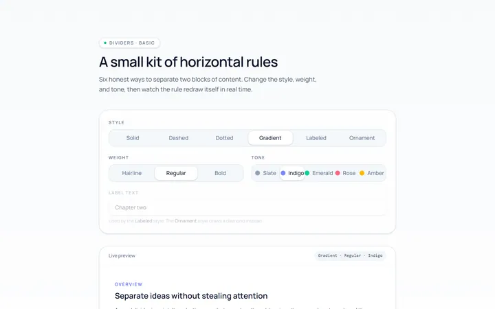
Basic Divider
Originalbasic horizontal dividers
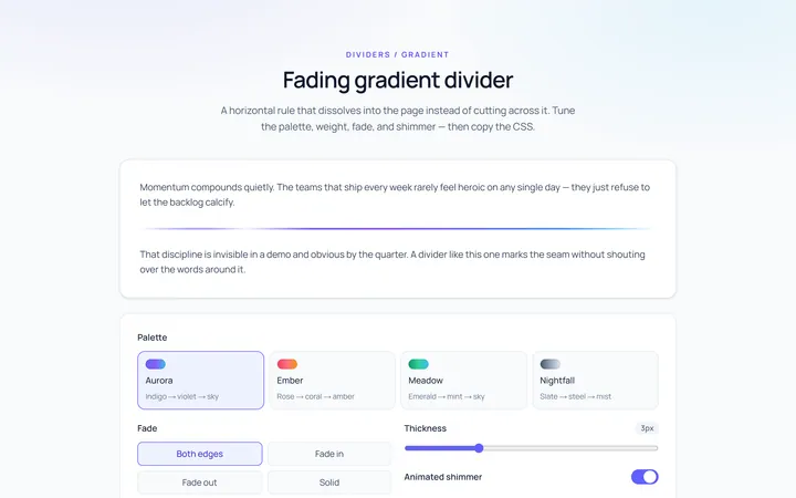
Gradient Divider
Originalgradient/fading divider
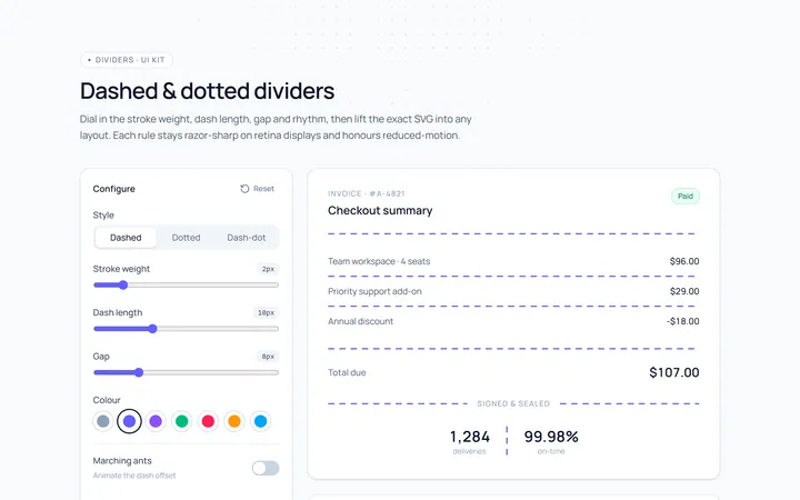
Dashed Divider
Originaldashed and dotted dividers
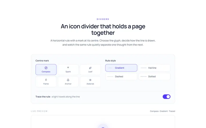
Icon Divider
Originaldivider with a centre icon
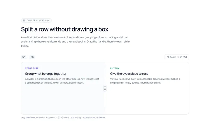
Vertical Divider
Originalvertical dividers
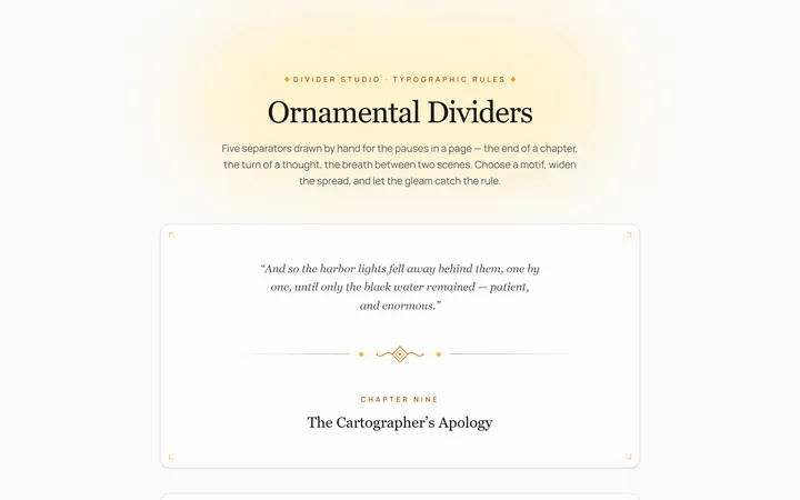
Fancy Divider
Originaldecorative ornament divider
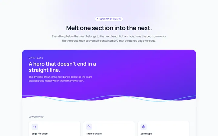
Section Divider
Originalsection wave/angle divider

Spotlight Hero
OriginalA centred hero with a soft radial spotlight, badge and dual call-to-action.

Split Hero
OriginalA two-column hero pairing a headline and CTAs with a product mock and social proof.

Gradient Spotlight Hero
OriginalA minimal centred hero with a soft gradient-mesh backdrop, announcement pill and dual call-to-action buttons.

App Preview Hero
OriginalA centred hero that pairs headline copy with a realistic product dashboard mock built entirely from markup, complete with browser chrome and a floating notification card.

Waitlist Capture Hero
OriginalA dark, focused hero with an inline email capture form and avatar social proof, ready for pre-launch waitlists.