

Gradient Divider
Original · freegradient/fading divider
Copy prompt gives Claude Code, Cursor or v0 a ready-to-paste prompt that recreates this exact component.
npx shadcn@latest add https://webinnoventix.com/r/div-gradient.json"use client";
import { useId, useState } from "react";
import { motion, useReducedMotion } from "motion/react";
type PaletteId = "aurora" | "ember" | "meadow" | "nightfall";
type FadeId = "both" | "left" | "right" | "full";
interface Palette {
id: PaletteId;
name: string;
note: string;
stops: [string, string, string];
}
interface DividerProps {
stops: [string, string, string];
thickness: number;
fade: FadeId;
glow: boolean;
animate: boolean;
separator?: boolean;
}
const PALETTE_MAP: Record<PaletteId, Palette> = {
aurora: {
id: "aurora",
name: "Aurora",
note: "Indigo → violet → sky",
stops: ["#6366f1", "#8b5cf6", "#38bdf8"],
},
ember: {
id: "ember",
name: "Ember",
note: "Rose → coral → amber",
stops: ["#f43f5e", "#fb7185", "#f59e0b"],
},
meadow: {
id: "meadow",
name: "Meadow",
note: "Emerald → mint → sky",
stops: ["#059669", "#34d399", "#38bdf8"],
},
nightfall: {
id: "nightfall",
name: "Nightfall",
note: "Slate → steel → mist",
stops: ["#475569", "#94a3b8", "#e2e8f0"],
},
};
const PALETTE_ORDER: PaletteId[] = ["aurora", "ember", "meadow", "nightfall"];
const MASKS: Record<FadeId, string> = {
both: "linear-gradient(90deg, transparent, #000 18%, #000 82%, transparent)",
left: "linear-gradient(90deg, transparent, #000 45%)",
right: "linear-gradient(90deg, #000 55%, transparent)",
full: "linear-gradient(90deg, #000, #000)",
};
const FADE_OPTIONS: { id: FadeId; label: string }[] = [
{ id: "both", label: "Both edges" },
{ id: "left", label: "Fade in" },
{ id: "right", label: "Fade out" },
{ id: "full", label: "Solid" },
];
const KEYFRAMES = `
@keyframes gd_sweep {
0% { transform: translateX(-130%); }
100% { transform: translateX(430%); }
}
@keyframes gd_pulse {
0%, 100% { opacity: .4; }
50% { opacity: .85; }
}
.gd-sweep-anim { animation: gd_sweep 3.4s linear infinite; }
.gd-glow-anim { animation: gd_pulse 3.4s ease-in-out infinite; }
@media (prefers-reduced-motion: reduce) {
.gd-sweep-anim, .gd-glow-anim { animation: none !important; }
}
`;
function Divider({ stops, thickness, fade, glow, animate, separator }: DividerProps) {
const gradient = `linear-gradient(90deg, ${stops[0]}, ${stops[1]}, ${stops[2]})`;
const mask = MASKS[fade];
return (
<div
className="relative w-full"
style={{ height: `${thickness}px` }}
role={separator ? "separator" : undefined}
aria-orientation={separator ? "horizontal" : undefined}
aria-hidden={separator ? undefined : true}
>
<div
className="absolute inset-0 rounded-full"
style={{ backgroundImage: gradient, WebkitMaskImage: mask, maskImage: mask }}
/>
{glow ? (
<div
className={`absolute inset-0 rounded-full blur-[4px] ${animate ? "gd-glow-anim" : "opacity-60"}`}
style={{ backgroundImage: gradient, WebkitMaskImage: mask, maskImage: mask }}
/>
) : null}
{glow && animate ? (
<div
className="pointer-events-none absolute inset-0 overflow-hidden rounded-full"
style={{ WebkitMaskImage: mask, maskImage: mask }}
>
<div
className="gd-sweep-anim absolute inset-y-0 -left-1/4 w-1/4 rounded-full"
style={{
backgroundImage:
"linear-gradient(90deg, transparent, rgba(255,255,255,0.95), transparent)",
}}
/>
</div>
) : null}
</div>
);
}
function Swatch({ stops }: { stops: [string, string, string] }) {
return (
<span
aria-hidden="true"
className="h-4 w-8 shrink-0 rounded-full ring-1 ring-inset ring-black/10 dark:ring-white/15"
style={{ backgroundImage: `linear-gradient(90deg, ${stops[0]}, ${stops[1]}, ${stops[2]})` }}
/>
);
}
export default function GradientDivider() {
const uid = useId();
const reduced = useReducedMotion();
const animate = !reduced;
const [palette, setPalette] = useState<PaletteId>("aurora");
const [fade, setFade] = useState<FadeId>("both");
const [thickness, setThickness] = useState<number>(3);
const [glow, setGlow] = useState<boolean>(true);
const [copied, setCopied] = useState<boolean>(false);
const active = PALETTE_MAP[palette];
const cssLine = `background: linear-gradient(90deg, ${active.stops.join(", ")});`;
async function copyCss() {
try {
await navigator.clipboard.writeText(cssLine);
setCopied(true);
window.setTimeout(() => setCopied(false), 1600);
} catch {
setCopied(false);
}
}
const focusRing =
"focus-visible:outline-none focus-visible:ring-2 focus-visible:ring-indigo-500 focus-visible:ring-offset-2 focus-visible:ring-offset-white dark:focus-visible:ring-offset-slate-900";
return (
<section className="relative w-full overflow-hidden bg-slate-50 px-4 py-20 text-slate-900 sm:px-6 lg:px-8 dark:bg-slate-950 dark:text-slate-100">
<style>{KEYFRAMES}</style>
<div
aria-hidden="true"
className="pointer-events-none absolute inset-0"
style={{
backgroundImage:
"radial-gradient(60rem 30rem at 15% -10%, rgba(99,102,241,0.12), transparent 60%), radial-gradient(50rem 28rem at 90% 0%, rgba(56,189,248,0.10), transparent 55%)",
}}
/>
<div className="relative mx-auto max-w-4xl">
<header className="mb-10 text-center">
<p className="text-xs font-semibold uppercase tracking-[0.2em] text-indigo-600 dark:text-indigo-400">
Dividers / Gradient
</p>
<h2 className="mt-3 text-3xl font-semibold tracking-tight sm:text-4xl">
Fading gradient divider
</h2>
<p className="mx-auto mt-4 max-w-xl text-base leading-relaxed text-slate-600 dark:text-slate-400">
A horizontal rule that dissolves into the page instead of cutting across it. Tune the
palette, weight, fade, and shimmer — then copy the CSS.
</p>
</header>
<motion.div
initial={reduced ? false : { opacity: 0, y: 14 }}
whileInView={reduced ? undefined : { opacity: 1, y: 0 }}
viewport={{ once: true, margin: "-80px" }}
transition={{ duration: 0.5, ease: "easeOut" }}
className="rounded-2xl border border-slate-200 bg-white p-6 shadow-sm sm:p-8 dark:border-slate-800 dark:bg-slate-900"
>
<p className="text-[15px] leading-relaxed text-slate-700 dark:text-slate-300">
Momentum compounds quietly. The teams that ship every week rarely feel heroic on any
single day — they just refuse to let the backlog calcify.
</p>
<div className="my-7">
<Divider
stops={active.stops}
thickness={thickness}
fade={fade}
glow={glow}
animate={animate}
separator
/>
</div>
<p className="text-[15px] leading-relaxed text-slate-700 dark:text-slate-300">
That discipline is invisible in a demo and obvious by the quarter. A divider like this
one marks the seam without shouting over the words around it.
</p>
</motion.div>
<div className="mt-6 grid gap-5 rounded-2xl border border-slate-200 bg-white p-6 sm:p-7 dark:border-slate-800 dark:bg-slate-900">
<fieldset>
<legend className="mb-3 text-sm font-semibold text-slate-800 dark:text-slate-200">
Palette
</legend>
<div className="grid grid-cols-2 gap-2 sm:grid-cols-4">
{PALETTE_ORDER.map((id) => {
const p = PALETTE_MAP[id];
const checked = palette === id;
return (
<label key={id} className="cursor-pointer">
<input
type="radio"
name={`${uid}-palette`}
value={id}
checked={checked}
onChange={() => setPalette(id)}
className="peer sr-only"
/>
<span
className="flex flex-col gap-2 rounded-xl border border-slate-200 bg-slate-50 p-3 text-left transition-colors peer-checked:border-indigo-500 peer-checked:bg-indigo-50 peer-focus-visible:ring-2 peer-focus-visible:ring-indigo-500 peer-focus-visible:ring-offset-2 peer-focus-visible:ring-offset-white dark:border-slate-700 dark:bg-slate-800/60 dark:peer-checked:border-indigo-400 dark:peer-checked:bg-indigo-500/10 dark:peer-focus-visible:ring-offset-slate-900"
>
<Swatch stops={p.stops} />
<span className="text-sm font-medium text-slate-800 dark:text-slate-100">
{p.name}
</span>
<span className="text-xs text-slate-500 dark:text-slate-400">{p.note}</span>
</span>
</label>
);
})}
</div>
</fieldset>
<div className="grid gap-5 sm:grid-cols-2">
<fieldset>
<legend className="mb-3 text-sm font-semibold text-slate-800 dark:text-slate-200">
Fade
</legend>
<div className="grid grid-cols-2 gap-2">
{FADE_OPTIONS.map((f) => {
const checked = fade === f.id;
return (
<label key={f.id} className="cursor-pointer">
<input
type="radio"
name={`${uid}-fade`}
value={f.id}
checked={checked}
onChange={() => setFade(f.id)}
className="peer sr-only"
/>
<span className="block rounded-lg border border-slate-200 bg-slate-50 px-3 py-2 text-center text-sm text-slate-700 transition-colors peer-checked:border-indigo-500 peer-checked:bg-indigo-50 peer-checked:font-medium peer-checked:text-indigo-700 peer-focus-visible:ring-2 peer-focus-visible:ring-indigo-500 peer-focus-visible:ring-offset-2 peer-focus-visible:ring-offset-white dark:border-slate-700 dark:bg-slate-800/60 dark:text-slate-300 dark:peer-checked:border-indigo-400 dark:peer-checked:bg-indigo-500/10 dark:peer-checked:text-indigo-300 dark:peer-focus-visible:ring-offset-slate-900">
{f.label}
</span>
</label>
);
})}
</div>
</fieldset>
<div className="flex flex-col gap-5">
<div>
<div className="mb-3 flex items-center justify-between">
<label
htmlFor={`${uid}-thickness`}
className="text-sm font-semibold text-slate-800 dark:text-slate-200"
>
Thickness
</label>
<span className="rounded-md bg-slate-100 px-2 py-0.5 text-xs font-medium tabular-nums text-slate-600 dark:bg-slate-800 dark:text-slate-300">
{thickness}px
</span>
</div>
<input
id={`${uid}-thickness`}
type="range"
min={1}
max={8}
step={1}
value={thickness}
onChange={(e) => setThickness(Number(e.target.value))}
aria-valuetext={`${thickness} pixels`}
className={`w-full cursor-pointer accent-indigo-500 ${focusRing} rounded-full`}
/>
</div>
<div className="flex items-center justify-between">
<span
id={`${uid}-glow-label`}
className="text-sm font-semibold text-slate-800 dark:text-slate-200"
>
Animated shimmer
</span>
<button
type="button"
role="switch"
aria-checked={glow}
aria-labelledby={`${uid}-glow-label`}
onClick={() => setGlow((g) => !g)}
className={`relative inline-flex h-6 w-11 shrink-0 items-center rounded-full transition-colors ${
glow ? "bg-indigo-500" : "bg-slate-300 dark:bg-slate-700"
} ${focusRing}`}
>
<span
className={`inline-block h-5 w-5 transform rounded-full bg-white shadow transition-transform ${
glow ? "translate-x-5" : "translate-x-0.5"
}`}
/>
</button>
</div>
</div>
</div>
<div className="flex flex-col gap-3 rounded-xl border border-slate-200 bg-slate-50 p-3 sm:flex-row sm:items-center sm:justify-between dark:border-slate-700 dark:bg-slate-800/50">
<code className="overflow-x-auto whitespace-nowrap font-mono text-xs text-slate-600 dark:text-slate-300">
{cssLine}
</code>
<button
type="button"
onClick={copyCss}
className={`inline-flex shrink-0 items-center gap-1.5 rounded-lg bg-slate-900 px-3 py-1.5 text-xs font-medium text-white transition-colors hover:bg-slate-700 ${focusRing} dark:bg-white dark:text-slate-900 dark:hover:bg-slate-200`}
>
{copied ? (
<svg viewBox="0 0 20 20" className="h-3.5 w-3.5" aria-hidden="true">
<path
d="M4 10.5l4 4 8-8.5"
fill="none"
stroke="currentColor"
strokeWidth="2"
strokeLinecap="round"
strokeLinejoin="round"
/>
</svg>
) : (
<svg viewBox="0 0 20 20" className="h-3.5 w-3.5" aria-hidden="true">
<rect
x="7"
y="7"
width="9"
height="9"
rx="1.5"
fill="none"
stroke="currentColor"
strokeWidth="1.6"
/>
<path
d="M13 7V5.5A1.5 1.5 0 0011.5 4h-6A1.5 1.5 0 004 5.5v6A1.5 1.5 0 005.5 13H7"
fill="none"
stroke="currentColor"
strokeWidth="1.6"
strokeLinecap="round"
/>
</svg>
)}
{copied ? "Copied" : "Copy CSS"}
</button>
</div>
<span aria-live="polite" className="sr-only">
{copied ? "CSS copied to clipboard" : ""}
</span>
</div>
<div className="mt-10">
<p className="mb-5 text-center text-xs font-semibold uppercase tracking-[0.2em] text-slate-400 dark:text-slate-500">
Every palette, at a glance
</p>
<ul className="space-y-6">
{PALETTE_ORDER.map((id) => {
const p = PALETTE_MAP[id];
return (
<li key={id} className="flex flex-col gap-2">
<div className="flex items-center justify-between px-1">
<span className="text-sm font-medium text-slate-700 dark:text-slate-300">
{p.name}
</span>
<span className="text-xs text-slate-400 dark:text-slate-500">{p.note}</span>
</div>
<Divider
stops={p.stops}
thickness={3}
fade="both"
glow={id === palette}
animate={animate}
/>
</li>
);
})}
</ul>
</div>
</div>
</section>
);
}Dependencies
Licence
Built by Web Innoventix. Free for personal and commercial use, no attribution required.
Built by Web Innoventix
Need a custom interface, a full website, or SEO that gets you cited by AI? We design, build and rank it end to end.
Get a free quoteSimilar components
Browse all →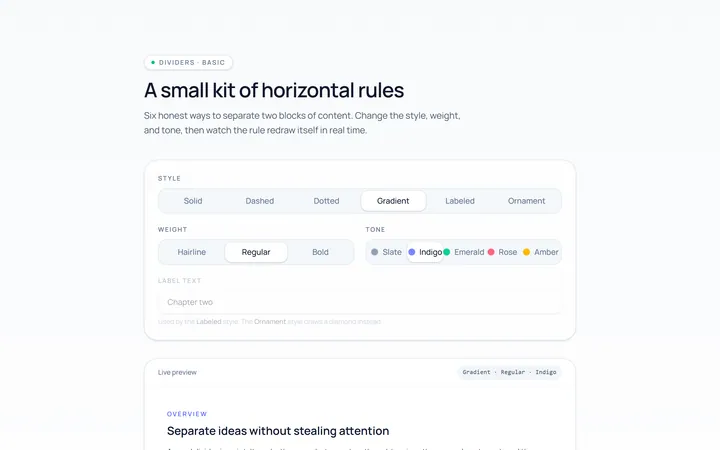
Basic Divider
Originalbasic horizontal dividers
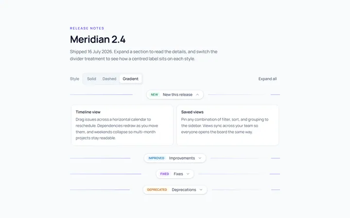
Label Divider
Originaldivider with centred label
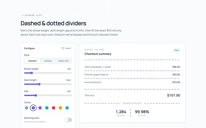
Dashed Divider
Originaldashed and dotted dividers
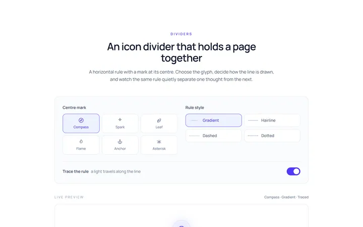
Icon Divider
Originaldivider with a centre icon
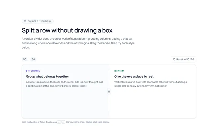
Vertical Divider
Originalvertical dividers
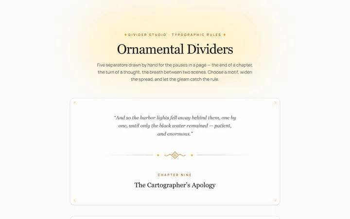
Fancy Divider
Originaldecorative ornament divider
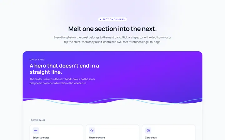
Section Divider
Originalsection wave/angle divider

Spotlight Hero
OriginalA centred hero with a soft radial spotlight, badge and dual call-to-action.

Split Hero
OriginalA two-column hero pairing a headline and CTAs with a product mock and social proof.

Gradient Spotlight Hero
OriginalA minimal centred hero with a soft gradient-mesh backdrop, announcement pill and dual call-to-action buttons.

App Preview Hero
OriginalA centred hero that pairs headline copy with a realistic product dashboard mock built entirely from markup, complete with browser chrome and a floating notification card.

Waitlist Capture Hero
OriginalA dark, focused hero with an inline email capture form and avatar social proof, ready for pre-launch waitlists.