

Section Divider
Original · freesection wave/angle divider
Copy prompt gives Claude Code, Cursor or v0 a ready-to-paste prompt that recreates this exact component.
npx shadcn@latest add https://webinnoventix.com/r/div-section.json"use client";
import { useId, useMemo, useRef, useState } from "react";
import type { ReactNode } from "react";
import { AnimatePresence, motion, useReducedMotion } from "motion/react";
type Shape = "wave" | "curve" | "angle" | "peaks" | "chevron";
const SHAPES: { id: Shape; label: string; hint: string }[] = [
{ id: "wave", label: "Wave", hint: "Twin-crest sine curve" },
{ id: "curve", label: "Curve", hint: "Single soft arc" },
{ id: "angle", label: "Angle", hint: "Diagonal tilt" },
{ id: "peaks", label: "Peaks", hint: "Repeating ridges" },
{ id: "chevron", label: "Chevron", hint: "One centred point" },
];
const W = 1200;
function r(x: number): number {
return Math.round(x * 10) / 10;
}
function genPath(shape: Shape, w: number, h: number, a: number, invert: boolean): string {
const mid = h / 2;
const iv = (y: number): number => r(invert ? h - y : y);
const x = (p: number): number => r(w * p);
switch (shape) {
case "wave":
return `M0 ${iv(mid)} C ${x(0.16)} ${iv(mid - a * 1.25)} ${x(0.34)} ${iv(mid + a * 1.25)} ${x(0.5)} ${iv(mid)} C ${x(0.66)} ${iv(mid - a * 1.25)} ${x(0.84)} ${iv(mid + a * 1.25)} ${w} ${iv(mid)} L ${w} ${h} L 0 ${h} Z`;
case "curve":
return `M0 ${iv(mid + a * 0.75)} Q ${x(0.5)} ${iv(mid - a * 1.7)} ${w} ${iv(mid + a * 0.75)} L ${w} ${h} L 0 ${h} Z`;
case "angle":
return `M0 ${iv(mid - a)} L ${w} ${iv(mid + a)} L ${w} ${h} L 0 ${h} Z`;
case "peaks":
return `M0 ${iv(mid + a)} L ${x(1 / 6)} ${iv(mid - a)} L ${x(2 / 6)} ${iv(mid + a)} L ${x(3 / 6)} ${iv(mid - a)} L ${x(4 / 6)} ${iv(mid + a)} L ${x(5 / 6)} ${iv(mid - a)} L ${w} ${iv(mid + a)} L ${w} ${h} L 0 ${h} Z`;
case "chevron":
return `M0 ${iv(mid + a)} L ${x(0.5)} ${iv(mid - a)} L ${w} ${iv(mid + a)} L ${w} ${h} L 0 ${h} Z`;
default:
return "";
}
}
function tileWave(w2: number, h: number, a: number, half: number): string {
const mid = h / 2;
let d = `M0 ${r(mid)}`;
let up = true;
for (let px = 0; px < w2; px += half) {
const cy = up ? mid - a : mid + a;
d += ` Q ${r(px + half / 2)} ${r(cy)} ${r(px + half)} ${r(mid)}`;
up = !up;
}
return d;
}
export default function SectionDividerStudio() {
const reduced = useReducedMotion();
const uid = useId();
const radioName = `${uid}-shape`;
const heightId = `${uid}-height`;
const depthId = `${uid}-depth`;
const [shape, setShape] = useState<Shape>("wave");
const [height, setHeight] = useState<number>(120);
const [depth, setDepth] = useState<number>(62);
const [flipH, setFlipH] = useState<boolean>(false);
const [invert, setInvert] = useState<boolean>(false);
const [flow, setFlow] = useState<boolean>(true);
const [copied, setCopied] = useState<boolean>(false);
const copyTimer = useRef<number | null>(null);
const a = useMemo(() => (depth / 100) * (height / 2) * 0.92, [depth, height]);
const path = useMemo(() => genPath(shape, W, height, a, invert), [shape, height, a, invert]);
const overlayPath = useMemo(() => tileWave(2400, height, Math.min(a, height * 0.3), 300), [height, a]);
const svgSnippet = useMemo(
() =>
`<svg viewBox="0 0 ${W} ${height}" preserveAspectRatio="none" xmlns="http://www.w3.org/2000/svg" style="display:block;width:100%;height:${height}px">\n <path d="${path}" fill="currentColor" />\n</svg>`,
[path, height],
);
const copy = async (): Promise<void> => {
try {
await navigator.clipboard.writeText(svgSnippet);
setCopied(true);
if (copyTimer.current !== null) window.clearTimeout(copyTimer.current);
copyTimer.current = window.setTimeout(() => setCopied(false), 1800);
} catch {
setCopied(false);
}
};
const pillTransition = reduced
? { duration: 0 }
: ({ type: "spring", stiffness: 380, damping: 30 } as const);
return (
<section className="relative w-full overflow-hidden bg-slate-50 px-4 py-16 text-slate-900 sm:px-6 sm:py-24 dark:bg-slate-950 dark:text-slate-100">
<style>{`
@keyframes fcdiv-drift { from { transform: translateX(0); } to { transform: translateX(-25%); } }
@keyframes fcdiv-rise { from { opacity: 0; transform: translateY(10px); } to { opacity: 1; transform: translateY(0); } }
.fcdiv-anim { animation: fcdiv-drift 9s linear infinite; }
.fcdiv-rise { animation: fcdiv-rise 0.5s ease-out both; }
@media (prefers-reduced-motion: reduce) {
.fcdiv-anim, .fcdiv-rise { animation: none !important; }
}
`}</style>
<div
aria-hidden="true"
className="pointer-events-none absolute -top-24 left-1/2 h-72 w-[36rem] -translate-x-1/2 rounded-full bg-violet-300/30 blur-3xl dark:bg-violet-600/10"
/>
<div className="relative mx-auto max-w-5xl">
<header className="mx-auto max-w-2xl text-center">
<span className="inline-flex items-center gap-2 rounded-full border border-indigo-200 bg-white px-3 py-1 text-xs font-semibold uppercase tracking-widest text-indigo-600 dark:border-indigo-500/30 dark:bg-slate-900 dark:text-indigo-300">
<span className="h-1.5 w-1.5 rounded-full bg-indigo-500" />
Section dividers
</span>
<h2 className="mt-5 text-balance text-3xl font-bold tracking-tight sm:text-4xl">
Melt one section into the next.
</h2>
<p className="mt-4 text-pretty text-base leading-relaxed text-slate-600 dark:text-slate-400">
Everything below the crest belongs to the next band. Pick a shape, tune the depth,
mirror or flip the crest, then copy a self-contained SVG that stretches edge-to-edge.
</p>
</header>
{/* Live preview */}
<div className="mt-10 overflow-hidden rounded-3xl border border-slate-200 shadow-xl shadow-slate-900/5 dark:border-slate-800 dark:shadow-black/30">
<div
className="relative isolate bg-gradient-to-br from-indigo-600 via-violet-600 to-indigo-700 px-6 sm:px-10"
style={{ paddingTop: 40, paddingBottom: height + 32 }}
>
<p className="text-xs font-semibold uppercase tracking-widest text-indigo-200">
Upper band
</p>
<h3 className="mt-2 max-w-md text-2xl font-bold text-white sm:text-3xl">
A hero that doesn’t end in a straight line.
</h3>
<p className="mt-3 max-w-sm text-sm leading-relaxed text-indigo-100">
The divider is drawn in the next band’s colour, so the seam disappears no matter
which theme the viewer is in.
</p>
{/* Divider */}
<div
className="absolute inset-x-0 bottom-0 overflow-hidden text-slate-50 dark:text-slate-900"
style={{ height, transform: flipH ? "scaleX(-1)" : undefined }}
>
<svg
viewBox={`0 0 ${W} ${height}`}
preserveAspectRatio="none"
className="block h-full w-full"
role="img"
aria-label={`${shape} section divider`}
>
<path d={path} fill="currentColor" />
</svg>
{flow ? (
<svg
aria-hidden="true"
viewBox={`0 0 2400 ${height}`}
preserveAspectRatio="none"
className={`pointer-events-none absolute inset-0 h-full text-sky-300/70 dark:text-sky-400/50 ${reduced ? "" : "fcdiv-anim"}`}
style={{ width: "200%", maxWidth: "none" }}
>
<path
d={overlayPath}
fill="none"
stroke="currentColor"
strokeWidth={3}
strokeLinecap="round"
/>
</svg>
) : null}
</div>
</div>
<div className="bg-slate-50 px-6 py-8 sm:px-10 sm:py-10 dark:bg-slate-900">
<p className="text-xs font-semibold uppercase tracking-widest text-slate-500 dark:text-slate-400">
Lower band
</p>
<div className="mt-4 grid gap-4 sm:grid-cols-3">
<Feature
title="Edge-to-edge"
body="preserveAspectRatio “none” stretches the path across any width, no math."
icon={
<path
d="M3 12h18M3 12l4-4M3 12l4 4M21 12l-4-4M21 12l-4 4"
fill="none"
stroke="currentColor"
strokeWidth={1.75}
strokeLinecap="round"
strokeLinejoin="round"
/>
}
/>
<Feature
title="Theme-aware"
body="The fill is currentColor, so the crest inherits whatever section sits below."
icon={
<path
d="M12 3a9 9 0 1 0 9 9 7 7 0 0 1-9-9Z"
fill="none"
stroke="currentColor"
strokeWidth={1.75}
strokeLinecap="round"
strokeLinejoin="round"
/>
}
/>
<Feature
title="Zero deps"
body="Pure inline SVG. No images, no plugins, nothing to download or ship."
icon={
<path
d="M12 2 3 7v10l9 5 9-5V7l-9-5Zm0 0v20M3 7l9 5 9-5"
fill="none"
stroke="currentColor"
strokeWidth={1.75}
strokeLinecap="round"
strokeLinejoin="round"
/>
}
/>
</div>
</div>
</div>
{/* Controls */}
<div className="mt-6 grid gap-6 rounded-3xl border border-slate-200 bg-white p-6 sm:p-8 md:grid-cols-2 dark:border-slate-800 dark:bg-slate-900">
<div className="space-y-6">
<fieldset>
<legend className="text-sm font-semibold text-slate-700 dark:text-slate-200">
Divider shape
</legend>
<div className="mt-3 grid grid-cols-3 gap-2 sm:grid-cols-5">
{SHAPES.map((s) => {
const active = shape === s.id;
return (
<label key={s.id} className="relative cursor-pointer" title={s.hint}>
<input
type="radio"
name={radioName}
value={s.id}
checked={active}
onChange={() => setShape(s.id)}
className="peer sr-only"
/>
{active ? (
<motion.span
layoutId={`${uid}-shape-pill`}
transition={pillTransition}
className="absolute inset-0 rounded-xl bg-indigo-50 ring-2 ring-indigo-500 dark:bg-indigo-500/10"
/>
) : null}
<span className="relative z-10 flex flex-col items-center gap-1.5 rounded-xl border border-slate-200 px-2 py-2.5 transition-colors peer-hover:border-slate-300 peer-focus-visible:outline-none peer-focus-visible:ring-2 peer-focus-visible:ring-indigo-500 peer-focus-visible:ring-offset-2 peer-focus-visible:ring-offset-white dark:border-slate-700 dark:peer-hover:border-slate-600 dark:peer-focus-visible:ring-offset-slate-900">
<svg
viewBox="0 0 56 22"
preserveAspectRatio="none"
className={`h-5 w-14 ${active ? "text-indigo-600 dark:text-indigo-400" : "text-slate-400 dark:text-slate-500"}`}
aria-hidden="true"
>
<path d={genPath(s.id, 56, 22, 6, false)} fill="currentColor" />
</svg>
<span
className={`text-xs font-medium ${active ? "text-indigo-700 dark:text-indigo-300" : "text-slate-600 dark:text-slate-300"}`}
>
{s.label}
</span>
</span>
</label>
);
})}
</div>
</fieldset>
<div>
<p className="text-sm font-semibold text-slate-700 dark:text-slate-200">Transform</p>
<div className="mt-3 flex flex-wrap gap-2">
<Toggle
active={flipH}
onClick={() => setFlipH((v) => !v)}
label="Flip crest"
icon={
<path
d="M12 3v18M7 8 3 12l4 4M17 8l4 4-4 4"
fill="none"
stroke="currentColor"
strokeWidth={1.75}
strokeLinecap="round"
strokeLinejoin="round"
/>
}
/>
<Toggle
active={invert}
onClick={() => setInvert((v) => !v)}
label="Invert"
icon={
<path
d="M3 12h18M8 7 12 3l4 4M8 17l4 4 4-4"
fill="none"
stroke="currentColor"
strokeWidth={1.75}
strokeLinecap="round"
strokeLinejoin="round"
/>
}
/>
<Toggle
active={flow}
onClick={() => setFlow((v) => !v)}
label="Animate flow"
icon={
<path
d="M3 12c2-3 4-3 6 0s4 3 6 0 4-3 6 0"
fill="none"
stroke="currentColor"
strokeWidth={1.75}
strokeLinecap="round"
strokeLinejoin="round"
/>
}
/>
</div>
</div>
</div>
<div className="space-y-6">
<Slider
id={heightId}
label="Height"
value={height}
min={48}
max={180}
step={4}
unit="px"
onChange={(v) => setHeight(v)}
/>
<Slider
id={depthId}
label="Crest depth"
value={depth}
min={8}
max={100}
step={2}
unit="%"
onChange={(v) => setDepth(v)}
/>
<div>
<div className="flex items-center justify-between">
<p className="text-sm font-semibold text-slate-700 dark:text-slate-200">
Output SVG
</p>
<button
type="button"
onClick={copy}
className="inline-flex items-center gap-1.5 rounded-lg bg-indigo-600 px-3 py-1.5 text-xs font-semibold text-white transition-colors hover:bg-indigo-500 focus-visible:outline-none focus-visible:ring-2 focus-visible:ring-indigo-500 focus-visible:ring-offset-2 focus-visible:ring-offset-white dark:focus-visible:ring-offset-slate-900"
>
{copied ? (
<>
<svg
viewBox="0 0 24 24"
className="h-3.5 w-3.5 text-emerald-300"
aria-hidden="true"
>
<path
d="m5 12 5 5 9-11"
fill="none"
stroke="currentColor"
strokeWidth={2.25}
strokeLinecap="round"
strokeLinejoin="round"
/>
</svg>
Copied
</>
) : (
<>
<svg viewBox="0 0 24 24" className="h-3.5 w-3.5" aria-hidden="true">
<path
d="M9 9V5a1 1 0 0 1 1-1h9a1 1 0 0 1 1 1v9a1 1 0 0 1-1 1h-4M4 9h9a1 1 0 0 1 1 1v9a1 1 0 0 1-1 1H4a1 1 0 0 1-1-1v-9a1 1 0 0 1 1-1Z"
fill="none"
stroke="currentColor"
strokeWidth={1.75}
strokeLinecap="round"
strokeLinejoin="round"
/>
</svg>
Copy SVG
</>
)}
</button>
</div>
<pre className="mt-3 max-h-32 overflow-auto rounded-xl border border-slate-200 bg-slate-50 p-3 text-[11px] leading-relaxed text-slate-700 dark:border-slate-700 dark:bg-slate-950 dark:text-slate-300">
<code>{svgSnippet}</code>
</pre>
<span aria-live="polite" className="sr-only">
{copied ? "SVG copied to clipboard" : ""}
</span>
</div>
</div>
</div>
</div>
<AnimatePresence>
{copied ? (
<motion.div
initial={{ opacity: 0, y: reduced ? 0 : 12 }}
animate={{ opacity: 1, y: 0 }}
exit={{ opacity: 0, y: reduced ? 0 : 12 }}
transition={{ duration: reduced ? 0 : 0.2 }}
className="pointer-events-none fixed inset-x-0 bottom-6 z-50 mx-auto flex w-fit items-center gap-2 rounded-full bg-slate-900 px-4 py-2 text-sm font-medium text-white shadow-lg dark:bg-white dark:text-slate-900"
role="status"
>
<svg viewBox="0 0 24 24" className="h-4 w-4 text-emerald-400" aria-hidden="true">
<path
d="m5 12 5 5 9-11"
fill="none"
stroke="currentColor"
strokeWidth={2.25}
strokeLinecap="round"
strokeLinejoin="round"
/>
</svg>
SVG copied to clipboard
</motion.div>
) : null}
</AnimatePresence>
</section>
);
}
function Feature({
title,
body,
icon,
}: {
title: string;
body: string;
icon: ReactNode;
}) {
return (
<div className="rounded-2xl border border-slate-200 bg-white p-4 dark:border-slate-800 dark:bg-slate-950">
<span className="flex h-9 w-9 items-center justify-center rounded-lg bg-indigo-50 text-indigo-600 dark:bg-indigo-500/10 dark:text-indigo-400">
<svg viewBox="0 0 24 24" className="h-5 w-5" aria-hidden="true">
{icon}
</svg>
</span>
<h4 className="mt-3 text-sm font-semibold text-slate-800 dark:text-slate-100">{title}</h4>
<p className="mt-1 text-sm leading-relaxed text-slate-600 dark:text-slate-400">{body}</p>
</div>
);
}
function Toggle({
active,
onClick,
label,
icon,
}: {
active: boolean;
onClick: () => void;
label: string;
icon: ReactNode;
}) {
return (
<button
type="button"
onClick={onClick}
aria-pressed={active}
className={`inline-flex items-center gap-2 rounded-xl border px-3 py-2 text-sm font-medium transition-colors focus-visible:outline-none focus-visible:ring-2 focus-visible:ring-indigo-500 focus-visible:ring-offset-2 focus-visible:ring-offset-white dark:focus-visible:ring-offset-slate-900 ${
active
? "border-indigo-500 bg-indigo-50 text-indigo-700 dark:border-indigo-500/60 dark:bg-indigo-500/10 dark:text-indigo-300"
: "border-slate-200 bg-white text-slate-600 hover:border-slate-300 dark:border-slate-700 dark:bg-slate-900 dark:text-slate-300 dark:hover:border-slate-600"
}`}
>
<svg viewBox="0 0 24 24" className="h-4 w-4" aria-hidden="true">
{icon}
</svg>
{label}
</button>
);
}
function Slider({
id,
label,
value,
min,
max,
step,
unit,
onChange,
}: {
id: string;
label: string;
value: number;
min: number;
max: number;
step: number;
unit: string;
onChange: (v: number) => void;
}) {
return (
<div>
<div className="flex items-center justify-between">
<label htmlFor={id} className="text-sm font-semibold text-slate-700 dark:text-slate-200">
{label}
</label>
<span className="rounded-md bg-slate-100 px-2 py-0.5 font-mono text-xs text-slate-600 dark:bg-slate-800 dark:text-slate-300">
{value}
{unit}
</span>
</div>
<input
id={id}
type="range"
min={min}
max={max}
step={step}
value={value}
onChange={(e) => onChange(Number(e.currentTarget.value))}
className="mt-3 h-2 w-full cursor-pointer appearance-none rounded-full bg-slate-200 accent-indigo-600 focus-visible:outline-none focus-visible:ring-2 focus-visible:ring-indigo-500 focus-visible:ring-offset-2 focus-visible:ring-offset-white dark:bg-slate-700 dark:focus-visible:ring-offset-slate-900"
/>
</div>
);
}Dependencies
Licence
Built by Web Innoventix. Free for personal and commercial use, no attribution required.
Built by Web Innoventix
Need a custom interface, a full website, or SEO that gets you cited by AI? We design, build and rank it end to end.
Get a free quoteSimilar components
Browse all →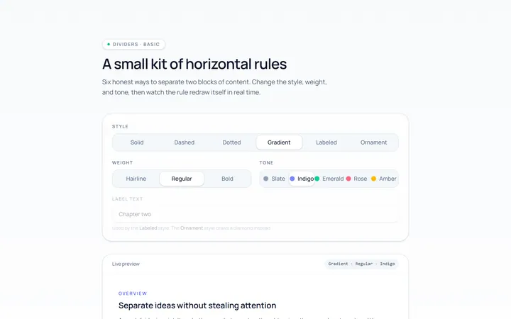
Basic Divider
Originalbasic horizontal dividers
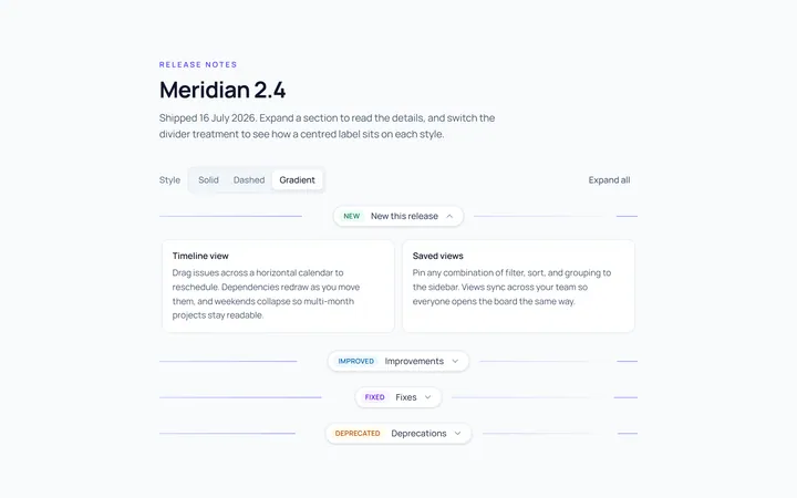
Label Divider
Originaldivider with centred label
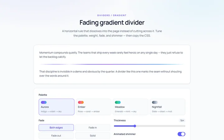
Gradient Divider
Originalgradient/fading divider
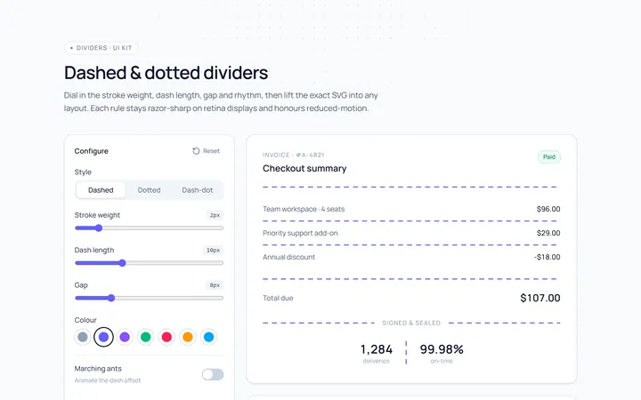
Dashed Divider
Originaldashed and dotted dividers
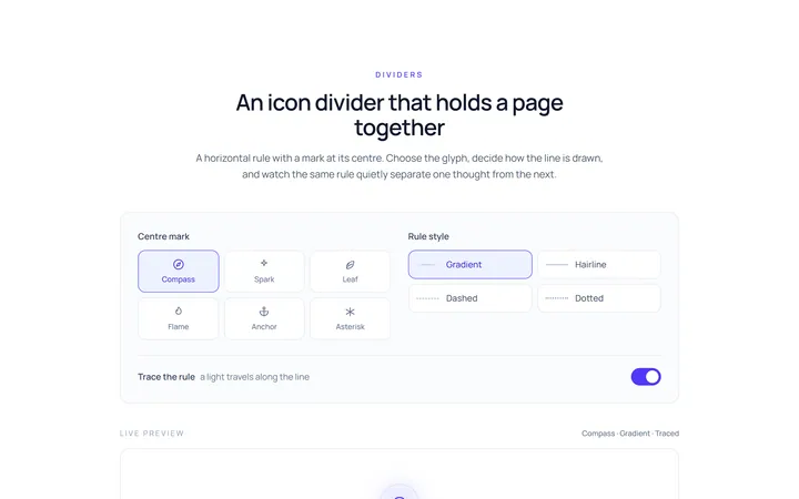
Icon Divider
Originaldivider with a centre icon
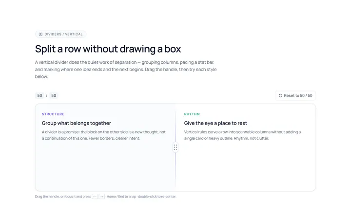
Vertical Divider
Originalvertical dividers
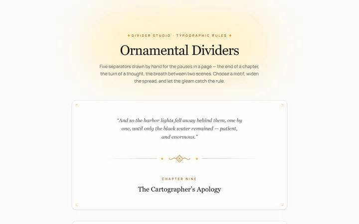
Fancy Divider
Originaldecorative ornament divider

Spotlight Hero
OriginalA centred hero with a soft radial spotlight, badge and dual call-to-action.

Split Hero
OriginalA two-column hero pairing a headline and CTAs with a product mock and social proof.

Gradient Spotlight Hero
OriginalA minimal centred hero with a soft gradient-mesh backdrop, announcement pill and dual call-to-action buttons.

App Preview Hero
OriginalA centred hero that pairs headline copy with a realistic product dashboard mock built entirely from markup, complete with browser chrome and a floating notification card.

Waitlist Capture Hero
OriginalA dark, focused hero with an inline email capture form and avatar social proof, ready for pre-launch waitlists.