

Animated Indicator Tab
Original · freetabs with a morphing indicator
byWeb InnoventixReact + Tailwind
tabanimatedindicatortabs
Copy prompt gives Claude Code, Cursor or v0 a ready-to-paste prompt that recreates this exact component.
npx shadcn@latest add https://webinnoventix.com/r/tab-animated-indicator.jsontab-animated-indicator.tsx
"use client"

import {
  useId,
  useRef,
  useState,
  type KeyboardEvent,
  type ReactNode,
} from "react"
import { motion, useReducedMotion } from "motion/react"

type Stat = { value: string; label: string }

type TabItem = {
  id: string
  label: string
  icon: ReactNode
  kicker: string
  heading: string
  body: string
  points: string[]
  stats: Stat[]
  live?: boolean
}

function StreamIcon() {
  return (
    <svg
      viewBox="0 0 24 24"
      fill="none"
      stroke="currentColor"
      strokeWidth={1.75}
      strokeLinecap="round"
      strokeLinejoin="round"
      className="h-4 w-4"
      aria-hidden="true"
    >
      <path d="M3 12h3l2 5 4-14 2 9h4" />
    </svg>
  )
}

function CohortIcon() {
  return (
    <svg
      viewBox="0 0 24 24"
      fill="none"
      stroke="currentColor"
      strokeWidth={1.75}
      strokeLinecap="round"
      strokeLinejoin="round"
      className="h-4 w-4"
      aria-hidden="true"
    >
      <circle cx="9" cy="8" r="3" />
      <path d="M15.5 6.2a3 3 0 0 1 0 5.6" />
      <path d="M3.5 19a5.5 5.5 0 0 1 11 0" />
      <path d="M17 13.7A5.5 5.5 0 0 1 20.5 19" />
    </svg>
  )
}

function FunnelIcon() {
  return (
    <svg
      viewBox="0 0 24 24"
      fill="none"
      stroke="currentColor"
      strokeWidth={1.75}
      strokeLinecap="round"
      strokeLinejoin="round"
      className="h-4 w-4"
      aria-hidden="true"
    >
      <path d="M3 5h18l-7 8v6l-4 2v-8L3 5z" />
    </svg>
  )
}

function AlertIcon() {
  return (
    <svg
      viewBox="0 0 24 24"
      fill="none"
      stroke="currentColor"
      strokeWidth={1.75}
      strokeLinecap="round"
      strokeLinejoin="round"
      className="h-4 w-4"
      aria-hidden="true"
    >
      <path d="M6 9a6 6 0 0 1 12 0c0 5 2 6 2 6H4s2-1 2-6" />
      <path d="M10 20a2 2 0 0 0 4 0" />
    </svg>
  )
}

function CheckIcon() {
  return (
    <svg
      viewBox="0 0 24 24"
      fill="none"
      stroke="currentColor"
      strokeWidth={2}
      strokeLinecap="round"
      strokeLinejoin="round"
      className="mt-0.5 h-4 w-4 shrink-0 text-emerald-500 dark:text-emerald-400"
      aria-hidden="true"
    >
      <path d="M20 6 9 17l-5-5" />
    </svg>
  )
}

const TABS: TabItem[] = [
  {
    id: "stream",
    label: "Live stream",
    icon: <StreamIcon />,
    kicker: "Realtime pipeline",
    heading: "Watch events land the moment they fire",
    body: "Every click, purchase, and API call streams into your workspace with sub-second latency. Filter the firehose by user, property, or source without ever waiting on a batch job to finish.",
    points: [
      "Sub-second ingestion from web, mobile, and server SDKs",
      "Live filters that narrow the stream as you type",
      "Replay any session to see the exact order of events",
    ],
    stats: [
      { value: "420ms", label: "median end-to-end latency" },
      { value: "38B", label: "events processed each week" },
    ],
    live: true,
  },
  {
    id: "cohorts",
    label: "Cohorts",
    icon: <CohortIcon />,
    kicker: "Retention",
    heading: "Group users by what they did, not who they are",
    body: "Build cohorts from any sequence of behaviors and track how each group retains week over week. Compare a feature's adopters against everyone else in two clicks, no SQL required.",
    points: [
      "Behavioral cohorts from any event sequence",
      "Week, day, or month retention grids side by side",
      "Compare any cohort against a control group",
    ],
    stats: [
      { value: "+17%", label: "week-4 retention for activated users" },
      { value: "52", label: "saved cohort definitions" },
    ],
  },
  {
    id: "funnels",
    label: "Funnels",
    icon: <FunnelIcon />,
    kicker: "Conversion",
    heading: "Find the exact step where people drop",
    body: "Chart a multi-step funnel and see conversion and drop-off between every stage. Break any step down by device, plan, or campaign to find where the leak actually is.",
    points: [
      "Unlimited steps with configurable conversion windows",
      "Drop-off broken down by any user property",
      "Automatic highlight of the single biggest leak",
    ],
    stats: [
      { value: "6.4%", label: "signup to paid conversion" },
      { value: "Step 3", label: "where most users exit today" },
    ],
  },
  {
    id: "alerts",
    label: "Alerts",
    icon: <AlertIcon />,
    kicker: "Monitoring",
    heading: "Get pinged before a metric becomes a fire",
    body: "Set fixed thresholds or let anomaly detection learn what normal looks like for each metric. Route alerts to Slack, email, or a webhook, and mute the noise with smart grouping.",
    points: [
      "Static thresholds and learned anomaly baselines",
      "Delivery to Slack, email, PagerDuty, or webhook",
      "Grouping that collapses duplicate alerts into one",
    ],
    stats: [
      { value: "90s", label: "median time to first alert" },
      { value: "0", label: "noisy duplicate pages last month" },
    ],
  },
]

export default function TabAnimatedIndicator() {
  const uid = useId()
  const prefersReduced = useReducedMotion()
  const [active, setActive] = useState<string>(TABS[0].id)
  const tabRefs = useRef<(HTMLButtonElement | null)[]>([])

  const tabDomId = (id: string) => `${uid}-tab-${id}`
  const panelDomId = (id: string) => `${uid}-panel-${id}`

  function onKeyDown(event: KeyboardEvent<HTMLDivElement>) {
    const count = TABS.length
    const currentIndex = TABS.findIndex((tab) => tab.id === active)
    let nextIndex = currentIndex

    switch (event.key) {
      case "ArrowRight":
      case "ArrowDown":
        nextIndex = (currentIndex + 1) % count
        break
      case "ArrowLeft":
      case "ArrowUp":
        nextIndex = (currentIndex - 1 + count) % count
        break
      case "Home":
        nextIndex = 0
        break
      case "End":
        nextIndex = count - 1
        break
      default:
        return
    }

    event.preventDefault()
    const nextTab = TABS[nextIndex]
    setActive(nextTab.id)
    tabRefs.current[nextIndex]?.focus()
  }

  return (
    <section className="relative w-full overflow-hidden bg-slate-50 px-4 py-20 text-slate-900 sm:py-28 dark:bg-slate-950 dark:text-slate-100">
      <style>{`
        @keyframes tai-pulse {
          0%, 100% { opacity: 1; transform: scale(1); }
          50% { opacity: 0.4; transform: scale(0.68); }
        }
        @keyframes tai-ring {
          0% { opacity: 0.6; transform: scale(1); }
          100% { opacity: 0; transform: scale(2.6); }
        }
        @keyframes tai-drift {
          0%, 100% { transform: translate3d(0, 0, 0); }
          50% { transform: translate3d(7%, -9%, 0); }
        }
        .tai-livedot { animation: tai-pulse 1.8s ease-in-out infinite; }
        .tai-livering { animation: tai-ring 1.8s ease-out infinite; }
        .tai-blob { animation: tai-drift 16s ease-in-out infinite; }
        @media (prefers-reduced-motion: reduce) {
          .tai-livedot, .tai-livering, .tai-blob { animation: none !important; }
        }
      `}</style>

      <div
        aria-hidden="true"
        className="tai-blob pointer-events-none absolute -top-24 left-1/2 h-72 w-72 -translate-x-1/2 rounded-full bg-gradient-to-br from-indigo-300/40 via-violet-300/30 to-sky-300/30 blur-3xl dark:from-indigo-600/25 dark:via-violet-600/20 dark:to-sky-600/20"
      />

      <div className="relative mx-auto max-w-5xl">
        <div className="mx-auto max-w-2xl text-center">
          <span className="inline-flex items-center gap-2 rounded-full border border-slate-200 bg-white px-3 py-1 text-xs font-semibold uppercase tracking-wide text-indigo-600 dark:border-slate-800 dark:bg-slate-900 dark:text-indigo-300">
            <span className="h-1.5 w-1.5 rounded-full bg-indigo-500 dark:bg-indigo-400" />
            Product analytics
          </span>
          <h2 className="mt-4 text-3xl font-semibold tracking-tight text-slate-900 sm:text-4xl dark:text-white">
            One workspace for every product question
          </h2>
          <p className="mt-3 text-base text-slate-600 dark:text-slate-400">
            Switch between the tools your team reaches for daily. The indicator
            morphs to wherever you land.
          </p>
        </div>

        <div className="mt-10 flex justify-center">
          <div className="max-w-full overflow-x-auto pb-1">
            <div
              role="tablist"
              aria-label="Product analytics capabilities"
              aria-orientation="horizontal"
              onKeyDown={onKeyDown}
              className="inline-flex items-center gap-1 rounded-full border border-slate-200 bg-white p-1.5 shadow-sm dark:border-slate-800 dark:bg-slate-900"
            >
              {TABS.map((tab, index) => {
                const isActive = tab.id === active
                return (
                  <button
                    key={tab.id}
                    ref={(el) => {
                      tabRefs.current[index] = el
                    }}
                    type="button"
                    role="tab"
                    id={tabDomId(tab.id)}
                    aria-selected={isActive}
                    aria-controls={panelDomId(tab.id)}
                    tabIndex={isActive ? 0 : -1}
                    onClick={() => setActive(tab.id)}
                    className={`relative flex items-center gap-2 whitespace-nowrap rounded-full px-4 py-2 text-sm font-medium transition-colors duration-200 focus:outline-none focus-visible:outline-none focus-visible:ring-2 focus-visible:ring-indigo-500 focus-visible:ring-offset-2 focus-visible:ring-offset-white dark:focus-visible:ring-offset-slate-900 ${
                      isActive
                        ? "text-slate-900 dark:text-white"
                        : "text-slate-500 hover:text-slate-800 dark:text-slate-400 dark:hover:text-slate-200"
                    }`}
                  >
                    {isActive && (
                      <motion.span
                        layoutId={`${uid}-pill`}
                        className="absolute inset-0 rounded-full bg-slate-100 ring-1 ring-slate-900/5 dark:bg-slate-800 dark:ring-white/10"
                        transition={
                          prefersReduced
                            ? { duration: 0 }
                            : { type: "spring", stiffness: 380, damping: 32 }
                        }
                      />
                    )}
                    <span
                      className={`relative z-10 ${
                        isActive
                          ? "text-indigo-600 dark:text-indigo-300"
                          : ""
                      }`}
                    >
                      {tab.icon}
                    </span>
                    <span className="relative z-10">{tab.label}</span>
                  </button>
                )
              })}
            </div>
          </div>
        </div>

        <div className="mt-8">
          {TABS.map((tab) => {
            const isActive = tab.id === active
            return (
              <div
                key={tab.id}
                role="tabpanel"
                id={panelDomId(tab.id)}
                aria-labelledby={tabDomId(tab.id)}
                hidden={!isActive}
                tabIndex={0}
                className="rounded-2xl border border-slate-200 bg-white/80 p-6 shadow-sm backdrop-blur focus:outline-none focus-visible:outline-none focus-visible:ring-2 focus-visible:ring-indigo-500 focus-visible:ring-offset-2 focus-visible:ring-offset-slate-50 sm:p-8 dark:border-slate-800 dark:bg-slate-900/70 dark:focus-visible:ring-offset-slate-950"
              >
                {isActive && (
                  <motion.div
                    initial={prefersReduced ? false : { opacity: 0, y: 10 }}
                    animate={{ opacity: 1, y: 0 }}
                    transition={{
                      duration: prefersReduced ? 0 : 0.28,
                      ease: [0.22, 1, 0.36, 1],
                    }}
                    className="grid gap-8 lg:grid-cols-5"
                  >
                    <div className="lg:col-span-3">
                      <div className="flex items-center gap-3">
                        <span className="text-xs font-semibold uppercase tracking-wide text-indigo-600 dark:text-indigo-300">
                          {tab.kicker}
                        </span>
                        {tab.live && (
                          <span className="inline-flex items-center gap-2 rounded-full bg-emerald-50 px-2.5 py-0.5 text-xs font-medium text-emerald-700 dark:bg-emerald-500/10 dark:text-emerald-300">
                            <span className="relative inline-flex h-2.5 w-2.5">
                              <span className="tai-livering absolute inline-flex h-full w-full rounded-full bg-emerald-400/70" />
                              <span className="tai-livedot relative inline-flex h-2.5 w-2.5 rounded-full bg-emerald-500" />
                            </span>
                            Live now
                          </span>
                        )}
                      </div>

                      <h3 className="mt-3 text-2xl font-semibold tracking-tight text-slate-900 dark:text-white">
                        {tab.heading}
                      </h3>
                      <p className="mt-3 text-base leading-relaxed text-slate-600 dark:text-slate-400">
                        {tab.body}
                      </p>

                      <ul role="list" className="mt-6 space-y-3">
                        {tab.points.map((point) => (
                          <li
                            key={point}
                            className="flex items-start gap-3 text-sm text-slate-700 dark:text-slate-300"
                          >
                            <CheckIcon />
                            <span>{point}</span>
                          </li>
                        ))}
                      </ul>
                    </div>

                    <div className="flex flex-col gap-4 lg:col-span-2">
                      {tab.stats.map((stat) => (
                        <div
                          key={stat.label}
                          className="rounded-xl border border-slate-200 bg-slate-50 p-4 dark:border-slate-800 dark:bg-slate-800/50"
                        >
                          <div className="text-3xl font-semibold tracking-tight text-slate-900 dark:text-white">
                            {stat.value}
                          </div>
                          <div className="mt-1 text-sm text-slate-500 dark:text-slate-400">
                            {stat.label}
                          </div>
                        </div>
                      ))}
                    </div>
                  </motion.div>
                )}
              </div>
            )
          })}
        </div>
      </div>
    </section>
  )
}
Dependencies
motion
Licence
Built by Web Innoventix. Free for personal and commercial use, no attribution required.
Built by Web Innoventix
Need a custom interface, a full website, or SEO that gets you cited by AI? We design, build and rank it end to end.
Get a free quoteSimilar components
Browse all →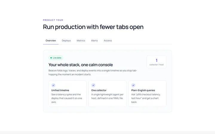
Underline Tab
Originalunderline tabs with sliding indicator
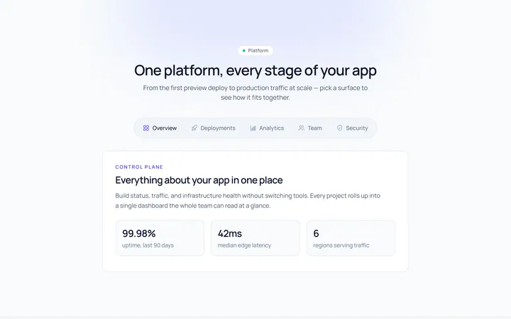
Pills Tab
Originalpill tabs
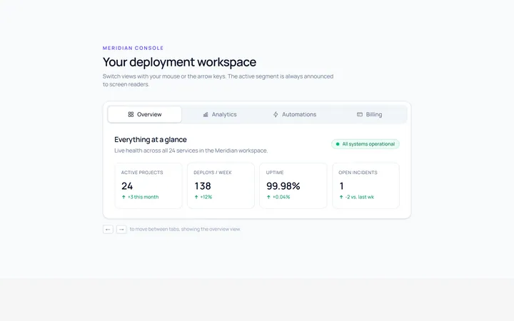
Boxed Tab
Originalboxed/segmented tabs
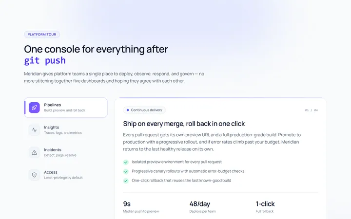
Vertical Tab
Originalvertical tabs
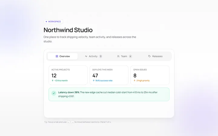
Icons Tab
Originaltabs with icons
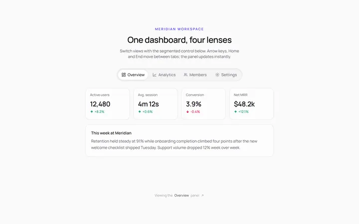
Segmented Tab
Originalsegmented control tabs
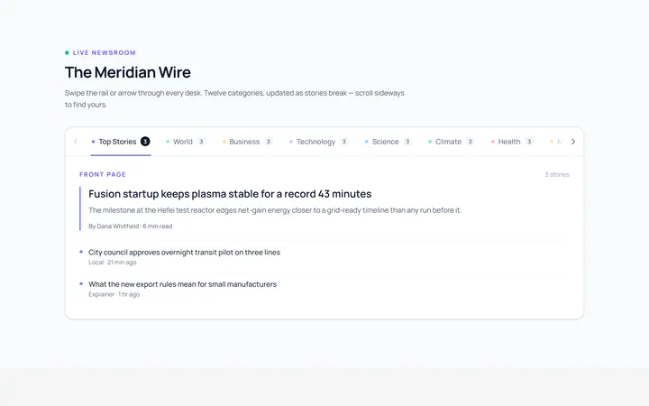
Scrollable Tab
Originalhorizontally scrollable tabs
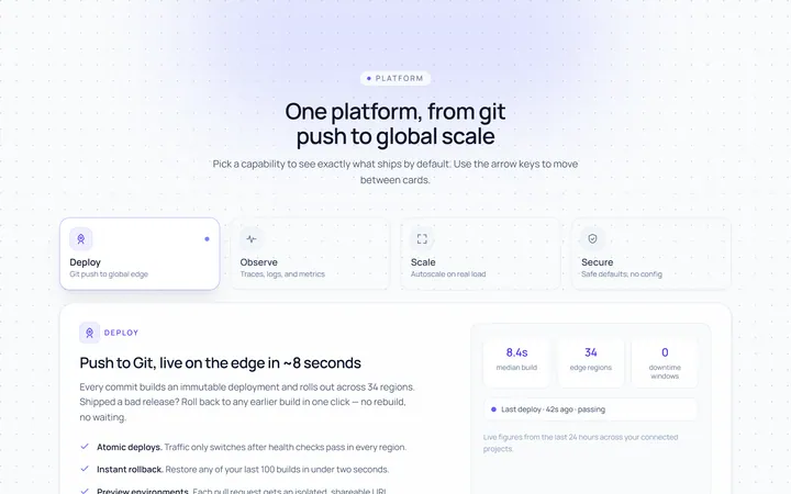
Cards Tab
Originalcard-style tabs with panels
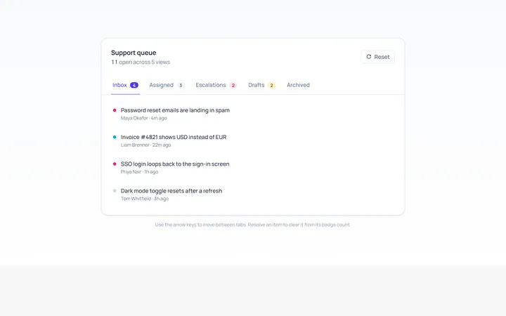
With Badge Tab
Originaltabs with count badges
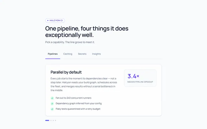
Line Grow Tab
Originaltabs where the underline grows in
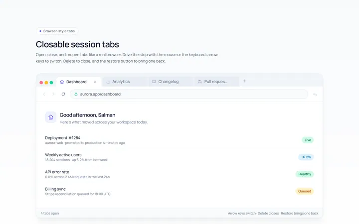
Closable Tab
Originalbrowser-style closable tabs

Spotlight Hero
OriginalA centred hero with a soft radial spotlight, badge and dual call-to-action.