

Icons Tab
Original · freetabs with icons
byWeb InnoventixReact + Tailwind
tabiconstabs
Copy prompt gives Claude Code, Cursor or v0 a ready-to-paste prompt that recreates this exact component.
npx shadcn@latest add https://webinnoventix.com/r/tab-icons.jsontab-icons.tsx
"use client";
import { useRef, useState, type KeyboardEvent as ReactKeyboardEvent, type ReactElement } from "react";
import { AnimatePresence, motion, useReducedMotion } from "motion/react";
/* ----------------------------------------------------------------------------
Icons (inline, stroke = currentColor)
---------------------------------------------------------------------------- */
function GridIcon({ className }: { className?: string }): ReactElement {
return (
<svg
className={className}
viewBox="0 0 24 24"
fill="none"
stroke="currentColor"
strokeWidth={1.8}
strokeLinecap="round"
strokeLinejoin="round"
aria-hidden="true"
>
<rect x="3.5" y="3.5" width="7" height="7" rx="2" />
<rect x="13.5" y="3.5" width="7" height="7" rx="2" />
<rect x="3.5" y="13.5" width="7" height="7" rx="2" />
<rect x="13.5" y="13.5" width="7" height="7" rx="2" />
</svg>
);
}
function PulseIcon({ className }: { className?: string }): ReactElement {
return (
<svg
className={className}
viewBox="0 0 24 24"
fill="none"
stroke="currentColor"
strokeWidth={1.8}
strokeLinecap="round"
strokeLinejoin="round"
aria-hidden="true"
>
<path d="M3 12h3.5l2-6 4 12 2.4-8 1.6 2H21" />
</svg>
);
}
function UsersIcon({ className }: { className?: string }): ReactElement {
return (
<svg
className={className}
viewBox="0 0 24 24"
fill="none"
stroke="currentColor"
strokeWidth={1.8}
strokeLinecap="round"
strokeLinejoin="round"
aria-hidden="true"
>
<circle cx="9" cy="8" r="3.2" />
<path d="M3.5 19.5a5.5 5.5 0 0 1 11 0" />
<path d="M16 5.2a3.2 3.2 0 0 1 0 5.6" />
<path d="M17.5 14.4a5.5 5.5 0 0 1 3 5.1" />
</svg>
);
}
function TagIcon({ className }: { className?: string }): ReactElement {
return (
<svg
className={className}
viewBox="0 0 24 24"
fill="none"
stroke="currentColor"
strokeWidth={1.8}
strokeLinecap="round"
strokeLinejoin="round"
aria-hidden="true"
>
<path d="M3.5 11.5V4.5a1 1 0 0 1 1-1h7l8 8a1.6 1.6 0 0 1 0 2.3l-5.7 5.7a1.6 1.6 0 0 1-2.3 0l-8-8Z" />
<circle cx="8" cy="8" r="1.3" />
</svg>
);
}
function ArrowUpIcon({ className }: { className?: string }): ReactElement {
return (
<svg
className={className}
viewBox="0 0 24 24"
fill="none"
stroke="currentColor"
strokeWidth={2}
strokeLinecap="round"
strokeLinejoin="round"
aria-hidden="true"
>
<path d="M12 19V5" />
<path d="m6 11 6-6 6 6" />
</svg>
);
}
function CheckIcon({ className }: { className?: string }): ReactElement {
return (
<svg
className={className}
viewBox="0 0 24 24"
fill="none"
stroke="currentColor"
strokeWidth={2.2}
strokeLinecap="round"
strokeLinejoin="round"
aria-hidden="true"
>
<path d="m4.5 12.5 5 5 10-11" />
</svg>
);
}
/* ----------------------------------------------------------------------------
Data
---------------------------------------------------------------------------- */
type TabId = "overview" | "activity" | "team" | "releases";
interface TabDef {
id: TabId;
label: string;
Icon: (props: { className?: string }) => ReactElement;
count?: number;
}
const TABS: TabDef[] = [
{ id: "overview", label: "Overview", Icon: GridIcon },
{ id: "activity", label: "Activity", Icon: PulseIcon, count: 3 },
{ id: "team", label: "Team", Icon: UsersIcon, count: 4 },
{ id: "releases", label: "Releases", Icon: TagIcon },
];
interface Metric {
label: string;
value: string;
note: string;
tone: "emerald" | "sky" | "amber";
}
const METRICS: Metric[] = [
{ label: "Active projects", value: "12", note: "+2 this month", tone: "emerald" },
{ label: "Deploys this week", value: "47", note: "94% success rate", tone: "sky" },
{ label: "Open issues", value: "8", note: "3 high priority", tone: "amber" },
];
interface Event {
who: string;
what: string;
when: string;
tone: "indigo" | "emerald" | "sky" | "amber";
}
const EVENTS: Event[] = [
{ who: "Priya Nair", what: "merged “Reduce cold-start latency” into main", when: "14:20", tone: "emerald" },
{ who: "Deploy bot", what: "promoted v3.8.1 to production", when: "11:05", tone: "sky" },
{ who: "Marcus Adeyemi", what: "revised the onboarding flow spec", when: "09:42", tone: "indigo" },
{ who: "Lena Whitfield", what: "opened issue #204 · retry storm on webhook delivery", when: "Yesterday", tone: "amber" },
];
interface Member {
name: string;
role: string;
initials: string;
status: "online" | "away" | "offline";
}
const MEMBERS: Member[] = [
{ name: "Priya Nair", role: "Engineering Lead", initials: "PN", status: "online" },
{ name: "Marcus Adeyemi", role: "Product Designer", initials: "MA", status: "away" },
{ name: "Lena Whitfield", role: "Backend Engineer", initials: "LW", status: "online" },
{ name: "Tomas Berg", role: "QA & Release", initials: "TB", status: "offline" },
];
interface Release {
version: string;
title: string;
date: string;
channel: "Production" | "Beta";
}
const RELEASES: Release[] = [
{ version: "v3.8.1", title: "Faster onboarding", date: "Jul 14", channel: "Production" },
{ version: "v3.9.0-rc.1", title: "Realtime presence", date: "Jul 15", channel: "Beta" },
{ version: "v3.8.0", title: "Team roles GA", date: "Jul 2", channel: "Production" },
{ version: "v3.7.4", title: "Billing reliability", date: "Jun 21", channel: "Production" },
];
/* ----------------------------------------------------------------------------
Small styling maps
---------------------------------------------------------------------------- */
const METRIC_TONE: Record<Metric["tone"], string> = {
emerald: "text-emerald-600 dark:text-emerald-400",
sky: "text-sky-600 dark:text-sky-400",
amber: "text-amber-600 dark:text-amber-400",
};
const EVENT_DOT: Record<Event["tone"], string> = {
indigo: "bg-indigo-500",
emerald: "bg-emerald-500",
sky: "bg-sky-500",
amber: "bg-amber-500",
};
const STATUS_DOT: Record<Member["status"], string> = {
online: "bg-emerald-500",
away: "bg-amber-500",
offline: "bg-zinc-400 dark:bg-zinc-600",
};
const STATUS_LABEL: Record<Member["status"], string> = {
online: "Online",
away: "Away",
offline: "Offline",
};
/* ----------------------------------------------------------------------------
Panels
---------------------------------------------------------------------------- */
function OverviewPanel(): ReactElement {
return (
<div className="grid gap-4">
<div className="grid gap-3 sm:grid-cols-3">
{METRICS.map((m) => (
<div
key={m.label}
className="rounded-2xl border border-zinc-200 bg-white/70 p-4 dark:border-white/10 dark:bg-white/[0.03]"
>
<p className="text-xs font-medium uppercase tracking-wide text-zinc-500 dark:text-zinc-400">
{m.label}
</p>
<p className="mt-2 text-3xl font-semibold tracking-tight text-zinc-900 dark:text-zinc-50">
{m.value}
</p>
<p className={`mt-1 flex items-center gap-1 text-xs font-medium ${METRIC_TONE[m.tone]}`}>
<ArrowUpIcon className="h-3.5 w-3.5" />
{m.note}
</p>
</div>
))}
</div>
<div className="flex items-start gap-3 rounded-2xl border border-emerald-200 bg-emerald-50/70 p-4 dark:border-emerald-500/25 dark:bg-emerald-500/10">
<span className="mt-0.5 grid h-7 w-7 shrink-0 place-items-center rounded-full bg-emerald-500/15 text-emerald-600 dark:text-emerald-400">
<CheckIcon className="h-4 w-4" />
</span>
<p className="text-sm leading-relaxed text-emerald-900 dark:text-emerald-100">
<span className="font-semibold">Latency down 38%.</span> The new edge cache cut median
cold-start from 410 ms to 254 ms after shipping v3.8.1.
</p>
</div>
</div>
);
}
function ActivityPanel(): ReactElement {
return (
<ol className="relative ml-1.5 space-y-5 border-l border-dashed border-zinc-200 pl-6 dark:border-white/10">
{EVENTS.map((e) => (
<li key={e.what} className="relative">
<span
className={`absolute -left-[1.65rem] top-1 h-2.5 w-2.5 rounded-full ring-4 ring-white dark:ring-zinc-900 ${EVENT_DOT[e.tone]}`}
/>
<p className="text-sm leading-snug text-zinc-700 dark:text-zinc-200">
<span className="font-semibold text-zinc-900 dark:text-zinc-50">{e.who}</span>{" "}
{e.what}
</p>
<p className="mt-0.5 text-xs tabular-nums text-zinc-400 dark:text-zinc-500">{e.when}</p>
</li>
))}
</ol>
);
}
function TeamPanel(): ReactElement {
return (
<ul className="grid gap-2.5 sm:grid-cols-2">
{MEMBERS.map((m) => (
<li
key={m.name}
className="flex items-center gap-3 rounded-2xl border border-zinc-200 bg-white/70 p-3 dark:border-white/10 dark:bg-white/[0.03]"
>
<span className="relative grid h-10 w-10 shrink-0 place-items-center rounded-full bg-gradient-to-br from-indigo-500 to-violet-600 text-sm font-semibold text-white">
{m.initials}
<span
className={`absolute -bottom-0.5 -right-0.5 h-3 w-3 rounded-full ring-2 ring-white dark:ring-zinc-900 ${STATUS_DOT[m.status]}`}
/>
</span>
<div className="min-w-0">
<p className="truncate text-sm font-medium text-zinc-900 dark:text-zinc-50">{m.name}</p>
<p className="truncate text-xs text-zinc-500 dark:text-zinc-400">{m.role}</p>
</div>
<span className="ml-auto text-[11px] font-medium text-zinc-400 dark:text-zinc-500">
{STATUS_LABEL[m.status]}
</span>
</li>
))}
</ul>
);
}
function ReleasesPanel(): ReactElement {
return (
<ul className="divide-y divide-zinc-200 overflow-hidden rounded-2xl border border-zinc-200 dark:divide-white/10 dark:border-white/10">
{RELEASES.map((r) => (
<li
key={r.version}
className="flex items-center gap-3 bg-white/60 px-4 py-3 dark:bg-white/[0.03]"
>
<code className="rounded-md bg-zinc-100 px-2 py-0.5 text-xs font-semibold tabular-nums text-zinc-700 dark:bg-white/10 dark:text-zinc-200">
{r.version}
</code>
<span className="truncate text-sm text-zinc-800 dark:text-zinc-100">{r.title}</span>
<span className="ml-auto flex items-center gap-3">
<span
className={
r.channel === "Production"
? "inline-flex items-center rounded-full bg-emerald-500/12 px-2 py-0.5 text-[11px] font-medium text-emerald-700 dark:text-emerald-300"
: "inline-flex items-center rounded-full bg-sky-500/12 px-2 py-0.5 text-[11px] font-medium text-sky-700 dark:text-sky-300"
}
>
{r.channel}
</span>
<span className="hidden text-xs tabular-nums text-zinc-400 dark:text-zinc-500 sm:inline">
{r.date}
</span>
</span>
</li>
))}
</ul>
);
}
function renderPanel(id: TabId): ReactElement {
switch (id) {
case "overview":
return <OverviewPanel />;
case "activity":
return <ActivityPanel />;
case "team":
return <TeamPanel />;
case "releases":
return <ReleasesPanel />;
}
}
/* ----------------------------------------------------------------------------
Component
---------------------------------------------------------------------------- */
export default function TabIcons(): ReactElement {
const [activeId, setActiveId] = useState<TabId>("overview");
const reduce = useReducedMotion();
const tabRefs = useRef<Array<HTMLButtonElement | null>>([]);
const activeIndex = TABS.findIndex((t) => t.id === activeId);
function focusTab(index: number): void {
const bounded = (index + TABS.length) % TABS.length;
setActiveId(TABS[bounded].id);
tabRefs.current[bounded]?.focus();
}
function onKeyDown(e: ReactKeyboardEvent<HTMLButtonElement>, index: number): void {
switch (e.key) {
case "ArrowRight":
case "ArrowDown":
e.preventDefault();
focusTab(index + 1);
break;
case "ArrowLeft":
case "ArrowUp":
e.preventDefault();
focusTab(index - 1);
break;
case "Home":
e.preventDefault();
focusTab(0);
break;
case "End":
e.preventDefault();
focusTab(TABS.length - 1);
break;
default:
break;
}
}
const pillTransition = reduce
? { duration: 0 }
: { type: "spring" as const, stiffness: 440, damping: 36, mass: 0.7 };
const contentVariants = {
hidden: { opacity: 0, y: reduce ? 0 : 10 },
show: { opacity: 1, y: 0 },
exit: { opacity: 0, y: reduce ? 0 : -10 },
};
return (
<section className="relative w-full overflow-hidden bg-gradient-to-b from-zinc-50 via-white to-zinc-100 px-4 py-20 text-zinc-900 dark:from-zinc-950 dark:via-zinc-950 dark:to-black dark:text-zinc-100 sm:px-6 sm:py-28">
<style>{`
@keyframes tabicons-float {
0%, 100% { transform: translate3d(0, 0, 0) scale(1); }
50% { transform: translate3d(0, -22px, 0) scale(1.06); }
}
@keyframes tabicons-drift {
0%, 100% { transform: translate3d(0, 0, 0); }
50% { transform: translate3d(26px, 14px, 0); }
}
@media (prefers-reduced-motion: reduce) {
.tabicons-anim { animation: none !important; }
}
`}</style>
{/* Decorative atmosphere */}
<div aria-hidden="true" className="pointer-events-none absolute inset-0 overflow-hidden">
<div className="tabicons-anim absolute -left-24 top-0 h-72 w-72 rounded-full bg-indigo-400/20 blur-3xl dark:bg-indigo-500/15 [animation:tabicons-float_19s_ease-in-out_infinite]" />
<div className="tabicons-anim absolute -right-16 bottom-0 h-80 w-80 rounded-full bg-violet-400/20 blur-3xl dark:bg-violet-500/15 [animation:tabicons-drift_23s_ease-in-out_infinite]" />
<div
className="absolute inset-0 opacity-[0.04] dark:opacity-[0.06]"
style={{
backgroundImage:
"linear-gradient(currentColor 1px, transparent 1px), linear-gradient(90deg, currentColor 1px, transparent 1px)",
backgroundSize: "44px 44px",
maskImage: "radial-gradient(ellipse 70% 60% at 50% 40%, black, transparent)",
WebkitMaskImage: "radial-gradient(ellipse 70% 60% at 50% 40%, black, transparent)",
}}
/>
</div>
<div className="relative mx-auto max-w-3xl">
<header className="mb-8">
<span className="inline-flex items-center gap-2 rounded-full border border-zinc-200 bg-white/70 px-3 py-1 text-xs font-medium tracking-wide text-indigo-600 dark:border-white/10 dark:bg-white/[0.04] dark:text-indigo-300">
<span className="h-1.5 w-1.5 rounded-full bg-indigo-500" />
WORKSPACE
</span>
<h2 className="mt-4 text-3xl font-semibold tracking-tight text-zinc-900 dark:text-zinc-50 sm:text-4xl">
Northwind Studio
</h2>
<p className="mt-2 max-w-xl text-sm leading-relaxed text-zinc-600 dark:text-zinc-400 sm:text-base">
One place to track shipping velocity, team activity, and releases across the studio.
</p>
</header>
<div className="rounded-3xl border border-zinc-200 bg-white/70 p-3 shadow-xl shadow-zinc-900/5 backdrop-blur dark:border-white/10 dark:bg-zinc-900/50 dark:shadow-black/40 sm:p-4">
{/* Tablist */}
<div
role="tablist"
aria-label="Workspace sections"
aria-orientation="horizontal"
className="flex gap-1 overflow-x-auto rounded-2xl bg-zinc-100/80 p-1.5 ring-1 ring-zinc-200/70 [scrollbar-width:none] dark:bg-black/30 dark:ring-white/10"
>
{TABS.map((tab, index) => {
const selected = tab.id === activeId;
return (
<button
key={tab.id}
ref={(el) => {
tabRefs.current[index] = el;
}}
role="tab"
id={`tabicons-tab-${tab.id}`}
type="button"
aria-selected={selected}
aria-controls={`tabicons-panel-${tab.id}`}
tabIndex={selected ? 0 : -1}
onClick={() => setActiveId(tab.id)}
onKeyDown={(e) => onKeyDown(e, index)}
className={`relative flex flex-1 items-center justify-center gap-2 whitespace-nowrap rounded-xl px-3 py-2.5 text-sm font-medium transition-colors focus-visible:outline-none focus-visible:ring-2 focus-visible:ring-indigo-500 focus-visible:ring-offset-2 focus-visible:ring-offset-zinc-100 dark:focus-visible:ring-offset-zinc-900 ${
selected
? "text-zinc-900 dark:text-zinc-50"
: "text-zinc-500 hover:text-zinc-800 dark:text-zinc-400 dark:hover:text-zinc-100"
}`}
>
{selected && (
<motion.span
layoutId="tabicons-pill"
transition={pillTransition}
className="absolute inset-0 rounded-xl bg-white shadow-sm ring-1 ring-zinc-200/80 dark:bg-zinc-800 dark:ring-white/10"
/>
)}
<span className="relative z-10 flex items-center gap-2">
<tab.Icon
className={`h-4 w-4 shrink-0 transition-colors ${
selected ? "text-indigo-600 dark:text-indigo-400" : ""
}`}
/>
<span>{tab.label}</span>
{typeof tab.count === "number" && (
<span
className={`ml-0.5 hidden rounded-full px-1.5 text-[11px] font-semibold leading-5 sm:inline ${
selected
? "bg-indigo-600 text-white"
: "bg-zinc-200 text-zinc-600 dark:bg-white/10 dark:text-zinc-300"
}`}
>
{tab.count}
</span>
)}
</span>
</button>
);
})}
</div>
{/* Panel */}
<div className="mt-4 min-h-[19rem] rounded-2xl p-1 sm:p-3">
<div
role="tabpanel"
id={`tabicons-panel-${activeId}`}
aria-labelledby={`tabicons-tab-${activeId}`}
tabIndex={0}
className="rounded-xl focus-visible:outline-none focus-visible:ring-2 focus-visible:ring-indigo-500 focus-visible:ring-offset-2 focus-visible:ring-offset-white dark:focus-visible:ring-offset-zinc-900"
>
<AnimatePresence mode="wait" initial={false}>
<motion.div
key={activeId}
variants={contentVariants}
initial="hidden"
animate="show"
exit="exit"
transition={{ duration: reduce ? 0 : 0.22, ease: [0.22, 1, 0.36, 1] }}
>
{renderPanel(activeId)}
</motion.div>
</AnimatePresence>
</div>
</div>
</div>
<p className="mt-4 px-1 text-xs text-zinc-400 dark:text-zinc-500">
Tip: focus a tab and use{" "}
<kbd className="rounded border border-zinc-300 bg-white px-1 font-sans text-[10px] text-zinc-600 dark:border-white/15 dark:bg-white/10 dark:text-zinc-300">
←
</kbd>{" "}
<kbd className="rounded border border-zinc-300 bg-white px-1 font-sans text-[10px] text-zinc-600 dark:border-white/15 dark:bg-white/10 dark:text-zinc-300">
→
</kbd>{" "}
to move between sections. Panel {activeIndex + 1} of {TABS.length}.
</p>
</div>
</section>
);
}Dependencies
motion
Licence
Built by Web Innoventix. Free for personal and commercial use, no attribution required.
Built by Web Innoventix
Need a custom interface, a full website, or SEO that gets you cited by AI? We design, build and rank it end to end.
Get a free quoteSimilar components
Browse all →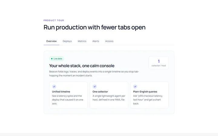
Underline Tab
Originalunderline tabs with sliding indicator
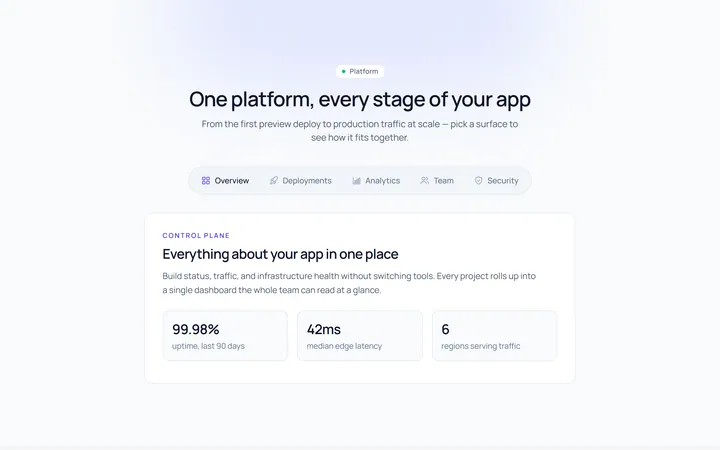
Pills Tab
Originalpill tabs
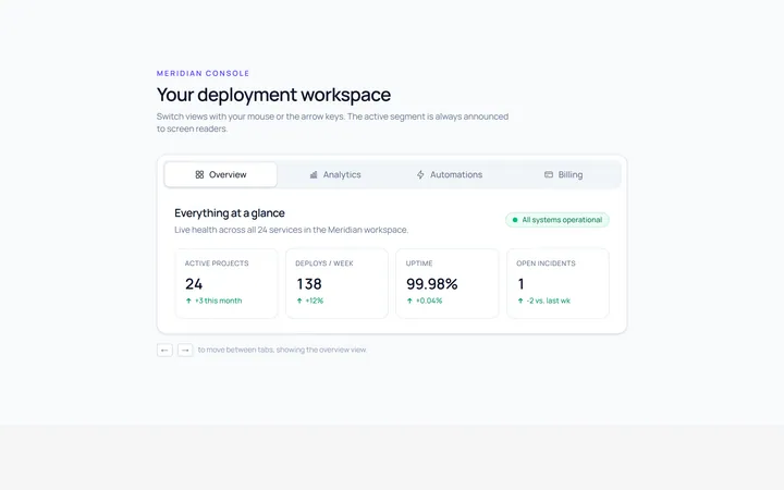
Boxed Tab
Originalboxed/segmented tabs
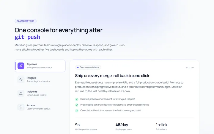
Vertical Tab
Originalvertical tabs
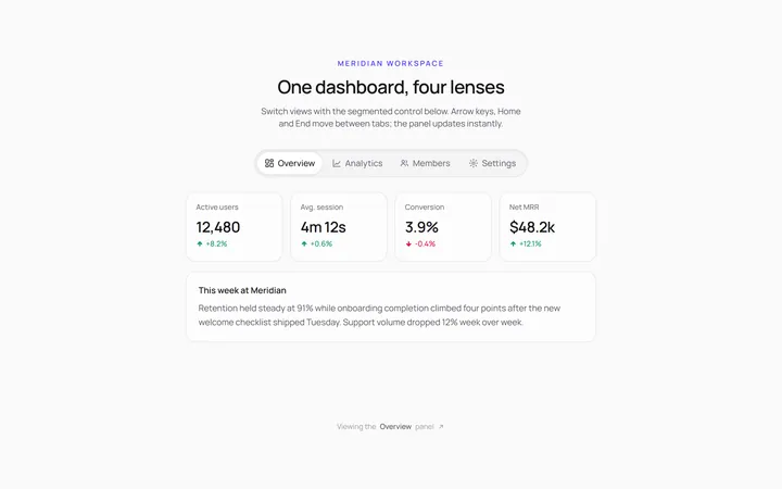
Segmented Tab
Originalsegmented control tabs
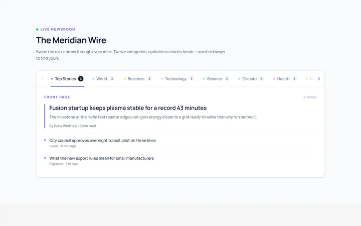
Scrollable Tab
Originalhorizontally scrollable tabs
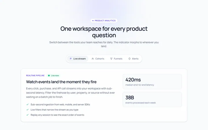
Animated Indicator Tab
Originaltabs with a morphing indicator
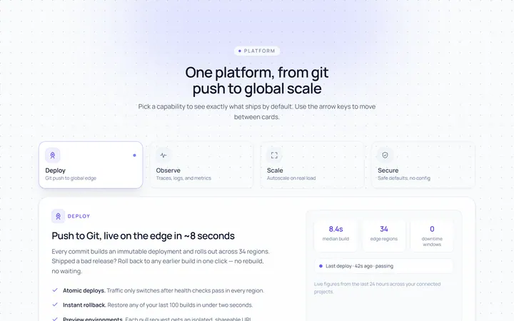
Cards Tab
Originalcard-style tabs with panels
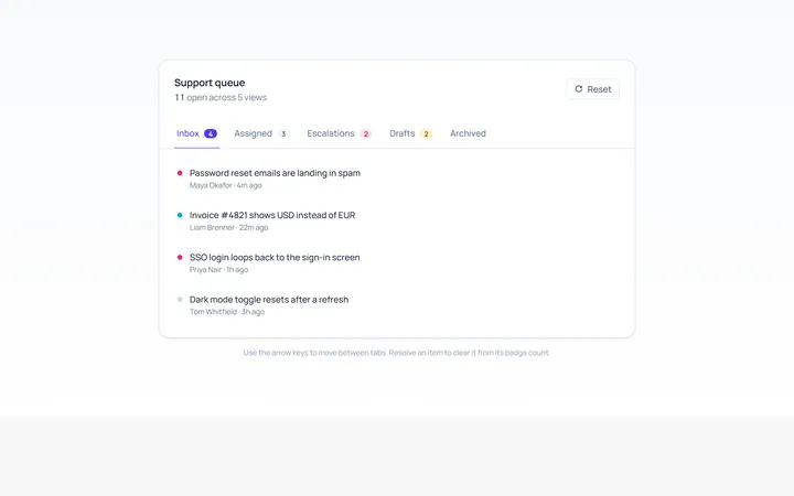
With Badge Tab
Originaltabs with count badges
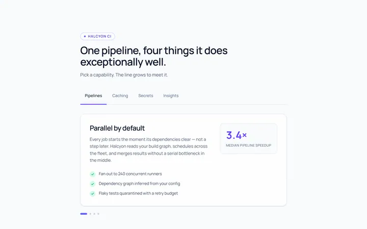
Line Grow Tab
Originaltabs where the underline grows in
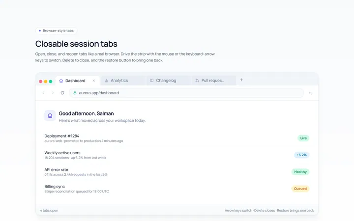
Closable Tab
Originalbrowser-style closable tabs

Spotlight Hero
OriginalA centred hero with a soft radial spotlight, badge and dual call-to-action.