

Cards Tab
Original · freecard-style tabs with panels
byWeb InnoventixReact + Tailwind
tabcardstabs
Copy prompt gives Claude Code, Cursor or v0 a ready-to-paste prompt that recreates this exact component.
npx shadcn@latest add https://webinnoventix.com/r/tab-cards.jsontab-cards.tsx
"use client";

import { useId, useRef, useState, type KeyboardEvent, type ReactNode } from "react";
import { AnimatePresence, motion, useReducedMotion } from "motion/react";

type TabId = "deploy" | "observe" | "scale" | "secure";

interface Accent {
  text: string;
  iconWrap: string;
  dot: string;
  tile: string;
  check: string;
}

interface Bullet {
  term: string;
  detail: string;
}

interface Metric {
  value: string;
  label: string;
}

interface PanelContent {
  heading: string;
  desc: string;
  bullets: Bullet[];
  metrics: Metric[];
  status: string;
}

interface TabItem {
  id: TabId;
  label: string;
  tagline: string;
  icon: ReactNode;
  accent: Accent;
  panel: PanelContent;
}

const ACCENTS: Record<TabId, Accent> = {
  deploy: {
    text: "text-indigo-600 dark:text-indigo-400",
    iconWrap: "bg-indigo-500/10 text-indigo-600 ring-1 ring-indigo-500/20 dark:text-indigo-400 dark:ring-indigo-400/20",
    dot: "bg-indigo-500",
    tile: "text-indigo-600 dark:text-indigo-400",
    check: "text-indigo-500 dark:text-indigo-400",
  },
  observe: {
    text: "text-violet-600 dark:text-violet-400",
    iconWrap: "bg-violet-500/10 text-violet-600 ring-1 ring-violet-500/20 dark:text-violet-400 dark:ring-violet-400/20",
    dot: "bg-violet-500",
    tile: "text-violet-600 dark:text-violet-400",
    check: "text-violet-500 dark:text-violet-400",
  },
  scale: {
    text: "text-emerald-600 dark:text-emerald-400",
    iconWrap: "bg-emerald-500/10 text-emerald-600 ring-1 ring-emerald-500/20 dark:text-emerald-400 dark:ring-emerald-400/20",
    dot: "bg-emerald-500",
    tile: "text-emerald-600 dark:text-emerald-400",
    check: "text-emerald-500 dark:text-emerald-400",
  },
  secure: {
    text: "text-amber-600 dark:text-amber-400",
    iconWrap: "bg-amber-500/10 text-amber-600 ring-1 ring-amber-500/20 dark:text-amber-400 dark:ring-amber-400/20",
    dot: "bg-amber-500",
    tile: "text-amber-600 dark:text-amber-400",
    check: "text-amber-500 dark:text-amber-400",
  },
};

function IconDeploy() {
  return (
    <svg viewBox="0 0 24 24" fill="none" stroke="currentColor" strokeWidth={1.6} strokeLinecap="round" strokeLinejoin="round" className="h-5 w-5" aria-hidden="true">
      <path d="M12 3c3.5 1.8 5.5 5 5.5 9.5L12 17l-5.5-4.5C6.5 8 8.5 4.8 12 3Z" />
      <circle cx="12" cy="10" r="1.8" />
      <path d="M9.2 17.4 7 21m7.8-3.6L17 21" />
    </svg>
  );
}

function IconObserve() {
  return (
    <svg viewBox="0 0 24 24" fill="none" stroke="currentColor" strokeWidth={1.6} strokeLinecap="round" strokeLinejoin="round" className="h-5 w-5" aria-hidden="true">
      <path d="M3 12h3.5l2-6 3.5 13 2.8-9 1.7 2H21" />
    </svg>
  );
}

function IconScale() {
  return (
    <svg viewBox="0 0 24 24" fill="none" stroke="currentColor" strokeWidth={1.6} strokeLinecap="round" strokeLinejoin="round" className="h-5 w-5" aria-hidden="true">
      <path d="M4 9V4h5M20 15v5h-5M20 9V4h-5M4 15v5h5" />
    </svg>
  );
}

function IconSecure() {
  return (
    <svg viewBox="0 0 24 24" fill="none" stroke="currentColor" strokeWidth={1.6} strokeLinecap="round" strokeLinejoin="round" className="h-5 w-5" aria-hidden="true">
      <path d="M12 3 5 6v5.5c0 4 2.9 7.4 7 8.5 4.1-1.1 7-4.5 7-8.5V6l-7-3Z" />
      <path d="m9.2 12 2 2 3.6-3.8" />
    </svg>
  );
}

function CheckIcon({ className }: { className: string }) {
  return (
    <svg viewBox="0 0 24 24" fill="none" stroke="currentColor" strokeWidth={2} strokeLinecap="round" strokeLinejoin="round" className={className} aria-hidden="true">
      <path d="m20 6-11 11-5-5" />
    </svg>
  );
}

const TABS: TabItem[] = [
  {
    id: "deploy",
    label: "Deploy",
    tagline: "Git push to global edge",
    icon: <IconDeploy />,
    accent: ACCENTS.deploy,
    panel: {
      heading: "Push to Git, live on the edge in ~8 seconds",
      desc:
        "Every commit builds an immutable deployment and rolls out across 34 regions. Shipped a bad release? Roll back to any earlier build in one click — no rebuild, no waiting.",
      bullets: [
        { term: "Atomic deploys", detail: "Traffic only switches after health checks pass in every region." },
        { term: "Instant rollback", detail: "Restore any of your last 100 builds in under two seconds." },
        { term: "Preview environments", detail: "Each pull request gets an isolated, shareable URL." },
      ],
      metrics: [
        { value: "8.4s", label: "median build" },
        { value: "34", label: "edge regions" },
        { value: "0", label: "downtime windows" },
      ],
      status: "Last deploy · 42s ago · passing",
    },
  },
  {
    id: "observe",
    label: "Observe",
    tagline: "Traces, logs, and metrics",
    icon: <IconObserve />,
    accent: ACCENTS.observe,
    panel: {
      heading: "Trace one slow request from edge to database",
      desc:
        "Distributed traces, structured logs, and metrics share a single timeline. Click a spike on the latency chart and jump straight to the span that caused it — no dashboard hopping.",
      bullets: [
        { term: "Waterfall traces", detail: "See every query, cache hit, and outbound call inside a span." },
        { term: "Correlated logs", detail: "Logs auto-link to their trace ID, so you stop grepping services." },
        { term: "Live tail", detail: "Stream production logs with sub-second delay, filtered by any field." },
      ],
      metrics: [
        { value: "1.2M/s", label: "spans ingested" },
        { value: "30d", label: "full retention" },
        { value: "240ms", label: "p99 query" },
      ],
      status: "Ingest healthy · 1.19M spans/s",
    },
  },
  {
    id: "scale",
    label: "Scale",
    tagline: "Autoscale on real load",
    icon: <IconScale />,
    accent: ACCENTS.scale,
    panel: {
      heading: "Absorb a 40× traffic spike without paging anyone",
      desc:
        "Compute scales on real request pressure, not a fixed schedule. Idle services drop to zero; a viral moment fans out to thousands of instances in seconds, then settles back on its own.",
      bullets: [
        { term: "Request-based autoscaling", detail: "New instances start in ~300ms cold and 0ms when warm." },
        { term: "Scale to zero", detail: "Pay nothing for services that aren't handling traffic." },
        { term: "Regional failover", detail: "If a region degrades, traffic reroutes automatically." },
      ],
      metrics: [
        { value: "300ms", label: "cold start" },
        { value: "0 → 5k", label: "instance range" },
        { value: "99.99%", label: "measured uptime" },
      ],
      status: "Autoscaler · steady · 128 instances",
    },
  },
  {
    id: "secure",
    label: "Secure",
    tagline: "Safe defaults, no config",
    icon: <IconSecure />,
    accent: ACCENTS.secure,
    panel: {
      heading: "Secure defaults you never have to configure",
      desc:
        "Every deployment ships behind a managed firewall with automatic TLS, DDoS mitigation, and secrets encrypted at rest. Compliance evidence is collected for you as you build.",
      bullets: [
        { term: "Managed WAF", detail: "OWASP rules plus per-route rate limits, on by default." },
        { term: "Encrypted secrets", detail: "Injected at runtime, never written into the build image." },
        { term: "Immutable audit log", detail: "Every config change is recorded and exportable." },
      ],
      metrics: [
        { value: "SOC 2", label: "Type II" },
        { value: "Auto", label: "TLS renewal" },
        { value: "L3–L7", label: "DDoS shield" },
      ],
      status: "All controls enforced · 0 open findings",
    },
  },
];

export default function TabCards() {
  const uid = useId();
  const prefersReduced = useReducedMotion();
  const [active, setActive] = useState<TabId>("deploy");
  const tabRefs = useRef<Array<HTMLButtonElement | null>>([]);

  const activeIndex = TABS.findIndex((t) => t.id === active);
  const activeTab = TABS[activeIndex];

  const onKeyDown = (event: KeyboardEvent<HTMLDivElement>) => {
    let next = activeIndex;
    switch (event.key) {
      case "ArrowRight":
      case "ArrowDown":
        next = (activeIndex + 1) % TABS.length;
        break;
      case "ArrowLeft":
      case "ArrowUp":
        next = (activeIndex - 1 + TABS.length) % TABS.length;
        break;
      case "Home":
        next = 0;
        break;
      case "End":
        next = TABS.length - 1;
        break;
      default:
        return;
    }
    event.preventDefault();
    setActive(TABS[next].id);
    tabRefs.current[next]?.focus();
  };

  const tabId = (id: TabId) => `${uid}-tab-${id}`;
  const panelId = (id: TabId) => `${uid}-panel-${id}`;

  return (
    <section className="relative w-full overflow-hidden bg-slate-50 py-20 text-slate-900 sm:py-28 dark:bg-slate-950 dark:text-slate-100">
      <style>{`
        @keyframes tabcards-pulse {
          0%, 100% { opacity: 1; transform: scale(1); }
          50% { opacity: 0.35; transform: scale(0.72); }
        }
        .tabcards-pulse { animation: tabcards-pulse 2s ease-in-out infinite; }
        @media (prefers-reduced-motion: reduce) {
          .tabcards-pulse { animation: none; }
        }
      `}</style>

      {/* backdrop texture */}
      <div
        aria-hidden="true"
        className="pointer-events-none absolute inset-0 opacity-[0.5] [background-image:radial-gradient(circle_at_1px_1px,#94a3b8_1px,transparent_0)] [background-size:26px_26px] dark:opacity-[0.12]"
      />
      <div
        aria-hidden="true"
        className="pointer-events-none absolute -top-24 left-1/2 h-72 w-[42rem] -translate-x-1/2 rounded-full bg-indigo-400/20 blur-3xl dark:bg-indigo-500/10"
      />

      <div className="relative mx-auto w-full max-w-6xl px-5 sm:px-8">
        <header className="mx-auto max-w-2xl text-center">
          <span className="inline-flex items-center gap-2 rounded-full border border-slate-300/70 bg-white/70 px-3 py-1 text-xs font-medium uppercase tracking-[0.18em] text-slate-500 backdrop-blur dark:border-slate-700/70 dark:bg-slate-900/60 dark:text-slate-400">
            <span className="h-1.5 w-1.5 rounded-full bg-indigo-500" />
            Platform
          </span>
          <h2 className="mt-5 text-balance text-3xl font-semibold tracking-tight sm:text-4xl">
            One platform, from git push to global scale
          </h2>
          <p className="mt-3 text-pretty text-base leading-relaxed text-slate-600 dark:text-slate-400">
            Pick a capability to see exactly what ships by default. Use the arrow keys to move between cards.
          </p>
        </header>

        {/* Card-style tabs */}
        <div
          role="tablist"
          aria-label="Platform capabilities"
          aria-orientation="horizontal"
          onKeyDown={onKeyDown}
          className="mt-12 grid grid-cols-2 gap-3 sm:gap-4 lg:grid-cols-4"
        >
          {TABS.map((tab, index) => {
            const isActive = tab.id === active;
            const highlightClass =
              "absolute inset-0 z-0 rounded-2xl bg-white shadow-xl shadow-slate-900/[0.07] ring-1 ring-indigo-500/40 dark:bg-slate-800/90 dark:shadow-black/40 dark:ring-indigo-400/30";
            return (
              <button
                key={tab.id}
                ref={(el) => {
                  tabRefs.current[index] = el;
                }}
                role="tab"
                id={tabId(tab.id)}
                type="button"
                aria-selected={isActive}
                aria-controls={panelId(tab.id)}
                tabIndex={isActive ? 0 : -1}
                onClick={() => setActive(tab.id)}
                className="group relative isolate flex min-h-[7rem] w-full flex-col items-start gap-2.5 rounded-2xl border border-slate-200/80 p-4 text-left transition-colors duration-200 focus-visible:outline-none focus-visible:ring-2 focus-visible:ring-indigo-500 focus-visible:ring-offset-2 focus-visible:ring-offset-slate-50 hover:border-slate-300 aria-selected:border-transparent dark:border-slate-800 dark:focus-visible:ring-indigo-400 dark:focus-visible:ring-offset-slate-950 dark:hover:border-slate-700"
              >
                {isActive &&
                  (prefersReduced ? (
                    <span aria-hidden="true" className={highlightClass} />
                  ) : (
                    <motion.span
                      aria-hidden="true"
                      layoutId={`${uid}-tabcards-highlight`}
                      transition={{ type: "spring", stiffness: 420, damping: 34 }}
                      className={highlightClass}
                    />
                  ))}

                <span className="relative z-10 flex w-full items-center justify-between">
                  <span
                    className={`flex h-9 w-9 items-center justify-center rounded-xl transition-colors ${
                      isActive
                        ? tab.accent.iconWrap
                        : "bg-slate-100 text-slate-500 ring-1 ring-slate-200/70 dark:bg-slate-800/60 dark:text-slate-400 dark:ring-slate-700/60"
                    }`}
                  >
                    {tab.icon}
                  </span>
                  <span
                    aria-hidden="true"
                    className={`h-2 w-2 rounded-full transition-opacity duration-200 ${tab.accent.dot} ${
                      isActive ? "opacity-100 tabcards-pulse" : "opacity-0"
                    }`}
                  />
                </span>

                <span className="relative z-10">
                  <span
                    className={`block text-[0.95rem] font-semibold leading-tight ${
                      isActive ? "text-slate-900 dark:text-white" : "text-slate-700 dark:text-slate-300"
                    }`}
                  >
                    {tab.label}
                  </span>
                  <span className="mt-0.5 block text-xs leading-snug text-slate-500 dark:text-slate-400">
                    {tab.tagline}
                  </span>
                </span>
              </button>
            );
          })}
        </div>

        {/* Panels */}
        <div className="relative mt-4 sm:mt-5">
          <AnimatePresence mode="wait" initial={false}>
            <motion.div
              key={activeTab.id}
              role="tabpanel"
              id={panelId(activeTab.id)}
              aria-labelledby={tabId(activeTab.id)}
              tabIndex={0}
              initial={prefersReduced ? false : { opacity: 0, y: 10 }}
              animate={prefersReduced ? {} : { opacity: 1, y: 0 }}
              exit={prefersReduced ? {} : { opacity: 0, y: -10 }}
              transition={{ duration: 0.26, ease: [0.22, 1, 0.36, 1] }}
              className="grid gap-8 rounded-3xl border border-slate-200/80 bg-white/80 p-6 shadow-sm backdrop-blur focus-visible:outline-none focus-visible:ring-2 focus-visible:ring-indigo-500 sm:p-8 lg:grid-cols-5 dark:border-slate-800 dark:bg-slate-900/70 dark:focus-visible:ring-indigo-400"
            >
              <div className="lg:col-span-3">
                <div className="flex items-center gap-2">
                  <span className={`inline-flex h-8 w-8 items-center justify-center rounded-lg ${activeTab.accent.iconWrap}`}>
                    {activeTab.icon}
                  </span>
                  <span className={`text-xs font-semibold uppercase tracking-[0.16em] ${activeTab.accent.text}`}>
                    {activeTab.label}
                  </span>
                </div>

                <h3 className="mt-4 text-pretty text-xl font-semibold tracking-tight sm:text-2xl">
                  {activeTab.panel.heading}
                </h3>
                <p className="mt-3 max-w-xl text-pretty text-[0.95rem] leading-relaxed text-slate-600 dark:text-slate-400">
                  {activeTab.panel.desc}
                </p>

                <ul className="mt-6 space-y-3.5">
                  {activeTab.panel.bullets.map((bullet) => (
                    <li key={bullet.term} className="flex gap-3">
                      <span className="mt-0.5 flex-none">
                        <CheckIcon className={`h-4 w-4 ${activeTab.accent.check}`} />
                      </span>
                      <span className="text-sm leading-relaxed text-slate-600 dark:text-slate-400">
                        <span className="font-semibold text-slate-900 dark:text-slate-100">{bullet.term}.</span>{" "}
                        {bullet.detail}
                      </span>
                    </li>
                  ))}
                </ul>
              </div>

              <div className="lg:col-span-2">
                <div className="h-full rounded-2xl border border-slate-200/80 bg-slate-50/80 p-5 dark:border-slate-800 dark:bg-slate-950/40">
                  <dl className="grid grid-cols-3 gap-3">
                    {activeTab.panel.metrics.map((metric) => (
                      <div key={metric.label} className="rounded-xl bg-white/70 px-2 py-3 text-center ring-1 ring-slate-200/70 dark:bg-slate-900/60 dark:ring-slate-800">
                        <dt className="sr-only">{metric.label}</dt>
                        <dd className={`text-lg font-semibold tracking-tight ${activeTab.accent.tile}`}>
                          {metric.value}
                        </dd>
                        <p className="mt-1 text-[0.7rem] leading-tight text-slate-500 dark:text-slate-400">
                          {metric.label}
                        </p>
                      </div>
                    ))}
                  </dl>

                  <div className="mt-4 flex items-center gap-2 rounded-xl border border-slate-200/70 bg-white/60 px-3 py-2.5 dark:border-slate-800 dark:bg-slate-900/50">
                    <span className="relative flex h-2 w-2 flex-none">
                      <span className={`tabcards-pulse absolute inline-flex h-full w-full rounded-full ${activeTab.accent.dot} opacity-70`} />
                      <span className={`relative inline-flex h-2 w-2 rounded-full ${activeTab.accent.dot}`} />
                    </span>
                    <span className="text-xs font-medium text-slate-600 dark:text-slate-300">
                      {activeTab.panel.status}
                    </span>
                  </div>

                  <p className="mt-4 text-xs leading-relaxed text-slate-400 dark:text-slate-500">
                    Live figures from the last 24 hours across your connected projects.
                  </p>
                </div>
              </div>
            </motion.div>
          </AnimatePresence>
        </div>
      </div>
    </section>
  );
}
Dependencies
motion
Licence
Built by Web Innoventix. Free for personal and commercial use, no attribution required.
Built by Web Innoventix
Need a custom interface, a full website, or SEO that gets you cited by AI? We design, build and rank it end to end.
Get a free quoteSimilar components
Browse all →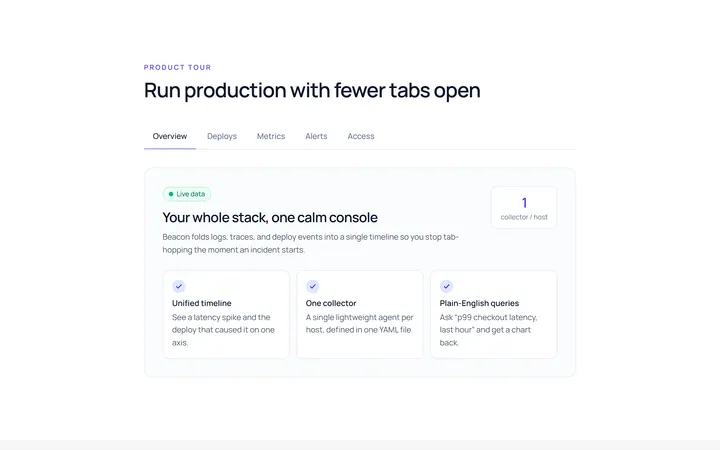
Underline Tab
Originalunderline tabs with sliding indicator
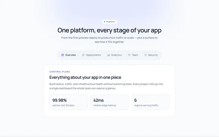
Pills Tab
Originalpill tabs
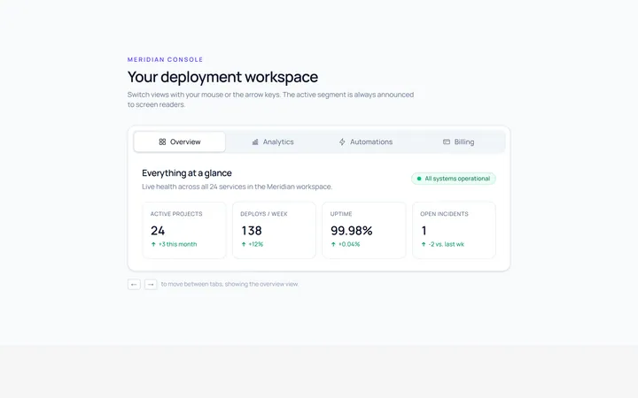
Boxed Tab
Originalboxed/segmented tabs
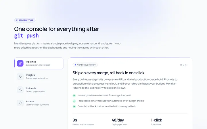
Vertical Tab
Originalvertical tabs
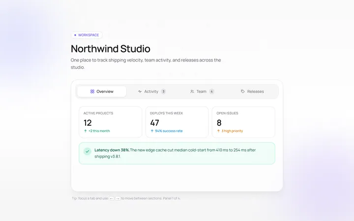
Icons Tab
Originaltabs with icons
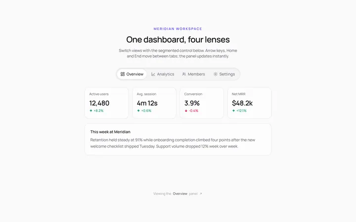
Segmented Tab
Originalsegmented control tabs
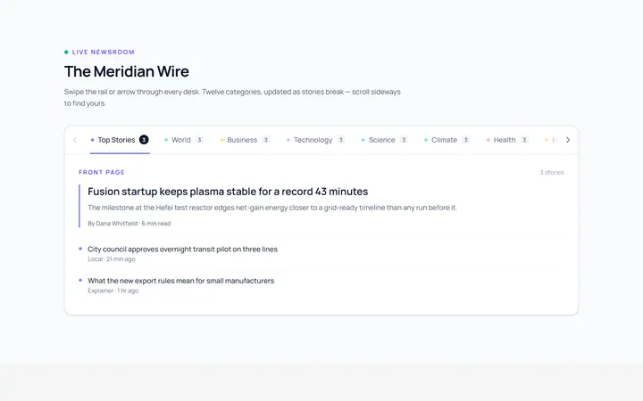
Scrollable Tab
Originalhorizontally scrollable tabs
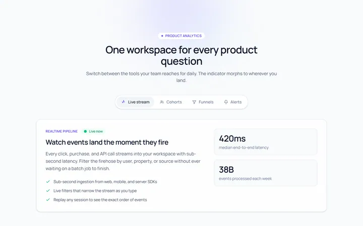
Animated Indicator Tab
Originaltabs with a morphing indicator
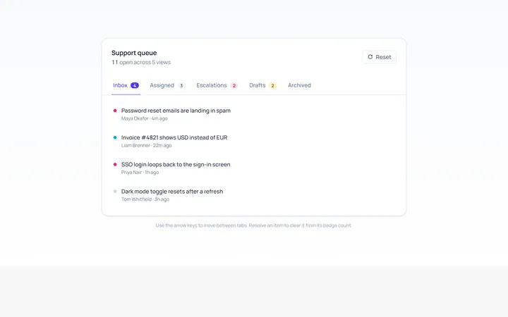
With Badge Tab
Originaltabs with count badges
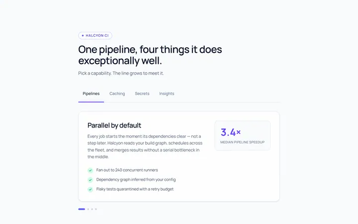
Line Grow Tab
Originaltabs where the underline grows in
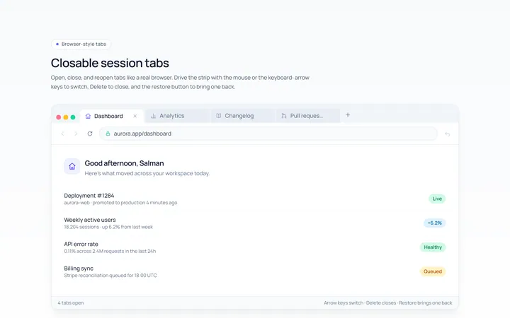
Closable Tab
Originalbrowser-style closable tabs

Spotlight Hero
OriginalA centred hero with a soft radial spotlight, badge and dual call-to-action.