

Segmented Tab
Original · freesegmented control tabs
byWeb InnoventixReact + Tailwind
tabsegmentedtabs
Copy prompt gives Claude Code, Cursor or v0 a ready-to-paste prompt that recreates this exact component.
npx shadcn@latest add https://webinnoventix.com/r/tab-segmented.jsontab-segmented.tsx
"use client";

import {
  useId,
  useRef,
  useState,
  type ComponentType,
  type KeyboardEvent,
  type ReactNode,
  type SVGProps,
} from "react";
import { AnimatePresence, motion, useReducedMotion } from "motion/react";

type IconProps = SVGProps<SVGSVGElement>;

function IconOverview(props: IconProps) {
  return (
    <svg viewBox="0 0 24 24" fill="none" stroke="currentColor" strokeWidth={1.8} strokeLinecap="round" strokeLinejoin="round" aria-hidden="true" {...props}>
      <rect x="3" y="3" width="7" height="9" rx="1.5" />
      <rect x="14" y="3" width="7" height="5" rx="1.5" />
      <rect x="14" y="12" width="7" height="9" rx="1.5" />
      <rect x="3" y="16" width="7" height="5" rx="1.5" />
    </svg>
  );
}

function IconAnalytics(props: IconProps) {
  return (
    <svg viewBox="0 0 24 24" fill="none" stroke="currentColor" strokeWidth={1.8} strokeLinecap="round" strokeLinejoin="round" aria-hidden="true" {...props}>
      <path d="M4 20V4" />
      <path d="M4 20h16" />
      <path d="M8 16l3.5-4 3 2.5L20 8" />
    </svg>
  );
}

function IconMembers(props: IconProps) {
  return (
    <svg viewBox="0 0 24 24" fill="none" stroke="currentColor" strokeWidth={1.8} strokeLinecap="round" strokeLinejoin="round" aria-hidden="true" {...props}>
      <circle cx="9" cy="8" r="3.2" />
      <path d="M3.5 19a5.5 5.5 0 0 1 11 0" />
      <path d="M16 5.2a3.2 3.2 0 0 1 0 5.6" />
      <path d="M17 14.2A5.5 5.5 0 0 1 20.5 19" />
    </svg>
  );
}

function IconSettings(props: IconProps) {
  return (
    <svg viewBox="0 0 24 24" fill="none" stroke="currentColor" strokeWidth={1.8} strokeLinecap="round" strokeLinejoin="round" aria-hidden="true" {...props}>
      <circle cx="12" cy="12" r="3" />
      <path d="M12 2v3M12 19v3M2 12h3M19 12h3M4.9 4.9l2.1 2.1M17 17l2.1 2.1M19.1 4.9L17 7M7 17l-2.1 2.1" />
    </svg>
  );
}

function IconArrow(props: IconProps) {
  return (
    <svg viewBox="0 0 24 24" fill="none" stroke="currentColor" strokeWidth={2} strokeLinecap="round" strokeLinejoin="round" aria-hidden="true" {...props}>
      <path d="M7 17L17 7" />
      <path d="M9 7h8v8" />
    </svg>
  );
}

type TabId = "overview" | "analytics" | "members" | "settings";

type Tab = {
  id: TabId;
  label: string;
  icon: ComponentType<IconProps>;
};

const TABS: Tab[] = [
  { id: "overview", label: "Overview", icon: IconOverview },
  { id: "analytics", label: "Analytics", icon: IconAnalytics },
  { id: "members", label: "Members", icon: IconMembers },
  { id: "settings", label: "Settings", icon: IconSettings },
];

type Stat = {
  label: string;
  value: string;
  delta: string;
  trend: "up" | "down";
};

const STATS: Stat[] = [
  { label: "Active users", value: "12,480", delta: "+8.2%", trend: "up" },
  { label: "Avg. session", value: "4m 12s", delta: "+0.6%", trend: "up" },
  { label: "Conversion", value: "3.9%", delta: "-0.4%", trend: "down" },
  { label: "Net MRR", value: "$48.2k", delta: "+12.1%", trend: "up" },
];

type Bar = { day: string; value: number };

const SIGNUPS: Bar[] = [
  { day: "Mon", value: 42 },
  { day: "Tue", value: 58 },
  { day: "Wed", value: 51 },
  { day: "Thu", value: 74 },
  { day: "Fri", value: 66 },
  { day: "Sat", value: 39 },
  { day: "Sun", value: 47 },
];

const SOURCES: { name: string; pct: number }[] = [
  { name: "Organic search", pct: 41 },
  { name: "Direct", pct: 27 },
  { name: "Referral", pct: 18 },
  { name: "Social", pct: 14 },
];

type Member = { name: string; role: string; email: string; tone: string };

const MEMBERS: Member[] = [
  { name: "Aisha Rahman", role: "Owner", email: "aisha@meridian.io", tone: "bg-indigo-500" },
  { name: "Marco Silva", role: "Admin", email: "marco@meridian.io", tone: "bg-emerald-500" },
  { name: "Lena Fischer", role: "Editor", email: "lena@meridian.io", tone: "bg-rose-500" },
  { name: "Diego Torres", role: "Viewer", email: "diego@meridian.io", tone: "bg-amber-500" },
  { name: "Priya Nair", role: "Editor", email: "priya@meridian.io", tone: "bg-sky-500" },
];

function initials(name: string): string {
  return name
    .split(" ")
    .map((part) => part[0])
    .join("")
    .slice(0, 2)
    .toUpperCase();
}

function Panel({ children }: { children: ReactNode }) {
  return <div className="grid gap-4">{children}</div>;
}

function OverviewPanel() {
  return (
    <Panel>
      <div className="grid grid-cols-2 gap-3 sm:grid-cols-4">
        {STATS.map((stat) => (
          <div
            key={stat.label}
            className="rounded-2xl border border-zinc-200 bg-white/70 p-4 dark:border-zinc-800 dark:bg-zinc-900/60"
          >
            <p className="text-xs font-medium text-zinc-500 dark:text-zinc-400">{stat.label}</p>
            <p className="mt-2 text-2xl font-semibold tracking-tight text-zinc-900 dark:text-white">
              {stat.value}
            </p>
            <span
              className={
                stat.trend === "up"
                  ? "mt-1 inline-flex items-center gap-1 text-xs font-medium text-emerald-600 dark:text-emerald-400"
                  : "mt-1 inline-flex items-center gap-1 text-xs font-medium text-rose-600 dark:text-rose-400"
              }
            >
              <svg
                viewBox="0 0 12 12"
                className={stat.trend === "down" ? "h-3 w-3 rotate-180" : "h-3 w-3"}
                fill="none"
                stroke="currentColor"
                strokeWidth={2}
                strokeLinecap="round"
                strokeLinejoin="round"
                aria-hidden="true"
              >
                <path d="M6 9V3M3 6l3-3 3 3" />
              </svg>
              {stat.delta}
            </span>
          </div>
        ))}
      </div>
      <div className="rounded-2xl border border-zinc-200 bg-white/70 p-5 dark:border-zinc-800 dark:bg-zinc-900/60">
        <h3 className="text-sm font-semibold text-zinc-900 dark:text-white">This week at Meridian</h3>
        <p className="mt-2 text-sm leading-relaxed text-zinc-600 dark:text-zinc-400">
          Retention held steady at 91% while onboarding completion climbed four points after the new
          welcome checklist shipped Tuesday. Support volume dropped 12% week over week.
        </p>
      </div>
    </Panel>
  );
}

function AnalyticsPanel() {
  const max = Math.max(...SIGNUPS.map((bar) => bar.value));
  return (
    <Panel>
      <div className="rounded-2xl border border-zinc-200 bg-white/70 p-5 dark:border-zinc-800 dark:bg-zinc-900/60">
        <div className="flex items-center justify-between">
          <h3 className="text-sm font-semibold text-zinc-900 dark:text-white">Signups this week</h3>
          <span className="inline-flex items-center gap-1.5 rounded-full bg-emerald-50 px-2.5 py-1 text-xs font-medium text-emerald-700 ring-1 ring-inset ring-emerald-200 dark:bg-emerald-500/10 dark:text-emerald-300 dark:ring-emerald-500/25">
            <span className="seg-anim-pulse h-1.5 w-1.5 rounded-full bg-emerald-500" />
            Live
          </span>
        </div>
        <div className="mt-5 flex h-40 items-end justify-between gap-2">
          {SIGNUPS.map((bar, index) => (
            <div key={bar.day} className="flex h-full flex-1 flex-col items-center justify-end gap-2">
              <div
                className="seg-anim-rise w-full origin-bottom rounded-t-md bg-gradient-to-t from-indigo-500 to-violet-400 dark:from-indigo-500 dark:to-violet-400"
                style={{ height: `${(bar.value / max) * 100}%`, animationDelay: `${index * 55}ms` }}
              />
              <span className="text-[11px] font-medium text-zinc-400 dark:text-zinc-500">{bar.day}</span>
            </div>
          ))}
        </div>
      </div>
      <div className="rounded-2xl border border-zinc-200 bg-white/70 p-5 dark:border-zinc-800 dark:bg-zinc-900/60">
        <h3 className="text-sm font-semibold text-zinc-900 dark:text-white">Top acquisition sources</h3>
        <ul className="mt-4 space-y-3">
          {SOURCES.map((source) => (
            <li key={source.name} className="flex items-center gap-3">
              <span className="w-28 shrink-0 text-sm text-zinc-600 dark:text-zinc-400">{source.name}</span>
              <span className="h-2 flex-1 overflow-hidden rounded-full bg-zinc-100 dark:bg-zinc-800">
                <span
                  className="block h-full rounded-full bg-indigo-500"
                  style={{ width: `${source.pct}%` }}
                />
              </span>
              <span className="w-10 shrink-0 text-right text-sm font-medium tabular-nums text-zinc-900 dark:text-white">
                {source.pct}%
              </span>
            </li>
          ))}
        </ul>
      </div>
    </Panel>
  );
}

function MembersPanel() {
  return (
    <Panel>
      <ul className="divide-y divide-zinc-200 overflow-hidden rounded-2xl border border-zinc-200 bg-white/70 dark:divide-zinc-800 dark:border-zinc-800 dark:bg-zinc-900/60">
        {MEMBERS.map((member) => (
          <li key={member.email} className="flex items-center gap-3 p-4">
            <span
              className={`flex h-10 w-10 shrink-0 items-center justify-center rounded-full text-sm font-semibold text-white ${member.tone}`}
              aria-hidden="true"
            >
              {initials(member.name)}
            </span>
            <div className="min-w-0 flex-1">
              <p className="truncate text-sm font-medium text-zinc-900 dark:text-white">{member.name}</p>
              <p className="truncate text-xs text-zinc-500 dark:text-zinc-400">{member.email}</p>
            </div>
            <span className="rounded-full bg-zinc-100 px-2.5 py-1 text-xs font-medium text-zinc-600 dark:bg-zinc-800 dark:text-zinc-300">
              {member.role}
            </span>
          </li>
        ))}
      </ul>
    </Panel>
  );
}

function Toggle({
  label,
  description,
  checked,
  onChange,
}: {
  label: string;
  description: string;
  checked: boolean;
  onChange: (next: boolean) => void;
}) {
  return (
    <div className="flex items-center justify-between gap-4 rounded-2xl border border-zinc-200 bg-white/70 p-4 dark:border-zinc-800 dark:bg-zinc-900/60">
      <div className="min-w-0">
        <p className="text-sm font-medium text-zinc-900 dark:text-white">{label}</p>
        <p className="mt-0.5 text-xs text-zinc-500 dark:text-zinc-400">{description}</p>
      </div>
      <button
        type="button"
        role="switch"
        aria-checked={checked}
        aria-label={label}
        onClick={() => onChange(!checked)}
        className={`relative inline-flex h-6 w-11 shrink-0 items-center rounded-full transition-colors focus-visible:outline-none focus-visible:ring-2 focus-visible:ring-indigo-500 focus-visible:ring-offset-2 focus-visible:ring-offset-white dark:focus-visible:ring-offset-zinc-950 ${
          checked ? "bg-indigo-500" : "bg-zinc-300 dark:bg-zinc-700"
        }`}
      >
        <span
          className={`inline-block h-5 w-5 transform rounded-full bg-white shadow-sm transition-transform duration-200 ${
            checked ? "translate-x-5" : "translate-x-0.5"
          }`}
        />
      </button>
    </div>
  );
}

function SettingsPanel() {
  const [digest, setDigest] = useState(true);
  const [twoFactor, setTwoFactor] = useState(false);
  return (
    <Panel>
      <div className="rounded-2xl border border-zinc-200 bg-white/70 p-5 dark:border-zinc-800 dark:bg-zinc-900/60">
        <h3 className="text-sm font-semibold text-zinc-900 dark:text-white">Workspace</h3>
        <dl className="mt-4 grid gap-3 text-sm sm:grid-cols-2">
          <div className="flex justify-between gap-4 sm:block">
            <dt className="text-zinc-500 dark:text-zinc-400">Name</dt>
            <dd className="font-medium text-zinc-900 dark:text-white">Meridian</dd>
          </div>
          <div className="flex justify-between gap-4 sm:block">
            <dt className="text-zinc-500 dark:text-zinc-400">Timezone</dt>
            <dd className="font-medium text-zinc-900 dark:text-white">UTC+05:00 · Karachi</dd>
          </div>
        </dl>
      </div>
      <Toggle
        label="Weekly digest email"
        description="A Monday summary of metrics and activity sent to admins."
        checked={digest}
        onChange={setDigest}
      />
      <Toggle
        label="Two-factor authentication"
        description="Require a second step at sign-in for everyone in the workspace."
        checked={twoFactor}
        onChange={setTwoFactor}
      />
    </Panel>
  );
}

const PANELS: Record<TabId, ComponentType> = {
  overview: OverviewPanel,
  analytics: AnalyticsPanel,
  members: MembersPanel,
  settings: SettingsPanel,
};

export default function TabSegmented() {
  const prefersReduced = useReducedMotion();
  const uid = useId();
  const [active, setActive] = useState<TabId>("overview");
  const tabRefs = useRef<Array<HTMLButtonElement | null>>([]);

  const activeIndex = TABS.findIndex((tab) => tab.id === active);

  function focusTab(index: number) {
    const clamped = (index + TABS.length) % TABS.length;
    setActive(TABS[clamped].id);
    tabRefs.current[clamped]?.focus();
  }

  function onKeyDown(event: KeyboardEvent<HTMLDivElement>) {
    switch (event.key) {
      case "ArrowRight":
      case "ArrowDown":
        event.preventDefault();
        focusTab(activeIndex + 1);
        break;
      case "ArrowLeft":
      case "ArrowUp":
        event.preventDefault();
        focusTab(activeIndex - 1);
        break;
      case "Home":
        event.preventDefault();
        focusTab(0);
        break;
      case "End":
        event.preventDefault();
        focusTab(TABS.length - 1);
        break;
      default:
        break;
    }
  }

  const ActivePanel = PANELS[active];

  return (
    <section className="relative w-full bg-zinc-50 px-4 py-16 text-zinc-900 sm:px-6 sm:py-24 dark:bg-zinc-950 dark:text-zinc-100">
      <style>{`
        @keyframes seg-pulse {
          0%, 100% { opacity: 1; transform: scale(1); }
          50% { opacity: 0.35; transform: scale(0.6); }
        }
        @keyframes seg-rise {
          from { transform: scaleY(0); }
          to { transform: scaleY(1); }
        }
        .seg-anim-pulse { animation: seg-pulse 1.8s ease-in-out infinite; }
        .seg-anim-rise { animation: seg-rise 0.55s cubic-bezier(0.22, 1, 0.36, 1) both; }
        @media (prefers-reduced-motion: reduce) {
          .seg-anim-pulse, .seg-anim-rise { animation: none !important; }
          .seg-anim-rise { transform: none !important; }
        }
      `}</style>

      <div className="mx-auto max-w-2xl">
        <div className="mb-8 text-center">
          <p className="text-xs font-semibold uppercase tracking-[0.2em] text-indigo-600 dark:text-indigo-400">
            Meridian workspace
          </p>
          <h2 className="mt-3 text-2xl font-semibold tracking-tight text-zinc-900 sm:text-3xl dark:text-white">
            One dashboard, four lenses
          </h2>
          <p className="mx-auto mt-3 max-w-md text-sm text-zinc-600 dark:text-zinc-400">
            Switch views with the segmented control below. Arrow keys, Home and End move between
            tabs; the panel updates instantly.
          </p>
        </div>

        <div
          role="tablist"
          aria-label="Dashboard sections"
          aria-orientation="horizontal"
          onKeyDown={onKeyDown}
          className="mx-auto flex w-full max-w-md gap-1 rounded-full border border-zinc-200 bg-zinc-100 p-1 shadow-inner dark:border-zinc-800 dark:bg-zinc-900"
        >
          {TABS.map((tab, index) => {
            const selected = tab.id === active;
            const Icon = tab.icon;
            const thumb = prefersReduced ? (
              <span className="absolute inset-0 rounded-full bg-white shadow-sm ring-1 ring-zinc-200 dark:bg-zinc-800 dark:ring-zinc-700" />
            ) : (
              <motion.span
                layoutId={`${uid}-thumb`}
                transition={{ type: "spring", stiffness: 420, damping: 34 }}
                className="absolute inset-0 rounded-full bg-white shadow-sm ring-1 ring-zinc-200 dark:bg-zinc-800 dark:ring-zinc-700"
              />
            );
            return (
              <button
                key={tab.id}
                ref={(node) => {
                  tabRefs.current[index] = node;
                }}
                role="tab"
                type="button"
                id={`${uid}-tab-${tab.id}`}
                aria-selected={selected}
                aria-controls={`${uid}-panel-${tab.id}`}
                tabIndex={selected ? 0 : -1}
                onClick={() => setActive(tab.id)}
                className={`relative flex flex-1 items-center justify-center gap-1.5 rounded-full px-2 py-2 text-sm font-medium transition-colors focus-visible:outline-none focus-visible:ring-2 focus-visible:ring-indigo-500 focus-visible:ring-offset-2 focus-visible:ring-offset-zinc-100 dark:focus-visible:ring-offset-zinc-900 ${
                  selected
                    ? "text-zinc-900 dark:text-white"
                    : "text-zinc-500 hover:text-zinc-800 dark:text-zinc-400 dark:hover:text-zinc-200"
                }`}
              >
                {selected && thumb}
                <span className="relative z-10 flex items-center gap-1.5">
                  <Icon className="h-4 w-4" />
                  <span className="hidden sm:inline">{tab.label}</span>
                  <span className="sr-only sm:hidden">{tab.label}</span>
                </span>
              </button>
            );
          })}
        </div>

        <div className="mt-6 min-h-[22rem]">
          <AnimatePresence mode="wait" initial={false}>
            <motion.div
              key={active}
              role="tabpanel"
              id={`${uid}-panel-${active}`}
              aria-labelledby={`${uid}-tab-${active}`}
              tabIndex={0}
              initial={prefersReduced ? false : { opacity: 0, y: 8 }}
              animate={{ opacity: 1, y: 0 }}
              exit={prefersReduced ? { opacity: 1 } : { opacity: 0, y: -8 }}
              transition={{ duration: 0.22, ease: [0.22, 1, 0.36, 1] }}
              className="rounded-2xl focus-visible:outline-none focus-visible:ring-2 focus-visible:ring-indigo-500 focus-visible:ring-offset-4 focus-visible:ring-offset-zinc-50 dark:focus-visible:ring-offset-zinc-950"
            >
              <ActivePanel />
            </motion.div>
          </AnimatePresence>
        </div>

        <p className="mt-6 flex items-center justify-center gap-1.5 text-xs text-zinc-400 dark:text-zinc-500">
          Viewing the
          <span className="font-medium text-zinc-600 dark:text-zinc-300">
            {TABS[activeIndex].label}
          </span>
          panel
          <IconArrow className="h-3 w-3" />
        </p>
      </div>
    </section>
  );
}
Dependencies
motion
Licence
Built by Web Innoventix. Free for personal and commercial use, no attribution required.
Built by Web Innoventix
Need a custom interface, a full website, or SEO that gets you cited by AI? We design, build and rank it end to end.
Get a free quoteSimilar components
Browse all →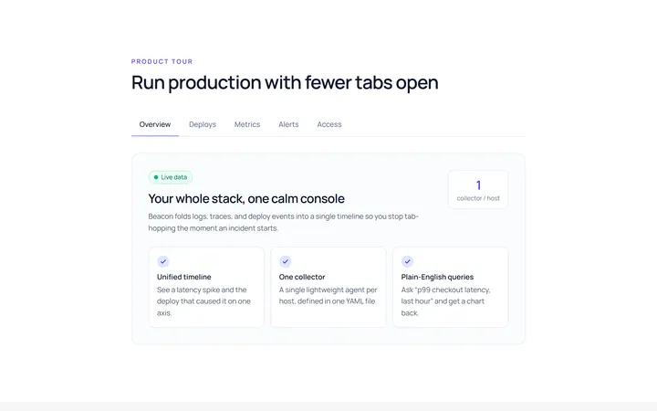
Underline Tab
Originalunderline tabs with sliding indicator
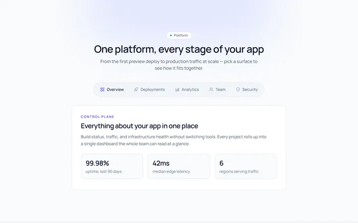
Pills Tab
Originalpill tabs
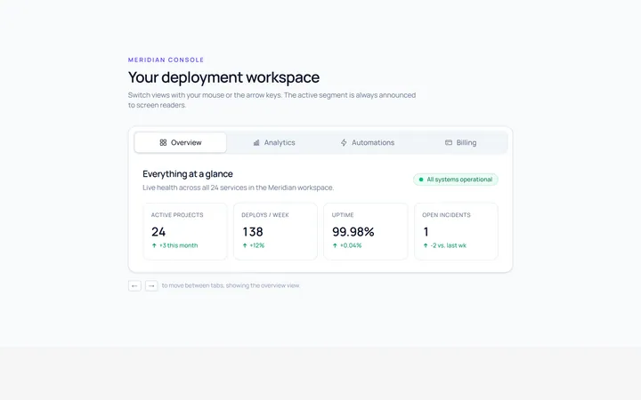
Boxed Tab
Originalboxed/segmented tabs
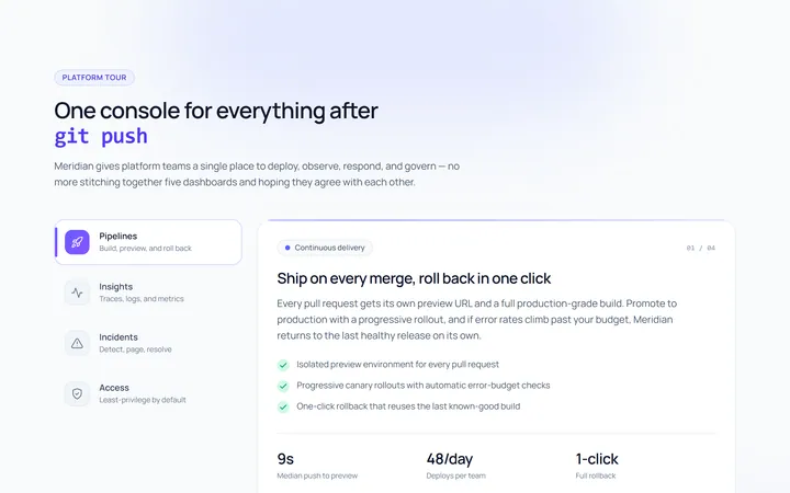
Vertical Tab
Originalvertical tabs
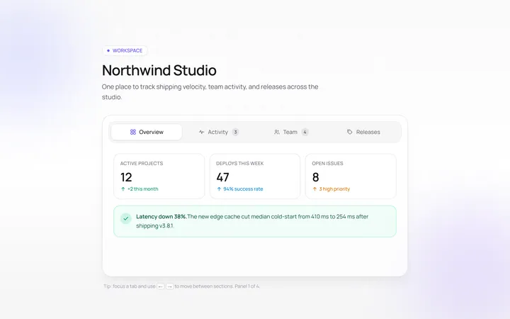
Icons Tab
Originaltabs with icons
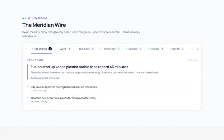
Scrollable Tab
Originalhorizontally scrollable tabs
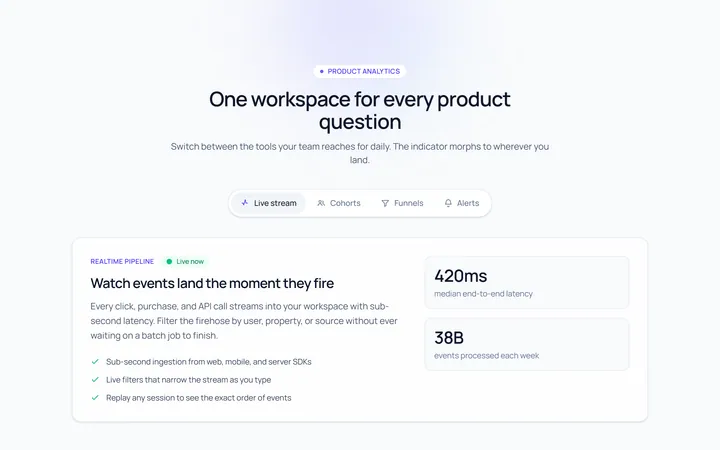
Animated Indicator Tab
Originaltabs with a morphing indicator
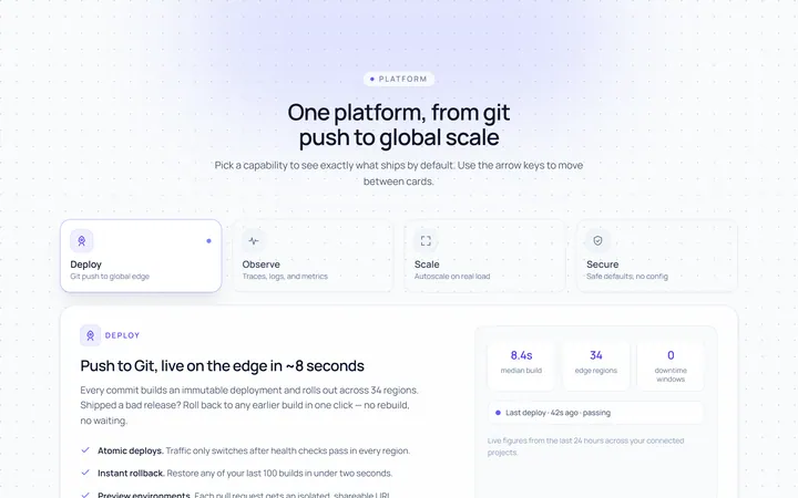
Cards Tab
Originalcard-style tabs with panels
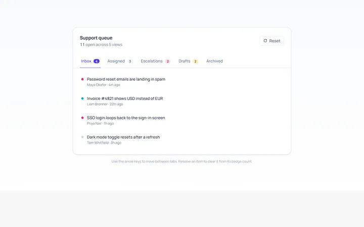
With Badge Tab
Originaltabs with count badges
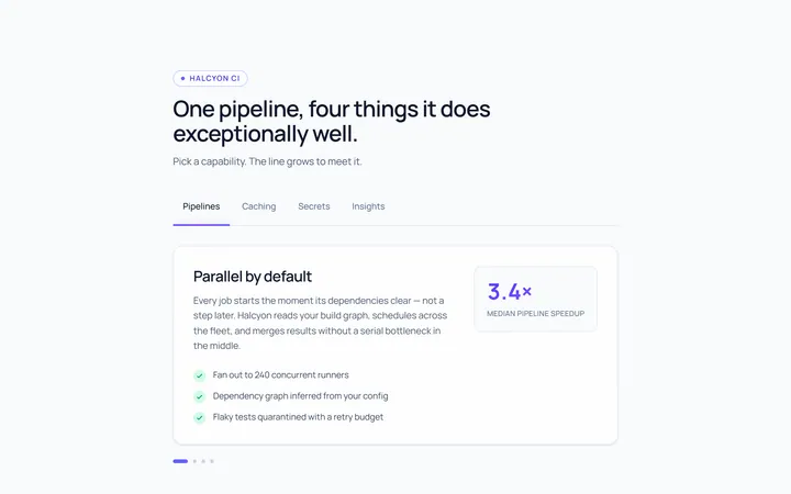
Line Grow Tab
Originaltabs where the underline grows in
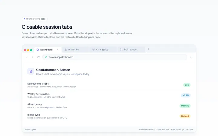
Closable Tab
Originalbrowser-style closable tabs

Spotlight Hero
OriginalA centred hero with a soft radial spotlight, badge and dual call-to-action.