

Underline Tab
Original · freeunderline tabs with sliding indicator
byWeb InnoventixReact + Tailwind
tabunderlinetabs
Copy prompt gives Claude Code, Cursor or v0 a ready-to-paste prompt that recreates this exact component.
npx shadcn@latest add https://webinnoventix.com/r/tab-underline.jsontab-underline.tsx
"use client";

import {
  useCallback,
  useEffect,
  useId,
  useLayoutEffect,
  useRef,
  useState,
} from "react";
import { motion, useReducedMotion } from "motion/react";

const useIsomorphicLayoutEffect =
  typeof window !== "undefined" ? useLayoutEffect : useEffect;

type Point = { title: string; body: string };

type Tab = {
  id: string;
  label: string;
  heading: string;
  blurb: string;
  stat: { value: string; label: string };
  points: Point[];
};

const TABS: Tab[] = [
  {
    id: "overview",
    label: "Overview",
    heading: "Your whole stack, one calm console",
    blurb:
      "Beacon folds logs, traces, and deploy events into a single timeline so you stop tab-hopping the moment an incident starts.",
    stat: { value: "1", label: "collector / host" },
    points: [
      {
        title: "Unified timeline",
        body: "See a latency spike and the deploy that caused it on one axis.",
      },
      {
        title: "One collector",
        body: "A single lightweight agent per host, defined in one YAML file.",
      },
      {
        title: "Plain-English queries",
        body: "Ask “p99 checkout latency, last hour” and get a chart back.",
      },
    ],
  },
  {
    id: "deploys",
    label: "Deploys",
    heading: "Ship, watch, roll back in seconds",
    blurb:
      "Every release is annotated on your graphs automatically, so a regression is obvious the instant it lands in production.",
    stat: { value: "< 5s", label: "median rollback" },
    points: [
      {
        title: "Deploy markers",
        body: "Each release is pinned to your graphs with commit and author.",
      },
      {
        title: "Guarded rollouts",
        body: "Halt a bad deploy the moment error rate crosses your budget.",
      },
      {
        title: "Change diffs",
        body: "Inspect exactly which services and configs moved in a release.",
      },
    ],
  },
  {
    id: "metrics",
    label: "Metrics",
    heading: "Metrics that don't cost a mortgage",
    blurb:
      "High-cardinality metrics at one-second resolution with predictable per-seat pricing — no surprise overage invoices at month end.",
    stat: { value: "1s", label: "metric resolution" },
    points: [
      {
        title: "High cardinality",
        body: "Tag by user, region, or build without sampling data away.",
      },
      {
        title: "Per-seat pricing",
        body: "A predictable monthly cost, never a metered usage bill.",
      },
      {
        title: "90-day retention",
        body: "Query a full quarter of raw metrics at full resolution.",
      },
    ],
  },
  {
    id: "alerts",
    label: "Alerts",
    heading: "Alerts your team won't mute",
    blurb:
      "Symptom-based alerting with built-in deduplication routes the right page to the right on-call, instead of paging the whole channel.",
    stat: { value: "92%", label: "less alert noise" },
    points: [
      {
        title: "Symptom-based",
        body: "Page on what users feel, not on every transient CPU blip.",
      },
      {
        title: "Smart dedupe",
        body: "Collapse a hundred related failures into one clear incident.",
      },
      {
        title: "Routed on-call",
        body: "The right team gets paged; the shared channel stays quiet.",
      },
    ],
  },
  {
    id: "access",
    label: "Access",
    heading: "Access control without the ticket queue",
    blurb:
      "SSO, SCIM, and scoped API tokens mean granting a contractor read-only access takes a single click, not a two-week sprint.",
    stat: { value: "SCIM 2.0", label: "auto-provisioning" },
    points: [
      {
        title: "SSO + SCIM",
        body: "Provision and deprovision from Okta or Entra automatically.",
      },
      {
        title: "Scoped tokens",
        body: "Grant read-only API keys that expire on a fixed schedule.",
      },
      {
        title: "Audit trail",
        body: "Every query and config change is logged and exportable.",
      },
    ],
  },
];

function CheckIcon() {
  return (
    <svg
      viewBox="0 0 20 20"
      fill="none"
      aria-hidden="true"
      className="h-3.5 w-3.5"
    >
      <path
        d="M4 10.5 8 14.5 16 6"
        stroke="currentColor"
        strokeWidth={2.25}
        strokeLinecap="round"
        strokeLinejoin="round"
      />
    </svg>
  );
}

export default function TabUnderline() {
  const uid = useId();
  const reduce = useReducedMotion();

  const [active, setActive] = useState(0);
  const [indicator, setIndicator] = useState<{ left: number; width: number }>({
    left: 0,
    width: 0,
  });

  const listRef = useRef<HTMLDivElement | null>(null);
  const tabRefs = useRef<Array<HTMLButtonElement | null>>([]);

  const measure = useCallback(() => {
    const el = tabRefs.current[active];
    if (el) setIndicator({ left: el.offsetLeft, width: el.offsetWidth });
  }, [active]);

  useIsomorphicLayoutEffect(() => {
    measure();
  }, [measure]);

  useEffect(() => {
    const list = listRef.current;
    if (!list || typeof ResizeObserver === "undefined") return;
    const ro = new ResizeObserver(() => measure());
    ro.observe(list);
    return () => ro.disconnect();
  }, [measure]);

  const onKeyDown = (
    e: React.KeyboardEvent<HTMLButtonElement>,
    i: number,
  ) => {
    const count = TABS.length;
    let next = i;
    switch (e.key) {
      case "ArrowRight":
      case "ArrowDown":
        next = (i + 1) % count;
        break;
      case "ArrowLeft":
      case "ArrowUp":
        next = (i - 1 + count) % count;
        break;
      case "Home":
        next = 0;
        break;
      case "End":
        next = count - 1;
        break;
      default:
        return;
    }
    e.preventDefault();
    setActive(next);
    tabRefs.current[next]?.focus();
  };

  const activeTab = TABS[active];
  const panelId = `${uid}-panel`;

  return (
    <section className="relative w-full overflow-hidden bg-white px-6 py-20 text-slate-900 dark:bg-slate-950 dark:text-slate-100 sm:py-28">
      <style>{`
        @keyframes tabund-ping {
          75%, 100% { transform: scale(2.4); opacity: 0; }
        }
        .tabund-ping { animation: tabund-ping 1.9s cubic-bezier(0, 0, 0.2, 1) infinite; }
        @media (prefers-reduced-motion: reduce) {
          .tabund-ping { animation: none; }
        }
      `}</style>

      <div className="mx-auto max-w-3xl">
        <header className="mb-10">
          <p className="mb-3 text-xs font-semibold uppercase tracking-[0.2em] text-indigo-600 dark:text-indigo-400">
            Product tour
          </p>
          <h2 className="text-balance text-3xl font-semibold tracking-tight text-slate-900 dark:text-white sm:text-4xl">
            Run production with fewer tabs open
          </h2>
        </header>

        {/* Tablist */}
        <div
          ref={listRef}
          role="tablist"
          aria-label="Beacon platform features"
          aria-orientation="horizontal"
          className="relative flex gap-1 overflow-x-auto border-b border-slate-200 pb-px [scrollbar-width:none] dark:border-slate-800"
        >
          {TABS.map((tab, i) => {
            const selected = i === active;
            return (
              <button
                key={tab.id}
                ref={(el) => {
                  tabRefs.current[i] = el;
                }}
                id={`${uid}-tab-${i}`}
                role="tab"
                type="button"
                aria-selected={selected}
                aria-controls={panelId}
                tabIndex={selected ? 0 : -1}
                onClick={() => setActive(i)}
                onKeyDown={(e) => onKeyDown(e, i)}
                className={`relative shrink-0 rounded-t-md px-4 py-3 text-sm font-medium outline-none transition-colors focus-visible:ring-2 focus-visible:ring-indigo-500 focus-visible:ring-offset-2 focus-visible:ring-offset-white dark:focus-visible:ring-indigo-400 dark:focus-visible:ring-offset-slate-950 ${
                  selected
                    ? "text-slate-900 dark:text-white"
                    : "text-slate-500 hover:text-slate-800 dark:text-slate-400 dark:hover:text-slate-200"
                }`}
              >
                {tab.label}
              </button>
            );
          })}

          <motion.span
            aria-hidden="true"
            className="absolute -bottom-px left-0 h-0.5 rounded-full bg-indigo-500 dark:bg-indigo-400"
            initial={false}
            animate={{ x: indicator.left, width: indicator.width }}
            transition={
              reduce
                ? { duration: 0 }
                : { type: "spring", stiffness: 520, damping: 42, mass: 0.9 }
            }
          />
        </div>

        {/* Panel */}
        <motion.div
          key={active}
          role="tabpanel"
          id={panelId}
          aria-labelledby={`${uid}-tab-${active}`}
          tabIndex={0}
          initial={reduce ? false : { opacity: 0, y: 12 }}
          animate={{ opacity: 1, y: 0 }}
          transition={{
            duration: reduce ? 0 : 0.32,
            ease: [0.22, 1, 0.36, 1],
          }}
          className="mt-8 rounded-2xl border border-slate-200 bg-slate-50/60 p-6 outline-none focus-visible:ring-2 focus-visible:ring-indigo-500 focus-visible:ring-offset-2 focus-visible:ring-offset-white dark:border-slate-800 dark:bg-slate-900/40 dark:focus-visible:ring-indigo-400 dark:focus-visible:ring-offset-slate-950 sm:p-8"
        >
          <div className="flex flex-col gap-6 sm:flex-row sm:items-start sm:justify-between">
            <div className="max-w-xl">
              <div className="mb-3 inline-flex items-center gap-1.5 rounded-full border border-emerald-200 bg-emerald-50 px-2.5 py-1 text-xs font-medium text-emerald-700 dark:border-emerald-500/20 dark:bg-emerald-500/10 dark:text-emerald-300">
                <span className="relative flex h-2 w-2">
                  <span className="tabund-ping absolute inline-flex h-full w-full rounded-full bg-emerald-400/70" />
                  <span className="relative inline-flex h-2 w-2 rounded-full bg-emerald-500" />
                </span>
                Live data
              </div>
              <h3 className="text-xl font-semibold tracking-tight text-slate-900 dark:text-white sm:text-2xl">
                {activeTab.heading}
              </h3>
              <p className="mt-2 text-sm leading-relaxed text-slate-600 dark:text-slate-400">
                {activeTab.blurb}
              </p>
            </div>

            <div className="shrink-0 rounded-xl border border-slate-200 bg-white px-4 py-3 text-center dark:border-slate-800 dark:bg-slate-950/50">
              <div className="text-2xl font-semibold tracking-tight text-indigo-600 tabular-nums dark:text-indigo-400">
                {activeTab.stat.value}
              </div>
              <div className="mt-0.5 text-xs text-slate-500 dark:text-slate-400">
                {activeTab.stat.label}
              </div>
            </div>
          </div>

          <ul className="mt-6 grid gap-3 sm:grid-cols-3">
            {activeTab.points.map((p) => (
              <li
                key={p.title}
                className="rounded-xl border border-slate-200 bg-white p-4 dark:border-slate-800 dark:bg-slate-950/40"
              >
                <div className="mb-2 flex h-6 w-6 items-center justify-center rounded-full bg-indigo-100 text-indigo-700 dark:bg-indigo-500/15 dark:text-indigo-300">
                  <CheckIcon />
                </div>
                <div className="text-sm font-semibold text-slate-900 dark:text-white">
                  {p.title}
                </div>
                <p className="mt-1 text-sm leading-relaxed text-slate-600 dark:text-slate-400">
                  {p.body}
                </p>
              </li>
            ))}
          </ul>
        </motion.div>
      </div>
    </section>
  );
}
Dependencies
motion
Licence
Built by Web Innoventix. Free for personal and commercial use, no attribution required.
Built by Web Innoventix
Need a custom interface, a full website, or SEO that gets you cited by AI? We design, build and rank it end to end.
Get a free quoteSimilar components
Browse all →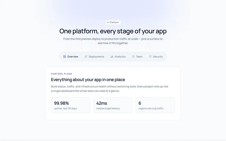
Pills Tab
Originalpill tabs
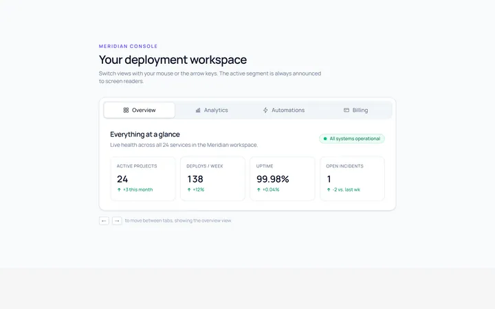
Boxed Tab
Originalboxed/segmented tabs
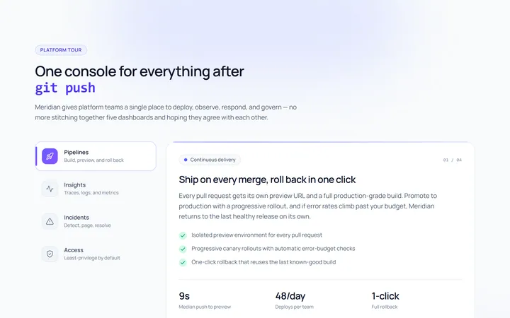
Vertical Tab
Originalvertical tabs
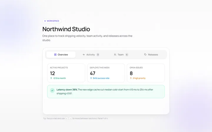
Icons Tab
Originaltabs with icons
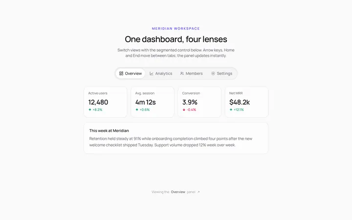
Segmented Tab
Originalsegmented control tabs
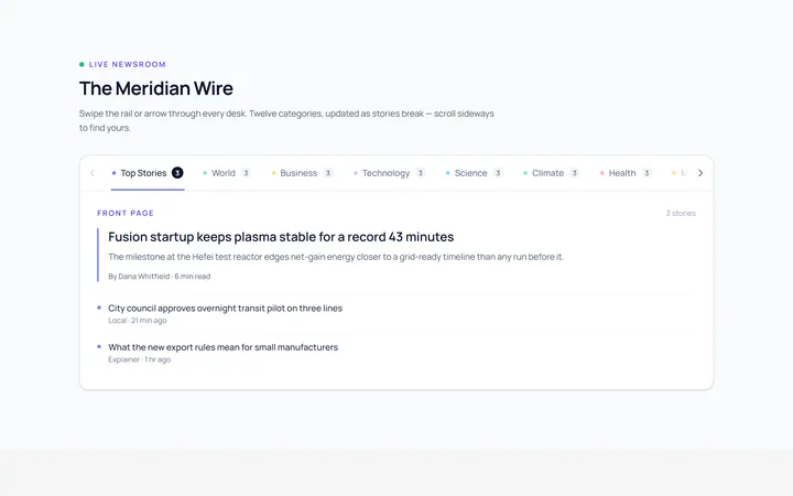
Scrollable Tab
Originalhorizontally scrollable tabs
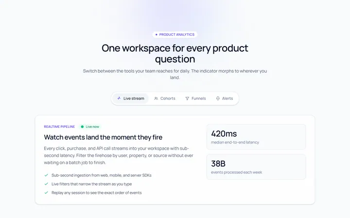
Animated Indicator Tab
Originaltabs with a morphing indicator
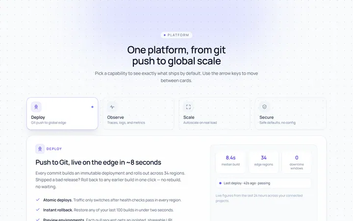
Cards Tab
Originalcard-style tabs with panels
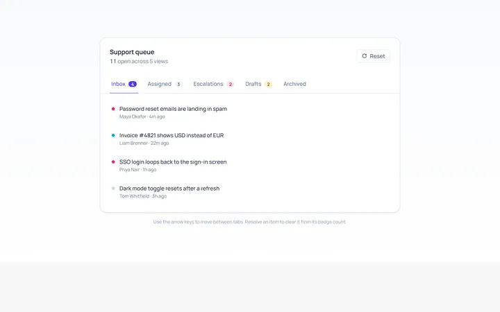
With Badge Tab
Originaltabs with count badges
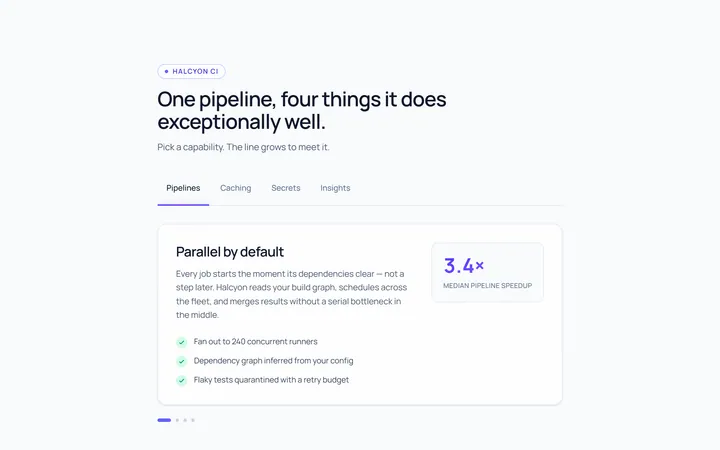
Line Grow Tab
Originaltabs where the underline grows in
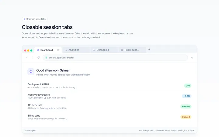
Closable Tab
Originalbrowser-style closable tabs

Spotlight Hero
OriginalA centred hero with a soft radial spotlight, badge and dual call-to-action.