

Vertical Tab
Original · freevertical tabs
byWeb InnoventixReact + Tailwind
tabverticaltabs
Copy prompt gives Claude Code, Cursor or v0 a ready-to-paste prompt that recreates this exact component.
npx shadcn@latest add https://webinnoventix.com/r/tab-vertical.jsontab-vertical.tsx
"use client"
import {
useId,
useRef,
useState,
type KeyboardEvent,
type ReactNode,
} from "react"
import { AnimatePresence, motion, useReducedMotion } from "motion/react"
type Stat = { value: string; label: string }
type Tab = {
id: string
eyebrow: string
label: string
summary: string
heading: string
description: string
features: string[]
stats: Stat[]
cta: string
icon: ReactNode
}
const iconClass = "h-5 w-5"
const TABS: Tab[] = [
{
id: "pipelines",
eyebrow: "Continuous delivery",
label: "Pipelines",
summary: "Build, preview, and roll back",
heading: "Ship on every merge, roll back in one click",
description:
"Every pull request gets its own preview URL and a full production-grade build. Promote to production with a progressive rollout, and if error rates climb past your budget, Meridian returns to the last healthy release on its own.",
features: [
"Isolated preview environment for every pull request",
"Progressive canary rollouts with automatic error-budget checks",
"One-click rollback that reuses the last known-good build",
],
stats: [
{ value: "9s", label: "Median push to preview" },
{ value: "48/day", label: "Deploys per team" },
{ value: "1-click", label: "Full rollback" },
],
cta: "Explore pipelines",
icon: (
<svg
viewBox="0 0 24 24"
fill="none"
stroke="currentColor"
strokeWidth={1.7}
strokeLinecap="round"
strokeLinejoin="round"
className={iconClass}
aria-hidden="true"
>
<path d="M4.5 16.5c-1.5 1.26-2 5-2 5s3.74-.5 5-2c.71-.84.7-2.13-.09-2.91a2.18 2.18 0 0 0-2.91-.09z" />
<path d="M12 15l-3-3a22 22 0 0 1 2-3.95A12.88 12.88 0 0 1 22 2c0 2.72-.78 7.5-6 11a22.35 22.35 0 0 1-4 2z" />
<path d="M9 12H4s.55-3.03 2-4c1.62-1.08 5 0 5 0" />
<path d="M12 15v5s3.03-.55 4-2c1.08-1.62 0-5 0-5" />
</svg>
),
},
{
id: "insights",
eyebrow: "Observability",
label: "Insights",
summary: "Traces, logs, and metrics",
heading: "Trace any request from the edge to the database",
description:
"Correlated traces, logs, and metrics live behind a single query bar. Click a slow request and jump straight to the exact function call, database query, or upstream service that held it up.",
features: [
"Distributed tracing stitched across every service hop",
"Logs and metrics linked to the trace that produced them",
"Saved views and alerts that page the right on-call engineer",
],
stats: [
{ value: "14mo", label: "Trace retention" },
{ value: "<200ms", label: "Query response" },
{ value: "100%", label: "Sampled requests" },
],
cta: "Explore insights",
icon: (
<svg
viewBox="0 0 24 24"
fill="none"
stroke="currentColor"
strokeWidth={1.7}
strokeLinecap="round"
strokeLinejoin="round"
className={iconClass}
aria-hidden="true"
>
<path d="M22 12h-4l-3 9L9 3l-3 9H2" />
</svg>
),
},
{
id: "incidents",
eyebrow: "Incident response",
label: "Incidents",
summary: "Detect, page, resolve",
heading: "Resolve incidents before customers file a ticket",
description:
"Meridian opens an incident the moment an error budget breaks, spins up a dedicated channel, and attaches the traces and deploys that changed right before things went sideways — so responders start with context, not questions.",
features: [
"Automatic incident creation from error-budget breaches",
"Timeline that pins the deploy and change that triggered it",
"Post-incident reviews generated from the real timeline",
],
stats: [
{ value: "90s", label: "Detect to page" },
{ value: "3x", label: "Faster resolution" },
{ value: "0", label: "Manual status pages" },
],
cta: "Explore incidents",
icon: (
<svg
viewBox="0 0 24 24"
fill="none"
stroke="currentColor"
strokeWidth={1.7}
strokeLinecap="round"
strokeLinejoin="round"
className={iconClass}
aria-hidden="true"
>
<path d="M10.29 3.86 1.82 18a2 2 0 0 0 1.71 3h16.94a2 2 0 0 0 1.71-3L13.71 3.86a2 2 0 0 0-3.42 0z" />
<line x1="12" y1="9" x2="12" y2="13" />
<line x1="12" y1="17" x2="12.01" y2="17" />
</svg>
),
},
{
id: "access",
eyebrow: "Governance",
label: "Access",
summary: "Least-privilege by default",
heading: "Least-privilege access without the ticket queue",
description:
"Engineers request scoped, time-boxed access to exactly what they need, approvals happen in chat, and every grant expires on its own. Auditors get an immutable log without asking a single person for it.",
features: [
"Time-boxed, scoped grants that expire automatically",
"Chat-based approvals with a full audit trail",
"SCIM provisioning and SSO for every identity provider",
],
stats: [
{ value: "15min", label: "Default grant window" },
{ value: "SOC 2", label: "Type II audited" },
{ value: "100%", label: "Grants logged" },
],
cta: "Explore access",
icon: (
<svg
viewBox="0 0 24 24"
fill="none"
stroke="currentColor"
strokeWidth={1.7}
strokeLinecap="round"
strokeLinejoin="round"
className={iconClass}
aria-hidden="true"
>
<path d="M12 22s8-4 8-10V5l-8-3-8 3v7c0 6 8 10 8 10z" />
<path d="M9 12l2 2 4-4" />
</svg>
),
},
]
const CheckIcon = () => (
<svg
viewBox="0 0 24 24"
fill="none"
stroke="currentColor"
strokeWidth={2.4}
strokeLinecap="round"
strokeLinejoin="round"
className="h-3.5 w-3.5"
aria-hidden="true"
>
<path d="M20 6 9 17l-5-5" />
</svg>
)
const ArrowIcon = () => (
<svg
viewBox="0 0 24 24"
fill="none"
stroke="currentColor"
strokeWidth={2}
strokeLinecap="round"
strokeLinejoin="round"
className="h-4 w-4"
aria-hidden="true"
>
<path d="M5 12h13M13 6l6 6-6 6" />
</svg>
)
export default function TabVertical() {
const uid = useId()
const reduce = useReducedMotion()
const [active, setActive] = useState(0)
const tabRefs = useRef<(HTMLButtonElement | null)[]>([])
const onKeyDown = (e: KeyboardEvent<HTMLButtonElement>) => {
const count = TABS.length
let next = active
switch (e.key) {
case "ArrowDown":
case "ArrowRight":
next = (active + 1) % count
break
case "ArrowUp":
case "ArrowLeft":
next = (active - 1 + count) % count
break
case "Home":
next = 0
break
case "End":
next = count - 1
break
default:
return
}
e.preventDefault()
setActive(next)
tabRefs.current[next]?.focus()
}
const current = TABS[active]
return (
<section className="relative w-full overflow-hidden bg-slate-50 py-20 sm:py-28 dark:bg-slate-950">
<style>{`
@keyframes tv-ping {
0% { transform: scale(1); opacity: 0.55; }
75%, 100% { transform: scale(2.4); opacity: 0; }
}
@keyframes tv-sheen {
0% { background-position: 0% 50%; }
100% { background-position: 200% 50%; }
}
.tv-ping { animation: tv-ping 1.9s cubic-bezier(0, 0, 0.2, 1) infinite; }
.tv-sheen { background-size: 200% 100%; animation: tv-sheen 4s linear infinite; }
@media (prefers-reduced-motion: reduce) {
.tv-ping, .tv-sheen { animation: none !important; }
}
`}</style>
<div aria-hidden="true" className="pointer-events-none absolute inset-0">
<div className="absolute left-1/2 top-[-6rem] h-72 w-[46rem] -translate-x-1/2 rounded-full bg-indigo-300/25 blur-3xl dark:bg-indigo-500/10" />
<div className="absolute bottom-[-8rem] right-[-4rem] h-72 w-72 rounded-full bg-violet-300/20 blur-3xl dark:bg-violet-500/10" />
</div>
<div className="relative mx-auto w-full max-w-6xl px-6">
<div className="max-w-2xl">
<span className="inline-flex items-center gap-2 rounded-full border border-indigo-200 bg-indigo-50 px-3 py-1 text-xs font-semibold uppercase tracking-wider text-indigo-700 dark:border-indigo-500/30 dark:bg-indigo-500/10 dark:text-indigo-300">
Platform tour
</span>
<h2 className="mt-5 text-3xl font-semibold tracking-tight text-slate-900 sm:text-4xl dark:text-white">
One console for everything after{" "}
<span className="whitespace-nowrap font-mono text-indigo-600 dark:text-indigo-400">
git push
</span>
</h2>
<p className="mt-4 text-base leading-relaxed text-slate-600 dark:text-slate-300">
Meridian gives platform teams a single place to deploy, observe,
respond, and govern — no more stitching together five dashboards and
hoping they agree with each other.
</p>
</div>
<div className="mt-12 grid gap-4 lg:grid-cols-[minmax(0,19rem)_minmax(0,1fr)] lg:gap-6">
<div
role="tablist"
aria-orientation="vertical"
aria-label="Platform capabilities"
className="flex flex-col gap-2"
>
{TABS.map((tab, i) => {
const isActive = active === i
return (
<button
key={tab.id}
ref={(el) => {
tabRefs.current[i] = el
}}
type="button"
role="tab"
id={`${uid}-tab-${i}`}
aria-selected={isActive}
aria-controls={`${uid}-panel`}
tabIndex={isActive ? 0 : -1}
onClick={() => setActive(i)}
onKeyDown={onKeyDown}
className={[
"group relative flex items-start gap-4 rounded-2xl border px-4 py-4 text-left transition-colors",
"focus-visible:outline-none focus-visible:ring-2 focus-visible:ring-indigo-500 focus-visible:ring-offset-2 focus-visible:ring-offset-slate-50 dark:focus-visible:ring-offset-slate-950",
isActive
? "border-indigo-200 bg-white shadow-sm shadow-indigo-500/5 dark:border-indigo-500/30 dark:bg-slate-900"
: "border-transparent hover:border-slate-200 hover:bg-white/70 dark:hover:border-slate-800 dark:hover:bg-slate-900/50",
].join(" ")}
>
{isActive && (
<motion.span
layoutId={`${uid}-bar`}
aria-hidden="true"
className="absolute bottom-3 left-0 top-3 w-1 rounded-full bg-gradient-to-b from-indigo-500 to-violet-500"
transition={
reduce
? { duration: 0 }
: { type: "spring", stiffness: 520, damping: 42 }
}
/>
)}
<span
className={[
"flex h-10 w-10 shrink-0 items-center justify-center rounded-xl border transition-colors",
isActive
? "border-transparent bg-gradient-to-br from-indigo-500 to-violet-500 text-white"
: "border-slate-200 bg-slate-100 text-slate-500 group-hover:text-slate-700 dark:border-slate-800 dark:bg-slate-800 dark:text-slate-400 dark:group-hover:text-slate-200",
].join(" ")}
>
{tab.icon}
</span>
<span className="min-w-0">
<span
className={[
"block text-sm font-semibold transition-colors",
isActive
? "text-slate-900 dark:text-white"
: "text-slate-700 dark:text-slate-200",
].join(" ")}
>
{tab.label}
</span>
<span className="mt-0.5 block text-xs text-slate-500 dark:text-slate-400">
{tab.summary}
</span>
</span>
</button>
)
})}
</div>
<div
role="tabpanel"
id={`${uid}-panel`}
aria-labelledby={`${uid}-tab-${active}`}
tabIndex={0}
className="relative overflow-hidden rounded-3xl border border-slate-200 bg-white p-6 focus-visible:outline-none focus-visible:ring-2 focus-visible:ring-indigo-500 sm:p-8 dark:border-slate-800 dark:bg-slate-900"
>
<span
aria-hidden="true"
className="tv-sheen absolute inset-x-0 top-0 h-px bg-gradient-to-r from-transparent via-indigo-500 to-transparent"
/>
<AnimatePresence mode="wait" initial={false}>
<motion.div
key={active}
initial={reduce ? false : { opacity: 0, y: 10 }}
animate={reduce ? {} : { opacity: 1, y: 0 }}
exit={reduce ? {} : { opacity: 0, y: -8 }}
transition={{ duration: 0.26, ease: "easeOut" }}
>
<div className="flex items-center justify-between gap-4">
<span className="inline-flex items-center gap-2 rounded-full border border-slate-200 bg-slate-50 px-3 py-1 text-xs font-medium text-slate-600 dark:border-slate-700 dark:bg-slate-800 dark:text-slate-300">
<span className="relative flex h-2 w-2">
<span className="tv-ping absolute inline-flex h-full w-full rounded-full bg-indigo-400" />
<span className="relative inline-flex h-2 w-2 rounded-full bg-indigo-500" />
</span>
{current.eyebrow}
</span>
<span className="font-mono text-xs tabular-nums text-slate-400 dark:text-slate-500">
{String(active + 1).padStart(2, "0")} /{" "}
{String(TABS.length).padStart(2, "0")}
</span>
</div>
<h3 className="mt-5 text-xl font-semibold tracking-tight text-slate-900 sm:text-2xl dark:text-white">
{current.heading}
</h3>
<p className="mt-3 max-w-2xl text-sm leading-relaxed text-slate-600 sm:text-base dark:text-slate-300">
{current.description}
</p>
<ul className="mt-6 space-y-3">
{current.features.map((feature) => (
<li key={feature} className="flex items-start gap-3">
<span className="mt-0.5 flex h-5 w-5 shrink-0 items-center justify-center rounded-full bg-emerald-100 text-emerald-600 dark:bg-emerald-500/15 dark:text-emerald-400">
<CheckIcon />
</span>
<span className="text-sm text-slate-600 dark:text-slate-300">
{feature}
</span>
</li>
))}
</ul>
<dl className="mt-8 grid grid-cols-3 gap-4 border-t border-slate-200 pt-6 dark:border-slate-800">
{current.stats.map((stat) => (
<div key={stat.label}>
<dt className="sr-only">{stat.label}</dt>
<dd className="text-xl font-semibold tracking-tight text-slate-900 sm:text-2xl dark:text-white">
{stat.value}
</dd>
<p className="mt-1 text-xs leading-snug text-slate-500 dark:text-slate-400">
{stat.label}
</p>
</div>
))}
</dl>
<button
type="button"
className="mt-8 inline-flex items-center gap-2 rounded-xl bg-slate-900 px-4 py-2.5 text-sm font-semibold text-white transition-colors hover:bg-slate-700 focus-visible:outline-none focus-visible:ring-2 focus-visible:ring-indigo-500 focus-visible:ring-offset-2 focus-visible:ring-offset-white dark:bg-white dark:text-slate-900 dark:hover:bg-slate-200 dark:focus-visible:ring-offset-slate-900"
>
{current.cta}
<ArrowIcon />
</button>
</motion.div>
</AnimatePresence>
</div>
</div>
</div>
</section>
)
}Dependencies
motion
Licence
Built by Web Innoventix. Free for personal and commercial use, no attribution required.
Built by Web Innoventix
Need a custom interface, a full website, or SEO that gets you cited by AI? We design, build and rank it end to end.
Get a free quoteSimilar components
Browse all →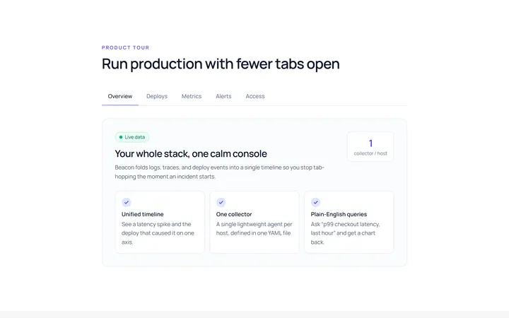
Underline Tab
Originalunderline tabs with sliding indicator
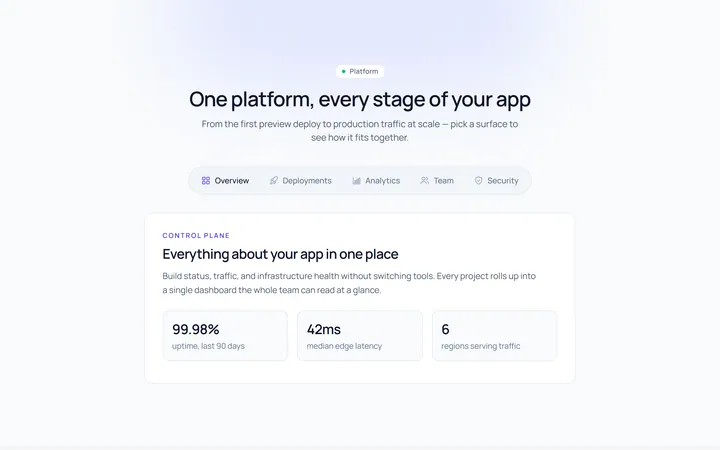
Pills Tab
Originalpill tabs
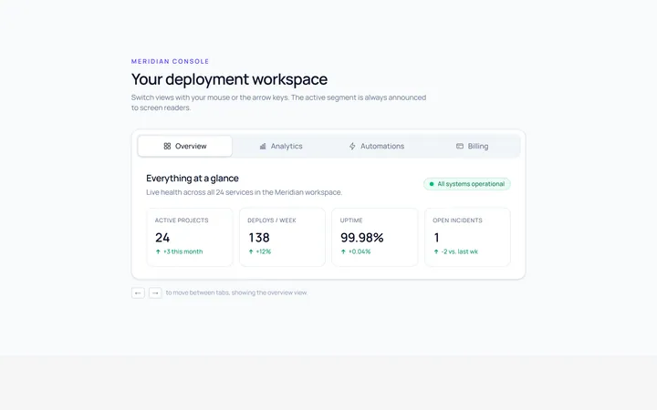
Boxed Tab
Originalboxed/segmented tabs
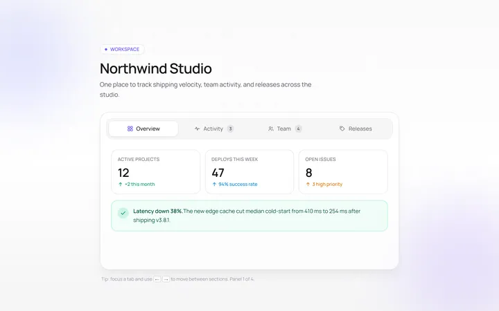
Icons Tab
Originaltabs with icons
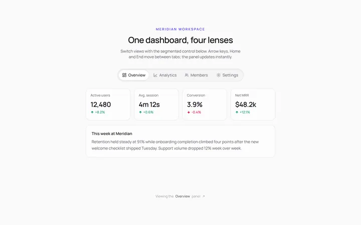
Segmented Tab
Originalsegmented control tabs
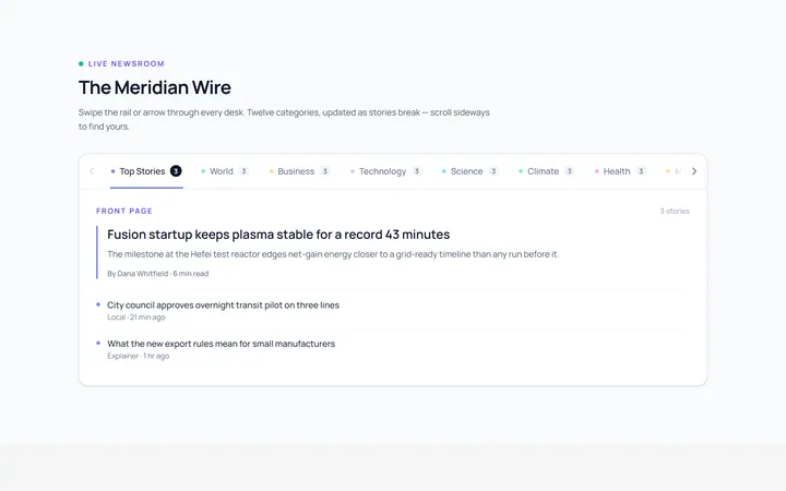
Scrollable Tab
Originalhorizontally scrollable tabs
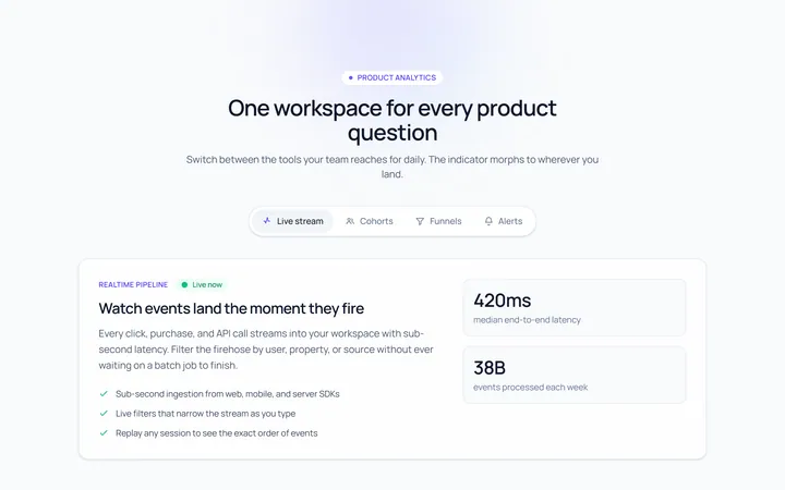
Animated Indicator Tab
Originaltabs with a morphing indicator
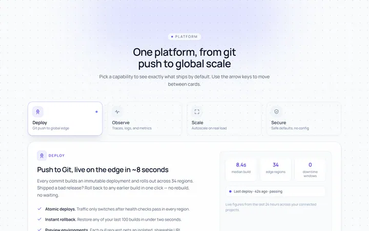
Cards Tab
Originalcard-style tabs with panels
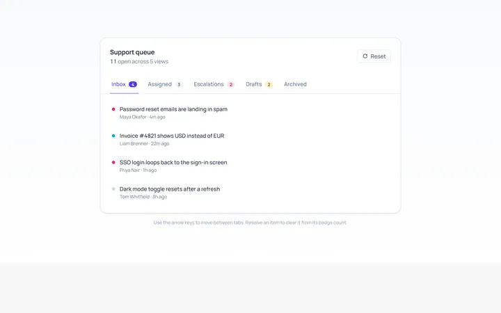
With Badge Tab
Originaltabs with count badges
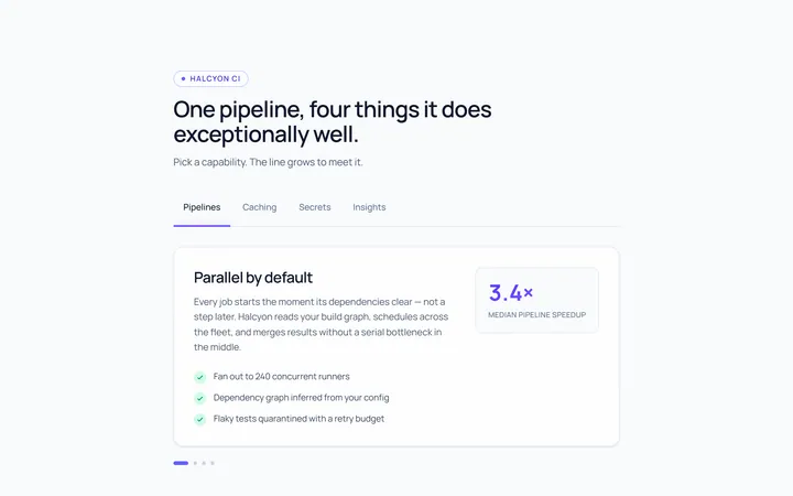
Line Grow Tab
Originaltabs where the underline grows in
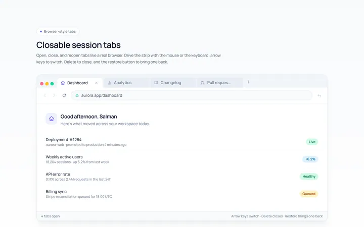
Closable Tab
Originalbrowser-style closable tabs

Spotlight Hero
OriginalA centred hero with a soft radial spotlight, badge and dual call-to-action.