

Boxed Tab
Original · freeboxed/segmented tabs
byWeb InnoventixReact + Tailwind
tabboxedtabs
Copy prompt gives Claude Code, Cursor or v0 a ready-to-paste prompt that recreates this exact component.
npx shadcn@latest add https://webinnoventix.com/r/tab-boxed.jsontab-boxed.tsx
"use client"
import { useId, useRef, useState, type KeyboardEvent, type ReactNode } from "react"
import { AnimatePresence, motion, useReducedMotion } from "motion/react"
type TabKey = "overview" | "analytics" | "automations" | "billing"
interface TabDef {
key: TabKey
label: string
Icon: (props: { className?: string }) => ReactNode
}
function GridIcon({ className }: { className?: string }) {
return (
<svg viewBox="0 0 24 24" fill="none" aria-hidden="true" className={className}>
<rect x="3.5" y="3.5" width="7" height="7" rx="1.6" stroke="currentColor" strokeWidth="1.6" />
<rect x="13.5" y="3.5" width="7" height="7" rx="1.6" stroke="currentColor" strokeWidth="1.6" />
<rect x="3.5" y="13.5" width="7" height="7" rx="1.6" stroke="currentColor" strokeWidth="1.6" />
<rect x="13.5" y="13.5" width="7" height="7" rx="1.6" stroke="currentColor" strokeWidth="1.6" />
</svg>
)
}
function ChartIcon({ className }: { className?: string }) {
return (
<svg viewBox="0 0 24 24" fill="none" aria-hidden="true" className={className}>
<path d="M4 20h16" stroke="currentColor" strokeWidth="1.6" strokeLinecap="round" />
<rect x="5" y="12" width="3.4" height="6" rx="1" stroke="currentColor" strokeWidth="1.6" />
<rect x="10.3" y="8" width="3.4" height="10" rx="1" stroke="currentColor" strokeWidth="1.6" />
<rect x="15.6" y="4.5" width="3.4" height="13.5" rx="1" stroke="currentColor" strokeWidth="1.6" />
</svg>
)
}
function BoltIcon({ className }: { className?: string }) {
return (
<svg viewBox="0 0 24 24" fill="none" aria-hidden="true" className={className}>
<path
d="M13 2 4.5 13.2c-.4.5 0 1.3.7 1.3H11l-1 8 8.5-11.2c.4-.5 0-1.3-.7-1.3H12l1-8Z"
stroke="currentColor"
strokeWidth="1.6"
strokeLinejoin="round"
/>
</svg>
)
}
function CardIcon({ className }: { className?: string }) {
return (
<svg viewBox="0 0 24 24" fill="none" aria-hidden="true" className={className}>
<rect x="3" y="5.5" width="18" height="13" rx="2.2" stroke="currentColor" strokeWidth="1.6" />
<path d="M3 9.5h18" stroke="currentColor" strokeWidth="1.6" />
<path d="M6.5 14.5h4" stroke="currentColor" strokeWidth="1.6" strokeLinecap="round" />
</svg>
)
}
const TABS: readonly TabDef[] = [
{ key: "overview", label: "Overview", Icon: GridIcon },
{ key: "analytics", label: "Analytics", Icon: ChartIcon },
{ key: "automations", label: "Automations", Icon: BoltIcon },
{ key: "billing", label: "Billing", Icon: CardIcon },
]
function StatTile({ label, value, delta, positive }: { label: string; value: string; delta: string; positive: boolean }) {
return (
<div className="rounded-xl border border-slate-200 bg-white p-4 dark:border-slate-800 dark:bg-slate-900/60">
<p className="text-[0.7rem] font-medium uppercase tracking-wider text-slate-500 dark:text-slate-400">{label}</p>
<p className="mt-2 text-2xl font-semibold tracking-tight text-slate-900 tabular-nums dark:text-white">{value}</p>
<p
className={
"mt-1 inline-flex items-center gap-1 text-xs font-medium " +
(positive ? "text-emerald-600 dark:text-emerald-400" : "text-rose-600 dark:text-rose-400")
}
>
<svg viewBox="0 0 12 12" className="h-3 w-3" fill="none" aria-hidden="true">
<path
d={positive ? "M6 2.5v7M6 2.5 3 5.5M6 2.5l3 3" : "M6 9.5v-7M6 9.5 3 6.5M6 9.5l3-3"}
stroke="currentColor"
strokeWidth="1.5"
strokeLinecap="round"
strokeLinejoin="round"
/>
</svg>
{delta}
</p>
</div>
)
}
function OverviewPanel() {
return (
<div>
<div className="flex flex-wrap items-center justify-between gap-3">
<div>
<h3 className="text-lg font-semibold tracking-tight text-slate-900 dark:text-white">Everything at a glance</h3>
<p className="mt-1 text-sm text-slate-500 dark:text-slate-400">
Live health across all 24 services in the Meridian workspace.
</p>
</div>
<span className="inline-flex items-center gap-2 rounded-full bg-emerald-50 px-3 py-1 text-xs font-medium text-emerald-700 ring-1 ring-inset ring-emerald-600/20 dark:bg-emerald-500/10 dark:text-emerald-300 dark:ring-emerald-400/20">
<span className="relative flex h-2 w-2">
<span className="tabboxed-live-ring absolute inline-flex h-full w-full rounded-full bg-emerald-500" />
<span className="relative inline-flex h-2 w-2 rounded-full bg-emerald-500" />
</span>
All systems operational
</span>
</div>
<div className="mt-5 grid grid-cols-2 gap-3 sm:grid-cols-4">
<StatTile label="Active projects" value="24" delta="+3 this month" positive />
<StatTile label="Deploys / week" value="138" delta="+12%" positive />
<StatTile label="Uptime" value="99.98%" delta="+0.04%" positive />
<StatTile label="Open incidents" value="1" delta="-2 vs. last wk" positive />
</div>
</div>
)
}
const CHART: readonly { day: string; value: number }[] = [
{ day: "Mon", value: 62 },
{ day: "Tue", value: 78 },
{ day: "Wed", value: 71 },
{ day: "Thu", value: 95 },
{ day: "Fri", value: 88 },
{ day: "Sat", value: 44 },
{ day: "Sun", value: 39 },
]
function AnalyticsPanel() {
const max = Math.max(...CHART.map((c) => c.value))
return (
<div>
<div className="flex flex-wrap items-center justify-between gap-3">
<div>
<h3 className="text-lg font-semibold tracking-tight text-slate-900 dark:text-white">Traffic & performance</h3>
<p className="mt-1 text-sm text-slate-500 dark:text-slate-400">Requests served over the last 7 days.</p>
</div>
<div className="flex gap-5">
<div>
<p className="text-[0.7rem] uppercase tracking-wider text-slate-500 dark:text-slate-400">p95 latency</p>
<p className="text-base font-semibold text-slate-900 tabular-nums dark:text-white">214 ms</p>
</div>
<div>
<p className="text-[0.7rem] uppercase tracking-wider text-slate-500 dark:text-slate-400">error rate</p>
<p className="text-base font-semibold text-slate-900 tabular-nums dark:text-white">0.12%</p>
</div>
</div>
</div>
<div className="mt-6 flex items-end justify-between gap-2 sm:gap-4" role="img" aria-label="Bar chart of daily requests, peaking Thursday at 95 thousand">
{CHART.map((c) => (
<div key={c.day} className="flex flex-1 flex-col items-center gap-2">
<span className="text-xs font-medium text-slate-600 tabular-nums dark:text-slate-300">{c.value}k</span>
<div className="flex h-32 w-full items-end justify-center">
<div
className="w-full max-w-[2.75rem] rounded-t-md bg-gradient-to-t from-indigo-500 to-violet-400 dark:from-indigo-500 dark:to-violet-400"
style={{ height: `${(c.value / max) * 100}%` }}
/>
</div>
<span className="text-xs text-slate-500 dark:text-slate-400">{c.day}</span>
</div>
))}
</div>
</div>
)
}
const RULES: readonly { name: string; desc: string; active: boolean }[] = [
{ name: "Auto-scale on CPU > 75%", desc: "Adds a replica when sustained for 3 minutes.", active: true },
{ name: "Nightly database backup", desc: "Snapshot to cold storage at 02:00 UTC.", active: true },
{ name: "Slack alert on failed deploy", desc: "Posts to #eng-releases with the run log.", active: true },
{ name: "Archive stale branches", desc: "Merged branches older than 30 days.", active: false },
]
function AutomationsPanel() {
return (
<div>
<h3 className="text-lg font-semibold tracking-tight text-slate-900 dark:text-white">Automations</h3>
<p className="mt-1 text-sm text-slate-500 dark:text-slate-400">Rules that run without anyone lifting a finger.</p>
<ul className="mt-5 divide-y divide-slate-200 overflow-hidden rounded-xl border border-slate-200 dark:divide-slate-800 dark:border-slate-800">
{RULES.map((r) => (
<li key={r.name} className="flex items-center justify-between gap-4 bg-white px-4 py-3.5 dark:bg-slate-900/60">
<div className="flex items-start gap-3">
<span
className={
"mt-0.5 grid h-8 w-8 shrink-0 place-items-center rounded-lg " +
(r.active
? "bg-amber-100 text-amber-700 dark:bg-amber-400/10 dark:text-amber-300"
: "bg-slate-100 text-slate-400 dark:bg-slate-800 dark:text-slate-500")
}
>
<BoltIcon className="h-4 w-4" />
</span>
<div>
<p className="text-sm font-medium text-slate-900 dark:text-white">{r.name}</p>
<p className="text-xs text-slate-500 dark:text-slate-400">{r.desc}</p>
</div>
</div>
<span
className={
"shrink-0 rounded-full px-2.5 py-1 text-xs font-medium ring-1 ring-inset " +
(r.active
? "bg-emerald-50 text-emerald-700 ring-emerald-600/20 dark:bg-emerald-500/10 dark:text-emerald-300 dark:ring-emerald-400/20"
: "bg-slate-100 text-slate-500 ring-slate-500/20 dark:bg-slate-800 dark:text-slate-400 dark:ring-slate-400/20")
}
>
{r.active ? "Active" : "Paused"}
</span>
</li>
))}
</ul>
</div>
)
}
function UsageBar({ label, used, total, unit }: { label: string; used: number; total: number; unit: string }) {
const pct = Math.min(100, Math.round((used / total) * 100))
return (
<div>
<div className="flex items-center justify-between text-sm">
<span className="font-medium text-slate-700 dark:text-slate-200">{label}</span>
<span className="text-slate-500 tabular-nums dark:text-slate-400">
{used.toLocaleString()} / {total.toLocaleString()} {unit}
</span>
</div>
<div className="mt-2 h-2 w-full overflow-hidden rounded-full bg-slate-200 dark:bg-slate-800">
<div
className={
"h-full rounded-full " +
(pct > 85 ? "bg-rose-500" : "bg-sky-500")
}
style={{ width: `${pct}%` }}
/>
</div>
</div>
)
}
function BillingPanel() {
return (
<div>
<div className="flex flex-wrap items-center justify-between gap-3">
<div>
<h3 className="text-lg font-semibold tracking-tight text-slate-900 dark:text-white">Plan & usage</h3>
<p className="mt-1 text-sm text-slate-500 dark:text-slate-400">Next invoice issues on 1 August 2026.</p>
</div>
<div className="rounded-xl border border-indigo-200 bg-indigo-50 px-4 py-2 text-right dark:border-indigo-500/30 dark:bg-indigo-500/10">
<p className="text-xs font-medium text-indigo-700 dark:text-indigo-300">Current plan</p>
<p className="text-sm font-semibold text-slate-900 dark:text-white">
Team <span className="text-slate-500 dark:text-slate-400">· $79/mo</span>
</p>
</div>
</div>
<div className="mt-6 space-y-5 rounded-xl border border-slate-200 bg-white p-5 dark:border-slate-800 dark:bg-slate-900/60">
<UsageBar label="Seats" used={12} total={15} unit="" />
<UsageBar label="Build minutes" used={4210} total={6000} unit="min" />
<UsageBar label="Bandwidth" used={812} total={1000} unit="GB" />
</div>
</div>
)
}
function renderPanel(key: TabKey): ReactNode {
switch (key) {
case "overview":
return <OverviewPanel />
case "analytics":
return <AnalyticsPanel />
case "automations":
return <AutomationsPanel />
case "billing":
return <BillingPanel />
}
}
export default function TabBoxed() {
const uid = useId()
const reduce = useReducedMotion()
const [active, setActive] = useState<TabKey>("overview")
const tabRefs = useRef<(HTMLButtonElement | null)[]>([])
const activeIndex = TABS.findIndex((t) => t.key === active)
const onKeyDown = (e: KeyboardEvent<HTMLButtonElement>, index: number) => {
let next = index
switch (e.key) {
case "ArrowRight":
case "ArrowDown":
next = (index + 1) % TABS.length
break
case "ArrowLeft":
case "ArrowUp":
next = (index - 1 + TABS.length) % TABS.length
break
case "Home":
next = 0
break
case "End":
next = TABS.length - 1
break
default:
return
}
e.preventDefault()
setActive(TABS[next].key)
tabRefs.current[next]?.focus()
}
const tabId = (key: TabKey) => `${uid}-tab-${key}`
const panelId = (key: TabKey) => `${uid}-panel-${key}`
return (
<section className="relative w-full bg-slate-50 px-6 py-20 dark:bg-slate-950 sm:px-8 sm:py-28">
<style>{`
@keyframes tabboxed-ping {
0% { transform: scale(1); opacity: 0.6; }
70%, 100% { transform: scale(2.4); opacity: 0; }
}
.tabboxed-live-ring { animation: tabboxed-ping 1.8s cubic-bezier(0, 0, 0.2, 1) infinite; }
@media (prefers-reduced-motion: reduce) {
.tabboxed-live-ring { animation: none; }
}
`}</style>
<div className="mx-auto max-w-3xl">
<header className="mb-8">
<p className="text-xs font-semibold uppercase tracking-[0.2em] text-indigo-600 dark:text-indigo-400">
Meridian Console
</p>
<h2 className="mt-2 text-2xl font-semibold tracking-tight text-slate-900 dark:text-white sm:text-3xl">
Your deployment workspace
</h2>
<p className="mt-2 max-w-xl text-sm text-slate-500 dark:text-slate-400">
Switch views with your mouse or the arrow keys. The active segment is always announced to screen readers.
</p>
</header>
<div className="rounded-2xl border border-slate-200 bg-white p-2 shadow-sm dark:border-slate-800 dark:bg-slate-900">
<div
role="tablist"
aria-label="Workspace views"
aria-orientation="horizontal"
className="flex gap-1 rounded-xl bg-slate-100 p-1 dark:bg-slate-800/70"
>
{TABS.map((tab, index) => {
const selected = tab.key === active
return (
<button
key={tab.key}
ref={(el) => {
tabRefs.current[index] = el
}}
id={tabId(tab.key)}
role="tab"
type="button"
aria-selected={selected}
aria-controls={panelId(tab.key)}
tabIndex={selected ? 0 : -1}
onClick={() => setActive(tab.key)}
onKeyDown={(e) => onKeyDown(e, index)}
className={
"relative flex min-w-0 flex-1 items-center justify-center gap-2 rounded-lg px-2 py-2.5 text-sm font-medium transition-colors outline-none focus-visible:ring-2 focus-visible:ring-indigo-500 focus-visible:ring-offset-2 focus-visible:ring-offset-slate-100 dark:focus-visible:ring-offset-slate-800 sm:px-4 " +
(selected
? "text-slate-900 dark:text-white"
: "text-slate-500 hover:text-slate-800 dark:text-slate-400 dark:hover:text-slate-100")
}
>
{selected && (
<motion.span
layoutId={`${uid}-segment`}
className="absolute inset-0 rounded-lg bg-white shadow-sm ring-1 ring-slate-950/5 dark:bg-slate-900 dark:ring-white/10"
transition={reduce ? { duration: 0 } : { type: "spring", stiffness: 520, damping: 42 }}
/>
)}
<span className="relative z-10 flex items-center gap-2">
<tab.Icon className="h-4 w-4 shrink-0" />
<span className="truncate">{tab.label}</span>
</span>
</button>
)
})}
</div>
<div className="px-3 pb-4 pt-6 sm:px-5">
<AnimatePresence mode="wait" initial={false}>
<motion.div
key={active}
id={panelId(active)}
role="tabpanel"
aria-labelledby={tabId(active)}
tabIndex={0}
initial={reduce ? false : { opacity: 0, y: 8 }}
animate={{ opacity: 1, y: 0 }}
exit={reduce ? { opacity: 0 } : { opacity: 0, y: -8 }}
transition={reduce ? { duration: 0 } : { duration: 0.22, ease: [0.22, 1, 0.36, 1] }}
className="rounded-lg outline-none focus-visible:ring-2 focus-visible:ring-indigo-500 focus-visible:ring-offset-2 focus-visible:ring-offset-white dark:focus-visible:ring-offset-slate-900"
>
{renderPanel(active)}
</motion.div>
</AnimatePresence>
</div>
</div>
<p className="mt-4 flex flex-wrap items-center gap-x-2 gap-y-1 text-xs text-slate-400 dark:text-slate-500">
<kbd className="rounded border border-slate-300 bg-white px-1.5 py-0.5 font-sans text-[0.7rem] text-slate-600 dark:border-slate-700 dark:bg-slate-800 dark:text-slate-300">
←
</kbd>
<kbd className="rounded border border-slate-300 bg-white px-1.5 py-0.5 font-sans text-[0.7rem] text-slate-600 dark:border-slate-700 dark:bg-slate-800 dark:text-slate-300">
→
</kbd>
<span>to move between tabs, showing the {TABS[activeIndex].label.toLowerCase()} view.</span>
</p>
</div>
</section>
)
}Dependencies
motion
Licence
Built by Web Innoventix. Free for personal and commercial use, no attribution required.
Built by Web Innoventix
Need a custom interface, a full website, or SEO that gets you cited by AI? We design, build and rank it end to end.
Get a free quoteSimilar components
Browse all →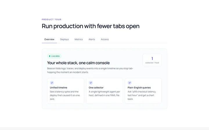
Underline Tab
Originalunderline tabs with sliding indicator
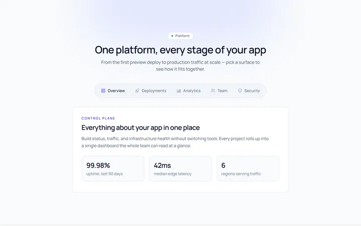
Pills Tab
Originalpill tabs
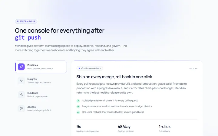
Vertical Tab
Originalvertical tabs
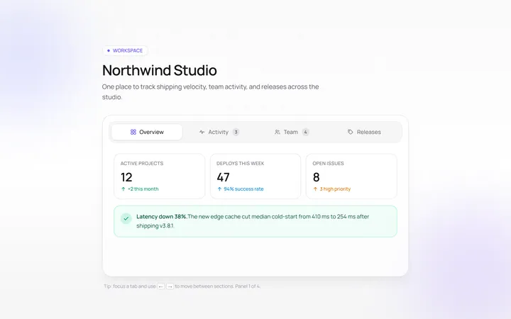
Icons Tab
Originaltabs with icons
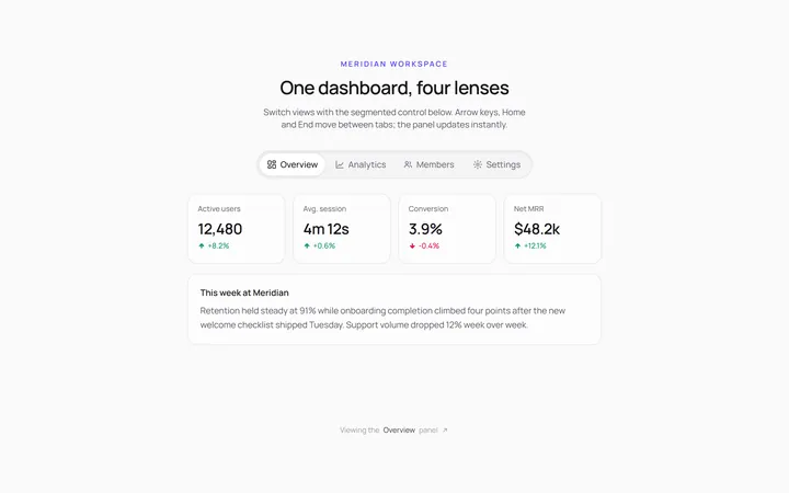
Segmented Tab
Originalsegmented control tabs
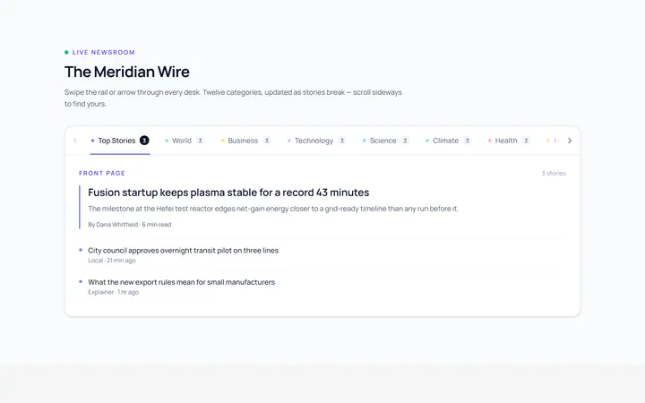
Scrollable Tab
Originalhorizontally scrollable tabs
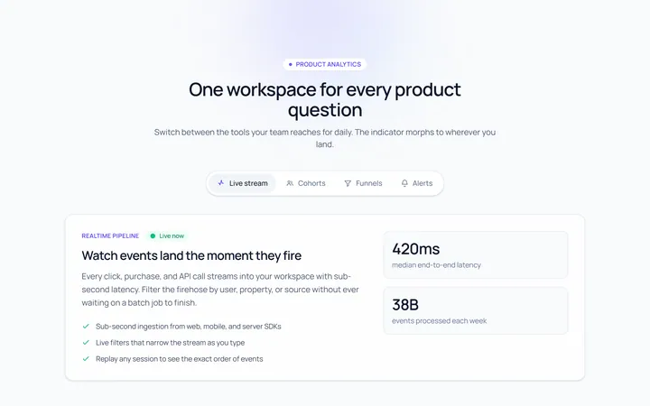
Animated Indicator Tab
Originaltabs with a morphing indicator
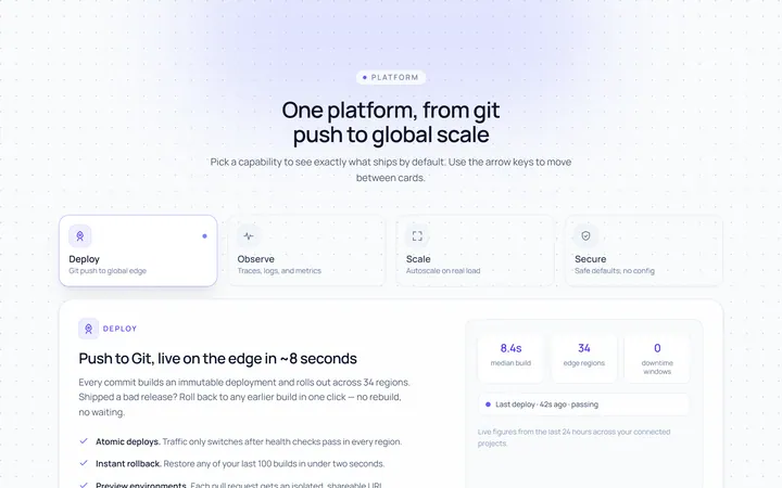
Cards Tab
Originalcard-style tabs with panels
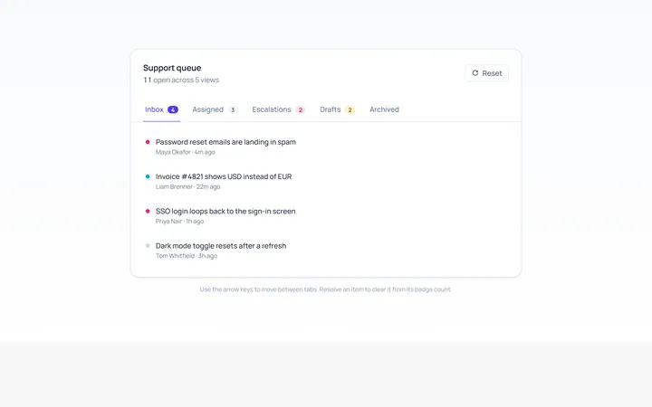
With Badge Tab
Originaltabs with count badges
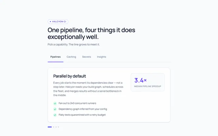
Line Grow Tab
Originaltabs where the underline grows in
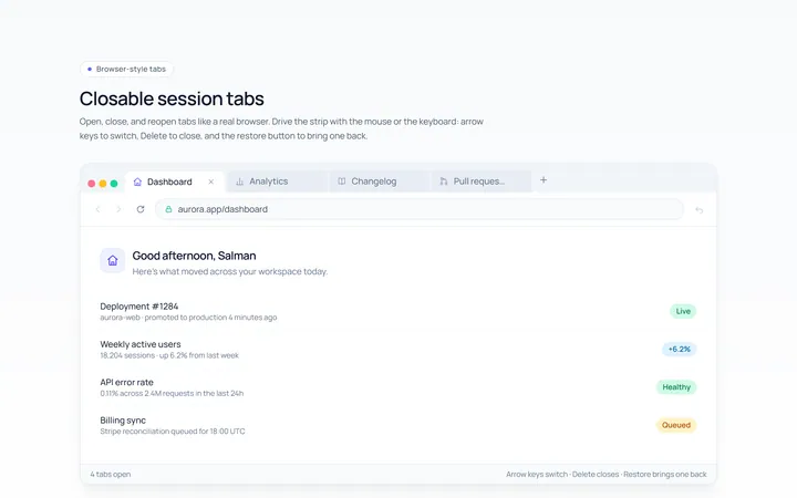
Closable Tab
Originalbrowser-style closable tabs

Spotlight Hero
OriginalA centred hero with a soft radial spotlight, badge and dual call-to-action.