

Closable Tab
Original · freebrowser-style closable tabs
byWeb InnoventixReact + Tailwind
tabclosabletabs
Copy prompt gives Claude Code, Cursor or v0 a ready-to-paste prompt that recreates this exact component.
npx shadcn@latest add https://webinnoventix.com/r/tab-closable.jsontab-closable.tsx
"use client";
import { AnimatePresence, motion, useReducedMotion } from "motion/react";
import {
useCallback,
useEffect,
useId,
useRef,
useState,
type KeyboardEvent as ReactKeyboardEvent,
type MouseEvent as ReactMouseEvent,
} from "react";
type IconName =
| "home"
| "chart"
| "book"
| "git"
| "spark"
| "back"
| "forward"
| "reload"
| "plus"
| "close"
| "lock"
| "undo"
| "globe";
type Tone = "emerald" | "amber" | "rose" | "indigo" | "sky" | "violet";
interface Row {
primary: string;
secondary: string;
tag: string;
tone: Tone;
}
interface TabData {
title: string;
url: string;
icon: IconName;
kind: "site" | "newtab";
heading: string;
subtitle: string;
rows: Row[];
}
interface TabItem extends TabData {
id: string;
}
const toneClasses: Record<Tone, string> = {
emerald:
"bg-emerald-100 text-emerald-700 dark:bg-emerald-500/15 dark:text-emerald-300",
amber: "bg-amber-100 text-amber-700 dark:bg-amber-500/15 dark:text-amber-300",
rose: "bg-rose-100 text-rose-700 dark:bg-rose-500/15 dark:text-rose-300",
indigo:
"bg-indigo-100 text-indigo-700 dark:bg-indigo-500/15 dark:text-indigo-300",
sky: "bg-sky-100 text-sky-700 dark:bg-sky-500/15 dark:text-sky-300",
violet:
"bg-violet-100 text-violet-700 dark:bg-violet-500/15 dark:text-violet-300",
};
const SITES = {
dashboard: {
title: "Dashboard",
url: "aurora.app/dashboard",
icon: "home",
kind: "site",
heading: "Good afternoon, Salman",
subtitle: "Here's what moved across your workspace today.",
rows: [
{
primary: "Deployment #1284",
secondary: "aurora-web · promoted to production 4 minutes ago",
tag: "Live",
tone: "emerald",
},
{
primary: "Weekly active users",
secondary: "18,204 sessions · up 6.2% from last week",
tag: "+6.2%",
tone: "sky",
},
{
primary: "API error rate",
secondary: "0.11% across 2.4M requests in the last 24h",
tag: "Healthy",
tone: "emerald",
},
{
primary: "Billing sync",
secondary: "Stripe reconciliation queued for 18:00 UTC",
tag: "Queued",
tone: "amber",
},
],
},
analytics: {
title: "Analytics",
url: "aurora.app/analytics",
icon: "chart",
kind: "site",
heading: "Product analytics",
subtitle: "Last 30 days, compared to the previous period.",
rows: [
{
primary: "New signups",
secondary: "1,932 accounts created this month",
tag: "+11%",
tone: "sky",
},
{
primary: "Activation rate",
secondary: "64% reached first value in under 10 minutes",
tag: "Good",
tone: "emerald",
},
{
primary: "Monthly churn",
secondary: "2.1% of accounts, down from 2.8%",
tag: "-0.7pt",
tone: "emerald",
},
{
primary: "Top referrer",
secondary: "github.com drove 41% of new traffic",
tag: "Organic",
tone: "indigo",
},
],
},
changelog: {
title: "Changelog",
url: "aurora.app/changelog",
icon: "book",
kind: "site",
heading: "What's new",
subtitle: "Release notes for the Aurora tab system.",
rows: [
{
primary: "v3.8 — Closable tab groups",
secondary: "Reopen the last closed tab from the toolbar or keyboard",
tag: "New",
tone: "violet",
},
{
primary: "v3.7 — Keyboard navigation",
secondary: "Arrow keys, Home, End, and Delete now drive the tab strip",
tag: "Improved",
tone: "sky",
},
{
primary: "v3.6 — Reduced-motion support",
secondary: "Every transition respects prefers-reduced-motion",
tag: "a11y",
tone: "emerald",
},
{
primary: "v3.5 — Dark theme polish",
secondary: "Higher contrast on the active tab and address bar",
tag: "Fix",
tone: "amber",
},
],
},
pulls: {
title: "Pull requests",
url: "github.com/aurora-labs/core/pulls",
icon: "git",
kind: "site",
heading: "Open pull requests",
subtitle: "aurora-labs/core · 4 awaiting your review.",
rows: [
{
primary: "#482 Add roving tabindex to the tablist",
secondary: "maya-k · 3 files changed · +128 −40",
tag: "Review",
tone: "amber",
},
{
primary: "#479 Fix focus loss after closing a tab",
secondary: "dev-omar · approved by 2 reviewers",
tag: "Approved",
tone: "emerald",
},
{
primary: "#475 Animate tab reflow on close",
secondary: "lena · marked as draft",
tag: "Draft",
tone: "indigo",
},
{
primary: "#471 Address-bar autocomplete",
secondary: "priya · conflicts with main",
tag: "Conflict",
tone: "rose",
},
],
},
} satisfies Record<string, TabData>;
type SiteKey = keyof typeof SITES;
const SITE_ORDER: SiteKey[] = ["dashboard", "analytics", "changelog", "pulls"];
function newTabTemplate(): TabData {
return {
title: "New tab",
url: "aurora://newtab",
icon: "spark",
kind: "newtab",
heading: "Open a workspace",
subtitle: "Pick up where you left off, or start something fresh.",
rows: [],
};
}
function Icon({ name, className }: { name: IconName; className?: string }) {
const common = {
className,
viewBox: "0 0 24 24",
fill: "none",
stroke: "currentColor",
strokeWidth: 1.7,
strokeLinecap: "round" as const,
strokeLinejoin: "round" as const,
"aria-hidden": true,
focusable: false,
};
switch (name) {
case "home":
return (
<svg {...common}>
<path d="M3 10.75 12 3l9 7.75" />
<path d="M5.5 9.4V21h13V9.4" />
<path d="M9.75 21v-5.5h4.5V21" />
</svg>
);
case "chart":
return (
<svg {...common}>
<path d="M3.5 20.5h17" />
<path d="M6 20.5V12" />
<path d="M12 20.5V5" />
<path d="M18 20.5v-9" />
</svg>
);
case "book":
return (
<svg {...common}>
<path d="M12 6.4C10.5 5 8 4.5 4.6 4.8V18c3.4-.3 5.9.2 7.4 1.7" />
<path d="M12 6.4C13.5 5 16 4.5 19.4 4.8V18c-3.4-.3-5.9.2-7.4 1.7" />
<path d="M12 6.4v13.3" />
</svg>
);
case "git":
return (
<svg {...common}>
<circle cx="6.5" cy="6" r="2.3" />
<circle cx="6.5" cy="18" r="2.3" />
<path d="M6.5 8.3v7.4" />
<circle cx="17.5" cy="18" r="2.3" />
<path d="M17.5 15.7v-4.4a4 4 0 0 0-4-4h-3" />
<path d="M11.6 5.1 9.9 7.3 12.1 9" />
</svg>
);
case "spark":
return (
<svg {...common}>
<path d="M12 3.2l1.9 5.3 5.3 1.9-5.3 1.9L12 17.5l-1.9-5.2-5.3-1.9 5.3-1.9z" />
<path d="M18.6 4.2l.6 1.7 1.7.6-1.7.6-.6 1.7-.6-1.7-1.7-.6 1.7-.6z" />
</svg>
);
case "back":
return (
<svg {...common}>
<path d="M15 5.5 8.5 12l6.5 6.5" />
</svg>
);
case "forward":
return (
<svg {...common}>
<path d="M9 5.5 15.5 12 9 18.5" />
</svg>
);
case "reload":
return (
<svg {...common}>
<path d="M19.6 8.6A7.5 7.5 0 1 0 20.5 13" />
<path d="M20.5 4v5h-5" />
</svg>
);
case "plus":
return (
<svg {...common}>
<path d="M12 5v14" />
<path d="M5 12h14" />
</svg>
);
case "close":
return (
<svg {...common}>
<path d="M6.5 6.5l11 11" />
<path d="M17.5 6.5l-11 11" />
</svg>
);
case "lock":
return (
<svg {...common}>
<rect x="5" y="11" width="14" height="9" rx="2" />
<path d="M8 11V8a4 4 0 0 1 8 0v3" />
</svg>
);
case "undo":
return (
<svg {...common}>
<path d="M9 7 4 12l5 5" />
<path d="M4 12h11a5 5 0 0 1 0 10h-1.5" />
</svg>
);
case "globe":
return (
<svg {...common}>
<circle cx="12" cy="12" r="8.4" />
<path d="M3.6 12h16.8" />
<path d="M12 3.6c2.4 2.3 3.7 5.3 3.7 8.4S14.4 18.1 12 20.4c-2.4-2.3-3.7-5.3-3.7-8.4S9.6 5.9 12 3.6z" />
</svg>
);
default:
return null;
}
}
export default function TabClosable() {
const baseId = useId();
const reduce = useReducedMotion() === true;
const [tabs, setTabs] = useState<TabItem[]>(() =>
SITE_ORDER.slice(0, 4).map((key, i) => ({ id: `seed-${i}`, ...SITES[key] })),
);
const [activeId, setActiveId] = useState<string>("seed-0");
const [closedStack, setClosedStack] = useState<TabData[]>([]);
const [pendingFocus, setPendingFocus] = useState<string | null>(null);
const [loading, setLoading] = useState(false);
const counter = useRef(1);
const tabRefs = useRef(new Map<string, HTMLDivElement>());
const loadTimer = useRef<number | null>(null);
const nextId = () => `tab-${counter.current++}`;
const panelId = `${baseId}-panel`;
const tabDomId = (id: string) => `${baseId}-tab-${id}`;
const activeTab = tabs.find((t) => t.id === activeId) ?? tabs[0];
useEffect(() => {
if (pendingFocus) {
tabRefs.current.get(pendingFocus)?.focus();
setPendingFocus(null);
}
}, [pendingFocus, tabs]);
useEffect(
() => () => {
if (loadTimer.current) window.clearTimeout(loadTimer.current);
},
[],
);
const triggerLoad = useCallback(() => {
setLoading(true);
if (loadTimer.current) window.clearTimeout(loadTimer.current);
loadTimer.current = window.setTimeout(
() => setLoading(false),
reduce ? 0 : 720,
);
}, [reduce]);
const selectAndFocus = useCallback((id: string) => {
setActiveId(id);
setPendingFocus(id);
}, []);
const closeTab = useCallback(
(id: string) => {
const idx = tabs.findIndex((t) => t.id === id);
if (idx === -1) return;
const closed: TabData = { ...tabs[idx] };
const next = tabs.filter((t) => t.id !== id);
setClosedStack((c) => [closed, ...c].slice(0, 8));
if (next.length === 0) {
const nid = nextId();
setTabs([{ id: nid, ...newTabTemplate() }]);
setActiveId(nid);
setPendingFocus(nid);
return;
}
setTabs(next);
if (activeId === id) {
const neighbor = next[Math.min(idx, next.length - 1)];
setActiveId(neighbor.id);
setPendingFocus(neighbor.id);
} else {
setPendingFocus(activeId);
}
},
[tabs, activeId],
);
const addTab = useCallback(() => {
const nid = nextId();
setTabs((prev) => [...prev, { id: nid, ...newTabTemplate() }]);
setActiveId(nid);
setPendingFocus(nid);
triggerLoad();
}, [triggerLoad]);
const reopenTab = useCallback(() => {
if (closedStack.length === 0) return;
const [first, ...rest] = closedStack;
const nid = nextId();
setTabs((prev) => [...prev, { id: nid, ...first }]);
setClosedStack(rest);
setActiveId(nid);
setPendingFocus(nid);
triggerLoad();
}, [closedStack, triggerLoad]);
const navigate = useCallback(
(key: SiteKey) => {
setTabs((prev) =>
prev.map((t) => (t.id === activeId ? { ...SITES[key], id: t.id } : t)),
);
triggerLoad();
},
[activeId, triggerLoad],
);
const setUrl = useCallback(
(value: string) => {
setTabs((prev) =>
prev.map((t) => (t.id === activeId ? { ...t, url: value } : t)),
);
},
[activeId],
);
const onTabKeyDown = useCallback(
(event: ReactKeyboardEvent<HTMLDivElement>, index: number) => {
const { key } = event;
if (key === "ArrowRight" || key === "ArrowLeft") {
event.preventDefault();
const dir = key === "ArrowRight" ? 1 : -1;
const nextIndex = (index + dir + tabs.length) % tabs.length;
selectAndFocus(tabs[nextIndex].id);
} else if (key === "Home") {
event.preventDefault();
selectAndFocus(tabs[0].id);
} else if (key === "End") {
event.preventDefault();
selectAndFocus(tabs[tabs.length - 1].id);
} else if (key === "Delete" || key === "Backspace") {
event.preventDefault();
closeTab(tabs[index].id);
} else if (key === "Enter" || key === " ") {
event.preventDefault();
selectAndFocus(tabs[index].id);
}
},
[tabs, selectAndFocus, closeTab],
);
const spring = reduce
? { duration: 0 }
: { type: "spring" as const, stiffness: 520, damping: 40, mass: 0.7 };
const focusRing =
"focus-visible:outline-none focus-visible:ring-2 focus-visible:ring-indigo-500 focus-visible:ring-offset-2 focus-visible:ring-offset-white dark:focus-visible:ring-indigo-400 dark:focus-visible:ring-offset-zinc-900";
return (
<section className="relative w-full overflow-hidden bg-gradient-to-b from-slate-50 to-white px-4 py-16 sm:py-24 dark:from-zinc-950 dark:to-black">
<style>{`
@keyframes bctab-spin { to { transform: rotate(360deg); } }
@keyframes bctab-shimmer {
0% { background-position: -160% 0; }
100% { background-position: 260% 0; }
}
.bctab-spin { animation: bctab-spin 0.72s linear infinite; }
.bctab-shimmer {
background-image: linear-gradient(
110deg,
rgba(255,255,255,0) 20%,
rgba(255,255,255,0.55) 50%,
rgba(255,255,255,0) 80%
);
background-size: 200% 100%;
animation: bctab-shimmer 1s linear infinite;
}
@media (prefers-reduced-motion: reduce) {
.bctab-spin, .bctab-shimmer { animation: none !important; }
}
`}</style>
<div className="relative mx-auto w-full max-w-5xl">
<div className="mb-8 max-w-2xl">
<span className="inline-flex items-center gap-2 rounded-full border border-slate-200 bg-white px-3 py-1 text-xs font-medium tracking-wide text-slate-600 dark:border-zinc-800 dark:bg-zinc-900 dark:text-zinc-300">
<span className="h-1.5 w-1.5 rounded-full bg-indigo-500" />
Browser-style tabs
</span>
<h2 className="mt-4 text-2xl font-semibold tracking-tight text-slate-900 sm:text-3xl dark:text-zinc-50">
Closable session tabs
</h2>
<p className="mt-2 text-sm leading-relaxed text-slate-600 dark:text-zinc-400">
Open, close, and reopen tabs like a real browser. Drive the strip
with the mouse or the keyboard: arrow keys to switch, Delete to
close, and the restore button to bring one back.
</p>
</div>
{/* Browser window */}
<div className="overflow-hidden rounded-2xl border border-slate-200 bg-white shadow-xl shadow-slate-900/5 dark:border-zinc-800 dark:bg-zinc-900 dark:shadow-black/40">
{/* Tab strip */}
<div className="flex items-end gap-1 bg-slate-100 px-3 pt-2.5 dark:bg-zinc-950">
<div
className="mb-2 mr-2 hidden shrink-0 items-center gap-1.5 sm:flex"
aria-hidden="true"
>
<span className="h-3 w-3 rounded-full bg-rose-400/90" />
<span className="h-3 w-3 rounded-full bg-amber-400/90" />
<span className="h-3 w-3 rounded-full bg-emerald-400/90" />
</div>
<div
role="tablist"
aria-label="Open browser tabs"
aria-orientation="horizontal"
className="flex min-w-0 flex-1 items-end gap-1 overflow-x-auto"
>
<AnimatePresence initial={false} mode="popLayout">
{tabs.map((tab, index) => {
const active = tab.id === activeId;
return (
<motion.div
key={tab.id}
layout={!reduce}
initial={reduce ? false : { opacity: 0, scale: 0.85, y: 6 }}
animate={reduce ? {} : { opacity: 1, scale: 1, y: 0 }}
exit={reduce ? { opacity: 0 } : { opacity: 0, scale: 0.8 }}
transition={spring}
ref={(el: HTMLDivElement | null) => {
if (el) tabRefs.current.set(tab.id, el);
else tabRefs.current.delete(tab.id);
}}
role="tab"
id={tabDomId(tab.id)}
aria-selected={active}
aria-controls={panelId}
tabIndex={active ? 0 : -1}
onClick={() => selectAndFocus(tab.id)}
onKeyDown={(e) => onTabKeyDown(e, index)}
onAuxClick={(e: ReactMouseEvent<HTMLDivElement>) => {
if (e.button === 1) {
e.preventDefault();
closeTab(tab.id);
}
}}
className={[
"group relative flex w-40 shrink-0 cursor-pointer select-none items-center gap-2 rounded-t-lg px-3 py-2 text-sm transition-colors",
focusRing,
active
? "z-10 -mb-px bg-white text-slate-900 shadow-[0_-1px_0_rgba(0,0,0,0.04)] dark:bg-zinc-900 dark:text-zinc-50"
: "bg-slate-200/60 text-slate-500 hover:bg-slate-200 dark:bg-zinc-800/50 dark:text-zinc-400 dark:hover:bg-zinc-800",
].join(" ")}
>
<span
className={[
"grid h-4 w-4 shrink-0 place-items-center",
active
? "text-indigo-500 dark:text-indigo-400"
: "text-slate-400 dark:text-zinc-500",
].join(" ")}
>
<Icon name={tab.icon} className="h-4 w-4" />
</span>
<span className="min-w-0 flex-1 truncate font-medium">
{tab.title}
</span>
<button
type="button"
tabIndex={active ? 0 : -1}
aria-label={`Close ${tab.title}`}
onClick={(e) => {
e.stopPropagation();
closeTab(tab.id);
}}
onKeyDown={(e) => e.stopPropagation()}
onMouseDown={(e) => e.stopPropagation()}
className={[
"grid h-5 w-5 shrink-0 place-items-center rounded-md text-slate-500 transition hover:bg-slate-300/60 hover:text-slate-900 dark:text-zinc-400 dark:hover:bg-zinc-700 dark:hover:text-zinc-50",
focusRing,
active
? "opacity-70"
: "opacity-0 group-hover:opacity-70 group-focus-within:opacity-70",
].join(" ")}
>
<Icon name="close" className="h-3.5 w-3.5" />
</button>
</motion.div>
);
})}
</AnimatePresence>
<button
type="button"
onClick={addTab}
aria-label="Open a new tab"
title="New tab"
className={[
"mb-1 grid h-8 w-8 shrink-0 place-items-center rounded-lg text-slate-500 transition hover:bg-slate-200 hover:text-slate-900 dark:text-zinc-400 dark:hover:bg-zinc-800 dark:hover:text-zinc-50",
focusRing,
].join(" ")}
>
<Icon name="plus" className="h-4 w-4" />
</button>
</div>
</div>
{/* Toolbar / address bar */}
<div className="flex items-center gap-2 border-b border-slate-200 bg-white px-3 py-2.5 dark:border-zinc-800 dark:bg-zinc-900">
<div className="flex items-center gap-0.5">
<button
type="button"
disabled
aria-label="Go back"
className="grid h-8 w-8 place-items-center rounded-lg text-slate-300 dark:text-zinc-700"
>
<Icon name="back" className="h-4 w-4" />
</button>
<button
type="button"
disabled
aria-label="Go forward"
className="grid h-8 w-8 place-items-center rounded-lg text-slate-300 dark:text-zinc-700"
>
<Icon name="forward" className="h-4 w-4" />
</button>
<button
type="button"
onClick={triggerLoad}
aria-label="Reload this tab"
title="Reload"
className={[
"grid h-8 w-8 place-items-center rounded-lg text-slate-500 transition hover:bg-slate-100 hover:text-slate-900 dark:text-zinc-400 dark:hover:bg-zinc-800 dark:hover:text-zinc-50",
focusRing,
].join(" ")}
>
<Icon
name="reload"
className={`h-4 w-4 ${loading ? "bctab-spin" : ""}`}
/>
</button>
</div>
<form
className="flex min-w-0 flex-1"
onSubmit={(e) => {
e.preventDefault();
triggerLoad();
(
document.activeElement as HTMLElement | null
)?.blur();
}}
>
<label htmlFor={`${baseId}-omnibox`} className="sr-only">
Address and search bar
</label>
<div
className={[
"flex min-w-0 flex-1 items-center gap-2 rounded-full border border-slate-200 bg-slate-50 px-3.5 py-1.5 transition focus-within:border-indigo-400 focus-within:bg-white dark:border-zinc-700 dark:bg-zinc-800/70 dark:focus-within:border-indigo-400 dark:focus-within:bg-zinc-800",
].join(" ")}
>
<Icon
name={activeTab.kind === "newtab" ? "globe" : "lock"}
className="h-3.5 w-3.5 shrink-0 text-emerald-500 dark:text-emerald-400"
/>
<input
id={`${baseId}-omnibox`}
value={activeTab.url}
onChange={(e) => setUrl(e.target.value)}
spellCheck={false}
autoComplete="off"
className="min-w-0 flex-1 bg-transparent text-sm text-slate-700 outline-none placeholder:text-slate-400 dark:text-zinc-200 dark:placeholder:text-zinc-500"
placeholder="Search or enter address"
/>
</div>
</form>
<button
type="button"
onClick={reopenTab}
disabled={closedStack.length === 0}
aria-label={
closedStack.length === 0
? "No closed tabs to reopen"
: `Reopen last closed tab (${closedStack.length} available)`
}
title="Reopen closed tab"
className={[
"relative grid h-8 w-8 shrink-0 place-items-center rounded-lg transition",
focusRing,
closedStack.length === 0
? "text-slate-300 dark:text-zinc-700"
: "text-slate-500 hover:bg-slate-100 hover:text-slate-900 dark:text-zinc-400 dark:hover:bg-zinc-800 dark:hover:text-zinc-50",
].join(" ")}
>
<Icon name="undo" className="h-4 w-4" />
{closedStack.length > 0 && (
<span className="absolute -right-0.5 -top-0.5 grid h-4 min-w-4 place-items-center rounded-full bg-indigo-500 px-1 text-[10px] font-semibold leading-none text-white">
{closedStack.length}
</span>
)}
</button>
</div>
{/* Content panel */}
<div
role="tabpanel"
id={panelId}
aria-labelledby={tabDomId(activeTab.id)}
tabIndex={0}
className={[
"relative min-h-[22rem] bg-white px-5 py-6 sm:px-8 sm:py-8 dark:bg-zinc-900",
focusRing,
].join(" ")}
>
<AnimatePresence>
{loading && (
<motion.div
key="loadbar"
className="absolute inset-x-0 top-0 h-[3px] overflow-hidden bg-slate-100 dark:bg-zinc-800"
initial={{ opacity: 1 }}
exit={{ opacity: 0 }}
transition={{ duration: reduce ? 0 : 0.2 }}
>
<motion.div
className="h-full rounded-r-full bg-indigo-500 bctab-shimmer dark:bg-indigo-400"
initial={{ width: reduce ? "100%" : "8%" }}
animate={{ width: "100%" }}
transition={{ duration: reduce ? 0 : 0.7, ease: "easeOut" }}
/>
</motion.div>
)}
</AnimatePresence>
<AnimatePresence mode="wait" initial={false}>
<motion.div
key={`${activeTab.id}-${activeTab.url}`}
initial={reduce ? false : { opacity: 0, y: 10 }}
animate={reduce ? {} : { opacity: 1, y: 0 }}
exit={reduce ? {} : { opacity: 0, y: -8 }}
transition={{ duration: reduce ? 0 : 0.24, ease: "easeOut" }}
>
<div className="flex items-start gap-3">
<span className="mt-0.5 grid h-10 w-10 shrink-0 place-items-center rounded-xl bg-indigo-50 text-indigo-600 ring-1 ring-inset ring-indigo-100 dark:bg-indigo-500/10 dark:text-indigo-300 dark:ring-indigo-500/20">
<Icon name={activeTab.icon} className="h-5 w-5" />
</span>
<div className="min-w-0">
<h3 className="text-lg font-semibold tracking-tight text-slate-900 dark:text-zinc-50">
{activeTab.heading}
</h3>
<p className="mt-0.5 text-sm text-slate-500 dark:text-zinc-400">
{activeTab.subtitle}
</p>
</div>
</div>
{activeTab.kind === "newtab" ? (
<div className="mt-6">
<p className="mb-3 text-xs font-medium uppercase tracking-wider text-slate-400 dark:text-zinc-500">
Frequently visited
</p>
<div className="grid grid-cols-1 gap-2.5 sm:grid-cols-2">
{SITE_ORDER.map((key) => {
const site = SITES[key];
return (
<button
key={key}
type="button"
onClick={() => navigate(key)}
className={[
"group flex items-center gap-3 rounded-xl border border-slate-200 bg-slate-50/60 px-4 py-3 text-left transition hover:border-indigo-300 hover:bg-white dark:border-zinc-800 dark:bg-zinc-800/40 dark:hover:border-indigo-500/40 dark:hover:bg-zinc-800",
focusRing,
].join(" ")}
>
<span className="grid h-9 w-9 shrink-0 place-items-center rounded-lg bg-white text-slate-600 ring-1 ring-inset ring-slate-200 transition group-hover:text-indigo-600 dark:bg-zinc-900 dark:text-zinc-300 dark:ring-zinc-700 dark:group-hover:text-indigo-300">
<Icon name={site.icon} className="h-4 w-4" />
</span>
<span className="min-w-0">
<span className="block truncate text-sm font-medium text-slate-800 dark:text-zinc-100">
{site.title}
</span>
<span className="block truncate text-xs text-slate-400 dark:text-zinc-500">
{site.url}
</span>
</span>
</button>
);
})}
</div>
</div>
) : (
<ul className="mt-6 divide-y divide-slate-100 dark:divide-zinc-800">
{activeTab.rows.map((row) => (
<li
key={row.primary}
className="flex items-center justify-between gap-4 py-3"
>
<div className="min-w-0">
<p className="truncate text-sm font-medium text-slate-800 dark:text-zinc-100">
{row.primary}
</p>
<p className="truncate text-xs text-slate-500 dark:text-zinc-400">
{row.secondary}
</p>
</div>
<span
className={[
"shrink-0 rounded-full px-2.5 py-1 text-xs font-semibold",
toneClasses[row.tone],
].join(" ")}
>
{row.tag}
</span>
</li>
))}
</ul>
)}
</motion.div>
</AnimatePresence>
</div>
{/* Status bar */}
<div className="flex items-center justify-between gap-3 border-t border-slate-200 bg-slate-50 px-4 py-2 text-xs text-slate-500 dark:border-zinc-800 dark:bg-zinc-950 dark:text-zinc-500">
<span>
{tabs.length} {tabs.length === 1 ? "tab" : "tabs"} open
</span>
<span className="hidden sm:inline">
Arrow keys switch · Delete closes · Restore brings one back
</span>
</div>
</div>
</div>
</section>
);
}Dependencies
motion
Licence
Built by Web Innoventix. Free for personal and commercial use, no attribution required.
Built by Web Innoventix
Need a custom interface, a full website, or SEO that gets you cited by AI? We design, build and rank it end to end.
Get a free quoteSimilar components
Browse all →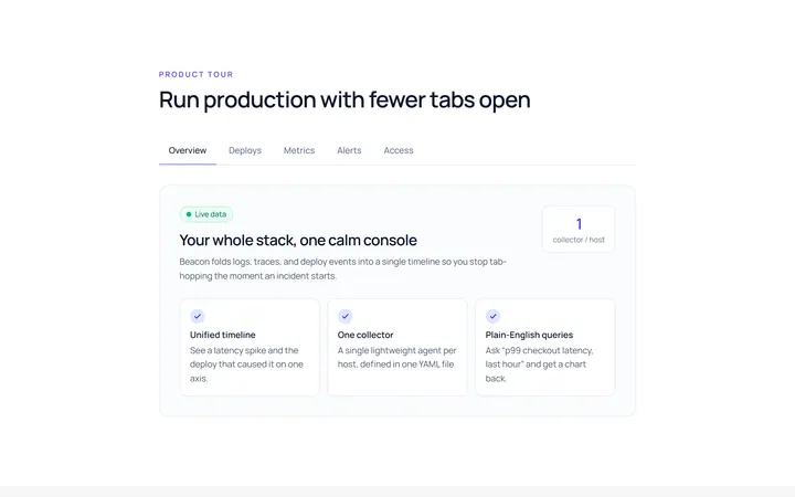
Underline Tab
Originalunderline tabs with sliding indicator
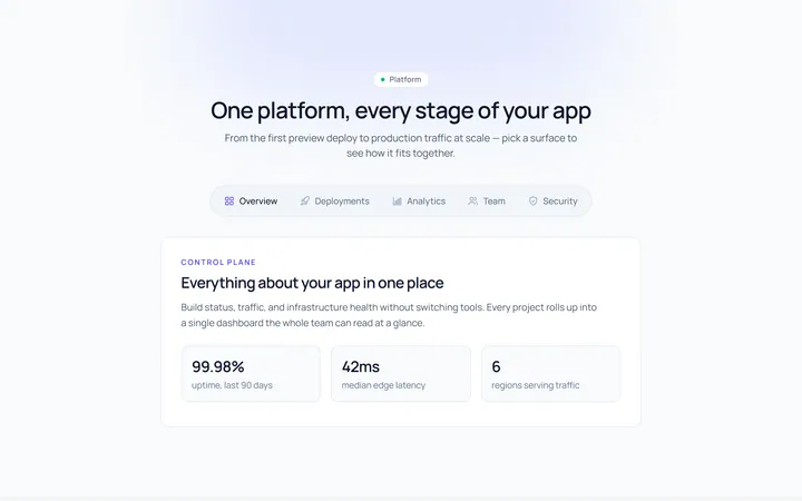
Pills Tab
Originalpill tabs
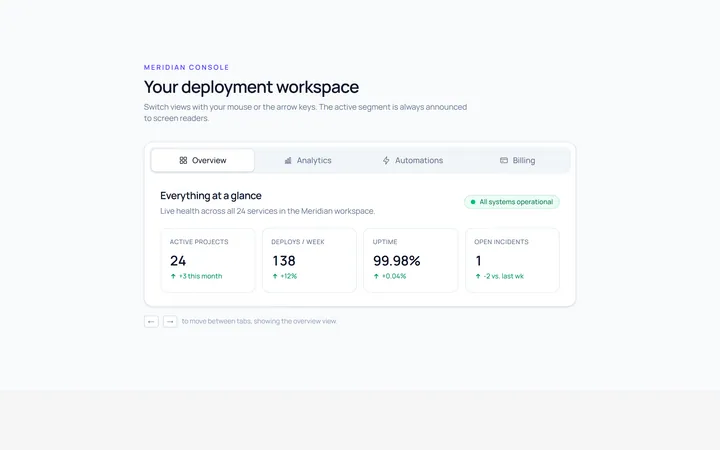
Boxed Tab
Originalboxed/segmented tabs
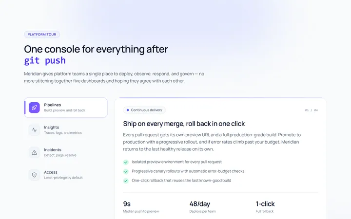
Vertical Tab
Originalvertical tabs
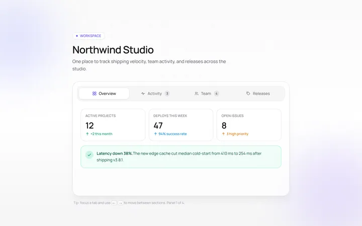
Icons Tab
Originaltabs with icons
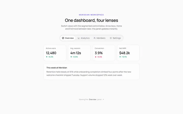
Segmented Tab
Originalsegmented control tabs
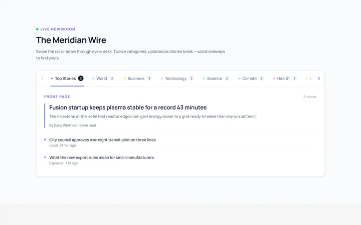
Scrollable Tab
Originalhorizontally scrollable tabs
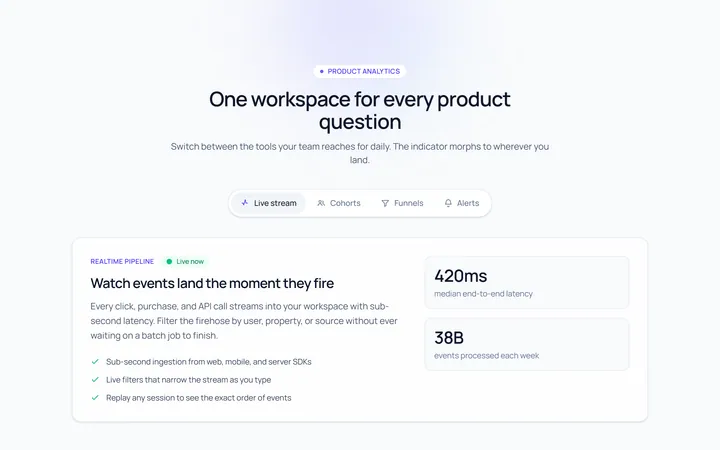
Animated Indicator Tab
Originaltabs with a morphing indicator
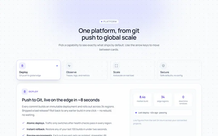
Cards Tab
Originalcard-style tabs with panels
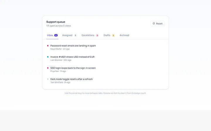
With Badge Tab
Originaltabs with count badges
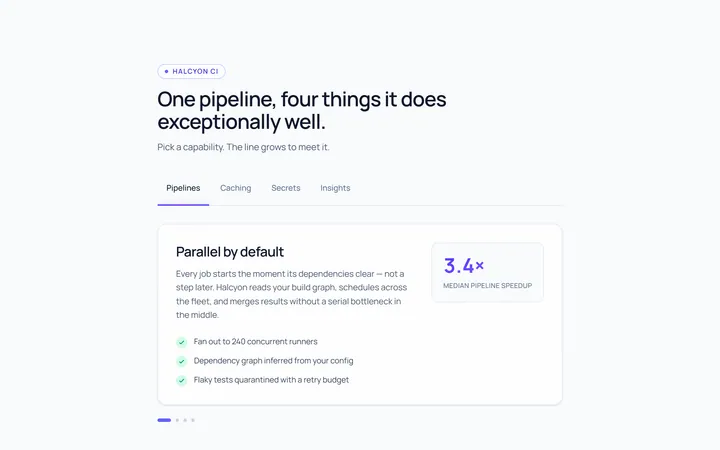
Line Grow Tab
Originaltabs where the underline grows in

Spotlight Hero
OriginalA centred hero with a soft radial spotlight, badge and dual call-to-action.