

Arrow Tooltip
Original · freetooltips with an arrow
byWeb InnoventixReact + Tailwind
tiparrowtooltips
Copy prompt gives Claude Code, Cursor or v0 a ready-to-paste prompt that recreates this exact component.
npx shadcn@latest add https://webinnoventix.com/r/tip-arrow.jsontip-arrow.tsx
"use client";
import {
cloneElement,
useEffect,
useId,
useRef,
useState,
type KeyboardEvent,
type ReactElement,
type ReactNode,
} from "react";
import { AnimatePresence, motion, useReducedMotion } from "motion/react";
type Placement = "top" | "right" | "bottom" | "left";
const PLACEMENTS: Placement[] = ["top", "right", "bottom", "left"];
const CONTAINER_POS: Record<Placement, string> = {
top: "bottom-full left-1/2 mb-2.5",
bottom: "top-full left-1/2 mt-2.5",
left: "right-full top-1/2 mr-2.5",
right: "left-full top-1/2 ml-2.5",
};
const ARROW_POS: Record<Placement, string> = {
top: "bottom-0 left-1/2 -translate-x-1/2 translate-y-1/2 rotate-45",
bottom: "top-0 left-1/2 -translate-x-1/2 -translate-y-1/2 rotate-45",
left: "right-0 top-1/2 -translate-y-1/2 translate-x-1/2 rotate-45",
right: "left-0 top-1/2 -translate-y-1/2 -translate-x-1/2 rotate-45",
};
const ARROW_ROTATION: Record<Placement, string> = {
top: "rotate-0",
right: "rotate-90",
bottom: "rotate-180",
left: "-rotate-90",
};
const PLACEMENT_LABEL: Record<Placement, string> = {
top: "Top",
right: "Right",
bottom: "Bottom",
left: "Left",
};
function svgProps(size: string) {
return {
viewBox: "0 0 24 24",
fill: "none",
stroke: "currentColor",
strokeWidth: 1.75,
strokeLinecap: "round" as const,
strokeLinejoin: "round" as const,
"aria-hidden": true,
className: size,
};
}
function BoldIcon() {
return (
<svg {...svgProps("h-4 w-4")}>
<path d="M7 5h6a3.5 3.5 0 0 1 0 7H7z" />
<path d="M7 12h7a3.5 3.5 0 0 1 0 7H7z" />
</svg>
);
}
function ItalicIcon() {
return (
<svg {...svgProps("h-4 w-4")}>
<line x1="10" y1="4" x2="19" y2="4" />
<line x1="5" y1="20" x2="14" y2="20" />
<line x1="15" y1="4" x2="9" y2="20" />
</svg>
);
}
function UnderlineIcon() {
return (
<svg {...svgProps("h-4 w-4")}>
<path d="M6 4v6a6 6 0 0 0 12 0V4" />
<line x1="4" y1="21" x2="20" y2="21" />
</svg>
);
}
function LinkIcon() {
return (
<svg {...svgProps("h-4 w-4")}>
<path d="M10 13a5 5 0 0 0 7 0l2-2a5 5 0 0 0-7-7l-1 1" />
<path d="M14 11a5 5 0 0 0-7 0l-2 2a5 5 0 0 0 7 7l1-1" />
</svg>
);
}
function CodeIcon() {
return (
<svg {...svgProps("h-4 w-4")}>
<polyline points="16 6 22 12 16 18" />
<polyline points="8 6 2 12 8 18" />
</svg>
);
}
function ArrowIcon() {
return (
<svg {...svgProps("h-3.5 w-3.5")}>
<path d="M12 19V5" />
<path d="M5 12l7-7 7 7" />
</svg>
);
}
type Tool = {
key: string;
label: string;
description: string;
shortcut: string;
icon: ReactNode;
};
const TOOLS: Tool[] = [
{ key: "bold", label: "Bold", description: "Emphasise the selected text.", shortcut: "B", icon: <BoldIcon /> },
{ key: "italic", label: "Italic", description: "Slant the selected text.", shortcut: "I", icon: <ItalicIcon /> },
{ key: "underline", label: "Underline", description: "Add a baseline rule.", shortcut: "U", icon: <UnderlineIcon /> },
{ key: "link", label: "Insert link", description: "Wrap the selection in a URL.", shortcut: "K", icon: <LinkIcon /> },
{ key: "code", label: "Inline code", description: "Format as monospaced code.", shortcut: "E", icon: <CodeIcon /> },
];
type TooltipProps = {
label: string;
description?: string;
shortcut?: string;
placement: Placement;
delay: number;
reduced: boolean;
children: ReactElement;
};
function Tooltip({ label, description, shortcut, placement, delay, reduced, children }: TooltipProps) {
const [open, setOpen] = useState(false);
const id = useId();
const timer = useRef<ReturnType<typeof setTimeout> | null>(null);
const clear = () => {
if (timer.current) {
clearTimeout(timer.current);
timer.current = null;
}
};
useEffect(() => {
return () => clear();
}, []);
const openNow = () => {
clear();
setOpen(true);
};
const openDelayed = () => {
clear();
if (delay <= 0) {
setOpen(true);
return;
}
timer.current = setTimeout(() => setOpen(true), delay);
};
const close = () => {
clear();
setOpen(false);
};
const onKeyDown = (event: KeyboardEvent<HTMLSpanElement>) => {
if (event.key === "Escape" && open) {
event.stopPropagation();
close();
}
};
const isVertical = placement === "top" || placement === "bottom";
const restX: string | number = isVertical ? "-50%" : 0;
const restY: string | number = isVertical ? 0 : "-50%";
const slide = placement === "top" || placement === "left" ? 4 : -4;
const fromX: string | number = isVertical ? restX : slide;
const fromY: string | number = isVertical ? slide : restY;
const variants = reduced
? {
hidden: { opacity: 0, x: restX, y: restY },
shown: { opacity: 1, x: restX, y: restY },
}
: {
hidden: { opacity: 0, scale: 0.94, x: fromX, y: fromY },
shown: { opacity: 1, scale: 1, x: restX, y: restY },
};
return (
<span
className="relative inline-flex"
onMouseEnter={openDelayed}
onMouseLeave={close}
onFocus={openNow}
onBlur={close}
onKeyDown={onKeyDown}
>
{cloneElement(children, { "aria-describedby": open ? id : undefined })}
<AnimatePresence>
{open && (
<motion.span
key={placement}
id={id}
role="tooltip"
variants={variants}
initial="hidden"
animate="shown"
exit="hidden"
transition={{ duration: reduced ? 0.12 : 0.18, ease: [0.16, 1, 0.3, 1] }}
className={`pointer-events-none absolute z-50 block w-max max-w-[15rem] rounded-lg bg-slate-900 px-3 py-2 text-left text-xs leading-snug text-slate-50 shadow-xl shadow-slate-900/25 ring-1 ring-slate-900/10 dark:bg-slate-100 dark:text-slate-900 dark:shadow-black/50 dark:ring-white/10 ${CONTAINER_POS[placement]}`}
>
<span className="block font-semibold tracking-tight">{label}</span>
{description ? (
<span className="mt-0.5 block text-[0.7rem] font-normal text-slate-300 dark:text-slate-600">
{description}
</span>
) : null}
{shortcut ? (
<span className="mt-1.5 flex items-center gap-1 text-[0.65rem] text-slate-400 dark:text-slate-500">
<kbd className="rounded border border-white/15 bg-white/10 px-1.5 py-0.5 font-mono text-[0.65rem] font-medium text-slate-100 dark:border-slate-900/15 dark:bg-slate-900/10 dark:text-slate-700">
Ctrl
</kbd>
<span aria-hidden="true">+</span>
<kbd className="rounded border border-white/15 bg-white/10 px-1.5 py-0.5 font-mono text-[0.65rem] font-medium text-slate-100 dark:border-slate-900/15 dark:bg-slate-900/10 dark:text-slate-700">
{shortcut}
</kbd>
</span>
) : null}
<span
aria-hidden="true"
className={`absolute h-2.5 w-2.5 bg-slate-900 dark:bg-slate-100 ${ARROW_POS[placement]}`}
/>
</motion.span>
)}
</AnimatePresence>
</span>
);
}
export default function TipArrow() {
const [placement, setPlacement] = useState<Placement>("top");
const [delay, setDelay] = useState(120);
const radioRefs = useRef<(HTMLButtonElement | null)[]>([]);
const prefersReduced = useReducedMotion() ?? false;
const onRadioKeyDown = (event: KeyboardEvent<HTMLButtonElement>, index: number) => {
let next = index;
if (event.key === "ArrowRight" || event.key === "ArrowDown") {
next = (index + 1) % PLACEMENTS.length;
} else if (event.key === "ArrowLeft" || event.key === "ArrowUp") {
next = (index - 1 + PLACEMENTS.length) % PLACEMENTS.length;
} else if (event.key === "Home") {
next = 0;
} else if (event.key === "End") {
next = PLACEMENTS.length - 1;
} else {
return;
}
event.preventDefault();
setPlacement(PLACEMENTS[next]);
radioRefs.current[next]?.focus();
};
const triggerButton =
"inline-flex h-11 w-11 items-center justify-center rounded-lg text-slate-600 transition-colors hover:bg-white hover:text-indigo-600 hover:shadow-sm focus-visible:outline-none focus-visible:ring-2 focus-visible:ring-indigo-500 focus-visible:ring-offset-2 focus-visible:ring-offset-slate-100 dark:text-slate-300 dark:hover:bg-slate-950 dark:hover:text-indigo-300 dark:focus-visible:ring-offset-slate-800";
const inlineTrigger =
"rounded-sm font-semibold text-indigo-700 underline decoration-dotted decoration-indigo-400 underline-offset-4 transition-colors hover:text-indigo-500 hover:decoration-indigo-500 focus-visible:outline-none focus-visible:ring-2 focus-visible:ring-indigo-500 focus-visible:ring-offset-2 focus-visible:ring-offset-white dark:text-indigo-300 dark:decoration-indigo-500 dark:hover:text-indigo-200 dark:focus-visible:ring-offset-slate-900";
return (
<section className="relative w-full overflow-hidden bg-gradient-to-b from-slate-50 to-white px-6 py-20 text-slate-900 sm:px-10 dark:from-slate-950 dark:to-slate-900 dark:text-slate-100">
<style>{`
@keyframes tiparrow-pulse {
0%, 100% { opacity: 1; transform: scale(1); }
50% { opacity: 0.45; transform: scale(0.72); }
}
@keyframes tiparrow-ring {
0% { transform: scale(0.85); opacity: 0.7; }
100% { transform: scale(2.4); opacity: 0; }
}
.tiparrow-pulse { animation: tiparrow-pulse 2.4s ease-in-out infinite; }
.tiparrow-ring { animation: tiparrow-ring 2.4s ease-out infinite; }
@media (prefers-reduced-motion: reduce) {
.tiparrow-pulse, .tiparrow-ring { animation: none !important; }
}
`}</style>
<div
aria-hidden="true"
className="pointer-events-none absolute -top-24 left-1/2 h-72 w-72 -translate-x-1/2 rounded-full bg-indigo-300/20 blur-3xl dark:bg-indigo-500/10"
/>
<div className="relative mx-auto max-w-3xl">
<header className="mb-12 text-center">
<span className="inline-flex items-center gap-2 rounded-full border border-slate-200 bg-white px-3 py-1 text-xs font-medium text-slate-600 shadow-sm dark:border-slate-800 dark:bg-slate-900 dark:text-slate-300">
<span className="relative flex h-2 w-2">
<span className="tiparrow-ring absolute inline-flex h-full w-full rounded-full bg-emerald-500" />
<span className="tiparrow-pulse relative inline-flex h-2 w-2 rounded-full bg-emerald-500" />
</span>
Interactive demo
</span>
<h2 className="mt-5 text-balance text-3xl font-semibold tracking-tight sm:text-4xl">
Tooltips that point where it matters
</h2>
<p className="mx-auto mt-4 max-w-xl text-pretty text-base leading-relaxed text-slate-600 dark:text-slate-400">
An accessible, anchored tooltip with a matching arrow on all four sides. Hover or focus
a control, press{" "}
<kbd className="rounded border border-slate-300 bg-slate-100 px-1.5 py-0.5 font-mono text-xs text-slate-700 dark:border-slate-700 dark:bg-slate-800 dark:text-slate-300">
Esc
</kbd>{" "}
to dismiss.
</p>
</header>
<div className="rounded-2xl border border-slate-200 bg-white/70 p-6 shadow-sm backdrop-blur-sm sm:p-8 dark:border-slate-800 dark:bg-slate-900/60">
<div className="flex flex-col gap-6 border-b border-slate-200 pb-6 sm:flex-row sm:items-end sm:justify-between dark:border-slate-800">
<div>
<span
id="tiparrow-placement-label"
className="mb-2 block text-sm font-medium text-slate-700 dark:text-slate-300"
>
Arrow placement
</span>
<div
role="radiogroup"
aria-labelledby="tiparrow-placement-label"
className="inline-flex rounded-lg bg-slate-100 p-1 dark:bg-slate-800"
>
{PLACEMENTS.map((option, index) => {
const selected = placement === option;
return (
<button
key={option}
ref={(node) => {
radioRefs.current[index] = node;
}}
type="button"
role="radio"
aria-checked={selected}
tabIndex={selected ? 0 : -1}
onClick={() => setPlacement(option)}
onKeyDown={(event) => onRadioKeyDown(event, index)}
className={`inline-flex items-center gap-1.5 rounded-md px-3 py-1.5 text-sm font-medium transition-colors focus-visible:outline-none focus-visible:ring-2 focus-visible:ring-indigo-500 focus-visible:ring-offset-2 focus-visible:ring-offset-slate-100 dark:focus-visible:ring-offset-slate-800 ${
selected
? "bg-white text-indigo-700 shadow-sm dark:bg-slate-950 dark:text-indigo-300"
: "text-slate-500 hover:text-slate-800 dark:text-slate-400 dark:hover:text-slate-100"
}`}
>
<span className={ARROW_ROTATION[option]}>
<ArrowIcon />
</span>
{PLACEMENT_LABEL[option]}
</button>
);
})}
</div>
</div>
<div className="sm:text-right">
<label
htmlFor="tiparrow-delay"
className="mb-2 block text-sm font-medium text-slate-700 dark:text-slate-300"
>
Hover delay
<span className="ml-2 font-mono text-xs font-normal text-indigo-600 dark:text-indigo-400">
{delay} ms
</span>
</label>
<input
id="tiparrow-delay"
type="range"
min={0}
max={600}
step={60}
value={delay}
onChange={(event) => setDelay(Number(event.target.value))}
className="h-2 w-full cursor-pointer appearance-none rounded-full bg-slate-200 accent-indigo-600 sm:w-52 dark:bg-slate-700"
/>
</div>
</div>
<div className="flex min-h-[13rem] items-center justify-center py-8">
<div
role="toolbar"
aria-label="Text formatting"
className="inline-flex items-center gap-1 rounded-xl border border-slate-200 bg-slate-100 p-1.5 shadow-inner dark:border-slate-700 dark:bg-slate-800"
>
{TOOLS.map((tool, index) => (
<span key={tool.key} className="inline-flex items-center">
<Tooltip
label={tool.label}
description={tool.description}
shortcut={tool.shortcut}
placement={placement}
delay={delay}
reduced={prefersReduced}
>
<button type="button" aria-label={tool.label} className={triggerButton}>
{tool.icon}
</button>
</Tooltip>
{index === 2 ? (
<span aria-hidden="true" className="mx-1 h-6 w-px bg-slate-300 dark:bg-slate-600" />
) : null}
</span>
))}
</div>
</div>
<p className="border-t border-slate-200 pt-6 text-center text-sm leading-relaxed text-slate-600 dark:border-slate-800 dark:text-slate-400">
Ships as a{" "}
<Tooltip
label="Headless behaviour"
description="Swap the box styling freely; the positioning and wiring stay intact."
placement={placement}
delay={delay}
reduced={prefersReduced}
>
<button type="button" className={inlineTrigger}>
headless
</button>
</Tooltip>{" "}
pattern, so the arrow{" "}
<Tooltip
label="Edge-anchored arrow"
description="A rotated square sits flush against the trigger on every side."
placement={placement}
delay={delay}
reduced={prefersReduced}
>
<button type="button" className={inlineTrigger}>
stays aligned
</button>
</Tooltip>{" "}
while the{" "}
<Tooltip
label="Built-in ARIA"
description="The trigger receives aria-describedby that targets role=tooltip."
placement={placement}
delay={delay}
reduced={prefersReduced}
>
<button type="button" className={inlineTrigger}>
ARIA wiring
</button>
</Tooltip>{" "}
comes wired in.
</p>
</div>
<ul className="mx-auto mt-8 flex max-w-2xl flex-wrap justify-center gap-x-6 gap-y-2 text-center text-xs text-slate-500 dark:text-slate-500">
<li>Opens on hover and keyboard focus</li>
<li aria-hidden="true" className="text-slate-300 dark:text-slate-700">
·
</li>
<li>Arrow keys switch placement</li>
<li aria-hidden="true" className="text-slate-300 dark:text-slate-700">
·
</li>
<li>Escape dismisses</li>
<li aria-hidden="true" className="text-slate-300 dark:text-slate-700">
·
</li>
<li>Respects reduced motion</li>
</ul>
</div>
</section>
);
}Dependencies
motion
Licence
Built by Web Innoventix. Free for personal and commercial use, no attribution required.
Built by Web Innoventix
Need a custom interface, a full website, or SEO that gets you cited by AI? We design, build and rank it end to end.
Get a free quoteSimilar components
Browse all →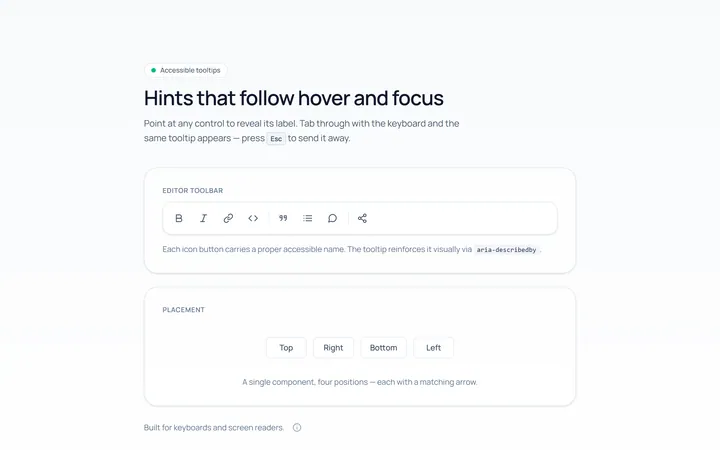
Basic Tooltip
Originalbasic tooltips on hover
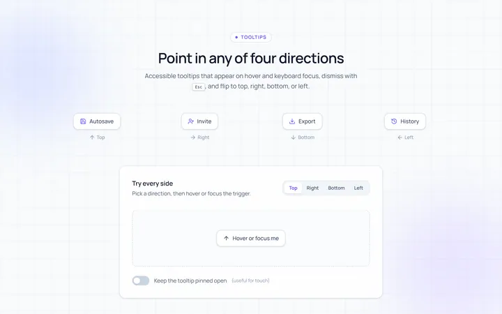
Directions Tooltip
Originaltooltips in four directions
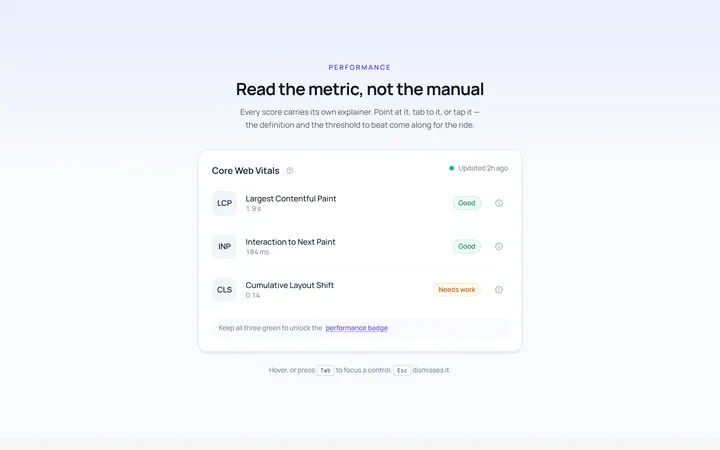
Rich Tooltip
Originalrich tooltip with title and body
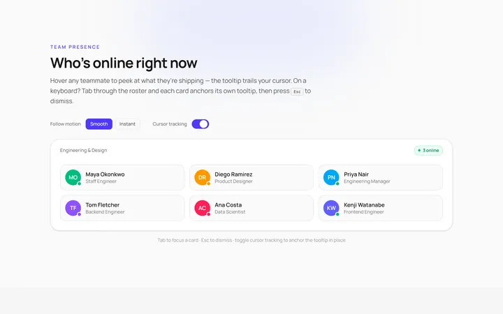
Follow Cursor Tooltip
Originaltooltip that follows the cursor
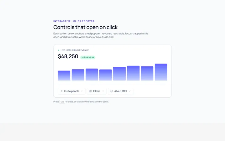
Popover Tooltip
Originalclick popover with content
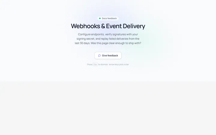
Popover Form Tooltip
Originalpopover containing a mini form
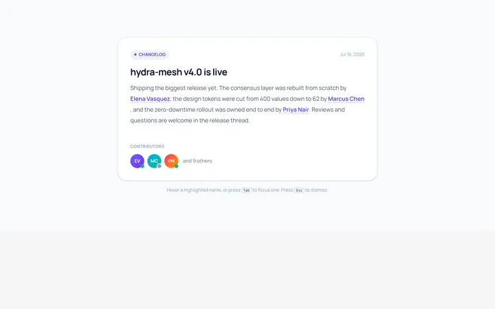
Hover Card Tooltip
Originalprofile hover card
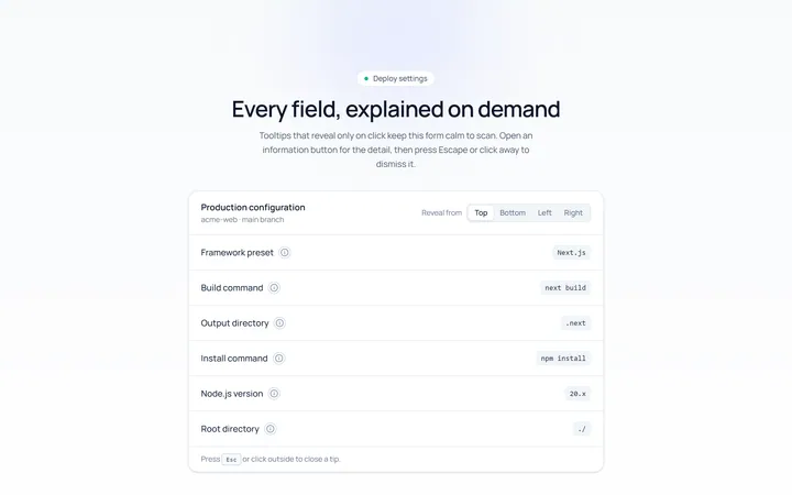
Click Tooltip
Originalclick-to-reveal tooltip
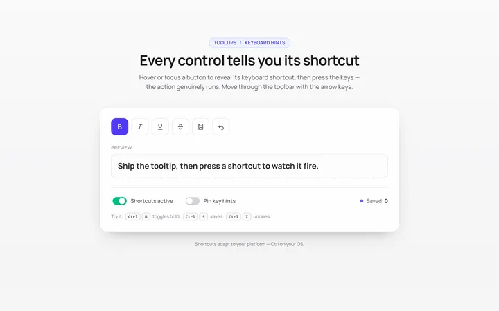
Keyboard Hint Tooltip
Originalkeyboard shortcut hint tooltips
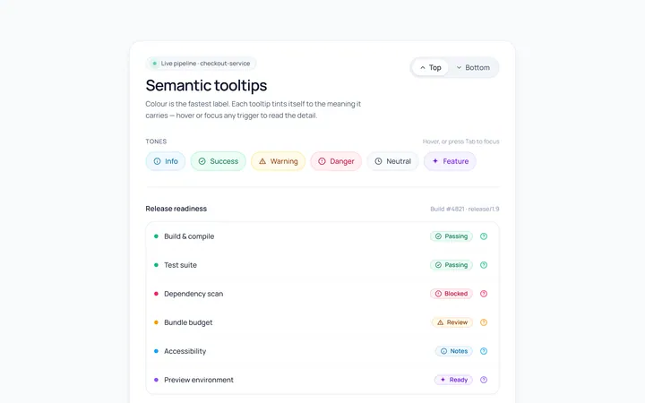
Color Tooltip
Originalcoloured semantic tooltips
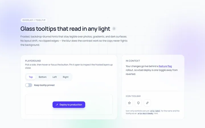
Glass Tooltip
Originalglassmorphic tooltips

Spotlight Hero
OriginalA centred hero with a soft radial spotlight, badge and dual call-to-action.