

Rich Tooltip
Original · freerich tooltip with title and body
byWeb InnoventixReact + Tailwind
tiprichtooltips
Copy prompt gives Claude Code, Cursor or v0 a ready-to-paste prompt that recreates this exact component.
npx shadcn@latest add https://webinnoventix.com/r/tip-rich.jsontip-rich.tsx
"use client";

import { useEffect, useId, useRef, useState } from "react";
import type { ReactNode } from "react";
import { AnimatePresence, motion, useReducedMotion } from "motion/react";

type Placement = "top" | "bottom" | "left" | "right";

interface RichTooltipProps {
  title: string;
  body: string;
  meta?: string;
  placement?: Placement;
  label: string;
  children: ReactNode;
  className?: string;
}

interface Metric {
  abbr: string;
  name: string;
  value: string;
  status: string;
  good: boolean;
  title: string;
  body: string;
  meta: string;
}

const panelPosition: Record<Placement, string> = {
  top: "bottom-full left-1/2 -translate-x-1/2 mb-2.5",
  bottom: "top-full left-1/2 -translate-x-1/2 mt-2.5",
  left: "right-full top-1/2 -translate-y-1/2 mr-2.5",
  right: "left-full top-1/2 -translate-y-1/2 ml-2.5",
};

const arrowPosition: Record<Placement, string> = {
  top: "left-1/2 top-full -translate-x-1/2 -translate-y-1/2",
  bottom: "left-1/2 bottom-full -translate-x-1/2 translate-y-1/2",
  left: "top-1/2 left-full -translate-y-1/2 -translate-x-1/2",
  right: "top-1/2 right-full -translate-y-1/2 translate-x-1/2",
};

const enterOffset: Record<Placement, { x?: number; y?: number }> = {
  top: { y: 4 },
  bottom: { y: -4 },
  left: { x: 4 },
  right: { x: -4 },
};

function InfoIcon() {
  return (
    <svg viewBox="0 0 20 20" fill="none" aria-hidden="true" className="h-4 w-4">
      <circle cx="10" cy="10" r="7.25" stroke="currentColor" strokeWidth="1.4" />
      <path d="M10 9v4.25" stroke="currentColor" strokeWidth="1.4" strokeLinecap="round" />
      <circle cx="10" cy="6.4" r="0.95" fill="currentColor" />
    </svg>
  );
}

function HelpIcon() {
  return (
    <svg viewBox="0 0 20 20" fill="none" aria-hidden="true" className="h-3.5 w-3.5">
      <circle cx="10" cy="10" r="7.25" stroke="currentColor" strokeWidth="1.4" />
      <path
        d="M8.1 7.7a1.9 1.9 0 0 1 3.6.8c0 1.3-1.7 1.6-1.7 2.7"
        stroke="currentColor"
        strokeWidth="1.4"
        strokeLinecap="round"
        strokeLinejoin="round"
      />
      <circle cx="10" cy="13.7" r="0.95" fill="currentColor" />
    </svg>
  );
}

function RichTooltip({
  title,
  body,
  meta,
  placement = "top",
  label,
  children,
  className,
}: RichTooltipProps) {
  const [open, setOpen] = useState(false);
  const tooltipId = useId();
  const timer = useRef<number | null>(null);
  const reduce = useReducedMotion();

  useEffect(() => {
    return () => {
      if (timer.current !== null) window.clearTimeout(timer.current);
    };
  }, []);

  const scheduleOpen = () => {
    if (timer.current !== null) window.clearTimeout(timer.current);
    timer.current = window.setTimeout(() => setOpen(true), 120);
  };

  const close = () => {
    if (timer.current !== null) {
      window.clearTimeout(timer.current);
      timer.current = null;
    }
    setOpen(false);
  };

  const offset = enterOffset[placement];
  const hidden = reduce ? { opacity: 0 } : { opacity: 0, scale: 0.96, ...offset };
  const shown = { opacity: 1, scale: 1, x: 0, y: 0 };

  return (
    <span
      className="relative inline-flex"
      onMouseEnter={scheduleOpen}
      onMouseLeave={close}
      onKeyDown={(e) => {
        if (e.key === "Escape") close();
      }}
    >
      <button
        type="button"
        aria-label={label}
        aria-describedby={open ? tooltipId : undefined}
        aria-expanded={open}
        onFocus={() => setOpen(true)}
        onBlur={close}
        onClick={() => setOpen((v) => !v)}
        className={
          "inline-flex items-center justify-center rounded-full text-slate-400 outline-none transition-colors hover:text-indigo-600 focus-visible:ring-2 focus-visible:ring-indigo-500 focus-visible:ring-offset-2 focus-visible:ring-offset-white dark:text-slate-500 dark:hover:text-indigo-300 dark:focus-visible:ring-offset-slate-900 " +
          (className ?? "")
        }
      >
        {children}
      </button>

      <AnimatePresence>
        {open ? (
          <motion.span
            key={tooltipId}
            role="tooltip"
            id={tooltipId}
            initial={hidden}
            animate={shown}
            exit={hidden}
            transition={reduce ? { duration: 0 } : { duration: 0.16, ease: [0.16, 1, 0.3, 1] }}
            className={"pointer-events-none absolute z-20 block w-64 " + panelPosition[placement]}
          >
            <span
              aria-hidden="true"
              className={
                "absolute z-0 h-2.5 w-2.5 rotate-45 rounded-[2px] border border-slate-200 bg-white dark:border-slate-700 dark:bg-slate-900 " +
                arrowPosition[placement]
              }
            />
            <span className="relative z-10 block rounded-xl border border-slate-200 bg-white p-3.5 text-left shadow-xl shadow-slate-900/10 dark:border-slate-700 dark:bg-slate-900 dark:shadow-black/40">
              <span className="flex items-start gap-2.5">
                <span className="mt-0.5 flex h-6 w-6 shrink-0 items-center justify-center rounded-lg bg-indigo-50 text-indigo-600 dark:bg-indigo-500/15 dark:text-indigo-300">
                  <InfoIcon />
                </span>
                <span className="block">
                  <span className="block text-sm font-semibold text-slate-900 dark:text-white">
                    {title}
                  </span>
                  <span className="mt-1 block text-[13px] leading-relaxed text-slate-600 dark:text-slate-300">
                    {body}
                  </span>
                  {meta ? (
                    <span className="mt-2.5 inline-flex items-center gap-1.5 rounded-md bg-slate-100 px-2 py-1 text-[11px] font-medium text-slate-600 dark:bg-slate-800 dark:text-slate-300">
                      <span className="h-1.5 w-1.5 rounded-full bg-emerald-500" />
                      {meta}
                    </span>
                  ) : null}
                </span>
              </span>
            </span>
          </motion.span>
        ) : null}
      </AnimatePresence>
    </span>
  );
}

const pillBase =
  "inline-flex items-center rounded-full px-2.5 py-1 text-xs font-medium ring-1 ring-inset ";
const goodPill =
  pillBase +
  "bg-emerald-50 text-emerald-700 ring-emerald-600/20 dark:bg-emerald-500/10 dark:text-emerald-300 dark:ring-emerald-400/20";
const warnPill =
  pillBase +
  "bg-amber-50 text-amber-700 ring-amber-600/20 dark:bg-amber-500/10 dark:text-amber-300 dark:ring-amber-400/20";

const metrics: Metric[] = [
  {
    abbr: "LCP",
    name: "Largest Contentful Paint",
    value: "1.9 s",
    status: "Good",
    good: true,
    title: "Largest Contentful Paint",
    body: "Marks when the biggest image or block of text in the viewport finishes rendering — the moment the page first feels loaded to a visitor.",
    meta: "Good ≤ 2.5 s",
  },
  {
    abbr: "INP",
    name: "Interaction to Next Paint",
    value: "184 ms",
    status: "Good",
    good: true,
    title: "Interaction to Next Paint",
    body: "The delay between a tap, click or keypress and the next frame the browser paints. It samples the worst interactions across the whole visit.",
    meta: "Good ≤ 200 ms",
  },
  {
    abbr: "CLS",
    name: "Cumulative Layout Shift",
    value: "0.14",
    status: "Needs work",
    good: false,
    title: "Cumulative Layout Shift",
    body: "Adds up how far visible elements jump while the page settles. Reserve height for images, ads and embeds so content never shoves under a reader's thumb.",
    meta: "Good ≤ 0.10",
  },
];

const keyframes = `
@keyframes tiprich-pulse {
  0%, 100% { opacity: 0.55; transform: scale(1); }
  70% { opacity: 0; transform: scale(2.4); }
}
.tiprich-live::after {
  content: "";
  position: absolute;
  inset: 0;
  border-radius: 9999px;
  background: currentColor;
  animation: tiprich-pulse 2.4s cubic-bezier(0.4, 0, 0.2, 1) infinite;
}
@media (prefers-reduced-motion: reduce) {
  .tiprich-live::after { animation: none; opacity: 0; }
}
`;

export default function TipRich() {
  return (
    <section className="relative w-full overflow-hidden bg-slate-50 px-6 py-20 dark:bg-slate-950 sm:py-28">
      <style>{keyframes}</style>

      <div
        aria-hidden="true"
        className="pointer-events-none absolute inset-x-0 top-0 h-72 bg-gradient-to-b from-indigo-100/60 to-transparent dark:from-indigo-500/10"
      />

      <div className="relative mx-auto max-w-xl">
        <header className="text-center">
          <p className="text-xs font-semibold uppercase tracking-[0.18em] text-indigo-600 dark:text-indigo-400">
            Performance
          </p>
          <h2 className="mt-3 text-2xl font-bold tracking-tight text-slate-900 dark:text-white sm:text-3xl">
            Read the metric, not the manual
          </h2>
          <p className="mx-auto mt-3 max-w-md text-sm leading-relaxed text-slate-600 dark:text-slate-300">
            Every score carries its own explainer. Point at it, tab to it, or tap it — the
            definition and the threshold to beat come along for the ride.
          </p>
        </header>

        <div className="mt-8 rounded-2xl border border-slate-200 bg-white p-5 shadow-sm dark:border-slate-800 dark:bg-slate-900 sm:p-6">
          <div className="flex items-start justify-between gap-4">
            <div className="flex items-center gap-1.5">
              <h3 className="text-base font-semibold text-slate-900 dark:text-white">
                Core Web Vitals
              </h3>
              <RichTooltip
                placement="bottom"
                label="About this report"
                title="About this report"
                body="Field data from the Chrome UX Report, refreshed hourly. Each score reflects the 75th percentile of real visits over the trailing 28 days."
                meta="p75 · mobile"
                className="h-6 w-6"
              >
                <HelpIcon />
              </RichTooltip>
            </div>
            <span className="flex items-center gap-2 text-xs text-slate-500 dark:text-slate-400">
              <span className="relative inline-flex h-2 w-2 text-emerald-500">
                <span className="tiprich-live absolute inset-0 inline-flex rounded-full" />
                <span className="relative inline-flex h-2 w-2 rounded-full bg-emerald-500" />
              </span>
              Updated 2h ago
            </span>
          </div>

          <ul role="list" className="mt-2 divide-y divide-slate-100 dark:divide-slate-800">
            {metrics.map((m) => (
              <li key={m.abbr} className="flex items-center gap-4 py-4">
                <span className="flex h-11 w-11 shrink-0 items-center justify-center rounded-xl bg-slate-100 text-sm font-bold tracking-tight text-slate-700 dark:bg-slate-800 dark:text-slate-200">
                  {m.abbr}
                </span>
                <span className="min-w-0 flex-1">
                  <span className="block truncate text-sm font-medium text-slate-900 dark:text-white">
                    {m.name}
                  </span>
                  <span className="block text-xs tabular-nums text-slate-500 dark:text-slate-400">
                    {m.value}
                  </span>
                </span>
                <span className={m.good ? goodPill : warnPill}>{m.status}</span>
                <RichTooltip
                  placement="left"
                  label={"What " + m.name + " measures"}
                  title={m.title}
                  body={m.body}
                  meta={m.meta}
                  className="h-8 w-8"
                >
                  <InfoIcon />
                </RichTooltip>
              </li>
            ))}
          </ul>

          <div className="mt-3 flex flex-wrap items-center gap-x-1.5 gap-y-1 rounded-lg bg-slate-50 px-3 py-2.5 text-xs text-slate-500 dark:bg-slate-800/50 dark:text-slate-400">
            <span>Keep all three green to unlock the</span>
            <RichTooltip
              placement="top"
              label="What the performance badge is"
              title="Performance badge"
              body="Hold every metric in the green for seven days straight and your listing earns a fast-site badge in search and directory results."
              meta="7-day streak"
              className="!rounded font-medium !text-indigo-600 underline decoration-dotted underline-offset-2 hover:!text-indigo-700 dark:!text-indigo-300 dark:hover:!text-indigo-200"
            >
              performance badge
            </RichTooltip>
            <span>.</span>
          </div>
        </div>

        <p className="mt-6 text-center text-xs text-slate-500 dark:text-slate-400">
          Hover, or press{" "}
          <kbd className="rounded border border-slate-300 bg-white px-1.5 py-0.5 font-mono text-[11px] text-slate-600 dark:border-slate-700 dark:bg-slate-800 dark:text-slate-300">
            Tab
          </kbd>{" "}
          to focus a control.{" "}
          <kbd className="rounded border border-slate-300 bg-white px-1.5 py-0.5 font-mono text-[11px] text-slate-600 dark:border-slate-700 dark:bg-slate-800 dark:text-slate-300">
            Esc
          </kbd>{" "}
          dismisses it.
        </p>
      </div>
    </section>
  );
}
Dependencies
motion
Licence
Built by Web Innoventix. Free for personal and commercial use, no attribution required.
Built by Web Innoventix
Need a custom interface, a full website, or SEO that gets you cited by AI? We design, build and rank it end to end.
Get a free quoteSimilar components
Browse all →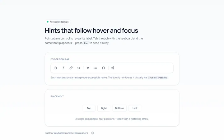
Basic Tooltip
Originalbasic tooltips on hover
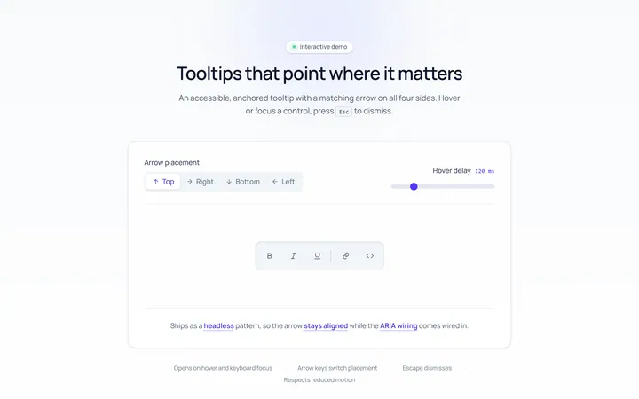
Arrow Tooltip
Originaltooltips with an arrow
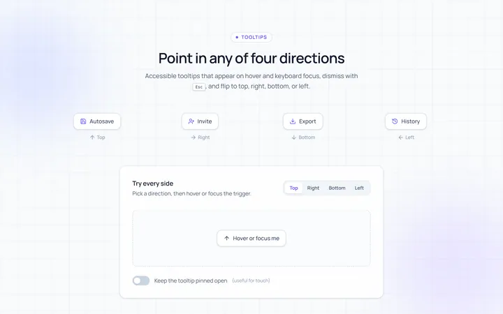
Directions Tooltip
Originaltooltips in four directions
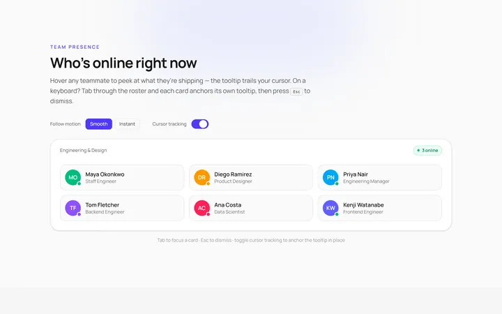
Follow Cursor Tooltip
Originaltooltip that follows the cursor
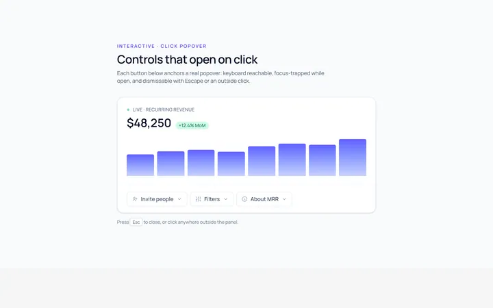
Popover Tooltip
Originalclick popover with content
Popover Form Tooltip
Originalpopover containing a mini form
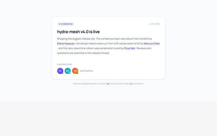
Hover Card Tooltip
Originalprofile hover card
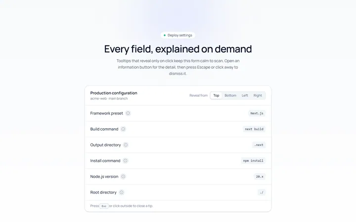
Click Tooltip
Originalclick-to-reveal tooltip
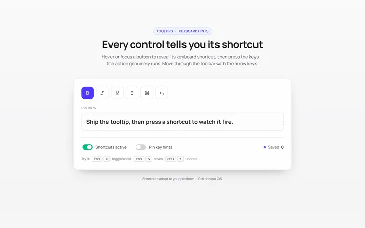
Keyboard Hint Tooltip
Originalkeyboard shortcut hint tooltips
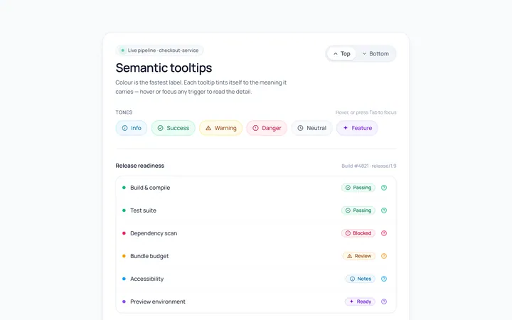
Color Tooltip
Originalcoloured semantic tooltips
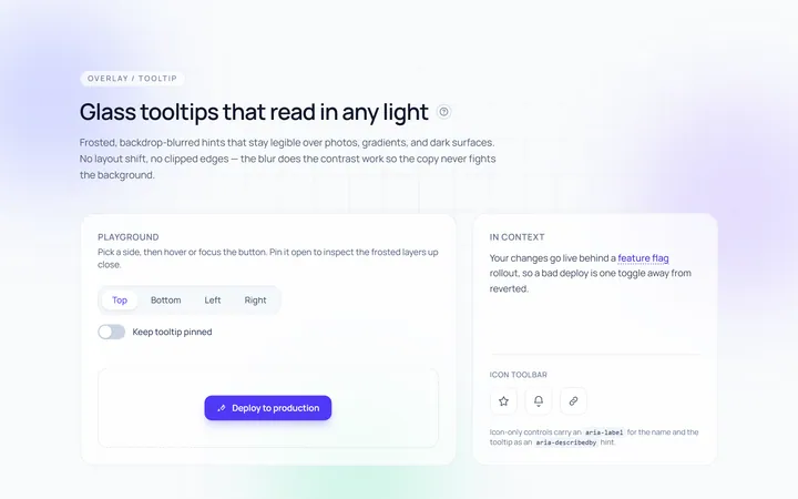
Glass Tooltip
Originalglassmorphic tooltips

Spotlight Hero
OriginalA centred hero with a soft radial spotlight, badge and dual call-to-action.