

Glass Tooltip
Original · freeglassmorphic tooltips
byWeb InnoventixReact + Tailwind
tipglasstooltips
Copy prompt gives Claude Code, Cursor or v0 a ready-to-paste prompt that recreates this exact component.
npx shadcn@latest add https://webinnoventix.com/r/tip-glass.jsontip-glass.tsx
"use client";

import {
  cloneElement,
  useId,
  useState,
  type ReactElement,
  type ReactNode,
} from "react";
import { AnimatePresence, motion, useReducedMotion } from "motion/react";

type Placement = "top" | "bottom" | "left" | "right";

const PLACEMENT_BOX: Record<Placement, string> = {
  top: "bottom-full left-1/2 -translate-x-1/2 mb-2.5",
  bottom: "top-full left-1/2 -translate-x-1/2 mt-2.5",
  left: "right-full top-1/2 -translate-y-1/2 mr-2.5",
  right: "left-full top-1/2 -translate-y-1/2 ml-2.5",
};

const ARROW_BOX: Record<Placement, string> = {
  top: "bottom-0 left-1/2 -translate-x-1/2 translate-y-1/2 border-b border-r",
  bottom: "top-0 left-1/2 -translate-x-1/2 -translate-y-1/2 border-t border-l",
  left: "right-0 top-1/2 translate-x-1/2 -translate-y-1/2 border-t border-r",
  right: "left-0 top-1/2 -translate-x-1/2 -translate-y-1/2 border-b border-l",
};

const OFFSET: Record<Placement, { x: number; y: number }> = {
  top: { x: 0, y: 6 },
  bottom: { x: 0, y: -6 },
  left: { x: 6, y: 0 },
  right: { x: -6, y: 0 },
};

interface TooltipProps {
  content: ReactNode;
  children: ReactElement;
  placement?: Placement;
  forceOpen?: boolean;
}

function Tooltip({
  content,
  children,
  placement = "top",
  forceOpen = false,
}: TooltipProps) {
  const id = useId();
  const reduce = useReducedMotion();
  const [hovered, setHovered] = useState(false);
  const [focused, setFocused] = useState(false);
  const open = forceOpen || hovered || focused;

  const trigger = cloneElement(
    children as ReactElement<{ "aria-describedby"?: string }>,
    { "aria-describedby": open ? id : undefined },
  );

  const off = OFFSET[placement];

  return (
    <span
      className="relative inline-flex"
      onMouseEnter={() => setHovered(true)}
      onMouseLeave={() => setHovered(false)}
      onFocus={() => setFocused(true)}
      onBlur={() => setFocused(false)}
      onKeyDown={(e) => {
        if (e.key === "Escape") {
          setHovered(false);
          setFocused(false);
        }
      }}
    >
      {trigger}
      <AnimatePresence>
        {open && (
          <div
            className={`pointer-events-none absolute z-50 ${PLACEMENT_BOX[placement]}`}
          >
            <motion.div
              id={id}
              role="tooltip"
              initial={
                reduce
                  ? { opacity: 0 }
                  : { opacity: 0, scale: 0.94, x: off.x, y: off.y }
              }
              animate={
                reduce
                  ? { opacity: 1 }
                  : { opacity: 1, scale: 1, x: 0, y: 0 }
              }
              exit={
                reduce
                  ? { opacity: 0 }
                  : { opacity: 0, scale: 0.94, x: off.x, y: off.y }
              }
              transition={{
                duration: reduce ? 0.14 : 0.22,
                ease: [0.16, 1, 0.3, 1],
              }}
              className="relative w-max max-w-[16rem] rounded-2xl border border-white/50 bg-white/55 px-3.5 py-2.5 text-sm leading-snug text-slate-800 shadow-xl shadow-slate-900/10 ring-1 ring-white/40 backdrop-blur-xl backdrop-saturate-150 dark:border-white/10 dark:bg-slate-900/55 dark:text-slate-100 dark:shadow-black/40 dark:ring-white/5"
            >
              <span
                aria-hidden="true"
                className="pointer-events-none absolute inset-x-0 top-0 h-1/2 rounded-t-2xl bg-gradient-to-b from-white/55 to-transparent dark:from-white/10"
              />
              <div className="relative">{content}</div>
              <span
                aria-hidden="true"
                className={`absolute z-[-1] size-2.5 rotate-45 rounded-[3px] border-white/50 bg-white/55 backdrop-blur-xl dark:border-white/10 dark:bg-slate-900/55 ${ARROW_BOX[placement]}`}
              />
            </motion.div>
          </div>
        )}
      </AnimatePresence>
    </span>
  );
}

const PLACEMENTS: { value: Placement; label: string }[] = [
  { value: "top", label: "Top" },
  { value: "bottom", label: "Bottom" },
  { value: "left", label: "Left" },
  { value: "right", label: "Right" },
];

function StarIcon() {
  return (
    <svg
      viewBox="0 0 24 24"
      fill="none"
      stroke="currentColor"
      strokeWidth={1.6}
      strokeLinecap="round"
      strokeLinejoin="round"
      className="size-5"
      aria-hidden="true"
    >
      <path d="M12 3.5l2.6 5.3 5.9.86-4.25 4.14 1 5.86L12 17.9l-5.25 2.76 1-5.86L3.5 9.66l5.9-.86L12 3.5z" />
    </svg>
  );
}

function BellIcon() {
  return (
    <svg
      viewBox="0 0 24 24"
      fill="none"
      stroke="currentColor"
      strokeWidth={1.6}
      strokeLinecap="round"
      strokeLinejoin="round"
      className="size-5"
      aria-hidden="true"
    >
      <path d="M6 9a6 6 0 0112 0c0 4.5 1.5 6 1.5 6h-15S6 13.5 6 9z" />
      <path d="M10 20a2 2 0 004 0" />
    </svg>
  );
}

function LinkIcon() {
  return (
    <svg
      viewBox="0 0 24 24"
      fill="none"
      stroke="currentColor"
      strokeWidth={1.6}
      strokeLinecap="round"
      strokeLinejoin="round"
      className="size-5"
      aria-hidden="true"
    >
      <path d="M10 13.5a3.5 3.5 0 005 0l3-3a3.5 3.5 0 00-5-5l-1.5 1.5" />
      <path d="M14 10.5a3.5 3.5 0 00-5 0l-3 3a3.5 3.5 0 005 5l1.5-1.5" />
    </svg>
  );
}

function HelpIcon() {
  return (
    <svg
      viewBox="0 0 24 24"
      fill="none"
      stroke="currentColor"
      strokeWidth={1.7}
      strokeLinecap="round"
      strokeLinejoin="round"
      className="size-4"
      aria-hidden="true"
    >
      <circle cx="12" cy="12" r="9" />
      <path d="M9.4 9.2a2.6 2.6 0 015 .8c0 1.7-2.4 2-2.4 3.5" />
      <path d="M12 17h.01" />
    </svg>
  );
}

function RocketIcon() {
  return (
    <svg
      viewBox="0 0 24 24"
      fill="none"
      stroke="currentColor"
      strokeWidth={1.6}
      strokeLinecap="round"
      strokeLinejoin="round"
      className="size-4"
      aria-hidden="true"
    >
      <path d="M5 15c-1.5 1-2 4-2 4s3-.5 4-2" />
      <path d="M14.5 4.5c3.5 1 4.5 6 4.5 6l-6 6-4-4 6-6c-.5-1-1-2 0-2z" />
      <circle cx="14" cy="9" r="1.2" />
    </svg>
  );
}

export default function TipGlass() {
  const [placement, setPlacement] = useState<Placement>("top");
  const [pinned, setPinned] = useState(false);

  const iconBtn =
    "inline-flex size-11 items-center justify-center rounded-xl border border-slate-200/80 bg-white/70 text-slate-600 backdrop-blur transition-colors hover:border-indigo-300 hover:text-indigo-600 focus-visible:outline-none focus-visible:ring-2 focus-visible:ring-indigo-500 focus-visible:ring-offset-2 focus-visible:ring-offset-slate-50 dark:border-slate-700/80 dark:bg-slate-800/60 dark:text-slate-300 dark:hover:border-indigo-500/60 dark:hover:text-indigo-300 dark:focus-visible:ring-offset-slate-950";

  return (
    <section className="relative w-full bg-slate-50 px-6 py-20 sm:py-28 dark:bg-slate-950">
      <style>{`
        @keyframes tipglass-float {
          0%, 100% { transform: translate3d(0, 0, 0); }
          50% { transform: translate3d(0, -22px, 0); }
        }
        @keyframes tipglass-sheen {
          0% { transform: translateX(-130%); }
          100% { transform: translateX(230%); }
        }
        @media (prefers-reduced-motion: reduce) {
          .tipglass-anim { animation: none !important; }
        }
      `}</style>

      {/* Atmospheric backdrop so the frosted glass has something to refract */}
      <div className="pointer-events-none absolute inset-0 overflow-hidden">
        <div
          className="tipglass-anim absolute -left-16 top-4 size-72 rounded-full bg-indigo-400/30 blur-3xl dark:bg-indigo-500/20"
          style={{ animation: "tipglass-float 13s ease-in-out infinite" }}
        />
        <div
          className="tipglass-anim absolute right-[-4rem] top-40 size-80 rounded-full bg-violet-400/25 blur-3xl dark:bg-violet-500/20"
          style={{ animation: "tipglass-float 17s ease-in-out infinite 1.5s" }}
        />
        <div
          className="tipglass-anim absolute bottom-[-3rem] left-1/3 size-72 rounded-full bg-emerald-300/25 blur-3xl dark:bg-emerald-500/15"
          style={{ animation: "tipglass-float 15s ease-in-out infinite 0.8s" }}
        />
        <div
          className="absolute inset-0 opacity-[0.6] dark:opacity-40"
          style={{
            backgroundImage:
              "linear-gradient(to right, rgba(100,116,139,0.14) 1px, transparent 1px), linear-gradient(to bottom, rgba(100,116,139,0.14) 1px, transparent 1px)",
            backgroundSize: "56px 56px",
            maskImage:
              "radial-gradient(ellipse 80% 60% at 50% 40%, black, transparent 75%)",
            WebkitMaskImage:
              "radial-gradient(ellipse 80% 60% at 50% 40%, black, transparent 75%)",
          }}
        />
      </div>

      <div className="relative mx-auto max-w-5xl">
        <header className="max-w-2xl">
          <span className="inline-flex items-center gap-2 rounded-full border border-slate-200/80 bg-white/70 px-3 py-1 text-xs font-medium uppercase tracking-[0.18em] text-slate-500 backdrop-blur dark:border-slate-700/80 dark:bg-slate-900/60 dark:text-slate-400">
            Overlay / Tooltip
          </span>
          <h2 className="mt-5 flex flex-wrap items-center gap-x-3 text-3xl font-semibold tracking-tight text-slate-900 sm:text-4xl dark:text-white">
            Glass tooltips that read in any light
            <Tooltip
              placement="bottom"
              content="Every trigger below responds to mouse hover, keyboard focus, and the Escape key — try tabbing through the page."
            >
              <button
                type="button"
                aria-label="How these tooltips behave"
                className="inline-flex size-6 items-center justify-center rounded-full border border-slate-300 text-slate-500 transition-colors hover:border-indigo-400 hover:text-indigo-600 focus-visible:outline-none focus-visible:ring-2 focus-visible:ring-indigo-500 focus-visible:ring-offset-2 focus-visible:ring-offset-slate-50 dark:border-slate-600 dark:text-slate-400 dark:hover:text-indigo-300 dark:focus-visible:ring-offset-slate-950"
              >
                <HelpIcon />
              </button>
            </Tooltip>
          </h2>
          <p className="mt-4 text-base leading-relaxed text-slate-600 dark:text-slate-300">
            Frosted, backdrop-blurred hints that stay legible over photos,
            gradients, and dark surfaces. No layout shift, no clipped edges — the
            blur does the contrast work so the copy never fights the background.
          </p>
        </header>

        <div className="mt-12 grid gap-6 lg:grid-cols-5">
          {/* Playground */}
          <div className="lg:col-span-3">
            <div className="relative h-full overflow-hidden rounded-3xl border border-slate-200/80 bg-white/70 p-7 backdrop-blur-md dark:border-slate-800 dark:bg-slate-900/50">
              <span
                aria-hidden="true"
                className="pointer-events-none absolute inset-x-0 top-0 h-px overflow-hidden"
              >
                <span
                  className="tipglass-anim absolute inset-y-0 w-1/3 bg-gradient-to-r from-transparent via-indigo-400/70 to-transparent dark:via-indigo-300/60"
                  style={{ animation: "tipglass-sheen 6s ease-in-out infinite" }}
                />
              </span>

              <h3 className="text-sm font-semibold uppercase tracking-wider text-slate-500 dark:text-slate-400">
                Playground
              </h3>
              <p className="mt-1 text-sm text-slate-600 dark:text-slate-300">
                Pick a side, then hover or focus the button. Pin it open to
                inspect the frosted layers up close.
              </p>

              <div
                role="radiogroup"
                aria-label="Tooltip placement"
                className="mt-6 inline-flex flex-wrap gap-1.5 rounded-2xl border border-slate-200/80 bg-slate-100/70 p-1.5 dark:border-slate-700/80 dark:bg-slate-800/50"
              >
                {PLACEMENTS.map((p) => (
                  <label key={p.value} className="cursor-pointer">
                    <input
                      type="radio"
                      name="tipglass-placement"
                      value={p.value}
                      checked={placement === p.value}
                      onChange={() => setPlacement(p.value)}
                      className="peer sr-only"
                    />
                    <span className="inline-flex select-none rounded-xl px-4 py-1.5 text-sm font-medium text-slate-600 transition-colors peer-checked:bg-white peer-checked:text-indigo-600 peer-checked:shadow-sm peer-focus-visible:ring-2 peer-focus-visible:ring-indigo-500 peer-focus-visible:ring-offset-2 peer-focus-visible:ring-offset-slate-100 dark:text-slate-300 dark:peer-checked:bg-slate-900 dark:peer-checked:text-indigo-300 dark:peer-focus-visible:ring-offset-slate-800">
                      {p.label}
                    </span>
                  </label>
                ))}
              </div>

              <div className="mt-4">
                <label className="inline-flex cursor-pointer items-center gap-3">
                  <span className="relative inline-block h-6 w-11 shrink-0">
                    <input
                      type="checkbox"
                      checked={pinned}
                      onChange={(e) => setPinned(e.target.checked)}
                      className="peer sr-only"
                    />
                    <span className="absolute inset-0 rounded-full bg-slate-300 transition-colors peer-checked:bg-indigo-500 peer-focus-visible:ring-2 peer-focus-visible:ring-indigo-500 peer-focus-visible:ring-offset-2 peer-focus-visible:ring-offset-white dark:bg-slate-700 dark:peer-focus-visible:ring-offset-slate-900" />
                    <span className="absolute left-0.5 top-0.5 size-5 rounded-full bg-white shadow transition-transform peer-checked:translate-x-5" />
                  </span>
                  <span className="text-sm font-medium text-slate-700 dark:text-slate-200">
                    Keep tooltip pinned
                  </span>
                </label>
              </div>

              <div className="mt-10 flex min-h-[8rem] items-center justify-center rounded-2xl border border-dashed border-slate-300/70 py-8 dark:border-slate-700/70">
                <Tooltip
                  placement={placement}
                  forceOpen={pinned}
                  content={
                    <div className="space-y-2">
                      <p className="flex items-center gap-2 font-semibold text-slate-900 dark:text-white">
                        <span className="text-emerald-500 dark:text-emerald-400">
                          <RocketIcon />
                        </span>
                        Ships in about 40 seconds
                      </p>
                      <p className="text-xs text-slate-600 dark:text-slate-300">
                        Runs the full test suite, then rolls out to three edge
                        regions behind an automatic canary.
                      </p>
                      <p className="flex items-center gap-1.5 pt-0.5 text-xs text-slate-500 dark:text-slate-400">
                        <kbd className="rounded-md border border-slate-300/70 bg-white/60 px-1.5 py-0.5 font-sans text-[11px] font-semibold text-slate-700 dark:border-slate-600/70 dark:bg-slate-800/70 dark:text-slate-200">
                          ⌘
                        </kbd>
                        <kbd className="rounded-md border border-slate-300/70 bg-white/60 px-1.5 py-0.5 font-sans text-[11px] font-semibold text-slate-700 dark:border-slate-600/70 dark:bg-slate-800/70 dark:text-slate-200">
                          ↵
                        </kbd>
                        to confirm
                      </p>
                    </div>
                  }
                >
                  <button
                    type="button"
                    className="inline-flex items-center gap-2 rounded-xl bg-indigo-600 px-5 py-2.5 text-sm font-semibold text-white shadow-lg shadow-indigo-600/25 transition-colors hover:bg-indigo-500 focus-visible:outline-none focus-visible:ring-2 focus-visible:ring-indigo-500 focus-visible:ring-offset-2 focus-visible:ring-offset-white dark:focus-visible:ring-offset-slate-900"
                  >
                    <RocketIcon />
                    Deploy to production
                  </button>
                </Tooltip>
              </div>
            </div>
          </div>

          {/* In context */}
          <div className="lg:col-span-2">
            <div className="flex h-full flex-col gap-6 rounded-3xl border border-slate-200/80 bg-white/70 p-7 backdrop-blur-md dark:border-slate-800 dark:bg-slate-900/50">
              <div>
                <h3 className="text-sm font-semibold uppercase tracking-wider text-slate-500 dark:text-slate-400">
                  In context
                </h3>
                <p className="mt-3 text-[15px] leading-relaxed text-slate-700 dark:text-slate-200">
                  Your changes go live behind a{" "}
                  <Tooltip
                    placement="top"
                    content="A switch that ships code dark, then reveals it to a slice of traffic — roll back instantly with no redeploy."
                  >
                    <button
                      type="button"
                      className="rounded font-medium text-indigo-700 underline decoration-dotted decoration-indigo-400 underline-offset-4 transition-colors hover:text-indigo-500 focus-visible:outline-none focus-visible:ring-2 focus-visible:ring-indigo-500 focus-visible:ring-offset-2 focus-visible:ring-offset-white dark:text-indigo-300 dark:focus-visible:ring-offset-slate-900"
                    >
                      feature flag
                    </button>
                  </Tooltip>{" "}
                  rollout, so a bad deploy is one toggle away from reverted.
                </p>
              </div>

              <div className="mt-auto border-t border-slate-200/70 pt-6 dark:border-slate-700/70">
                <p className="mb-3 text-xs font-medium uppercase tracking-wider text-slate-500 dark:text-slate-400">
                  Icon toolbar
                </p>
                <div className="flex items-center gap-3">
                  <Tooltip placement="bottom" content="Add to favorites">
                    <button type="button" aria-label="Add to favorites" className={iconBtn}>
                      <StarIcon />
                    </button>
                  </Tooltip>
                  <Tooltip placement="bottom" content="Mute notifications">
                    <button type="button" aria-label="Mute notifications" className={iconBtn}>
                      <BellIcon />
                    </button>
                  </Tooltip>
                  <Tooltip placement="bottom" content="Copy share link">
                    <button type="button" aria-label="Copy share link" className={iconBtn}>
                      <LinkIcon />
                    </button>
                  </Tooltip>
                </div>
                <p className="mt-5 text-xs text-slate-500 dark:text-slate-400">
                  Icon-only controls carry an <code className="rounded bg-slate-100 px-1 py-0.5 text-[11px] text-slate-700 dark:bg-slate-800 dark:text-slate-300">aria-label</code>{" "}
                  for the name and the tooltip as an{" "}
                  <code className="rounded bg-slate-100 px-1 py-0.5 text-[11px] text-slate-700 dark:bg-slate-800 dark:text-slate-300">aria-describedby</code>{" "}
                  hint.
                </p>
              </div>
            </div>
          </div>
        </div>
      </div>
    </section>
  );
}
Dependencies
motion
Licence
Built by Web Innoventix. Free for personal and commercial use, no attribution required.
Built by Web Innoventix
Need a custom interface, a full website, or SEO that gets you cited by AI? We design, build and rank it end to end.
Get a free quoteSimilar components
Browse all →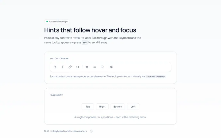
Basic Tooltip
Originalbasic tooltips on hover
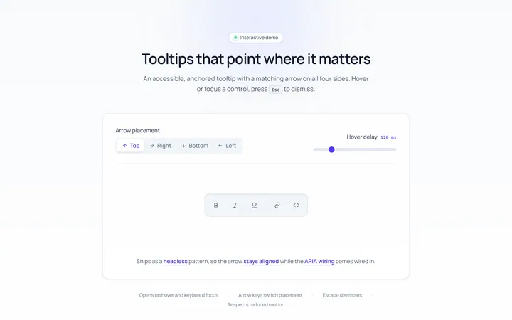
Arrow Tooltip
Originaltooltips with an arrow
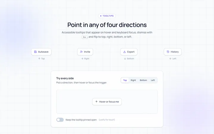
Directions Tooltip
Originaltooltips in four directions
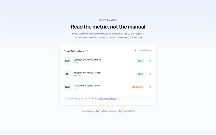
Rich Tooltip
Originalrich tooltip with title and body
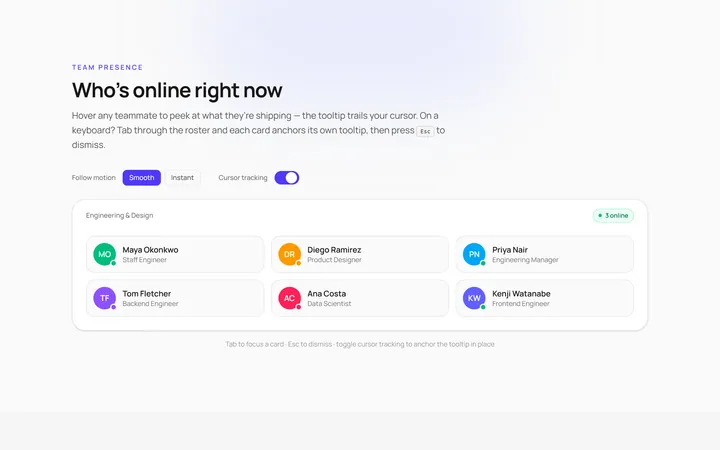
Follow Cursor Tooltip
Originaltooltip that follows the cursor
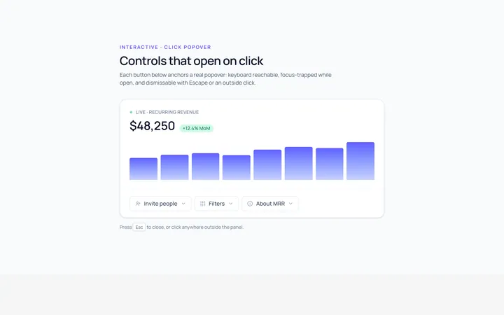
Popover Tooltip
Originalclick popover with content
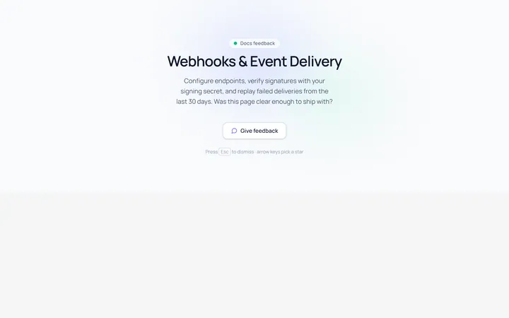
Popover Form Tooltip
Originalpopover containing a mini form
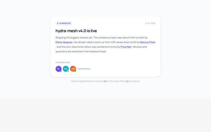
Hover Card Tooltip
Originalprofile hover card
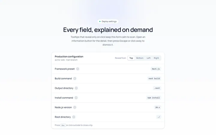
Click Tooltip
Originalclick-to-reveal tooltip
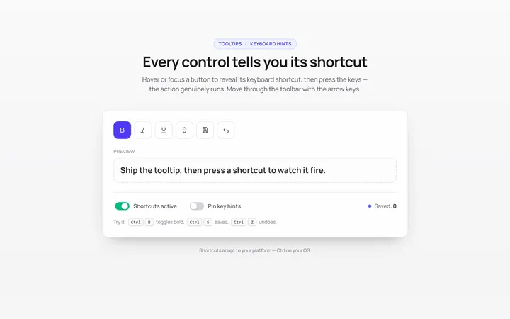
Keyboard Hint Tooltip
Originalkeyboard shortcut hint tooltips
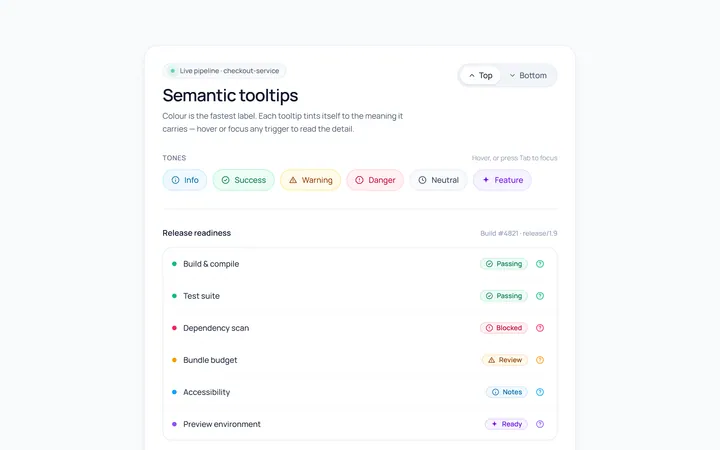
Color Tooltip
Originalcoloured semantic tooltips

Spotlight Hero
OriginalA centred hero with a soft radial spotlight, badge and dual call-to-action.