

Basic Tooltip
Original · freebasic tooltips on hover
byWeb InnoventixReact + Tailwind
tipbasictooltips
Copy prompt gives Claude Code, Cursor or v0 a ready-to-paste prompt that recreates this exact component.
npx shadcn@latest add https://webinnoventix.com/r/tip-basic.jsontip-basic.tsx
"use client";
import {
cloneElement,
isValidElement,
useEffect,
useId,
useRef,
useState,
} from "react";
import type { KeyboardEvent, ReactElement, ReactNode } from "react";
import { AnimatePresence, motion, useReducedMotion } from "motion/react";
type Placement = "top" | "right" | "bottom" | "left";
interface TooltipProps {
label: string;
children: ReactElement<{ "aria-describedby"?: string }>;
placement?: Placement;
shortcut?: string;
delay?: number;
}
const positionClass: Record<Placement, string> = {
top: "bottom-full left-1/2 -translate-x-1/2 mb-2",
right: "left-full top-1/2 -translate-y-1/2 ml-2",
bottom: "top-full left-1/2 -translate-x-1/2 mt-2",
left: "right-full top-1/2 -translate-y-1/2 mr-2",
};
const arrowClass: Record<Placement, string> = {
top: "top-full left-1/2 -translate-x-1/2 -mt-1",
right: "right-full top-1/2 -translate-y-1/2 -mr-1",
bottom: "bottom-full left-1/2 -translate-x-1/2 -mb-1",
left: "left-full top-1/2 -translate-y-1/2 -ml-1",
};
const offsets: Record<Placement, { x?: number; y?: number }> = {
top: { y: 4 },
right: { x: -4 },
bottom: { y: -4 },
left: { x: 4 },
};
function Tooltip({
label,
children,
placement = "top",
shortcut,
delay = 120,
}: TooltipProps) {
const [open, setOpen] = useState(false);
const tipId = useId();
const reduce = useReducedMotion();
const enterTimer = useRef<number | null>(null);
const leaveTimer = useRef<number | null>(null);
const clearTimers = () => {
if (enterTimer.current !== null) window.clearTimeout(enterTimer.current);
if (leaveTimer.current !== null) window.clearTimeout(leaveTimer.current);
enterTimer.current = null;
leaveTimer.current = null;
};
useEffect(() => () => clearTimers(), []);
const show = () => {
clearTimers();
enterTimer.current = window.setTimeout(() => setOpen(true), delay);
};
const hide = () => {
clearTimers();
setOpen(false);
};
const onKeyDown = (event: KeyboardEvent<HTMLSpanElement>) => {
if (event.key === "Escape" && open) {
event.stopPropagation();
hide();
}
};
return (
<span
className="relative inline-flex"
onMouseEnter={show}
onMouseLeave={hide}
onFocus={show}
onBlur={hide}
onKeyDown={onKeyDown}
>
{isValidElement(children)
? cloneElement(children, {
"aria-describedby": open ? tipId : undefined,
})
: children}
<AnimatePresence>
{open && (
<span
className={`pointer-events-none absolute z-50 ${positionClass[placement]}`}
>
<motion.span
role="tooltip"
id={tipId}
initial={
reduce
? { opacity: 0 }
: { opacity: 0, scale: 0.96, ...offsets[placement] }
}
animate={{ opacity: 1, scale: 1, x: 0, y: 0 }}
exit={
reduce
? { opacity: 0 }
: { opacity: 0, scale: 0.96, ...offsets[placement] }
}
transition={{ duration: reduce ? 0 : 0.16, ease: "easeOut" }}
className="relative flex items-center gap-2 whitespace-nowrap rounded-lg bg-slate-900 px-2.5 py-1.5 text-xs font-medium text-white shadow-lg shadow-slate-900/25 ring-1 ring-slate-900/10 dark:bg-slate-100 dark:text-slate-900 dark:shadow-black/40 dark:ring-white/10"
>
{label}
{shortcut ? (
<kbd className="rounded border border-white/25 bg-white/10 px-1.5 py-0.5 font-sans text-[10px] font-semibold tracking-wide text-slate-200 dark:border-slate-900/20 dark:bg-slate-900/10 dark:text-slate-600">
{shortcut}
</kbd>
) : null}
<span
aria-hidden="true"
className={`absolute h-2 w-2 rotate-45 rounded-[1px] bg-slate-900 dark:bg-slate-100 ${arrowClass[placement]}`}
/>
</motion.span>
</span>
)}
</AnimatePresence>
</span>
);
}
const iconProps = {
viewBox: "0 0 24 24",
fill: "none",
stroke: "currentColor",
strokeWidth: 2,
strokeLinecap: "round" as const,
strokeLinejoin: "round" as const,
"aria-hidden": true,
className: "h-[18px] w-[18px]",
};
function BoldIcon() {
return (
<svg {...iconProps}>
<path d="M6 4h8a4 4 0 0 1 0 8H6z" />
<path d="M6 12h9a4 4 0 0 1 0 8H6z" />
</svg>
);
}
function ItalicIcon() {
return (
<svg {...iconProps}>
<line x1="19" y1="4" x2="10" y2="4" />
<line x1="14" y1="20" x2="5" y2="20" />
<line x1="15" y1="4" x2="9" y2="20" />
</svg>
);
}
function LinkIcon() {
return (
<svg {...iconProps}>
<path d="M10 13a5 5 0 0 0 7.54.54l3-3a5 5 0 0 0-7.07-7.07l-1.72 1.71" />
<path d="M14 11a5 5 0 0 0-7.54-.54l-3 3a5 5 0 0 0 7.07 7.07l1.71-1.71" />
</svg>
);
}
function CodeIcon() {
return (
<svg {...iconProps}>
<polyline points="16 18 22 12 16 6" />
<polyline points="8 6 2 12 8 18" />
</svg>
);
}
function QuoteIcon() {
return (
<svg {...iconProps}>
<path d="M10 11H6a1 1 0 0 1-1-1V7a1 1 0 0 1 1-1h3a1 1 0 0 1 1 1v6c0 2-1 3.2-3 4" />
<path d="M20 11h-4a1 1 0 0 1-1-1V7a1 1 0 0 1 1-1h3a1 1 0 0 1 1 1v6c0 2-1 3.2-3 4" />
</svg>
);
}
function ListIcon() {
return (
<svg {...iconProps}>
<line x1="8" y1="6" x2="21" y2="6" />
<line x1="8" y1="12" x2="21" y2="12" />
<line x1="8" y1="18" x2="21" y2="18" />
<line x1="3" y1="6" x2="3.01" y2="6" />
<line x1="3" y1="12" x2="3.01" y2="12" />
<line x1="3" y1="18" x2="3.01" y2="18" />
</svg>
);
}
function CommentIcon() {
return (
<svg {...iconProps}>
<path d="M21 11.5a8.38 8.38 0 0 1-.9 3.8 8.5 8.5 0 0 1-7.6 4.7 8.38 8.38 0 0 1-3.8-.9L3 21l1.9-5.7a8.38 8.38 0 0 1-.9-3.8 8.5 8.5 0 0 1 4.7-7.6 8.38 8.38 0 0 1 3.8-.9h.5a8.48 8.48 0 0 1 8 8v.5z" />
</svg>
);
}
function ShareIcon() {
return (
<svg {...iconProps}>
<circle cx="18" cy="5" r="3" />
<circle cx="6" cy="12" r="3" />
<circle cx="18" cy="19" r="3" />
<line x1="8.59" y1="13.51" x2="15.42" y2="17.49" />
<line x1="15.41" y1="6.51" x2="8.59" y2="10.49" />
</svg>
);
}
function InfoIcon() {
return (
<svg {...iconProps} className="h-4 w-4">
<circle cx="12" cy="12" r="10" />
<line x1="12" y1="16" x2="12" y2="12" />
<line x1="12" y1="8" x2="12.01" y2="8" />
</svg>
);
}
const toolButtonClass =
"inline-flex h-10 w-10 items-center justify-center rounded-lg text-slate-600 transition-colors hover:bg-slate-100 hover:text-slate-900 focus-visible:outline-none focus-visible:ring-2 focus-visible:ring-indigo-500 focus-visible:ring-offset-2 focus-visible:ring-offset-white dark:text-slate-400 dark:hover:bg-slate-800 dark:hover:text-white dark:focus-visible:ring-offset-slate-900";
const placementButtonClass =
"inline-flex min-w-[4.5rem] items-center justify-center rounded-lg border border-slate-200 bg-white px-4 py-2 text-sm font-medium text-slate-700 transition-colors hover:border-slate-300 hover:bg-slate-50 focus-visible:outline-none focus-visible:ring-2 focus-visible:ring-indigo-500 focus-visible:ring-offset-2 focus-visible:ring-offset-white dark:border-slate-800 dark:bg-slate-900 dark:text-slate-200 dark:hover:border-slate-700 dark:hover:bg-slate-800 dark:focus-visible:ring-offset-slate-900";
interface ToolItem {
label: string;
shortcut?: string;
icon: ReactNode;
}
const tools: ToolItem[] = [
{ label: "Bold", shortcut: "⌘B", icon: <BoldIcon /> },
{ label: "Italic", shortcut: "⌘I", icon: <ItalicIcon /> },
{ label: "Insert link", shortcut: "⌘K", icon: <LinkIcon /> },
{ label: "Inline code", shortcut: "⌘E", icon: <CodeIcon /> },
{ label: "Block quote", icon: <QuoteIcon /> },
{ label: "Bulleted list", icon: <ListIcon /> },
{ label: "Add comment", shortcut: "⌘⌥M", icon: <CommentIcon /> },
{ label: "Share document", icon: <ShareIcon /> },
];
function Divider() {
return (
<span
aria-hidden="true"
className="mx-1 h-6 w-px shrink-0 bg-slate-200 dark:bg-slate-700"
/>
);
}
export default function TipBasic() {
const placements: Placement[] = ["top", "right", "bottom", "left"];
return (
<section className="relative w-full overflow-hidden bg-gradient-to-b from-slate-50 to-white px-4 py-20 text-slate-900 sm:py-28 dark:from-slate-950 dark:to-slate-900 dark:text-slate-100">
<style>{`
@keyframes tipbasic-pulse {
0% { transform: scale(1); opacity: 0.6; }
70% { transform: scale(2.4); opacity: 0; }
100% { transform: scale(2.4); opacity: 0; }
}
.tipbasic-animate {
animation: tipbasic-pulse 2s cubic-bezier(0.4, 0, 0.6, 1) infinite;
}
@media (prefers-reduced-motion: reduce) {
.tipbasic-animate { animation: none; }
}
`}</style>
<div className="mx-auto max-w-3xl">
<header className="mb-10 flex flex-col items-start">
<span className="mb-4 inline-flex items-center gap-2 rounded-full border border-slate-200 bg-white px-3 py-1 text-xs font-medium text-slate-600 dark:border-slate-800 dark:bg-slate-900 dark:text-slate-300">
<span className="relative flex h-2 w-2">
<span className="tipbasic-animate absolute inline-flex h-full w-full rounded-full bg-emerald-400" />
<span className="relative inline-flex h-2 w-2 rounded-full bg-emerald-500" />
</span>
Accessible tooltips
</span>
<h2 className="text-balance text-3xl font-semibold tracking-tight sm:text-4xl">
Hints that follow hover and focus
</h2>
<p className="mt-3 max-w-xl text-pretty text-base leading-relaxed text-slate-600 dark:text-slate-400">
Point at any control to reveal its label. Tab through with the
keyboard and the same tooltip appears — press{" "}
<kbd className="rounded border border-slate-300 bg-slate-100 px-1.5 py-0.5 font-sans text-xs font-semibold text-slate-700 dark:border-slate-700 dark:bg-slate-800 dark:text-slate-200">
Esc
</kbd>{" "}
to send it away.
</p>
</header>
<div className="rounded-3xl border border-slate-200 bg-white/60 p-6 shadow-sm backdrop-blur sm:p-8 dark:border-slate-800 dark:bg-slate-900/40">
<p className="mb-3 text-xs font-semibold uppercase tracking-wider text-slate-500 dark:text-slate-400">
Editor toolbar
</p>
<div
role="toolbar"
aria-label="Text formatting"
className="flex flex-wrap items-center gap-1 rounded-2xl border border-slate-200 bg-white p-2 shadow-sm dark:border-slate-800 dark:bg-slate-900"
>
{tools.map((tool, index) => (
<span key={tool.label} className="flex items-center">
{(index === 4 || index === 7) && <Divider />}
<Tooltip label={tool.label} shortcut={tool.shortcut}>
<button
type="button"
aria-label={tool.label}
className={toolButtonClass}
>
{tool.icon}
</button>
</Tooltip>
</span>
))}
</div>
<p className="mt-4 text-sm text-slate-500 dark:text-slate-400">
Each icon button carries a proper accessible name. The tooltip
reinforces it visually via{" "}
<code className="rounded bg-slate-100 px-1.5 py-0.5 font-mono text-xs text-slate-700 dark:bg-slate-800 dark:text-slate-300">
aria-describedby
</code>
.
</p>
</div>
<div className="mt-6 rounded-3xl border border-slate-200 bg-white/60 p-6 shadow-sm backdrop-blur sm:p-8 dark:border-slate-800 dark:bg-slate-900/40">
<p className="mb-4 text-xs font-semibold uppercase tracking-wider text-slate-500 dark:text-slate-400">
Placement
</p>
<div className="flex flex-wrap items-center justify-center gap-3 py-6">
{placements.map((placement) => (
<Tooltip
key={placement}
placement={placement}
label={`Opens on the ${placement}`}
>
<button type="button" className={placementButtonClass}>
{placement.charAt(0).toUpperCase() + placement.slice(1)}
</button>
</Tooltip>
))}
</div>
<p className="mt-2 text-center text-sm text-slate-500 dark:text-slate-400">
A single component, four positions — each with a matching
arrow.
</p>
</div>
<div className="mt-6 flex items-center gap-2 text-sm text-slate-500 dark:text-slate-400">
<span>Built for keyboards and screen readers.</span>
<Tooltip
placement="top"
label="role='tooltip', focus + hover, Escape to dismiss"
>
<button
type="button"
aria-label="How these tooltips work"
className="inline-flex h-7 w-7 items-center justify-center rounded-full text-slate-400 transition-colors hover:bg-slate-100 hover:text-slate-700 focus-visible:outline-none focus-visible:ring-2 focus-visible:ring-indigo-500 focus-visible:ring-offset-2 focus-visible:ring-offset-white dark:hover:bg-slate-800 dark:hover:text-slate-200 dark:focus-visible:ring-offset-slate-900"
>
<InfoIcon />
</button>
</Tooltip>
</div>
</div>
</section>
);
}Dependencies
motion
Licence
Built by Web Innoventix. Free for personal and commercial use, no attribution required.
Built by Web Innoventix
Need a custom interface, a full website, or SEO that gets you cited by AI? We design, build and rank it end to end.
Get a free quoteSimilar components
Browse all →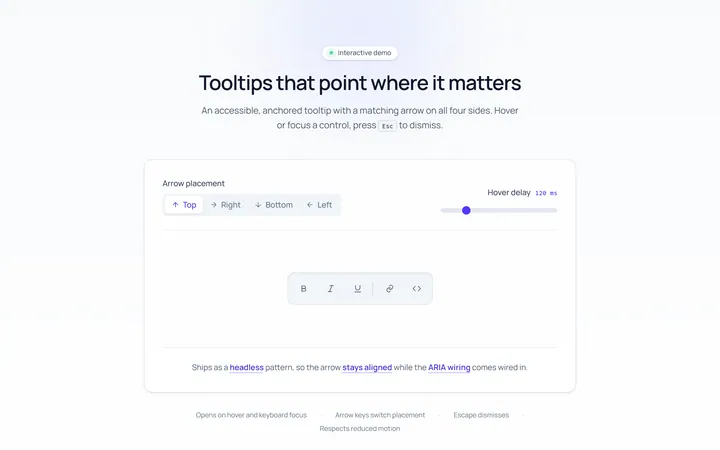
Arrow Tooltip
Originaltooltips with an arrow
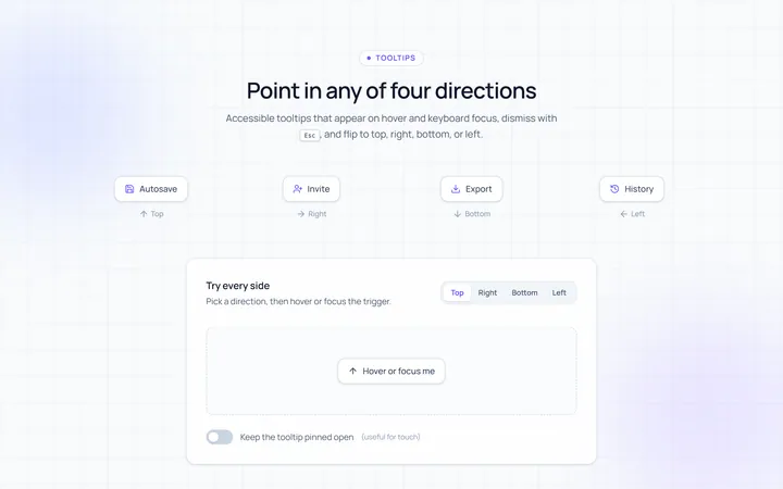
Directions Tooltip
Originaltooltips in four directions
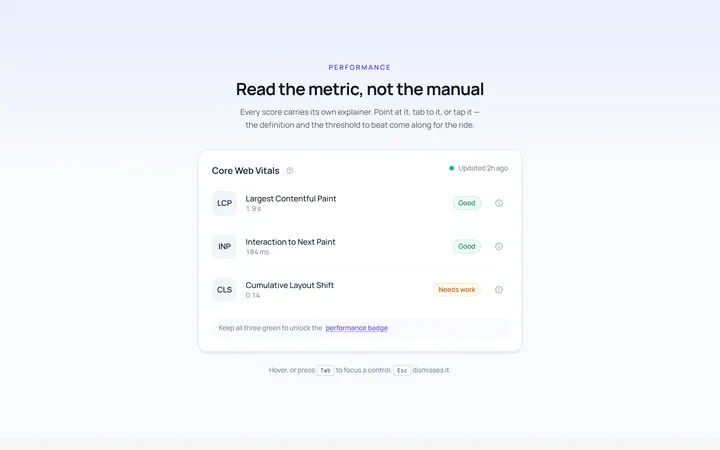
Rich Tooltip
Originalrich tooltip with title and body
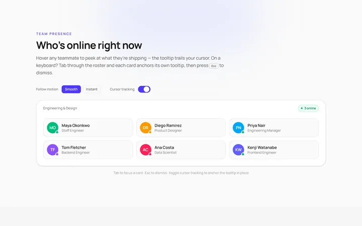
Follow Cursor Tooltip
Originaltooltip that follows the cursor
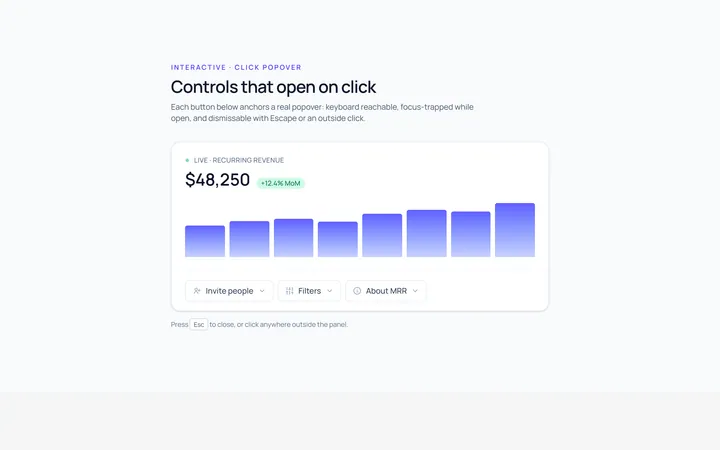
Popover Tooltip
Originalclick popover with content
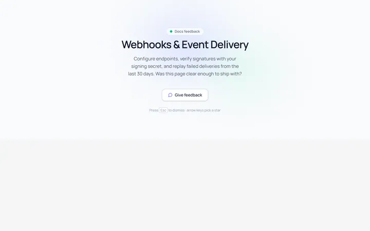
Popover Form Tooltip
Originalpopover containing a mini form
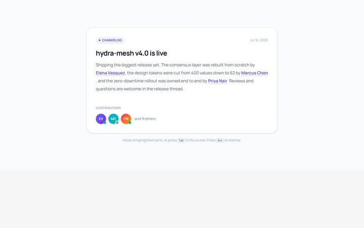
Hover Card Tooltip
Originalprofile hover card
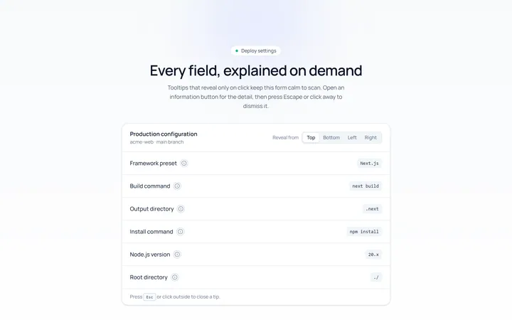
Click Tooltip
Originalclick-to-reveal tooltip
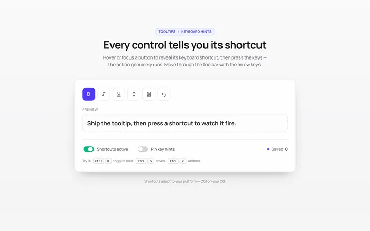
Keyboard Hint Tooltip
Originalkeyboard shortcut hint tooltips
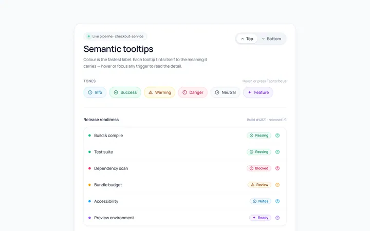
Color Tooltip
Originalcoloured semantic tooltips
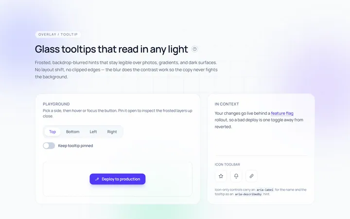
Glass Tooltip
Originalglassmorphic tooltips

Spotlight Hero
OriginalA centred hero with a soft radial spotlight, badge and dual call-to-action.