

Popover Form Tooltip
Original · freepopover containing a mini form
byWeb InnoventixReact + Tailwind
tippopoverformtooltips
Copy prompt gives Claude Code, Cursor or v0 a ready-to-paste prompt that recreates this exact component.
npx shadcn@latest add https://webinnoventix.com/r/tip-popover-form.jsontip-popover-form.tsx
"use client";
import {
useCallback,
useEffect,
useId,
useRef,
useState,
type FormEvent,
type KeyboardEvent as ReactKeyboardEvent,
} from "react";
import { AnimatePresence, motion, useReducedMotion } from "motion/react";
type Topic = "bug" | "idea" | "praise" | "other";
const TOPICS: { value: Topic; label: string }[] = [
{ value: "bug", label: "Bug" },
{ value: "idea", label: "Idea" },
{ value: "praise", label: "Praise" },
{ value: "other", label: "Other" },
];
const RATING_LABELS = ["Poor", "Fair", "Good", "Great", "Excellent"];
const MAX_MESSAGE = 400;
function StarIcon({ filled }: { filled: boolean }) {
return (
<svg
viewBox="0 0 24 24"
className="h-6 w-6"
fill={filled ? "currentColor" : "none"}
stroke="currentColor"
strokeWidth={1.6}
strokeLinejoin="round"
aria-hidden="true"
>
<path d="M12 3.4l2.47 5.26 5.53.74-4.06 3.86 1.05 5.64L12 16.98l-4.99 2.62 1.05-5.64-4.06-3.86 5.53-.74z" />
</svg>
);
}
export default function TipPopoverForm() {
const reduce = useReducedMotion();
const [open, setOpen] = useState(false);
const [submitted, setSubmitted] = useState(false);
const [rating, setRating] = useState(0);
const [topic, setTopic] = useState<Topic>("idea");
const [message, setMessage] = useState("");
const [email, setEmail] = useState("");
const [errors, setErrors] = useState<{ rating?: string; message?: string; email?: string }>({});
const triggerRef = useRef<HTMLButtonElement | null>(null);
const popoverRef = useRef<HTMLDivElement | null>(null);
const messageRef = useRef<HTMLTextAreaElement | null>(null);
const starRefs = useRef<Array<HTMLButtonElement | null>>([]);
const uid = useId();
const titleId = `${uid}-title`;
const descId = `${uid}-desc`;
const msgId = `${uid}-msg`;
const msgErrId = `${uid}-msg-err`;
const emailId = `${uid}-email`;
const emailErrId = `${uid}-email-err`;
const ratingErrId = `${uid}-rating-err`;
const closeAndRestore = useCallback(() => {
setOpen(false);
window.requestAnimationFrame(() => triggerRef.current?.focus());
}, []);
const resetForm = useCallback(() => {
setRating(0);
setTopic("idea");
setMessage("");
setEmail("");
setErrors({});
setSubmitted(false);
}, []);
// Move focus into the popover when it opens.
useEffect(() => {
if (!open) return;
const t = window.setTimeout(() => {
if (submitted) {
popoverRef.current?.querySelector<HTMLElement>("[data-autofocus]")?.focus();
} else {
starRefs.current[Math.max(0, rating - 1)]?.focus();
}
}, 20);
return () => window.clearTimeout(t);
// eslint-disable-next-line react-hooks/exhaustive-deps
}, [open, submitted]);
// Outside click / pointer dismiss.
useEffect(() => {
if (!open) return;
function onPointer(e: PointerEvent) {
const target = e.target as Node;
if (popoverRef.current?.contains(target)) return;
if (triggerRef.current?.contains(target)) return;
setOpen(false);
}
document.addEventListener("pointerdown", onPointer);
return () => document.removeEventListener("pointerdown", onPointer);
}, [open]);
function getFocusable(): HTMLElement[] {
const root = popoverRef.current;
if (!root) return [];
const sel =
'button:not([disabled]), [href], input:not([disabled]), textarea:not([disabled]), [tabindex]:not([tabindex="-1"])';
return Array.from(root.querySelectorAll<HTMLElement>(sel)).filter(
(el) => el.offsetParent !== null || el === document.activeElement,
);
}
function onPopoverKeyDown(e: ReactKeyboardEvent<HTMLDivElement>) {
if (e.key === "Escape") {
e.stopPropagation();
closeAndRestore();
return;
}
if (e.key !== "Tab") return;
const els = getFocusable();
if (els.length === 0) return;
const first = els[0];
const last = els[els.length - 1];
const active = document.activeElement as HTMLElement | null;
if (e.shiftKey && active === first) {
e.preventDefault();
last.focus();
} else if (!e.shiftKey && active === last) {
e.preventDefault();
first.focus();
}
}
function commitRating(next: number) {
setRating(next);
setErrors((prev) => ({ ...prev, rating: undefined }));
starRefs.current[next - 1]?.focus();
}
function onStarKeyDown(e: ReactKeyboardEvent<HTMLButtonElement>, index: number) {
const current = index + 1;
switch (e.key) {
case "ArrowRight":
case "ArrowUp":
e.preventDefault();
commitRating(Math.min(5, current + 1));
break;
case "ArrowLeft":
case "ArrowDown":
e.preventDefault();
commitRating(Math.max(1, current - 1));
break;
case "Home":
e.preventDefault();
commitRating(1);
break;
case "End":
e.preventDefault();
commitRating(5);
break;
default:
break;
}
}
function handleSubmit(e: FormEvent<HTMLFormElement>) {
e.preventDefault();
const nextErrors: typeof errors = {};
if (rating === 0) nextErrors.rating = "Pick a rating from one to five stars.";
if (message.trim().length < 8)
nextErrors.message = "Tell us a little more — at least 8 characters.";
if (email.trim() && !/^[^\s@]+@[^\s@]+\.[^\s@]+$/.test(email.trim()))
nextErrors.email = "That email address doesn't look right.";
setErrors(nextErrors);
if (Object.keys(nextErrors).length > 0) {
if (nextErrors.rating) starRefs.current[Math.max(0, rating - 1)]?.focus();
else if (nextErrors.message) messageRef.current?.focus();
return;
}
setSubmitted(true);
}
const tabbableStar = rating > 0 ? rating - 1 : 0;
return (
<section className="relative w-full overflow-hidden bg-slate-50 px-6 py-24 text-slate-900 dark:bg-slate-950 dark:text-slate-100 sm:px-10">
<style>{`
@keyframes tpf-ping {
0% { transform: scale(1); opacity: 0.55; }
70% { transform: scale(2.4); opacity: 0; }
100% { transform: scale(2.4); opacity: 0; }
}
@keyframes tpf-draw {
from { stroke-dashoffset: 26; }
to { stroke-dashoffset: 0; }
}
@keyframes tpf-rise {
from { opacity: 0; transform: translateY(6px); }
to { opacity: 1; transform: translateY(0); }
}
.tpf-ping { animation: tpf-ping 2.4s cubic-bezier(0,0,0.2,1) infinite; }
.tpf-draw { stroke-dasharray: 26; stroke-dashoffset: 26; animation: tpf-draw 0.5s ease-out 0.05s forwards; }
.tpf-rise { animation: tpf-rise 0.35s ease-out both; }
@media (prefers-reduced-motion: reduce) {
.tpf-ping, .tpf-draw, .tpf-rise { animation: none !important; }
.tpf-draw { stroke-dashoffset: 0; }
}
`}</style>
{/* atmosphere */}
<div
aria-hidden="true"
className="pointer-events-none absolute inset-0 opacity-70 [mask-image:radial-gradient(60%_60%_at_50%_35%,black,transparent)]"
>
<div className="absolute left-1/2 top-0 h-72 w-72 -translate-x-1/2 rounded-full bg-indigo-300/40 blur-3xl dark:bg-indigo-600/20" />
<div className="absolute right-1/4 top-40 h-56 w-56 rounded-full bg-emerald-300/30 blur-3xl dark:bg-emerald-600/15" />
</div>
<div className="relative mx-auto flex max-w-2xl flex-col items-center">
<p className="mb-3 inline-flex items-center gap-2 rounded-full border border-slate-200 bg-white/70 px-3 py-1 text-xs font-medium tracking-wide text-slate-600 backdrop-blur dark:border-slate-800 dark:bg-slate-900/70 dark:text-slate-400">
<span className="relative flex h-2 w-2">
<span className="tpf-ping absolute inline-flex h-full w-full rounded-full bg-emerald-400" />
<span className="relative inline-flex h-2 w-2 rounded-full bg-emerald-500" />
</span>
Docs feedback
</p>
<h2 className="text-balance text-center text-3xl font-semibold tracking-tight sm:text-4xl">
Webhooks & Event Delivery
</h2>
<p className="mt-4 max-w-lg text-balance text-center text-base leading-relaxed text-slate-600 dark:text-slate-400">
Configure endpoints, verify signatures with your signing secret, and replay failed
deliveries from the last 30 days. Was this page clear enough to ship with?
</p>
{/* Trigger + popover anchor */}
<div className="relative mt-10 inline-flex">
<button
ref={triggerRef}
type="button"
aria-haspopup="dialog"
aria-expanded={open}
aria-controls={open ? titleId : undefined}
onClick={() => {
if (open) {
closeAndRestore();
} else {
setSubmitted(false);
setOpen(true);
}
}}
className="group inline-flex items-center gap-2 rounded-xl border border-slate-300 bg-white px-5 py-2.5 text-sm font-semibold text-slate-800 shadow-sm transition-colors hover:border-indigo-400 hover:bg-indigo-50 focus-visible:outline-none focus-visible:ring-2 focus-visible:ring-indigo-500 focus-visible:ring-offset-2 focus-visible:ring-offset-slate-50 dark:border-slate-700 dark:bg-slate-900 dark:text-slate-100 dark:hover:border-indigo-500 dark:hover:bg-indigo-950/50 dark:focus-visible:ring-offset-slate-950"
>
<svg
viewBox="0 0 24 24"
className="h-4 w-4 text-indigo-500 transition-transform group-hover:-rotate-12 dark:text-indigo-400"
fill="none"
stroke="currentColor"
strokeWidth={1.8}
strokeLinecap="round"
strokeLinejoin="round"
aria-hidden="true"
>
<path d="M21 11.5a8.38 8.38 0 0 1-.9 3.8 8.5 8.5 0 0 1-7.6 4.7 8.38 8.38 0 0 1-3.8-.9L3 21l1.9-5.7a8.38 8.38 0 0 1-.9-3.8 8.5 8.5 0 0 1 4.7-7.6 8.38 8.38 0 0 1 3.8-.9h.5a8.48 8.48 0 0 1 8 8v.5z" />
</svg>
Give feedback
</button>
<AnimatePresence>
{open && (
<motion.div
ref={popoverRef}
role="dialog"
aria-modal="false"
aria-labelledby={titleId}
aria-describedby={descId}
onKeyDown={onPopoverKeyDown}
initial={reduce ? false : { opacity: 0, y: -8, scale: 0.97 }}
animate={reduce ? {} : { opacity: 1, y: 0, scale: 1 }}
exit={reduce ? { opacity: 0 } : { opacity: 0, y: -8, scale: 0.97 }}
transition={{ duration: 0.17, ease: [0.16, 1, 0.3, 1] }}
className="absolute left-1/2 top-full z-20 mt-3 w-[min(20rem,calc(100vw-3rem))] origin-top -translate-x-1/2 rounded-2xl border border-slate-200 bg-white p-5 text-left shadow-xl shadow-slate-900/10 dark:border-slate-700 dark:bg-slate-900 dark:shadow-black/40"
>
{/* arrow */}
<span
aria-hidden="true"
className="absolute -top-1.5 left-1/2 h-3 w-3 -translate-x-1/2 rotate-45 border-l border-t border-slate-200 bg-white dark:border-slate-700 dark:bg-slate-900"
/>
{submitted ? (
<div className="tpf-rise flex flex-col items-center py-3 text-center">
<span className="flex h-12 w-12 items-center justify-center rounded-full bg-emerald-100 text-emerald-600 dark:bg-emerald-500/15 dark:text-emerald-400">
<svg
viewBox="0 0 24 24"
className="h-6 w-6"
fill="none"
stroke="currentColor"
strokeWidth={2.4}
strokeLinecap="round"
strokeLinejoin="round"
aria-hidden="true"
>
<path className="tpf-draw" d="M5 13l4 4L19 7" />
</svg>
</span>
<h3 id={titleId} className="mt-3 text-sm font-semibold">
Thanks — that's logged
</h3>
<p id={descId} className="mt-1 text-xs leading-relaxed text-slate-500 dark:text-slate-400">
A human on the docs team reviews every note. We read this one.
</p>
<div className="mt-4 flex gap-2">
<button
type="button"
data-autofocus
onClick={resetForm}
className="rounded-lg border border-slate-300 px-3 py-1.5 text-xs font-medium text-slate-700 transition-colors hover:bg-slate-100 focus-visible:outline-none focus-visible:ring-2 focus-visible:ring-indigo-500 dark:border-slate-700 dark:text-slate-200 dark:hover:bg-slate-800"
>
Send another
</button>
<button
type="button"
onClick={() => {
resetForm();
closeAndRestore();
}}
className="rounded-lg bg-slate-900 px-3 py-1.5 text-xs font-semibold text-white transition-colors hover:bg-slate-700 focus-visible:outline-none focus-visible:ring-2 focus-visible:ring-indigo-500 dark:bg-white dark:text-slate-900 dark:hover:bg-slate-200"
>
Done
</button>
</div>
</div>
) : (
<form onSubmit={handleSubmit} noValidate>
<div className="mb-3 flex items-start justify-between gap-3">
<div>
<h3 id={titleId} className="text-sm font-semibold">
Rate this page
</h3>
<p id={descId} className="mt-0.5 text-xs text-slate-500 dark:text-slate-400">
Two taps and a line is plenty.
</p>
</div>
<button
type="button"
onClick={closeAndRestore}
aria-label="Close feedback form"
className="-mr-1 -mt-1 rounded-md p-1 text-slate-400 transition-colors hover:bg-slate-100 hover:text-slate-600 focus-visible:outline-none focus-visible:ring-2 focus-visible:ring-indigo-500 dark:hover:bg-slate-800 dark:hover:text-slate-200"
>
<svg
viewBox="0 0 24 24"
className="h-4 w-4"
fill="none"
stroke="currentColor"
strokeWidth={2}
strokeLinecap="round"
aria-hidden="true"
>
<path d="M6 6l12 12M18 6L6 18" />
</svg>
</button>
</div>
{/* Rating */}
<div
role="radiogroup"
aria-label="Overall rating"
aria-describedby={errors.rating ? ratingErrId : undefined}
className="flex items-center gap-1"
>
{RATING_LABELS.map((label, i) => {
const value = i + 1;
const active = rating >= value;
return (
<button
key={label}
ref={(el) => {
starRefs.current[i] = el;
}}
type="button"
role="radio"
aria-checked={rating === value}
aria-label={`${value} of 5 — ${label}`}
tabIndex={i === tabbableStar ? 0 : -1}
onClick={() => commitRating(value)}
onKeyDown={(e) => onStarKeyDown(e, i)}
className={`rounded-md p-0.5 transition-colors focus-visible:outline-none focus-visible:ring-2 focus-visible:ring-indigo-500 ${
active
? "text-amber-500"
: "text-slate-300 hover:text-amber-400 dark:text-slate-600 dark:hover:text-amber-500"
}`}
>
<StarIcon filled={active} />
</button>
);
})}
<span className="ml-2 min-w-[4.5rem] text-xs font-medium text-slate-500 dark:text-slate-400">
{rating > 0 ? RATING_LABELS[rating - 1] : "Tap a star"}
</span>
</div>
{errors.rating && (
<p id={ratingErrId} className="mt-1.5 text-xs text-rose-600 dark:text-rose-400">
{errors.rating}
</p>
)}
{/* Topic */}
<fieldset className="mt-4">
<legend className="mb-1.5 text-xs font-medium text-slate-600 dark:text-slate-400">
What kind of feedback?
</legend>
<div
role="radiogroup"
aria-label="Feedback topic"
className="grid grid-cols-4 gap-1 rounded-lg bg-slate-100 p-1 dark:bg-slate-800"
>
{TOPICS.map((t) => {
const active = topic === t.value;
return (
<button
key={t.value}
type="button"
role="radio"
aria-checked={active}
onClick={() => setTopic(t.value)}
className={`rounded-md px-2 py-1.5 text-xs font-medium transition-colors focus-visible:outline-none focus-visible:ring-2 focus-visible:ring-indigo-500 ${
active
? "bg-white text-slate-900 shadow-sm dark:bg-slate-950 dark:text-white"
: "text-slate-500 hover:text-slate-800 dark:text-slate-400 dark:hover:text-slate-200"
}`}
>
{t.label}
</button>
);
})}
</div>
</fieldset>
{/* Message */}
<div className="mt-4">
<div className="mb-1.5 flex items-center justify-between">
<label htmlFor={msgId} className="text-xs font-medium text-slate-600 dark:text-slate-400">
Your note
</label>
<span
className={`text-[11px] tabular-nums ${
message.length > MAX_MESSAGE - 40
? "text-amber-600 dark:text-amber-400"
: "text-slate-400 dark:text-slate-500"
}`}
>
{message.length}/{MAX_MESSAGE}
</span>
</div>
<textarea
id={msgId}
ref={messageRef}
value={message}
maxLength={MAX_MESSAGE}
onChange={(e) => {
setMessage(e.target.value);
if (errors.message) setErrors((p) => ({ ...p, message: undefined }));
}}
rows={3}
placeholder="The signature example used the old header name…"
aria-invalid={errors.message ? true : undefined}
aria-describedby={errors.message ? msgErrId : undefined}
className="w-full resize-none rounded-lg border border-slate-300 bg-white px-3 py-2 text-sm text-slate-900 placeholder:text-slate-400 focus:border-indigo-500 focus-visible:outline-none focus-visible:ring-2 focus-visible:ring-indigo-500 dark:border-slate-700 dark:bg-slate-950 dark:text-slate-100 dark:placeholder:text-slate-500"
/>
{errors.message && (
<p id={msgErrId} className="mt-1 text-xs text-rose-600 dark:text-rose-400">
{errors.message}
</p>
)}
</div>
{/* Email */}
<div className="mt-3">
<label htmlFor={emailId} className="mb-1.5 block text-xs font-medium text-slate-600 dark:text-slate-400">
Email <span className="font-normal text-slate-400 dark:text-slate-500">(optional, for a reply)</span>
</label>
<input
id={emailId}
type="email"
value={email}
autoComplete="email"
onChange={(e) => {
setEmail(e.target.value);
if (errors.email) setErrors((p) => ({ ...p, email: undefined }));
}}
placeholder="you@company.com"
aria-invalid={errors.email ? true : undefined}
aria-describedby={errors.email ? emailErrId : undefined}
className="w-full rounded-lg border border-slate-300 bg-white px-3 py-2 text-sm text-slate-900 placeholder:text-slate-400 focus:border-indigo-500 focus-visible:outline-none focus-visible:ring-2 focus-visible:ring-indigo-500 dark:border-slate-700 dark:bg-slate-950 dark:text-slate-100 dark:placeholder:text-slate-500"
/>
{errors.email && (
<p id={emailErrId} className="mt-1 text-xs text-rose-600 dark:text-rose-400">
{errors.email}
</p>
)}
</div>
<div className="mt-5 flex items-center justify-end gap-2">
<button
type="button"
onClick={closeAndRestore}
className="rounded-lg px-3 py-2 text-xs font-medium text-slate-600 transition-colors hover:bg-slate-100 focus-visible:outline-none focus-visible:ring-2 focus-visible:ring-indigo-500 dark:text-slate-300 dark:hover:bg-slate-800"
>
Cancel
</button>
<button
type="submit"
className="inline-flex items-center gap-1.5 rounded-lg bg-indigo-600 px-4 py-2 text-xs font-semibold text-white shadow-sm transition-colors hover:bg-indigo-500 focus-visible:outline-none focus-visible:ring-2 focus-visible:ring-indigo-500 focus-visible:ring-offset-2 focus-visible:ring-offset-white dark:focus-visible:ring-offset-slate-900"
>
Send feedback
<svg
viewBox="0 0 24 24"
className="h-3.5 w-3.5"
fill="none"
stroke="currentColor"
strokeWidth={2.2}
strokeLinecap="round"
strokeLinejoin="round"
aria-hidden="true"
>
<path d="M5 12h14M13 6l6 6-6 6" />
</svg>
</button>
</div>
</form>
)}
</motion.div>
)}
</AnimatePresence>
</div>
<p className="mt-6 text-xs text-slate-400 dark:text-slate-500">
Press <kbd className="rounded border border-slate-300 bg-white px-1 font-sans dark:border-slate-700 dark:bg-slate-900">Esc</kbd> to dismiss · arrow keys pick a star
</p>
</div>
</section>
);
}Dependencies
motion
Licence
Built by Web Innoventix. Free for personal and commercial use, no attribution required.
Built by Web Innoventix
Need a custom interface, a full website, or SEO that gets you cited by AI? We design, build and rank it end to end.
Get a free quoteSimilar components
Browse all →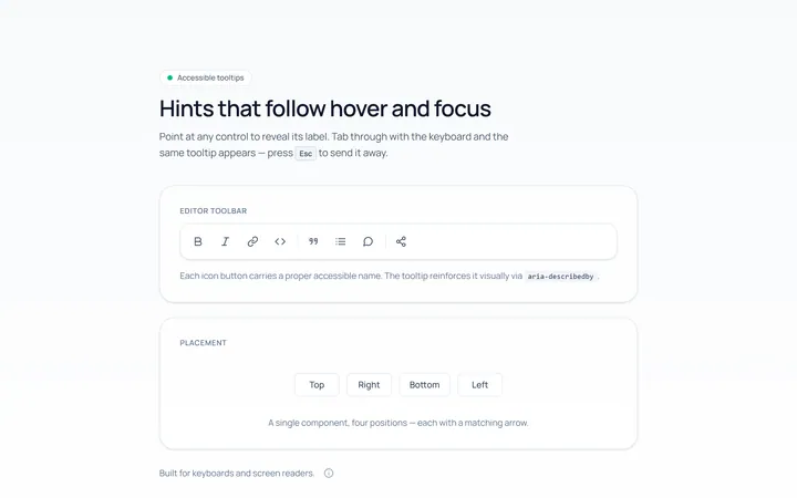
Basic Tooltip
Originalbasic tooltips on hover
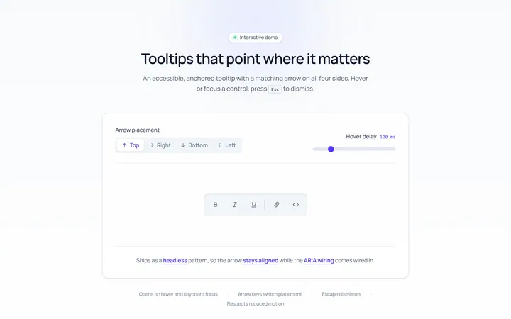
Arrow Tooltip
Originaltooltips with an arrow
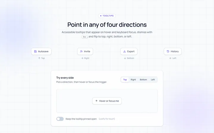
Directions Tooltip
Originaltooltips in four directions
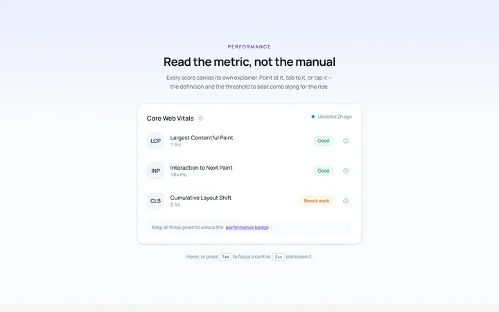
Rich Tooltip
Originalrich tooltip with title and body
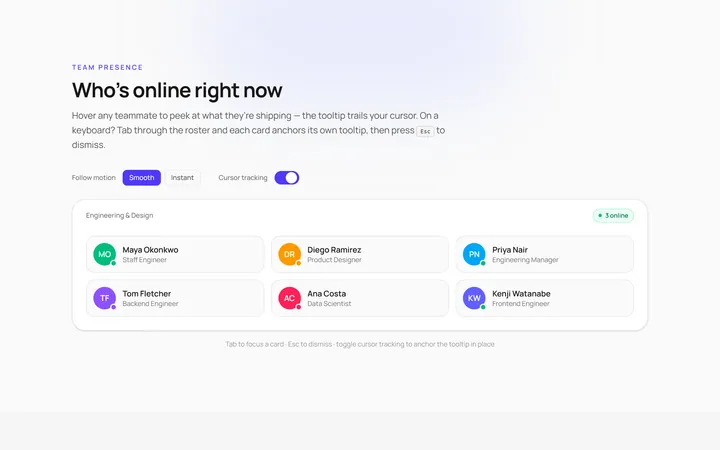
Follow Cursor Tooltip
Originaltooltip that follows the cursor
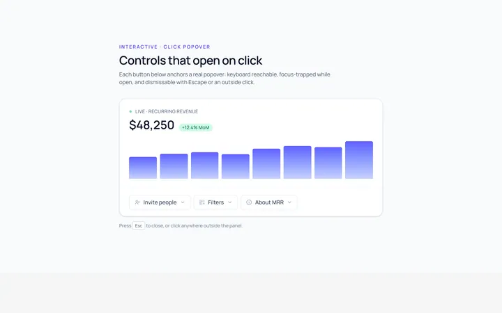
Popover Tooltip
Originalclick popover with content
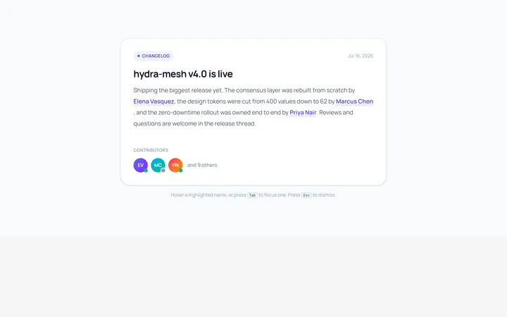
Hover Card Tooltip
Originalprofile hover card
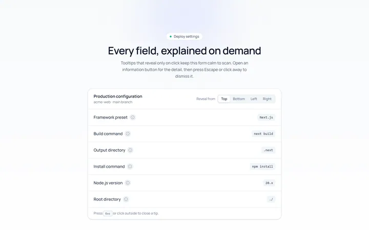
Click Tooltip
Originalclick-to-reveal tooltip
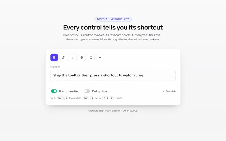
Keyboard Hint Tooltip
Originalkeyboard shortcut hint tooltips
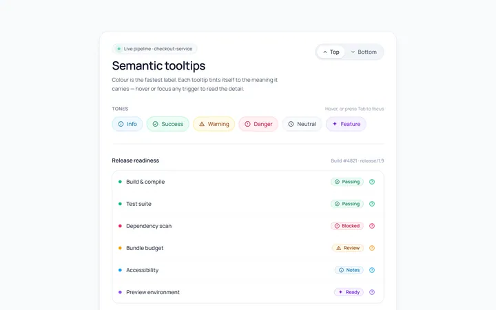
Color Tooltip
Originalcoloured semantic tooltips
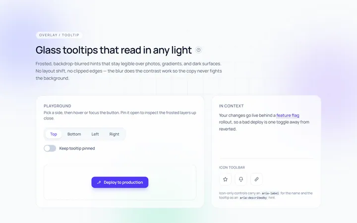
Glass Tooltip
Originalglassmorphic tooltips

Spotlight Hero
OriginalA centred hero with a soft radial spotlight, badge and dual call-to-action.