

Popover Tooltip
Original · freeclick popover with content
byWeb InnoventixReact + Tailwind
tippopovertooltips
Copy prompt gives Claude Code, Cursor or v0 a ready-to-paste prompt that recreates this exact component.
npx shadcn@latest add https://webinnoventix.com/r/tip-popover.jsontip-popover.tsx
"use client";
import {
useCallback,
useEffect,
useId,
useRef,
useState,
type FormEvent,
type KeyboardEvent as ReactKeyboardEvent,
type ReactNode,
} from "react";
import { AnimatePresence, motion, useReducedMotion } from "motion/react";
type Align = "start" | "center" | "end";
const FOCUSABLE =
'a[href], button:not([disabled]), textarea:not([disabled]), input:not([disabled]), select:not([disabled]), [tabindex]:not([tabindex="-1"])';
const RING =
"focus-visible:outline-none focus-visible:ring-2 focus-visible:ring-indigo-500 focus-visible:ring-offset-2 focus-visible:ring-offset-white dark:focus-visible:ring-offset-slate-900";
const ROLES = [
{ value: "admin", label: "Admin", hint: "Full access to billing, members, and API keys." },
{ value: "editor", label: "Editor", hint: "Can build dashboards and edit saved reports." },
{ value: "viewer", label: "Viewer", hint: "Read-only access to shared reports." },
];
const STATUSES = [
{ value: "active", label: "Active", count: 1284 },
{ value: "trialing", label: "Trialing", count: 156 },
{ value: "past_due", label: "Past due", count: 42 },
{ value: "churned", label: "Churned", count: 318 },
];
const RANGES = [
{ value: "7d", label: "Last 7 days" },
{ value: "30d", label: "Last 30 days" },
{ value: "90d", label: "Last quarter" },
];
const BARS = [42, 48, 51, 47, 58, 63, 61, 72];
/* ---------------------------------- Icons --------------------------------- */
function UserPlusIcon() {
return (
<svg
aria-hidden="true"
viewBox="0 0 24 24"
fill="none"
stroke="currentColor"
strokeWidth={1.7}
strokeLinecap="round"
strokeLinejoin="round"
className="h-4 w-4"
>
<path d="M15 19a5 5 0 0 0-10 0" />
<circle cx="10" cy="8" r="3.2" />
<path d="M18 8v6M21 11h-6" />
</svg>
);
}
function SlidersIcon() {
return (
<svg
aria-hidden="true"
viewBox="0 0 24 24"
fill="none"
stroke="currentColor"
strokeWidth={1.7}
strokeLinecap="round"
strokeLinejoin="round"
className="h-4 w-4"
>
<path d="M5 21v-7M5 10V3M12 21v-9M12 8V3M19 21v-5M19 12V3" />
<path d="M2.5 14h5M9.5 8h5M16.5 16h5" />
</svg>
);
}
function InfoIcon() {
return (
<svg
aria-hidden="true"
viewBox="0 0 24 24"
fill="none"
stroke="currentColor"
strokeWidth={1.7}
strokeLinecap="round"
strokeLinejoin="round"
className="h-4 w-4"
>
<circle cx="12" cy="12" r="9" />
<path d="M12 11v5M12 7.5h.01" />
</svg>
);
}
function ChevronIcon({ open }: { open: boolean }) {
return (
<svg
aria-hidden="true"
viewBox="0 0 24 24"
fill="none"
stroke="currentColor"
strokeWidth={1.9}
strokeLinecap="round"
strokeLinejoin="round"
className={`h-3.5 w-3.5 text-slate-400 transition-transform duration-200 ${
open ? "rotate-180" : ""
}`}
>
<path d="m6 9 6 6 6-6" />
</svg>
);
}
function CloseIcon() {
return (
<svg
aria-hidden="true"
viewBox="0 0 24 24"
fill="none"
stroke="currentColor"
strokeWidth={1.9}
strokeLinecap="round"
strokeLinejoin="round"
className="h-4 w-4"
>
<path d="M6 6l12 12M18 6 6 18" />
</svg>
);
}
function CheckIcon() {
return (
<svg
aria-hidden="true"
viewBox="0 0 24 24"
fill="none"
stroke="currentColor"
strokeWidth={2.2}
strokeLinecap="round"
strokeLinejoin="round"
className="h-5 w-5"
>
<path d="m4 12.5 5 5L20 6.5" />
</svg>
);
}
/* --------------------------------- Popover -------------------------------- */
function Popover({
triggerLabel,
icon,
title,
align = "start",
panelWidth = "w-80",
children,
}: {
triggerLabel: string;
icon: ReactNode;
title: string;
align?: Align;
panelWidth?: string;
children: (close: () => void) => ReactNode;
}) {
const [open, setOpen] = useState(false);
const reduce = useReducedMotion();
const wrapRef = useRef<HTMLDivElement | null>(null);
const triggerRef = useRef<HTMLButtonElement | null>(null);
const panelRef = useRef<HTMLDivElement | null>(null);
const baseId = useId();
const panelId = `${baseId}-panel`;
const titleId = `${baseId}-title`;
const close = useCallback(() => setOpen(false), []);
// Move focus into the panel on open, restore it to the trigger on close.
useEffect(() => {
if (!open) return;
const panel = panelRef.current;
if (!panel) return;
const preferred = panel.querySelector<HTMLElement>("[data-autofocus]");
const first = panel.querySelector<HTMLElement>(FOCUSABLE);
(preferred ?? first)?.focus();
return () => triggerRef.current?.focus();
}, [open]);
// Dismiss on outside click and Escape.
useEffect(() => {
if (!open) return;
function onPointerDown(event: MouseEvent) {
if (wrapRef.current && !wrapRef.current.contains(event.target as Node)) {
setOpen(false);
}
}
function onKeyDown(event: KeyboardEvent) {
if (event.key === "Escape") {
event.stopPropagation();
setOpen(false);
}
}
document.addEventListener("mousedown", onPointerDown);
document.addEventListener("keydown", onKeyDown);
return () => {
document.removeEventListener("mousedown", onPointerDown);
document.removeEventListener("keydown", onKeyDown);
};
}, [open]);
// Keep Tab focus contained within the open panel.
function onPanelKeyDown(event: ReactKeyboardEvent<HTMLDivElement>) {
if (event.key !== "Tab") return;
const panel = panelRef.current;
if (!panel) return;
const nodes = Array.from(panel.querySelectorAll<HTMLElement>(FOCUSABLE));
if (nodes.length === 0) return;
const firstEl = nodes[0];
const lastEl = nodes[nodes.length - 1];
const active = document.activeElement;
if (event.shiftKey && active === firstEl) {
event.preventDefault();
lastEl.focus();
} else if (!event.shiftKey && active === lastEl) {
event.preventDefault();
firstEl.focus();
}
}
const alignClass =
align === "end"
? "right-0"
: align === "center"
? "left-1/2 -translate-x-1/2"
: "left-0";
const arrowClass =
align === "end"
? "right-6"
: align === "center"
? "left-1/2 -translate-x-1/2"
: "left-6";
return (
<div ref={wrapRef} className="relative inline-block">
<button
ref={triggerRef}
type="button"
onClick={() => setOpen((prev) => !prev)}
aria-haspopup="dialog"
aria-expanded={open}
aria-controls={open ? panelId : undefined}
className={`inline-flex items-center gap-2 rounded-lg border px-3 py-2 text-sm font-medium transition-colors ${RING} ${
open
? "border-indigo-300 bg-indigo-50 text-indigo-700 dark:border-indigo-500/50 dark:bg-indigo-500/10 dark:text-indigo-200"
: "border-slate-200 bg-white text-slate-700 hover:border-slate-300 hover:bg-slate-50 dark:border-slate-700 dark:bg-slate-800/60 dark:text-slate-200 dark:hover:bg-slate-800"
}`}
>
<span className={open ? "text-indigo-500 dark:text-indigo-300" : "text-slate-400 dark:text-slate-400"}>
{icon}
</span>
{triggerLabel}
<ChevronIcon open={open} />
</button>
<div className={`absolute top-full z-30 mt-3 ${alignClass}`}>
<AnimatePresence>
{open && (
<motion.div
ref={panelRef}
id={panelId}
role="dialog"
aria-labelledby={titleId}
onKeyDown={onPanelKeyDown}
initial={reduce ? { opacity: 0 } : { opacity: 0, y: -6, scale: 0.97 }}
animate={reduce ? { opacity: 1 } : { opacity: 1, y: 0, scale: 1 }}
exit={reduce ? { opacity: 0 } : { opacity: 0, y: -6, scale: 0.97 }}
transition={{ duration: 0.16, ease: [0.22, 1, 0.36, 1] }}
style={{ transformOrigin: "top" }}
className={`relative ${panelWidth} max-w-[calc(100vw-3rem)] rounded-xl border border-slate-200 bg-white p-4 text-left shadow-xl shadow-slate-900/10 dark:border-slate-700 dark:bg-slate-900 dark:shadow-black/40`}
>
<span
aria-hidden="true"
className={`absolute -top-1.5 h-3 w-3 rotate-45 border-l border-t border-slate-200 bg-white dark:border-slate-700 dark:bg-slate-900 ${arrowClass}`}
/>
<div className="mb-3 flex items-start justify-between gap-3">
<h3 id={titleId} className="text-sm font-semibold text-slate-900 dark:text-slate-100">
{title}
</h3>
<button
type="button"
onClick={close}
aria-label={`Close ${title}`}
className={`-mr-1 -mt-1 rounded-md p-1 text-slate-400 transition-colors hover:bg-slate-100 hover:text-slate-600 dark:hover:bg-slate-800 dark:hover:text-slate-200 ${RING}`}
>
<CloseIcon />
</button>
</div>
{children(close)}
</motion.div>
)}
</AnimatePresence>
</div>
</div>
);
}
/* ------------------------------ Popover bodies ---------------------------- */
function InviteBody({ onDone }: { onDone: () => void }) {
const [email, setEmail] = useState("");
const [role, setRole] = useState("editor");
const [error, setError] = useState<string | null>(null);
const [sent, setSent] = useState<string | null>(null);
const emailId = useId();
const roleId = useId();
const errorId = useId();
const selectedRole = ROLES.find((r) => r.value === role) ?? ROLES[1];
function submit(event: FormEvent<HTMLFormElement>) {
event.preventDefault();
const value = email.trim();
if (!/^[^\s@]+@[^\s@]+\.[^\s@]+$/.test(value)) {
setError("Enter a valid work email address.");
return;
}
setError(null);
setSent(value);
}
if (sent) {
return (
<div className="text-sm">
<div className="mb-3 flex h-11 w-11 items-center justify-center rounded-full bg-emerald-100 text-emerald-600 dark:bg-emerald-500/15 dark:text-emerald-300">
<CheckIcon />
</div>
<p className="text-slate-700 dark:text-slate-300">
Invite sent to{" "}
<span className="font-medium text-slate-900 dark:text-slate-100">{sent}</span> as{" "}
{selectedRole.label}.
</p>
<div className="mt-4 flex gap-2">
<button
type="button"
onClick={() => {
setSent(null);
setEmail("");
}}
className={`rounded-lg border border-slate-200 bg-white px-3 py-2 text-sm font-medium text-slate-700 transition-colors hover:bg-slate-50 dark:border-slate-700 dark:bg-slate-800 dark:text-slate-200 dark:hover:bg-slate-700 ${RING}`}
>
Invite another
</button>
<button
type="button"
onClick={onDone}
className={`rounded-lg bg-indigo-600 px-3 py-2 text-sm font-medium text-white transition-colors hover:bg-indigo-500 ${RING}`}
>
Done
</button>
</div>
</div>
);
}
return (
<form onSubmit={submit} className="text-sm" noValidate>
<label htmlFor={emailId} className="mb-1.5 block font-medium text-slate-700 dark:text-slate-300">
Work email
</label>
<input
id={emailId}
type="email"
data-autofocus
value={email}
onChange={(e) => {
setEmail(e.target.value);
if (error) setError(null);
}}
placeholder="teammate@company.com"
aria-invalid={error ? true : undefined}
aria-describedby={error ? errorId : undefined}
className={`w-full rounded-lg border bg-white px-3 py-2 text-slate-900 placeholder:text-slate-400 dark:bg-slate-800 dark:text-slate-100 dark:placeholder:text-slate-500 ${RING} ${
error
? "border-rose-400 dark:border-rose-500/60"
: "border-slate-200 dark:border-slate-700"
}`}
/>
{error && (
<p id={errorId} role="alert" className="mt-1.5 text-xs text-rose-600 dark:text-rose-400">
{error}
</p>
)}
<label htmlFor={roleId} className="mb-1.5 mt-4 block font-medium text-slate-700 dark:text-slate-300">
Role
</label>
<select
id={roleId}
value={role}
onChange={(e) => setRole(e.target.value)}
className={`w-full rounded-lg border border-slate-200 bg-white px-3 py-2 text-slate-900 dark:border-slate-700 dark:bg-slate-800 dark:text-slate-100 ${RING}`}
>
{ROLES.map((r) => (
<option key={r.value} value={r.value}>
{r.label}
</option>
))}
</select>
<p className="mt-1.5 text-xs text-slate-500 dark:text-slate-400">{selectedRole.hint}</p>
<div className="mt-4 flex justify-end gap-2">
<button
type="button"
onClick={onDone}
className={`rounded-lg border border-slate-200 bg-white px-3 py-2 text-sm font-medium text-slate-700 transition-colors hover:bg-slate-50 dark:border-slate-700 dark:bg-slate-800 dark:text-slate-200 dark:hover:bg-slate-700 ${RING}`}
>
Cancel
</button>
<button
type="submit"
className={`rounded-lg bg-indigo-600 px-3 py-2 text-sm font-medium text-white transition-colors hover:bg-indigo-500 ${RING}`}
>
Send invite
</button>
</div>
</form>
);
}
function FilterBody({ onDone }: { onDone: () => void }) {
const [selected, setSelected] = useState<string[]>(["active", "trialing"]);
const [range, setRange] = useState("30d");
const groupId = useId();
function toggle(value: string) {
setSelected((prev) =>
prev.includes(value) ? prev.filter((v) => v !== value) : [...prev, value],
);
}
return (
<div className="text-sm">
<fieldset>
<legend className="mb-2 font-medium text-slate-700 dark:text-slate-300">
Subscription status
</legend>
<div className="space-y-1">
{STATUSES.map((s) => {
const checked = selected.includes(s.value);
return (
<label
key={s.value}
className="flex cursor-pointer items-center justify-between rounded-lg px-2 py-1.5 transition-colors hover:bg-slate-50 dark:hover:bg-slate-800/70"
>
<span className="flex items-center gap-2.5">
<input
type="checkbox"
checked={checked}
onChange={() => toggle(s.value)}
className={`h-4 w-4 rounded border-slate-300 text-indigo-600 dark:border-slate-600 dark:bg-slate-800 ${RING}`}
/>
<span className="text-slate-700 dark:text-slate-200">{s.label}</span>
</span>
<span className="tabular-nums text-xs text-slate-400 dark:text-slate-500">
{s.count.toLocaleString()}
</span>
</label>
);
})}
</div>
</fieldset>
<fieldset className="mt-4">
<legend className="mb-2 font-medium text-slate-700 dark:text-slate-300">Date range</legend>
<div className="flex flex-wrap gap-1.5">
{RANGES.map((r) => {
const active = range === r.value;
return (
<label
key={r.value}
className={`cursor-pointer rounded-full border px-3 py-1 text-xs font-medium transition-colors ${
active
? "border-indigo-300 bg-indigo-50 text-indigo-700 dark:border-indigo-500/50 dark:bg-indigo-500/15 dark:text-indigo-200"
: "border-slate-200 text-slate-600 hover:bg-slate-50 dark:border-slate-700 dark:text-slate-300 dark:hover:bg-slate-800"
}`}
>
<input
type="radio"
name={groupId}
value={r.value}
checked={active}
onChange={() => setRange(r.value)}
className="sr-only"
/>
{r.label}
</label>
);
})}
</div>
</fieldset>
<div className="mt-4 flex items-center justify-between border-t border-slate-100 pt-3 dark:border-slate-800">
<p aria-live="polite" className="text-xs text-slate-500 dark:text-slate-400">
{selected.length} status{selected.length === 1 ? "" : "es"} selected
</p>
<div className="flex gap-2">
<button
type="button"
onClick={() => {
setSelected([]);
setRange("30d");
}}
className={`rounded-lg px-2.5 py-1.5 text-xs font-medium text-slate-500 transition-colors hover:bg-slate-100 hover:text-slate-700 dark:text-slate-400 dark:hover:bg-slate-800 dark:hover:text-slate-200 ${RING}`}
>
Reset
</button>
<button
type="button"
onClick={onDone}
className={`rounded-lg bg-indigo-600 px-3 py-1.5 text-xs font-medium text-white transition-colors hover:bg-indigo-500 ${RING}`}
>
Apply filters
</button>
</div>
</div>
</div>
);
}
function InfoBody() {
return (
<div className="text-sm">
<p className="text-slate-600 dark:text-slate-300">
Monthly Recurring Revenue is the normalized, predictable revenue your active
subscriptions produce each month. One-time fees and usage overages are excluded.
</p>
<dl className="mt-3 space-y-1.5">
<div className="flex items-center justify-between">
<dt className="flex items-center gap-2 text-slate-600 dark:text-slate-300">
<span className="h-2 w-2 rounded-full bg-emerald-500" />
New & expansion
</dt>
<dd className="tabular-nums font-medium text-emerald-600 dark:text-emerald-400">+$6,410</dd>
</div>
<div className="flex items-center justify-between">
<dt className="flex items-center gap-2 text-slate-600 dark:text-slate-300">
<span className="h-2 w-2 rounded-full bg-rose-500" />
Churned & contraction
</dt>
<dd className="tabular-nums font-medium text-rose-600 dark:text-rose-400">-$1,180</dd>
</div>
</dl>
<a
href="https://en.wikipedia.org/wiki/Subscription_business_model"
target="_blank"
rel="noopener"
className={`mt-3 inline-flex items-center gap-1 rounded-md text-sm font-medium text-indigo-600 hover:text-indigo-500 dark:text-indigo-400 dark:hover:text-indigo-300 ${RING}`}
>
Read the metric guide
<svg
aria-hidden="true"
viewBox="0 0 24 24"
fill="none"
stroke="currentColor"
strokeWidth={1.9}
strokeLinecap="round"
strokeLinejoin="round"
className="h-3.5 w-3.5"
>
<path d="M7 17 17 7M8 7h9v9" />
</svg>
</a>
</div>
);
}
/* ------------------------------- Main export ------------------------------ */
export default function TipPopover() {
const styles = `
@keyframes tippop-pulse {
0%, 100% { opacity: 1; transform: scale(1); }
50% { opacity: 0.4; transform: scale(0.7); }
}
.tippop-live-dot { animation: tippop-pulse 2.4s ease-in-out infinite; }
@media (prefers-reduced-motion: reduce) {
.tippop-live-dot { animation: none; }
}
`;
const max = Math.max(...BARS);
return (
<section className="relative w-full bg-slate-50 px-6 py-20 text-slate-900 sm:py-28 dark:bg-slate-950 dark:text-slate-100">
<style>{styles}</style>
<div className="mx-auto w-full max-w-2xl">
<header className="mb-8">
<p className="text-xs font-semibold uppercase tracking-[0.18em] text-indigo-600 dark:text-indigo-400">
Interactive · Click popover
</p>
<h2 className="mt-2 text-2xl font-semibold tracking-tight text-slate-900 sm:text-3xl dark:text-slate-50">
Controls that open on click
</h2>
<p className="mt-2 max-w-prose text-sm text-slate-600 dark:text-slate-400">
Each button below anchors a real popover: keyboard reachable, focus-trapped while
open, and dismissable with Escape or an outside click.
</p>
</header>
<div className="rounded-2xl border border-slate-200 bg-white shadow-sm dark:border-slate-800 dark:bg-slate-900">
<div className="p-6">
<div className="flex items-center gap-2">
<span className="tippop-live-dot h-2 w-2 rounded-full bg-emerald-500" />
<span className="text-xs font-medium uppercase tracking-wide text-slate-500 dark:text-slate-400">
Live · Recurring revenue
</span>
</div>
<div className="mt-2 flex items-baseline gap-3">
<span className="text-3xl font-semibold tracking-tight tabular-nums text-slate-900 dark:text-slate-50">
$48,250
</span>
<span className="inline-flex items-center rounded-full bg-emerald-100 px-2 py-0.5 text-xs font-medium text-emerald-700 dark:bg-emerald-500/15 dark:text-emerald-300">
+12.4% MoM
</span>
</div>
<div
role="img"
aria-label="Monthly recurring revenue trending upward over eight months"
className="mt-6 flex h-24 items-end gap-2"
>
{BARS.map((value, i) => (
<div
key={i}
className="flex-1 rounded-t bg-gradient-to-t from-indigo-200 to-indigo-500 dark:from-indigo-500/30 dark:to-indigo-400"
style={{ height: `${(value / max) * 100}%` }}
/>
))}
</div>
</div>
<div className="flex flex-wrap items-center gap-2 border-t border-slate-100 px-6 py-4 dark:border-slate-800">
<Popover triggerLabel="Invite people" title="Invite a teammate" icon={<UserPlusIcon />}>
{(close) => <InviteBody onDone={close} />}
</Popover>
<Popover
triggerLabel="Filters"
title="Filter members"
icon={<SlidersIcon />}
align="center"
panelWidth="w-72"
>
{(close) => <FilterBody onDone={close} />}
</Popover>
<Popover
triggerLabel="About MRR"
title="How MRR is calculated"
icon={<InfoIcon />}
align="end"
panelWidth="w-72"
>
{() => <InfoBody />}
</Popover>
</div>
</div>
<p className="mt-4 text-xs text-slate-500 dark:text-slate-400">
Press <kbd className="rounded border border-slate-300 bg-white px-1.5 py-0.5 font-sans text-[0.7rem] text-slate-600 dark:border-slate-600 dark:bg-slate-800 dark:text-slate-300">Esc</kbd>{" "}
to close, or click anywhere outside the panel.
</p>
</div>
</section>
);
}Dependencies
motion
Licence
Built by Web Innoventix. Free for personal and commercial use, no attribution required.
Built by Web Innoventix
Need a custom interface, a full website, or SEO that gets you cited by AI? We design, build and rank it end to end.
Get a free quoteSimilar components
Browse all →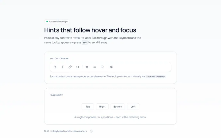
Basic Tooltip
Originalbasic tooltips on hover
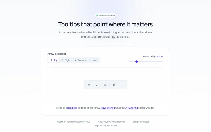
Arrow Tooltip
Originaltooltips with an arrow
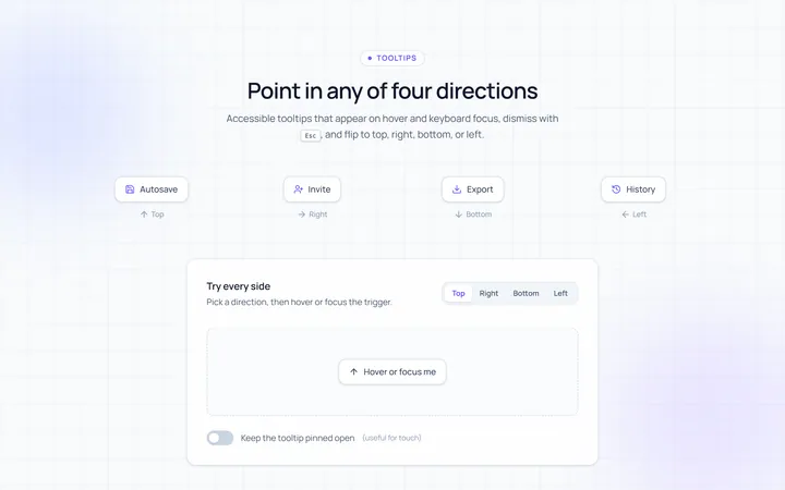
Directions Tooltip
Originaltooltips in four directions
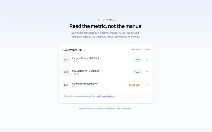
Rich Tooltip
Originalrich tooltip with title and body
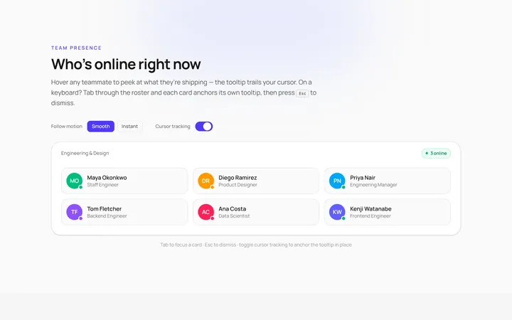
Follow Cursor Tooltip
Originaltooltip that follows the cursor
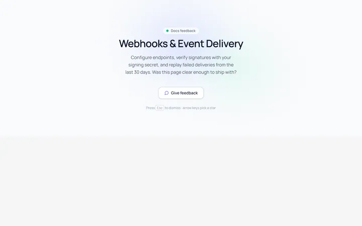
Popover Form Tooltip
Originalpopover containing a mini form
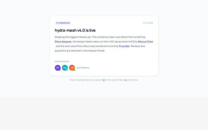
Hover Card Tooltip
Originalprofile hover card
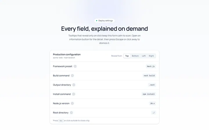
Click Tooltip
Originalclick-to-reveal tooltip
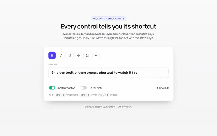
Keyboard Hint Tooltip
Originalkeyboard shortcut hint tooltips
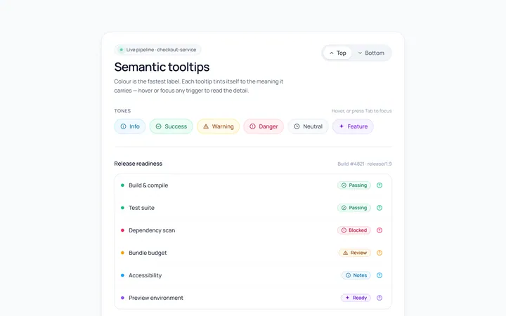
Color Tooltip
Originalcoloured semantic tooltips
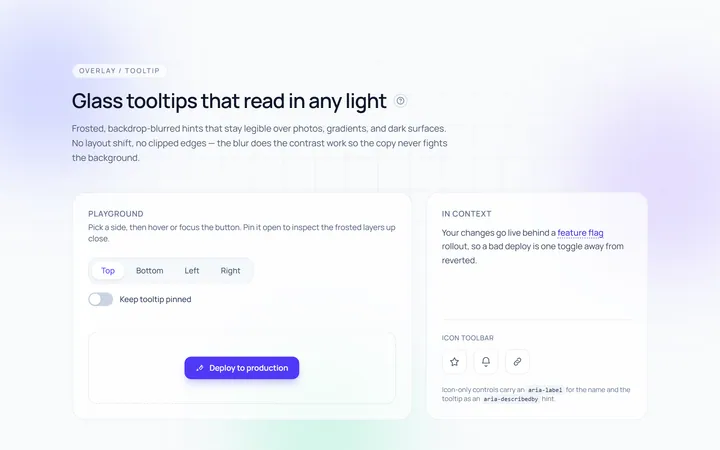
Glass Tooltip
Originalglassmorphic tooltips

Spotlight Hero
OriginalA centred hero with a soft radial spotlight, badge and dual call-to-action.