

Follow Cursor Tooltip
Original · freetooltip that follows the cursor
byWeb InnoventixReact + Tailwind
tipfollowcursortooltips
Copy prompt gives Claude Code, Cursor or v0 a ready-to-paste prompt that recreates this exact component.
npx shadcn@latest add https://webinnoventix.com/r/tip-follow-cursor.jsontip-follow-cursor.tsx
"use client";
import {
useRef,
useState,
type PointerEvent as ReactPointerEvent,
type FocusEvent as ReactFocusEvent,
type KeyboardEvent as ReactKeyboardEvent,
} from "react";
import {
motion,
AnimatePresence,
useMotionValue,
useSpring,
useReducedMotion,
} from "motion/react";
type Status = "online" | "meeting" | "focused" | "away";
interface Member {
id: string;
name: string;
role: string;
task: string;
status: Status;
avatar: string;
initials: string;
}
interface StatusMeta {
label: string;
dot: string;
text: string;
ping: boolean;
}
const MEMBERS: Member[] = [
{
id: "maya",
name: "Maya Okonkwo",
role: "Staff Engineer",
task: "Shipping the realtime sync layer",
status: "online",
avatar: "bg-emerald-500",
initials: "MO",
},
{
id: "diego",
name: "Diego Ramirez",
role: "Product Designer",
task: "Prototyping the onboarding flow",
status: "meeting",
avatar: "bg-amber-500",
initials: "DR",
},
{
id: "priya",
name: "Priya Nair",
role: "Engineering Manager",
task: "Reviewing the Q3 roadmap",
status: "online",
avatar: "bg-sky-500",
initials: "PN",
},
{
id: "tom",
name: "Tom Fletcher",
role: "Backend Engineer",
task: "Debugging webhook retries",
status: "focused",
avatar: "bg-violet-500",
initials: "TF",
},
{
id: "ana",
name: "Ana Costa",
role: "Data Scientist",
task: "Training the churn model",
status: "away",
avatar: "bg-rose-500",
initials: "AC",
},
{
id: "kenji",
name: "Kenji Watanabe",
role: "Frontend Engineer",
task: "Refactoring the design tokens",
status: "online",
avatar: "bg-indigo-500",
initials: "KW",
},
];
const STATUS: Record<Status, StatusMeta> = {
online: {
label: "Online",
dot: "bg-emerald-500",
text: "text-emerald-600 dark:text-emerald-400",
ping: true,
},
meeting: {
label: "In a meeting",
dot: "bg-amber-500",
text: "text-amber-600 dark:text-amber-400",
ping: false,
},
focused: {
label: "Heads-down",
dot: "bg-violet-500",
text: "text-violet-600 dark:text-violet-400",
ping: false,
},
away: {
label: "Away",
dot: "bg-rose-500",
text: "text-rose-600 dark:text-rose-400",
ping: false,
},
};
const TIP_W = 272;
const TIP_H = 140;
const KEYFRAMES = `
@keyframes tipfc-ping {
0% { transform: scale(1); opacity: 0.55; }
70% { transform: scale(2.2); opacity: 0; }
100% { transform: scale(2.2); opacity: 0; }
}
.tipfc-ping-ring { animation: tipfc-ping 1.8s cubic-bezier(0, 0, 0.2, 1) infinite; }
@media (prefers-reduced-motion: reduce) {
.tipfc-ping-ring { animation: none; }
}
`;
export default function TipFollowCursor() {
const reduce = useReducedMotion();
const panelRef = useRef<HTMLDivElement | null>(null);
const [activeId, setActiveId] = useState<string | null>(null);
const [anchored, setAnchored] = useState(false);
const [anchorBelow, setAnchorBelow] = useState(false);
const [flipX, setFlipX] = useState(false);
const [flipY, setFlipY] = useState(false);
const [mode, setMode] = useState<"smooth" | "instant">("smooth");
const [tracking, setTracking] = useState(true);
const rawX = useMotionValue(0);
const rawY = useMotionValue(0);
const springX = useSpring(rawX, { stiffness: 520, damping: 42, mass: 0.6 });
const springY = useSpring(rawY, { stiffness: 520, damping: 42, mass: 0.6 });
const smooth = mode === "smooth" && !reduce;
const px = smooth ? springX : rawX;
const py = smooth ? springY : rawY;
const active = MEMBERS.find((m) => m.id === activeId) ?? null;
const activeStatus = active ? STATUS[active.status] : null;
const onlineCount = MEMBERS.filter((m) => m.status === "online").length;
function showAnchored(id: string, el: HTMLElement) {
const panel = panelRef.current;
if (!panel) return;
const pr = panel.getBoundingClientRect();
const er = el.getBoundingClientRect();
const half = TIP_W / 2;
const cx = er.left - pr.left + er.width / 2;
const clampedX = Math.min(Math.max(cx, half + 8), pr.width - half - 8);
const spaceAbove = er.top - pr.top;
const below = spaceAbove < TIP_H + 24;
rawX.set(clampedX);
rawY.set(below ? er.bottom - pr.top + 12 : er.top - pr.top - 12);
setAnchorBelow(below);
setAnchored(true);
setActiveId(id);
}
function onPointer(e: ReactPointerEvent<HTMLButtonElement>, id: string) {
if (!tracking) {
showAnchored(id, e.currentTarget);
return;
}
const panel = panelRef.current;
if (!panel) return;
const rect = panel.getBoundingClientRect();
const localX = e.clientX - rect.left;
const localY = e.clientY - rect.top;
rawX.set(localX);
rawY.set(localY);
const nextFlipX = localX > rect.width - (TIP_W + 24);
const nextFlipY = localY > rect.height - (TIP_H + 24);
setFlipX((p) => (p !== nextFlipX ? nextFlipX : p));
setFlipY((p) => (p !== nextFlipY ? nextFlipY : p));
if (anchored) setAnchored(false);
if (activeId !== id) setActiveId(id);
}
function onFocusCard(e: ReactFocusEvent<HTMLButtonElement>, id: string) {
showAnchored(id, e.currentTarget);
}
function onLeave(id: string) {
setActiveId((cur) => (cur === id ? null : cur));
}
function onPanelKeyDown(e: ReactKeyboardEvent<HTMLDivElement>) {
if (e.key === "Escape" && activeId) {
setActiveId(null);
const el = document.activeElement;
if (el instanceof HTMLElement) el.blur();
}
}
const offX: number | string = anchored
? "-50%"
: flipX
? -(TIP_W + 16)
: 16;
const offY: number | string = anchored
? anchorBelow
? "0%"
: "-100%"
: flipY
? -(TIP_H + 16)
: 20;
const tipInitial = reduce
? { opacity: 0, x: offX, y: offY }
: { opacity: 0, scale: 0.9, x: offX, y: offY };
const tipAnimate = reduce
? { opacity: 1, x: offX, y: offY }
: { opacity: 1, scale: 1, x: offX, y: offY };
const tipExit = reduce
? { opacity: 0, x: offX, y: offY }
: { opacity: 0, scale: 0.9, x: offX, y: offY };
return (
<section className="relative w-full overflow-hidden bg-neutral-50 px-4 py-20 text-neutral-900 sm:py-28 dark:bg-neutral-950 dark:text-neutral-100">
<style>{KEYFRAMES}</style>
<div
aria-hidden="true"
className="pointer-events-none absolute -top-24 left-1/2 h-72 w-[36rem] max-w-full -translate-x-1/2 rounded-full bg-indigo-300/20 blur-3xl dark:bg-indigo-600/10"
/>
<div className="relative mx-auto max-w-5xl">
<header className="mb-8 max-w-2xl">
<p className="text-xs font-semibold uppercase tracking-[0.2em] text-indigo-600 dark:text-indigo-400">
Team presence
</p>
<h2 className="mt-3 text-3xl font-bold tracking-tight sm:text-4xl">
Who’s online right now
</h2>
<p className="mt-3 text-sm leading-relaxed text-neutral-600 sm:text-base dark:text-neutral-400">
Hover any teammate to peek at what they’re shipping — the
tooltip trails your cursor. On a keyboard? Tab through the roster and
each card anchors its own tooltip, then press{" "}
<kbd className="rounded border border-neutral-300 bg-neutral-100 px-1.5 py-0.5 font-mono text-[11px] text-neutral-700 dark:border-neutral-700 dark:bg-neutral-800 dark:text-neutral-300">
Esc
</kbd>{" "}
to dismiss.
</p>
</header>
<div className="mb-6 flex flex-wrap items-center gap-x-8 gap-y-4">
<fieldset className="flex items-center gap-3">
<legend className="sr-only">Tooltip follow motion</legend>
<span className="text-xs font-medium text-neutral-500 dark:text-neutral-400">
Follow motion
</span>
<div className="flex gap-1.5">
{(
[
{ v: "smooth", label: "Smooth" },
{ v: "instant", label: "Instant" },
] as const
).map((opt) => (
<label key={opt.v} className="cursor-pointer">
<input
type="radio"
name="tipfc-follow"
value={opt.v}
checked={mode === opt.v}
disabled={!tracking}
onChange={() => setMode(opt.v)}
className="peer sr-only"
/>
<span className="block rounded-lg px-3 py-1.5 text-xs font-medium text-neutral-600 ring-1 ring-inset ring-neutral-200 transition peer-checked:bg-indigo-600 peer-checked:text-white peer-checked:ring-indigo-600 peer-focus-visible:ring-2 peer-focus-visible:ring-offset-2 peer-focus-visible:ring-indigo-500 peer-disabled:opacity-40 dark:text-neutral-300 dark:ring-neutral-700 dark:peer-focus-visible:ring-offset-neutral-950">
{opt.label}
</span>
</label>
))}
</div>
</fieldset>
<div className="flex items-center gap-3">
<span
id="tipfc-switch-label"
className="text-xs font-medium text-neutral-500 dark:text-neutral-400"
>
Cursor tracking
</span>
<button
type="button"
role="switch"
aria-checked={tracking}
aria-labelledby="tipfc-switch-label"
onClick={() => setTracking((v) => !v)}
className={`relative inline-flex h-6 w-11 shrink-0 items-center rounded-full transition-colors focus-visible:outline-none focus-visible:ring-2 focus-visible:ring-offset-2 focus-visible:ring-indigo-500 dark:focus-visible:ring-offset-neutral-950 ${
tracking
? "bg-indigo-600"
: "bg-neutral-300 dark:bg-neutral-700"
}`}
>
<span
className={`inline-block h-5 w-5 transform rounded-full bg-white shadow transition-transform ${
tracking ? "translate-x-5" : "translate-x-0.5"
}`}
/>
</button>
</div>
</div>
<div
ref={panelRef}
onKeyDown={onPanelKeyDown}
className="relative overflow-hidden rounded-3xl border border-neutral-200 bg-white p-4 pt-14 shadow-sm sm:p-6 sm:pt-16 dark:border-neutral-800 dark:bg-neutral-900"
>
<div className="absolute inset-x-4 top-4 flex items-center justify-between sm:inset-x-6">
<span className="text-xs font-medium text-neutral-500 dark:text-neutral-400">
Engineering & Design
</span>
<span className="inline-flex items-center gap-1.5 rounded-full bg-emerald-50 px-2.5 py-1 text-[11px] font-semibold text-emerald-700 ring-1 ring-inset ring-emerald-200 dark:bg-emerald-500/10 dark:text-emerald-400 dark:ring-emerald-500/20">
<span className="h-1.5 w-1.5 rounded-full bg-emerald-500" />
{onlineCount} online
</span>
</div>
<ul className="grid grid-cols-1 gap-3 sm:grid-cols-2 lg:grid-cols-3">
{MEMBERS.map((m) => {
const isActive = activeId === m.id;
const meta = STATUS[m.status];
return (
<li key={m.id}>
<button
type="button"
aria-describedby={isActive ? "tipfc-tooltip" : undefined}
onPointerEnter={(e) => onPointer(e, m.id)}
onPointerMove={(e) => onPointer(e, m.id)}
onPointerLeave={() => onLeave(m.id)}
onFocus={(e) => onFocusCard(e, m.id)}
onBlur={() => onLeave(m.id)}
className={`flex w-full select-none items-center gap-3 rounded-2xl border p-3 text-left transition-colors focus-visible:outline-none focus-visible:ring-2 focus-visible:ring-indigo-500 focus-visible:ring-offset-2 dark:focus-visible:ring-offset-neutral-900 ${
isActive
? "border-indigo-400 bg-indigo-50/60 dark:border-indigo-500 dark:bg-indigo-500/10"
: "border-neutral-200 bg-neutral-50 hover:border-neutral-300 hover:bg-white dark:border-neutral-800 dark:bg-neutral-900/50 dark:hover:border-neutral-700 dark:hover:bg-neutral-800/60"
}`}
>
<span className="relative shrink-0">
<span
className={`grid h-10 w-10 place-items-center rounded-full text-sm font-semibold text-white ${m.avatar}`}
>
{m.initials}
</span>
<span
className={`absolute -bottom-0.5 -right-0.5 h-3 w-3 rounded-full border-2 border-white dark:border-neutral-900 ${meta.dot}`}
/>
</span>
<span className="min-w-0">
<span className="block truncate text-sm font-semibold text-neutral-900 dark:text-neutral-50">
{m.name}
</span>
<span className="block truncate text-xs text-neutral-500 dark:text-neutral-400">
{m.role}
</span>
</span>
</button>
</li>
);
})}
</ul>
<motion.div
className="pointer-events-none absolute left-0 top-0 z-30"
style={{ x: px, y: py }}
>
{active && !anchored && tracking ? (
<span className="relative -left-1 -top-1 block h-2 w-2">
<span className="tipfc-ping-ring absolute inline-flex h-full w-full rounded-full bg-indigo-400/70 dark:bg-indigo-500/60" />
<span className="relative inline-flex h-2 w-2 rounded-full bg-indigo-500 ring-2 ring-white dark:ring-neutral-900" />
</span>
) : null}
</motion.div>
<motion.div
className="pointer-events-none absolute left-0 top-0 z-40"
style={{ x: px, y: py }}
>
<AnimatePresence>
{active && activeStatus ? (
<motion.div
key="tip"
id="tipfc-tooltip"
role="tooltip"
initial={tipInitial}
animate={tipAnimate}
exit={tipExit}
transition={{ duration: reduce ? 0.12 : 0.16, ease: "easeOut" }}
style={{ width: TIP_W }}
className="rounded-xl border border-neutral-200 bg-white p-3.5 shadow-xl shadow-neutral-900/10 dark:border-neutral-700 dark:bg-neutral-800 dark:shadow-black/40"
>
<div className="flex items-start gap-3">
<span
className={`grid h-9 w-9 shrink-0 place-items-center rounded-full text-xs font-semibold text-white ${active.avatar}`}
>
{active.initials}
</span>
<div className="min-w-0">
<p className="truncate text-sm font-semibold text-neutral-900 dark:text-neutral-50">
{active.name}
</p>
<p className="truncate text-xs text-neutral-500 dark:text-neutral-400">
{active.role}
</p>
</div>
</div>
<p className="mt-3 text-xs leading-relaxed text-neutral-600 dark:text-neutral-300">
<span className="text-neutral-400 dark:text-neutral-500">
Now:{" "}
</span>
{active.task}
</p>
<div className="mt-3 flex items-center gap-1.5 border-t border-neutral-100 pt-2.5 dark:border-neutral-700/60">
<span className="relative flex h-2 w-2">
{activeStatus.ping ? (
<span className="tipfc-ping-ring absolute inline-flex h-full w-full rounded-full bg-emerald-400/70 dark:bg-emerald-500/60" />
) : null}
<span
className={`relative inline-flex h-2 w-2 rounded-full ${activeStatus.dot}`}
/>
</span>
<span
className={`text-[11px] font-medium ${activeStatus.text}`}
>
{activeStatus.label}
</span>
</div>
</motion.div>
) : null}
</AnimatePresence>
</motion.div>
</div>
<p className="mt-4 text-center text-xs text-neutral-400 dark:text-neutral-500">
Tab to focus a card · Esc to dismiss · toggle cursor
tracking to anchor the tooltip in place
</p>
</div>
</section>
);
}Dependencies
motion
Licence
Built by Web Innoventix. Free for personal and commercial use, no attribution required.
Built by Web Innoventix
Need a custom interface, a full website, or SEO that gets you cited by AI? We design, build and rank it end to end.
Get a free quoteSimilar components
Browse all →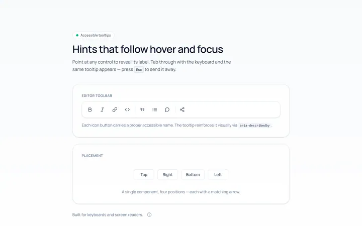
Basic Tooltip
Originalbasic tooltips on hover
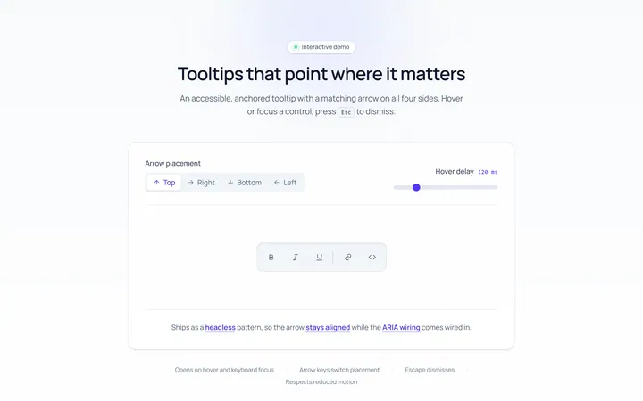
Arrow Tooltip
Originaltooltips with an arrow
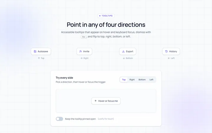
Directions Tooltip
Originaltooltips in four directions
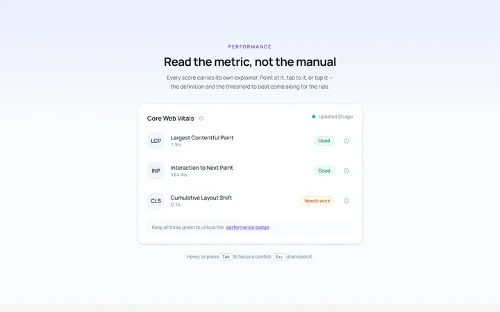
Rich Tooltip
Originalrich tooltip with title and body
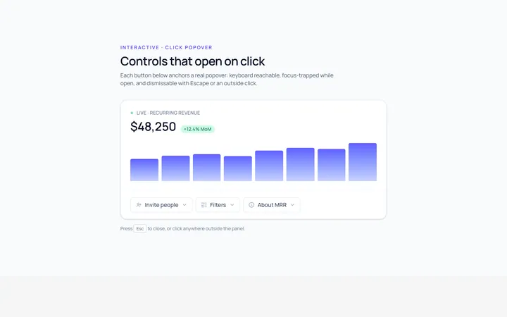
Popover Tooltip
Originalclick popover with content
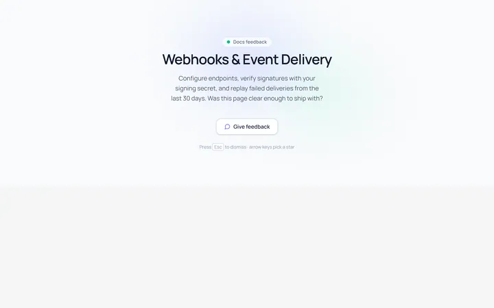
Popover Form Tooltip
Originalpopover containing a mini form
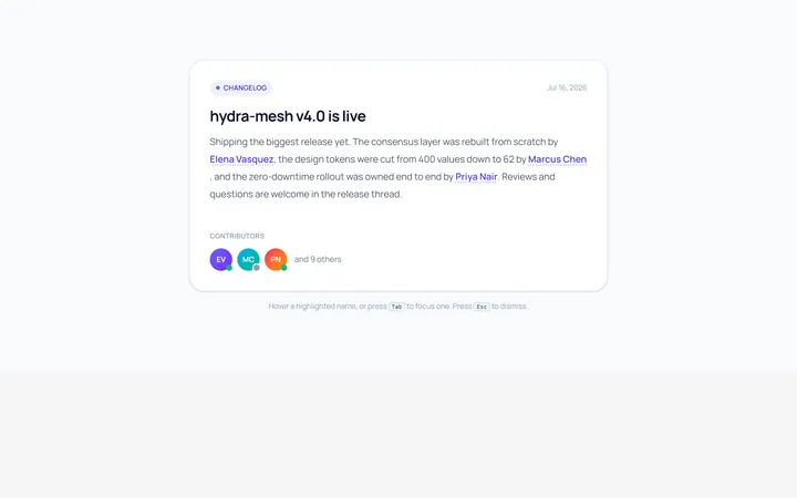
Hover Card Tooltip
Originalprofile hover card
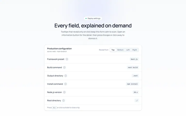
Click Tooltip
Originalclick-to-reveal tooltip
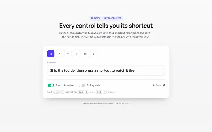
Keyboard Hint Tooltip
Originalkeyboard shortcut hint tooltips
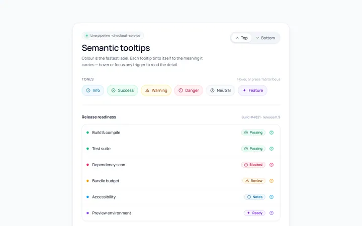
Color Tooltip
Originalcoloured semantic tooltips
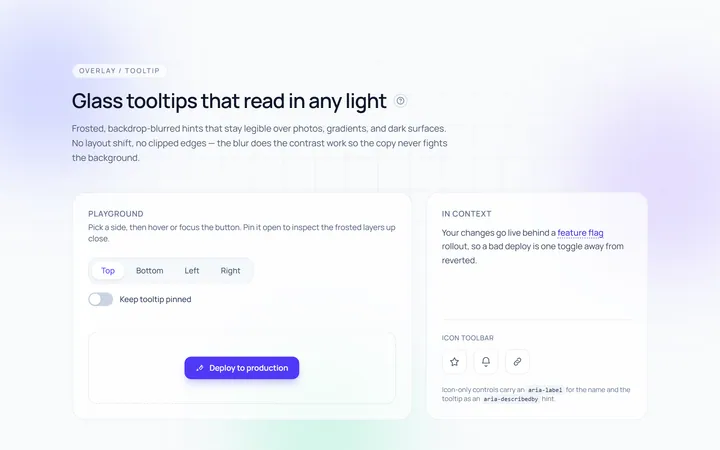
Glass Tooltip
Originalglassmorphic tooltips

Spotlight Hero
OriginalA centred hero with a soft radial spotlight, badge and dual call-to-action.