

Hover Card Tooltip
Original · freeprofile hover card
byWeb InnoventixReact + Tailwind
tiphovercardtooltips
Copy prompt gives Claude Code, Cursor or v0 a ready-to-paste prompt that recreates this exact component.
npx shadcn@latest add https://webinnoventix.com/r/tip-hover-card.jsontip-hover-card.tsx
"use client";

import {
  useEffect,
  useRef,
  useState,
  type FocusEvent,
  type KeyboardEvent,
} from "react";
import { AnimatePresence, motion, useReducedMotion } from "motion/react";

type Align = "start" | "center" | "end";

type Stat = { label: string; value: string };

type Profile = {
  id: string;
  name: string;
  handle: string;
  initials: string;
  gradient: string;
  role: string;
  bio: string;
  location: string;
  joined: string;
  website: string;
  websiteLabel: string;
  verified: boolean;
  online: boolean;
  stats: Stat[];
  mutuals: string;
};

const PROFILES: Profile[] = [
  {
    id: "elena",
    name: "Elena Vasquez",
    handle: "elenacodes",
    initials: "EV",
    gradient: "from-indigo-500 to-violet-600",
    role: "Principal Engineer · Vantage Labs",
    bio: "Distributed systems and Rust. I maintain hydra-mesh and write about consensus you can actually reason about.",
    location: "Lisbon, Portugal",
    joined: "Joined March 2019",
    website: "https://elena.dev",
    websiteLabel: "elena.dev",
    verified: true,
    online: true,
    stats: [
      { value: "18.4k", label: "Followers" },
      { value: "312", label: "Following" },
      { value: "47", label: "Projects" },
    ],
    mutuals: "Followed by Marcus Chen and 6 others you follow.",
  },
  {
    id: "marcus",
    name: "Marcus Chen",
    handle: "marcusdesigns",
    initials: "MC",
    gradient: "from-sky-500 to-emerald-500",
    role: "Design Systems Lead · Northwind",
    bio: "Turned 400 one-off buttons into 6. Accessibility first, tokens always. Previously on the Figma community team.",
    location: "Toronto, Canada",
    joined: "Joined July 2020",
    website: "https://marcus.design",
    websiteLabel: "marcus.design",
    verified: false,
    online: false,
    stats: [
      { value: "9.1k", label: "Followers" },
      { value: "540", label: "Following" },
      { value: "23", label: "Projects" },
    ],
    mutuals: "Followed by Priya Nair and 3 others you follow.",
  },
  {
    id: "priya",
    name: "Priya Nair",
    handle: "priyaships",
    initials: "PN",
    gradient: "from-rose-500 to-amber-500",
    role: "Staff SRE · Coreband",
    bio: "On-call so you don't have to be. Kubernetes, observability, and blameless postmortems. She/her.",
    location: "Bengaluru, India",
    joined: "Joined January 2018",
    website: "https://priya.sh",
    websiteLabel: "priya.sh",
    verified: true,
    online: true,
    stats: [
      { value: "12.7k", label: "Followers" },
      { value: "208", label: "Following" },
      { value: "61", label: "Projects" },
    ],
    mutuals: "Followed by Elena Vasquez and 11 others you follow.",
  },
];

function VerifiedIcon({ className }: { className?: string }) {
  return (
    <svg viewBox="0 0 24 24" fill="currentColor" className={className} aria-hidden="true">
      <path
        fillRule="evenodd"
        d="M12 2l2.09 1.5 2.55-.36 1.02 2.37 2.37 1.02-.36 2.55L21 12l-1.5 2.09.36 2.55-2.37 1.02-1.02 2.37-2.55-.36L12 22l-2.09-1.5-2.55.36-1.02-2.37-2.37-1.02.36-2.55L3 12l1.5-2.09-.36-2.55 2.37-1.02L7.53 3.14l2.55.36L12 2zm-1.2 12.6l4.6-4.6-1.4-1.4-3.2 3.2-1.4-1.4-1.4 1.4 2.8 2.8z"
        clipRule="evenodd"
      />
    </svg>
  );
}

function LocationIcon({ className }: { className?: string }) {
  return (
    <svg
      viewBox="0 0 24 24"
      fill="none"
      stroke="currentColor"
      strokeWidth={1.8}
      strokeLinecap="round"
      strokeLinejoin="round"
      className={className}
      aria-hidden="true"
    >
      <path d="M12 21s-6-5.2-6-10a6 6 0 1112 0c0 4.8-6 10-6 10z" />
      <circle cx="12" cy="11" r="2" />
    </svg>
  );
}

function CalendarIcon({ className }: { className?: string }) {
  return (
    <svg
      viewBox="0 0 24 24"
      fill="none"
      stroke="currentColor"
      strokeWidth={1.8}
      strokeLinecap="round"
      strokeLinejoin="round"
      className={className}
      aria-hidden="true"
    >
      <rect x="3.5" y="5" width="17" height="16" rx="2" />
      <path d="M3.5 9.5h17M8 3.5v3M16 3.5v3" />
    </svg>
  );
}

function LinkIcon({ className }: { className?: string }) {
  return (
    <svg
      viewBox="0 0 24 24"
      fill="none"
      stroke="currentColor"
      strokeWidth={1.8}
      strokeLinecap="round"
      strokeLinejoin="round"
      className={className}
      aria-hidden="true"
    >
      <path d="M10 13a5 5 0 007.5.5l2-2a5 5 0 00-7-7l-1.2 1.2" />
      <path d="M14 11a5 5 0 00-7.5-.5l-2 2a5 5 0 007 7l1.2-1.2" />
    </svg>
  );
}

function Avatar({ profile, size }: { profile: Profile; size: "sm" | "lg" }) {
  const dim = size === "lg" ? "h-14 w-14 text-base" : "h-9 w-9 text-xs";
  const dot = size === "lg" ? "h-3.5 w-3.5" : "h-2.5 w-2.5";
  return (
    <span
      className={`relative inline-flex ${dim} shrink-0 items-center justify-center rounded-full bg-gradient-to-br ${profile.gradient} font-semibold text-white shadow-sm ring-2 ring-white dark:ring-slate-900`}
    >
      {profile.initials}
      <span
        className={`absolute bottom-0 right-0 block ${dot} rounded-full ring-2 ring-white dark:ring-slate-900 ${
          profile.online ? "tiphover-pulse-dot bg-emerald-500" : "bg-slate-400"
        }`}
        aria-hidden="true"
      />
    </span>
  );
}

function ProfilePanel({
  profile,
  align,
  isFollowed,
  onToggleFollow,
}: {
  profile: Profile;
  align: Align;
  isFollowed: boolean;
  onToggleFollow: (id: string) => void;
}) {
  const arrowPos =
    align === "start"
      ? "left-6"
      : align === "end"
        ? "right-6"
        : "left-1/2 -translate-x-1/2";

  return (
    <div className="relative w-[min(20rem,calc(100vw-2.5rem))] rounded-2xl border border-slate-200 bg-white p-4 text-left shadow-xl shadow-slate-900/10 dark:border-slate-800 dark:bg-slate-900 dark:shadow-black/40">
      <span
        className={`absolute -top-1.5 h-3 w-3 rotate-45 border-l border-t border-slate-200 bg-white dark:border-slate-800 dark:bg-slate-900 ${arrowPos}`}
        aria-hidden="true"
      />

      <div className="flex items-start justify-between gap-3">
        <Avatar profile={profile} size="lg" />
        <button
          type="button"
          onClick={() => onToggleFollow(profile.id)}
          aria-pressed={isFollowed}
          aria-label={
            isFollowed
              ? `Unfollow ${profile.name}`
              : `Follow ${profile.name}`
          }
          className={`rounded-full px-4 py-1.5 text-[13px] font-semibold transition-colors focus-visible:outline-none focus-visible:ring-2 focus-visible:ring-indigo-500 focus-visible:ring-offset-2 focus-visible:ring-offset-white dark:focus-visible:ring-offset-slate-900 ${
            isFollowed
              ? "border border-slate-300 text-slate-700 hover:border-rose-300 hover:text-rose-600 dark:border-slate-700 dark:text-slate-200 dark:hover:border-rose-500/50 dark:hover:text-rose-400"
              : "bg-slate-900 text-white hover:bg-slate-700 dark:bg-white dark:text-slate-900 dark:hover:bg-slate-200"
          }`}
        >
          {isFollowed ? "Following" : "Follow"}
        </button>
      </div>

      <div className="mt-3">
        <div className="flex items-center gap-1.5">
          <h3 className="text-[15px] font-semibold text-slate-900 dark:text-white">
            {profile.name}
          </h3>
          {profile.verified ? (
            <VerifiedIcon className="h-4 w-4 text-sky-500" />
          ) : null}
        </div>
        <p className="mt-0.5 text-[13px] text-slate-500 dark:text-slate-400">
          @{profile.handle}
        </p>
      </div>

      <p className="mt-2 text-[13px] font-medium text-indigo-600 dark:text-indigo-400">
        {profile.role}
      </p>

      <p className="mt-2 text-[13px] leading-relaxed text-slate-600 dark:text-slate-300">
        {profile.bio}
      </p>

      <div className="mt-3 flex flex-wrap gap-x-3 gap-y-1 text-[12px] text-slate-500 dark:text-slate-400">
        <span className="inline-flex items-center gap-1">
          <LocationIcon className="h-3.5 w-3.5" />
          {profile.location}
        </span>
        <a
          href={profile.website}
          target="_blank"
          rel="noopener"
          className="inline-flex items-center gap-1 rounded text-indigo-600 hover:underline focus-visible:outline-none focus-visible:ring-2 focus-visible:ring-indigo-500 focus-visible:ring-offset-2 focus-visible:ring-offset-white dark:text-indigo-400 dark:focus-visible:ring-offset-slate-900"
        >
          <LinkIcon className="h-3.5 w-3.5" />
          {profile.websiteLabel}
        </a>
        <span className="inline-flex items-center gap-1">
          <CalendarIcon className="h-3.5 w-3.5" />
          {profile.joined}
        </span>
      </div>

      <div className="mt-3 flex items-center gap-4 border-t border-slate-100 pt-3 dark:border-slate-800">
        {profile.stats.map((s) => (
          <span key={s.label} className="text-[13px]">
            <strong className="font-semibold text-slate-900 dark:text-white">
              {s.value}
            </strong>{" "}
            <span className="text-slate-500 dark:text-slate-400">{s.label}</span>
          </span>
        ))}
      </div>

      <p className="mt-3 text-[12px] text-slate-500 dark:text-slate-400">
        {profile.mutuals}
      </p>
    </div>
  );
}

function Mention({
  profile,
  align,
  variant,
  reduce,
  openId,
  onOpen,
  onClose,
  followed,
  onToggleFollow,
}: {
  profile: Profile;
  align: Align;
  variant: "text" | "avatar";
  reduce: boolean;
  openId: string | null;
  onOpen: (id: string) => void;
  onClose: (id: string) => void;
  followed: Set<string>;
  onToggleFollow: (id: string) => void;
}) {
  const isOpen = openId === profile.id;
  const cardId = `tiphover-card-${profile.id}`;
  const triggerRef = useRef<HTMLButtonElement>(null);
  const openTimer = useRef<number | null>(null);
  const closeTimer = useRef<number | null>(null);

  const clearTimers = () => {
    if (openTimer.current !== null) {
      window.clearTimeout(openTimer.current);
      openTimer.current = null;
    }
    if (closeTimer.current !== null) {
      window.clearTimeout(closeTimer.current);
      closeTimer.current = null;
    }
  };

  useEffect(() => clearTimers, []);

  const scheduleOpen = () => {
    if (closeTimer.current !== null) {
      window.clearTimeout(closeTimer.current);
      closeTimer.current = null;
    }
    if (openTimer.current === null) {
      openTimer.current = window.setTimeout(() => {
        openTimer.current = null;
        onOpen(profile.id);
      }, 120);
    }
  };

  const scheduleClose = () => {
    if (openTimer.current !== null) {
      window.clearTimeout(openTimer.current);
      openTimer.current = null;
    }
    if (closeTimer.current === null) {
      closeTimer.current = window.setTimeout(() => {
        closeTimer.current = null;
        onClose(profile.id);
      }, 160);
    }
  };

  const handleFocus = () => {
    clearTimers();
    onOpen(profile.id);
  };

  const handleBlur = (e: FocusEvent<HTMLSpanElement>) => {
    if (!e.currentTarget.contains(e.relatedTarget as Node | null)) {
      scheduleClose();
    }
  };

  const handleKeyDown = (e: KeyboardEvent<HTMLSpanElement>) => {
    if (e.key === "Escape" && isOpen) {
      e.preventDefault();
      clearTimers();
      onClose(profile.id);
      triggerRef.current?.focus();
    }
  };

  const horiz =
    align === "start" ? "left-0" : align === "end" ? "right-0" : "left-1/2";
  const xBase: string | number = align === "center" ? "-50%" : 0;

  const variants = {
    hidden: {
      opacity: 0,
      x: xBase,
      y: reduce ? 0 : 6,
      scale: reduce ? 1 : 0.97,
    },
    visible: { opacity: 1, x: xBase, y: 0, scale: 1 },
  };

  return (
    <span
      className="relative inline-block align-baseline"
      onMouseEnter={scheduleOpen}
      onMouseLeave={scheduleClose}
      onFocus={handleFocus}
      onBlur={handleBlur}
      onKeyDown={handleKeyDown}
    >
      {variant === "text" ? (
        <button
          ref={triggerRef}
          type="button"
          aria-haspopup="dialog"
          aria-expanded={isOpen}
          aria-controls={cardId}
          className="rounded align-baseline font-semibold text-indigo-600 underline decoration-dotted decoration-indigo-400/70 underline-offset-4 hover:decoration-indigo-500 focus-visible:outline-none focus-visible:ring-2 focus-visible:ring-indigo-500 focus-visible:ring-offset-2 focus-visible:ring-offset-white dark:text-indigo-400 dark:focus-visible:ring-offset-slate-900"
        >
          {profile.name}
        </button>
      ) : (
        <button
          ref={triggerRef}
          type="button"
          aria-haspopup="dialog"
          aria-expanded={isOpen}
          aria-controls={cardId}
          aria-label={`View ${profile.name}'s profile`}
          className="rounded-full transition-transform hover:-translate-y-0.5 focus-visible:outline-none focus-visible:ring-2 focus-visible:ring-indigo-500 focus-visible:ring-offset-2 focus-visible:ring-offset-white dark:focus-visible:ring-offset-slate-900"
        >
          <Avatar profile={profile} size="sm" />
        </button>
      )}

      <AnimatePresence>
        {isOpen ? (
          <motion.div
            key={cardId}
            id={cardId}
            role="dialog"
            aria-label={`${profile.name} profile`}
            className={`absolute z-50 pt-2 ${horiz}`}
            style={{ transformOrigin: "top" }}
            initial="hidden"
            animate="visible"
            exit="hidden"
            variants={variants}
            transition={{ duration: reduce ? 0 : 0.16, ease: "easeOut" }}
          >
            <ProfilePanel
              profile={profile}
              align={align}
              isFollowed={followed.has(profile.id)}
              onToggleFollow={onToggleFollow}
            />
          </motion.div>
        ) : null}
      </AnimatePresence>
    </span>
  );
}

export default function TipHoverCard() {
  const reduce = useReducedMotion() ?? false;
  const [openId, setOpenId] = useState<string | null>(null);
  const [followed, setFollowed] = useState<Set<string>>(new Set());

  const handleOpen = (id: string) => setOpenId(id);
  const handleClose = (id: string) =>
    setOpenId((prev) => (prev === id ? null : prev));

  const toggleFollow = (id: string) =>
    setFollowed((prev) => {
      const next = new Set(prev);
      if (next.has(id)) {
        next.delete(id);
      } else {
        next.add(id);
      }
      return next;
    });

  const shared = {
    reduce,
    openId,
    onOpen: handleOpen,
    onClose: handleClose,
    followed,
    onToggleFollow: toggleFollow,
  };

  return (
    <section className="relative w-full bg-slate-50 px-4 py-16 dark:bg-slate-950 sm:px-6 sm:py-24">
      <div className="mx-auto max-w-2xl">
        <div className="rounded-3xl border border-slate-200 bg-white p-6 shadow-sm dark:border-slate-800 dark:bg-slate-900 sm:p-8">
          <div className="flex items-center justify-between gap-3">
            <span className="inline-flex items-center gap-1.5 rounded-full bg-indigo-50 px-2.5 py-1 text-[11px] font-semibold uppercase tracking-wide text-indigo-700 dark:bg-indigo-500/10 dark:text-indigo-300">
              <span className="h-1.5 w-1.5 rounded-full bg-indigo-500" />
              Changelog
            </span>
            <time className="text-xs text-slate-400 dark:text-slate-500">
              Jul 16, 2026
            </time>
          </div>

          <h2 className="mt-4 text-xl font-bold tracking-tight text-slate-900 dark:text-white sm:text-2xl">
            hydra-mesh v4.0 is live
          </h2>

          <p className="mt-3 text-[15px] leading-7 text-slate-600 dark:text-slate-300">
            Shipping the biggest release yet. The consensus layer was rebuilt
            from scratch by{" "}
            <Mention profile={PROFILES[0]} align="start" variant="text" {...shared} />
            , the design tokens were cut from 400 values down to 62 by{" "}
            <Mention profile={PROFILES[1]} align="center" variant="text" {...shared} />
            , and the zero-downtime rollout was owned end to end by{" "}
            <Mention profile={PROFILES[2]} align="end" variant="text" {...shared} />
            . Reviews and questions are welcome in the release thread.
          </p>

          <div className="mt-6 border-t border-slate-100 pt-5 dark:border-slate-800">
            <p className="text-[11px] font-semibold uppercase tracking-wide text-slate-400 dark:text-slate-500">
              Contributors
            </p>
            <div className="mt-3 flex items-center gap-2">
              {PROFILES.map((p, i) => (
                <Mention
                  key={p.id}
                  profile={p}
                  align={
                    i === 0 ? "start" : i === PROFILES.length - 1 ? "end" : "center"
                  }
                  variant="avatar"
                  {...shared}
                />
              ))}
              <span className="ml-1 text-[13px] text-slate-500 dark:text-slate-400">
                and 9 others
              </span>
            </div>
          </div>
        </div>

        <p className="mt-4 text-center text-xs text-slate-400 dark:text-slate-500">
          Hover a highlighted name, or press{" "}
          <kbd className="rounded border border-slate-300 bg-slate-100 px-1 font-mono text-[10px] text-slate-600 dark:border-slate-700 dark:bg-slate-800 dark:text-slate-300">
            Tab
          </kbd>{" "}
          to focus one. Press{" "}
          <kbd className="rounded border border-slate-300 bg-slate-100 px-1 font-mono text-[10px] text-slate-600 dark:border-slate-700 dark:bg-slate-800 dark:text-slate-300">
            Esc
          </kbd>{" "}
          to dismiss.
        </p>
      </div>

      <style>{`
        @keyframes tiphover-pulse {
          0% { box-shadow: 0 0 0 0 rgba(16, 185, 129, 0.55); }
          70% { box-shadow: 0 0 0 6px rgba(16, 185, 129, 0); }
          100% { box-shadow: 0 0 0 0 rgba(16, 185, 129, 0); }
        }
        .tiphover-pulse-dot { animation: tiphover-pulse 2.4s ease-out infinite; }
        @media (prefers-reduced-motion: reduce) {
          .tiphover-pulse-dot { animation: none !important; }
        }
      `}</style>
    </section>
  );
}
Dependencies
motion
Licence
Built by Web Innoventix. Free for personal and commercial use, no attribution required.
Built by Web Innoventix
Need a custom interface, a full website, or SEO that gets you cited by AI? We design, build and rank it end to end.
Get a free quoteSimilar components
Browse all →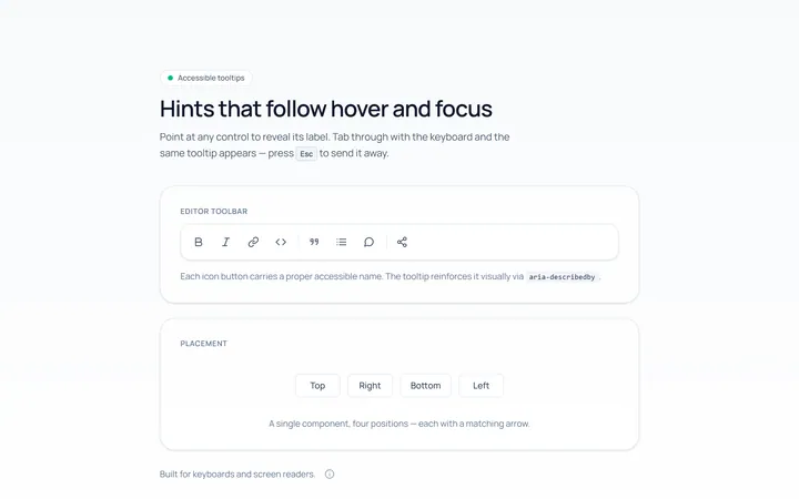
Basic Tooltip
Originalbasic tooltips on hover
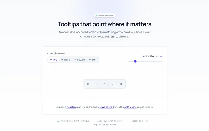
Arrow Tooltip
Originaltooltips with an arrow
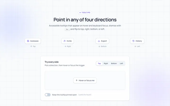
Directions Tooltip
Originaltooltips in four directions
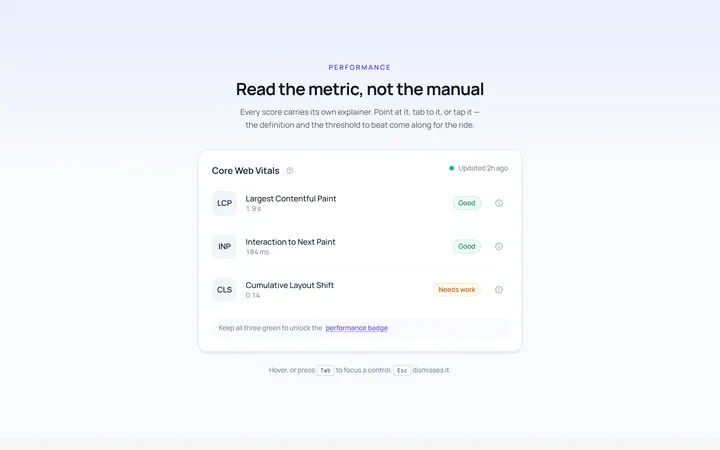
Rich Tooltip
Originalrich tooltip with title and body
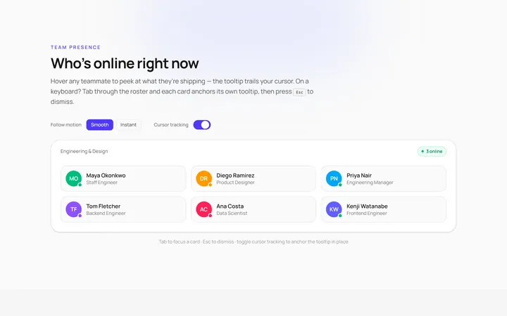
Follow Cursor Tooltip
Originaltooltip that follows the cursor
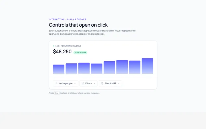
Popover Tooltip
Originalclick popover with content
Popover Form Tooltip
Originalpopover containing a mini form
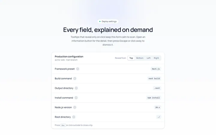
Click Tooltip
Originalclick-to-reveal tooltip
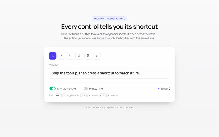
Keyboard Hint Tooltip
Originalkeyboard shortcut hint tooltips
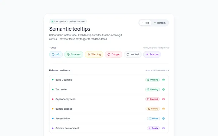
Color Tooltip
Originalcoloured semantic tooltips
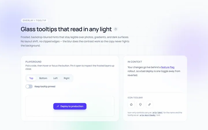
Glass Tooltip
Originalglassmorphic tooltips

Spotlight Hero
OriginalA centred hero with a soft radial spotlight, badge and dual call-to-action.