

Basic Sidebar
Original · freebasic app sidebar navigation
Copy prompt gives Claude Code, Cursor or v0 a ready-to-paste prompt that recreates this exact component.
npx shadcn@latest add https://webinnoventix.com/r/side-basic.json"use client";
import { useEffect, useMemo, useRef, useState } from "react";
import type {
CSSProperties,
KeyboardEvent as ReactKeyboardEvent,
ReactElement,
ReactNode,
RefObject,
} from "react";
import { AnimatePresence, motion, useReducedMotion } from "motion/react";
/* ------------------------------------------------------------------ *
* Icons — inline SVG, currentColor, no external libraries
* ------------------------------------------------------------------ */
function IconBase({
children,
className,
style,
}: {
children: ReactNode;
className?: string;
style?: CSSProperties;
}): ReactElement {
return (
<svg
viewBox="0 0 24 24"
fill="none"
stroke="currentColor"
strokeWidth={1.75}
strokeLinecap="round"
strokeLinejoin="round"
className={className}
style={style}
aria-hidden="true"
>
{children}
</svg>
);
}
type IconType = (props: { className?: string; style?: CSSProperties }) => ReactElement;
const DashboardIcon: IconType = ({ className }) => (
<IconBase className={className}>
<rect x="3" y="3" width="7.5" height="7.5" rx="1.6" />
<rect x="13.5" y="3" width="7.5" height="7.5" rx="1.6" />
<rect x="13.5" y="13.5" width="7.5" height="7.5" rx="1.6" />
<rect x="3" y="13.5" width="7.5" height="7.5" rx="1.6" />
</IconBase>
);
const ProjectsIcon: IconType = ({ className }) => (
<IconBase className={className}>
<path d="M3 7.5A1.5 1.5 0 0 1 4.5 6h4l2 2.2h7A1.5 1.5 0 0 1 19 9.7v7.8A1.5 1.5 0 0 1 17.5 19h-13A1.5 1.5 0 0 1 3 17.5Z" />
</IconBase>
);
const TasksIcon: IconType = ({ className }) => (
<IconBase className={className}>
<rect x="4" y="4" width="16" height="16" rx="2.5" />
<path d="m8.5 12.2 2.2 2.2 4.3-4.6" />
</IconBase>
);
const CalendarIcon: IconType = ({ className }) => (
<IconBase className={className}>
<rect x="3.5" y="5" width="17" height="15.5" rx="2.2" />
<path d="M3.5 9.5h17M8 3v4M16 3v4" />
</IconBase>
);
const AnalyticsIcon: IconType = ({ className }) => (
<IconBase className={className}>
<path d="M4 20V4" />
<path d="M4 20h16" />
<path d="M8.5 20v-5M13 20V9.5M17.5 20v-8.5" />
</IconBase>
);
const ReportsIcon: IconType = ({ className }) => (
<IconBase className={className}>
<path d="M6.5 3.5h7L18 8v11.5A1.5 1.5 0 0 1 16.5 21h-9A1.5 1.5 0 0 1 6 19.5V5A1.5 1.5 0 0 1 6.5 3.5Z" />
<path d="M13 3.5V8h4.5M9 13h6M9 16.5h6" />
</IconBase>
);
const ActivityIcon: IconType = ({ className }) => (
<IconBase className={className}>
<path d="M3 12h4l2.5 6 4-13 2.5 7H21" />
</IconBase>
);
const TeamIcon: IconType = ({ className }) => (
<IconBase className={className}>
<circle cx="9" cy="8.5" r="3" />
<path d="M3.5 19.5a5.5 5.5 0 0 1 11 0" />
<path d="M16 6.2a3 3 0 0 1 0 5.6M17.2 14.4a5.5 5.5 0 0 1 3.3 5.1" />
</IconBase>
);
const BillingIcon: IconType = ({ className }) => (
<IconBase className={className}>
<rect x="3" y="5.5" width="18" height="13" rx="2.2" />
<path d="M3 10h18M7 15h3" />
</IconBase>
);
const SettingsIcon: IconType = ({ className }) => (
<IconBase className={className}>
<circle cx="12" cy="12" r="3.1" />
<path d="M12 3v2.4M12 18.6V21M4.6 7.5l2 1.2M17.4 15.3l2 1.2M4.6 16.5l2-1.2M17.4 8.7l2-1.2" />
</IconBase>
);
const SearchIcon: IconType = ({ className }) => (
<IconBase className={className}>
<circle cx="11" cy="11" r="6.5" />
<path d="m20 20-3.6-3.6" />
</IconBase>
);
const ChevronIcon: IconType = ({ className, style }) => (
<IconBase className={className} style={style}>
<path d="m9 6 6 6-6 6" />
</IconBase>
);
const PlusIcon: IconType = ({ className }) => (
<IconBase className={className}>
<path d="M12 5v14M5 12h14" />
</IconBase>
);
const MenuIcon: IconType = ({ className }) => (
<IconBase className={className}>
<path d="M4 6h16M4 12h16M4 18h16" />
</IconBase>
);
const CloseIcon: IconType = ({ className }) => (
<IconBase className={className}>
<path d="M6 6l12 12M18 6 6 18" />
</IconBase>
);
const PanelIcon: IconType = ({ className }) => (
<IconBase className={className}>
<rect x="3.5" y="4.5" width="17" height="15" rx="2.2" />
<path d="M9.5 4.5v15" />
</IconBase>
);
const LogoMark: IconType = ({ className }) => (
<IconBase className={className}>
<path d="M4 17 12 4l8 13" />
<path d="M8 17 12 11l4 6" />
</IconBase>
);
/* ------------------------------------------------------------------ *
* Navigation model
* ------------------------------------------------------------------ */
type BadgeTone = "indigo" | "emerald" | "rose";
interface SubItem {
id: string;
label: string;
}
interface NavItem {
id: string;
label: string;
icon: IconType;
badge?: { text: string; tone: BadgeTone };
live?: boolean;
children?: SubItem[];
}
interface NavGroup {
id: string;
title: string;
items: NavItem[];
}
const GROUPS: NavGroup[] = [
{
id: "workspace",
title: "Workspace",
items: [
{ id: "dashboard", label: "Dashboard", icon: DashboardIcon },
{
id: "projects",
label: "Projects",
icon: ProjectsIcon,
children: [
{ id: "projects-all", label: "All projects" },
{ id: "projects-active", label: "Active sprint" },
{ id: "projects-archived", label: "Archived" },
],
},
{ id: "tasks", label: "Tasks", icon: TasksIcon, badge: { text: "12", tone: "indigo" } },
{ id: "calendar", label: "Calendar", icon: CalendarIcon },
],
},
{
id: "insights",
title: "Insights",
items: [
{ id: "analytics", label: "Analytics", icon: AnalyticsIcon },
{ id: "reports", label: "Reports", icon: ReportsIcon },
{ id: "activity", label: "Activity", icon: ActivityIcon, live: true },
],
},
{
id: "account",
title: "Account",
items: [
{ id: "team", label: "Team", icon: TeamIcon, badge: { text: "8", tone: "emerald" } },
{ id: "billing", label: "Billing", icon: BillingIcon },
{ id: "settings", label: "Settings", icon: SettingsIcon },
],
},
];
const ITEM_INDEX: Record<string, { label: string; group: string }> = {};
for (const group of GROUPS) {
for (const item of group.items) {
ITEM_INDEX[item.id] = { label: item.label, group: group.title };
if (item.children) {
for (const child of item.children) {
ITEM_INDEX[child.id] = { label: child.label, group: item.label };
}
}
}
}
const BADGE_TONE: Record<BadgeTone, string> = {
indigo:
"bg-indigo-100 text-indigo-700 dark:bg-indigo-500/15 dark:text-indigo-300",
emerald:
"bg-emerald-100 text-emerald-700 dark:bg-emerald-500/15 dark:text-emerald-300",
rose: "bg-rose-100 text-rose-700 dark:bg-rose-500/15 dark:text-rose-300",
};
const FOCUS_RING =
"focus-visible:outline-none focus-visible:ring-2 focus-visible:ring-indigo-500 dark:focus-visible:ring-indigo-400";
/* ------------------------------------------------------------------ *
* Account menu — role="menu" popover with keyboard support
* ------------------------------------------------------------------ */
function AccountMenu({
collapsed,
reduce,
}: {
collapsed: boolean;
reduce: boolean;
}): ReactElement {
const [open, setOpen] = useState(false);
const triggerRef = useRef<HTMLButtonElement>(null);
const menuRef = useRef<HTMLDivElement>(null);
const menuItems = ["View profile", "Preferences", "Keyboard shortcuts", "Sign out"];
useEffect(() => {
if (!open) return;
const onDoc = (e: MouseEvent) => {
const t = e.target as Node;
if (
menuRef.current &&
!menuRef.current.contains(t) &&
triggerRef.current &&
!triggerRef.current.contains(t)
) {
setOpen(false);
}
};
document.addEventListener("mousedown", onDoc);
return () => document.removeEventListener("mousedown", onDoc);
}, [open]);
useEffect(() => {
if (open) {
const first = menuRef.current?.querySelector<HTMLElement>('[role="menuitem"]');
first?.focus();
}
}, [open]);
const onMenuKey = (e: ReactKeyboardEvent<HTMLDivElement>) => {
const nodes = Array.from(
menuRef.current?.querySelectorAll<HTMLElement>('[role="menuitem"]') ?? [],
);
if (nodes.length === 0) return;
const idx = nodes.indexOf(document.activeElement as HTMLElement);
if (e.key === "ArrowDown") {
e.preventDefault();
nodes[(idx + 1) % nodes.length]?.focus();
} else if (e.key === "ArrowUp") {
e.preventDefault();
nodes[(idx - 1 + nodes.length) % nodes.length]?.focus();
} else if (e.key === "Home") {
e.preventDefault();
nodes[0]?.focus();
} else if (e.key === "End") {
e.preventDefault();
nodes[nodes.length - 1]?.focus();
} else if (e.key === "Escape") {
e.preventDefault();
setOpen(false);
triggerRef.current?.focus();
} else if (e.key === "Tab") {
setOpen(false);
}
};
return (
<div className="relative">
<button
ref={triggerRef}
type="button"
onClick={() => setOpen((v) => !v)}
aria-haspopup="menu"
aria-expanded={open}
className={`flex w-full items-center gap-3 rounded-xl border border-transparent p-2 text-left transition-colors hover:bg-slate-100 dark:hover:bg-slate-800 ${
open ? "bg-slate-100 dark:bg-slate-800" : ""
} ${collapsed ? "justify-center" : ""} ${FOCUS_RING}`}
>
<span
aria-hidden="true"
className="grid h-9 w-9 shrink-0 place-items-center rounded-full bg-gradient-to-br from-indigo-500 to-violet-600 text-sm font-semibold text-white shadow-sm"
>
AO
</span>
{!collapsed && (
<span className="min-w-0 flex-1">
<span className="block truncate text-sm font-semibold text-slate-800 dark:text-slate-100">
Amara Okafor
</span>
<span className="block truncate text-xs text-slate-500 dark:text-slate-400">
Product lead
</span>
</span>
)}
{!collapsed && (
<ChevronIcon className="h-4 w-4 shrink-0 -rotate-90 text-slate-400" />
)}
</button>
<AnimatePresence>
{open && (
<motion.div
ref={menuRef}
role="menu"
aria-label="Account"
onKeyDown={onMenuKey}
initial={reduce ? { opacity: 0 } : { opacity: 0, y: 6, scale: 0.98 }}
animate={reduce ? { opacity: 1 } : { opacity: 1, y: 0, scale: 1 }}
exit={reduce ? { opacity: 0 } : { opacity: 0, y: 6, scale: 0.98 }}
transition={{ duration: reduce ? 0 : 0.16, ease: [0.22, 1, 0.36, 1] }}
className="absolute bottom-full left-0 z-50 mb-2 min-w-[220px] origin-bottom-left rounded-xl border border-slate-200 bg-white p-1.5 shadow-xl shadow-slate-900/10 dark:border-slate-700 dark:bg-slate-800 dark:shadow-black/40"
>
{menuItems.map((label, i) => (
<button
key={label}
type="button"
role="menuitem"
tabIndex={-1}
onClick={() => {
setOpen(false);
triggerRef.current?.focus();
}}
className={`flex w-full items-center rounded-lg px-3 py-2 text-left text-sm transition-colors ${
i === menuItems.length - 1
? "text-rose-600 hover:bg-rose-50 dark:text-rose-400 dark:hover:bg-rose-500/10"
: "text-slate-700 hover:bg-slate-100 dark:text-slate-200 dark:hover:bg-slate-700/70"
} ${FOCUS_RING}`}
>
{label}
</button>
))}
</motion.div>
)}
</AnimatePresence>
</div>
);
}
/* ------------------------------------------------------------------ *
* Sidebar shell — header + roving-tabindex nav + footer
* ------------------------------------------------------------------ */
interface SidebarShellProps {
collapsed: boolean;
isMobile: boolean;
reduce: boolean;
activeId: string;
tabbableId: string;
expanded: Record<string, boolean>;
onSelect: (id: string) => void;
onToggleGroup: (id: string) => void;
onFocusItem: (id: string) => void;
onCollapseToggle: () => void;
onExpandSidebar: () => void;
onCloseMobile: () => void;
closeButtonRef?: RefObject<HTMLButtonElement | null>;
}
function SidebarShell({
collapsed,
isMobile,
reduce,
activeId,
tabbableId,
expanded,
onSelect,
onToggleGroup,
onFocusItem,
onCollapseToggle,
onExpandSidebar,
onCloseMobile,
closeButtonRef,
}: SidebarShellProps): ReactElement {
const navRef = useRef<HTMLElement>(null);
const handleNavKey = (e: ReactKeyboardEvent<HTMLElement>) => {
const container = navRef.current;
if (!container) return;
const nodes = Array.from(
container.querySelectorAll<HTMLElement>('[data-nav-item="true"]'),
).filter((el) => el.offsetParent !== null);
if (nodes.length === 0) return;
const active = document.activeElement as HTMLElement | null;
const idx = active ? nodes.indexOf(active) : -1;
const focusAt = (n: number) => {
const target = nodes[(n + nodes.length) % nodes.length];
if (!target) return;
target.focus();
const id = target.getAttribute("data-id");
if (id) onFocusItem(id);
};
switch (e.key) {
case "ArrowDown":
e.preventDefault();
focusAt(idx + 1);
break;
case "ArrowUp":
e.preventDefault();
focusAt(idx - 1);
break;
case "Home":
e.preventDefault();
focusAt(0);
break;
case "End":
e.preventDefault();
focusAt(nodes.length - 1);
break;
case "ArrowRight": {
const el = nodes[idx];
if (el && el.dataset.expandable === "true") {
if (el.dataset.expanded === "false" && el.dataset.id) {
e.preventDefault();
onToggleGroup(el.dataset.id);
} else {
e.preventDefault();
focusAt(idx + 1);
}
}
break;
}
case "ArrowLeft": {
const el = nodes[idx];
if (
el &&
el.dataset.expandable === "true" &&
el.dataset.expanded === "true" &&
el.dataset.id
) {
e.preventDefault();
onToggleGroup(el.dataset.id);
} else if (el && el.dataset.parent) {
const parent = nodes.find((n) => n.dataset.id === el.dataset.parent);
if (parent) {
e.preventDefault();
parent.focus();
onFocusItem(el.dataset.parent);
}
}
break;
}
default:
break;
}
};
const chevronMotion = reduce ? undefined : "transform 180ms cubic-bezier(0.22,1,0.36,1)";
return (
<div className="flex h-full w-full flex-col">
{/* Header */}
<div className="flex items-center gap-2 px-3 pt-4 pb-3">
<div className="flex min-w-0 flex-1 items-center gap-2.5">
<span
aria-hidden="true"
className="grid h-9 w-9 shrink-0 place-items-center rounded-xl bg-slate-900 text-white dark:bg-white dark:text-slate-900"
>
<LogoMark className="h-5 w-5" />
</span>
{!collapsed && (
<span className="min-w-0">
<span className="block truncate text-sm font-bold tracking-tight text-slate-900 dark:text-white">
Meridian
</span>
<span className="block truncate text-[11px] text-slate-500 dark:text-slate-400">
Studio workspace
</span>
</span>
)}
</div>
{isMobile ? (
<button
ref={closeButtonRef}
type="button"
onClick={onCloseMobile}
aria-label="Close navigation"
className={`grid h-9 w-9 shrink-0 place-items-center rounded-lg text-slate-500 transition-colors hover:bg-slate-100 hover:text-slate-800 dark:text-slate-400 dark:hover:bg-slate-800 dark:hover:text-slate-100 ${FOCUS_RING}`}
>
<CloseIcon className="h-5 w-5" />
</button>
) : (
<button
type="button"
onClick={onCollapseToggle}
aria-pressed={collapsed}
aria-label={collapsed ? "Expand sidebar" : "Collapse sidebar"}
className={`hidden shrink-0 place-items-center rounded-lg text-slate-500 transition-colors hover:bg-slate-100 hover:text-slate-800 dark:text-slate-400 dark:hover:bg-slate-800 dark:hover:text-slate-100 lg:grid lg:h-9 lg:w-9 ${
collapsed ? "lg:hidden" : ""
} ${FOCUS_RING}`}
>
<PanelIcon className="h-5 w-5" />
</button>
)}
</div>
{/* Search + primary action */}
<div className="px-3 pb-2">
{collapsed ? (
<button
type="button"
onClick={onExpandSidebar}
aria-label="Search — expand sidebar"
className={`grid h-10 w-full place-items-center rounded-lg border border-slate-200 text-slate-500 transition-colors hover:bg-slate-100 dark:border-slate-800 dark:text-slate-400 dark:hover:bg-slate-800 ${FOCUS_RING}`}
>
<SearchIcon className="h-[18px] w-[18px]" />
</button>
) : (
<div className="relative">
<label htmlFor={`side-search-${isMobile ? "m" : "d"}`} className="sr-only">
Search workspace
</label>
<SearchIcon className="pointer-events-none absolute left-3 top-1/2 h-[18px] w-[18px] -translate-y-1/2 text-slate-400" />
<input
id={`side-search-${isMobile ? "m" : "d"}`}
type="search"
placeholder="Search…"
className={`h-10 w-full rounded-lg border border-slate-200 bg-slate-50 pl-9 pr-3 text-sm text-slate-800 placeholder:text-slate-400 transition-colors focus:border-indigo-400 focus:bg-white dark:border-slate-800 dark:bg-slate-800/60 dark:text-slate-100 dark:placeholder:text-slate-500 dark:focus:bg-slate-800 ${FOCUS_RING}`}
/>
</div>
)}
</div>
<div className="px-3 pb-1.5">
<button
type="button"
onClick={() => onSelect("projects-all")}
className={`flex h-10 w-full items-center gap-2 rounded-lg bg-indigo-600 px-3 text-sm font-semibold text-white shadow-sm shadow-indigo-600/25 transition-colors hover:bg-indigo-500 dark:bg-indigo-500 dark:hover:bg-indigo-400 ${
collapsed ? "justify-center px-0" : ""
} ${FOCUS_RING}`}
aria-label="Create new project"
title={collapsed ? "New project" : undefined}
>
<PlusIcon className="h-[18px] w-[18px] shrink-0" />
{!collapsed && <span>New project</span>}
</button>
</div>
{/* Navigation */}
<nav
ref={navRef}
aria-label="Primary"
onKeyDown={handleNavKey}
className="mt-1 flex-1 overflow-y-auto overflow-x-hidden px-3 py-2"
>
{GROUPS.map((group) => (
<div key={group.id} className="pb-3">
{collapsed ? (
<div className="mx-2 mb-1.5 h-px bg-slate-200 dark:bg-slate-800" aria-hidden="true" />
) : (
<p className="px-2 pb-1.5 text-[11px] font-semibold uppercase tracking-wider text-slate-400 dark:text-slate-500">
{group.title}
</p>
)}
<ul role="list" className="space-y-0.5">
{group.items.map((item) => {
const isExpandable = Boolean(item.children);
const isOpen = Boolean(expanded[item.id]) && !collapsed;
const childActive = item.children?.some((c) => c.id === activeId) ?? false;
const isActive = activeId === item.id || childActive;
const Icon = item.icon;
const submenuId = `submenu-${item.id}-${isMobile ? "m" : "d"}`;
const rowClass = `group/item relative flex w-full items-center gap-3 rounded-lg px-2.5 py-2 text-sm font-medium transition-colors ${
isActive
? "bg-indigo-50 text-indigo-700 dark:bg-indigo-500/10 dark:text-indigo-200"
: "text-slate-600 hover:bg-slate-100 hover:text-slate-900 dark:text-slate-300 dark:hover:bg-slate-800 dark:hover:text-white"
} ${collapsed ? "justify-center px-0" : ""} ${FOCUS_RING}`;
return (
<li key={item.id}>
{isExpandable ? (
<button
type="button"
data-nav-item="true"
data-id={item.id}
data-expandable="true"
data-expanded={isOpen ? "true" : "false"}
tabIndex={tabbableId === item.id ? 0 : -1}
aria-expanded={isOpen}
aria-controls={submenuId}
onFocus={() => onFocusItem(item.id)}
onClick={() => {
if (collapsed) {
onExpandSidebar();
if (!expanded[item.id]) onToggleGroup(item.id);
} else {
onToggleGroup(item.id);
}
}}
className={rowClass}
title={collapsed ? item.label : undefined}
aria-label={collapsed ? item.label : undefined}
>
{isActive && (
<span
aria-hidden="true"
className="absolute inset-y-1.5 left-0 w-1 rounded-r-full bg-indigo-600 dark:bg-indigo-400"
/>
)}
<Icon className="h-[18px] w-[18px] shrink-0" />
{!collapsed && <span className="min-w-0 flex-1 truncate text-left">{item.label}</span>}
{!collapsed && (
<ChevronIcon
className="h-4 w-4 shrink-0 text-slate-400"
style={{
transform: isOpen ? "rotate(90deg)" : "rotate(0deg)",
transition: chevronMotion,
}}
/>
)}
</button>
) : (
<a
href={`#${item.id}`}
data-nav-item="true"
data-id={item.id}
tabIndex={tabbableId === item.id ? 0 : -1}
aria-current={activeId === item.id ? "page" : undefined}
onFocus={() => onFocusItem(item.id)}
onClick={(e) => {
e.preventDefault();
onSelect(item.id);
}}
className={rowClass}
title={collapsed ? item.label : undefined}
aria-label={collapsed ? item.label : undefined}
>
{isActive && (
<span
aria-hidden="true"
className="absolute inset-y-1.5 left-0 w-1 rounded-r-full bg-indigo-600 dark:bg-indigo-400"
/>
)}
<Icon className="h-[18px] w-[18px] shrink-0" />
{!collapsed && (
<span className="min-w-0 flex-1 truncate text-left">{item.label}</span>
)}
{!collapsed && item.live && (
<span className="relative flex h-2 w-2 shrink-0" aria-hidden="true">
<span
className="sidebasic-anim absolute inline-flex h-full w-full rounded-full bg-rose-400 opacity-75"
style={{
animation: reduce
? "none"
: "sidebasic-ping 1.8s cubic-bezier(0,0,0.2,1) infinite",
}}
/>
<span className="relative inline-flex h-2 w-2 rounded-full bg-rose-500" />
</span>
)}
{!collapsed && item.badge && (
<span
className={`shrink-0 rounded-full px-2 py-0.5 text-[11px] font-semibold tabular-nums ${
BADGE_TONE[item.badge.tone]
}`}
>
{item.badge.text}
</span>
)}
</a>
)}
{isExpandable && item.children && (
<ul
role="list"
id={submenuId}
hidden={!isOpen}
className="mt-0.5 ml-[22px] space-y-0.5 border-l border-slate-200 pl-3 dark:border-slate-800"
>
{item.children.map((child) => {
const childIsActive = activeId === child.id;
return (
<li key={child.id}>
<a
href={`#${child.id}`}
data-nav-item="true"
data-id={child.id}
data-parent={item.id}
tabIndex={tabbableId === child.id ? 0 : -1}
aria-current={childIsActive ? "page" : undefined}
onFocus={() => onFocusItem(child.id)}
onClick={(e) => {
e.preventDefault();
onSelect(child.id);
}}
className={`block truncate rounded-md px-2.5 py-1.5 text-[13px] transition-colors ${
childIsActive
? "font-semibold text-indigo-700 dark:text-indigo-300"
: "text-slate-500 hover:bg-slate-100 hover:text-slate-800 dark:text-slate-400 dark:hover:bg-slate-800 dark:hover:text-slate-100"
} ${FOCUS_RING}`}
>
{child.label}
</a>
</li>
);
})}
</ul>
)}
</li>
);
})}
</ul>
</div>
))}
</nav>
{/* Footer */}
<div className="border-t border-slate-200 p-3 dark:border-slate-800">
<AccountMenu collapsed={collapsed} reduce={reduce} />
</div>
</div>
);
}
/* ------------------------------------------------------------------ *
* Main content preview (context for the sidebar)
* ------------------------------------------------------------------ */
function MainPreview({ activeId }: { activeId: string }): ReactElement {
const current = ITEM_INDEX[activeId] ?? { label: "Dashboard", group: "Workspace" };
const stats = [
{ label: "Active projects", value: "12", delta: "+3 this week", up: true },
{ label: "Open tasks", value: "47", delta: "8 due today", up: false },
{ label: "Team velocity", value: "92%", delta: "+6% vs last sprint", up: true },
];
const feed = [
{ who: "Priya Menon", what: "closed “API rate limiting” in Backend", when: "12m" },
{ who: "Deploy pipeline", what: "finished for release v2.4.0", when: "40m" },
{ who: "Jonah Weiss", what: "commented on “Onboarding redesign”", when: "1h" },
{ who: "Billing", what: "generated invoice #INV-2043", when: "3h" },
];
return (
<div className="mx-auto max-w-3xl">
<nav aria-label="Breadcrumb" className="mb-1.5 text-xs text-slate-400 dark:text-slate-500">
<span>{current.group}</span>
<span className="px-1.5">/</span>
<span className="font-medium text-slate-600 dark:text-slate-300">{current.label}</span>
</nav>
<h3 className="text-xl font-bold tracking-tight text-slate-900 dark:text-white sm:text-2xl">
{current.label}
</h3>
<p className="mt-1 text-sm text-slate-500 dark:text-slate-400">
A snapshot of your workspace over the last 30 days.
</p>
<div className="mt-6 grid grid-cols-1 gap-3 sm:grid-cols-3">
{stats.map((s) => (
<div
key={s.label}
className="rounded-xl border border-slate-200 bg-white p-4 dark:border-slate-800 dark:bg-slate-900/60"
>
<p className="text-xs font-medium text-slate-500 dark:text-slate-400">{s.label}</p>
<p className="mt-1.5 text-2xl font-bold tabular-nums text-slate-900 dark:text-white">
{s.value}
</p>
<p
className={`mt-1 text-xs font-medium ${
s.up
? "text-emerald-600 dark:text-emerald-400"
: "text-amber-600 dark:text-amber-400"
}`}
>
{s.delta}
</p>
</div>
))}
</div>
<div className="mt-6 rounded-xl border border-slate-200 bg-white dark:border-slate-800 dark:bg-slate-900/60">
<div className="border-b border-slate-200 px-4 py-3 dark:border-slate-800">
<h4 className="text-sm font-semibold text-slate-800 dark:text-slate-100">
Recent activity
</h4>
</div>
<ul role="list" className="divide-y divide-slate-100 dark:divide-slate-800">
{feed.map((f, i) => (
<li key={i} className="flex items-start gap-3 px-4 py-3">
<span
aria-hidden="true"
className="mt-1.5 h-2 w-2 shrink-0 rounded-full bg-indigo-400 dark:bg-indigo-500"
/>
<p className="min-w-0 flex-1 text-sm text-slate-600 dark:text-slate-300">
<span className="font-semibold text-slate-800 dark:text-slate-100">{f.who}</span>{" "}
{f.what}
</p>
<span className="shrink-0 text-xs tabular-nums text-slate-400 dark:text-slate-500">
{f.when}
</span>
</li>
))}
</ul>
</div>
</div>
);
}
/* ------------------------------------------------------------------ *
* Root component
* ------------------------------------------------------------------ */
export default function SideBasic(): ReactElement {
const prefersReduced = useReducedMotion();
const reduce = Boolean(prefersReduced);
const [collapsed, setCollapsed] = useState(false);
const [mobileOpen, setMobileOpen] = useState(false);
const [activeId, setActiveId] = useState("dashboard");
const [tabbableId, setTabbableId] = useState("dashboard");
const [expanded, setExpanded] = useState<Record<string, boolean>>({
projects: true,
});
const hamburgerRef = useRef<HTMLButtonElement>(null);
const drawerCloseRef = useRef<HTMLButtonElement>(null);
const panelRef = useRef<HTMLDivElement>(null);
const visibleIds = useMemo(() => {
const ids: string[] = [];
for (const group of GROUPS) {
for (const item of group.items) {
ids.push(item.id);
if (item.children && expanded[item.id] && !collapsed) {
for (const child of item.children) ids.push(child.id);
}
}
}
return ids;
}, [expanded, collapsed]);
const effectiveTabbableId = visibleIds.includes(tabbableId)
? tabbableId
: visibleIds[0] ?? "dashboard";
const handleSelect = (id: string) => {
setActiveId(id);
setTabbableId(id);
};
const handleSelectMobile = (id: string) => {
handleSelect(id);
setMobileOpen(false);
};
const handleToggleGroup = (id: string) =>
setExpanded((prev) => ({ ...prev, [id]: !prev[id] }));
const handleFocusItem = (id: string) => setTabbableId(id);
// Drawer focus management + Escape / focus-trap
useEffect(() => {
if (mobileOpen) {
const t = window.setTimeout(() => drawerCloseRef.current?.focus(), 40);
return () => window.clearTimeout(t);
}
hamburgerRef.current?.focus();
return undefined;
}, [mobileOpen]);
const onDrawerKey = (e: ReactKeyboardEvent<HTMLDivElement>) => {
if (e.key === "Escape") {
e.preventDefault();
setMobileOpen(false);
return;
}
if (e.key !== "Tab") return;
const focusables = panelRef.current?.querySelectorAll<HTMLElement>(
'a[href], button:not([disabled]), input, [tabindex]:not([tabindex="-1"])',
);
if (!focusables || focusables.length === 0) return;
const list = Array.from(focusables);
const first = list[0];
const last = list[list.length - 1];
const activeEl = document.activeElement;
if (e.shiftKey && activeEl === first) {
e.preventDefault();
last.focus();
} else if (!e.shiftKey && activeEl === last) {
e.preventDefault();
first.focus();
}
};
const asideWidth = collapsed ? 76 : 272;
const css = `
@keyframes sidebasic-ping {
0% { transform: scale(1); opacity: 0.6; }
75%, 100% { transform: scale(2.4); opacity: 0; }
}
@keyframes sidebasic-fade-up {
from { opacity: 0; transform: translateY(8px); }
to { opacity: 1; transform: translateY(0); }
}
.sidebasic-fade-up { animation: sidebasic-fade-up 420ms cubic-bezier(0.22, 1, 0.36, 1) both; }
@media (prefers-reduced-motion: reduce) {
.sidebasic-anim, .sidebasic-fade-up { animation: none !important; }
}
`;
return (
<section className="relative w-full bg-slate-50 px-4 py-14 dark:bg-slate-950 sm:py-20">
<style>{css}</style>
<div className="mx-auto max-w-6xl">
<header className="mb-8 max-w-2xl">
<p className="text-xs font-semibold uppercase tracking-[0.18em] text-indigo-600 dark:text-indigo-400">
Meridian · Workspace UI
</p>
<h2 className="mt-2 text-2xl font-bold tracking-tight text-slate-900 dark:text-white sm:text-3xl">
Application sidebar
</h2>
<p className="mt-2 text-sm leading-relaxed text-slate-600 dark:text-slate-400">
A keyboard-navigable navigation rail with roving tabindex arrow keys, expandable
groups, a collapsible icon-only mode, and a focus-trapped mobile drawer — built with
no component library.
</p>
</header>
<div className="relative flex h-[560px] overflow-hidden rounded-2xl border border-slate-200 bg-white shadow-xl shadow-slate-900/5 dark:border-slate-800 dark:bg-slate-900 dark:shadow-black/30 sm:h-[620px]">
{/* Desktop sidebar */}
<aside
className="hidden shrink-0 border-r border-slate-200 bg-white dark:border-slate-800 dark:bg-slate-900 lg:block"
style={{
width: asideWidth,
transition: reduce ? undefined : "width 240ms cubic-bezier(0.22,1,0.36,1)",
}}
>
<SidebarShell
collapsed={collapsed}
isMobile={false}
reduce={reduce}
activeId={activeId}
tabbableId={effectiveTabbableId}
expanded={expanded}
onSelect={handleSelect}
onToggleGroup={handleToggleGroup}
onFocusItem={handleFocusItem}
onCollapseToggle={() => setCollapsed((v) => !v)}
onExpandSidebar={() => setCollapsed(false)}
onCloseMobile={() => setMobileOpen(false)}
/>
</aside>
{/* Collapsed-rail expand button (desktop) */}
{collapsed && (
<button
type="button"
onClick={() => setCollapsed(false)}
aria-label="Expand sidebar"
aria-pressed={collapsed}
className={`absolute left-[60px] top-4 z-20 hidden h-8 w-8 place-items-center rounded-full border border-slate-200 bg-white text-slate-500 shadow-sm transition-colors hover:text-slate-900 dark:border-slate-700 dark:bg-slate-800 dark:text-slate-400 dark:hover:text-white lg:grid ${FOCUS_RING}`}
>
<ChevronIcon className="h-4 w-4" />
</button>
)}
{/* Main column */}
<div className="flex min-w-0 flex-1 flex-col">
{/* Mobile top bar */}
<div className="flex items-center gap-3 border-b border-slate-200 px-4 py-3 dark:border-slate-800 lg:hidden">
<button
ref={hamburgerRef}
type="button"
onClick={() => setMobileOpen(true)}
aria-label="Open navigation"
aria-expanded={mobileOpen}
aria-controls="mobile-nav"
className={`grid h-9 w-9 place-items-center rounded-lg text-slate-600 transition-colors hover:bg-slate-100 dark:text-slate-300 dark:hover:bg-slate-800 ${FOCUS_RING}`}
>
<MenuIcon className="h-5 w-5" />
</button>
<span
aria-hidden="true"
className="grid h-7 w-7 place-items-center rounded-lg bg-slate-900 text-white dark:bg-white dark:text-slate-900"
>
<LogoMark className="h-4 w-4" />
</span>
<span className="text-sm font-bold tracking-tight text-slate-900 dark:text-white">
Meridian
</span>
</div>
<main className="flex-1 overflow-y-auto p-5 sm:p-8">
<div key={activeId} className="sidebasic-fade-up">
<MainPreview activeId={activeId} />
</div>
</main>
</div>
{/* Mobile drawer */}
<AnimatePresence>
{mobileOpen && (
<motion.div
key="drawer"
className="absolute inset-0 z-40 lg:hidden"
initial={{ opacity: 0 }}
animate={{ opacity: 1 }}
exit={{ opacity: 0 }}
transition={{ duration: reduce ? 0 : 0.2 }}
>
<div
onClick={() => setMobileOpen(false)}
className="absolute inset-0 bg-slate-900/50 backdrop-blur-sm"
aria-hidden="true"
/>
<motion.div
ref={panelRef}
id="mobile-nav"
role="dialog"
aria-modal="true"
aria-label="Navigation"
onKeyDown={onDrawerKey}
initial={reduce ? { opacity: 0 } : { x: "-100%" }}
animate={reduce ? { opacity: 1 } : { x: 0 }}
exit={reduce ? { opacity: 0 } : { x: "-100%" }}
transition={
reduce
? { duration: 0 }
: { type: "tween", duration: 0.28, ease: [0.22, 1, 0.36, 1] }
}
className="absolute inset-y-0 left-0 z-10 w-[280px] max-w-[85%] border-r border-slate-200 bg-white shadow-2xl dark:border-slate-800 dark:bg-slate-900"
>
<SidebarShell
collapsed={false}
isMobile
reduce={reduce}
activeId={activeId}
tabbableId={effectiveTabbableId}
expanded={expanded}
onSelect={handleSelectMobile}
onToggleGroup={handleToggleGroup}
onFocusItem={handleFocusItem}
onCollapseToggle={() => setCollapsed((v) => !v)}
onExpandSidebar={() => setCollapsed(false)}
onCloseMobile={() => setMobileOpen(false)}
closeButtonRef={drawerCloseRef}
/>
</motion.div>
</motion.div>
)}
</AnimatePresence>
</div>
</div>
</section>
);
}Dependencies
Licence
Built by Web Innoventix. Free for personal and commercial use, no attribution required.
Built by Web Innoventix
Need a custom interface, a full website, or SEO that gets you cited by AI? We design, build and rank it end to end.
Get a free quoteSimilar components
Browse all →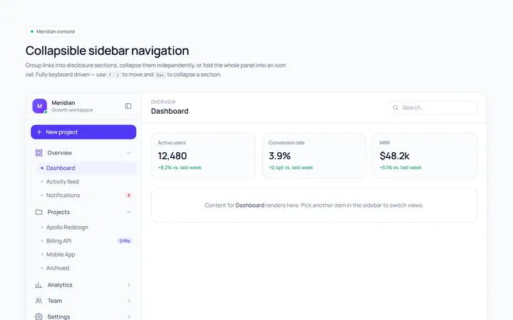
Collapsible Sidebar
Originalcollapsible sidebar sections
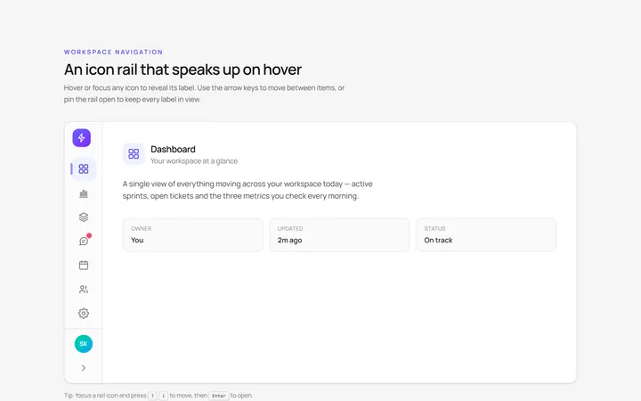
Icons Sidebar
Originalicon sidebar with labels on hover
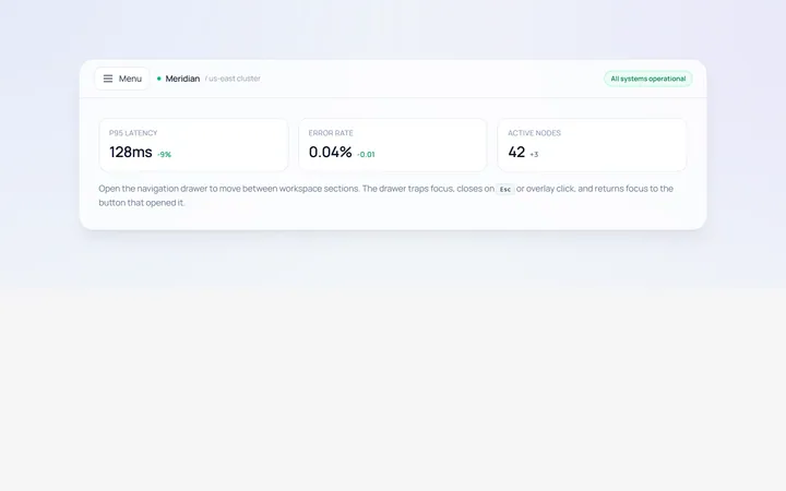
Drawer Left Sidebar
Originalslide-in left drawer with overlay
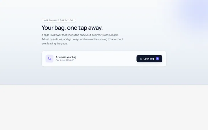
Drawer Right Sidebar
Originalslide-in right drawer panel
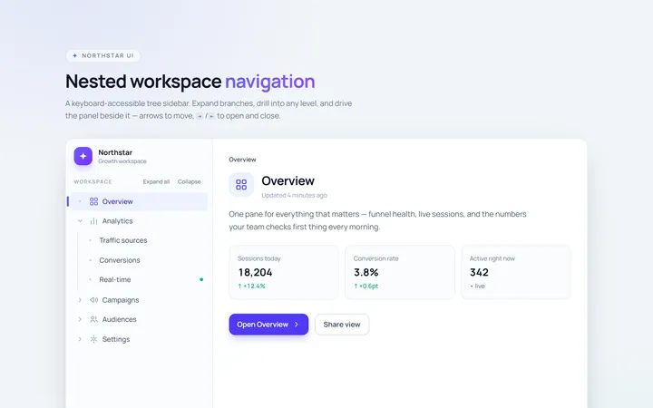
Nested Sidebar
Originalsidebar with expandable nested items
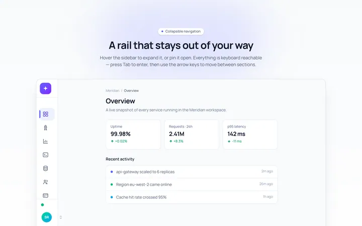
Mini Sidebar
Originalmini rail that expands on hover
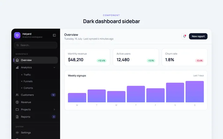
Dark Sidebar
Originaldark themed dashboard sidebar
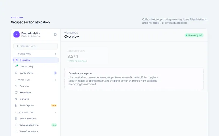
Sections Sidebar
Originalsidebar with grouped sections and headers
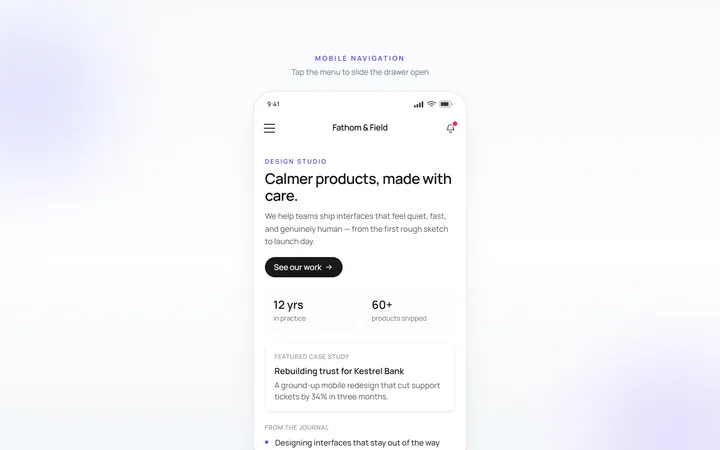
Mobile Sidebar
Originalmobile hamburger slide menu
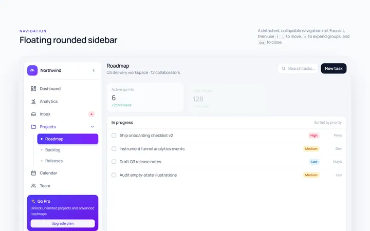
Floating Sidebar
Originalfloating rounded sidebar
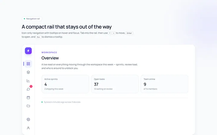
Rail Sidebar
Originalnarrow icon rail with tooltips

Spotlight Hero
OriginalA centred hero with a soft radial spotlight, badge and dual call-to-action.