

Drawer Left Sidebar
Original · freeslide-in left drawer with overlay
Copy prompt gives Claude Code, Cursor or v0 a ready-to-paste prompt that recreates this exact component.
npx shadcn@latest add https://webinnoventix.com/r/side-drawer-left.json"use client";
import {
type KeyboardEvent as ReactKeyboardEvent,
type ReactElement,
type ReactNode,
useCallback,
useEffect,
useId,
useRef,
useState,
} from "react";
import {
AnimatePresence,
motion,
type Transition,
useReducedMotion,
} from "motion/react";
type IconProps = { className?: string };
type NavItem = {
id: string;
label: string;
hint: string;
icon: (props: IconProps) => ReactElement;
badge?: string;
tone?: "amber" | "emerald";
};
type NavGroup = {
id: string;
title: string;
items: NavItem[];
};
function MenuIcon({ className }: IconProps) {
return (
<svg className={className} viewBox="0 0 24 24" fill="none" aria-hidden="true">
<path d="M4 6h16M4 12h16M4 18h16" stroke="currentColor" strokeWidth={1.9} strokeLinecap="round" />
</svg>
);
}
function CloseIcon({ className }: IconProps) {
return (
<svg className={className} viewBox="0 0 24 24" fill="none" aria-hidden="true">
<path d="M6 6l12 12M18 6L6 18" stroke="currentColor" strokeWidth={1.9} strokeLinecap="round" />
</svg>
);
}
function SearchIcon({ className }: IconProps) {
return (
<svg className={className} viewBox="0 0 24 24" fill="none" aria-hidden="true">
<circle cx="11" cy="11" r="6.5" stroke="currentColor" strokeWidth={1.8} />
<path d="M20 20l-3.6-3.6" stroke="currentColor" strokeWidth={1.8} strokeLinecap="round" />
</svg>
);
}
function OverviewIcon({ className }: IconProps) {
return (
<svg className={className} viewBox="0 0 24 24" fill="none" aria-hidden="true">
<rect x="3.5" y="3.5" width="7" height="7" rx="1.6" stroke="currentColor" strokeWidth={1.7} />
<rect x="13.5" y="3.5" width="7" height="4.5" rx="1.4" stroke="currentColor" strokeWidth={1.7} />
<rect x="13.5" y="11" width="7" height="9.5" rx="1.6" stroke="currentColor" strokeWidth={1.7} />
<rect x="3.5" y="13.5" width="7" height="7" rx="1.6" stroke="currentColor" strokeWidth={1.7} />
</svg>
);
}
function DeployIcon({ className }: IconProps) {
return (
<svg className={className} viewBox="0 0 24 24" fill="none" aria-hidden="true">
<path d="M14.5 3.5c3 .3 5.7 3 6 6-2 5-6 8.5-8.5 9.5L8 15.5C9 13 12.5 9 14.5 3.5Z" stroke="currentColor" strokeWidth={1.7} strokeLinejoin="round" />
<circle cx="14.5" cy="9.5" r="1.7" stroke="currentColor" strokeWidth={1.7} />
<path d="M8 15.5 5 18M6.5 20l-1.8-1.8M9.5 17l1.8 1.8" stroke="currentColor" strokeWidth={1.7} strokeLinecap="round" />
</svg>
);
}
function PulseIcon({ className }: IconProps) {
return (
<svg className={className} viewBox="0 0 24 24" fill="none" aria-hidden="true">
<path d="M3 12h4l2.5-6 4 13 2.5-7H21" stroke="currentColor" strokeWidth={1.8} strokeLinecap="round" strokeLinejoin="round" />
</svg>
);
}
function AlertIcon({ className }: IconProps) {
return (
<svg className={className} viewBox="0 0 24 24" fill="none" aria-hidden="true">
<path d="M12 3.8 21 19.5H3L12 3.8Z" stroke="currentColor" strokeWidth={1.7} strokeLinejoin="round" />
<path d="M12 10v4" stroke="currentColor" strokeWidth={1.8} strokeLinecap="round" />
<circle cx="12" cy="17" r="0.6" fill="currentColor" stroke="currentColor" strokeWidth={0.8} />
</svg>
);
}
function DatabaseIcon({ className }: IconProps) {
return (
<svg className={className} viewBox="0 0 24 24" fill="none" aria-hidden="true">
<ellipse cx="12" cy="6" rx="7" ry="2.8" stroke="currentColor" strokeWidth={1.7} />
<path d="M5 6v12c0 1.5 3.1 2.8 7 2.8s7-1.3 7-2.8V6" stroke="currentColor" strokeWidth={1.7} />
<path d="M5 12c0 1.5 3.1 2.8 7 2.8s7-1.3 7-2.8" stroke="currentColor" strokeWidth={1.7} />
</svg>
);
}
function NetworkIcon({ className }: IconProps) {
return (
<svg className={className} viewBox="0 0 24 24" fill="none" aria-hidden="true">
<circle cx="6" cy="6" r="2.4" stroke="currentColor" strokeWidth={1.7} />
<circle cx="18" cy="7" r="2.4" stroke="currentColor" strokeWidth={1.7} />
<circle cx="12" cy="18" r="2.4" stroke="currentColor" strokeWidth={1.7} />
<path d="M7.7 7.6 10.6 16M16.3 8.8 13.4 16M8.2 6.4h7.4" stroke="currentColor" strokeWidth={1.7} strokeLinecap="round" />
</svg>
);
}
function MembersIcon({ className }: IconProps) {
return (
<svg className={className} viewBox="0 0 24 24" fill="none" aria-hidden="true">
<circle cx="9" cy="8" r="3" stroke="currentColor" strokeWidth={1.7} />
<path d="M3.5 19c.5-3.1 2.9-5 5.5-5s5 1.9 5.5 5" stroke="currentColor" strokeWidth={1.7} strokeLinecap="round" />
<path d="M16 6.2A2.8 2.8 0 0 1 17.6 11M17 14.4c2 .5 3.5 2.2 3.9 4.6" stroke="currentColor" strokeWidth={1.7} strokeLinecap="round" />
</svg>
);
}
function BillingIcon({ className }: IconProps) {
return (
<svg className={className} viewBox="0 0 24 24" fill="none" aria-hidden="true">
<rect x="3" y="5.5" width="18" height="13" rx="2.2" stroke="currentColor" strokeWidth={1.7} />
<path d="M3 9.5h18M6.5 14.5h4" stroke="currentColor" strokeWidth={1.7} strokeLinecap="round" />
</svg>
);
}
function SettingsIcon({ className }: IconProps) {
return (
<svg className={className} viewBox="0 0 24 24" fill="none" aria-hidden="true">
<circle cx="12" cy="12" r="2.8" stroke="currentColor" strokeWidth={1.7} />
<path d="M12 3v2.4M12 18.6V21M4.2 7.5l2 1.2M17.8 15.3l2 1.2M4.2 16.5l2-1.2M17.8 8.7l2-1.2" stroke="currentColor" strokeWidth={1.7} strokeLinecap="round" />
</svg>
);
}
function LogoutIcon({ className }: IconProps) {
return (
<svg className={className} viewBox="0 0 24 24" fill="none" aria-hidden="true">
<path d="M14 5.5H6.5A1.5 1.5 0 0 0 5 7v10a1.5 1.5 0 0 0 1.5 1.5H14" stroke="currentColor" strokeWidth={1.7} strokeLinecap="round" />
<path d="M17 8.5 20.5 12 17 15.5M20 12h-9" stroke="currentColor" strokeWidth={1.7} strokeLinecap="round" strokeLinejoin="round" />
</svg>
);
}
function BrandMark({ className }: IconProps) {
return (
<svg className={className} viewBox="0 0 32 32" fill="none" aria-hidden="true">
<rect width="32" height="32" rx="9" fill="url(#sdl-brand)" />
<path d="M8 22V10l8 7 8-7v12" stroke="white" strokeWidth={2.4} strokeLinecap="round" strokeLinejoin="round" />
<defs>
<linearGradient id="sdl-brand" x1="0" y1="0" x2="32" y2="32" gradientUnits="userSpaceOnUse">
<stop stopColor="#818cf8" />
<stop offset="1" stopColor="#8b5cf6" />
</linearGradient>
</defs>
</svg>
);
}
const NAV_GROUPS: NavGroup[] = [
{
id: "workspace",
title: "Workspace",
items: [
{ id: "overview", label: "Overview", hint: "Fleet health at a glance", icon: OverviewIcon },
{ id: "deployments", label: "Deployments", hint: "34 shipped this week", icon: DeployIcon },
{ id: "observability", label: "Observability", hint: "Traces, logs & metrics", icon: PulseIcon },
{ id: "incidents", label: "Incidents", hint: "2 active, 1 acknowledged", icon: AlertIcon, badge: "2", tone: "amber" },
],
},
{
id: "resources",
title: "Resources",
items: [
{ id: "databases", label: "Databases", hint: "6 clusters · Postgres", icon: DatabaseIcon },
{ id: "networking", label: "Networking", hint: "Routes, edges & DNS", icon: NetworkIcon },
],
},
{
id: "org",
title: "Team & billing",
items: [
{ id: "members", label: "Members", hint: "12 seats in use", icon: MembersIcon },
{ id: "billing", label: "Usage & billing", hint: "Renews Aug 1", icon: BillingIcon, badge: "Pro", tone: "emerald" },
{ id: "settings", label: "Settings", hint: "Workspace preferences", icon: SettingsIcon },
],
},
];
const FOCUSABLE =
'a[href],button:not([disabled]),input:not([disabled]),textarea,select,[tabindex]:not([tabindex="-1"])';
export default function SideDrawerLeft(): ReactElement {
const reduce = useReducedMotion();
const [open, setOpen] = useState(false);
const [active, setActive] = useState("overview");
const [query, setQuery] = useState("");
const triggerRef = useRef<HTMLButtonElement>(null);
const panelRef = useRef<HTMLDivElement>(null);
const titleId = useId();
const descId = useId();
const close = useCallback(() => setOpen(false), []);
// Body scroll lock while the drawer is open.
useEffect(() => {
if (!open) return;
const prev = document.body.style.overflow;
document.body.style.overflow = "hidden";
return () => {
document.body.style.overflow = prev;
};
}, [open]);
// Focus management: move focus into the panel on open, restore on close.
useEffect(() => {
if (!open) return;
const previouslyFocused = document.activeElement as HTMLElement | null;
const raf = window.requestAnimationFrame(() => {
const node = panelRef.current;
const first = node?.querySelector<HTMLElement>(FOCUSABLE);
first?.focus();
});
return () => {
window.cancelAnimationFrame(raf);
const target = triggerRef.current ?? previouslyFocused;
target?.focus();
};
}, [open]);
const onPanelKeyDown = useCallback(
(event: ReactKeyboardEvent<HTMLDivElement>) => {
if (event.key === "Escape") {
event.stopPropagation();
close();
return;
}
if (event.key !== "Tab") return;
const node = panelRef.current;
if (!node) return;
const items = Array.from(node.querySelectorAll<HTMLElement>(FOCUSABLE)).filter(
(el) => el.offsetParent !== null || el === document.activeElement,
);
if (items.length === 0) return;
const firstEl = items[0];
const lastEl = items[items.length - 1];
const activeEl = document.activeElement as HTMLElement | null;
if (event.shiftKey && activeEl === firstEl) {
event.preventDefault();
lastEl.focus();
} else if (!event.shiftKey && activeEl === lastEl) {
event.preventDefault();
firstEl.focus();
}
},
[close],
);
const filtered: NavGroup[] = NAV_GROUPS.map((group) => ({
...group,
items: group.items.filter((item) =>
item.label.toLowerCase().includes(query.trim().toLowerCase()),
),
})).filter((group) => group.items.length > 0);
const overlayTransition: Transition = reduce
? { duration: 0 }
: { duration: 0.28, ease: [0.4, 0, 0.2, 1] };
const panelTransition: Transition = reduce
? { duration: 0 }
: { type: "spring", stiffness: 330, damping: 34, mass: 0.9 };
return (
<section className="relative w-full overflow-hidden bg-slate-100 px-4 py-16 text-slate-900 sm:px-8 md:py-24 dark:bg-slate-950 dark:text-slate-100">
<style>{`
@keyframes sdl-badge-pulse {
0%, 100% { box-shadow: 0 0 0 0 rgba(245, 158, 11, 0.45); }
50% { box-shadow: 0 0 0 5px rgba(245, 158, 11, 0); }
}
@keyframes sdl-sheen {
0% { transform: translateX(-120%); }
60%, 100% { transform: translateX(220%); }
}
.sdl-badge-live { animation: sdl-badge-pulse 2.4s ease-out infinite; }
.sdl-sheen { animation: sdl-sheen 4.5s ease-in-out infinite; }
@media (prefers-reduced-motion: reduce) {
.sdl-badge-live, .sdl-sheen { animation: none !important; }
}
`}</style>
{/* Ambient backdrop texture */}
<div
aria-hidden="true"
className="pointer-events-none absolute inset-0 opacity-70 [background:radial-gradient(60rem_40rem_at_-10%_-10%,rgba(129,140,248,0.18),transparent),radial-gradient(50rem_35rem_at_110%_10%,rgba(139,92,246,0.14),transparent)]"
/>
<div className="relative mx-auto max-w-5xl">
{/* Demo application chrome */}
<div className="overflow-hidden rounded-3xl border border-slate-200 bg-white/80 shadow-xl shadow-slate-900/5 backdrop-blur dark:border-slate-800 dark:bg-slate-900/70 dark:shadow-black/30">
<div className="flex items-center gap-3 border-b border-slate-200 px-4 py-3 sm:px-6 dark:border-slate-800">
<button
ref={triggerRef}
type="button"
onClick={() => setOpen(true)}
aria-haspopup="dialog"
aria-expanded={open}
aria-controls={titleId}
className="inline-flex items-center gap-2 rounded-xl border border-slate-200 bg-white px-3 py-2 text-sm font-medium text-slate-700 transition hover:border-indigo-300 hover:text-indigo-600 focus-visible:outline-none focus-visible:ring-2 focus-visible:ring-indigo-500 focus-visible:ring-offset-2 focus-visible:ring-offset-white dark:border-slate-700 dark:bg-slate-800 dark:text-slate-200 dark:hover:border-indigo-500 dark:hover:text-indigo-300 dark:focus-visible:ring-offset-slate-900"
>
<MenuIcon className="h-5 w-5" />
<span>Menu</span>
</button>
<div className="flex items-center gap-2">
<span className="hidden h-1.5 w-1.5 rounded-full bg-emerald-500 sm:inline-block" />
<span className="text-sm font-semibold tracking-tight text-slate-800 dark:text-slate-100">
Meridian
</span>
<span className="hidden text-xs text-slate-400 sm:inline dark:text-slate-500">
/ us-east cluster
</span>
</div>
<div className="ml-auto flex items-center gap-2">
<span className="rounded-full bg-emerald-50 px-2.5 py-1 text-[11px] font-semibold text-emerald-700 ring-1 ring-emerald-200 dark:bg-emerald-500/10 dark:text-emerald-300 dark:ring-emerald-500/25">
All systems operational
</span>
</div>
</div>
<div className="grid gap-4 p-6 sm:grid-cols-3 sm:p-8">
<StatCard label="p95 latency" value="128ms" delta="-9%" good />
<StatCard label="Error rate" value="0.04%" delta="-0.01" good />
<StatCard label="Active nodes" value="42" delta="+3" />
<p className="text-sm leading-relaxed text-slate-500 sm:col-span-3 dark:text-slate-400">
Open the navigation drawer to move between workspace sections. The drawer traps focus,
closes on <kbd className="rounded bg-slate-100 px-1.5 py-0.5 text-[11px] font-semibold text-slate-600 ring-1 ring-slate-200 dark:bg-slate-800 dark:text-slate-300 dark:ring-slate-700">Esc</kbd>{" "}
or overlay click, and returns focus to the button that opened it.
</p>
</div>
</div>
</div>
{/* Drawer + overlay */}
<AnimatePresence>
{open && (
<div className="fixed inset-0 z-50">
<motion.button
type="button"
aria-label="Close navigation"
tabIndex={-1}
onClick={close}
initial={{ opacity: 0 }}
animate={{ opacity: 1 }}
exit={{ opacity: 0 }}
transition={overlayTransition}
className="absolute inset-0 h-full w-full cursor-default bg-slate-950/55 backdrop-blur-sm"
/>
<motion.div
ref={panelRef}
role="dialog"
aria-modal="true"
aria-labelledby={titleId}
aria-describedby={descId}
id={titleId}
onKeyDown={onPanelKeyDown}
initial={{ x: "-100%" }}
animate={{ x: 0 }}
exit={{ x: "-100%" }}
transition={panelTransition}
className="absolute inset-y-0 left-0 flex w-[86%] max-w-sm flex-col border-r border-slate-200 bg-white shadow-2xl shadow-black/25 dark:border-slate-800 dark:bg-slate-900"
>
{/* Header */}
<div className="relative overflow-hidden border-b border-slate-200 px-5 pb-5 pt-6 dark:border-slate-800">
<div
aria-hidden="true"
className="pointer-events-none absolute inset-0 [background:linear-gradient(120deg,rgba(129,140,248,0.12),transparent_45%)]"
/>
<div className="pointer-events-none absolute inset-0 overflow-hidden">
<div className="sdl-sheen absolute -inset-y-4 left-0 w-1/3 skew-x-12 bg-gradient-to-r from-transparent via-white/50 to-transparent dark:via-white/10" />
</div>
<div className="relative flex items-center gap-3">
<BrandMark className="h-9 w-9 shrink-0" />
<div className="min-w-0">
<h2
id={descId}
className="truncate text-base font-semibold tracking-tight text-slate-900 dark:text-white"
>
Meridian Console
</h2>
<p className="truncate text-xs text-slate-500 dark:text-slate-400">
Northwind Robotics · Pro
</p>
</div>
<button
type="button"
onClick={close}
className="ml-auto grid h-9 w-9 shrink-0 place-items-center rounded-xl text-slate-500 transition hover:bg-slate-100 hover:text-slate-900 focus-visible:outline-none focus-visible:ring-2 focus-visible:ring-indigo-500 dark:text-slate-400 dark:hover:bg-slate-800 dark:hover:text-white"
aria-label="Close navigation"
>
<CloseIcon className="h-5 w-5" />
</button>
</div>
{/* Search */}
<div className="relative mt-4">
<SearchIcon className="pointer-events-none absolute left-3 top-1/2 h-4 w-4 -translate-y-1/2 text-slate-400 dark:text-slate-500" />
<input
type="text"
value={query}
onChange={(e) => setQuery(e.target.value)}
placeholder="Jump to a section"
aria-label="Filter navigation sections"
className="w-full rounded-xl border border-slate-200 bg-slate-50 py-2 pl-9 pr-3 text-sm text-slate-800 placeholder:text-slate-400 focus-visible:border-indigo-400 focus-visible:outline-none focus-visible:ring-2 focus-visible:ring-indigo-500/40 dark:border-slate-700 dark:bg-slate-800/70 dark:text-slate-100 dark:placeholder:text-slate-500"
/>
</div>
</div>
{/* Nav */}
<nav
aria-label="Primary"
className="flex-1 overflow-y-auto px-3 py-4 [scrollbar-width:thin]"
>
{filtered.length === 0 && (
<p className="px-3 py-6 text-center text-sm text-slate-400 dark:text-slate-500">
No sections match “{query}”.
</p>
)}
{filtered.map((group) => (
<div key={group.id} className="mb-5 last:mb-1">
<p className="px-3 pb-1.5 text-[11px] font-semibold uppercase tracking-wider text-slate-400 dark:text-slate-500">
{group.title}
</p>
<ul className="space-y-0.5">
{group.items.map((item) => {
const isActive = active === item.id;
return (
<li key={item.id}>
<button
type="button"
onClick={() => setActive(item.id)}
aria-current={isActive ? "page" : undefined}
className={[
"group relative flex w-full items-center gap-3 rounded-xl px-3 py-2.5 text-left transition focus-visible:outline-none focus-visible:ring-2 focus-visible:ring-indigo-500",
isActive
? "bg-indigo-50 text-indigo-700 dark:bg-indigo-500/15 dark:text-indigo-200"
: "text-slate-700 hover:bg-slate-100 dark:text-slate-300 dark:hover:bg-slate-800/70",
].join(" ")}
>
<span
aria-hidden="true"
className={[
"absolute left-0 top-1/2 h-6 w-1 -translate-y-1/2 rounded-r-full bg-indigo-500 transition-opacity",
isActive ? "opacity-100" : "opacity-0",
].join(" ")}
/>
<item.icon
className={[
"h-5 w-5 shrink-0 transition-colors",
isActive
? "text-indigo-600 dark:text-indigo-300"
: "text-slate-400 group-hover:text-slate-600 dark:text-slate-500 dark:group-hover:text-slate-300",
].join(" ")}
/>
<span className="min-w-0 flex-1">
<span className="block truncate text-sm font-medium">
{item.label}
</span>
<span className="block truncate text-xs text-slate-400 dark:text-slate-500">
{item.hint}
</span>
</span>
{item.badge && (
<Badge tone={item.tone}>{item.badge}</Badge>
)}
</button>
</li>
);
})}
</ul>
</div>
))}
</nav>
{/* Footer / account */}
<div className="border-t border-slate-200 p-3 dark:border-slate-800">
<div className="flex items-center gap-3 rounded-2xl bg-slate-50 p-2.5 dark:bg-slate-800/60">
<span className="grid h-10 w-10 shrink-0 place-items-center rounded-full bg-gradient-to-br from-violet-500 to-indigo-500 text-sm font-semibold text-white">
PN
</span>
<div className="min-w-0 flex-1">
<p className="truncate text-sm font-medium text-slate-800 dark:text-slate-100">
Priya Nair
</p>
<p className="truncate text-xs text-slate-500 dark:text-slate-400">
priya@northwind.dev
</p>
</div>
<button
type="button"
onClick={close}
aria-label="Sign out"
className="grid h-9 w-9 shrink-0 place-items-center rounded-xl text-slate-500 transition hover:bg-white hover:text-rose-600 focus-visible:outline-none focus-visible:ring-2 focus-visible:ring-rose-500 dark:text-slate-400 dark:hover:bg-slate-700 dark:hover:text-rose-300"
>
<LogoutIcon className="h-5 w-5" />
</button>
</div>
</div>
</motion.div>
</div>
)}
</AnimatePresence>
</section>
);
}
function Badge({
children,
tone = "amber",
}: {
children: ReactNode;
tone?: "amber" | "emerald";
}): ReactElement {
if (tone === "emerald") {
return (
<span className="rounded-full bg-emerald-100 px-2 py-0.5 text-[11px] font-semibold text-emerald-700 dark:bg-emerald-500/15 dark:text-emerald-300">
{children}
</span>
);
}
return (
<span className="sdl-badge-live rounded-full bg-amber-100 px-2 py-0.5 text-[11px] font-semibold text-amber-700 dark:bg-amber-500/15 dark:text-amber-300">
{children}
</span>
);
}
function StatCard({
label,
value,
delta,
good = false,
}: {
label: string;
value: string;
delta: string;
good?: boolean;
}): ReactElement {
return (
<div className="rounded-2xl border border-slate-200 bg-white p-4 dark:border-slate-800 dark:bg-slate-900/60">
<p className="text-xs font-medium uppercase tracking-wide text-slate-400 dark:text-slate-500">
{label}
</p>
<div className="mt-1.5 flex items-baseline gap-2">
<span className="text-2xl font-semibold tracking-tight text-slate-900 dark:text-white">
{value}
</span>
<span
className={[
"text-xs font-semibold",
good
? "text-emerald-600 dark:text-emerald-400"
: "text-slate-500 dark:text-slate-400",
].join(" ")}
>
{delta}
</span>
</div>
</div>
);
}Dependencies
Licence
Built by Web Innoventix. Free for personal and commercial use, no attribution required.
Built by Web Innoventix
Need a custom interface, a full website, or SEO that gets you cited by AI? We design, build and rank it end to end.
Get a free quoteSimilar components
Browse all →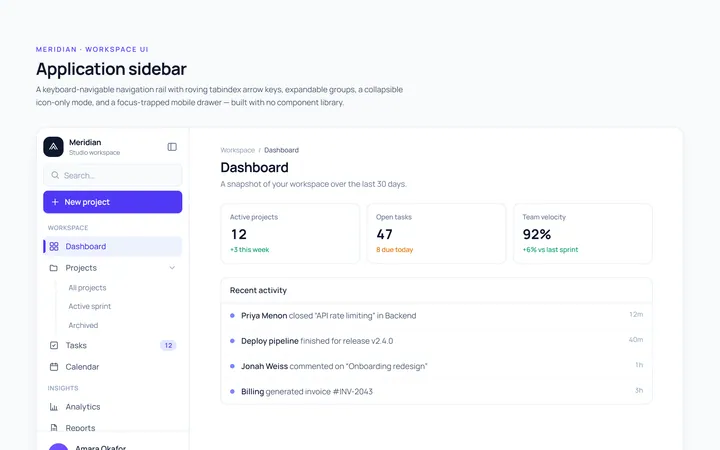
Basic Sidebar
Originalbasic app sidebar navigation
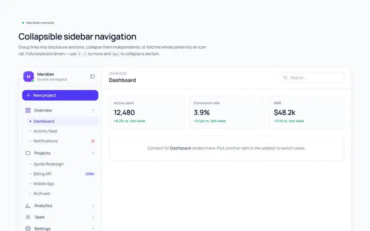
Collapsible Sidebar
Originalcollapsible sidebar sections
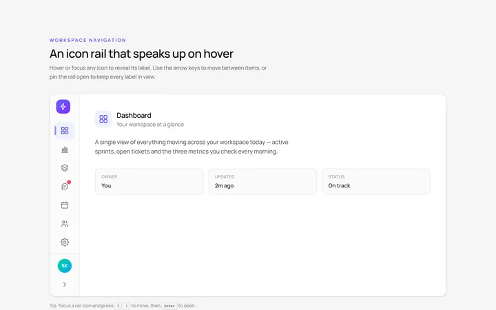
Icons Sidebar
Originalicon sidebar with labels on hover
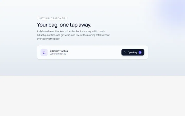
Drawer Right Sidebar
Originalslide-in right drawer panel
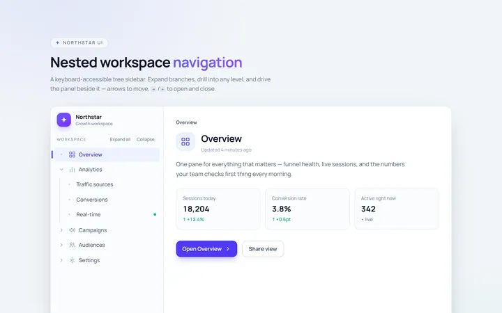
Nested Sidebar
Originalsidebar with expandable nested items
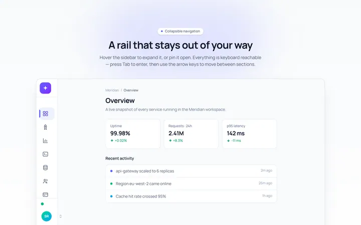
Mini Sidebar
Originalmini rail that expands on hover
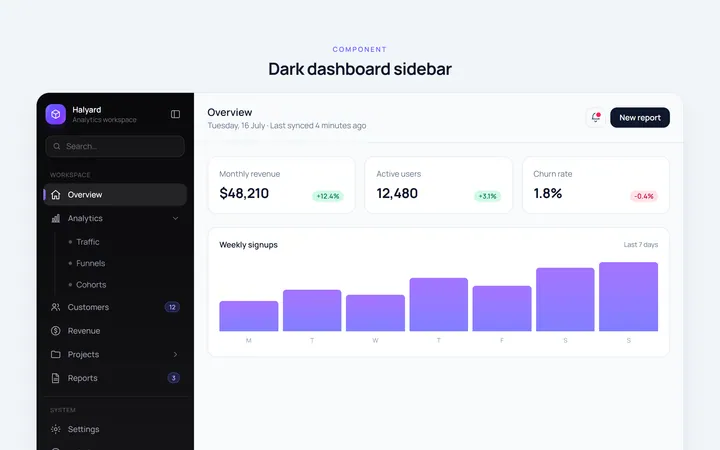
Dark Sidebar
Originaldark themed dashboard sidebar
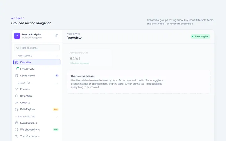
Sections Sidebar
Originalsidebar with grouped sections and headers
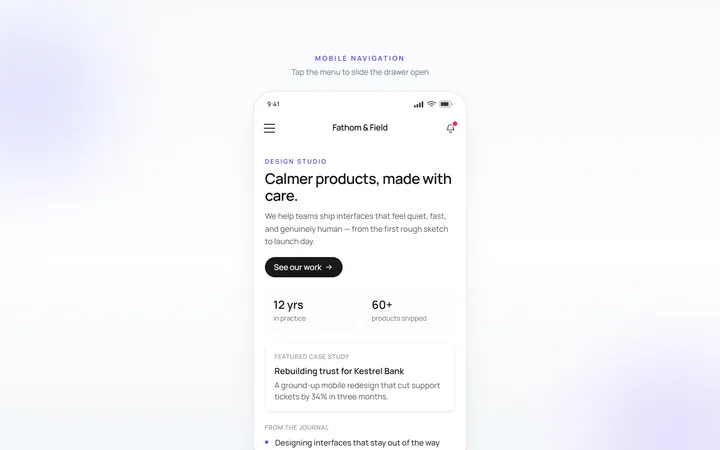
Mobile Sidebar
Originalmobile hamburger slide menu
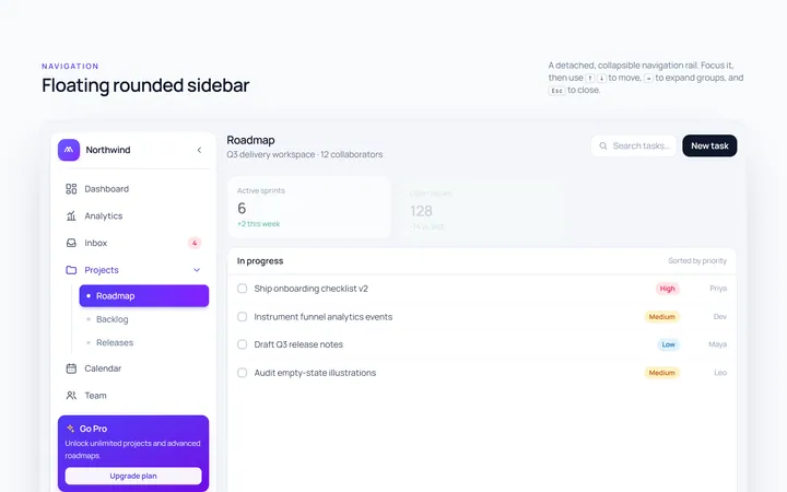
Floating Sidebar
Originalfloating rounded sidebar
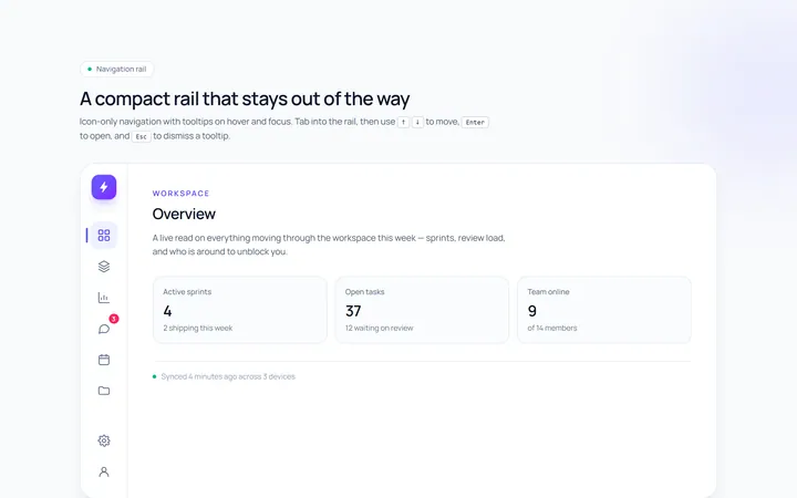
Rail Sidebar
Originalnarrow icon rail with tooltips

Spotlight Hero
OriginalA centred hero with a soft radial spotlight, badge and dual call-to-action.