

Floating Sidebar
Original · freefloating rounded sidebar
Copy prompt gives Claude Code, Cursor or v0 a ready-to-paste prompt that recreates this exact component.
npx shadcn@latest add https://webinnoventix.com/r/side-floating.json"use client";
import {
useState,
useRef,
useEffect,
useMemo,
type ReactNode,
type KeyboardEvent as ReactKeyboardEvent,
} from "react";
import { motion, AnimatePresence, useReducedMotion } from "motion/react";
/* ---------------------------------- icons --------------------------------- */
type IconCmp = (props: { className?: string }) => ReactNode;
const IconDashboard: IconCmp = ({ className }) => (
<svg viewBox="0 0 24 24" fill="none" stroke="currentColor" strokeWidth={1.8} strokeLinecap="round" strokeLinejoin="round" className={className} aria-hidden="true">
<rect x="3" y="3" width="7" height="9" rx="1.5" />
<rect x="14" y="3" width="7" height="5" rx="1.5" />
<rect x="14" y="12" width="7" height="9" rx="1.5" />
<rect x="3" y="16" width="7" height="5" rx="1.5" />
</svg>
);
const IconAnalytics: IconCmp = ({ className }) => (
<svg viewBox="0 0 24 24" fill="none" stroke="currentColor" strokeWidth={1.8} strokeLinecap="round" strokeLinejoin="round" className={className} aria-hidden="true">
<path d="M4 20h16" />
<path d="M7 20v-6" />
<path d="M12 20V8" />
<path d="M17 20v-9" />
<path d="M5 10l4-4 3 3 5-6" />
</svg>
);
const IconInbox: IconCmp = ({ className }) => (
<svg viewBox="0 0 24 24" fill="none" stroke="currentColor" strokeWidth={1.8} strokeLinecap="round" strokeLinejoin="round" className={className} aria-hidden="true">
<path d="M4 13l2-7a2 2 0 0 1 1.9-1.4h8.2A2 2 0 0 1 18 6l2 7" />
<path d="M4 13v4a2 2 0 0 0 2 2h12a2 2 0 0 0 2-2v-4" />
<path d="M4 13h4l1.5 2.5h5L16 13h4" />
</svg>
);
const IconProjects: IconCmp = ({ className }) => (
<svg viewBox="0 0 24 24" fill="none" stroke="currentColor" strokeWidth={1.8} strokeLinecap="round" strokeLinejoin="round" className={className} aria-hidden="true">
<path d="M3 7a2 2 0 0 1 2-2h3.6a2 2 0 0 1 1.6.8L11.4 7H19a2 2 0 0 1 2 2v8a2 2 0 0 1-2 2H5a2 2 0 0 1-2-2V7Z" />
</svg>
);
const IconCalendar: IconCmp = ({ className }) => (
<svg viewBox="0 0 24 24" fill="none" stroke="currentColor" strokeWidth={1.8} strokeLinecap="round" strokeLinejoin="round" className={className} aria-hidden="true">
<rect x="3.5" y="5" width="17" height="16" rx="2.5" />
<path d="M3.5 10h17" />
<path d="M8 3v4M16 3v4" />
<path d="M8 15h.01M12 15h.01M16 15h.01" />
</svg>
);
const IconTeam: IconCmp = ({ className }) => (
<svg viewBox="0 0 24 24" fill="none" stroke="currentColor" strokeWidth={1.8} strokeLinecap="round" strokeLinejoin="round" className={className} aria-hidden="true">
<circle cx="9" cy="8" r="3.2" />
<path d="M3.5 19a5.5 5.5 0 0 1 11 0" />
<path d="M16 5.2a3.2 3.2 0 0 1 0 5.9" />
<path d="M17 14.4A5.5 5.5 0 0 1 20.5 19" />
</svg>
);
const IconChevron: IconCmp = ({ className }) => (
<svg viewBox="0 0 24 24" fill="none" stroke="currentColor" strokeWidth={2} strokeLinecap="round" strokeLinejoin="round" className={className} aria-hidden="true">
<path d="M9 6l6 6-6 6" />
</svg>
);
const IconSettings: IconCmp = ({ className }) => (
<svg viewBox="0 0 24 24" fill="none" stroke="currentColor" strokeWidth={1.8} strokeLinecap="round" strokeLinejoin="round" className={className} aria-hidden="true">
<path d="M5 7h9M18 7h1" />
<circle cx="16" cy="7" r="2.2" />
<path d="M5 17h4M13 17h6" />
<circle cx="10.5" cy="17" r="2.2" />
</svg>
);
const IconSpark: IconCmp = ({ className }) => (
<svg viewBox="0 0 24 24" fill="none" stroke="currentColor" strokeWidth={1.8} strokeLinecap="round" strokeLinejoin="round" className={className} aria-hidden="true">
<path d="M12 3l1.8 4.6L18.5 9l-4.7 1.4L12 15l-1.8-4.6L5.5 9l4.7-1.4L12 3Z" />
<path d="M18.5 15l.8 2 2 .8-2 .8-.8 2-.8-2-2-.8 2-.8 .8-2Z" />
</svg>
);
const IconSearch: IconCmp = ({ className }) => (
<svg viewBox="0 0 24 24" fill="none" stroke="currentColor" strokeWidth={1.8} strokeLinecap="round" strokeLinejoin="round" className={className} aria-hidden="true">
<circle cx="11" cy="11" r="6.5" />
<path d="m20 20-3.6-3.6" />
</svg>
);
/* ------------------------------- nav model -------------------------------- */
type NavLeaf = { type: "link"; id: string; label: string; icon: IconCmp; badge?: string };
type NavGroup = { type: "group"; id: string; label: string; icon: IconCmp; children: { id: string; label: string }[] };
type NavNode = NavLeaf | NavGroup;
const NAV: NavNode[] = [
{ type: "link", id: "dashboard", label: "Dashboard", icon: IconDashboard },
{ type: "link", id: "analytics", label: "Analytics", icon: IconAnalytics },
{ type: "link", id: "inbox", label: "Inbox", icon: IconInbox, badge: "4" },
{
type: "group",
id: "projects",
label: "Projects",
icon: IconProjects,
children: [
{ id: "roadmap", label: "Roadmap" },
{ id: "backlog", label: "Backlog" },
{ id: "releases", label: "Releases" },
],
},
{ type: "link", id: "calendar", label: "Calendar", icon: IconCalendar },
{ type: "link", id: "team", label: "Team", icon: IconTeam },
];
const groupIds = new Set(NAV.filter((n): n is NavGroup => n.type === "group").map((n) => n.id));
const isGroupId = (id: string) => groupIds.has(id);
const parentGroupOf = (id: string): NavGroup | undefined =>
NAV.find((n): n is NavGroup => n.type === "group" && n.children.some((c) => c.id === id));
const labelOf = (id: string): string => {
for (const n of NAV) {
if (n.id === id) return n.label;
if (n.type === "group") {
const c = n.children.find((ch) => ch.id === id);
if (c) return c.label;
}
}
return id;
};
/* ------------------------------- component -------------------------------- */
const COLLAPSED_W = 76;
const EXPANDED_W = 272;
export default function SideFloating() {
const reduce = useReducedMotion();
const [collapsed, setCollapsed] = useState(false);
const [active, setActive] = useState("roadmap");
const [openGroups, setOpenGroups] = useState<string[]>(["projects"]);
const [focusedId, setFocusedId] = useState("dashboard");
const itemRefs = useRef<Record<string, HTMLButtonElement | null>>({});
const focusFlag = useRef(false);
// Roving-tabindex order in current visible sequence.
const orderedIds = useMemo(() => {
const ids: string[] = [];
for (const n of NAV) {
ids.push(n.id);
if (n.type === "group" && !collapsed && openGroups.includes(n.id)) {
for (const c of n.children) ids.push(c.id);
}
}
return ids;
}, [collapsed, openGroups]);
useEffect(() => {
if (focusFlag.current) {
itemRefs.current[focusedId]?.focus();
focusFlag.current = false;
}
}, [focusedId]);
const focusId = (id: string) => {
focusFlag.current = true;
setFocusedId(id);
};
const focusAt = (i: number) => {
const id = orderedIds[i];
if (id) focusId(id);
};
const openGroup = (id: string) => setOpenGroups((p) => (p.includes(id) ? p : [...p, id]));
const closeGroup = (id: string) => setOpenGroups((p) => p.filter((x) => x !== id));
const toggleGroup = (id: string) => {
if (collapsed) {
setCollapsed(false);
openGroup(id);
} else {
setOpenGroups((p) => (p.includes(id) ? p.filter((x) => x !== id) : [...p, id]));
}
setFocusedId(id);
};
const toggleCollapsed = () =>
setCollapsed((c) => {
const next = !c;
if (next) {
const p = parentGroupOf(focusedId);
if (p) setFocusedId(p.id);
}
return next;
});
const onMenuKeyDown = (e: ReactKeyboardEvent<HTMLUListElement>) => {
const ids = orderedIds;
const current = ids.indexOf(focusedId);
const idx = current === -1 ? 0 : current;
switch (e.key) {
case "ArrowDown":
e.preventDefault();
focusAt(Math.min(ids.length - 1, idx + 1));
break;
case "ArrowUp":
e.preventDefault();
focusAt(Math.max(0, idx - 1));
break;
case "Home":
e.preventDefault();
focusAt(0);
break;
case "End":
e.preventDefault();
focusAt(ids.length - 1);
break;
case "ArrowRight":
if (isGroupId(focusedId)) {
e.preventDefault();
if (collapsed) setCollapsed(false);
openGroup(focusedId);
}
break;
case "ArrowLeft": {
if (isGroupId(focusedId) && openGroups.includes(focusedId)) {
e.preventDefault();
closeGroup(focusedId);
} else {
const p = parentGroupOf(focusedId);
if (p) {
e.preventDefault();
focusId(p.id);
}
}
break;
}
case "Escape":
if (openGroups.length) {
e.preventDefault();
setOpenGroups([]);
}
break;
default:
break;
}
};
const spring = reduce ? { duration: 0 } : { type: "spring" as const, stiffness: 500, damping: 38 };
const submenuT = reduce ? { duration: 0 } : { duration: 0.26, ease: [0.22, 1, 0.36, 1] as const };
const setRef = (id: string) => (el: HTMLButtonElement | null) => {
itemRefs.current[id] = el;
};
const btnBase =
"relative flex w-full items-center rounded-xl text-sm font-medium outline-none transition-colors " +
"focus-visible:ring-2 focus-visible:ring-indigo-500 focus-visible:ring-offset-2 " +
"focus-visible:ring-offset-white dark:focus-visible:ring-offset-slate-900";
return (
<section
aria-labelledby="sf-heading"
className="relative w-full overflow-hidden bg-slate-50 px-4 py-16 text-slate-900 sm:py-24 dark:bg-slate-950 dark:text-slate-100"
>
<style>{`
@keyframes sf-pulse { 0%,100%{opacity:1;transform:scale(1)} 50%{opacity:.35;transform:scale(.72)} }
@keyframes sf-rise { from{opacity:0;transform:translateY(10px)} to{opacity:1;transform:none} }
.sf-live-dot{ animation: sf-pulse 1.9s ease-in-out infinite; }
.sf-rise{ animation: sf-rise .55s cubic-bezier(.22,1,.36,1) both; }
@media (prefers-reduced-motion: reduce){
.sf-live-dot, .sf-rise{ animation: none !important; }
}
`}</style>
{/* atmosphere */}
<div aria-hidden="true" className="pointer-events-none absolute inset-0 -z-10">
<div className="absolute -left-24 top-8 h-72 w-72 rounded-full bg-indigo-300/30 blur-3xl dark:bg-indigo-600/15" />
<div className="absolute -right-16 bottom-0 h-80 w-80 rounded-full bg-violet-300/25 blur-3xl dark:bg-violet-700/15" />
</div>
<div className="mx-auto max-w-6xl">
<header className="mb-8 flex flex-col gap-3 px-1 sm:mb-10 sm:flex-row sm:items-end sm:justify-between">
<div>
<p className="text-xs font-semibold uppercase tracking-[0.2em] text-indigo-600 dark:text-indigo-400">
Navigation
</p>
<h2 id="sf-heading" className="mt-1 text-2xl font-semibold tracking-tight sm:text-3xl">
Floating rounded sidebar
</h2>
</div>
<p className="max-w-xs text-sm text-slate-500 dark:text-slate-400">
A detached, collapsible navigation rail. Focus it, then use{" "}
<kbd className="rounded border border-slate-300 bg-white px-1 font-mono text-[11px] text-slate-600 dark:border-slate-700 dark:bg-slate-800 dark:text-slate-300">↑</kbd>{" "}
<kbd className="rounded border border-slate-300 bg-white px-1 font-mono text-[11px] text-slate-600 dark:border-slate-700 dark:bg-slate-800 dark:text-slate-300">↓</kbd>{" "}
to move, <kbd className="rounded border border-slate-300 bg-white px-1 font-mono text-[11px] text-slate-600 dark:border-slate-700 dark:bg-slate-800 dark:text-slate-300">→</kbd> to expand groups, and{" "}
<kbd className="rounded border border-slate-300 bg-white px-1 font-mono text-[11px] text-slate-600 dark:border-slate-700 dark:bg-slate-800 dark:text-slate-300">Esc</kbd> to close.
</p>
</header>
{/* app canvas — the rail floats above this surface */}
<div className="relative flex min-h-[560px] gap-0 overflow-hidden rounded-3xl border border-slate-200/80 bg-slate-100/70 p-3 shadow-[0_30px_80px_-40px_rgba(30,27,75,0.45)] backdrop-blur-sm sm:p-4 dark:border-slate-800/80 dark:bg-slate-900/40">
{/* ---------------------------- floating rail --------------------------- */}
<aside
aria-label="Application sidebar"
style={{ width: collapsed ? COLLAPSED_W : EXPANDED_W }}
className={
"z-10 flex shrink-0 flex-col rounded-2xl border border-slate-200 bg-white/95 p-3 shadow-xl shadow-slate-900/5 backdrop-blur-xl dark:border-slate-800 dark:bg-slate-900/95 dark:shadow-black/30 " +
(reduce ? "" : "transition-[width] duration-300 ease-out")
}
>
{/* brand + collapse */}
<div className={"flex gap-2 " + (collapsed ? "flex-col items-center" : "items-center justify-between")}>
<div className="flex items-center gap-2.5 overflow-hidden">
<span className="grid h-9 w-9 shrink-0 place-items-center rounded-xl bg-gradient-to-br from-indigo-500 to-violet-600 text-white shadow-md shadow-indigo-500/30">
<svg viewBox="0 0 24 24" className="h-5 w-5" fill="none" stroke="currentColor" strokeWidth={2} strokeLinecap="round" strokeLinejoin="round" aria-hidden="true">
<path d="M4 15l5-9 5 9M9 15l5-9 5 9" />
</svg>
</span>
{!collapsed && (
<span className="whitespace-nowrap text-[15px] font-semibold tracking-tight">Northwind</span>
)}
</div>
<button
type="button"
onClick={toggleCollapsed}
aria-label={collapsed ? "Expand sidebar" : "Collapse sidebar"}
className="grid h-8 w-8 shrink-0 place-items-center rounded-lg text-slate-500 outline-none transition-colors hover:bg-slate-100 hover:text-slate-800 focus-visible:ring-2 focus-visible:ring-indigo-500 focus-visible:ring-offset-2 focus-visible:ring-offset-white dark:text-slate-400 dark:hover:bg-slate-800 dark:hover:text-slate-100 dark:focus-visible:ring-offset-slate-900"
>
<IconChevron className={"h-4 w-4 transition-transform duration-300 " + (collapsed ? "rotate-0" : "rotate-180")} />
</button>
</div>
<div className="my-3 h-px bg-slate-200 dark:bg-slate-800" />
{/* menu */}
<nav aria-label="Primary" className="min-h-0 flex-1">
<ul role="menu" aria-orientation="vertical" onKeyDown={onMenuKeyDown} className="flex flex-col gap-1">
{NAV.map((node) => {
const Icon = node.icon;
const isOpen = openGroups.includes(node.id);
const childActive = node.type === "group" && node.children.some((c) => c.id === active);
const isActive = active === node.id;
return (
<li key={node.id} role="none" className="group/item relative">
<button
ref={setRef(node.id)}
role="menuitem"
type="button"
tabIndex={focusedId === node.id ? 0 : -1}
aria-current={isActive ? "page" : undefined}
aria-haspopup={node.type === "group" ? "menu" : undefined}
aria-expanded={node.type === "group" ? (collapsed ? false : isOpen) : undefined}
aria-controls={node.type === "group" ? `sf-sub-${node.id}` : undefined}
aria-label={collapsed ? node.label : undefined}
onClick={() => {
if (node.type === "group") toggleGroup(node.id);
else {
setActive(node.id);
setFocusedId(node.id);
}
}}
className={
btnBase +
" gap-3 py-2.5 " +
(collapsed ? "justify-center px-0 " : "px-3 ") +
(isActive
? "text-white "
: childActive
? "text-indigo-700 hover:bg-slate-100 dark:text-indigo-300 dark:hover:bg-slate-800/70 "
: "text-slate-600 hover:bg-slate-100 hover:text-slate-900 dark:text-slate-300 dark:hover:bg-slate-800/70 dark:hover:text-white ")
}
>
{isActive && (
<motion.span
layoutId="sf-active-pill"
transition={spring}
className="pointer-events-none absolute inset-0 -z-0 rounded-xl bg-gradient-to-r from-indigo-600 to-violet-600 shadow-md shadow-indigo-500/30 dark:from-indigo-500 dark:to-violet-500"
/>
)}
<span className="relative z-10 grid h-5 w-5 shrink-0 place-items-center">
<Icon className="h-5 w-5" />
{collapsed && node.type === "link" && node.badge && (
<span className="absolute -right-1.5 -top-1.5 h-2 w-2 rounded-full bg-rose-500 ring-2 ring-white dark:ring-slate-900" />
)}
</span>
{!collapsed && (
<span className="relative z-10 flex-1 whitespace-nowrap text-left">{node.label}</span>
)}
{!collapsed && node.type === "link" && node.badge && (
<span
className={
"relative z-10 ml-auto rounded-full px-2 py-0.5 text-[11px] font-semibold " +
(isActive
? "bg-white/20 text-white"
: "bg-rose-100 text-rose-600 dark:bg-rose-500/20 dark:text-rose-300")
}
>
{node.badge}
</span>
)}
{!collapsed && node.type === "group" && (
<IconChevron
className={
"relative z-10 ml-auto h-4 w-4 shrink-0 transition-transform duration-200 " +
(isOpen ? "rotate-90" : "rotate-0") +
(childActive ? " text-indigo-500" : " text-slate-400")
}
/>
)}
</button>
{/* tooltip when collapsed */}
{collapsed && (
<span
aria-hidden="true"
className="pointer-events-none absolute left-[calc(100%+14px)] top-1/2 z-30 -translate-y-1/2 whitespace-nowrap rounded-md bg-slate-900 px-2 py-1 text-xs font-medium text-white opacity-0 shadow-lg transition-opacity duration-150 group-hover/item:opacity-100 group-focus-within/item:opacity-100 dark:bg-slate-700"
>
{node.label}
{node.type === "link" && node.badge ? ` · ${node.badge}` : ""}
</span>
)}
{/* submenu */}
{node.type === "group" && (
<AnimatePresence initial={false}>
{!collapsed && isOpen && (
<motion.ul
id={`sf-sub-${node.id}`}
role="menu"
aria-label={node.label}
initial={{ height: 0, opacity: 0 }}
animate={{ height: "auto", opacity: 1 }}
exit={{ height: 0, opacity: 0 }}
transition={submenuT}
className="overflow-hidden"
>
<li role="none" className="mt-1 ml-[22px] flex flex-col gap-0.5 border-l border-slate-200 pl-3 dark:border-slate-800">
{node.children.map((child) => {
const childIsActive = active === child.id;
return (
<div key={child.id} role="none">
<button
ref={setRef(child.id)}
role="menuitem"
type="button"
tabIndex={focusedId === child.id ? 0 : -1}
aria-current={childIsActive ? "page" : undefined}
onClick={() => {
setActive(child.id);
setFocusedId(child.id);
}}
className={
btnBase +
" gap-2.5 py-2 pl-3 pr-3 " +
(childIsActive
? "text-white "
: "text-slate-500 hover:bg-slate-100 hover:text-slate-900 dark:text-slate-400 dark:hover:bg-slate-800/70 dark:hover:text-white ")
}
>
{childIsActive && (
<motion.span
layoutId="sf-active-pill"
transition={spring}
className="pointer-events-none absolute inset-0 -z-0 rounded-lg bg-gradient-to-r from-indigo-600 to-violet-600 shadow-md shadow-indigo-500/30 dark:from-indigo-500 dark:to-violet-500"
/>
)}
<span
className={
"relative z-10 h-1.5 w-1.5 shrink-0 rounded-full " +
(childIsActive ? "bg-white" : "bg-slate-300 dark:bg-slate-600")
}
/>
<span className="relative z-10 whitespace-nowrap">{child.label}</span>
</button>
</div>
);
})}
</li>
</motion.ul>
)}
</AnimatePresence>
)}
</li>
);
})}
</ul>
</nav>
{/* upgrade card */}
{!collapsed && (
<div className="mt-3 overflow-hidden rounded-xl bg-gradient-to-br from-indigo-600 to-violet-700 p-3 text-white shadow-lg shadow-indigo-600/25">
<div className="flex items-center gap-2">
<IconSpark className="h-4 w-4 text-amber-300" />
<span className="text-sm font-semibold">Go Pro</span>
</div>
<p className="mt-1 text-xs leading-relaxed text-indigo-100">
Unlock unlimited projects and advanced roadmaps.
</p>
<button
type="button"
className="mt-2.5 w-full rounded-lg bg-white/95 py-1.5 text-xs font-semibold text-indigo-700 outline-none transition hover:bg-white focus-visible:ring-2 focus-visible:ring-white focus-visible:ring-offset-2 focus-visible:ring-offset-indigo-600"
>
Upgrade plan
</button>
</div>
)}
<div className="my-3 h-px bg-slate-200 dark:bg-slate-800" />
{/* profile */}
<div className={"flex items-center gap-2 " + (collapsed ? "justify-center" : "")}>
<button
type="button"
aria-label="Maya Chen — account menu"
className="group/prof relative flex min-w-0 flex-1 items-center gap-2.5 rounded-xl p-1.5 outline-none transition-colors hover:bg-slate-100 focus-visible:ring-2 focus-visible:ring-indigo-500 focus-visible:ring-offset-2 focus-visible:ring-offset-white dark:hover:bg-slate-800 dark:focus-visible:ring-offset-slate-900"
>
<span className="relative grid h-9 w-9 shrink-0 place-items-center rounded-full bg-gradient-to-br from-emerald-400 to-sky-500 text-sm font-semibold text-white">
MC
<span className="sf-live-dot absolute -bottom-0.5 -right-0.5 h-3 w-3 rounded-full bg-emerald-500 ring-2 ring-white dark:ring-slate-900" />
</span>
{!collapsed && (
<span className="min-w-0 flex-1 text-left">
<span className="block truncate text-sm font-semibold text-slate-800 dark:text-slate-100">Maya Chen</span>
<span className="block truncate text-xs text-slate-500 dark:text-slate-400">Workspace admin</span>
</span>
)}
</button>
{!collapsed && (
<button
type="button"
aria-label="Settings"
className="grid h-8 w-8 shrink-0 place-items-center rounded-lg text-slate-500 outline-none transition-colors hover:bg-slate-100 hover:text-slate-800 focus-visible:ring-2 focus-visible:ring-indigo-500 focus-visible:ring-offset-2 focus-visible:ring-offset-white dark:text-slate-400 dark:hover:bg-slate-800 dark:hover:text-slate-100 dark:focus-visible:ring-offset-slate-900"
>
<IconSettings className="h-5 w-5" />
</button>
)}
</div>
</aside>
{/* ---------------------------- content preview ------------------------- */}
<div className="hidden min-w-0 flex-1 flex-col pl-4 lg:flex">
<div className="flex items-center justify-between gap-3">
<div className="min-w-0">
<h3 className="truncate text-lg font-semibold tracking-tight">{labelOf(active)}</h3>
<p className="truncate text-sm text-slate-500 dark:text-slate-400">Q3 delivery workspace · 12 collaborators</p>
</div>
<div className="flex items-center gap-2">
<div className="hidden items-center gap-2 rounded-xl border border-slate-200 bg-white px-3 py-2 text-sm text-slate-400 sm:flex dark:border-slate-800 dark:bg-slate-900">
<IconSearch className="h-4 w-4" />
<span>Search tasks…</span>
</div>
<button
type="button"
className="rounded-xl bg-slate-900 px-3.5 py-2 text-sm font-semibold text-white outline-none transition hover:bg-slate-700 focus-visible:ring-2 focus-visible:ring-indigo-500 focus-visible:ring-offset-2 focus-visible:ring-offset-slate-100 dark:bg-white dark:text-slate-900 dark:hover:bg-slate-200 dark:focus-visible:ring-offset-slate-900"
>
New task
</button>
</div>
</div>
<div className="mt-5 grid grid-cols-3 gap-3">
{[
{ k: "Active sprints", v: "6", d: "+2 this week", tone: "text-emerald-600 dark:text-emerald-400" },
{ k: "Open issues", v: "128", d: "-14 vs last", tone: "text-emerald-600 dark:text-emerald-400" },
{ k: "Cycle time", v: "3.2d", d: "+0.4d slower", tone: "text-rose-600 dark:text-rose-400" },
].map((s, i) => (
<div
key={s.k}
className="sf-rise rounded-2xl border border-slate-200 bg-white p-4 dark:border-slate-800 dark:bg-slate-900"
style={{ animationDelay: `${i * 70}ms` }}
>
<p className="text-xs font-medium text-slate-500 dark:text-slate-400">{s.k}</p>
<p className="mt-1 text-2xl font-semibold tracking-tight">{s.v}</p>
<p className={"mt-0.5 text-xs font-medium " + s.tone}>{s.d}</p>
</div>
))}
</div>
<div className="mt-4 min-h-0 flex-1 overflow-hidden rounded-2xl border border-slate-200 bg-white dark:border-slate-800 dark:bg-slate-900">
<div className="flex items-center justify-between border-b border-slate-200 px-4 py-3 dark:border-slate-800">
<span className="text-sm font-semibold">In progress</span>
<span className="text-xs text-slate-400">Sorted by priority</span>
</div>
<ul className="divide-y divide-slate-100 dark:divide-slate-800">
{[
{ t: "Ship onboarding checklist v2", who: "Priya", tag: "High", tone: "bg-rose-100 text-rose-600 dark:bg-rose-500/20 dark:text-rose-300" },
{ t: "Instrument funnel analytics events", who: "Dev", tag: "Medium", tone: "bg-amber-100 text-amber-700 dark:bg-amber-500/20 dark:text-amber-300" },
{ t: "Draft Q3 release notes", who: "Maya", tag: "Low", tone: "bg-sky-100 text-sky-700 dark:bg-sky-500/20 dark:text-sky-300" },
{ t: "Audit empty-state illustrations", who: "Leo", tag: "Medium", tone: "bg-amber-100 text-amber-700 dark:bg-amber-500/20 dark:text-amber-300" },
].map((row) => (
<li key={row.t} className="flex items-center gap-3 px-4 py-3">
<span className="h-4 w-4 shrink-0 rounded-md border-2 border-slate-300 dark:border-slate-600" />
<span className="min-w-0 flex-1 truncate text-sm text-slate-700 dark:text-slate-200">{row.t}</span>
<span className={"rounded-full px-2 py-0.5 text-[11px] font-semibold " + row.tone}>{row.tag}</span>
<span className="hidden w-16 truncate text-right text-xs text-slate-400 sm:block">{row.who}</span>
</li>
))}
</ul>
</div>
</div>
</div>
</div>
</section>
);
}Dependencies
Licence
Built by Web Innoventix. Free for personal and commercial use, no attribution required.
Built by Web Innoventix
Need a custom interface, a full website, or SEO that gets you cited by AI? We design, build and rank it end to end.
Get a free quoteSimilar components
Browse all →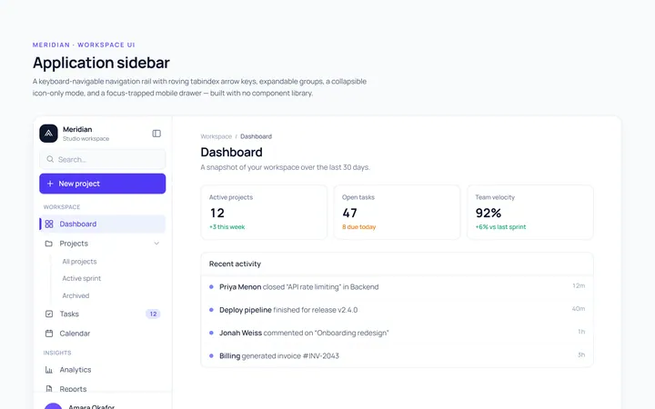
Basic Sidebar
Originalbasic app sidebar navigation
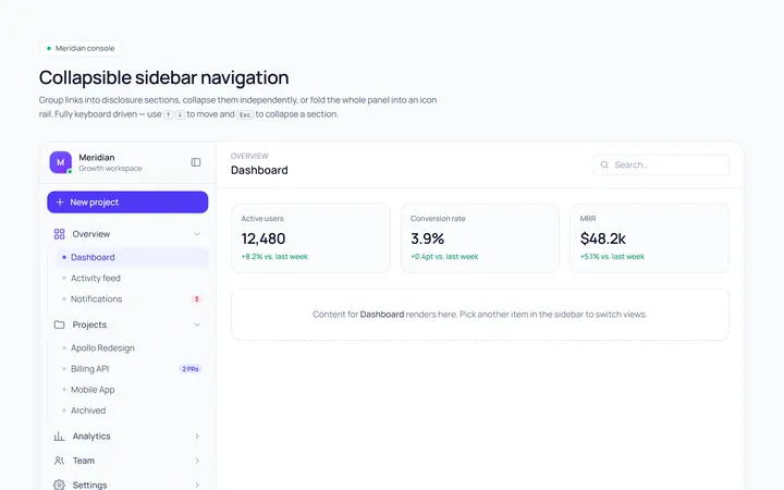
Collapsible Sidebar
Originalcollapsible sidebar sections
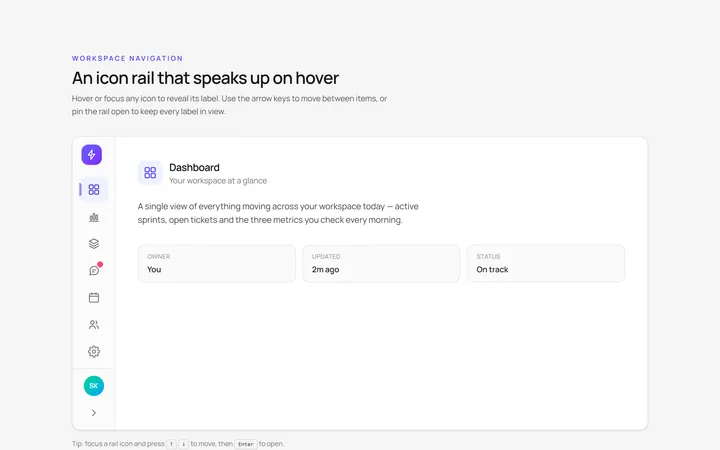
Icons Sidebar
Originalicon sidebar with labels on hover
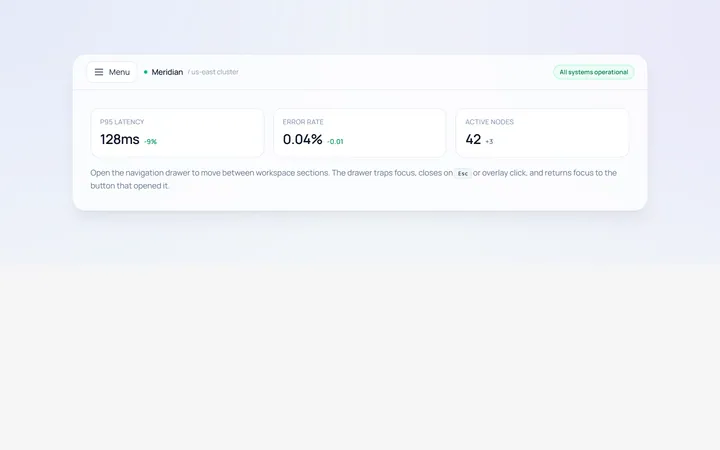
Drawer Left Sidebar
Originalslide-in left drawer with overlay
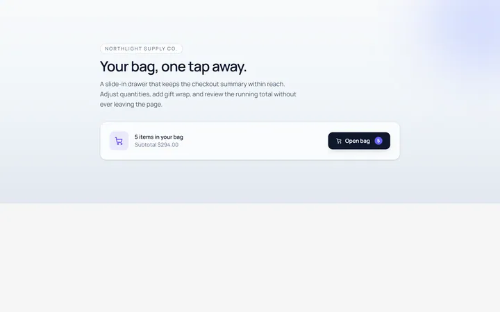
Drawer Right Sidebar
Originalslide-in right drawer panel
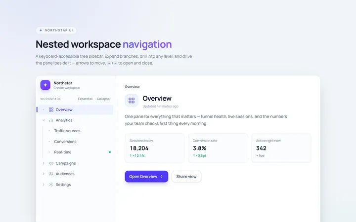
Nested Sidebar
Originalsidebar with expandable nested items
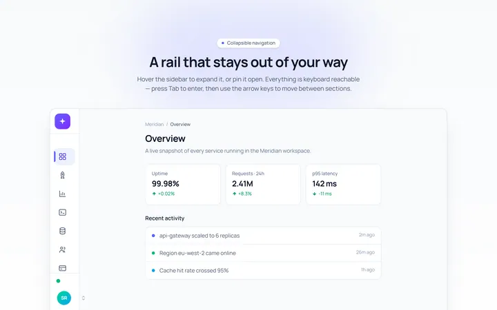
Mini Sidebar
Originalmini rail that expands on hover
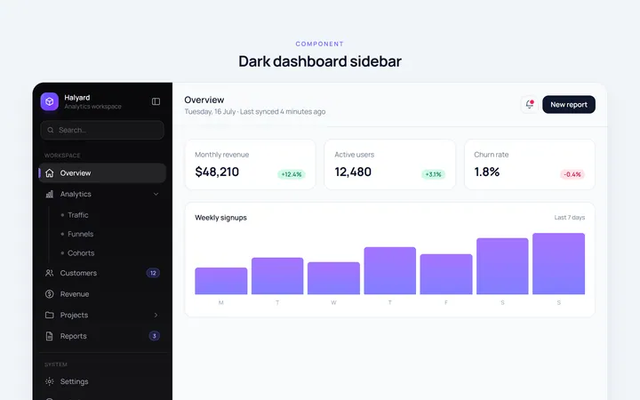
Dark Sidebar
Originaldark themed dashboard sidebar
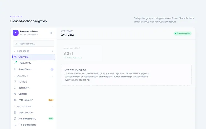
Sections Sidebar
Originalsidebar with grouped sections and headers
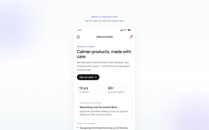
Mobile Sidebar
Originalmobile hamburger slide menu
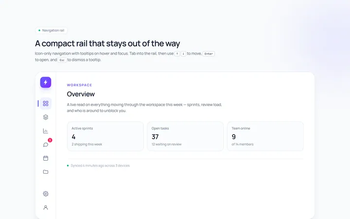
Rail Sidebar
Originalnarrow icon rail with tooltips

Spotlight Hero
OriginalA centred hero with a soft radial spotlight, badge and dual call-to-action.