

Mobile Sidebar
Original · freemobile hamburger slide menu
Copy prompt gives Claude Code, Cursor or v0 a ready-to-paste prompt that recreates this exact component.
npx shadcn@latest add https://webinnoventix.com/r/side-mobile.json"use client";
import {
useCallback,
useEffect,
useId,
useMemo,
useRef,
useState,
type KeyboardEvent as ReactKeyboardEvent,
type ReactNode,
} from "react";
import { AnimatePresence, motion, useReducedMotion } from "motion/react";
type IconName =
| "home"
| "work"
| "studio"
| "services"
| "journal"
| "contact"
| "chevron"
| "close"
| "arrow"
| "bell";
type Child = { id: string; label: string; href: string };
type Leaf = {
id: string;
label: string;
href: string;
icon: Exclude<IconName, "chevron" | "close" | "arrow" | "bell">;
badge?: string;
};
type Group = Leaf & { children: Child[] };
type NavNode = Leaf | Group;
function isGroup(n: NavNode): n is Group {
return "children" in n;
}
const cx = (...parts: Array<string | false | null | undefined>): string =>
parts.filter(Boolean).join(" ");
const NAV: NavNode[] = [
{ id: "home", label: "Home", href: "#home", icon: "home" },
{
id: "work",
label: "Work",
href: "#work",
icon: "work",
children: [
{ id: "work-cases", label: "Case studies", href: "#work/cases" },
{ id: "work-clients", label: "Selected clients", href: "#work/clients" },
{ id: "work-awards", label: "Awards & press", href: "#work/awards" },
],
},
{
id: "studio",
label: "Studio",
href: "#studio",
icon: "studio",
children: [
{ id: "studio-approach", label: "Our approach", href: "#studio/approach" },
{ id: "studio-team", label: "The team", href: "#studio/team" },
{ id: "studio-careers", label: "Careers (3 open)", href: "#studio/careers" },
],
},
{
id: "services",
label: "Services",
href: "#services",
icon: "services",
children: [
{ id: "svc-brand", label: "Brand identity", href: "#services/brand" },
{ id: "svc-web", label: "Web & product", href: "#services/web" },
{ id: "svc-motion", label: "Motion & film", href: "#services/motion" },
],
},
{ id: "journal", label: "Journal", href: "#journal", icon: "journal", badge: "New" },
{ id: "contact", label: "Contact", href: "#contact", icon: "contact" },
];
const GROUP_BY_ID: Record<string, Group> = {};
const PARENT_OF: Record<string, string> = {};
for (const node of NAV) {
if (isGroup(node)) {
GROUP_BY_ID[node.id] = node;
for (const child of node.children) PARENT_OF[child.id] = node.id;
}
}
const paths: Record<IconName, ReactNode> = {
home: (
<>
<path d="M3 10.75 12 3l9 7.75" />
<path d="M5 9.5V20a1 1 0 0 0 1 1h4v-5.5h4V21h4a1 1 0 0 0 1-1V9.5" />
</>
),
work: (
<>
<path d="M3.5 8.5h17v10a1 1 0 0 1-1 1h-15a1 1 0 0 1-1-1z" />
<path d="M8.5 8.5V6.75A1.75 1.75 0 0 1 10.25 5h3.5A1.75 1.75 0 0 1 15.5 6.75V8.5" />
<path d="M3.5 12.5h17" />
</>
),
studio: (
<>
<path d="M9 10.5a2.75 2.75 0 1 0 0-5.5 2.75 2.75 0 0 0 0 5.5z" />
<path d="M3.5 19.5a5.5 5.5 0 0 1 11 0" />
<path d="M16.25 5.2a2.75 2.75 0 0 1 0 5.35" />
<path d="M16 14.4a5.5 5.5 0 0 1 4.5 5.1" />
</>
),
services: (
<>
<path d="M12 3.5 3.5 8 12 12.5 20.5 8 12 3.5z" />
<path d="M3.5 12 12 16.5 20.5 12" />
<path d="M3.5 16 12 20.5 20.5 16" />
</>
),
journal: (
<>
<path d="M12 6.5C10.4 5.2 7.8 4.8 5 5.2V18c2.8-.4 5.4 0 7 1.3 1.6-1.3 4.2-1.7 7-1.3V5.2c-2.8-.4-5.4 0-7 1.3z" />
<path d="M12 6.5V19" />
</>
),
contact: (
<>
<path d="M3.5 6.5h17v11h-17z" />
<path d="m4 7 8 6 8-6" />
</>
),
chevron: <path d="m6 9.5 6 6 6-6" />,
close: (
<>
<path d="m6.5 6.5 11 11" />
<path d="m17.5 6.5-11 11" />
</>
),
arrow: (
<>
<path d="M5 12h13" />
<path d="m12.5 6.5 5.5 5.5-5.5 5.5" />
</>
),
bell: (
<>
<path d="M6.5 9.75a5.5 5.5 0 0 1 11 0c0 4.5 2 5.75 2 5.75h-15s2-1.25 2-5.75z" />
<path d="M10 19.25a2 2 0 0 0 4 0" />
</>
),
};
function Icon({ name, className = "h-5 w-5" }: { name: IconName; className?: string }) {
return (
<svg
viewBox="0 0 24 24"
fill="none"
stroke="currentColor"
strokeWidth={1.75}
strokeLinecap="round"
strokeLinejoin="round"
className={className}
aria-hidden="true"
>
{paths[name]}
</svg>
);
}
function getTabbables(root: HTMLElement): HTMLElement[] {
const nodes = root.querySelectorAll<HTMLElement>(
'a[href], button:not([disabled]), [tabindex]',
);
return Array.from(nodes).filter((el) => {
const ti = el.getAttribute("tabindex");
if (ti !== null && Number(ti) < 0) return false;
return el.offsetParent !== null || el === document.activeElement;
});
}
export default function SideMobile() {
const prefersReduced = useReducedMotion();
const reduce = !!prefersReduced;
const [open, setOpen] = useState(false);
const [expanded, setExpanded] = useState<string[]>(["work"]);
const [activeKey, setActiveKey] = useState<string>(NAV[0].id);
const triggerRef = useRef<HTMLButtonElement | null>(null);
const drawerRef = useRef<HTMLDivElement | null>(null);
const nodeRefs = useRef<Record<string, HTMLElement | null>>({});
const pendingFocus = useRef<string | null>(null);
const wasOpen = useRef(false);
const rawId = useId();
const panelId = `sidemob-${rawId.replace(/[:]/g, "")}`;
const titleId = `${panelId}-title`;
const visibleKeys = useMemo(() => {
const keys: string[] = [];
for (const node of NAV) {
keys.push(node.id);
if (isGroup(node) && expanded.includes(node.id)) {
for (const child of node.children) keys.push(child.id);
}
}
return keys;
}, [expanded]);
const openMenu = useCallback(() => setOpen(true), []);
const closeMenu = useCallback(() => setOpen(false), []);
const toggleGroup = useCallback((id: string) => {
setExpanded((prev) =>
prev.includes(id) ? prev.filter((x) => x !== id) : [...prev, id],
);
setActiveKey(id);
}, []);
const focusKey = useCallback((key: string) => {
setActiveKey(key);
nodeRefs.current[key]?.focus();
}, []);
useEffect(() => {
if (!open) return;
const first = NAV[0].id;
setActiveKey(first);
const raf = requestAnimationFrame(() => {
nodeRefs.current[first]?.focus();
});
return () => cancelAnimationFrame(raf);
}, [open]);
useEffect(() => {
if (wasOpen.current && !open) triggerRef.current?.focus();
wasOpen.current = open;
}, [open]);
useEffect(() => {
const key = pendingFocus.current;
if (key && nodeRefs.current[key]) {
pendingFocus.current = null;
setActiveKey(key);
nodeRefs.current[key]?.focus();
}
}, [visibleKeys]);
const onMenuKeyDown = useCallback(
(e: ReactKeyboardEvent<HTMLElement>) => {
const keys = visibleKeys;
const len = keys.length;
const idx = keys.indexOf(activeKey);
switch (e.key) {
case "ArrowDown":
e.preventDefault();
focusKey(idx < 0 ? keys[0] : keys[(idx + 1) % len]);
break;
case "ArrowUp":
e.preventDefault();
focusKey(idx < 0 ? keys[len - 1] : keys[(idx - 1 + len) % len]);
break;
case "Home":
e.preventDefault();
focusKey(keys[0]);
break;
case "End":
e.preventDefault();
focusKey(keys[len - 1]);
break;
case "ArrowRight": {
const group = GROUP_BY_ID[activeKey];
if (group) {
e.preventDefault();
if (!expanded.includes(group.id)) {
pendingFocus.current = group.children[0].id;
setExpanded((prev) => [...prev, group.id]);
} else {
focusKey(group.children[0].id);
}
}
break;
}
case "ArrowLeft": {
e.preventDefault();
const parentId = PARENT_OF[activeKey];
if (parentId) {
setExpanded((prev) => prev.filter((x) => x !== parentId));
focusKey(parentId);
} else if (GROUP_BY_ID[activeKey] && expanded.includes(activeKey)) {
setExpanded((prev) => prev.filter((x) => x !== activeKey));
}
break;
}
default:
break;
}
},
[activeKey, expanded, focusKey, visibleKeys],
);
const onDrawerKeyDown = useCallback(
(e: ReactKeyboardEvent<HTMLDivElement>) => {
if (e.key === "Escape") {
e.preventDefault();
closeMenu();
return;
}
if (e.key !== "Tab") return;
const root = drawerRef.current;
if (!root) return;
const tabbables = getTabbables(root);
if (tabbables.length === 0) return;
const first = tabbables[0];
const last = tabbables[tabbables.length - 1];
const active = document.activeElement;
if (e.shiftKey && active === first) {
e.preventDefault();
last.focus();
} else if (!e.shiftKey && active === last) {
e.preventDefault();
first.focus();
}
},
[closeMenu],
);
const backdropVariants = { open: { opacity: 1 }, closed: { opacity: 0 } };
const drawerVariants = reduce
? { open: { opacity: 1 }, closed: { opacity: 0 } }
: { open: { x: 0 }, closed: { x: "-100%" } };
const logoMark = (
<span className="flex h-7 w-7 shrink-0 items-center justify-center rounded-lg bg-gradient-to-br from-indigo-500 to-violet-600 text-[13px] font-bold text-white shadow-sm shadow-violet-500/30">
F
</span>
);
return (
<section className="relative w-full overflow-hidden bg-gradient-to-b from-slate-50 via-white to-slate-100 px-4 py-16 text-slate-900 dark:from-zinc-950 dark:via-zinc-950 dark:to-black dark:text-zinc-100 sm:py-24">
<style>{`
@keyframes sidemob_fadeup {
from { opacity: 0; transform: translateY(7px); }
to { opacity: 1; transform: translateY(0); }
}
@keyframes sidemob_pulse {
0%, 100% { opacity: 1; transform: scale(1); }
50% { opacity: 0.55; transform: scale(0.82); }
}
@keyframes sidemob_shimmer {
0% { background-position: -160% 0; }
100% { background-position: 260% 0; }
}
.sidemob-item { animation: sidemob_fadeup 0.42s cubic-bezier(0.22, 1, 0.36, 1) both; }
.sidemob-dot { animation: sidemob_pulse 1.8s ease-in-out infinite; }
.sidemob-shine {
background: linear-gradient(100deg, transparent 22%, rgba(255,255,255,0.4) 50%, transparent 78%);
background-size: 220% 100%;
animation: sidemob_shimmer 3.4s ease-in-out infinite;
}
@media (prefers-reduced-motion: reduce) {
.sidemob-item, .sidemob-dot, .sidemob-shine { animation: none !important; }
.sidemob-item { opacity: 1 !important; transform: none !important; }
}
`}</style>
<div
aria-hidden="true"
className="pointer-events-none absolute -left-24 top-8 h-72 w-72 rounded-full bg-indigo-400/20 blur-3xl dark:bg-indigo-600/10"
/>
<div
aria-hidden="true"
className="pointer-events-none absolute -right-16 bottom-0 h-72 w-72 rounded-full bg-violet-400/20 blur-3xl dark:bg-violet-600/10"
/>
<div className="relative mx-auto flex max-w-md flex-col items-center gap-6">
<div className="text-center">
<p className="text-xs font-semibold uppercase tracking-[0.22em] text-indigo-600 dark:text-indigo-400">
Mobile navigation
</p>
<p className="mt-1.5 text-sm text-slate-500 dark:text-zinc-400">
Tap the menu to slide the drawer open
</p>
</div>
<div className="relative flex h-[660px] w-full max-w-[380px] flex-col overflow-hidden rounded-[2.25rem] border border-zinc-200/80 bg-white shadow-2xl shadow-slate-900/10 ring-1 ring-black/[0.04] dark:border-zinc-800 dark:bg-zinc-900 dark:shadow-black/50 dark:ring-white/[0.06]">
{/* Status bar */}
<div className="flex shrink-0 items-center justify-between px-6 pt-3.5 pb-1 text-[11px] font-semibold text-zinc-800 dark:text-zinc-200">
<span>9:41</span>
<div className="flex items-center gap-1.5 text-zinc-700 dark:text-zinc-300">
<svg width="17" height="11" viewBox="0 0 17 11" aria-hidden="true" className="fill-current">
<rect x="0" y="7" width="3" height="4" rx="1" />
<rect x="4.5" y="5" width="3" height="6" rx="1" />
<rect x="9" y="2.5" width="3" height="8.5" rx="1" />
<rect x="13.5" y="0" width="3" height="11" rx="1" />
</svg>
<svg
width="16"
height="11"
viewBox="0 0 16 11"
aria-hidden="true"
fill="none"
stroke="currentColor"
strokeWidth="1.4"
strokeLinecap="round"
>
<path d="M1 3.5a10 10 0 0 1 14 0" />
<path d="M3.5 6a6.5 6.5 0 0 1 9 0" />
<path d="M6 8.4a3 3 0 0 1 4 0" />
</svg>
<svg width="24" height="12" viewBox="0 0 24 12" aria-hidden="true">
<rect x="0.5" y="0.5" width="20" height="11" rx="3" className="stroke-current" strokeOpacity="0.5" fill="none" />
<rect x="2.5" y="2.5" width="14" height="7" rx="1.5" className="fill-current" />
<rect x="22" y="4" width="1.5" height="4" rx="0.75" className="fill-current" fillOpacity="0.5" />
</svg>
</div>
</div>
{/* App bar */}
<header className="relative z-[1] flex shrink-0 items-center gap-1 border-b border-zinc-100 px-2 py-2.5 dark:border-zinc-800">
<button
ref={triggerRef}
type="button"
onClick={() => (open ? closeMenu() : openMenu())}
aria-haspopup="dialog"
aria-expanded={open}
aria-controls={panelId}
aria-label={open ? "Close menu" : "Open menu"}
className="relative inline-flex h-10 w-10 items-center justify-center rounded-xl text-zinc-700 transition-colors hover:bg-zinc-100 focus-visible:outline-none focus-visible:ring-2 focus-visible:ring-indigo-500 focus-visible:ring-offset-2 focus-visible:ring-offset-white dark:text-zinc-200 dark:hover:bg-zinc-800 dark:focus-visible:ring-offset-zinc-900"
>
<span aria-hidden="true" className="relative block h-4 w-5">
<span
className={cx(
"absolute left-0 top-0 h-0.5 w-5 rounded-full bg-current transition-all duration-300",
open && "top-1/2 -translate-y-1/2 rotate-45",
)}
/>
<span
className={cx(
"absolute left-0 top-1/2 h-0.5 w-5 -translate-y-1/2 rounded-full bg-current transition-all duration-300",
open ? "opacity-0" : "opacity-100",
)}
/>
<span
className={cx(
"absolute bottom-0 left-0 h-0.5 w-5 rounded-full bg-current transition-all duration-300",
open && "bottom-1/2 translate-y-1/2 -rotate-45",
)}
/>
</span>
</button>
<span className="flex-1 text-center text-[15px] font-semibold tracking-tight text-zinc-900 dark:text-white">
Fathom & Field
</span>
<button
type="button"
tabIndex={open ? -1 : 0}
aria-label="Notifications"
className="relative inline-flex h-10 w-10 items-center justify-center rounded-xl text-zinc-600 transition-colors hover:bg-zinc-100 focus-visible:outline-none focus-visible:ring-2 focus-visible:ring-indigo-500 focus-visible:ring-offset-2 focus-visible:ring-offset-white dark:text-zinc-300 dark:hover:bg-zinc-800 dark:focus-visible:ring-offset-zinc-900"
>
<Icon name="bell" className="h-5 w-5" />
<span
aria-hidden="true"
className="absolute right-2 top-2 h-2 w-2 rounded-full bg-rose-500 ring-2 ring-white dark:ring-zinc-900"
/>
</button>
</header>
{/* Page content (behind the drawer) */}
<main aria-hidden={open} className="min-h-0 flex-1 overflow-y-auto">
<div className="space-y-5 px-5 pb-8 pt-5">
<section>
<p className="text-[11px] font-semibold uppercase tracking-[0.2em] text-indigo-600 dark:text-indigo-400">
Design studio
</p>
<h1 className="mt-2 text-[26px] font-semibold leading-[1.15] tracking-tight text-zinc-900 dark:text-white">
Calmer products, made with care.
</h1>
<p className="mt-2.5 text-sm leading-relaxed text-zinc-600 dark:text-zinc-400">
We help teams ship interfaces that feel quiet, fast, and genuinely
human — from the first rough sketch to launch day.
</p>
<button
type="button"
tabIndex={open ? -1 : 0}
className="mt-4 inline-flex items-center gap-1.5 rounded-full bg-zinc-900 px-4 py-2 text-sm font-medium text-white transition-colors hover:bg-zinc-800 focus-visible:outline-none focus-visible:ring-2 focus-visible:ring-indigo-500 focus-visible:ring-offset-2 focus-visible:ring-offset-white dark:bg-white dark:text-zinc-900 dark:hover:bg-zinc-200 dark:focus-visible:ring-offset-zinc-900"
>
See our work
<Icon name="arrow" className="h-4 w-4" />
</button>
</section>
<section className="grid grid-cols-2 gap-3">
<div className="rounded-2xl border border-zinc-100 bg-zinc-50/60 p-3.5 dark:border-zinc-800 dark:bg-zinc-800/30">
<p className="text-xl font-semibold text-zinc-900 dark:text-white">12 yrs</p>
<p className="mt-0.5 text-xs text-zinc-500 dark:text-zinc-400">in practice</p>
</div>
<div className="rounded-2xl border border-zinc-100 bg-zinc-50/60 p-3.5 dark:border-zinc-800 dark:bg-zinc-800/30">
<p className="text-xl font-semibold text-zinc-900 dark:text-white">60+</p>
<p className="mt-0.5 text-xs text-zinc-500 dark:text-zinc-400">products shipped</p>
</div>
</section>
<section className="rounded-2xl border border-zinc-100 bg-white p-4 shadow-sm dark:border-zinc-800 dark:bg-zinc-800/30">
<p className="text-[11px] font-semibold uppercase tracking-wider text-zinc-400 dark:text-zinc-500">
Featured case study
</p>
<h2 className="mt-1.5 text-[15px] font-semibold text-zinc-900 dark:text-white">
Rebuilding trust for Kestrel Bank
</h2>
<p className="mt-1 text-sm text-zinc-600 dark:text-zinc-400">
A ground-up mobile redesign that cut support tickets by 34% in three
months.
</p>
</section>
<section>
<h2 className="text-[11px] font-semibold uppercase tracking-wider text-zinc-400 dark:text-zinc-500">
From the journal
</h2>
<ul className="mt-2 space-y-2.5">
<li className="flex items-start gap-3">
<span className="mt-1.5 h-1.5 w-1.5 shrink-0 rounded-full bg-indigo-500" />
<div>
<p className="text-sm font-medium text-zinc-800 dark:text-zinc-100">
Designing interfaces that stay out of the way
</p>
<p className="text-xs text-zinc-500 dark:text-zinc-400">6 min read · Jul 2026</p>
</div>
</li>
<li className="flex items-start gap-3">
<span className="mt-1.5 h-1.5 w-1.5 shrink-0 rounded-full bg-violet-500" />
<div>
<p className="text-sm font-medium text-zinc-800 dark:text-zinc-100">
The quiet power of a good empty state
</p>
<p className="text-xs text-zinc-500 dark:text-zinc-400">4 min read · Jun 2026</p>
</div>
</li>
</ul>
</section>
<p className="pt-1 text-center text-xs text-zinc-400 dark:text-zinc-500">
Tap the menu icon to browse the site
</p>
</div>
</main>
{/* Slide-in menu */}
<AnimatePresence>
{open && (
<motion.div
key="overlay"
initial="closed"
animate="open"
exit="closed"
variants={{ open: {}, closed: {} }}
className="absolute inset-0 z-30"
>
<motion.div
variants={backdropVariants}
transition={{ duration: reduce ? 0 : 0.22 }}
onClick={closeMenu}
aria-hidden="true"
className="absolute inset-0 z-0 cursor-pointer bg-slate-900/40 backdrop-blur-[2px] dark:bg-black/60"
/>
<motion.div
key="drawer"
ref={drawerRef}
id={panelId}
role="dialog"
aria-modal="true"
aria-labelledby={titleId}
onKeyDown={onDrawerKeyDown}
variants={drawerVariants}
transition={
reduce
? { duration: 0.15 }
: { type: "spring", stiffness: 360, damping: 36 }
}
className="absolute inset-y-0 left-0 z-10 flex w-[82%] max-w-[300px] flex-col border-r border-zinc-200 bg-white shadow-2xl shadow-black/25 dark:border-zinc-800 dark:bg-zinc-950"
>
<div className="flex shrink-0 items-center justify-between border-b border-zinc-100 px-4 py-3.5 dark:border-zinc-800/80">
<div className="flex items-center gap-2.5">
{logoMark}
<span
id={titleId}
className="text-[15px] font-semibold tracking-tight text-zinc-900 dark:text-white"
>
Fathom & Field
</span>
</div>
<button
type="button"
onClick={closeMenu}
aria-label="Close menu"
className="inline-flex h-9 w-9 items-center justify-center rounded-lg text-zinc-500 transition-colors hover:bg-zinc-100 hover:text-zinc-900 focus-visible:outline-none focus-visible:ring-2 focus-visible:ring-inset focus-visible:ring-indigo-500 dark:text-zinc-400 dark:hover:bg-zinc-800 dark:hover:text-white"
>
<Icon name="close" className="h-5 w-5" />
</button>
</div>
<nav
aria-label="Primary"
role="menu"
aria-orientation="vertical"
onKeyDown={onMenuKeyDown}
className="min-h-0 flex-1 space-y-0.5 overflow-y-auto px-2 py-3"
>
{NAV.map((node, i) => {
const isActive = activeKey === node.id;
return (
<div
key={node.id}
role="none"
className="sidemob-item"
style={{ animationDelay: `${i * 45}ms` }}
>
{isGroup(node) ? (
<>
<button
type="button"
role="menuitem"
data-menuitem="true"
aria-haspopup="true"
aria-expanded={expanded.includes(node.id)}
aria-controls={`${panelId}-${node.id}`}
tabIndex={isActive ? 0 : -1}
ref={(el) => {
nodeRefs.current[node.id] = el;
}}
onClick={() => toggleGroup(node.id)}
onFocus={() => setActiveKey(node.id)}
className={cx(
"group flex w-full items-center gap-3 rounded-xl px-2.5 py-2 text-left text-[15px] font-medium transition-colors focus-visible:outline-none focus-visible:ring-2 focus-visible:ring-inset focus-visible:ring-indigo-500",
isActive
? "bg-zinc-100 text-zinc-900 dark:bg-zinc-800/70 dark:text-white"
: "text-zinc-700 hover:bg-zinc-50 dark:text-zinc-200 dark:hover:bg-zinc-900",
)}
>
<span className="flex h-9 w-9 shrink-0 items-center justify-center rounded-lg bg-zinc-100 text-zinc-500 transition-colors group-hover:text-indigo-600 dark:bg-zinc-800 dark:text-zinc-400 dark:group-hover:text-indigo-400">
<Icon name={node.icon} className="h-[18px] w-[18px]" />
</span>
<span className="flex-1 truncate">{node.label}</span>
<Icon
name="chevron"
className={cx(
"h-4 w-4 text-zinc-400 transition-transform duration-300",
expanded.includes(node.id) && "rotate-180",
)}
/>
</button>
{expanded.includes(node.id) && (
<ul
id={`${panelId}-${node.id}`}
role="menu"
aria-label={`${node.label} pages`}
className="mt-0.5 space-y-0.5 pl-[3.25rem] pr-1"
>
{node.children.map((child) => {
const childActive = activeKey === child.id;
return (
<li key={child.id} role="none">
<a
role="menuitem"
data-menuitem="true"
href={child.href}
tabIndex={childActive ? 0 : -1}
ref={(el) => {
nodeRefs.current[child.id] = el;
}}
onFocus={() => setActiveKey(child.id)}
onClick={closeMenu}
className={cx(
"block rounded-lg px-3 py-1.5 text-sm transition-colors focus-visible:outline-none focus-visible:ring-2 focus-visible:ring-inset focus-visible:ring-indigo-500",
childActive
? "bg-zinc-100 text-zinc-900 dark:bg-zinc-800/60 dark:text-white"
: "text-zinc-500 hover:bg-zinc-50 hover:text-zinc-800 dark:text-zinc-400 dark:hover:bg-zinc-900 dark:hover:text-zinc-100",
)}
>
{child.label}
</a>
</li>
);
})}
</ul>
)}
</>
) : (
<a
role="menuitem"
data-menuitem="true"
href={node.href}
aria-current={node.id === "home" ? "page" : undefined}
tabIndex={isActive ? 0 : -1}
ref={(el) => {
nodeRefs.current[node.id] = el;
}}
onFocus={() => setActiveKey(node.id)}
onClick={closeMenu}
className={cx(
"group relative flex items-center gap-3 rounded-xl px-2.5 py-2 text-[15px] font-medium transition-colors focus-visible:outline-none focus-visible:ring-2 focus-visible:ring-inset focus-visible:ring-indigo-500",
node.id === "home"
? "text-indigo-700 dark:text-indigo-300"
: "text-zinc-700 hover:bg-zinc-50 dark:text-zinc-200 dark:hover:bg-zinc-900",
isActive &&
node.id !== "home" &&
"bg-zinc-100 dark:bg-zinc-800/70",
isActive &&
node.id === "home" &&
"bg-indigo-50 dark:bg-indigo-500/10",
)}
>
{node.id === "home" && (
<span
aria-hidden="true"
className="absolute inset-y-2 left-0 w-1 rounded-full bg-indigo-500"
/>
)}
<span
className={cx(
"flex h-9 w-9 shrink-0 items-center justify-center rounded-lg transition-colors",
node.id === "home"
? "bg-indigo-100 text-indigo-600 dark:bg-indigo-500/20 dark:text-indigo-300"
: "bg-zinc-100 text-zinc-500 group-hover:text-indigo-600 dark:bg-zinc-800 dark:text-zinc-400 dark:group-hover:text-indigo-400",
)}
>
<Icon name={node.icon} className="h-[18px] w-[18px]" />
</span>
<span className="flex-1 truncate">{node.label}</span>
{node.badge && (
<span className="inline-flex items-center gap-1 rounded-full bg-emerald-100 px-2 py-0.5 text-[11px] font-semibold text-emerald-700 dark:bg-emerald-500/15 dark:text-emerald-300">
<span className="sidemob-dot h-1.5 w-1.5 rounded-full bg-emerald-500" />
{node.badge}
</span>
)}
</a>
)}
</div>
);
})}
</nav>
<div className="shrink-0 border-t border-zinc-100 px-4 py-4 dark:border-zinc-800/80">
<a
href="#contact"
onClick={closeMenu}
className="group relative flex items-center justify-center gap-2 overflow-hidden rounded-xl bg-gradient-to-r from-indigo-600 to-violet-600 px-4 py-3 text-sm font-semibold text-white shadow-lg shadow-indigo-600/25 transition-transform hover:scale-[1.01] focus-visible:outline-none focus-visible:ring-2 focus-visible:ring-inset focus-visible:ring-white/70"
>
<span aria-hidden="true" className="sidemob-shine pointer-events-none absolute inset-0" />
<span className="relative">Start a project</span>
<Icon name="arrow" className="relative h-4 w-4" />
</a>
<dl className="mt-3 space-y-1 px-1 text-xs text-zinc-500 dark:text-zinc-400">
<div className="flex items-center justify-between">
<dt>Email</dt>
<dd className="font-medium text-zinc-700 dark:text-zinc-300">
studio@fathomfield.com
</dd>
</div>
<div className="flex items-center justify-between">
<dt>Studios</dt>
<dd className="font-medium text-zinc-700 dark:text-zinc-300">
Lisbon · New York
</dd>
</div>
</dl>
</div>
</motion.div>
</motion.div>
)}
</AnimatePresence>
</div>
</div>
</section>
);
}Dependencies
Licence
Built by Web Innoventix. Free for personal and commercial use, no attribution required.
Built by Web Innoventix
Need a custom interface, a full website, or SEO that gets you cited by AI? We design, build and rank it end to end.
Get a free quoteSimilar components
Browse all →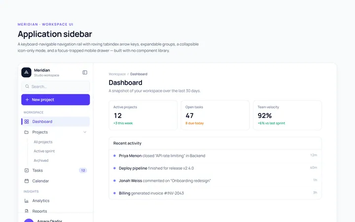
Basic Sidebar
Originalbasic app sidebar navigation
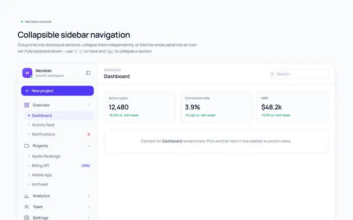
Collapsible Sidebar
Originalcollapsible sidebar sections
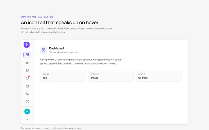
Icons Sidebar
Originalicon sidebar with labels on hover
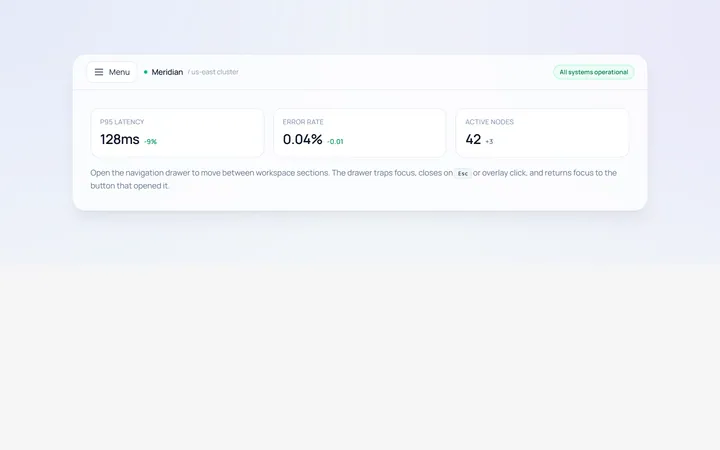
Drawer Left Sidebar
Originalslide-in left drawer with overlay
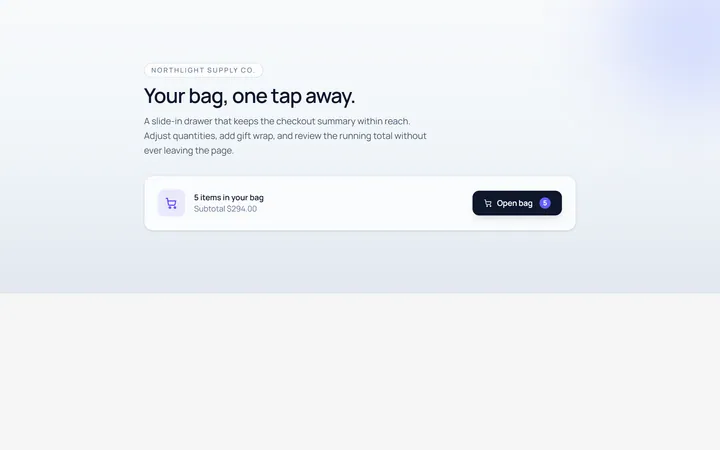
Drawer Right Sidebar
Originalslide-in right drawer panel
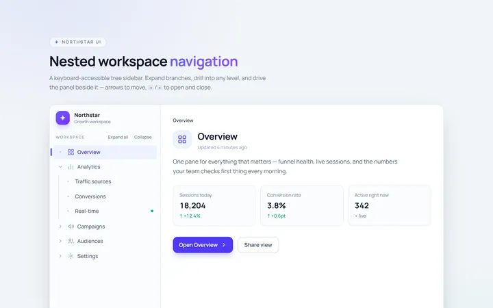
Nested Sidebar
Originalsidebar with expandable nested items
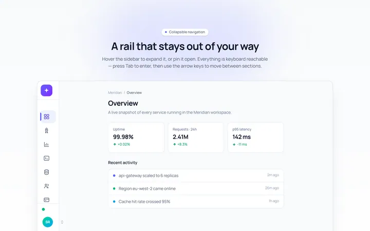
Mini Sidebar
Originalmini rail that expands on hover
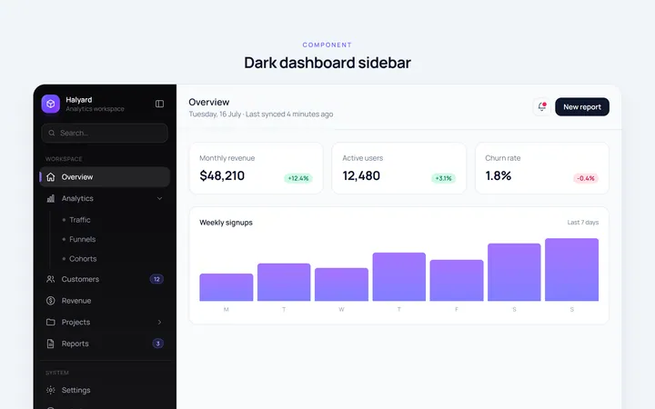
Dark Sidebar
Originaldark themed dashboard sidebar
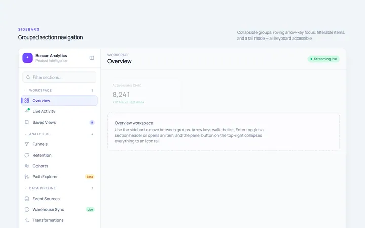
Sections Sidebar
Originalsidebar with grouped sections and headers
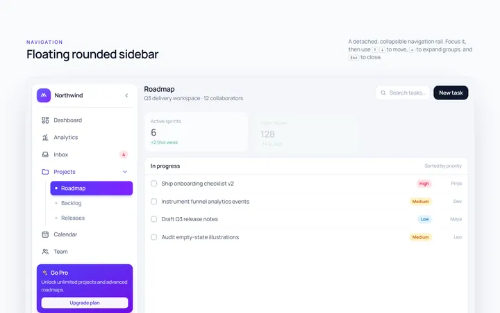
Floating Sidebar
Originalfloating rounded sidebar
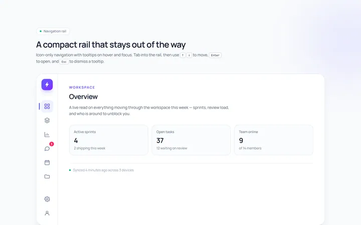
Rail Sidebar
Originalnarrow icon rail with tooltips

Spotlight Hero
OriginalA centred hero with a soft radial spotlight, badge and dual call-to-action.