

Collapsible Sidebar
Original · freecollapsible sidebar sections
Copy prompt gives Claude Code, Cursor or v0 a ready-to-paste prompt that recreates this exact component.
npx shadcn@latest add https://webinnoventix.com/r/side-collapsible.json"use client";
import { useId, useMemo, useRef, useState } from "react";
import type { KeyboardEvent as ReactKeyboardEvent } from "react";
import { AnimatePresence, motion, useReducedMotion } from "motion/react";
type IconName =
| "overview"
| "folder"
| "analytics"
| "team"
| "settings"
| "chevron"
| "panelLeft"
| "plus"
| "search"
| "logout";
type BadgeTone = "rose" | "amber" | "emerald" | "indigo";
type NavItem = {
id: string;
label: string;
badge?: { text: string; tone: BadgeTone };
};
type NavSection = {
id: string;
label: string;
icon: IconName;
items: NavItem[];
};
const SECTIONS: NavSection[] = [
{
id: "overview",
label: "Overview",
icon: "overview",
items: [
{ id: "overview-dashboard", label: "Dashboard" },
{ id: "overview-activity", label: "Activity feed" },
{
id: "overview-notifications",
label: "Notifications",
badge: { text: "3", tone: "rose" },
},
],
},
{
id: "projects",
label: "Projects",
icon: "folder",
items: [
{ id: "projects-apollo", label: "Apollo Redesign" },
{
id: "projects-billing",
label: "Billing API",
badge: { text: "2 PRs", tone: "indigo" },
},
{ id: "projects-mobile", label: "Mobile App" },
{ id: "projects-archived", label: "Archived" },
],
},
{
id: "analytics",
label: "Analytics",
icon: "analytics",
items: [
{ id: "analytics-traffic", label: "Traffic" },
{ id: "analytics-conversions", label: "Conversions" },
{ id: "analytics-cohorts", label: "Cohorts" },
{ id: "analytics-funnels", label: "Funnels" },
],
},
{
id: "team",
label: "Team",
icon: "team",
items: [
{ id: "team-members", label: "Members" },
{ id: "team-roles", label: "Roles & access" },
{
id: "team-invites",
label: "Invitations",
badge: { text: "5", tone: "amber" },
},
],
},
{
id: "settings",
label: "Settings",
icon: "settings",
items: [
{ id: "settings-general", label: "General" },
{ id: "settings-integrations", label: "Integrations" },
{ id: "settings-billing", label: "Billing" },
{ id: "settings-security", label: "Security" },
],
},
];
const BADGE_CLASSES: Record<BadgeTone, string> = {
rose: "bg-rose-100 text-rose-700 dark:bg-rose-500/15 dark:text-rose-300",
amber: "bg-amber-100 text-amber-800 dark:bg-amber-500/15 dark:text-amber-300",
emerald:
"bg-emerald-100 text-emerald-700 dark:bg-emerald-500/15 dark:text-emerald-300",
indigo:
"bg-indigo-100 text-indigo-700 dark:bg-indigo-500/15 dark:text-indigo-300",
};
function Icon({ name, className }: { name: IconName; className?: string }) {
const shared = {
className,
viewBox: "0 0 24 24",
fill: "none",
stroke: "currentColor",
strokeWidth: 1.7,
strokeLinecap: "round" as const,
strokeLinejoin: "round" as const,
"aria-hidden": true,
focusable: false,
};
switch (name) {
case "overview":
return (
<svg {...shared}>
<rect x="3" y="3" width="7" height="7" rx="1.5" />
<rect x="14" y="3" width="7" height="7" rx="1.5" />
<rect x="14" y="14" width="7" height="7" rx="1.5" />
<rect x="3" y="14" width="7" height="7" rx="1.5" />
</svg>
);
case "folder":
return (
<svg {...shared}>
<path d="M3 7a2 2 0 0 1 2-2h3.6a2 2 0 0 1 1.4.6L11.8 7H19a2 2 0 0 1 2 2v8a2 2 0 0 1-2 2H5a2 2 0 0 1-2-2Z" />
</svg>
);
case "analytics":
return (
<svg {...shared}>
<path d="M4 20V10" />
<path d="M10 20V4" />
<path d="M16 20v-7" />
<path d="M22 20H2" />
</svg>
);
case "team":
return (
<svg {...shared}>
<circle cx="9" cy="8" r="3.2" />
<path d="M3.5 19a5.5 5.5 0 0 1 11 0" />
<path d="M16 6.2a3 3 0 0 1 0 5.6" />
<path d="M17 14.4A5.5 5.5 0 0 1 20.5 19" />
</svg>
);
case "settings":
return (
<svg {...shared}>
<circle cx="12" cy="12" r="3" />
<path d="M19.4 15a1.6 1.6 0 0 0 .32 1.77l.06.06a2 2 0 1 1-2.83 2.83l-.06-.06a1.6 1.6 0 0 0-1.77-.32 1.6 1.6 0 0 0-.97 1.47V21a2 2 0 0 1-4 0v-.09A1.6 1.6 0 0 0 8.5 19.4a1.6 1.6 0 0 0-1.77.32l-.06.06a2 2 0 1 1-2.83-2.83l.06-.06a1.6 1.6 0 0 0 .32-1.77 1.6 1.6 0 0 0-1.47-.97H2.6a2 2 0 0 1 0-4h.09a1.6 1.6 0 0 0 1.47-.97 1.6 1.6 0 0 0-.32-1.77l-.06-.06A2 2 0 1 1 6.6 4.5l.06.06a1.6 1.6 0 0 0 1.77.32H8.5a1.6 1.6 0 0 0 .97-1.47V3.4a2 2 0 0 1 4 0v.09a1.6 1.6 0 0 0 .97 1.47 1.6 1.6 0 0 0 1.77-.32l.06-.06a2 2 0 1 1 2.83 2.83l-.06.06a1.6 1.6 0 0 0-.32 1.77v.09a1.6 1.6 0 0 0 1.47.97h.09a2 2 0 0 1 0 4h-.09a1.6 1.6 0 0 0-1.47.97Z" />
</svg>
);
case "chevron":
return (
<svg {...shared}>
<path d="m6 9 6 6 6-6" />
</svg>
);
case "panelLeft":
return (
<svg {...shared}>
<rect x="3" y="4" width="18" height="16" rx="2" />
<path d="M9 4v16" />
</svg>
);
case "plus":
return (
<svg {...shared}>
<path d="M12 5v14" />
<path d="M5 12h14" />
</svg>
);
case "search":
return (
<svg {...shared}>
<circle cx="11" cy="11" r="7" />
<path d="m20 20-3.2-3.2" />
</svg>
);
case "logout":
return (
<svg {...shared}>
<path d="M15 4h3a2 2 0 0 1 2 2v12a2 2 0 0 1-2 2h-3" />
<path d="M10 17 5 12l5-5" />
<path d="M5 12h12" />
</svg>
);
default:
return null;
}
}
export default function SideCollapsible() {
const reduce = useReducedMotion();
const baseId = useId().replace(/:/g, "");
const navRef = useRef<HTMLElement | null>(null);
const [collapsed, setCollapsed] = useState(false);
const [openSections, setOpenSections] = useState<Set<string>>(
() => new Set(["overview", "projects"]),
);
const [activeItem, setActiveItem] = useState("overview-dashboard");
const activeLabel = useMemo(() => {
for (const section of SECTIONS) {
const found = section.items.find((item) => item.id === activeItem);
if (found) return { section: section.label, item: found.label };
}
return { section: "Overview", item: "Dashboard" };
}, [activeItem]);
const springTransition = reduce
? { duration: 0 }
: { type: "spring" as const, stiffness: 320, damping: 34 };
const heightTransition = reduce
? { duration: 0 }
: { duration: 0.26, ease: [0.4, 0, 0.2, 1] as [number, number, number, number] };
function toggleSection(id: string) {
setOpenSections((prev) => {
const next = new Set(prev);
if (next.has(id)) next.delete(id);
else next.add(id);
return next;
});
}
function handleSectionClick(id: string) {
if (collapsed) {
setCollapsed(false);
setOpenSections((prev) => new Set(prev).add(id));
return;
}
toggleSection(id);
}
function handleNavKeyDown(event: ReactKeyboardEvent<HTMLElement>) {
const { key } = event;
if (!["ArrowDown", "ArrowUp", "Home", "End", "Escape"].includes(key)) {
return;
}
const nav = navRef.current;
if (!nav) return;
const current =
typeof document !== "undefined"
? (document.activeElement as HTMLElement | null)
: null;
if (key === "Escape") {
const sectionEl = current?.closest<HTMLElement>("[data-section-id]");
const sid = sectionEl?.getAttribute("data-section-id");
if (sid && openSections.has(sid)) {
event.preventDefault();
setOpenSections((prev) => {
const next = new Set(prev);
next.delete(sid);
return next;
});
sectionEl
?.querySelector<HTMLElement>("[data-section-header]")
?.focus();
}
return;
}
const items = Array.from(
nav.querySelectorAll<HTMLElement>("[data-nav-focusable]"),
).filter((el) => el.offsetParent !== null);
if (items.length === 0) return;
event.preventDefault();
const idx = current ? items.indexOf(current) : -1;
let next = idx;
if (key === "ArrowDown") next = idx < items.length - 1 ? idx + 1 : 0;
else if (key === "ArrowUp") next = idx > 0 ? idx - 1 : items.length - 1;
else if (key === "Home") next = 0;
else if (key === "End") next = items.length - 1;
items[next]?.focus();
}
const ring =
"focus-visible:outline-none focus-visible:ring-2 focus-visible:ring-indigo-500 dark:focus-visible:ring-indigo-400 focus-visible:ring-offset-2 focus-visible:ring-offset-white dark:focus-visible:ring-offset-neutral-950";
return (
<section className="relative w-full overflow-hidden bg-slate-50 px-4 py-16 dark:bg-neutral-950 sm:px-6 lg:px-8">
<style>{`
@keyframes sidecol-fade-in {
from { opacity: 0; transform: translateY(4px); }
to { opacity: 1; transform: translateY(0); }
}
@keyframes sidecol-ping {
0% { transform: scale(0.85); opacity: 0.65; }
70%, 100% { transform: scale(2.1); opacity: 0; }
}
.sidecol-enter { animation: sidecol-fade-in 260ms cubic-bezier(0.4,0,0.2,1) both; }
.sidecol-ping { animation: sidecol-ping 1900ms cubic-bezier(0,0,0.2,1) infinite; }
@media (prefers-reduced-motion: reduce) {
.sidecol-enter, .sidecol-ping { animation: none !important; }
}
`}</style>
<div className="mx-auto max-w-6xl">
<div className="mb-8 max-w-2xl">
<span className="inline-flex items-center gap-2 rounded-full border border-slate-200 bg-white px-3 py-1 text-xs font-medium text-slate-600 dark:border-neutral-800 dark:bg-neutral-900 dark:text-neutral-300">
<span className="h-1.5 w-1.5 rounded-full bg-emerald-500" />
Meridian console
</span>
<h2 className="mt-4 text-2xl font-semibold tracking-tight text-slate-900 dark:text-white sm:text-3xl">
Collapsible sidebar navigation
</h2>
<p className="mt-2 text-sm leading-relaxed text-slate-600 dark:text-neutral-400">
Group links into disclosure sections, collapse them independently, or
fold the whole panel into an icon rail. Fully keyboard driven — use{" "}
<kbd className="rounded border border-slate-300 bg-slate-100 px-1 text-[11px] dark:border-neutral-700 dark:bg-neutral-800">
↑
</kbd>{" "}
<kbd className="rounded border border-slate-300 bg-slate-100 px-1 text-[11px] dark:border-neutral-700 dark:bg-neutral-800">
↓
</kbd>{" "}
to move and{" "}
<kbd className="rounded border border-slate-300 bg-slate-100 px-1 text-[11px] dark:border-neutral-700 dark:bg-neutral-800">
Esc
</kbd>{" "}
to collapse a section.
</p>
</div>
<div className="flex min-h-[560px] overflow-hidden rounded-3xl border border-slate-200 bg-white shadow-xl shadow-slate-900/5 dark:border-neutral-800 dark:bg-neutral-900 dark:shadow-black/30">
{/* Sidebar */}
<motion.aside
initial={false}
animate={{ width: collapsed ? 84 : 288 }}
transition={springTransition}
className="flex shrink-0 flex-col border-r border-slate-200 bg-slate-50/80 dark:border-neutral-800 dark:bg-neutral-950/60"
aria-label="Sidebar"
>
{/* Workspace header */}
<div className="flex items-center gap-3 border-b border-slate-200 px-4 py-4 dark:border-neutral-800">
<div className="relative grid h-9 w-9 shrink-0 place-items-center rounded-xl bg-gradient-to-br from-indigo-500 to-violet-600 text-sm font-bold text-white shadow-sm">
M
<span className="absolute -bottom-0.5 -right-0.5 grid place-items-center">
<span className="sidecol-ping absolute inline-flex h-2.5 w-2.5 rounded-full bg-emerald-400" />
<span className="relative inline-flex h-2.5 w-2.5 rounded-full border-2 border-slate-50 bg-emerald-500 dark:border-neutral-950" />
</span>
</div>
{!collapsed && (
<div className="sidecol-enter min-w-0 flex-1">
<p className="truncate text-sm font-semibold text-slate-900 dark:text-white">
Meridian
</p>
<p className="truncate text-xs text-slate-500 dark:text-neutral-400">
Growth workspace
</p>
</div>
)}
<button
type="button"
onClick={() => setCollapsed((v) => !v)}
aria-pressed={collapsed}
aria-label={collapsed ? "Expand sidebar" : "Collapse sidebar"}
title={collapsed ? "Expand sidebar" : "Collapse sidebar"}
className={`grid h-8 w-8 shrink-0 place-items-center rounded-lg text-slate-500 transition-colors hover:bg-slate-200/70 hover:text-slate-900 dark:text-neutral-400 dark:hover:bg-neutral-800 dark:hover:text-white ${ring}`}
>
<Icon
name="panelLeft"
className={`h-[18px] w-[18px] transition-transform duration-300 ${
collapsed ? "rotate-180" : ""
}`}
/>
</button>
</div>
{/* New button */}
<div className="px-3 pt-3">
<button
type="button"
className={`flex w-full items-center gap-2 rounded-xl bg-indigo-600 px-3 py-2 text-sm font-medium text-white shadow-sm transition-colors hover:bg-indigo-500 ${
collapsed ? "justify-center" : ""
} ${ring}`}
aria-label="New project"
title="New project"
>
<Icon name="plus" className="h-[18px] w-[18px] shrink-0" />
{!collapsed && <span className="sidecol-enter">New project</span>}
</button>
</div>
{/* Nav */}
<nav
ref={navRef}
aria-label="Primary"
onKeyDown={handleNavKeyDown}
className="mt-2 flex-1 space-y-1 overflow-y-auto px-3 py-2"
>
{SECTIONS.map((section) => {
const open = collapsed ? false : openSections.has(section.id);
const panelId = `${baseId}-panel-${section.id}`;
const headerId = `${baseId}-header-${section.id}`;
const hasActive = section.items.some(
(item) => item.id === activeItem,
);
return (
<div key={section.id} data-section-id={section.id}>
<button
type="button"
id={headerId}
data-section-header
data-nav-focusable
aria-expanded={open}
aria-controls={panelId}
onClick={() => handleSectionClick(section.id)}
title={collapsed ? section.label : undefined}
className={`group flex w-full items-center gap-3 rounded-xl px-2.5 py-2 text-sm font-medium transition-colors ${
collapsed ? "justify-center" : ""
} ${
hasActive && !open
? "text-indigo-700 dark:text-indigo-300"
: "text-slate-700 dark:text-neutral-300"
} hover:bg-slate-200/70 dark:hover:bg-neutral-800/70 ${ring}`}
>
<Icon
name={section.icon}
className={`h-5 w-5 shrink-0 ${
hasActive
? "text-indigo-600 dark:text-indigo-400"
: "text-slate-500 dark:text-neutral-400"
}`}
/>
{!collapsed && (
<>
<span className="sidecol-enter flex-1 text-left">
{section.label}
</span>
<Icon
name="chevron"
className={`h-4 w-4 shrink-0 text-slate-400 transition-transform duration-300 dark:text-neutral-500 ${
open ? "" : "-rotate-90"
}`}
/>
</>
)}
</button>
<AnimatePresence initial={false}>
{open && (
<motion.div
id={panelId}
role="region"
aria-labelledby={headerId}
key="panel"
initial={{ height: 0, opacity: 0 }}
animate={{ height: "auto", opacity: 1 }}
exit={{ height: 0, opacity: 0 }}
transition={heightTransition}
className="overflow-hidden"
>
<ul className="mt-1 space-y-0.5 border-l border-slate-200 pb-1 pl-3.5 dark:border-neutral-800">
{section.items.map((item) => {
const isActive = item.id === activeItem;
return (
<li key={item.id}>
<a
href={`#${item.id}`}
data-nav-focusable
aria-current={isActive ? "page" : undefined}
onClick={(e) => {
e.preventDefault();
setActiveItem(item.id);
}}
className={`flex items-center gap-2 rounded-lg px-2.5 py-1.5 text-sm transition-colors ${
isActive
? "bg-indigo-50 font-medium text-indigo-700 dark:bg-indigo-500/10 dark:text-indigo-300"
: "text-slate-600 hover:bg-slate-200/60 hover:text-slate-900 dark:text-neutral-400 dark:hover:bg-neutral-800/60 dark:hover:text-white"
} ${ring}`}
>
<span
className={`h-1.5 w-1.5 shrink-0 rounded-full ${
isActive
? "bg-indigo-500"
: "bg-slate-300 dark:bg-neutral-700"
}`}
/>
<span className="flex-1 truncate">
{item.label}
</span>
{item.badge && (
<span
className={`shrink-0 rounded-full px-1.5 py-0.5 text-[10px] font-semibold leading-none ${
BADGE_CLASSES[item.badge.tone]
}`}
>
{item.badge.text}
</span>
)}
</a>
</li>
);
})}
</ul>
</motion.div>
)}
</AnimatePresence>
</div>
);
})}
</nav>
{/* Footer user card */}
<div className="border-t border-slate-200 p-3 dark:border-neutral-800">
<div
className={`flex items-center gap-3 rounded-xl p-2 ${
collapsed ? "justify-center" : ""
}`}
>
<span className="grid h-9 w-9 shrink-0 place-items-center rounded-full bg-gradient-to-br from-emerald-400 to-sky-500 text-xs font-bold text-white">
SK
</span>
{!collapsed && (
<div className="sidecol-enter min-w-0 flex-1">
<p className="truncate text-sm font-medium text-slate-900 dark:text-white">
Salman K.
</p>
<p className="truncate text-xs text-slate-500 dark:text-neutral-400">
salman@meridian.io
</p>
</div>
)}
{!collapsed && (
<button
type="button"
aria-label="Sign out"
title="Sign out"
className={`grid h-8 w-8 shrink-0 place-items-center rounded-lg text-slate-400 transition-colors hover:bg-slate-200/70 hover:text-rose-600 dark:text-neutral-500 dark:hover:bg-neutral-800 dark:hover:text-rose-400 ${ring}`}
>
<Icon name="logout" className="h-[18px] w-[18px]" />
</button>
)}
</div>
</div>
</motion.aside>
{/* Main content preview */}
<div className="flex min-w-0 flex-1 flex-col">
<header className="flex items-center gap-3 border-b border-slate-200 px-6 py-4 dark:border-neutral-800">
<div className="min-w-0">
<p className="text-xs font-medium uppercase tracking-wide text-slate-400 dark:text-neutral-500">
{activeLabel.section}
</p>
<h3 className="truncate text-lg font-semibold text-slate-900 dark:text-white">
{activeLabel.item}
</h3>
</div>
<label className="relative ml-auto hidden items-center sm:flex">
<span className="sr-only">Search workspace</span>
<Icon
name="search"
className="pointer-events-none absolute left-3 h-4 w-4 text-slate-400 dark:text-neutral-500"
/>
<input
type="search"
placeholder="Search…"
className={`w-56 rounded-lg border border-slate-200 bg-white py-1.5 pl-9 pr-3 text-sm text-slate-800 placeholder:text-slate-400 dark:border-neutral-800 dark:bg-neutral-950 dark:text-neutral-100 dark:placeholder:text-neutral-500 ${ring}`}
/>
</label>
</header>
<div className="flex-1 space-y-6 p-6">
<div className="grid grid-cols-1 gap-4 sm:grid-cols-3">
{[
{ label: "Active users", value: "12,480", delta: "+8.2%" },
{ label: "Conversion rate", value: "3.9%", delta: "+0.4pt" },
{ label: "MRR", value: "$48.2k", delta: "+5.1%" },
].map((stat) => (
<div
key={stat.label}
className="rounded-2xl border border-slate-200 bg-slate-50/60 p-4 dark:border-neutral-800 dark:bg-neutral-950/40"
>
<p className="text-xs font-medium text-slate-500 dark:text-neutral-400">
{stat.label}
</p>
<p className="mt-2 text-2xl font-semibold tracking-tight text-slate-900 dark:text-white">
{stat.value}
</p>
<p className="mt-1 inline-flex items-center gap-1 text-xs font-medium text-emerald-600 dark:text-emerald-400">
{stat.delta} vs. last week
</p>
</div>
))}
</div>
<div className="rounded-2xl border border-dashed border-slate-300 p-8 text-center dark:border-neutral-700">
<p className="text-sm text-slate-500 dark:text-neutral-400">
Content for{" "}
<span className="font-medium text-slate-700 dark:text-neutral-200">
{activeLabel.item}
</span>{" "}
renders here. Pick another item in the sidebar to switch views.
</p>
</div>
</div>
</div>
</div>
</div>
</section>
);
}Dependencies
Licence
Built by Web Innoventix. Free for personal and commercial use, no attribution required.
Built by Web Innoventix
Need a custom interface, a full website, or SEO that gets you cited by AI? We design, build and rank it end to end.
Get a free quoteSimilar components
Browse all →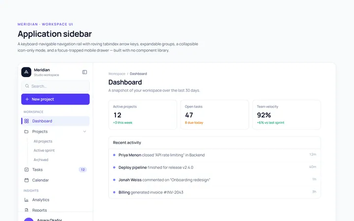
Basic Sidebar
Originalbasic app sidebar navigation
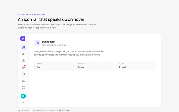
Icons Sidebar
Originalicon sidebar with labels on hover
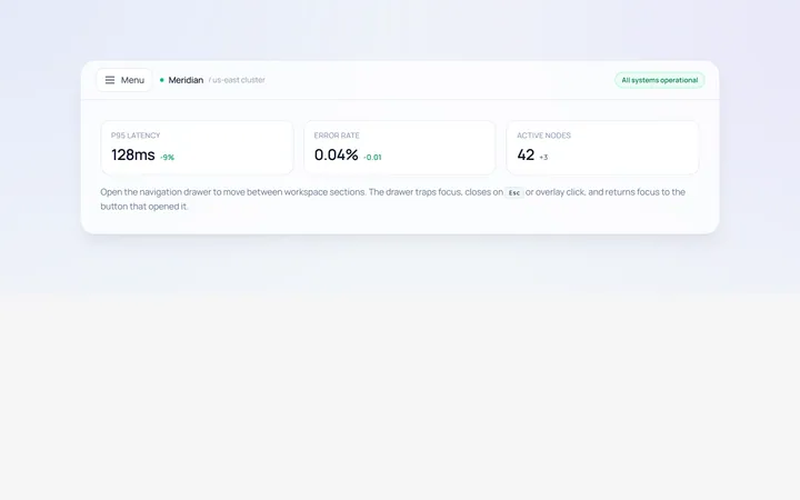
Drawer Left Sidebar
Originalslide-in left drawer with overlay
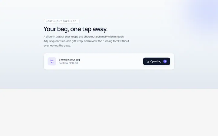
Drawer Right Sidebar
Originalslide-in right drawer panel
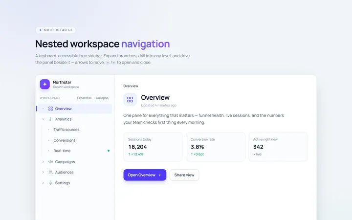
Nested Sidebar
Originalsidebar with expandable nested items
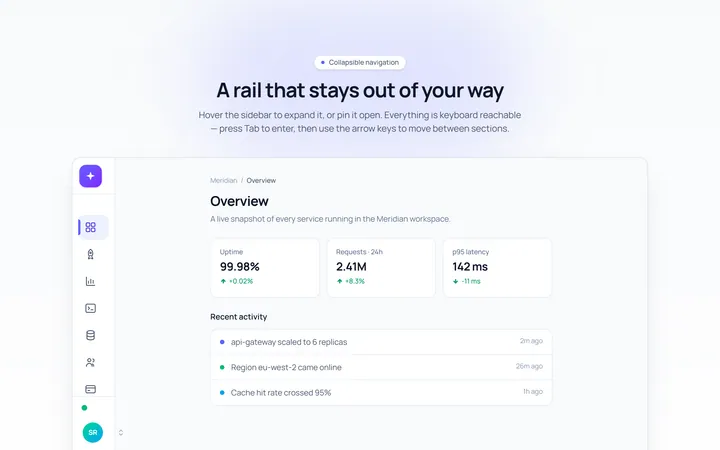
Mini Sidebar
Originalmini rail that expands on hover
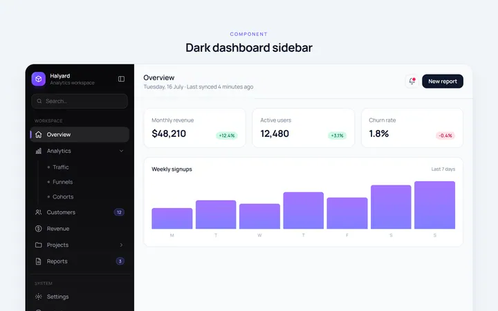
Dark Sidebar
Originaldark themed dashboard sidebar
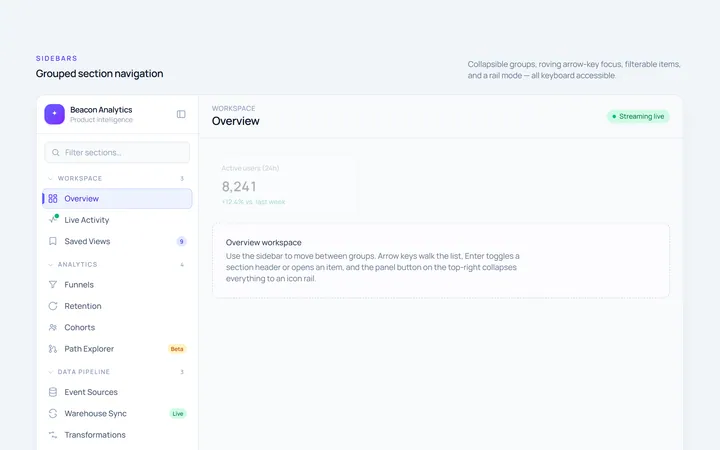
Sections Sidebar
Originalsidebar with grouped sections and headers
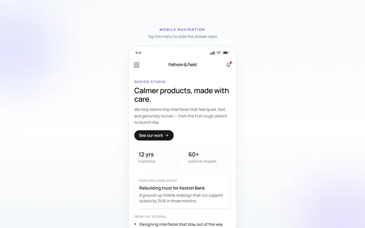
Mobile Sidebar
Originalmobile hamburger slide menu
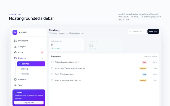
Floating Sidebar
Originalfloating rounded sidebar
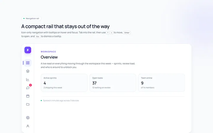
Rail Sidebar
Originalnarrow icon rail with tooltips

Spotlight Hero
OriginalA centred hero with a soft radial spotlight, badge and dual call-to-action.