

Icons Sidebar
Original · freeicon sidebar with labels on hover
Copy prompt gives Claude Code, Cursor or v0 a ready-to-paste prompt that recreates this exact component.
npx shadcn@latest add https://webinnoventix.com/r/side-icons.json"use client";
import {
useId,
useRef,
useState,
type KeyboardEvent,
type ReactNode,
} from "react";
import { AnimatePresence, motion, useReducedMotion } from "motion/react";
type IconProps = { className?: string };
type NavItem = {
id: string;
label: string;
hint: string;
body: string;
badge?: number;
icon: (props: IconProps) => ReactNode;
};
function DashboardIcon({ className }: IconProps) {
return (
<svg viewBox="0 0 24 24" fill="none" stroke="currentColor" strokeWidth={1.7} strokeLinecap="round" strokeLinejoin="round" className={className} aria-hidden="true">
<rect x="3" y="3" width="7.5" height="7.5" rx="1.6" />
<rect x="13.5" y="3" width="7.5" height="7.5" rx="1.6" />
<rect x="13.5" y="13.5" width="7.5" height="7.5" rx="1.6" />
<rect x="3" y="13.5" width="7.5" height="7.5" rx="1.6" />
</svg>
);
}
function AnalyticsIcon({ className }: IconProps) {
return (
<svg viewBox="0 0 24 24" fill="none" stroke="currentColor" strokeWidth={1.7} strokeLinecap="round" strokeLinejoin="round" className={className} aria-hidden="true">
<path d="M3.5 21h17" />
<rect x="5" y="11" width="3" height="7" rx="1" />
<rect x="10.5" y="6" width="3" height="12" rx="1" />
<rect x="16" y="9" width="3" height="9" rx="1" />
</svg>
);
}
function ProjectsIcon({ className }: IconProps) {
return (
<svg viewBox="0 0 24 24" fill="none" stroke="currentColor" strokeWidth={1.7} strokeLinecap="round" strokeLinejoin="round" className={className} aria-hidden="true">
<path d="M12 3 3 7.6l9 4.6 9-4.6L12 3Z" />
<path d="m3 12.4 9 4.6 9-4.6" />
<path d="m3 16.8 9 4.6 9-4.6" />
</svg>
);
}
function MessagesIcon({ className }: IconProps) {
return (
<svg viewBox="0 0 24 24" fill="none" stroke="currentColor" strokeWidth={1.7} strokeLinecap="round" strokeLinejoin="round" className={className} aria-hidden="true">
<path d="M20.5 12a8 8 0 0 1-11.6 7.13L4 20.5l1.4-4.86A8 8 0 1 1 20.5 12Z" />
<path d="M9 11h6" />
<path d="M9 14.5h4" />
</svg>
);
}
function CalendarIcon({ className }: IconProps) {
return (
<svg viewBox="0 0 24 24" fill="none" stroke="currentColor" strokeWidth={1.7} strokeLinecap="round" strokeLinejoin="round" className={className} aria-hidden="true">
<rect x="3.2" y="4.6" width="17.6" height="16.2" rx="2.4" />
<path d="M3.2 9.4h17.6" />
<path d="M8 3v3.2" />
<path d="M16 3v3.2" />
</svg>
);
}
function TeamIcon({ className }: IconProps) {
return (
<svg viewBox="0 0 24 24" fill="none" stroke="currentColor" strokeWidth={1.7} strokeLinecap="round" strokeLinejoin="round" className={className} aria-hidden="true">
<circle cx="9" cy="8" r="3.3" />
<path d="M3.4 20a5.6 5.6 0 0 1 11.2 0" />
<path d="M16 5.2a3.3 3.3 0 0 1 0 5.6" />
<path d="M17.6 14.5A5.6 5.6 0 0 1 20.6 20" />
</svg>
);
}
function SettingsIcon({ className }: IconProps) {
return (
<svg viewBox="0 0 24 24" fill="none" stroke="currentColor" strokeWidth={1.7} strokeLinecap="round" strokeLinejoin="round" className={className} aria-hidden="true">
<circle cx="12" cy="12" r="3.1" />
<path d="M19.4 15a1.65 1.65 0 0 0 .33 1.82l.06.06a2 2 0 1 1-2.83 2.83l-.06-.06a1.65 1.65 0 0 0-1.82-.33 1.65 1.65 0 0 0-1 1.51V21a2 2 0 0 1-4 0v-.09a1.65 1.65 0 0 0-1-1.51 1.65 1.65 0 0 0-1.82.33l-.06.06a2 2 0 1 1-2.83-2.83l.06-.06a1.65 1.65 0 0 0 .33-1.82 1.65 1.65 0 0 0-1.51-1H3a2 2 0 0 1 0-4h.09a1.65 1.65 0 0 0 1.51-1 1.65 1.65 0 0 0-.33-1.82l-.06-.06a2 2 0 1 1 2.83-2.83l.06.06a1.65 1.65 0 0 0 1.82.33H9a1.65 1.65 0 0 0 1-1.51V3a2 2 0 0 1 4 0v.09a1.65 1.65 0 0 0 1 1.51 1.65 1.65 0 0 0 1.82-.33l.06-.06a2 2 0 1 1 2.83 2.83l-.06.06a1.65 1.65 0 0 0-.33 1.82V9a1.65 1.65 0 0 0 1.51 1H21a2 2 0 0 1 0 4h-.09a1.65 1.65 0 0 0-1.51 1Z" />
</svg>
);
}
function ChevronIcon({ className }: IconProps) {
return (
<svg viewBox="0 0 24 24" fill="none" stroke="currentColor" strokeWidth={1.9} strokeLinecap="round" strokeLinejoin="round" className={className} aria-hidden="true">
<path d="m9 6 6 6-6 6" />
</svg>
);
}
const NAV_ITEMS: NavItem[] = [
{
id: "dashboard",
label: "Dashboard",
hint: "Your workspace at a glance",
body: "A single view of everything moving across your workspace today — active sprints, open tickets and the three metrics you check every morning.",
icon: DashboardIcon,
},
{
id: "analytics",
label: "Analytics",
hint: "Trends for the last 30 days",
body: "Traffic, activation and retention curves for the last 30 days, broken down by segment so you can see exactly where growth is coming from.",
icon: AnalyticsIcon,
},
{
id: "projects",
label: "Projects",
hint: "Everything in flight",
body: "Every build in flight with its owner, stage and ship date — filter by squad, drag to reprioritise and spot blockers before they slip.",
icon: ProjectsIcon,
},
{
id: "messages",
label: "Messages",
hint: "3 unread threads",
body: "Threads from your team and customers, newest first. Reply inline, assign an owner or snooze anything you can't get to before Thursday.",
badge: 3,
icon: MessagesIcon,
},
{
id: "calendar",
label: "Calendar",
hint: "This week's schedule",
body: "Standups, design reviews and the Friday launch all in one week view. Drag events to reschedule and hold focus blocks that nobody can book over.",
icon: CalendarIcon,
},
{
id: "team",
label: "Team",
hint: "People and availability",
body: "People, roles and current availability across the organisation. Invite a teammate, adjust permissions and see who's out before you assign work.",
icon: TeamIcon,
},
{
id: "settings",
label: "Settings",
hint: "Preferences and billing",
body: "Workspace preferences, billing and access controls. Rotate API keys, manage seats and set the defaults every new project inherits.",
icon: SettingsIcon,
},
];
export default function SideIcons() {
const prefersReduced = useReducedMotion();
const uid = useId();
const navId = `sideicn-nav-${uid}`;
const [activeId, setActiveId] = useState<string>(NAV_ITEMS[0].id);
const [focusedIndex, setFocusedIndex] = useState<number>(0);
const [revealedId, setRevealedId] = useState<string | null>(null);
const [expanded, setExpanded] = useState<boolean>(false);
const itemRefs = useRef<Array<HTMLButtonElement | null>>([]);
const activeItem =
NAV_ITEMS.find((item) => item.id === activeId) ?? NAV_ITEMS[0];
const moveFocus = (index: number) => {
setFocusedIndex(index);
itemRefs.current[index]?.focus();
};
const onItemKeyDown = (
event: KeyboardEvent<HTMLButtonElement>,
index: number,
) => {
const count = NAV_ITEMS.length;
let next = index;
switch (event.key) {
case "ArrowDown":
next = (index + 1) % count;
break;
case "ArrowUp":
next = (index - 1 + count) % count;
break;
case "Home":
next = 0;
break;
case "End":
next = count - 1;
break;
default:
return;
}
event.preventDefault();
moveFocus(next);
};
const railTransition = prefersReduced
? { duration: 0 }
: {
type: "tween" as const,
duration: 0.32,
ease: [0.22, 1, 0.36, 1] as [number, number, number, number],
};
const tooltipMotion = prefersReduced
? { initial: { opacity: 0 }, animate: { opacity: 1 }, exit: { opacity: 0 } }
: {
initial: { opacity: 0, x: -6, scale: 0.96 },
animate: { opacity: 1, x: 0, scale: 1 },
exit: { opacity: 0, x: -6, scale: 0.96 },
};
return (
<section className="relative w-full bg-neutral-100 px-4 py-16 dark:bg-neutral-950 sm:px-6 sm:py-24">
<style>{`
@keyframes sideicn-glow {
0%, 100% { opacity: 1; }
50% { opacity: 0.5; }
}
@keyframes sideicn-blip {
0%, 100% { opacity: 0.9; transform: scale(1); }
50% { opacity: 0.4; transform: scale(1.35); }
}
.sideicn-bar { animation: sideicn-glow 2.6s ease-in-out infinite; }
.sideicn-dot { animation: sideicn-blip 1.8s ease-in-out infinite; }
@media (prefers-reduced-motion: reduce) {
.sideicn-bar, .sideicn-dot { animation: none; }
}
`}</style>
<div className="mx-auto max-w-5xl">
<header className="mb-8 max-w-xl">
<p className="text-xs font-semibold uppercase tracking-[0.22em] text-indigo-600 dark:text-indigo-400">
Workspace navigation
</p>
<h2 className="mt-2 text-2xl font-semibold tracking-tight text-neutral-900 dark:text-neutral-50 sm:text-3xl">
An icon rail that speaks up on hover
</h2>
<p className="mt-2 text-sm leading-relaxed text-neutral-600 dark:text-neutral-400">
Hover or focus any icon to reveal its label. Use the arrow keys to
move between items, or pin the rail open to keep every label in view.
</p>
</header>
<div className="flex min-h-[30rem] overflow-hidden rounded-2xl border border-neutral-200 bg-white shadow-sm dark:border-neutral-800 dark:bg-neutral-900">
{/* Sidebar rail */}
<motion.nav
aria-label="Primary"
initial={false}
animate={{ width: expanded ? 244 : 76 }}
transition={railTransition}
className="relative flex shrink-0 flex-col border-r border-neutral-200 bg-neutral-50/80 dark:border-neutral-800 dark:bg-neutral-950/40"
>
{/* Brand */}
<div className="flex h-16 items-center gap-3 px-4">
<span className="flex h-9 w-9 shrink-0 items-center justify-center rounded-xl bg-gradient-to-br from-indigo-500 to-violet-600 text-white shadow-sm">
<svg viewBox="0 0 24 24" className="h-5 w-5" fill="none" stroke="currentColor" strokeWidth={2} strokeLinecap="round" strokeLinejoin="round" aria-hidden="true">
<path d="M13 2 4.5 13H11l-1 9 8.5-11H12l1-9Z" />
</svg>
</span>
<AnimatePresence initial={false}>
{expanded ? (
<motion.span
key="brand"
initial={prefersReduced ? { opacity: 0 } : { opacity: 0, x: -4 }}
animate={{ opacity: 1, x: 0 }}
exit={prefersReduced ? { opacity: 0 } : { opacity: 0, x: -4 }}
transition={{ duration: prefersReduced ? 0 : 0.18 }}
className="truncate text-sm font-semibold tracking-tight text-neutral-900 dark:text-neutral-50"
>
Halyard
</motion.span>
) : null}
</AnimatePresence>
</div>
{/* Items */}
<ul role="list" className="flex flex-1 flex-col gap-1 px-3 py-2">
{NAV_ITEMS.map((item, index) => {
const isActive = item.id === activeId;
const isRevealed = revealedId === item.id && !expanded;
const Icon = item.icon;
return (
<li key={item.id} className="relative">
<button
ref={(node) => {
itemRefs.current[index] = node;
}}
type="button"
aria-label={item.label}
aria-current={isActive ? "page" : undefined}
tabIndex={focusedIndex === index ? 0 : -1}
onClick={() => setActiveId(item.id)}
onKeyDown={(event) => onItemKeyDown(event, index)}
onFocus={() => {
setFocusedIndex(index);
setRevealedId(item.id);
}}
onBlur={() =>
setRevealedId((current) =>
current === item.id ? null : current,
)
}
onMouseEnter={() => setRevealedId(item.id)}
onMouseLeave={() =>
setRevealedId((current) =>
current === item.id ? null : current,
)
}
className={[
"group/item relative flex h-11 w-full items-center rounded-xl outline-none transition-colors",
expanded ? "gap-3 px-3" : "justify-center px-0",
isActive
? "bg-indigo-50 text-indigo-700 dark:bg-indigo-500/10 dark:text-indigo-300"
: "text-neutral-500 hover:bg-neutral-200/60 hover:text-neutral-900 dark:text-neutral-400 dark:hover:bg-neutral-800/60 dark:hover:text-neutral-100",
"focus-visible:ring-2 focus-visible:ring-indigo-500 focus-visible:ring-offset-2 focus-visible:ring-offset-neutral-50 dark:focus-visible:ring-offset-neutral-950",
].join(" ")}
>
{/* Active indicator bar (slides between items) */}
{isActive ? (
<motion.span
layoutId={`sideicn-indicator-${uid}`}
layout={!prefersReduced}
transition={railTransition}
className="sideicn-bar pointer-events-none absolute left-0 top-1/2 h-6 w-1 -translate-y-1/2 rounded-r-full bg-indigo-600 dark:bg-indigo-400"
aria-hidden="true"
/>
) : null}
<span className="relative flex h-6 w-6 shrink-0 items-center justify-center">
<Icon className="h-[22px] w-[22px]" />
{item.badge && !expanded ? (
<span
className="sideicn-dot absolute -right-1 -top-1 h-2.5 w-2.5 rounded-full bg-rose-500 ring-2 ring-neutral-50 dark:ring-neutral-950"
aria-hidden="true"
/>
) : null}
</span>
{/* Inline label (expanded mode) */}
{expanded ? (
<motion.span
initial={prefersReduced ? { opacity: 0 } : { opacity: 0, x: -4 }}
animate={{ opacity: 1, x: 0 }}
transition={{ duration: prefersReduced ? 0 : 0.18 }}
className="flex min-w-0 flex-1 items-center justify-between gap-2 text-sm font-medium"
>
<span className="truncate">{item.label}</span>
{item.badge ? (
<span className="flex h-5 min-w-[1.25rem] items-center justify-center rounded-full bg-rose-500 px-1.5 text-[11px] font-semibold text-white">
{item.badge}
</span>
) : null}
</motion.span>
) : null}
</button>
{/* Hover / focus tooltip (collapsed mode) */}
<AnimatePresence>
{isRevealed ? (
<motion.span
role="tooltip"
{...tooltipMotion}
transition={{ duration: prefersReduced ? 0 : 0.16, ease: "easeOut" }}
className="pointer-events-none absolute left-full top-1/2 z-20 ml-3 flex -translate-y-1/2 flex-col rounded-lg bg-neutral-900 px-3 py-2 text-left shadow-lg ring-1 ring-black/5 dark:bg-neutral-800 dark:ring-white/10"
>
<span className="flex items-center gap-2 whitespace-nowrap text-[13px] font-semibold text-white">
{item.label}
{item.badge ? (
<span className="flex h-4 min-w-[1rem] items-center justify-center rounded-full bg-rose-500 px-1 text-[10px] font-semibold text-white">
{item.badge}
</span>
) : null}
</span>
<span className="whitespace-nowrap text-[11px] text-neutral-300 dark:text-neutral-400">
{item.hint}
</span>
<span
className="absolute right-full top-1/2 -mr-px h-2 w-2 -translate-y-1/2 rotate-45 rounded-[1px] bg-neutral-900 dark:bg-neutral-800"
aria-hidden="true"
/>
</motion.span>
) : null}
</AnimatePresence>
</li>
);
})}
</ul>
{/* Footer: user + collapse toggle */}
<div className="border-t border-neutral-200 px-3 py-3 dark:border-neutral-800">
<div className={["flex items-center", expanded ? "gap-3 px-1" : "justify-center"].join(" ")}>
<span className="flex h-9 w-9 shrink-0 items-center justify-center rounded-full bg-gradient-to-br from-emerald-400 to-sky-500 text-xs font-bold text-white">
SK
</span>
{expanded ? (
<motion.span
initial={prefersReduced ? { opacity: 0 } : { opacity: 0, x: -4 }}
animate={{ opacity: 1, x: 0 }}
transition={{ duration: prefersReduced ? 0 : 0.18 }}
className="flex min-w-0 flex-col leading-tight"
>
<span className="truncate text-sm font-medium text-neutral-900 dark:text-neutral-50">
Salma Khan
</span>
<span className="truncate text-xs text-neutral-500 dark:text-neutral-400">
Product lead
</span>
</motion.span>
) : null}
</div>
<button
type="button"
onClick={() => setExpanded((value) => !value)}
aria-expanded={expanded}
aria-controls={navId}
aria-label={expanded ? "Collapse sidebar" : "Expand sidebar"}
className={[
"mt-3 flex h-9 items-center rounded-lg text-neutral-500 outline-none transition-colors",
expanded ? "w-full gap-2 px-3" : "w-full justify-center",
"hover:bg-neutral-200/60 hover:text-neutral-900 dark:text-neutral-400 dark:hover:bg-neutral-800/60 dark:hover:text-neutral-100",
"focus-visible:ring-2 focus-visible:ring-indigo-500 focus-visible:ring-offset-2 focus-visible:ring-offset-neutral-50 dark:focus-visible:ring-offset-neutral-950",
].join(" ")}
>
<ChevronIcon
className={[
"h-5 w-5 shrink-0 transition-transform duration-300",
expanded ? "rotate-180" : "rotate-0",
].join(" ")}
/>
{expanded ? (
<span className="text-sm font-medium">Collapse</span>
) : null}
</button>
</div>
{/* Referenced by the toggle for aria-controls */}
<span id={navId} className="sr-only">
Primary navigation, {expanded ? "expanded" : "collapsed"}
</span>
</motion.nav>
{/* Content panel reflects the active item */}
<div className="min-w-0 flex-1 bg-white p-6 dark:bg-neutral-900 sm:p-10">
<AnimatePresence mode="wait">
<motion.div
key={activeItem.id}
initial={prefersReduced ? { opacity: 0 } : { opacity: 0, y: 8 }}
animate={{ opacity: 1, y: 0 }}
exit={prefersReduced ? { opacity: 0 } : { opacity: 0, y: -8 }}
transition={{ duration: prefersReduced ? 0 : 0.24, ease: "easeOut" }}
>
<div className="flex items-center gap-3">
<span className="flex h-11 w-11 items-center justify-center rounded-xl bg-indigo-50 text-indigo-600 dark:bg-indigo-500/10 dark:text-indigo-300">
<activeItem.icon className="h-6 w-6" />
</span>
<div>
<h3 className="text-lg font-semibold tracking-tight text-neutral-900 dark:text-neutral-50">
{activeItem.label}
</h3>
<p className="text-sm text-neutral-500 dark:text-neutral-400">
{activeItem.hint}
</p>
</div>
</div>
<p className="mt-6 max-w-lg text-[15px] leading-relaxed text-neutral-700 dark:text-neutral-300">
{activeItem.body}
</p>
<div className="mt-8 grid grid-cols-2 gap-3 sm:grid-cols-3">
{["Owner", "Updated", "Status"].map((label, i) => (
<div
key={label}
className="rounded-xl border border-neutral-200 bg-neutral-50 px-4 py-3 dark:border-neutral-800 dark:bg-neutral-950/40"
>
<p className="text-[11px] font-medium uppercase tracking-wide text-neutral-400 dark:text-neutral-500">
{label}
</p>
<p className="mt-1 text-sm font-semibold text-neutral-800 dark:text-neutral-200">
{["You", "2m ago", "On track"][i]}
</p>
</div>
))}
</div>
</motion.div>
</AnimatePresence>
</div>
</div>
<p className="mt-4 text-xs text-neutral-500 dark:text-neutral-500">
Tip: focus a rail icon and press{" "}
<kbd className="rounded border border-neutral-300 bg-neutral-100 px-1.5 py-0.5 font-mono text-[10px] text-neutral-600 dark:border-neutral-700 dark:bg-neutral-800 dark:text-neutral-300">
↑
</kbd>{" "}
<kbd className="rounded border border-neutral-300 bg-neutral-100 px-1.5 py-0.5 font-mono text-[10px] text-neutral-600 dark:border-neutral-700 dark:bg-neutral-800 dark:text-neutral-300">
↓
</kbd>{" "}
to move, then{" "}
<kbd className="rounded border border-neutral-300 bg-neutral-100 px-1.5 py-0.5 font-mono text-[10px] text-neutral-600 dark:border-neutral-700 dark:bg-neutral-800 dark:text-neutral-300">
Enter
</kbd>{" "}
to open.
</p>
</div>
</section>
);
}Dependencies
Licence
Built by Web Innoventix. Free for personal and commercial use, no attribution required.
Built by Web Innoventix
Need a custom interface, a full website, or SEO that gets you cited by AI? We design, build and rank it end to end.
Get a free quoteSimilar components
Browse all →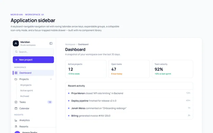
Basic Sidebar
Originalbasic app sidebar navigation
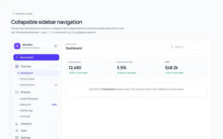
Collapsible Sidebar
Originalcollapsible sidebar sections
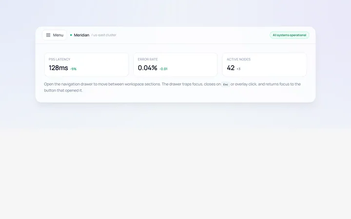
Drawer Left Sidebar
Originalslide-in left drawer with overlay
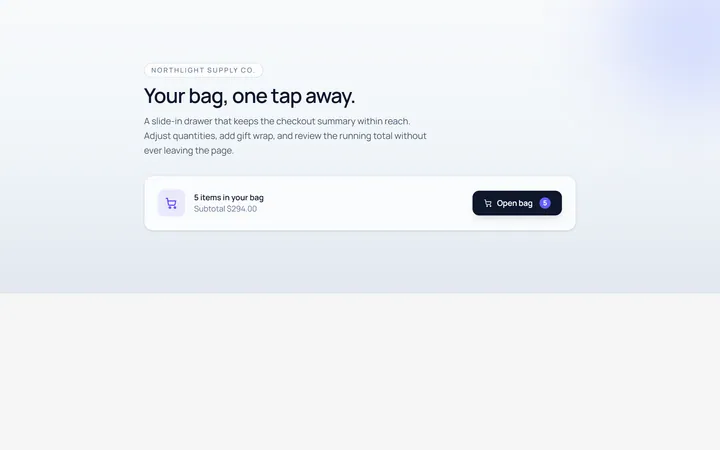
Drawer Right Sidebar
Originalslide-in right drawer panel
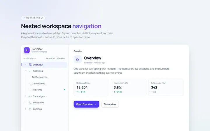
Nested Sidebar
Originalsidebar with expandable nested items
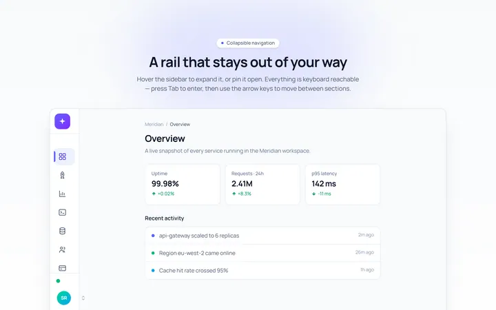
Mini Sidebar
Originalmini rail that expands on hover
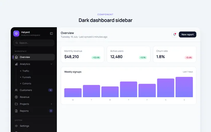
Dark Sidebar
Originaldark themed dashboard sidebar
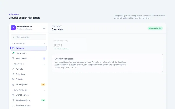
Sections Sidebar
Originalsidebar with grouped sections and headers
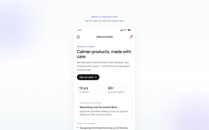
Mobile Sidebar
Originalmobile hamburger slide menu
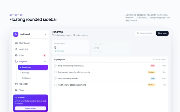
Floating Sidebar
Originalfloating rounded sidebar
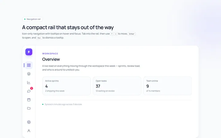
Rail Sidebar
Originalnarrow icon rail with tooltips

Spotlight Hero
OriginalA centred hero with a soft radial spotlight, badge and dual call-to-action.