

Rail Sidebar
Original · freenarrow icon rail with tooltips
Copy prompt gives Claude Code, Cursor or v0 a ready-to-paste prompt that recreates this exact component.
npx shadcn@latest add https://webinnoventix.com/r/side-rail.json"use client";
import {
useId,
useMemo,
useRef,
useState,
type KeyboardEvent,
type ReactNode,
} from "react";
import {
AnimatePresence,
MotionConfig,
motion,
useReducedMotion,
} from "motion/react";
type IconRenderer = (props: { className?: string }) => ReactNode;
interface RailItem {
id: string;
label: string;
group: "main" | "system";
badge?: number;
icon: IconRenderer;
}
interface Highlight {
label: string;
value: string;
note: string;
}
interface SectionContent {
kicker: string;
title: string;
body: string;
highlights: Highlight[];
meta: string;
}
const IconBolt: IconRenderer = ({ className }) => (
<svg
className={className}
viewBox="0 0 24 24"
fill="currentColor"
aria-hidden="true"
>
<path d="m13 2-8.5 11.5a.8.8 0 0 0 .64 1.28H10l-1.4 6.9a.6.6 0 0 0 1.08.46L18.5 10.5a.8.8 0 0 0-.64-1.28H13l1.4-6.9A.6.6 0 0 0 13 2Z" />
</svg>
);
const IconGrid: IconRenderer = ({ className }) => (
<svg
className={className}
viewBox="0 0 24 24"
fill="none"
stroke="currentColor"
strokeWidth={1.7}
strokeLinecap="round"
strokeLinejoin="round"
aria-hidden="true"
>
<rect x="3" y="3" width="7" height="7" rx="1.6" />
<rect x="14" y="3" width="7" height="7" rx="1.6" />
<rect x="14" y="14" width="7" height="7" rx="1.6" />
<rect x="3" y="14" width="7" height="7" rx="1.6" />
</svg>
);
const IconLayers: IconRenderer = ({ className }) => (
<svg
className={className}
viewBox="0 0 24 24"
fill="none"
stroke="currentColor"
strokeWidth={1.7}
strokeLinecap="round"
strokeLinejoin="round"
aria-hidden="true"
>
<path d="m12 2.5 9 5-9 5-9-5 9-5Z" />
<path d="m3 12 9 5 9-5" />
<path d="m3 16.8 9 5 9-5" />
</svg>
);
const IconChart: IconRenderer = ({ className }) => (
<svg
className={className}
viewBox="0 0 24 24"
fill="none"
stroke="currentColor"
strokeWidth={1.7}
strokeLinecap="round"
strokeLinejoin="round"
aria-hidden="true"
>
<path d="M3 3v16.5a1.5 1.5 0 0 0 1.5 1.5H21" />
<path d="M7.5 15.5v-3" />
<path d="M12 15.5v-7" />
<path d="M16.5 15.5v-4.5" />
</svg>
);
const IconChat: IconRenderer = ({ className }) => (
<svg
className={className}
viewBox="0 0 24 24"
fill="none"
stroke="currentColor"
strokeWidth={1.7}
strokeLinecap="round"
strokeLinejoin="round"
aria-hidden="true"
>
<path d="M20.5 11.4a7.6 7.6 0 0 1-8.1 7.6 8.4 8.4 0 0 1-3.5-.7L3.5 20l1.3-4.6a7.6 7.6 0 1 1 15.7-4Z" />
</svg>
);
const IconCalendar: IconRenderer = ({ className }) => (
<svg
className={className}
viewBox="0 0 24 24"
fill="none"
stroke="currentColor"
strokeWidth={1.7}
strokeLinecap="round"
strokeLinejoin="round"
aria-hidden="true"
>
<rect x="3.5" y="4.5" width="17" height="16" rx="2.4" />
<path d="M16 2.5v4M8 2.5v4M3.5 9.5h17" />
</svg>
);
const IconFolder: IconRenderer = ({ className }) => (
<svg
className={className}
viewBox="0 0 24 24"
fill="none"
stroke="currentColor"
strokeWidth={1.7}
strokeLinecap="round"
strokeLinejoin="round"
aria-hidden="true"
>
<path d="M3 7a2 2 0 0 1 2-2h3.7a2 2 0 0 1 1.5.7l1.1 1.3H19a2 2 0 0 1 2 2v7a2 2 0 0 1-2 2H5a2 2 0 0 1-2-2V7Z" />
</svg>
);
const IconGear: IconRenderer = ({ className }) => (
<svg
className={className}
viewBox="0 0 24 24"
fill="none"
stroke="currentColor"
strokeWidth={1.7}
strokeLinecap="round"
strokeLinejoin="round"
aria-hidden="true"
>
<circle cx="12" cy="12" r="3" />
<path d="M19.6 14.3a1.5 1.5 0 0 0 .3 1.65l.05.05a1.85 1.85 0 1 1-2.6 2.6l-.05-.05a1.5 1.5 0 0 0-1.65-.3 1.5 1.5 0 0 0-.9 1.37V20a1.85 1.85 0 1 1-3.7 0v-.06a1.5 1.5 0 0 0-.98-1.37 1.5 1.5 0 0 0-1.65.3l-.05.05a1.85 1.85 0 1 1-2.6-2.6l.05-.05a1.5 1.5 0 0 0 .3-1.65 1.5 1.5 0 0 0-1.37-.9H4a1.85 1.85 0 1 1 0-3.7h.06a1.5 1.5 0 0 0 1.37-.98 1.5 1.5 0 0 0-.3-1.65l-.05-.05a1.85 1.85 0 1 1 2.6-2.6l.05.05a1.5 1.5 0 0 0 1.65.3H9.4a1.5 1.5 0 0 0 .9-1.37V4a1.85 1.85 0 1 1 3.7 0v.06a1.5 1.5 0 0 0 .9 1.37 1.5 1.5 0 0 0 1.65-.3l.05-.05a1.85 1.85 0 1 1 2.6 2.6l-.05.05a1.5 1.5 0 0 0-.3 1.65v.06a1.5 1.5 0 0 0 1.37.9H20a1.85 1.85 0 1 1 0 3.7h-.06a1.5 1.5 0 0 0-1.37.9Z" />
</svg>
);
const IconUser: IconRenderer = ({ className }) => (
<svg
className={className}
viewBox="0 0 24 24"
fill="none"
stroke="currentColor"
strokeWidth={1.7}
strokeLinecap="round"
strokeLinejoin="round"
aria-hidden="true"
>
<circle cx="12" cy="8" r="3.8" />
<path d="M4.5 20a7.5 7.5 0 0 1 15 0" />
</svg>
);
const RAIL_ITEMS: RailItem[] = [
{ id: "overview", label: "Overview", group: "main", icon: IconGrid },
{ id: "projects", label: "Projects", group: "main", icon: IconLayers },
{ id: "analytics", label: "Analytics", group: "main", icon: IconChart },
{ id: "messages", label: "Messages", group: "main", icon: IconChat, badge: 3 },
{ id: "schedule", label: "Schedule", group: "main", icon: IconCalendar },
{ id: "files", label: "Files", group: "main", icon: IconFolder },
{ id: "settings", label: "Settings", group: "system", icon: IconGear },
{ id: "account", label: "Account", group: "system", icon: IconUser },
];
const CONTENT: Record<string, SectionContent> = {
overview: {
kicker: "Workspace",
title: "Overview",
body: "A live read on everything moving through the workspace this week — sprints, review load, and who is around to unblock you.",
highlights: [
{ label: "Active sprints", value: "4", note: "2 shipping this week" },
{ label: "Open tasks", value: "37", note: "12 waiting on review" },
{ label: "Team online", value: "9", note: "of 14 members" },
],
meta: "Synced 4 minutes ago across 3 devices",
},
projects: {
kicker: "Delivery",
title: "Projects",
body: "Every initiative across the three product squads, grouped by stage so blockers surface before they slip a release.",
highlights: [
{ label: "In progress", value: "6", note: "Across 3 squads" },
{ label: "Blocked", value: "1", note: "Waiting on design" },
{ label: "Shipped in July", value: "11", note: "On or ahead of plan" },
],
meta: "Roadmap last edited by Priya, 22 minutes ago",
},
analytics: {
kicker: "Insights",
title: "Analytics",
body: "Product usage and performance signals pulled from the last seven days, benchmarked against the trailing week.",
highlights: [
{ label: "Weekly active", value: "28.4k", note: "+6.2% vs last week" },
{ label: "Activation", value: "3.9%", note: "Signup to first value" },
{ label: "P95 latency", value: "212ms", note: "Down from 340ms" },
],
meta: "Metrics refresh every 15 minutes from the warehouse",
},
messages: {
kicker: "Inbox",
title: "Messages",
body: "Threads that need a reply from you, ranked by mentions first so nothing waiting on your call gets buried.",
highlights: [
{ label: "Unread", value: "3", note: "2 mention you directly" },
{ label: "Open threads", value: "18", note: "Across 5 channels" },
{ label: "Median reply", value: "24m", note: "Fastest this quarter" },
],
meta: "Notifications muted until 9:00 tomorrow",
},
schedule: {
kicker: "Calendar",
title: "Schedule",
body: "Today's commitments plus the focus blocks you protected, so deep work does not get eaten by the meeting stack.",
highlights: [
{ label: "Today", value: "3", note: "Next: standup at 10:00" },
{ label: "This week", value: "12", note: "4 still need prep" },
{ label: "Focus time", value: "6h", note: "Protected and blocked" },
],
meta: "Timezone: Asia/Karachi (GMT+5)",
},
files: {
kicker: "Library",
title: "Files",
body: "Shared documents and assets your team touched recently, with storage headroom so uploads never stall mid-review.",
highlights: [
{ label: "Documents", value: "248", note: "18 updated today" },
{ label: "Storage", value: "64%", note: "of 50 GB in use" },
{ label: "Shared", value: "31", note: "with your team" },
],
meta: "Version history retained for 90 days",
},
settings: {
kicker: "Configuration",
title: "Settings",
body: "Workspace-wide controls — integrations, membership, and billing — everything that changes how the whole team works.",
highlights: [
{ label: "Integrations", value: "7", note: "GitHub, Linear, Slack…" },
{ label: "Members", value: "14", note: "3 invites pending" },
{ label: "Plan", value: "Team", note: "Renews August 1" },
],
meta: "Only owners can change billing and roles",
},
account: {
kicker: "You",
title: "Account",
body: "Your personal profile, access level, and contribution streak — the record of what you have shipped so far.",
highlights: [
{ label: "Role", value: "Maintainer", note: "Full workspace access" },
{ label: "Streak", value: "23 days", note: "A new personal best" },
{ label: "Reviews", value: "142", note: "Merged this quarter" },
],
meta: "Signed in from Lahore · session expires in 6 days",
},
};
export default function SideRail() {
const reduce = useReducedMotion();
const uid = useId();
const [activeId, setActiveId] = useState<string>("overview");
const [focusIndex, setFocusIndex] = useState<number>(0);
const [hoverId, setHoverId] = useState<string | null>(null);
const [focusId, setFocusId] = useState<string | null>(null);
const [dismissedTip, setDismissedTip] = useState<string | null>(null);
const btnRefs = useRef<Array<HTMLButtonElement | null>>([]);
const mainItems = useMemo(
() => RAIL_ITEMS.filter((item) => item.group === "main"),
[],
);
const systemItems = useMemo(
() => RAIL_ITEMS.filter((item) => item.group === "system"),
[],
);
const active = CONTENT[activeId];
function moveFocus(next: number) {
const count = RAIL_ITEMS.length;
const wrapped = (next + count) % count;
setFocusIndex(wrapped);
setDismissedTip(null);
btnRefs.current[wrapped]?.focus();
}
function handleKeyDown(
event: KeyboardEvent<HTMLButtonElement>,
index: number,
) {
switch (event.key) {
case "ArrowDown":
case "ArrowRight":
event.preventDefault();
moveFocus(index + 1);
break;
case "ArrowUp":
case "ArrowLeft":
event.preventDefault();
moveFocus(index - 1);
break;
case "Home":
event.preventDefault();
moveFocus(0);
break;
case "End":
event.preventDefault();
moveFocus(RAIL_ITEMS.length - 1);
break;
case "Escape":
if (focusId) {
event.preventDefault();
setDismissedTip(focusId);
}
break;
default:
break;
}
}
function renderTab(item: RailItem) {
const index = RAIL_ITEMS.indexOf(item);
const Icon = item.icon;
const isActive = activeId === item.id;
const tipVisible =
hoverId === item.id ||
(focusId === item.id && dismissedTip !== item.id);
return (
<div key={item.id} className="relative flex items-center justify-center">
<button
ref={(el) => {
btnRefs.current[index] = el;
}}
type="button"
role="tab"
id={`${uid}-tab-${item.id}`}
aria-selected={isActive}
aria-controls={`${uid}-panel-${item.id}`}
aria-label={item.label}
tabIndex={focusIndex === index ? 0 : -1}
onClick={() => {
setActiveId(item.id);
setFocusIndex(index);
}}
onKeyDown={(event) => handleKeyDown(event, index)}
onMouseEnter={() => setHoverId(item.id)}
onMouseLeave={() =>
setHoverId((current) => (current === item.id ? null : current))
}
onFocus={() => {
setFocusId(item.id);
setFocusIndex(index);
setDismissedTip(null);
}}
onBlur={() =>
setFocusId((current) => (current === item.id ? null : current))
}
className={[
"group relative flex h-11 w-11 items-center justify-center rounded-xl outline-none transition-colors duration-200",
"focus-visible:ring-2 focus-visible:ring-indigo-500 focus-visible:ring-offset-2 focus-visible:ring-offset-white dark:focus-visible:ring-offset-slate-900",
isActive
? "bg-indigo-50 text-indigo-600 dark:bg-indigo-500/15 dark:text-indigo-300"
: "text-slate-500 hover:bg-slate-100 hover:text-slate-900 dark:text-slate-400 dark:hover:bg-slate-800 dark:hover:text-slate-100",
].join(" ")}
>
{isActive ? (
<motion.span
layoutId={`${uid}-indicator`}
aria-hidden="true"
className="absolute -left-[7px] top-1/2 h-6 w-[3px] -translate-y-1/2 rounded-full bg-indigo-500 dark:bg-indigo-400"
transition={
reduce
? { duration: 0 }
: { type: "spring", stiffness: 520, damping: 40 }
}
/>
) : null}
<Icon className="h-[22px] w-[22px]" />
{item.badge ? (
<span
aria-hidden="true"
className="absolute -right-0.5 -top-0.5 flex h-4 min-w-4 items-center justify-center"
>
<span className="siderail-ping absolute inline-flex h-full w-full rounded-full bg-rose-400/60" />
<span className="relative inline-flex h-4 min-w-4 items-center justify-center rounded-full bg-rose-500 px-1 text-[10px] font-semibold leading-none text-white">
{item.badge}
</span>
</span>
) : null}
</button>
<AnimatePresence>
{tipVisible ? (
<motion.span
aria-hidden="true"
initial={reduce ? { opacity: 0 } : { opacity: 0, x: -6 }}
animate={{ opacity: 1, x: 0 }}
exit={reduce ? { opacity: 0 } : { opacity: 0, x: -6 }}
transition={{ duration: reduce ? 0.12 : 0.16, ease: "easeOut" }}
className="pointer-events-none absolute left-full top-1/2 z-30 ml-3 flex -translate-y-1/2 items-center whitespace-nowrap rounded-lg bg-slate-900 px-2.5 py-1.5 text-xs font-medium text-white shadow-lg shadow-slate-900/25 dark:bg-slate-100 dark:text-slate-900"
>
<span className="absolute -left-1 top-1/2 h-2 w-2 -translate-y-1/2 rotate-45 rounded-[2px] bg-slate-900 dark:bg-slate-100" />
{item.label}
{item.badge ? (
<span className="ml-1.5 rounded-full bg-white/15 px-1.5 py-px text-[10px] text-white dark:bg-slate-900/10 dark:text-slate-700">
{item.badge} new
</span>
) : null}
</motion.span>
) : null}
</AnimatePresence>
</div>
);
}
return (
<section className="relative w-full overflow-hidden bg-slate-50 px-4 py-16 sm:px-6 lg:py-24 dark:bg-slate-950">
<style>{`
@keyframes siderail-ping {
0% { transform: scale(1); opacity: 0.7; }
75%, 100% { transform: scale(2.1); opacity: 0; }
}
.siderail-ping { animation: siderail-ping 1.9s cubic-bezier(0,0,0.2,1) infinite; }
@keyframes siderail-drift {
0%, 100% { transform: translateY(0); }
50% { transform: translateY(-3px); }
}
.siderail-drift { animation: siderail-drift 4.5s ease-in-out infinite; }
@media (prefers-reduced-motion: reduce) {
.siderail-ping, .siderail-drift { animation: none !important; }
}
`}</style>
<div
aria-hidden="true"
className="pointer-events-none absolute -right-24 top-0 h-72 w-72 rounded-full bg-indigo-500/10 blur-3xl dark:bg-indigo-500/15"
/>
<div className="relative mx-auto max-w-5xl">
<header className="mb-8 max-w-2xl">
<span className="inline-flex items-center gap-2 rounded-full border border-slate-200 bg-white px-3 py-1 text-xs font-medium text-slate-500 dark:border-slate-800 dark:bg-slate-900 dark:text-slate-400">
<span className="h-1.5 w-1.5 rounded-full bg-emerald-500" />
Navigation rail
</span>
<h2 className="mt-4 text-2xl font-semibold tracking-tight text-slate-900 sm:text-3xl dark:text-slate-50">
A compact rail that stays out of the way
</h2>
<p className="mt-2 text-sm leading-relaxed text-slate-600 dark:text-slate-400">
Icon-only navigation with tooltips on hover and focus. Tab into the
rail, then use{" "}
<kbd className="rounded border border-slate-300 bg-white px-1.5 py-0.5 font-mono text-[11px] text-slate-700 dark:border-slate-700 dark:bg-slate-800 dark:text-slate-200">
↑
</kbd>{" "}
<kbd className="rounded border border-slate-300 bg-white px-1.5 py-0.5 font-mono text-[11px] text-slate-700 dark:border-slate-700 dark:bg-slate-800 dark:text-slate-200">
↓
</kbd>{" "}
to move,{" "}
<kbd className="rounded border border-slate-300 bg-white px-1.5 py-0.5 font-mono text-[11px] text-slate-700 dark:border-slate-700 dark:bg-slate-800 dark:text-slate-200">
Enter
</kbd>{" "}
to open, and{" "}
<kbd className="rounded border border-slate-300 bg-white px-1.5 py-0.5 font-mono text-[11px] text-slate-700 dark:border-slate-700 dark:bg-slate-800 dark:text-slate-200">
Esc
</kbd>{" "}
to dismiss a tooltip.
</p>
</header>
<MotionConfig reducedMotion="user">
<div className="flex overflow-hidden rounded-3xl border border-slate-200 bg-white shadow-xl shadow-slate-900/5 dark:border-slate-800 dark:bg-slate-900">
<div className="flex w-[76px] shrink-0 flex-col items-center border-r border-slate-200 bg-white py-5 dark:border-slate-800 dark:bg-slate-900">
<div className="siderail-drift flex h-10 w-10 items-center justify-center rounded-xl bg-gradient-to-br from-indigo-500 to-violet-600 text-white shadow-lg shadow-indigo-500/30">
<IconBolt className="h-5 w-5" />
</div>
<div
aria-hidden="true"
className="my-4 h-px w-8 bg-slate-200 dark:bg-slate-800"
/>
<div
role="tablist"
aria-orientation="vertical"
aria-label="Workspace sections"
className="flex flex-1 flex-col items-center gap-1.5"
>
{mainItems.map(renderTab)}
<div aria-hidden="true" className="min-h-6 flex-1" />
{systemItems.map(renderTab)}
</div>
</div>
<div className="min-w-0 flex-1 p-6 sm:p-8 lg:p-10">
<AnimatePresence mode="wait">
<motion.div
key={activeId}
role="tabpanel"
id={`${uid}-panel-${activeId}`}
aria-labelledby={`${uid}-tab-${activeId}`}
tabIndex={0}
initial={reduce ? { opacity: 0 } : { opacity: 0, y: 10 }}
animate={{ opacity: 1, y: 0 }}
exit={reduce ? { opacity: 0 } : { opacity: 0, y: -10 }}
transition={{ duration: 0.22, ease: "easeOut" }}
className="outline-none focus-visible:ring-2 focus-visible:ring-indigo-500 focus-visible:ring-offset-4 focus-visible:ring-offset-white dark:focus-visible:ring-offset-slate-900"
>
<p className="text-xs font-semibold uppercase tracking-[0.18em] text-indigo-600 dark:text-indigo-400">
{active.kicker}
</p>
<h3 className="mt-2 text-2xl font-semibold tracking-tight text-slate-900 dark:text-slate-50">
{active.title}
</h3>
<p className="mt-3 max-w-xl text-sm leading-relaxed text-slate-600 dark:text-slate-400">
{active.body}
</p>
<dl className="mt-7 grid grid-cols-1 gap-3 sm:grid-cols-3">
{active.highlights.map((h) => (
<div
key={h.label}
className="rounded-2xl border border-slate-200 bg-slate-50/60 p-4 dark:border-slate-800 dark:bg-slate-800/40"
>
<dt className="text-xs font-medium text-slate-500 dark:text-slate-400">
{h.label}
</dt>
<dd className="mt-1.5 text-2xl font-semibold tracking-tight text-slate-900 dark:text-slate-50">
{h.value}
</dd>
<dd className="mt-1 text-xs text-slate-500 dark:text-slate-400">
{h.note}
</dd>
</div>
))}
</dl>
<div className="mt-7 flex items-center gap-2 border-t border-slate-200 pt-4 text-xs text-slate-400 dark:border-slate-800 dark:text-slate-500">
<span className="h-1.5 w-1.5 rounded-full bg-emerald-500" />
{active.meta}
</div>
</motion.div>
</AnimatePresence>
</div>
</div>
</MotionConfig>
</div>
</section>
);
}Dependencies
Licence
Built by Web Innoventix. Free for personal and commercial use, no attribution required.
Built by Web Innoventix
Need a custom interface, a full website, or SEO that gets you cited by AI? We design, build and rank it end to end.
Get a free quoteSimilar components
Browse all →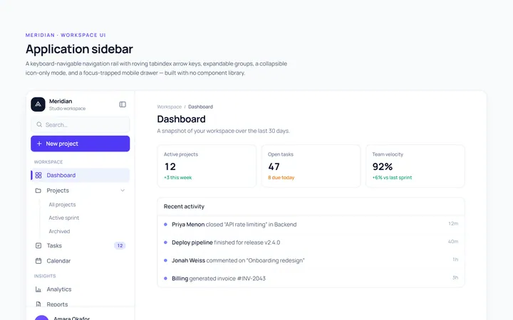
Basic Sidebar
Originalbasic app sidebar navigation
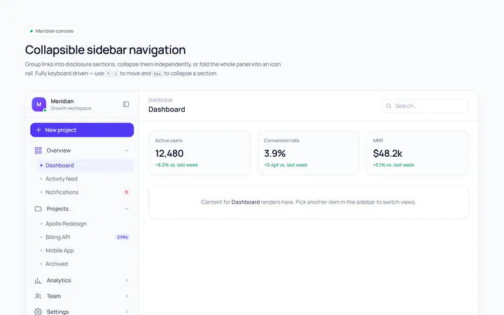
Collapsible Sidebar
Originalcollapsible sidebar sections
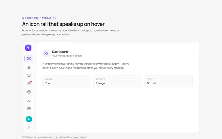
Icons Sidebar
Originalicon sidebar with labels on hover
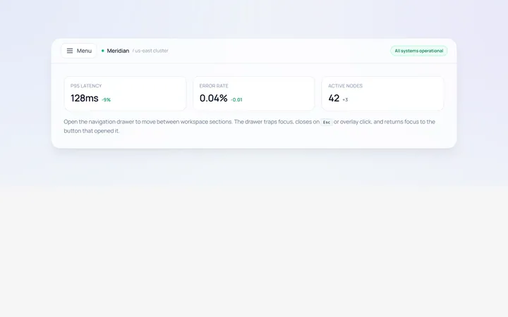
Drawer Left Sidebar
Originalslide-in left drawer with overlay
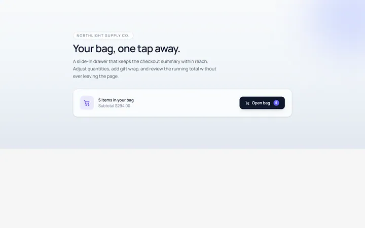
Drawer Right Sidebar
Originalslide-in right drawer panel
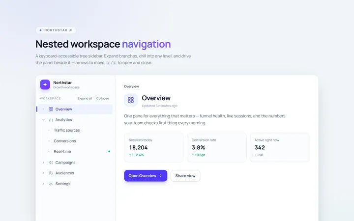
Nested Sidebar
Originalsidebar with expandable nested items
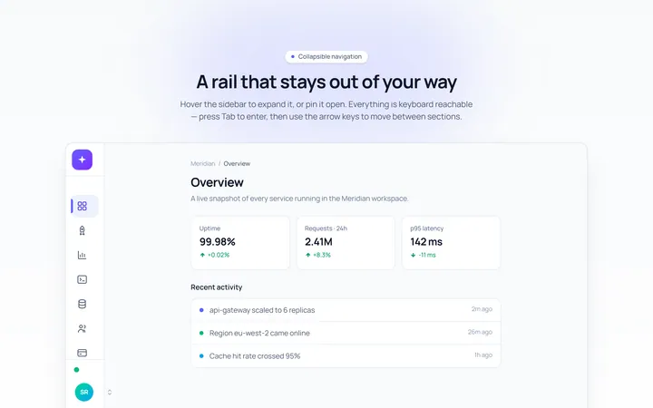
Mini Sidebar
Originalmini rail that expands on hover
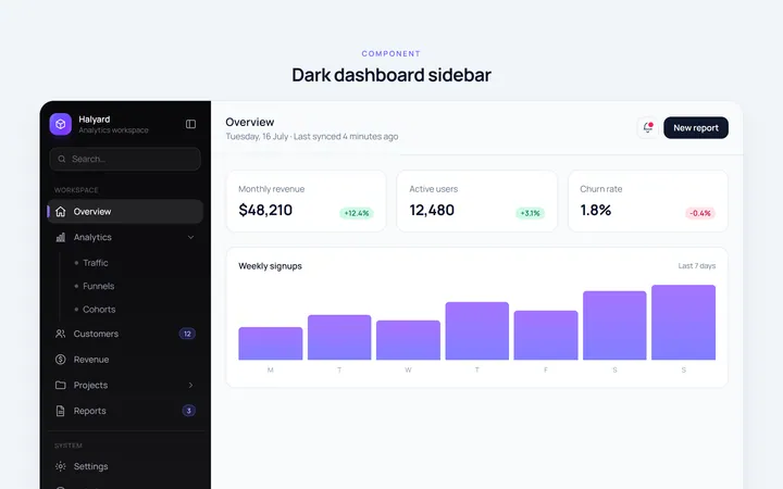
Dark Sidebar
Originaldark themed dashboard sidebar
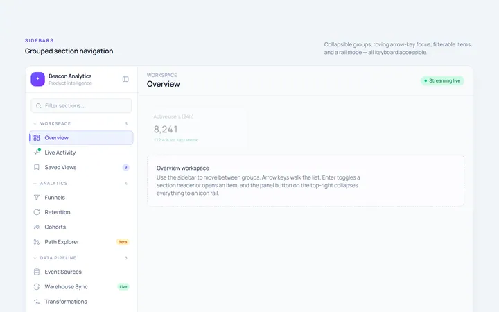
Sections Sidebar
Originalsidebar with grouped sections and headers
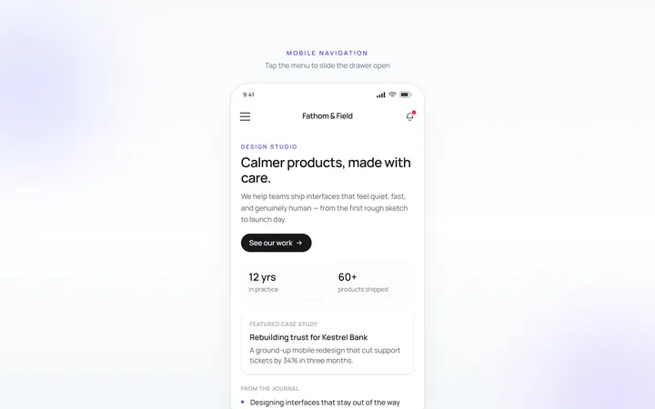
Mobile Sidebar
Originalmobile hamburger slide menu
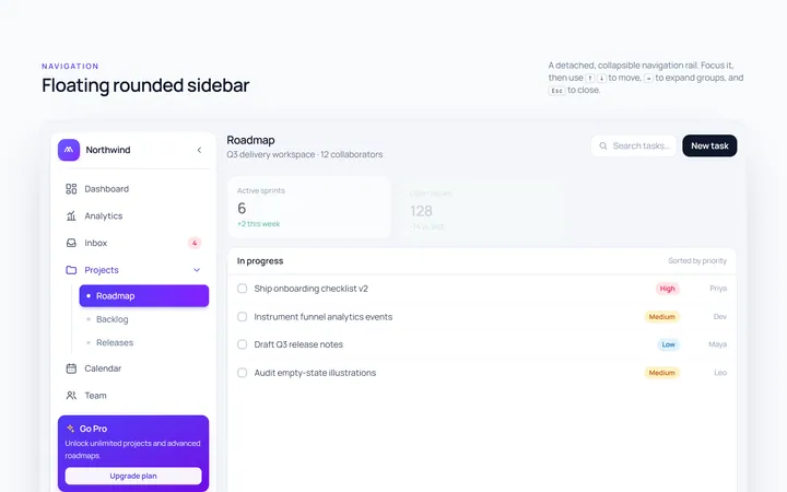
Floating Sidebar
Originalfloating rounded sidebar

Spotlight Hero
OriginalA centred hero with a soft radial spotlight, badge and dual call-to-action.