

Mini Sidebar
Original · freemini rail that expands on hover
Copy prompt gives Claude Code, Cursor or v0 a ready-to-paste prompt that recreates this exact component.
npx shadcn@latest add https://webinnoventix.com/r/side-mini.json"use client"
import { useRef, useState, type FocusEvent, type KeyboardEvent, type ReactNode } from "react"
import { motion, useReducedMotion } from "motion/react"
type IconProps = { className?: string }
type IconFn = (props: IconProps) => ReactNode
const svgBase = {
viewBox: "0 0 24 24",
fill: "none",
stroke: "currentColor",
strokeWidth: 1.6,
strokeLinecap: "round" as const,
strokeLinejoin: "round" as const,
"aria-hidden": true,
}
const IconOverview: IconFn = ({ className }) => (
<svg {...svgBase} className={className}>
<rect x="3.5" y="3.5" width="7" height="7" rx="1.6" />
<rect x="13.5" y="3.5" width="7" height="7" rx="1.6" />
<rect x="3.5" y="13.5" width="7" height="7" rx="1.6" />
<rect x="13.5" y="13.5" width="7" height="7" rx="1.6" />
</svg>
)
const IconDeploy: IconFn = ({ className }) => (
<svg {...svgBase} className={className}>
<path d="M12 2.5c2.7 1.7 4.3 4.6 4.3 7.9 0 1.7-.4 3.2-1 4.4H8.7c-.6-1.2-1-2.7-1-4.4 0-3.3 1.6-6.2 4.3-7.9Z" />
<circle cx="12" cy="9.3" r="1.5" />
<path d="M9.4 16.8c-1.1 1-1.6 2.6-1.6 4.2 1.2-.2 2.5-.7 3.3-1.6M14.6 16.8c1.1 1 1.6 2.6 1.6 4.2-1.2-.2-2.5-.7-3.3-1.6" />
</svg>
)
const IconAnalytics: IconFn = ({ className }) => (
<svg {...svgBase} className={className}>
<path d="M4 4v15a1 1 0 0 0 1 1h15" />
<path d="M8 16v-4" />
<path d="M12.5 16V8" />
<path d="M17 16v-6" />
</svg>
)
const IconLogs: IconFn = ({ className }) => (
<svg {...svgBase} className={className}>
<rect x="3" y="4" width="18" height="16" rx="2.4" />
<path d="M7.5 9.5l2.6 2.5-2.6 2.5" />
<path d="M13 15h3.8" />
</svg>
)
const IconDatabase: IconFn = ({ className }) => (
<svg {...svgBase} className={className}>
<ellipse cx="12" cy="6" rx="7" ry="3" />
<path d="M5 6v12c0 1.66 3.13 3 7 3s7-1.34 7-3V6" />
<path d="M5 12c0 1.66 3.13 3 7 3s7-1.34 7-3" />
</svg>
)
const IconTeam: IconFn = ({ className }) => (
<svg {...svgBase} className={className}>
<circle cx="9.5" cy="8" r="3" />
<path d="M3.8 20a5.7 5.7 0 0 1 11.4 0" />
<path d="M16.5 5.6a3 3 0 0 1 0 5.8" />
<path d="M18.2 20a5.7 5.7 0 0 0-2.7-4.9" />
</svg>
)
const IconBilling: IconFn = ({ className }) => (
<svg {...svgBase} className={className}>
<rect x="3" y="5" width="18" height="14" rx="2.4" />
<path d="M3 9.5h18" />
<path d="M7 14.5h3.5" />
</svg>
)
const IconSettings: IconFn = ({ className }) => (
<svg {...svgBase} className={className}>
<path d="M4 7h9" />
<path d="M17 7h3" />
<circle cx="15" cy="7" r="2.1" />
<path d="M4 17h3" />
<path d="M11 17h9" />
<circle cx="9" cy="17" r="2.1" />
</svg>
)
const IconPin: IconFn = ({ className }) => (
<svg {...svgBase} strokeWidth={1.7} className={className}>
<path d="M9 4h6l-1 5 2.5 2.5V13H7.5v-1.5L10 9 9 4Z" />
<path d="M12 13v6.5" />
</svg>
)
const IconExpand: IconFn = ({ className }) => (
<svg {...svgBase} strokeWidth={1.7} className={className}>
<path d="M8 9l4-4 4 4" />
<path d="M8 15l4 4 4-4" />
</svg>
)
type Metric = { label: string; value: string; delta: string; positive: boolean | null }
type Tone = "indigo" | "emerald" | "amber" | "rose" | "sky"
type Activity = { text: string; time: string; tone: Tone }
type Section = {
id: string
label: string
blurb: string
icon: IconFn
metrics: Metric[]
activity: Activity[]
}
const SECTIONS: Section[] = [
{
id: "overview",
label: "Overview",
blurb: "A live snapshot of every service running in the Meridian workspace.",
icon: IconOverview,
metrics: [
{ label: "Uptime", value: "99.98%", delta: "+0.02%", positive: true },
{ label: "Requests · 24h", value: "2.41M", delta: "+8.3%", positive: true },
{ label: "p95 latency", value: "142 ms", delta: "-11 ms", positive: true },
],
activity: [
{ text: "api-gateway scaled to 6 replicas", time: "2m ago", tone: "indigo" },
{ text: "Region eu-west-2 came online", time: "26m ago", tone: "emerald" },
{ text: "Cache hit rate crossed 95%", time: "1h ago", tone: "sky" },
],
},
{
id: "deployments",
label: "Deployments",
blurb: "Ship, promote, and roll back releases across every region.",
icon: IconDeploy,
metrics: [
{ label: "Deploys today", value: "14", delta: "+3", positive: true },
{ label: "Avg build", value: "2m 08s", delta: "-19s", positive: true },
{ label: "Failed", value: "1", delta: "+1", positive: false },
],
activity: [
{ text: "v2.8.1 promoted to production", time: "4m ago", tone: "emerald" },
{ text: "Preview build for #1423 is ready", time: "18m ago", tone: "sky" },
{ text: "Rollback of v2.8.0 completed", time: "3h ago", tone: "amber" },
],
},
{
id: "analytics",
label: "Analytics",
blurb: "Traffic, conversion, and funnel trends over the last 30 days.",
icon: IconAnalytics,
metrics: [
{ label: "Visitors", value: "128.4k", delta: "+12.6%", positive: true },
{ label: "Conversion", value: "3.9%", delta: "+0.4 pt", positive: true },
{ label: "Bounce", value: "41.2%", delta: "-2.1 pt", positive: true },
],
activity: [
{ text: "Signup funnel step 2 improved 6%", time: "today", tone: "emerald" },
{ text: "Top referrer: news.ycombinator.com", time: "today", tone: "indigo" },
{ text: "Mobile share reached 58%", time: "yesterday", tone: "sky" },
],
},
{
id: "logs",
label: "Logs",
blurb: "Structured, searchable logs streamed live from every instance.",
icon: IconLogs,
metrics: [
{ label: "Events / min", value: "18.2k", delta: "+4%", positive: null },
{ label: "Errors · 1h", value: "37", delta: "-12", positive: true },
{ label: "Warnings · 1h", value: "214", delta: "+9", positive: false },
],
activity: [
{ text: "Error rate returned below 0.1%", time: "5m ago", tone: "emerald" },
{ text: "New alert rule: 5xx spike", time: "40m ago", tone: "amber" },
{ text: "Log retention set to 30 days", time: "2h ago", tone: "indigo" },
],
},
{
id: "databases",
label: "Databases",
blurb: "Connections, storage, and query performance for your clusters.",
icon: IconDatabase,
metrics: [
{ label: "Connections", value: "312 / 500", delta: "+22", positive: null },
{ label: "Storage", value: "68.4 GB", delta: "+1.2 GB", positive: null },
{ label: "Slow queries", value: "3", delta: "-5", positive: true },
],
activity: [
{ text: "Read replica added in us-east-1", time: "12m ago", tone: "emerald" },
{ text: "Vacuum completed on orders", time: "1h ago", tone: "indigo" },
{ text: "Index added to sessions.user_id", time: "5h ago", tone: "sky" },
],
},
{
id: "team",
label: "Team",
blurb: "Manage members, roles, and access across every project.",
icon: IconTeam,
metrics: [
{ label: "Members", value: "24", delta: "+2", positive: null },
{ label: "Pending invites", value: "3", delta: "0", positive: null },
{ label: "Admins", value: "5", delta: "0", positive: null },
],
activity: [
{ text: "Priya Nair joined as Engineer", time: "today", tone: "emerald" },
{ text: "Owner role transferred to Sam", time: "yesterday", tone: "indigo" },
{ text: "2 invitations expired", time: "2d ago", tone: "amber" },
],
},
{
id: "billing",
label: "Billing",
blurb: "Usage, invoices, and plan limits for the current cycle.",
icon: IconBilling,
metrics: [
{ label: "This cycle", value: "$1,284", delta: "+6.1%", positive: false },
{ label: "Included left", value: "38%", delta: "—", positive: null },
{ label: "Next invoice", value: "Aug 1", delta: "—", positive: null },
],
activity: [
{ text: "Usage crossed 80% of plan", time: "today", tone: "amber" },
{ text: "Invoice #0421 was paid", time: "3d ago", tone: "emerald" },
{ text: "Added a seat-based add-on", time: "6d ago", tone: "indigo" },
],
},
{
id: "settings",
label: "Settings",
blurb: "Workspace configuration, tokens, and integrations.",
icon: IconSettings,
metrics: [
{ label: "API tokens", value: "9", delta: "+1", positive: null },
{ label: "Integrations", value: "6", delta: "0", positive: null },
{ label: "Webhooks", value: "12", delta: "+2", positive: null },
],
activity: [
{ text: "Slack integration reconnected", time: "20m ago", tone: "emerald" },
{ text: "New personal access token", time: "2h ago", tone: "indigo" },
{ text: "SSO enforced for all members", time: "1d ago", tone: "sky" },
],
},
]
const toneDot: Record<Tone, string> = {
indigo: "bg-indigo-500",
emerald: "bg-emerald-500",
amber: "bg-amber-500",
rose: "bg-rose-500",
sky: "bg-sky-500",
}
function deltaClass(positive: boolean | null): string {
if (positive === null) return "text-slate-400 dark:text-slate-500"
return positive
? "text-emerald-600 dark:text-emerald-400"
: "text-rose-600 dark:text-rose-400"
}
export default function SideMini() {
const rm = useReducedMotion()
const [selected, setSelected] = useState(0)
const [roving, setRoving] = useState(0)
const [pinned, setPinned] = useState(false)
const [hovered, setHovered] = useState(false)
const [focused, setFocused] = useState(false)
const itemRefs = useRef<Array<HTMLButtonElement | null>>([])
const expanded = pinned || hovered || focused
const current = SECTIONS[selected]
const focusItem = (i: number) => {
const n = SECTIONS.length
const idx = ((i % n) + n) % n
setRoving(idx)
itemRefs.current[idx]?.focus()
}
const onNavKeyDown = (e: KeyboardEvent<HTMLUListElement>) => {
switch (e.key) {
case "ArrowDown":
case "ArrowRight":
e.preventDefault()
focusItem(roving + 1)
break
case "ArrowUp":
case "ArrowLeft":
e.preventDefault()
focusItem(roving - 1)
break
case "Home":
e.preventDefault()
focusItem(0)
break
case "End":
e.preventDefault()
focusItem(SECTIONS.length - 1)
break
default:
break
}
}
const onAsideBlur = (e: FocusEvent<HTMLElement>) => {
if (!e.currentTarget.contains(e.relatedTarget)) setFocused(false)
}
const onAsideKeyDown = (e: KeyboardEvent<HTMLElement>) => {
if (e.key === "Escape" && pinned) {
e.preventDefault()
setPinned(false)
}
}
const labelStyle = {
opacity: expanded ? 1 : 0,
transform: expanded ? "translateX(0)" : "translateX(-6px)",
transitionProperty: rm ? "none" : "opacity, transform",
transitionDuration: rm ? "0ms" : "200ms",
transitionTimingFunction: "cubic-bezier(0.22,1,0.36,1)",
}
const asideStyle = {
width: expanded ? 268 : 76,
transitionProperty: rm ? "none" : "width",
transitionDuration: rm ? "0ms" : "260ms",
transitionTimingFunction: "cubic-bezier(0.22,1,0.36,1)",
}
const indicatorTransition = rm
? { duration: 0 }
: { type: "spring" as const, stiffness: 600, damping: 42 }
return (
<section className="relative w-full overflow-hidden bg-gradient-to-b from-slate-50 to-white px-4 py-16 text-slate-900 antialiased sm:px-6 sm:py-24 lg:px-8 dark:from-slate-950 dark:to-slate-900 dark:text-slate-100">
<style>{`
.sidemini-ping { animation: sidemini-ping 1.9s cubic-bezier(0,0,0.2,1) infinite; }
.sidemini-rise { animation: sidemini-rise 340ms cubic-bezier(0.22,1,0.36,1) both; }
@keyframes sidemini-ping {
0% { transform: scale(1); opacity: 0.55; }
75%, 100% { transform: scale(2.4); opacity: 0; }
}
@keyframes sidemini-rise {
from { opacity: 0; transform: translateY(10px); }
to { opacity: 1; transform: none; }
}
@media (prefers-reduced-motion: reduce) {
.sidemini-ping, .sidemini-rise { animation: none !important; }
}
`}</style>
<div
aria-hidden="true"
className="pointer-events-none absolute left-1/2 top-0 -z-0 h-72 w-[36rem] max-w-full -translate-x-1/2 rounded-full bg-indigo-400/20 blur-3xl dark:bg-indigo-600/20"
/>
<div className="relative z-10">
<div className="mx-auto mb-8 max-w-2xl text-center sm:mb-10">
<span className="inline-flex items-center gap-2 rounded-full border border-slate-200 bg-white px-3 py-1 text-xs font-medium text-slate-600 shadow-sm dark:border-slate-800 dark:bg-slate-900 dark:text-slate-300">
<span className="h-1.5 w-1.5 rounded-full bg-indigo-500" aria-hidden="true" />
Collapsible navigation
</span>
<h2 className="mt-4 text-3xl font-bold tracking-tight text-slate-900 sm:text-4xl dark:text-white">
A rail that stays out of your way
</h2>
<p className="mx-auto mt-3 max-w-xl text-base text-slate-600 dark:text-slate-400">
Hover the sidebar to expand it, or pin it open. Everything is keyboard reachable — press Tab
to enter, then use the arrow keys to move between sections.
</p>
</div>
<div className="mx-auto flex h-[600px] max-w-5xl overflow-hidden rounded-2xl border border-slate-200 bg-white shadow-2xl shadow-slate-900/10 ring-1 ring-slate-900/5 dark:border-slate-800 dark:bg-slate-900 dark:shadow-black/40 dark:ring-white/5">
{/* ---- Mini rail ---- */}
<aside
aria-label={expanded ? "Workspace sidebar, expanded" : "Workspace sidebar, collapsed"}
onMouseEnter={() => setHovered(true)}
onMouseLeave={() => setHovered(false)}
onFocus={() => setFocused(true)}
onBlur={onAsideBlur}
onKeyDown={onAsideKeyDown}
style={asideStyle}
className="relative z-10 flex shrink-0 flex-col border-r border-slate-200 bg-white dark:border-slate-800 dark:bg-slate-900"
>
{/* Header / brand */}
<div className="flex h-16 items-center gap-3 border-b border-slate-200 px-3 dark:border-slate-800">
<span className="grid h-10 w-10 shrink-0 place-items-center rounded-xl bg-gradient-to-br from-indigo-500 to-violet-600 text-white shadow-sm shadow-indigo-500/30">
<svg viewBox="0 0 24 24" className="h-5 w-5" fill="currentColor" aria-hidden="true">
<path d="M12 2.2l2.4 7 7 2.4-7 2.4-2.4 7-2.4-7-7-2.4 7-2.4 2.4-7Z" />
</svg>
</span>
<span className="min-w-0 flex-1 overflow-hidden" style={labelStyle}>
<span className="block truncate text-sm font-semibold text-slate-900 dark:text-white">Meridian</span>
<span className="block truncate text-xs text-slate-500 dark:text-slate-400">Cloud console</span>
</span>
<button
type="button"
onClick={() => setPinned((p) => !p)}
aria-pressed={pinned}
aria-hidden={!expanded}
tabIndex={expanded ? 0 : -1}
aria-label={pinned ? "Unpin sidebar" : "Pin sidebar open"}
style={{
opacity: expanded ? 1 : 0,
pointerEvents: expanded ? "auto" : "none",
transitionProperty: rm ? "none" : "opacity",
transitionDuration: rm ? "0ms" : "180ms",
}}
className={
"grid h-8 w-8 shrink-0 place-items-center rounded-lg outline-none transition-colors focus-visible:ring-2 focus-visible:ring-indigo-500 focus-visible:ring-offset-2 focus-visible:ring-offset-white dark:focus-visible:ring-offset-slate-900 " +
(pinned
? "bg-indigo-50 text-indigo-600 dark:bg-indigo-500/15 dark:text-indigo-300"
: "text-slate-400 hover:bg-slate-100 hover:text-slate-700 dark:text-slate-500 dark:hover:bg-slate-800 dark:hover:text-slate-200")
}
>
<IconPin
className="h-[18px] w-[18px]"
/>
</button>
</div>
{/* Navigation */}
<nav aria-label="Workspace sections" className="flex-1 overflow-y-auto overflow-x-hidden px-2.5 py-3">
<p
className="px-2 pb-2 text-[11px] font-semibold uppercase tracking-wider text-slate-400 dark:text-slate-500"
style={labelStyle}
aria-hidden="true"
>
Navigate
</p>
<ul role="list" onKeyDown={onNavKeyDown} className="space-y-1">
{SECTIONS.map((s, i) => {
const active = selected === i
return (
<li key={s.id}>
<button
ref={(el) => {
itemRefs.current[i] = el
}}
type="button"
tabIndex={i === roving ? 0 : -1}
aria-current={active ? "page" : undefined}
title={!expanded ? s.label : undefined}
onClick={() => {
setSelected(i)
setRoving(i)
}}
className={
"group relative flex w-full items-center gap-3 rounded-xl px-2.5 py-2.5 outline-none transition-colors focus-visible:ring-2 focus-visible:ring-indigo-500 focus-visible:ring-offset-2 focus-visible:ring-offset-white dark:focus-visible:ring-offset-slate-900 " +
(active
? "bg-indigo-50 text-indigo-700 dark:bg-indigo-500/10 dark:text-indigo-300"
: "text-slate-600 hover:bg-slate-100 hover:text-slate-900 dark:text-slate-400 dark:hover:bg-slate-800/70 dark:hover:text-slate-100")
}
>
{active && (
<motion.span
layoutId="sidemini-active"
transition={indicatorTransition}
className="absolute left-0 top-1/2 h-7 w-1 -translate-y-1/2 rounded-r-full bg-indigo-500 dark:bg-indigo-400"
aria-hidden="true"
/>
)}
<span className="grid h-6 w-6 shrink-0 place-items-center">
{s.icon({ className: "h-[22px] w-[22px]" })}
</span>
<span
className="min-w-0 flex-1 truncate text-left text-sm font-medium"
style={labelStyle}
>
{s.label}
</span>
</button>
</li>
)
})}
</ul>
</nav>
{/* Footer */}
<div className="border-t border-slate-200 px-3 py-3 dark:border-slate-800">
<div className="flex items-center gap-3 px-1 pb-3">
<span className="relative grid h-2.5 w-2.5 shrink-0 place-items-center">
<span className="sidemini-ping absolute inline-flex h-full w-full rounded-full bg-emerald-400" />
<span className="relative inline-flex h-2.5 w-2.5 rounded-full bg-emerald-500" />
</span>
<span
className="min-w-0 flex-1 truncate text-xs font-medium text-slate-500 dark:text-slate-400"
style={labelStyle}
>
All systems operational
</span>
</div>
<button
type="button"
className="flex w-full items-center gap-3 rounded-xl px-1.5 py-1.5 text-left outline-none transition-colors hover:bg-slate-100 focus-visible:ring-2 focus-visible:ring-indigo-500 focus-visible:ring-offset-2 focus-visible:ring-offset-white dark:hover:bg-slate-800/70 dark:focus-visible:ring-offset-slate-900"
>
<span className="grid h-9 w-9 shrink-0 place-items-center rounded-full bg-gradient-to-br from-emerald-400 to-sky-500 text-xs font-bold text-white">
SR
</span>
<span className="min-w-0 flex-1 overflow-hidden" style={labelStyle}>
<span className="block truncate text-sm font-medium text-slate-900 dark:text-white">Sana Rao</span>
<span className="block truncate text-xs text-slate-500 dark:text-slate-400">Owner · sana@meridian.app</span>
</span>
<IconExpand className="h-4 w-4 shrink-0 text-slate-400" />
</button>
<p
className="mt-2 px-1.5 text-[11px] text-slate-400 dark:text-slate-500"
style={labelStyle}
aria-hidden="true"
>
↑ ↓ to move · Enter to open
</p>
</div>
</aside>
{/* ---- Main panel ---- */}
<main className="relative flex-1 overflow-y-auto bg-slate-50 dark:bg-slate-950">
<div key={selected} className="sidemini-rise mx-auto max-w-2xl px-6 py-8 sm:px-8">
<nav aria-label="Breadcrumb">
<ol className="flex items-center gap-1.5 text-xs text-slate-400 dark:text-slate-500">
<li>Meridian</li>
<li aria-hidden="true">/</li>
<li className="font-medium text-slate-600 dark:text-slate-300">{current.label}</li>
</ol>
</nav>
<h2 className="mt-3 text-2xl font-bold tracking-tight text-slate-900 dark:text-white">
{current.label}
</h2>
<p className="mt-1.5 text-sm text-slate-500 dark:text-slate-400">{current.blurb}</p>
<div className="mt-6 grid grid-cols-1 gap-3 sm:grid-cols-3">
{current.metrics.map((m) => {
const sign = m.delta.trim().charAt(0)
return (
<div
key={m.label}
className="rounded-xl border border-slate-200 bg-white p-4 dark:border-slate-800 dark:bg-slate-900"
>
<p className="text-xs font-medium text-slate-500 dark:text-slate-400">{m.label}</p>
<p className="mt-1 text-xl font-bold tracking-tight text-slate-900 dark:text-white">
{m.value}
</p>
<p className={"mt-1 inline-flex items-center gap-1 text-xs font-medium " + deltaClass(m.positive)}>
{sign === "+" && (
<svg viewBox="0 0 12 12" className="h-3 w-3" fill="none" stroke="currentColor" strokeWidth={2} aria-hidden="true">
<path d="M6 9V3M3 6l3-3 3 3" strokeLinecap="round" strokeLinejoin="round" />
</svg>
)}
{sign === "-" && (
<svg viewBox="0 0 12 12" className="h-3 w-3" fill="none" stroke="currentColor" strokeWidth={2} aria-hidden="true">
<path d="M6 3v6M9 6l-3 3-3-3" strokeLinecap="round" strokeLinejoin="round" />
</svg>
)}
{m.delta}
</p>
</div>
)
})}
</div>
<section className="mt-6">
<h3 className="text-sm font-semibold text-slate-900 dark:text-white">Recent activity</h3>
<ul
role="list"
className="mt-3 divide-y divide-slate-200 overflow-hidden rounded-xl border border-slate-200 bg-white dark:divide-slate-800 dark:border-slate-800 dark:bg-slate-900"
>
{current.activity.map((a) => (
<li key={a.text} className="flex items-start gap-3 px-4 py-3">
<span className={"mt-1.5 h-2 w-2 shrink-0 rounded-full " + toneDot[a.tone]} aria-hidden="true" />
<p className="flex-1 text-sm text-slate-600 dark:text-slate-300">{a.text}</p>
<span className="shrink-0 text-xs text-slate-400 dark:text-slate-500">{a.time}</span>
</li>
))}
</ul>
</section>
</div>
</main>
</div>
</div>
</section>
)
}Dependencies
Licence
Built by Web Innoventix. Free for personal and commercial use, no attribution required.
Built by Web Innoventix
Need a custom interface, a full website, or SEO that gets you cited by AI? We design, build and rank it end to end.
Get a free quoteSimilar components
Browse all →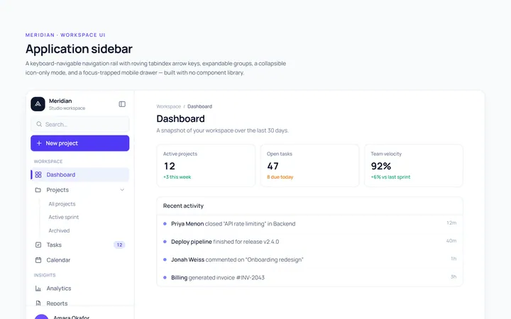
Basic Sidebar
Originalbasic app sidebar navigation
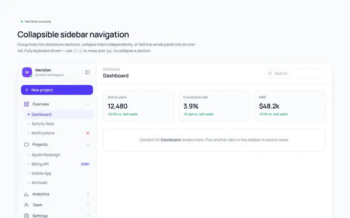
Collapsible Sidebar
Originalcollapsible sidebar sections
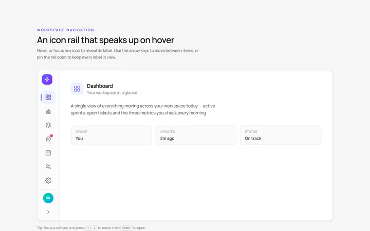
Icons Sidebar
Originalicon sidebar with labels on hover
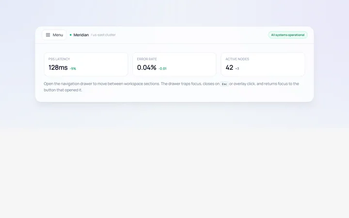
Drawer Left Sidebar
Originalslide-in left drawer with overlay
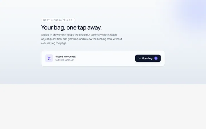
Drawer Right Sidebar
Originalslide-in right drawer panel
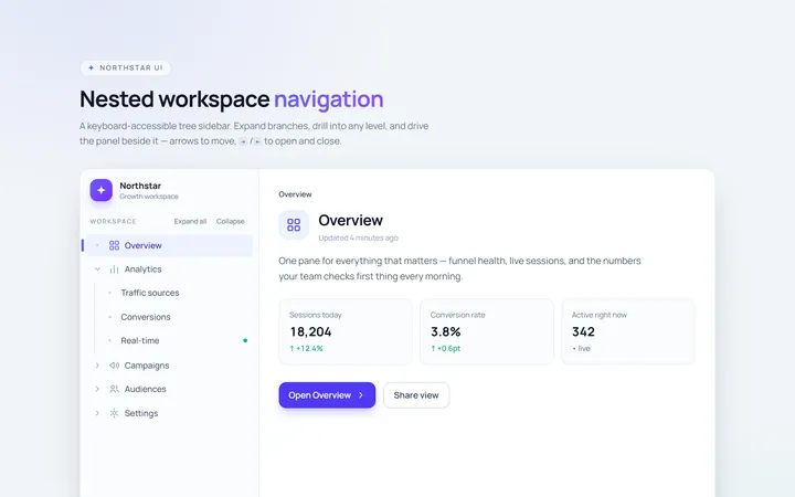
Nested Sidebar
Originalsidebar with expandable nested items
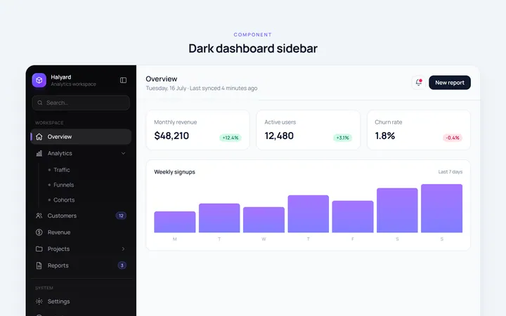
Dark Sidebar
Originaldark themed dashboard sidebar
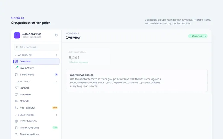
Sections Sidebar
Originalsidebar with grouped sections and headers
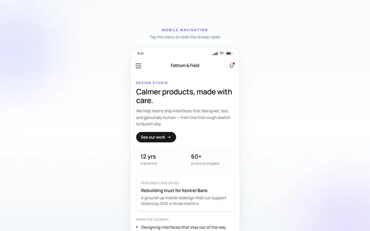
Mobile Sidebar
Originalmobile hamburger slide menu
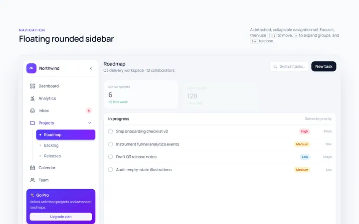
Floating Sidebar
Originalfloating rounded sidebar
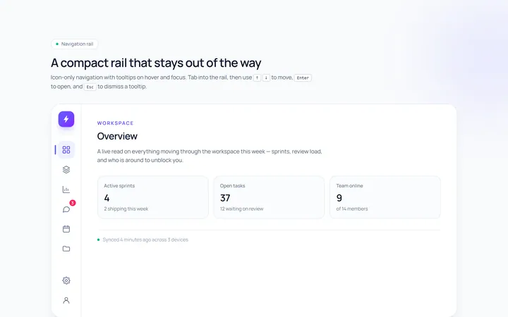
Rail Sidebar
Originalnarrow icon rail with tooltips

Spotlight Hero
OriginalA centred hero with a soft radial spotlight, badge and dual call-to-action.