

Sections Sidebar
Original · freesidebar with grouped sections and headers
Copy prompt gives Claude Code, Cursor or v0 a ready-to-paste prompt that recreates this exact component.
npx shadcn@latest add https://webinnoventix.com/r/side-sections.json"use client";
import {
useCallback,
useMemo,
useRef,
useState,
type KeyboardEvent,
type ReactNode,
} from "react";
import { AnimatePresence, motion, useReducedMotion } from "motion/react";
/* ------------------------------------------------------------------ */
/* Icons (inline, currentColor-driven so state colors flow through) */
/* ------------------------------------------------------------------ */
type IconProps = { className?: string };
const svgBase = {
viewBox: "0 0 24 24",
fill: "none",
stroke: "currentColor",
strokeWidth: 1.75,
strokeLinecap: "round" as const,
strokeLinejoin: "round" as const,
"aria-hidden": true,
};
function IconOverview({ className }: IconProps): ReactNode {
return (
<svg {...svgBase} className={className}>
<rect x="3" y="3" width="7" height="7" rx="1.5" />
<rect x="14" y="3" width="7" height="5" rx="1.5" />
<rect x="14" y="11" width="7" height="10" rx="1.5" />
<rect x="3" y="13" width="7" height="8" rx="1.5" />
</svg>
);
}
function IconActivity({ className }: IconProps): ReactNode {
return (
<svg {...svgBase} className={className}>
<path d="M3 12h4l2 6 4-14 2 8h6" />
</svg>
);
}
function IconBookmark({ className }: IconProps): ReactNode {
return (
<svg {...svgBase} className={className}>
<path d="M6 3h12a1 1 0 0 1 1 1v16l-7-4-7 4V4a1 1 0 0 1 1-1Z" />
</svg>
);
}
function IconFunnel({ className }: IconProps): ReactNode {
return (
<svg {...svgBase} className={className}>
<path d="M3 4h18l-7 8v6l-4 2v-8L3 4Z" />
</svg>
);
}
function IconRetention({ className }: IconProps): ReactNode {
return (
<svg {...svgBase} className={className}>
<path d="M21 12a9 9 0 1 1-2.64-6.36" />
<path d="M21 3v4h-4" />
</svg>
);
}
function IconCohorts({ className }: IconProps): ReactNode {
return (
<svg {...svgBase} className={className}>
<circle cx="9" cy="8" r="3" />
<circle cx="17" cy="10" r="2.4" />
<path d="M3.5 19a5.5 5.5 0 0 1 11 0" />
<path d="M15 19a4 4 0 0 1 5.5-3.7" />
</svg>
);
}
function IconPath({ className }: IconProps): ReactNode {
return (
<svg {...svgBase} className={className}>
<circle cx="6" cy="6" r="2.5" />
<circle cx="6" cy="18" r="2.5" />
<circle cx="18" cy="18" r="2.5" />
<path d="M6 8.5V15" />
<path d="M6 15c0-4 6-2 6-6a2.5 2.5 0 1 1 5 0c0 4 1 6 1 6.5" />
</svg>
);
}
function IconDatabase({ className }: IconProps): ReactNode {
return (
<svg {...svgBase} className={className}>
<ellipse cx="12" cy="5" rx="8" ry="3" />
<path d="M4 5v14c0 1.66 3.58 3 8 3s8-1.34 8-3V5" />
<path d="M4 12c0 1.66 3.58 3 8 3s8-1.34 8-3" />
</svg>
);
}
function IconSync({ className }: IconProps): ReactNode {
return (
<svg {...svgBase} className={className}>
<path d="M20 8a8 8 0 0 0-14.5-2.5M4 6v4h4" />
<path d="M4 16a8 8 0 0 0 14.5 2.5M20 18v-4h-4" />
</svg>
);
}
function IconTransform({ className }: IconProps): ReactNode {
return (
<svg {...svgBase} className={className}>
<path d="M3 7h11l-2.5-2.5M3 7l2.5 2.5" />
<path d="M21 17H10l2.5-2.5M21 17l-2.5 2.5" />
</svg>
);
}
function IconMember({ className }: IconProps): ReactNode {
return (
<svg {...svgBase} className={className}>
<circle cx="12" cy="8" r="3.2" />
<path d="M5 20a7 7 0 0 1 14 0" />
</svg>
);
}
function IconShield({ className }: IconProps): ReactNode {
return (
<svg {...svgBase} className={className}>
<path d="M12 3l7 3v5c0 5-3.5 8-7 10-3.5-2-7-5-7-10V6l7-3Z" />
<path d="m9 12 2 2 4-4" />
</svg>
);
}
function IconList({ className }: IconProps): ReactNode {
return (
<svg {...svgBase} className={className}>
<path d="M8 6h12M8 12h12M8 18h12" />
<circle cx="4" cy="6" r="1" />
<circle cx="4" cy="12" r="1" />
<circle cx="4" cy="18" r="1" />
</svg>
);
}
function IconCard({ className }: IconProps): ReactNode {
return (
<svg {...svgBase} className={className}>
<rect x="3" y="5" width="18" height="14" rx="2.5" />
<path d="M3 10h18M7 15h4" />
</svg>
);
}
function IconPuzzle({ className }: IconProps): ReactNode {
return (
<svg {...svgBase} className={className}>
<path d="M10 4a2 2 0 1 1 4 0v1h3a1 1 0 0 1 1 1v3h1a2 2 0 1 1 0 4h-1v3a1 1 0 0 1-1 1h-3v-1a2 2 0 1 0-4 0v1H7a1 1 0 0 1-1-1v-3H5a2 2 0 1 1 0-4h1V6a1 1 0 0 1 1-1h3V4Z" />
</svg>
);
}
function IconSliders({ className }: IconProps): ReactNode {
return (
<svg {...svgBase} className={className}>
<path d="M5 21v-7M5 10V3M12 21v-9M12 8V3M19 21v-4M19 13V3" />
<circle cx="5" cy="12" r="2" />
<circle cx="12" cy="10" r="2" />
<circle cx="19" cy="15" r="2" />
</svg>
);
}
function IconChevron({ className }: IconProps): ReactNode {
return (
<svg {...svgBase} className={className}>
<path d="m9 6 6 6-6 6" />
</svg>
);
}
function IconSearch({ className }: IconProps): ReactNode {
return (
<svg {...svgBase} className={className}>
<circle cx="11" cy="11" r="7" />
<path d="m21 21-4.3-4.3" />
</svg>
);
}
function IconClose({ className }: IconProps): ReactNode {
return (
<svg {...svgBase} className={className}>
<path d="M6 6l12 12M18 6 6 18" />
</svg>
);
}
function IconPanel({ className }: IconProps): ReactNode {
return (
<svg {...svgBase} className={className}>
<rect x="3" y="4" width="18" height="16" rx="2.5" />
<path d="M9 4v16" />
</svg>
);
}
function IconSpark({ className }: IconProps): ReactNode {
return (
<svg viewBox="0 0 24 24" fill="currentColor" aria-hidden="true" className={className}>
<path d="M12 2c.5 4.2 2.8 6.5 7 7-4.2.5-6.5 2.8-7 7-.5-4.2-2.8-6.5-7-7 4.2-.5 6.5-2.8 7-7Z" />
</svg>
);
}
/* ------------------------------------------------------------------ */
/* Data */
/* ------------------------------------------------------------------ */
type Tone = "indigo" | "emerald" | "amber";
type NavItem = {
id: string;
label: string;
icon: ReactNode;
badge?: string;
tone?: Tone;
live?: boolean;
};
type NavGroup = {
id: string;
label: string;
defaultCollapsed?: boolean;
items: NavItem[];
};
const ICON = "h-[18px] w-[18px] shrink-0";
const GROUPS: NavGroup[] = [
{
id: "workspace",
label: "Workspace",
items: [
{ id: "overview", label: "Overview", icon: <IconOverview className={ICON} /> },
{ id: "activity", label: "Live Activity", icon: <IconActivity className={ICON} />, live: true },
{ id: "views", label: "Saved Views", icon: <IconBookmark className={ICON} />, badge: "9", tone: "indigo" },
],
},
{
id: "analytics",
label: "Analytics",
items: [
{ id: "funnels", label: "Funnels", icon: <IconFunnel className={ICON} /> },
{ id: "retention", label: "Retention", icon: <IconRetention className={ICON} /> },
{ id: "cohorts", label: "Cohorts", icon: <IconCohorts className={ICON} /> },
{ id: "paths", label: "Path Explorer", icon: <IconPath className={ICON} />, badge: "Beta", tone: "amber" },
],
},
{
id: "data",
label: "Data Pipeline",
items: [
{ id: "sources", label: "Event Sources", icon: <IconDatabase className={ICON} /> },
{ id: "warehouse", label: "Warehouse Sync", icon: <IconSync className={ICON} />, badge: "Live", tone: "emerald" },
{ id: "transforms", label: "Transformations", icon: <IconTransform className={ICON} /> },
],
},
{
id: "team",
label: "Team",
defaultCollapsed: true,
items: [
{ id: "members", label: "Members", icon: <IconMember className={ICON} /> },
{ id: "roles", label: "Roles & Access", icon: <IconShield className={ICON} /> },
{ id: "audit", label: "Audit Log", icon: <IconList className={ICON} /> },
],
},
{
id: "settings",
label: "Settings",
defaultCollapsed: true,
items: [
{ id: "billing", label: "Billing & Usage", icon: <IconCard className={ICON} /> },
{ id: "integrations", label: "Integrations", icon: <IconPuzzle className={ICON} /> },
{ id: "preferences", label: "Preferences", icon: <IconSliders className={ICON} /> },
],
},
];
const STATS: { label: string; value: string; delta: string; up: boolean }[] = [
{ label: "Active users (24h)", value: "8,241", delta: "+12.4%", up: true },
{ label: "Conversion rate", value: "3.92%", delta: "+0.6pt", up: true },
{ label: "Median session", value: "4m 18s", delta: "-9s", up: false },
];
const toneBadge: Record<Tone, string> = {
indigo:
"bg-indigo-100 text-indigo-700 dark:bg-indigo-500/15 dark:text-indigo-300",
emerald:
"bg-emerald-100 text-emerald-700 dark:bg-emerald-500/15 dark:text-emerald-300",
amber:
"bg-amber-100 text-amber-700 dark:bg-amber-500/15 dark:text-amber-300",
};
/* ------------------------------------------------------------------ */
/* Component */
/* ------------------------------------------------------------------ */
export default function SideSections(): ReactNode {
const reduce = useReducedMotion();
const [active, setActive] = useState<string>("overview");
const [query, setQuery] = useState<string>("");
const [rail, setRail] = useState<boolean>(false);
const [focusedId, setFocusedId] = useState<string | null>(null);
const [collapsed, setCollapsed] = useState<Set<string>>(
() => new Set(GROUPS.filter((g) => g.defaultCollapsed).map((g) => g.id)),
);
const rowRefs = useRef<Map<string, HTMLButtonElement>>(new Map());
const setRowRef = useCallback(
(id: string) => (el: HTMLButtonElement | null) => {
if (el) rowRefs.current.set(id, el);
else rowRefs.current.delete(id);
},
[],
);
const q = query.trim().toLowerCase();
const filteredGroups = useMemo<NavGroup[]>(() => {
if (!q) return GROUPS;
return GROUPS.map((g) => ({
...g,
items: g.items.filter((i) => i.label.toLowerCase().includes(q)),
})).filter((g) => g.items.length > 0);
}, [q]);
const isOpen = useCallback(
(gid: string): boolean => rail || q !== "" || !collapsed.has(gid),
[rail, q, collapsed],
);
// Ordered list of keyboard-navigable row ids (roving tabindex).
const focusableIds = useMemo<string[]>(() => {
const ids: string[] = [];
for (const g of filteredGroups) {
if (!rail) ids.push(`hdr:${g.id}`);
if (isOpen(g.id)) for (const i of g.items) ids.push(`item:${i.id}`);
}
return ids;
}, [filteredGroups, rail, isOpen]);
const tabbableId =
focusedId && focusableIds.includes(focusedId)
? focusedId
: focusableIds[0] ?? null;
const toggleGroup = useCallback((gid: string) => {
setCollapsed((prev) => {
const next = new Set(prev);
if (next.has(gid)) next.delete(gid);
else next.add(gid);
return next;
});
}, []);
const focusRow = useCallback((id: string | undefined) => {
if (!id) return;
const el = rowRefs.current.get(id);
if (el) {
el.focus();
setFocusedId(id);
}
}, []);
const parentHeaderOf = useCallback(
(itemRowId: string): string | null => {
const itemId = itemRowId.slice(5);
for (const g of filteredGroups) {
if (g.items.some((i) => i.id === itemId)) return `hdr:${g.id}`;
}
return null;
},
[filteredGroups],
);
const onKeyDown = useCallback(
(e: KeyboardEvent<HTMLElement>) => {
const target = (e.target as HTMLElement).closest("[data-rowid]");
const rowId = target?.getAttribute("data-rowid") ?? null;
const ids = focusableIds;
if (ids.length === 0) return;
const idx = rowId ? ids.indexOf(rowId) : -1;
const clamp = (n: number) => Math.max(0, Math.min(ids.length - 1, n));
switch (e.key) {
case "ArrowDown":
e.preventDefault();
focusRow(ids[clamp(idx + 1)]);
break;
case "ArrowUp":
e.preventDefault();
focusRow(ids[clamp(idx - 1)]);
break;
case "Home":
e.preventDefault();
focusRow(ids[0]);
break;
case "End":
e.preventDefault();
focusRow(ids[ids.length - 1]);
break;
case "ArrowRight":
if (rowId?.startsWith("hdr:")) {
e.preventDefault();
const gid = rowId.slice(4);
if (!rail && q === "" && collapsed.has(gid)) toggleGroup(gid);
else focusRow(ids[clamp(idx + 1)]);
}
break;
case "ArrowLeft":
if (rowId?.startsWith("hdr:")) {
e.preventDefault();
const gid = rowId.slice(4);
if (!rail && q === "" && !collapsed.has(gid)) toggleGroup(gid);
} else if (rowId?.startsWith("item:")) {
e.preventDefault();
const parent = parentHeaderOf(rowId);
if (parent) focusRow(parent);
}
break;
default:
break;
}
},
[focusableIds, focusRow, rail, q, collapsed, toggleGroup, parentHeaderOf],
);
const activeMeta = useMemo(() => {
for (const g of GROUPS) {
const it = g.items.find((i) => i.id === active);
if (it) return { group: g.label, label: it.label };
}
return { group: "Workspace", label: "Overview" };
}, [active]);
const spring = reduce
? { duration: 0 }
: { type: "spring" as const, stiffness: 420, damping: 40 };
return (
<section
data-sidesec-root
className="relative w-full bg-slate-100 px-4 py-16 text-slate-900 sm:py-24 dark:bg-slate-950 dark:text-slate-100"
>
<style>{`
@keyframes sidesec-ping {
0% { transform: scale(1); opacity: .65; }
75%, 100% { transform: scale(2.6); opacity: 0; }
}
@keyframes sidesec-rise {
from { opacity: 0; transform: translateY(6px); }
to { opacity: 1; transform: none; }
}
@media (prefers-reduced-motion: reduce) {
[data-sidesec-root] .sidesec-animated { animation: none !important; }
[data-sidesec-root] * {
animation-duration: .001ms !important;
transition-duration: .001ms !important;
}
}
`}</style>
<div className="mx-auto max-w-6xl">
<div className="mb-6 flex flex-wrap items-end justify-between gap-3">
<div>
<p className="text-xs font-semibold uppercase tracking-[0.18em] text-indigo-600 dark:text-indigo-400">
Sidebars
</p>
<h2 className="mt-1 text-lg font-semibold tracking-tight">
Grouped section navigation
</h2>
</div>
<p className="max-w-sm text-sm text-slate-500 dark:text-slate-400">
Collapsible groups, roving arrow-key focus, filterable items, and a
rail mode — all keyboard accessible.
</p>
</div>
<motion.div
initial={reduce ? false : { opacity: 0, y: 10 }}
whileInView={{ opacity: 1, y: 0 }}
viewport={{ once: true, margin: "-80px" }}
transition={reduce ? { duration: 0 } : { duration: 0.4, ease: [0.22, 1, 0.36, 1] }}
className="flex min-h-[600px] overflow-hidden rounded-2xl border border-slate-200 bg-slate-50 shadow-xl shadow-slate-900/5 dark:border-slate-800 dark:bg-slate-950 dark:shadow-black/40"
>
{/* ---------------------------------------------------------- */}
{/* Sidebar */}
{/* ---------------------------------------------------------- */}
<motion.aside
initial={false}
animate={{ width: rail ? 78 : 288 }}
transition={spring}
className="flex shrink-0 flex-col border-r border-slate-200 bg-white dark:border-slate-800 dark:bg-slate-900"
>
{/* Brand + rail toggle */}
<div className="flex items-center gap-2.5 border-b border-slate-200 px-3.5 py-4 dark:border-slate-800">
<span className="grid h-9 w-9 shrink-0 place-items-center rounded-xl bg-gradient-to-br from-indigo-500 to-violet-600 text-white shadow-sm shadow-indigo-500/30">
<IconSpark className="h-4 w-4" />
</span>
{!rail && (
<div className="min-w-0 flex-1">
<p className="truncate text-sm font-semibold tracking-tight">
Beacon Analytics
</p>
<p className="truncate text-xs text-slate-400 dark:text-slate-500">
Product intelligence
</p>
</div>
)}
<button
type="button"
onClick={() => setRail((v) => !v)}
aria-pressed={rail}
aria-label={rail ? "Expand sidebar" : "Collapse sidebar to rail"}
title={rail ? "Expand sidebar" : "Collapse sidebar"}
className={`grid h-8 w-8 shrink-0 place-items-center rounded-lg text-slate-400 transition-colors hover:bg-slate-100 hover:text-slate-700 focus-visible:outline-none focus-visible:ring-2 focus-visible:ring-indigo-500 focus-visible:ring-offset-2 focus-visible:ring-offset-white dark:hover:bg-slate-800 dark:hover:text-slate-200 dark:focus-visible:ring-offset-slate-900 ${
rail ? "mx-auto" : ""
}`}
>
<IconPanel className="h-[18px] w-[18px]" />
</button>
</div>
{/* Filter */}
{!rail && (
<div className="px-3.5 pt-3.5">
<div className="relative">
<IconSearch className="pointer-events-none absolute left-3 top-1/2 h-4 w-4 -translate-y-1/2 text-slate-400 dark:text-slate-500" />
<input
type="text"
value={query}
onChange={(e) => setQuery(e.target.value)}
onKeyDown={(e) => {
if (e.key === "Escape" && query) {
e.stopPropagation();
setQuery("");
}
}}
placeholder="Filter sections…"
aria-label="Filter navigation sections"
className="w-full rounded-lg border border-slate-200 bg-slate-50 py-2 pl-9 pr-8 text-sm text-slate-700 placeholder:text-slate-400 focus:border-indigo-400 focus:bg-white focus:outline-none focus:ring-2 focus:ring-indigo-500/30 dark:border-slate-700 dark:bg-slate-800/60 dark:text-slate-200 dark:placeholder:text-slate-500 dark:focus:border-indigo-500 dark:focus:bg-slate-800"
/>
{query && (
<button
type="button"
onClick={() => setQuery("")}
aria-label="Clear filter"
className="absolute right-2 top-1/2 grid h-6 w-6 -translate-y-1/2 place-items-center rounded-md text-slate-400 hover:bg-slate-200 hover:text-slate-700 focus-visible:outline-none focus-visible:ring-2 focus-visible:ring-indigo-500 dark:hover:bg-slate-700 dark:hover:text-slate-200"
>
<IconClose className="h-3.5 w-3.5" />
</button>
)}
</div>
</div>
)}
{/* Nav */}
<nav
aria-label="Workspace navigation"
onKeyDown={onKeyDown}
className="flex-1 overflow-y-auto px-2.5 py-3"
>
{focusableIds.length === 0 ? (
<p className="px-2 py-8 text-center text-sm text-slate-400 dark:text-slate-500">
No sections match “{query}”.
</p>
) : (
filteredGroups.map((g, gi) => {
const open = isOpen(g.id);
const hdrRow = `hdr:${g.id}`;
return (
<div
key={g.id}
className={
rail && gi > 0
? "mt-2 border-t border-slate-100 pt-2 dark:border-slate-800/70"
: gi > 0
? "mt-1"
: ""
}
>
{!rail && (
<button
type="button"
id={`sidesec-hdr-${g.id}`}
data-rowid={hdrRow}
ref={setRowRef(hdrRow)}
tabIndex={tabbableId === hdrRow ? 0 : -1}
aria-expanded={open}
aria-controls={`sidesec-region-${g.id}`}
onFocus={() => setFocusedId(hdrRow)}
onClick={() => toggleGroup(g.id)}
className="group flex w-full items-center gap-1.5 rounded-md px-2 py-1.5 text-left text-[11px] font-semibold uppercase tracking-[0.12em] text-slate-400 transition-colors hover:text-slate-600 focus-visible:outline-none focus-visible:ring-2 focus-visible:ring-indigo-500 focus-visible:ring-offset-1 focus-visible:ring-offset-white dark:text-slate-500 dark:hover:text-slate-300 dark:focus-visible:ring-offset-slate-900"
>
<span
aria-hidden="true"
className="grid shrink-0 place-items-center text-slate-300 transition-transform duration-200 group-hover:text-slate-500 dark:text-slate-600 dark:group-hover:text-slate-400"
style={{ transform: open ? "rotate(90deg)" : "rotate(0deg)" }}
>
<IconChevron className="h-3.5 w-3.5" />
</span>
<span className="flex-1 truncate">{g.label}</span>
<span className="rounded px-1.5 py-0.5 text-[10px] font-medium tabular-nums text-slate-400 dark:text-slate-500">
{g.items.length}
</span>
</button>
)}
<AnimatePresence initial={false}>
{open && (
<motion.div
key="region"
id={rail ? undefined : `sidesec-region-${g.id}`}
role={rail ? undefined : "region"}
aria-labelledby={rail ? undefined : `sidesec-hdr-${g.id}`}
initial={reduce ? false : { height: 0, opacity: 0 }}
animate={{ height: "auto", opacity: 1 }}
exit={reduce ? { opacity: 0 } : { height: 0, opacity: 0 }}
transition={reduce ? { duration: 0 } : { duration: 0.22, ease: [0.22, 1, 0.36, 1] }}
style={{ overflow: "hidden" }}
>
<ul role="list" className="mt-0.5 space-y-0.5 pb-1">
{g.items.map((item) => {
const itemRow = `item:${item.id}`;
const isActive = active === item.id;
return (
<li key={item.id}>
<button
type="button"
data-rowid={itemRow}
ref={setRowRef(itemRow)}
tabIndex={tabbableId === itemRow ? 0 : -1}
aria-current={isActive ? "page" : undefined}
title={rail ? item.label : undefined}
onFocus={() => setFocusedId(itemRow)}
onClick={() => setActive(item.id)}
className={[
"group relative flex w-full items-center rounded-lg px-2.5 py-2 text-sm font-medium transition-colors focus-visible:outline-none focus-visible:ring-2 focus-visible:ring-indigo-500 focus-visible:ring-offset-1 focus-visible:ring-offset-white dark:focus-visible:ring-offset-slate-900",
rail ? "justify-center" : "gap-3",
isActive
? "bg-indigo-50 text-indigo-700 ring-1 ring-inset ring-indigo-200 dark:bg-indigo-500/10 dark:text-indigo-200 dark:ring-indigo-500/30"
: "text-slate-600 hover:bg-slate-100 hover:text-slate-900 dark:text-slate-400 dark:hover:bg-slate-800 dark:hover:text-slate-100",
].join(" ")}
>
{isActive && !rail && (
<span
aria-hidden="true"
className="absolute left-0 top-1/2 h-5 w-1 -translate-y-1/2 rounded-r-full bg-indigo-500"
/>
)}
<span className="relative grid place-items-center">
<span
className={
isActive
? "text-indigo-600 dark:text-indigo-300"
: "text-slate-400 group-hover:text-slate-600 dark:text-slate-500 dark:group-hover:text-slate-300"
}
>
{item.icon}
</span>
{item.live && (
<span className="absolute -right-0.5 -top-0.5 flex h-2 w-2">
<span className="sidesec-animated absolute inline-flex h-full w-full rounded-full bg-emerald-400 [animation:sidesec-ping_1.8s_cubic-bezier(0,0,0.2,1)_infinite]" />
<span className="relative inline-flex h-2 w-2 rounded-full bg-emerald-500" />
</span>
)}
</span>
{!rail && (
<>
<span className="flex-1 truncate text-left">
{item.label}
</span>
{item.badge && (
<span
className={`shrink-0 rounded-full px-1.5 py-0.5 text-[10px] font-semibold tabular-nums ${
toneBadge[item.tone ?? "indigo"]
}`}
>
{item.badge}
</span>
)}
</>
)}
{rail && <span className="sr-only">{item.label}</span>}
</button>
</li>
);
})}
</ul>
</motion.div>
)}
</AnimatePresence>
</div>
);
})
)}
</nav>
{/* Footer / account */}
<div className="border-t border-slate-200 p-2.5 dark:border-slate-800">
<button
type="button"
title={rail ? "Amara Ndiaye — Owner" : undefined}
className={`flex w-full items-center rounded-lg p-1.5 text-left transition-colors hover:bg-slate-100 focus-visible:outline-none focus-visible:ring-2 focus-visible:ring-indigo-500 focus-visible:ring-offset-1 focus-visible:ring-offset-white dark:hover:bg-slate-800 dark:focus-visible:ring-offset-slate-900 ${
rail ? "justify-center" : "gap-2.5"
}`}
>
<span className="grid h-8 w-8 shrink-0 place-items-center rounded-full bg-gradient-to-br from-rose-400 to-amber-400 text-xs font-bold text-white">
AN
</span>
{!rail && (
<span className="min-w-0 flex-1">
<span className="block truncate text-sm font-medium text-slate-700 dark:text-slate-200">
Amara Ndiaye
</span>
<span className="block truncate text-xs text-slate-400 dark:text-slate-500">
Owner · amara@beacon.io
</span>
</span>
)}
</button>
</div>
</motion.aside>
{/* ---------------------------------------------------------- */}
{/* Content preview (context for the sidebar) */}
{/* ---------------------------------------------------------- */}
<div className="hidden min-w-0 flex-1 flex-col sm:flex">
<header className="flex items-center justify-between border-b border-slate-200 px-6 py-4 dark:border-slate-800">
<div className="min-w-0">
<p className="text-xs font-medium uppercase tracking-wider text-slate-400 dark:text-slate-500">
{activeMeta.group}
</p>
<h1 className="truncate text-xl font-semibold tracking-tight text-slate-900 dark:text-white">
{activeMeta.label}
</h1>
</div>
<span className="hidden items-center gap-1.5 rounded-full bg-emerald-100 px-2.5 py-1 text-xs font-medium text-emerald-700 md:inline-flex dark:bg-emerald-500/15 dark:text-emerald-300">
<span className="h-1.5 w-1.5 rounded-full bg-emerald-500" />
Streaming live
</span>
</header>
<div className="grid flex-1 grid-cols-1 content-start gap-4 p-6 md:grid-cols-3">
{STATS.map((s, i) => (
<div
key={s.label}
className="sidesec-animated rounded-xl border border-slate-200 bg-white p-4 dark:border-slate-800 dark:bg-slate-900"
style={
reduce
? undefined
: {
animation: `sidesec-rise .45s ${0.06 * i}s cubic-bezier(0.22,1,0.36,1) both`,
}
}
>
<p className="text-xs font-medium text-slate-500 dark:text-slate-400">
{s.label}
</p>
<p className="mt-2 text-2xl font-semibold tabular-nums tracking-tight text-slate-900 dark:text-white">
{s.value}
</p>
<p
className={`mt-1 text-xs font-medium ${
s.up
? "text-emerald-600 dark:text-emerald-400"
: "text-rose-600 dark:text-rose-400"
}`}
>
{s.delta} vs. last week
</p>
</div>
))}
<div className="rounded-xl border border-dashed border-slate-300 bg-white/50 p-6 text-sm text-slate-500 md:col-span-3 dark:border-slate-700 dark:bg-slate-900/40 dark:text-slate-400">
<p className="font-medium text-slate-700 dark:text-slate-200">
{activeMeta.label} workspace
</p>
<p className="mt-1 max-w-prose">
Use the sidebar to move between groups. Arrow keys walk the
list, Enter toggles a section header or opens an item, and the
panel button on the top-right collapses everything to an icon
rail.
</p>
</div>
</div>
</div>
</motion.div>
</div>
</section>
);
}Dependencies
Licence
Built by Web Innoventix. Free for personal and commercial use, no attribution required.
Built by Web Innoventix
Need a custom interface, a full website, or SEO that gets you cited by AI? We design, build and rank it end to end.
Get a free quoteSimilar components
Browse all →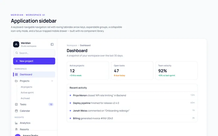
Basic Sidebar
Originalbasic app sidebar navigation
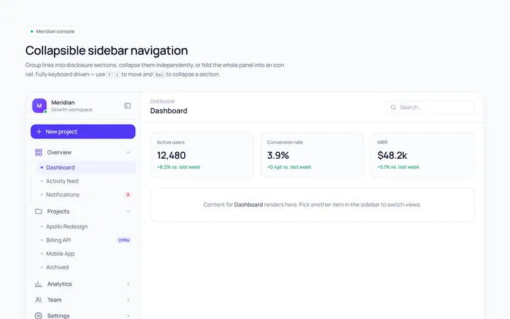
Collapsible Sidebar
Originalcollapsible sidebar sections
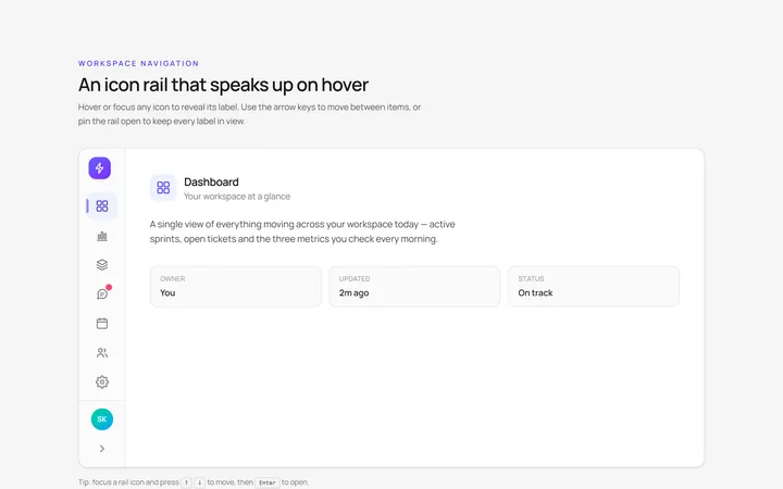
Icons Sidebar
Originalicon sidebar with labels on hover
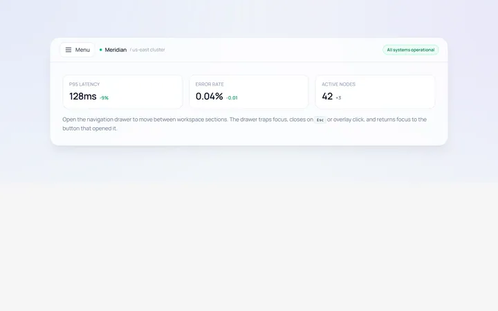
Drawer Left Sidebar
Originalslide-in left drawer with overlay
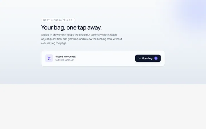
Drawer Right Sidebar
Originalslide-in right drawer panel
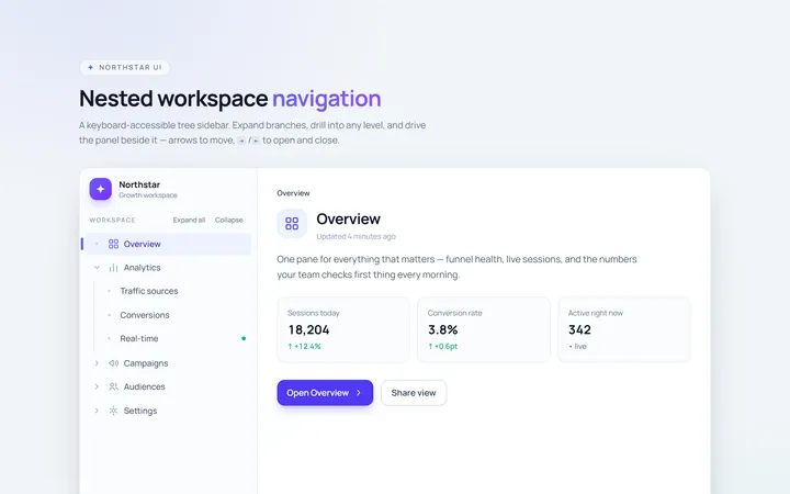
Nested Sidebar
Originalsidebar with expandable nested items
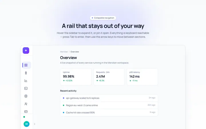
Mini Sidebar
Originalmini rail that expands on hover
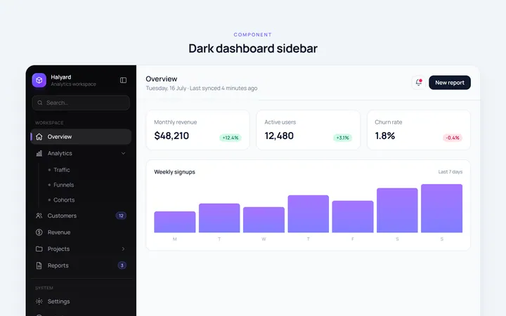
Dark Sidebar
Originaldark themed dashboard sidebar
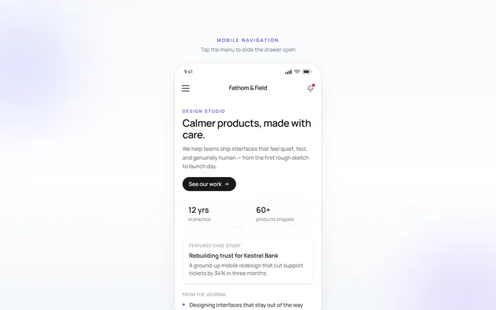
Mobile Sidebar
Originalmobile hamburger slide menu
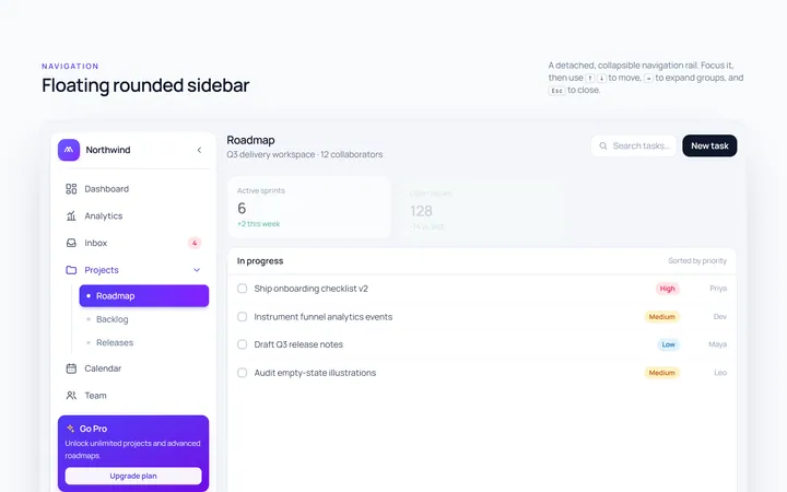
Floating Sidebar
Originalfloating rounded sidebar
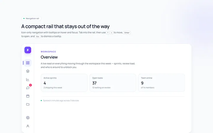
Rail Sidebar
Originalnarrow icon rail with tooltips

Spotlight Hero
OriginalA centred hero with a soft radial spotlight, badge and dual call-to-action.